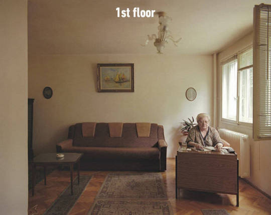
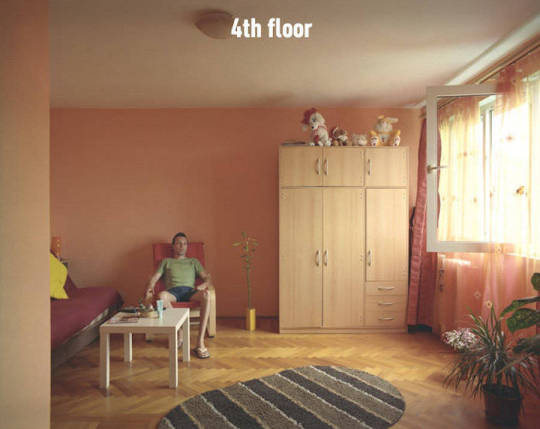
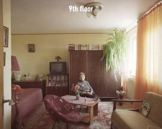
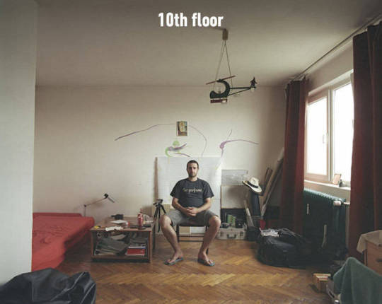
Photo

https://deadlyponies.com/news/article/mr-stitcher/
5 notes
·
View notes
Text
DIN Schrift


http://www.identifont.com/show?2T9
https://www.linotype.com/1245820/din-1451-mittelschrift-product.html?format=ot-ttf&branding=cyrillic
0 notes
Photo

Original manuscript of the novel “On the Road” by Jack Kerouac which he wrote in a 3 week session. Apparently the last bit was eaten by a dog.
0 notes
Text
“...how can a designer plan an annual report without some knowledge of economics? Lay out a book without an inter- est in, if not a passion for, literature? Design a logo for a high-tech company without some familiarity with science?
Obviously, they can and do. Some designers fill in their educational gaps as they go along; some just fake it. But most of the mediocre design today comes from designers who are faithfully doing as they were taught in school: they worship at the altar of the visual.”
“Modern design education, on the other hand, is essentially value-free: every problem has a purely visual solution that exists outside any cultural context.”
Michael Bierut, “Seventy-nine Short Essays on Design”
0 notes
Photo

stimuli_ Photo http://aestheticssensibilities.tumblr.com/post/148690032545
2 notes
·
View notes
Text

Designers actually can change the world for the better by making the complicated simple and finding beauty in truth. But things like the FDA Nutrition Facts Label, probably the most useful and widely reproduced piece of graphic design of the twentieth century, generally receive neither awards nor accolades from the likes of Adbusters or Rick Poynor: too humble, too accessible, too unshocking, too boring.
— Michael Bierut, 79 Short Essays on Design
0 notes
Text
when you’re designing while inspired

when you’re designing and you’re not inspired
154K notes
·
View notes
Video
vimeo
stimuli_Quayola, “Pleasant Places,” 2015 by bitforms gallery // Quayola “Pleasant Places,” 2015 Single channel, 4K landscape video Screen size variable 28 min, loop Ed 6 Titled like the first series of landscapes prints produced in Holland in the Seventeenth century, Pleasant Places consists of a series of digital paintings exploring the boundary between representation and abstraction. Inspired by the work of Vincent Van Gogh, Quayola has returned to the same countryside of Provence 125 years later. The landscapes serve as a point of departure - a pretext to aha pe an inner motion and vision. Through the misuse of image-analysis and manipulation algorithms, Pleasant Places challenges the photographic image and proposes alternative modes of vision and synthesis. Familiar landscapes - filmed in Ultra-High-Definition - is shown with meticulous attention to details and to the anthropomorphic shapes of the trees. Then, through the use of custom-software, the detailed texture of the foliage is reduced to two-dimensional masses of volume veering towards abstraction. As the outlines of trees and shrubs get blurred, nature becomes dense and almost impenetrable. The resulting compositions remain, suggestively, suspended between representation and abstraction, between the depth of the natural scenery and the surface of the screen. In contrast to this vision, raw data-visualizations of colour and motion information follow in sequence the contemplative digital paintings to remind us what really lies beneath the surface. Pleasant Places pays homage to the modern tradition of Western art that takes landscape as a point of departure towards abstraction, reducing the complexity of the world into new alternative synthesis.
2 notes
·
View notes
Photo


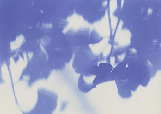
Shadow of Bombed Trees - Ginkgo, 2013 // Shunya Asami
31K notes
·
View notes


