Welcome to my tumblr. I post my sketches and art here. As well as a smattering of things from pokemon, to digimon, to harpies, RP posts, and other creative things. Currently playing: Pokemon Y External Links: @SetoSora - Personal Twitter account Twitch.tv @SetosStory - IC Twitter account DeviantArt
Don't wanna be here? Send us removal request.
Note
How do you prove you're a good problem solver in your art?
Do sample commissions that are solving a problem that the industry you’re trying to work in needs solved all the time. What I mean is, do a few samples of something that’s common or well-known in the industry. For example:
—If you want to illustrate book covers, pick a few classic books and make illustrations for the cover. You can even do a few books by the same author and make a series.
—If you want to do comic covers, illustrate some versions of well-known characters but in a fresh light.
—If you want to do editorial illustrations, pick a few articles that come up in the field you’re interested in, and illustrate those. Or do some portraits of celebrities, or illustrations clearly about recent news topics.
—If you want to do environment concept art, paint some commonly-used environments in a fresh way (medieval castles, futuristic cities, etc)
—If you want to do character concept art, do a fresh take on an existing set of characters in a new time period, or changed in some way. You could even mash up two famous fanbases and remix the characters.
The point of all this is not to just illustrate something you made up in your head—as interesting as that may be or not, it doesn’t show an AD that you can work within existing stories or characters, because we don’t know what the story in your head is, or how developed it is. But if we see you illustrating a story or concept that we already know, then we can judge how well you’re getting the ideas across.
Some people can do this instinctively, and even their own made-up illustration topics really do seem rich enough to tell a story, even if the AD doesn’t know what that story is. But a lot of people struggle with that, and it’s good practice to start off with someone else’s constraints. (And yes, “fan art” like this in your portfolio is fine.)
—Agent KillFee

389 notes
·
View notes
Photo

My favourite part of the first Digimon movie was when Botamon dual wielded shotguns.
8K notes
·
View notes
Photo


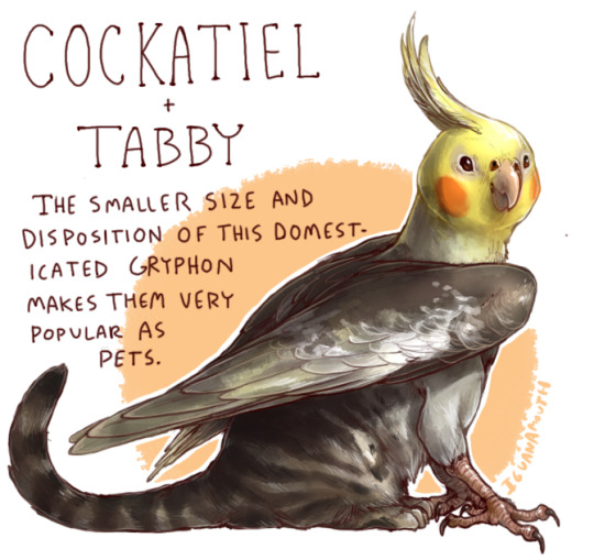
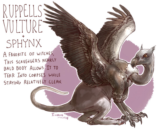
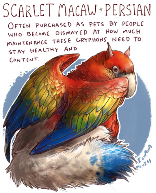
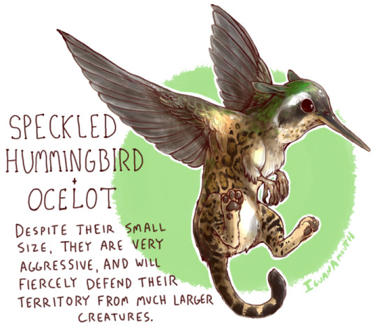
kept getting requests for gryphons so heres a bunch of them At Once
269K notes
·
View notes
Photo

~ a siberian tigress ~
3K notes
·
View notes
Text
Overwatch Character Design Contest
Strelka: Offensive support - for Ventain’s contest

Overview and Story pasted below the fold
Keep reading
9 notes
·
View notes
Note
hi Faebelina! I want to ask how does one get better at drawing? ;_; i know you may say 'practice' but I dont know what to practice. any tips? btw huge fan of your overwatch art!
Hey, Anon!
(Everything I’m about to say is personal opinion and the particular way I have been tackling learning.)
1.So in the beginning, it’s much more important that you are drawing often rather than drawing “correctly”. Your muscles need to adapt to certain movements. You will see a lot of improvement just by doing.
2.Once you’ve done that for a while you’ll naturally notice areas you need to work on. For example, you might not be great at faces. So you study faces– drawing from reference. As you draw, study why the features of the face sit the way they do. But most importantly, draw iterations. Instead of focusing hours on one good face, spend that time making iterations of several types of faces.This video can explain more about why that is beneficial and how to do it: https://www.youtube.com/watch?v=k0ufz75UvHs
3.If you’re noticing your drawings look stiff, work on gestures. These are quick (30sec-2min) doodles that push you to understand the point of a pose or movement rather than focusing on the edges. https://www.youtube.com/watch?v=8j39NqwL7s4
4.When you get around to coloring and you feel frustrated you can study color theory. Some people just naturally have a feel for good colors and others need to work a bit more, so whichever you are is okay. https://www.youtube.com/watch?v=9kQllLy_X4I
5.I don’t recommend doing a lot of finished pieces early on. I think it’s great to push yourself to the extent of your knowledge but I also think your time is better spent on fundamentals rather than polishing. This is something I wish I could do over.
Lastly I will leave you with some of my favorite resources for learning:
https://www.youtube.com/user/conceptcookie/videos
https://www.youtube.com/user/Sycra
http://muddycolors.blogspot.com/
https://www.youtube.com/channel/UCKtu_JtQCY0yryIy6zK4ZCg
https://www.ctrlpaint.com/
https://www.schoolism.com/
Hopefully this helps you get started! It’s a really exciting journey to be on, I wish you lots of luck :)
109 notes
·
View notes
Photo


so i’ve been working on some overwatch oc template psds based on the actual hero profiles on the overwatch site, and this is what i’ve come up with–you can see it in action with an actual character of mine here.
you can change the roles and difficulty ratings by toggling the visibility of different layers. it’s not as versatile as i’d like, as you’ll need to manually adjust the placement of some elements if you don’t have enough lines of text in certain boxes. if you have multiple abilities with longer descriptions, for example, you’ll have to duplicate whichever section you want, delete the one you don’t want, and manually shift the sections (tho if you have a more elegant way of going about it, feel free to do it your way).
for the ability icon images, if you can’t make your own, i recommend finding some neat minimalist icons from sites like thenounproject and iconfinder and using a white color overlay effect on them to match the style of the icons on the original hero profiles. if you don’t have the big noodle titling and futura lt heavy fonts (which are used in the psd files) installed on your computer, i’ve provided a download for both of them as well.
and finally, if you do use this, it’d be nice if you could credit me for it by linking back to the original post if possible (i won’t lead a witchhunt or anything if you don’t, but i’m sure people would appreciate knowing the source in case they want to use the template too)
download header template (first image)
download profile template (second & third images)
download required fonts
7K notes
·
View notes
Photo


Well that was a ride from start to finish. Survive Nomi 2k17
446 notes
·
View notes
Photo

Thunderstorm over farmland in upstate South Carolina / Sept. 2016
10K notes
·
View notes
Photo


some highlights from the blizzard gms trying to destroy the game
492 notes
·
View notes


