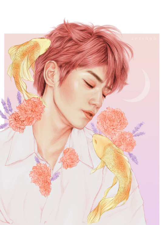
Text
get a grip [pcy]
—summary: working for park chanyeol, one of the favorite soccer players of the entire country, is damn right exhausting. taking out his obvious good looks and his charming smile, there is nothing more she can enjoy about him when she has to walk his demonic chihuahua through his rich neighborhood and get a sightly lower than average paycheck at the end of the month.
but it’s expected. he’s rich, successful and he probably bought the dog just because he could. all she has to do is her job. she barely even sees him, either way.
a lost chihuahua later and a few excuses spewing out her lips, the least she expects is for this year’s soccer promise to say he’ll be staying at home the rest of the summer, and that she better get his dog back to normal, if not, she’ll lose her job.
as if that barking demon isn’t enough of a problem, now she has to deal with her intense yet misunderstood attraction towards chanyeol. that isn’t such a promising summer.

—title: get a grip — pairing: park chanyeol x reader — genre: dog walker!au ; professional soccer player!au ; boss!au ; strangers to enemies to lovers!au — type: fluff ; angst ; humor ; suggestive — word count: 11,196 — note: this is a gift for one of my kofi supporters. thank you!
No matter how spacious this mansion is, it always remains empty. Pine green vines curl against the grass while her cheap sneakers step on it, shortened breaths leaving her lips in hopes of releasing the stress that accumulates inside of her.
Think, five thousand square feet worth of space in this house, and one tiny chihuahua had managed to slip the confines of its collar to run away as if he was on the brink of winning the goddamned Olympics.
How difficult could it be to find a beige-toned, short-haired, teeth-baring chihuahua in the middle of Park Chanyeol’s mansion? Well, extremely so, much more when said chihuahua belongs to him and she can’t find it anywhere.
She turns to the left, watching some of the chefs taking a break by one of Chanyeol’s balconies, cigarettes slipping through their lips to let out clouds of smoke. Three of them, to be exact, one shorter and fuller, one extremely buff and tall, and the shortest one the slimmest of them all.
“Guys!” Waving her hand in the air, she tries to recollect the attention of the trio. The shortest one stops smoking, waving back as he screams out her name. “Have you seen Messi?”
Yes, that’s the dog’s name. God bless Park Chanyeol for the ironies of his train of thought.
Keep reading
159 notes
·
View notes
Photo


SOLOIST!NCT series: JAEHYUN
834 notes
·
View notes
Text
this blog is an idiot positive zone. if ur a dumbass thats ok. this is a safe space for people w half a brain
280K notes
·
View notes
Text
i never talk about these things but i can’t remain silent.
i know tumblr doesn’t give a SHIT when things happen in countries outside the “most popular ones” (such as the usa & england). it’s true, don’t lie to me. y’all don’t give A FUCK. not every issue and problem in said countries gets the appropriate exposure but in general shit shows up on the news WORLD FREAKING WIDE. you set up donations, you help out, your spread the word, you say “pray for x”……
southern europe is burning.
my country is burning.
people are dying - at home, on the road, trying to run away, in their cars.
yesterday my country had 300 active fires.
people are losing EVERYTHING they own.
i have a friend that is on a train right now passing through places that have been burnt to the ground and she says the smoke is so intense it’s getting inside the train and she can barely breathe.
and yet, even though several people (myself included) have been trying to bring awareness to what has been happening in southern europe… what we get from most of you, those not part of the countries suffering, is silence. we don’t ask for money, we don’t ask for shit other than a reblog to spread awareness… something you can delete in 24/48hrs if you wish.
i don’t know what to tell you. i’m angry. i’m frustrated. i’m disappointed. i feel like i’m screaming into the void. “a reblog does nothing” - you know that’s a damn lie, you know exposure always helps, you know people start paying attention when posts on social media become popular. my country in particular is a small one, we get ZERO exposure. y’all are only starting to figure out we even fucking exist bc of the shit we’ve been winning lately.
but hell, if the EU doesn’t give a shit, why should some user on tumblr dot com?
again, i don’t know what to tell you so i’ll let the images speak for themselves:
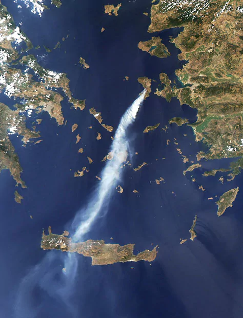
An image captured by a Nasa satellite shows a thick plume of smoke blowing southward from the Greek island of Chios over the island of Crete
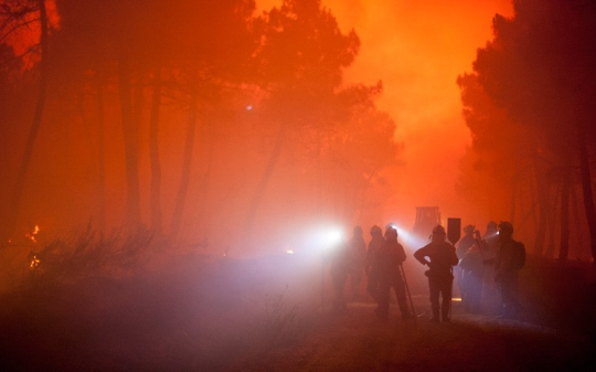
Torneros de Jamuz, Spain
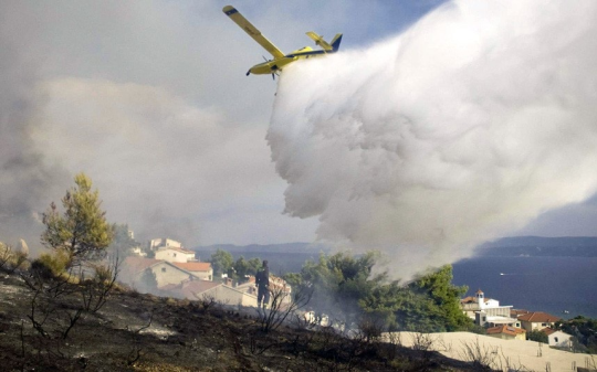
Duca, Croatia
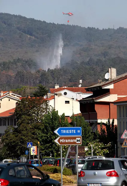
A helicopter from Italy’s civil protection service drops water on a fire near the railway between Venice and Trieste

Residents take refuge on the beach as a wildfire burns on the mountain next to the village of Lithi, on the Greek island of Chios

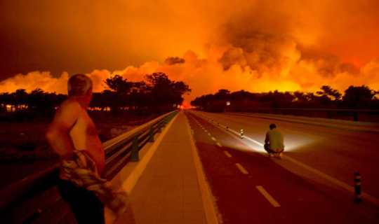
Men gather cattle during a forest fire in Vieira de Leiria, Marinha Grande, Portugal.
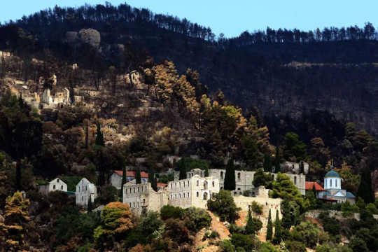
Charred trees are seen on the hills above the Cloister of Thivaidas on Mount Athos, a World Heritage Site in Greece

Portugal
198K notes
·
View notes
Text
Attention! Need blogs to follow!
I don’t follow enough blogs so my dashboard is super empty!
If you post about…
Journaling (art, bujo, anything!)
Studyblr
Calligraphy/handwriting
Maps/cartography
Home decoration/Inspo
Minimalism
(Or anything you feel like is related to these!)
… just reblog this and I’ll follow you!
644 notes
·
View notes
Photo

sooo yeah this blog is turning one year today! don’t know what to say really so here’s a resource pack as a thank u for sticking with me for the whole year! ♡
the pack contains: ° 20 elegant patterns; x ° 10 paint textures; x ° 10 fonts; ° 10 brushes; x ° a four in one colorful psd. x
all of these were made by me (aside from fonts), so if you’re gonna use this stuff, credit me! as always, don’t be a poop and don’t reupload/claim as your own & don’t forget to like or reblog this post if you’ve found it useful.
❤ download ❤
209 notes
·
View notes
Photo
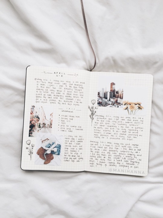
“we learn to live with the pain; mosaic broken hearts.” 🥀
2K notes
·
View notes
Photo
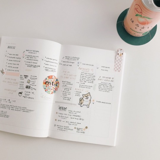
/ Y3S1, WEEK 3 back from my hiatus & ready to tackle uni 🗒
ig: c.aylie
8K notes
·
View notes
Photo


GIF OVERLAY PACK ONE;
Like/reblog this post if you wish to use any of these please. To save these animations just click onto the gif and save it. These gifs can be used on graphics to make them standout, however apply them screen or whatever looks right on the image/gif you’re using. Free free to follow me for more Photoshop related posts just as my psds, texture packs and fonts. If you use these animations please tag them as ‘i:lovoto’ I’d love to see what you’ve done with them! - Samuel.
1K notes
·
View notes
Photo


winnie jaehyun-the-pooh🍯
2K notes
·
View notes
Photo



A lot of you have been asking how I go about making my graphics, i.e. how I do graphic design, so I thought I’d make a guide - or perhaps a series of guides if you would like - on how to design graphics! First off, I’d like to introduce you to the fundamental elements of graphic design, and hopefully this will help you gain a new perspective. and improve your own design skills.

Lines are structures that connect two points. They make up everything that we see, even the letters and characters we read every day. But more often than not, we take them for granted. In reality, lines are one of the most rudimentary components of graphic design, and they serve to channel ideas and emotion.
Lines can:
Organize pieces of information or elements on a page
Serve as guidelines to lead the viewer’s eye
Provide movement such as using wavy lines to represent moving water
Emphasize certain parts of the page
Set a mood, such as how straight lines evoke order and neatness while zig-zags convey excitement and tension

A shape is any two-dimensional area with a recognizable boundary. They can add interest to designs (such as in backgrounds), organize visual content, and be used to make illustrations.
Shapes exist in three categories:
Geometric shapes are regular shapes like circles and squares
Organic shapes are more freeform, such as a blob or a leaf
Abstract shapes have a recognizable form but are not exactly natural shapes, such as alphabet glyphs, spirals, and stick figures
When brought together, these shapes can form helpful illustrations that will help convey meaning to your work or add some decoration to it.
The effects achieved by the shapes are determined by its form, color, size, and other characteristics. For example, triangles often show excitement and risk, while circles are seen as eternal and often feminine.
In the example illustration below, which is one of my January wallpapers, I use triangles to convey a feeling of vivacity and excitement.

Different shapes may also be used to structure content or create a layout, making it easier for the user’s eyes to find information. This is often the case in blogs and websites.

Color can be used to make an image stand out, convey information, enhance meaning, or group things together, but how do you know what colors ‘fit’ together? When you’re starting out, you might find it easier to look for color schemes from pinterest or wherever you can find inspiration. It also helps to look for images or photographs that evoke the same vibe you’re going for, and then using a similar color scheme.
But what if you want to make a palette yourself? Learn color theory!
Before I elaborate, here’s some terminology for you:
Hue is the color itself
Value is how dark or light the color is
Saturation is the intensity of the color
Now, how do you go about making a color scheme? Here are some types of color schemes you should know about:
Monochromatic color schemes only use one hue but vary in value and saturation.
Analogous color schemes use colors adjacent to each other on the color wheel, such as red, orange, and yellow, or blues and greens.
Complementary color schemes use colors opposite each other on the color wheel. To add complexity, play with the value and saturation of these colors.
Split complementary color schemes use colors on either side of the complement.
Triadic color schemes use three colors that form an equilateral triangle on the color wheel. These are often very stark and in-your-face, so you might want to use this type of color scheme in moderation.
Tetradic color schemes use four colors that form a rectangle on the color wheel. These are more effective if one color serves as the main color and the other three colors are just accents.
When choosing a color scheme, the main thing you should keep in mind is balance. Using fewer colors means it’ll be easier to balance and thus it is less likely that the piece will appear messy and discordant.
Color has the power of evoking emotions and moods, and each hue and shade has certain connotations associated with it.
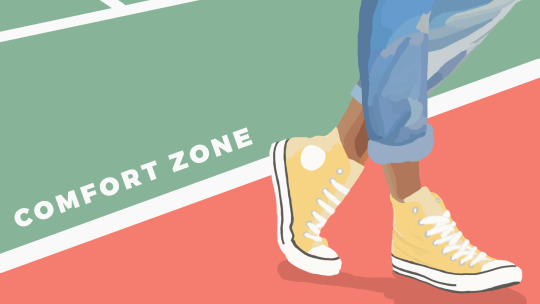
In the illustration below - which is part of my April wallpaper set - I use the color green to convey the safety and familiarity of the comfort zone. The color red, on the other hand, shows risk and danger, but it also represents the courage required to get out of the comfort zone.
So the next time you’re thinking of what colors to use in your project, think of what kind of message you want the audience to receive.

Like the other elements we’ve discussed so far, type conveys meaning beyond what is written. Type can communicate a mood, style, vibe, or feeling. A curly or script font might appear fancy and extravagant, while a handwritten font may seem raw and playful.
Different types of fonts are also suitable for different contexts. For example, sans-serif fonts are more readable on screen while serif fonts are more readable in print. Display fonts, on the other hand, tend to be fancy and decorative, and thus should only be used for small amounts of text, like titles.
Audience and purpose also serve a role in deciding what fonts to use. Large, bubbly text is suitable for a children’s birthday party invitation but probably not for a business card.
In graphic design, different fonts are often used in tandem with each other. The main principle or rule behind this is that you should choose fonts that complement each other. Large, bold fonts should be paired with small, subtle fonts. Oftentimes, you’ll have to rely on your instincts, and that’s okay.
Remember, though, that you wouldn’t want to overwhelm your readers by using too many fonts. Stick to one or two per project. To add variation, change the weight or style of the existing fonts.
Finally, your text would be more effective if you establish some sort of visual hierarchy. This essentially means sorting out your text in order of importance, using different typefaces and fonts. This includes adding a certain weight (or boldness) or increasing the size of texts that are more significant.
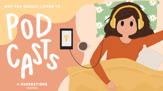
In the title graphic below, the word “podcasts” is handwritten and larger than the rest of the title because that’s what I want to draw attention to, so that readers know what the post is about. My name, on the other hand, is smaller than the other texts.

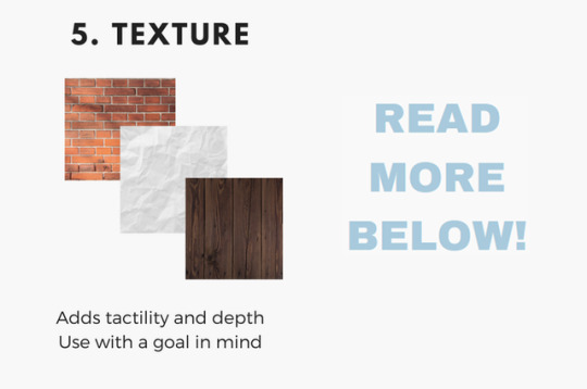
Texture adds tactility and depth and can also be used to evoke a certain feel. In this graphic from my March desktop wallpaper, I used a tape texture and a paint texture to achieve a scrapbook-y vibe.

Some other common textures used in designs are foil, watercolor, and paper textures. Although there are many textures to experiment with and choose from, you should also be careful not to overwhelm your viewers with too many textures in one piece.
Lines, shapes, color, text, and texture are the five basic elements of graphic design, and by understanding how these elements work together, you’ll be able to make more effective designs.
Now, the question is, do I think deeply about all of this when I make my designs? To be honest, not really. A lot of my designs are instinctual, but knowing the theory behind what I’m doing has helped me improve those instincts, and you can do the same!
That’s all for now. Hope this helps, and let me know if you would like me to continue the series or if this brief blog post is enough. Happy designing :)
Disclaimer: I’m not a graphic designer, just a stressed-out senior who sometimes likes to design and stuff.
9K notes
·
View notes
Text
free software alternatives
i never stop talking about some of these so i might as well banish them to a single post! you might know about a lot of them already, but feel free to look anyway
Adobe Animate (Flash) → OpenToonz, Synfig Studio, or Pencil2D
Adobe Audition → Audacity
Adobe Illustrator → Inkscape
Adobe Photoshop → GNU Image Manipulation Program or Paint.NET
Adobe Premiere Pro/After Effects → Fusion, Shotcut, OpenShot, Natron, or Blender
Autodesk Maya → Blender
Clip Studio Paint/Paint Tool SAI → Krita, FireAlpaca, (both also include animation tools!) or MediBang Paint
FL Studio → LMMS
Microsoft Office → LibreOffice or Calligra Suite
Scrivener → Celtx (sort of?) or Evernote
VLC media player → VLC media player lol
freeware can be a great opportunity to get a feel for something and learn a new skill. and in some cases, the free versions are almost as powerful, so you might find that you saved a lot of money but made work that was just about equal to what you might have done with paid software!
64K notes
·
View notes


