Text
PDP Task 7 Final show promotion
I researched what effective promotion and marketing is and why is it important, I found a very useful article in the Brisitsh Journal of Photography who interviewed Nick Thompson, from the marketing and exhibition team at theprintspace
Effective promotion and marketing are crucial to any exhibition you are planning to increase the number of people who attend. By having as many people see your work and meet you, you increase your opportunities for your work to be recognised, sold and/or lead to future work. Exhibitions are made to be seen, which is why promotion plays such a vital part in attracting an audience.
““Post about you show on you own social media platforms, you may not have a large following but if you invite friends and ask them to spread the word to people they know. Send details of your show to relevant blogs and magazines, as this will be your best chance of getting the word out to a larger audience.”
“Social media is crucial for promoting an exhibition. Facebook events are a very easy way to reach a large audience for free, and if you have some money in the budget you could create Facebook ads (I ran a free ad for a week, showing a baby portrait, it earned me lots of enquiries, so I know from experience it worth it). For Instagram and Twitter research relevant hashtags that relate to your exhibition. Also think about keywords and include them in your posts.”
As you are aware I am unable to use my social media platforms, therefore I have had to get creative by promoting the show in other ways.
I have printed loads of the exhibition posters and stuck them up locally all round my village. I am lucky to live in a very creatively engaged community and many people are genuinely encouraging and supportive of students at Colchester Institute.
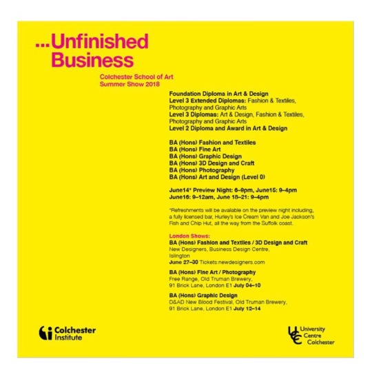
I have placed them in a gallery, at my lovely framer Andy’s shop, the post office, five pubs, the library, the newsagents, three food shops, and the very busy fish and chip shop. The only place that said “no” was the medical centre because it’s ““not health related” (personally I believe art and mental well-being are intrinsically linked, but I didn’t argue the point.) I have a poster on a board in my front garden, many people walk down my street as it’s the safe route to a local school, never know, it might catch someone’s eye.
I have sent a copy of the poster to Loupe magazine, and brief summary of the photographers work, because they are always really interested to hear what students are up to. I dont’t know yet if I can write an exhibition review, I am still waiting to hear back from them regarding this.
I have sent out the poster and a personalised invite to everybody on my email list, and had some positive responses, I have received a few “can’t make it sorry 😐” but as they all live in Australia and New Zealand, they can be forgiven.
I have telephoned and personally invited family and friends. I also have a number of colleagues attending throughout the week. I think when inviting people it’s really important to be mindful that the show is open for eight days at different times. It might really suit people to attend when it’s less busy.
On the night of the exhibition I will be selling A5 postcards of my work for a local charity that I am fundraising for. I hope selling these images will lead to future work, I think being open friendly and willing to talk about my work will be really important. I also plan to ask for peoples email addresses, this is a great strategy for building a professional mailing list.
0 notes
Text
I applied for a job, eek!
I am keen to build a photography business but am well aware that that doesn’t happen over night. I am in the fortunate position that I have work that means I won’t starve, however I want to work in a related arts field as I build my photography practice.
I have been on the mailing list of Colchester’s Firstsite gallery and attended many events there. I received an email with a link to a job vacancy. The job was for a LEARNING AND EDUCATION COORDINATOR, a part time role.
I thought this sounds right up my street, after I did the SWOT analysis it really helped me formalise what I’m good at, what I’m interested in and how can I translate that to future employment? This job seemed to require a lot of things that I am good at and have experience in. Such as an interest and knowledge of art, a passionate for working with young people, experience in training/teaching and good communication skills.
I was helped to write a relevant CV, which was a challenge as for the last 18 years it’s been entirely Nursing focused, however saying that many of my skills are transferable and I was encouraged to acknowledge that.
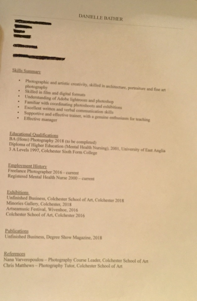
(Sorry this is a terrible photo, i promise the version I sent them was immaculate. I have redacted my address, phone number and email address for the purpose of the blog)
I sent them my application and did some research based on the job description, especially in relation to National Curriculum Art requirements. I brainstormed my own experiences in relation to dirversity and inclusion as these were things that were highlighted as important. I thought I might at least get an interview, I didn’t. I did contact them to find out why and get some feedback on my application. I was informed that they interviewed “three very strong” candidates and the job was given to a person already working for them.
Bit disappointed but not heartbroken, I will keep trying.
0 notes
Text
PDP Task 6 Minories Exhibition Evaluation
I have found it quite difficult to evaluate this exhibition in a positive light, because there were so many things about it that individually and collectively could have been done in a much better manner. However, it certainly has given me a great opportunity to reflect and consider all aspects of putting on exhibition for my FMP.
Timeframe: I heard that we would be participating in a exhibition for the first time eight days from the opening night, how is anybody realistically supposed to prepare for an exhibition with such short notice? I would not go as far as saying it’s setting people up to fail, but at the same time it certaining was not maximising our chances of it being a positive experience either.
Content: I did not have any idea what I was supposed to be showing, was it work we were supposed to have recently completed, or could it be any previous work, was there an overall theme? An email from a tutor said that work “must be framed, mounted and professionally presented.” I didn’t have images available that were professionally printed. All my recent work to date that has been assessed for my degree has kindly been taken away by enthusiastic relatives, I felt at a complete loss as to know what I was going to show. I emailed my tutor and said I couldn’t take part, as I didn’t have work to show, that couldn’t be presented as requested or the time to do so. Although a voluntary experience I got the distinct impression that my involvement was required. I learnt that all my peers would be “pinning” their work to the walls and that I could do the same. Honestly this caused me a lot of anxiety, which was completely avoidable had we known about this exhibition in good time and could prepare properly. I had some prints from a dance project I did in the first year that I decided to use. They were fairly abstract, 16x20 inches in dimension and had a minimal white boarder. Whilst unpacking my images my tutor spotted 2 images from an unrelated project, I liked them and so did she, it was agreed that one of these additional images could be shown, in conjunction with a book I produced. I regret this decision and I will explain that further later on.
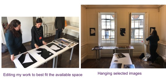
Gallery space: The room that photography students were allocated wasn’t very big, approximately 4x6 metres, there are five of us and not surprisingly only four walls. The student who wasn’t present to hang their work was put up on her behalf on the wall situated outside the main room. I chose three images that did fit fairly well into the wall space between two large windows, this was down to luck not careful planning. Another student had to stand their work on a tall fireplace, hardly an ideal way to exhibit work. Considering none of it was planned, we did the best with what we were given. I personally would have preferred the wall opposite the rooms entrance, as my images would have been see closer together rather than sperated by big windows and shutters, however in a group show, compromises are always going to have to be reached.
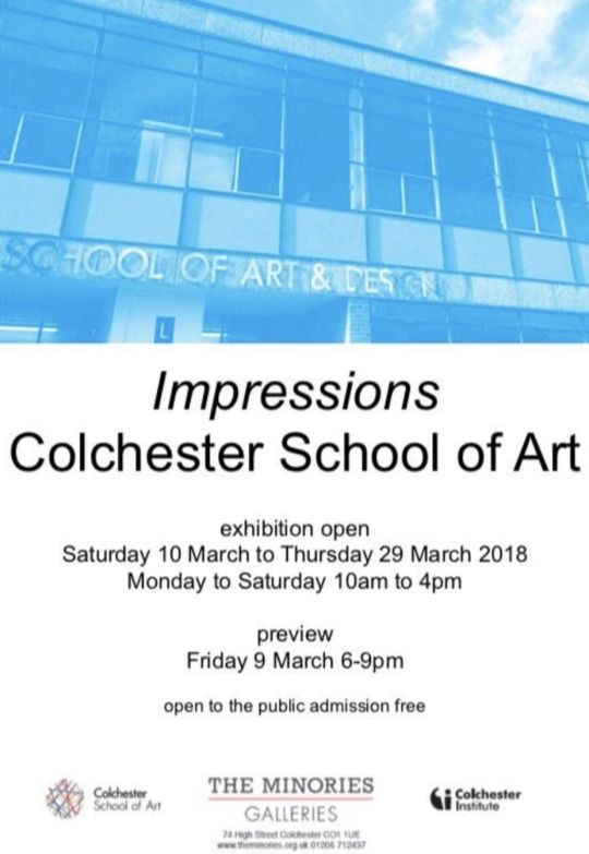
Promotion: When we were hanging our work at the gallery, we did have support from two Colchester Institute staff, someone to help us hang and the gallery manager who seemed to be in charge. It was my understanding that it’s their job to promote events taking place at the Minories and this would be happening. There was a single poster inside the doorway at the gallery but as far as I was aware none were put up at the Institute or anywhere in town. Even the poster looks a bit sad, it’s of a not very good photo of the School of Art, surely an poster for an art exhibition should show something from the exhibition? I have heard that social media promotion was virtually non existent too.
Opening night: I attended the opening night with a couple of friends, it was such a depressing atmosphere. The place was literally empty, in the forty five minutes we were there, two other small groups of people came in. I genuinely thought the place would be busy, like the shows I have previously attended at the Institute.
In conclusion I didn’t feel that sad about the lack of attendance, it was inevitable really because the whole event was very thrown together and poorly promoted. I would have been really sad if I had put a lot of effort, but I never had the time to do that, which is a shame as it was a wasted opportunity to share our work we really wanted to be seen and take pride in it.
Future planning: Every aspect of putting on my degree show will have to be better planned and managed. We need to negotiate the space as a group, prepare the walls/floor in good time. We need to organise our work and how decide how it can be best presented and promote the show effectively in as many ways possible. I do believe if we do all this, which is a collective and individual responsibility, we will have a successful show and feel proud of sharing our work. My glass is definitely half full.
0 notes
Text
PDP Task 5
Demonstrate your research and engagement with self promotion materials used by other photographers and to evidence the planning and production of your own.
Research
One of the most useful books I have read on self promotion is Maria Piscopo’s The Photographer’s Guide to Marketing and Self-Promotion. This book is in it’s fifth edition and published last year. Although it’s written from an American perspective, I found the information easily equated to the UKs photographic industry, the interviews with professional photographers were inspiring and helpful.
So what have I learnt?
Lots of photographers who are self employed really fall down on self-promotion and marketing, even the word self promotion can be off-putting to some. However, if you don’t do it, who will? Another aspect to consider is, are you showing what your clients actually want to see? I talked to Architectural photographer Keith Cooper at the Derby Photofair, about this issue. He said in reality he photographs some “bloody ugly industrial buildings” so whilst it could be a good photograph, it will only appeal to a small number of clients. Therefore, balancing your promotional images whether by portfolios or online, “try to target the level you want to work at, not what you are working at.” This is such good advice and something I had considered before, it’s made me reflect and reexamine what work I would show potential clients.
What is my message and who do I want it to reach, is a question I have asked myself. Having a great website that is current, relevant and easy to navigate, is a crucial part of self promotion and marketing. I really like the website of Architectural photographer Simon Kennedy www.simonkennedy.net
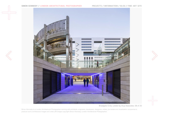
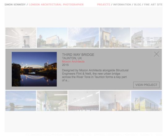
His home page is simple and clear, the main image scrolls using the navigation arrows. The feature that I liked the most was in the section “projects” there were numerous image options to click on, when you chose one it gave you information about the project with the option to view it further. Not overwhelming your audience with multiple images and providing them with a choice to view specific work, is a great design feature.
MY WEBSITE
In the second year at Uni we had to design and build a website, this wasn’t a particularly successful project for me. At the time my main interest was dance and performance photography, so I styled my website based around that. Although it didn’t feel particularly authentic my rational was that as someone unsure about my identity as photographer, it was better to show one genre I was good at, than a few that I was average at. My website looked so bad although tried really hard to make it look personal. In doing this, it just resulted in looking very amateurish, not something I want to share with the world online.
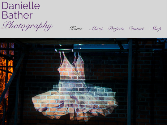
Having researched other photographers websites extensively it’s clear to me that with my limited computer skills I am just not able to create a website that looks or functions professionally. As I have mentioned before with post production editing, website design is a stand alone profession (I’m working hard to get better at photography, I don’t want to, or need to learn to build websites). Therefore I have asked a company called simpleandfunctional to build my new website for me. I still own the domain name www.daniellebather.com which I can continue to use. I chose simpleandfunctional as they manage two websites for architectural photographers that I think are visually striking, designed beautifully and function really well. I have requested that a link is created on my main site that takes the viewer to my fine art work. I saw this on Simon Kenndy’s website and thought it was a brilliant idea. It doesn’t confuse his commercial identity as an architecture and interior photographer or overwhelm his audience by presenting his fine art work.
A recent study in France concluded if people are searching for someone to commission, your website will be viewed on average for forty seven seconds, therefore precise and well presented work is vital. Giving the viewer the option by providing a link to other work and a way to purchase it but don’t bombard people,as they will simply leave your website and look elsewhere.
I asked Luca if he would consider looking at the images I have chosen to use on my website, he was very helpful in encouraging me to have them presented in groupings that were project based, rather than interiors/exteriors. This might seem obvious, but initially when I was considering work to include, I felt I didn’t have enough “projects” to include. He thought it be better to have fewer that are coherent, than more that are a mixture of work.
BUSINESS CARDS
I redesigned by business cards to better reflect who I am as a photographer or so I thought......
On the backs I have included a variety of architectural images. I did show this to my tutor, who said it would be better just saying “photographer”, as I do practice other sorts of photography. I think what I will do, is both and depending on who I am giving my cards to I will give either the generic version or the specific one, best of both worlds.
PRINT PORTFOLIO
From the research I have done on architectural and interior photographers, the vast majority of them have a printed portfolio. When I interviewed Luca Piffaretti and asked him how he started his business he said “I walked all over London showing Architects/designers my work” People want to see your prints even if you have your work available to to view online. No more than 12 images are necessary, people stop looking after a while, especially if you are one of many portfolios they have to review. Some photographers have book portfolios printed, I think this is appropriate for other genres of photography, for architectural photography, it’s not a great option as it’s important to be able to keep your work updated. Architects and designers are visual people, they are very focused on design and want to see images being beautifully presented, this is really important as it shows that you take care in your work.
There are many leather bound portfolios that are available to buy can be embossed with your name and or logo, as a vegetarian I’m not a fan of leather. I found a company who make wooden portfolios. I chose wood because it Environmentally sustainable, it’s durable. I chose A3 size in landscape orientation and post hinges internally, as I think they look more professional than a ring binder hinge, my work can be added to and removed as necessary. I chose to have the darker tone of wood of the two options because I think it looks more luxurious than the paler colour and have my name embossed on the front, as is simple and classical and ties in well with my website and busnisness cards.
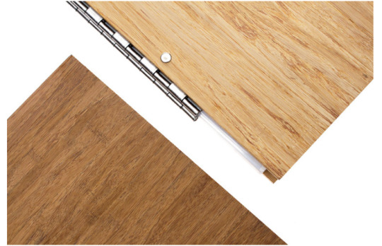
DISASTER! MY PORTFOLIO ARRIVED AND MY NAME HAD BEEN SPELT INCORRECTLY, IT SAID DANIEL BATHER. THEY ARE MAKING ME MAKE A NEW VERSION. THIS IS THE SECOND TIME A COMPANY WHO DOES PERSONALISED PRODUCTS, HAS MADE AN ERROR WITH MY NAME. MY PERSONALISED DIGITAL NAME FOR MY IMAGES SAID DANIELLA. COMPANIES SHOULD LEARN TO PROOF READ MORE EFFECTIVELY.
SOCIAL MEDIA
The internet is full of articles about how vital social media campaigns are, from the research I have undertaken, I think its a mistake to position social media activity as your marketing campaign, when it should only be part of your business message. I do have social media platforms Facebook, Twitter and Instagram that I have used for sharing my work and as a self promotional tool, which has generated work for me in the past. Unfortunately due to a legal situation, that is beyond my control, I am not currently permitted to use any social media accounts.
FACEBOOK
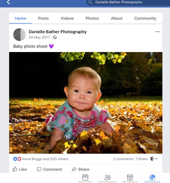
This is an example of a advert that I ran on my Facebook photography page, it was free and ran for a week. I got 14 enquiries for baby portraits. Some people were not local, but I did secure three shoots locally as a result of this advert, so it was worth it. However, I wouldn’t prioritise social media promotion for acrchitectural work, I really haven’t seen any professionals do this. In the future will continue to run adverts for family portraiture and fine art, it is a way to reach a targeted audience for this genre.
INSTAGRAM AND TWITTER
When I was able to use these social media platforms and was starting to think of myself as a brand, I did amend and change the way I was using them, this was really important as they were tied online to my professional work. My only Instagram page is called daniellebatherphotography, but it really was a general page. I decided to change the way I used the platform, I started by only posting images that have been taken on a camera (not my phone), I don’t include any personal photos of my family or friends and I post at least once a week to keep people interested. I don’t think I have had any work as a result of my instagram page, but I have certainly networked with photographers through it, which has helped with my studies and hopefully will beyond. Perviously on my twitter account, I noticed I had retweeted a lot about the NHS being in financial crisis, important yes, relevant to photography, not really. I now only share my own photographic work, and retweet relevant articles ect. There are so many interesting things going on in the world photographically that have wider implications politically, socially and ethically, which is important to me to include. I think it’s an honest reflection of me as a person, as well as a photographer. Again, I haven’t got work as a result of my twitter posts, however I think sharing exhibition information for example on Twitter is a way for reaching a wider audience. Keeping people informed about my photographic practice, I believe will lead to opportunities in the future, once I can use social media again.
0 notes
Text
PDP Task 3
SWOT ANALYSIS AND 5 YEAR CAREER PLAN.
“A SWOT analysis is a strategic planning technique undertaken by an individual or organisation to identify it’s internal strengths and weaknesses, as well as it’s external opportunities and threats, related to business competition or project planning.” (www.mindtools.com 2018)
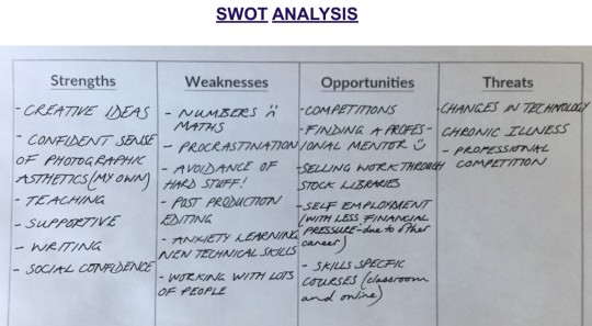
I completed a SWOT analysis on myself which required self reflection and honesty.
Strenghts summary
I feel confident that I am rarely lost for creative ideas, and over the last three years have changed in how I approach my work creatively, I feel more able to allow ideas to evolve organically and as a photographer this is really important.
I have a confident sense of photographic aesthetics, I know what I think makes a aesthetically strong image or group of images.
I love teaching, I don’t mean in a traditionally formal way but in a way that support others to fulfil their own understanding and goals. I am also good at saying “I don’t know.....but I can find out”. I don't profess to be an expert in anything but I am happy to share with others skills and things I do know.
I love words and language, I have always found that I am able to write well, I think this will help me to explain my work if necessary. (i.e. artist statement and project proposals etc).
I will talk to anybody, I and also listen (listening is a massively underrated skill). I have loads of experience as a Mental Health Nurse doing both, I think these are transferable skills that are vital as a future business owner.
Weaknesses summary
I have Dyscalculia (that is dyslexia for numbers) Maths and numbers really confuse me because i can’t keep numbers in my head :( The areas I have struggled with throughout this course is numbers on camera setting and light metres etc
I am a procrastinator, I dod tend to bury my head in the sand if i feel overwhelmed by something (usually maths) or if I have a lot to do.
I find post-production editing really hard, not just technically but knowing how to help myself if I get stuck.
Although I have previously said I will talk to anybody, I am not a fan of being in a large groups ( a big fashion shoot would fill me with dread). I like, and work best one to one, or in quiet small groups.
Opportunities summary
I have entered two photography competitions recently and will continue to search for suitable ones as my career progresses.
Having a professional mentor ( I am continuing to foster my professional relationship with an architectural photographer)
Selling work through stock libraries (not as profitable as it used to be) but could provide some income.
Self employment (with less financial pressure than some new business owners experience, due to having another career)
Skills specific courses - I like to and am open to continuing education in terms of developing skills, that will be useful to me as a professional photographer
Threats summary
Changes to technology - keeping up to speed with industry requirement.
I have a serious chronic illness that lands me in bed/hospital. (However I think pursuing architectural photography is good in relation to my ill-health. they tend to work alone on shoot and not rely on a team of people. Buildings don't tend to move, if I’m ill one day, I can postpone without letting people down and rearrange).
‘By failing to prepare, you are preparing to fail.”
Benjamin Franklin
Five year year plan
Ironically for someone who say they like to and are good at writing, I really haven’t found this easy. It has forced me to examine carefully what I would like to achieve in the future. However, experience tells me that life doesn’t always go to plan. I was devastated when my Nursing career was completely derailed, having to move back to the UK after 10 years overseas and spend a year sick, unable to work. This time in my life was awful, however it lead me to reevaluate my career direction and consider my interests and passion, which prompted my return to University, to study photography.
I do want to work I architectural photography, it is a genuine and long held interest of mine. Building upon a successful Uni project I came to realise the crossover between architecture and fine art practice. I struggled with my confidence and technical skills throughout my studies, meaning I was reluctant to even call myself a photographer. However my SWOT analysis has shown that I am persistent, have a good visual awareness, I’m friendly yet professional, and I enjoy teaching, skills which are really important in any area of work. I know that I keenly feel failure, I am really sensitive when things go wrong, rejection will sting, but that’s okay. I just have to remind myself that the true success is how you pick yourself up and what you do next. I accept I can’t do numbers/maths and am pretty rubbish at post production editing but i am not afraid to ask for help and will do that, when I need it. I will try not to procrastinate and feel paralysed by lots of work, buy utilising the strategies I know that work, such as writing myself lists, ticking off completed jobs is satisfying. I have no idea if this plan is realistic, but I will face what happens good or bad.
Year One
Purchase a good camera and save for other equipment
Work for London based Lee Turner & Associates Architects (am starting work with them, 9th July 2018)
Get my website professionally designed (this is happening now) and supply new work regularly
Enrole on a photoshop/lightroom photography industry specific course
Meet with architectural photographer Luca Piffaretti and work with him, develop professional relationship, offer to assist him.
Apply for work in related fields of interest, i.e.. galleries or education, photographer assistant etc
Send out lots of emails to architects and other potenial clients in East Anglia (there is life and work outside of London).
See a financial advisor
Work with graphic designer and printers to reproduce my photo book Labyrinthine
Work with Genevieve Yusuf, a writer to produce a photo book about Women living with Endometriosis (we have made a start!)
Year Two
Do a small business course
Build upon work with existing clients and seek new ones
Keep social media platforms current and relevant
Continue to update portfolio
Find opportunities to teach informally or in community settings, perhaps introducing people to photography as a therapeutic activity in the health sector.
Year Three
Continue to work on personal projects, that can be shared locally
Seek and create opportunities to collaborate with other creatives
Enter competitions and attend book fairs and portfolio reviews to learn from others and improve my own practice.
Year Four
Earning enough from main practice to continue to develop personal projects.
Assess my marketing strategy, and seek professional publicity
Work in other countries (ambitious I know, but I should take advantage of contacts overseas)
Year Five
Running a successful independent architecture and interiors photography business
Producing meaningful work in photo books, exhibitions etc
Sharing photography with others, through community groups, collaborative projects and through teaching (informally)
Love what I’m doing (well at least most of it)
0 notes
Text
PDP Task 2
Complete a days work experience in the particular area of photography that you are interested in.
As I have mentioned in a previous blog I have not been able to secure work experience in my preferred area of photography, architecture and interiors.
However I was offered another opportunity to work professionally. A friend of mine Su Quinn asked me to do some new portraits of her. According to her Wikipedia page,
“Suzy K Quinn is a British bestselling author, writing chiefly in the romance genre. Originally writing as Susanna Quinn, she is both a published and self-published author, and wrote the bestselling Ivy Lessons series (romance) and the Bad Mother’s Diary series (romantic comedy). She has sold over half a million books and has become a best seller in the UK, USA and Australia.
The brief
Su wanted an updated portrait that better reflected who she is now, to be used in her books and on her Amazon books profile page. I did look at Su’s current portrait, she said she was “A less wrinkly, fresh faced person then, I was writing thrillers about my single life in Japan as a hostess. Those books were for an entirely different audience, I’m a Mum now and so are most of my readers. I want them to look at me and relate, and think, I could talk to her”.
Research
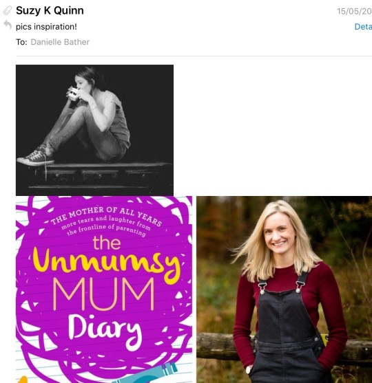
I did have a look at at examples of author portraits, most of which seem to have been just headshots taken in a studio. Researching before doing any shoot is really important. It gives you creative ideas and when talking to a client, you come across as well prepared and professional. Su really didn’t want a stuffy very posed portrait, she sent me some examples of the type of relaxed image she wanted me to achieve.
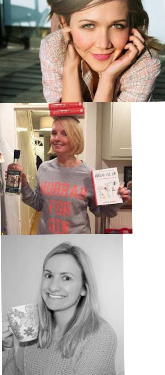
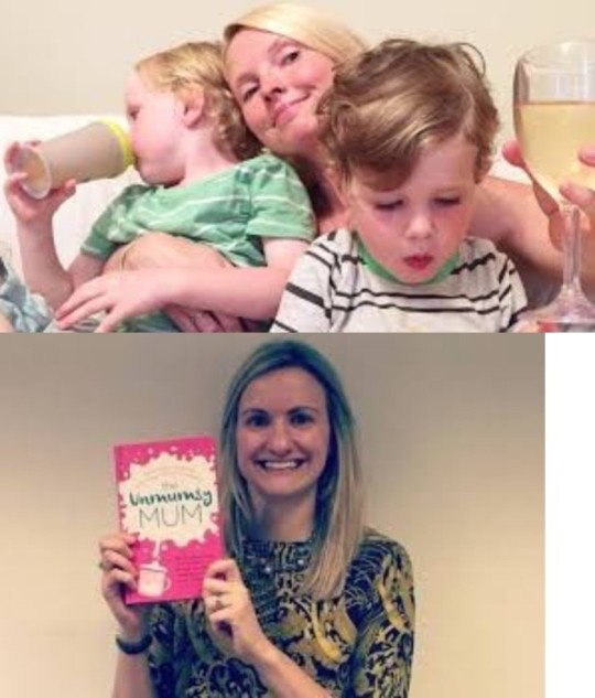
Planning and preparation
Su agreed that our lovely home town of Wivenhoe would be a great location. The photo, Su sent me of the woman drinking wine, made me think of our local pub (we occasionally go there). I asked my Dad to stand in for Su and did a test shoot. (Which surprisingly lead to some great images that I entered into a competition, more of which I will tell you about in another blog). It was really important to me to test out the equipment, location, lighting, atmosphere and overall aesthetic. I have very limited experience of doing professional portraiture and although it didn’t put pay to all my anxiety, it certainly helped me feel a little more confident going into the actual shoot. I sent Su some examples, she was really happy with them and thought the location was perfect.
The shoot
We headed out in the early evening, with the intention of shooting in the pub. It was a really lovely evening, the sun was setting and there was a slight breeze. We headed along the waterfront and started shooting there. I found it fairly easy to talk and shoot, perhaps because she is a friend. However before we started Su was a little self deprecating about her own appearance, and did say she had felt really awkward having her portrait taken in the past. I had to put aside my own nerves and try to make her feel as relaxed as possible. Taking about her latest book, her kids and life in a village full of creatives, seemed to put her at ease. Su had on a number of colourful rings and other jewellery, which reflect her fun, relaxed personality. As a writer her hands are important to do her job, we experimented a lot with including her hands in the photos, many of which worked really well. I think when doing portraits, styling is an important part of planning. Su did her own makeup and wore clothes she felt comfortable in, at my suggestion she did at one point remove her large pendant, as I felt face and with her hand infant of her it looked cluttered and chaotic. The light outside was really beautiful and the wind blew her hair of her face (who needs a wind machine when mother nature does the trick!) It was totally unplanned and unexpected that the photos taken outside we such a success. Su reviewed them all on my camera and was really pleased, she said she didn’t feel it was necessary to shoot in the pub.
Post production editing
I created two different contact sheet, jpg and web ready files. Perhaps unusually as only a single image was needed, once Su had selected her favourite image that was the only photo I needed to edit. Clearly this experience isn’t a true reflection of normal photography work. I must confess as editing is not a strong point of mine I was happy that I didn’t have to do too much. This made me reflect on the future and the role that retouchers play in the industry. I have used the services of a professional retoucher, honesty to watch her work made my head spin. Could I ever be that good, that proficient? Maybe I could, but then i think this is a job in it’s own right, the same as web designers, people don’t expect them to be able to shoot great images. They have very specific skills for a reason. Perhaps I am being avoidant, but at the same time I think I would rather not compromise my images when I could, if necessary, employ someone to do it for me.
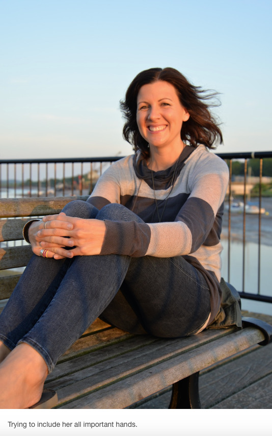
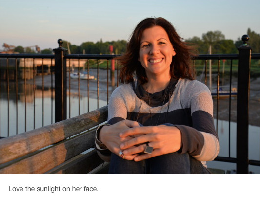
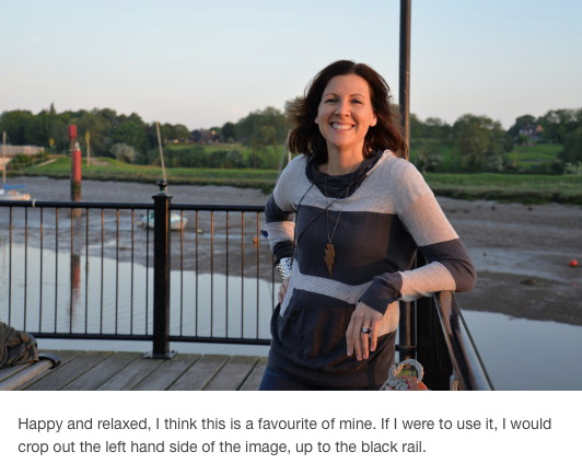
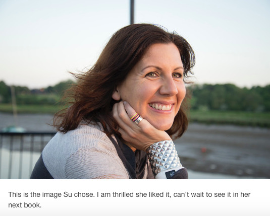
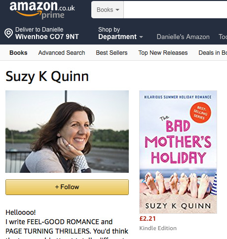
My image on Su’s Amazon page (a proud moment for me).
Fees and payment
Su and I hadn’t discussed a fee before the shoot (I know, I know very bad move). Fortunately for me she said immediately after we had finished “send me your invoice and I will pass it on” It appears that her publisher will be paying. Having had a lecture on fees and quotes I was prepared to calculate what I thought I would be reasonable. After my previous shoot where I was paid peanuts, I wasn’t going to undervalue myself again, I quoted £800, which is a lot of money. The rational was they are a huge wealthy company, they can afford it. (Nana your story about your flustered quote was ringing in my ears). I was paid within three days, therefore I feel a little vindicated, naturally I am not a ruthless money grabber, however to be taken seriously sometimes you have to fake it. In the future I will not be failing to provide a quote before a shoot.
0 notes
Text
PDP Task 1 Continued.
INTERVIEW WITH LUCA PIFFARETTI
Why and when did you decide to become an architectural photographer?
“I studied history in the medieval city of Bologna, Italy and became interested in photography whilst there. Bologna and Northern Italy is full of amazing, beautiful buildings or historical significance. This lead me to studying for a masters in Photography in London, my interest in buildings continued, I decided to combine my two passions, architecture and photography. “
How did you start your professional career?
“I started by working for a large architecture firm, I did this for three years. It helped me a lot to become more familiar with business rather than creative aspects of photography. In 2017, I decided to expand my freelance business.”
How did you go about attracting new clients?
“I have done and continue to do a lot of walking about the city with my portfolio approaching architects, designers, home magazine editors, showing them my work. When I first started I sent over 600 emails to potential client, explaining who I was, providing them with examples of my work and and included a link to my website. I think with people who you have no professional relationship with prefer to hear from you in person, if after an initial meeting I will always contact them in a couple of day by phone, it keeps me in their mind for work and shows enthusiasm, I have found this has been a reasonably successful way for me me to obtain new clients.”
What equipment can’t you live without?
“I have a Canon 5D Mark IV and also a Mark I, I always take both cameras with me on shoots (just in case).
A good tripod with a head that is easy to use, otherwise you waste time straightening images.
Tilt-shift lenses; I bought a 24, 45 and 90 over the years. They are quite expensive but worth it. I often hire a 17mm TS-E because it’s way to expensive to buy at the moment. I would say you can do a decent job by hiring a 17 and using some sort of zoom (24-105) for the details.
Hoya polarising filters; they do wonders when you need to eliminate reflections or when you have a lot of annoying highlights.”
Critical analysis
Reflecting upon Luca’s answers, I feel positive about my professional development and future career, knowing clearly what areas I have to aspects I must work on. I have a genuine interest and love for architecture, I always have and do find buildings interesting, even the ugly ones! Having worked in jobs that I haven’t liked, I know how important it is to me to love what I am doing for work, to care about it. I am not so naive to think that becoming an architectural photographer will be easy, pleasurable or interesting all of the time, certainly the sporadic nature of the work and therefore income is not something I have ever dealt with before (however having a career in Nursing also that pays me enough to live on, is certainly an advantage over other graduates starting out in professional photography, who have limited alternative employment opportunities).
I feel sure that I will be motivated and committed to approaching potential clients, I am confident in talking to knew people. Having a relaxed yet professional manner is really important. Reflecting on Luca’s responses and online advise I have read, most architectural and interior photographers have professional printed portfolios and also a website (both of which I will discuss later in my blog)
At university I have recently swapped from using a Nikon to Canon camera, this has allowed me to practice using the available tilt-shift lens. As I am still to upgrade my own camera to a full frame version, I can now consider both brands. The wide availability of equipment to hire means I can use the best available lenses etc for certain jobs without wasting money.
As Luca was the only person to respond to my questions, I emailed him again to request doing a work experience day with him. This was his response.
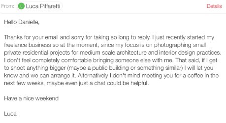
Naturally I was a bit disappointed, although his reasoning was totally understandable. I thought it was really considerate that he offered for me to join him if he were to get a bigger job and also just meet to talk. I emailed that I appreciated his kind offer and looked forward to arranging to meet in the future.
0 notes
Text
Photographers biographies.
I attended a Uni lecture that focused on artists biographies, what are included in them? Why do people have them and how are they seen? I researched specific articles and photographers websites to answers these questions.
WHAT IS A BIOGRAPHY? A biography is a glimpse at your personality, it gives the reader a sense of who you are what you might be like to work with. Having great photos isn’t enough, creatives will seek out a biography to help them make a quick judgement.
WHY DO I NEED A BIOGRAPHY? It has become industry standard to have a prepared biography. According to the British Journal of Photography, it should in your portfolio and on your website. Additionally, when you start exhibiting, this biography will find it’s way onto gallery websites, exhibition material and may even be quoted in interviews.
DOS AND DON’T OF BIOGRAPHIES.
THE DON’TS
1.Don’t be pompous...stating you have left an indelible mark on the modern photography world is a big no no.

This is a rather conceited example.
2. Don’t be too serious, being austere and sombre doesn’t make for a good read, you are trying to attract people and be hired.
3. Don’t waffle! This isn’t a PHD thesis.
4. Don’t be illiterate, spelling mistakes, poor grammar and bad translations just make you look unprofessional and sloppy.
THE DOS
1. Do have fun, you have a few seconds to catch someones eye and make them smile.
2. Do keep it short and short and sweet.
3. Do keep our interest
4. Do have a photo, its always nice to put a face to a name (not sure if I agree with this)
I wrote my own biography which was harder than I thought it would be, whilst taking into account the advice.
I received a camera on my eighth birthday, I have been taking photographs ever since. I had no formal training until I returned to University to study photography in 2015. My practice is diverse ranging from fine art, landscape, to architecture and portraiture.
I am very interested in the physical process of photography as a therapeutic activity, as much as the visual outcome. I relish time alone to quietly observe and immerse myself in the environment, whilst resisting the temptation to become a hermit.
I enjoy collaboration and cooperative learning, I am supportive in encouraging others in their own photographic interests.
I did originally write my biography in the third person however that came across as really pretentious, hardly the impression I am trying to convey. I have tried to give the reader a glimpse into my practice, what interests and motivates me as a photographer and my wider feelings about practice. I joked, I hope I didn’t take myself too seriously. Overall, trying to remember to be concise, I feel this is a true representation of me.
0 notes
Text
PDP Task 1 - Industry research.
Select three photographers that work within your chosen industry and critically analyse their work. Contact them for a short interview with the aim to gain insight into their practice and analyse your findings.
As I have previously mentioned in my biography my practice is diverse. Defining myself as a certain type of photographer is limiting, in the sense that it is untrue. I do intend to pursue a career in architectural and interiors photography. However, this does not distract from my personal interests in landscape and fine art practice, which is why I have chosen to analyse two architectural and interior photographers and a conceptual photographer.
BEN THOMAS
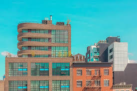
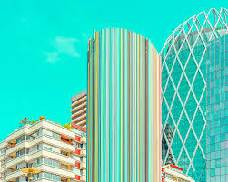
I chose to analyse Ben Thomas’s work, as I have followed his career since I saw an exhibition of his in Perth, Australia. Ben Thomas is an Australian conceptual photographer, who focuses mainly on the concept of highly populated urban landscapes. He utilises various techniques such as advanced colour manipulation, mirroring and tilt-shift photography.
Chroma II
Chroma II

Critical analysis
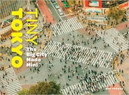
Tiny Tokyo: The Big City Made Mini was a book and exhibition produced in 2010. Thomas stated in an interview with FastCoCreate “I’ve been to Japan five times now, and every time I leave there, I just want to come back to shoot more. The way that one city moves into the next so seamlessly and the culture of the people there and this amazing aesthetic, you just don’t get that anywhere else.” Even though he has captured images of London, Paris, Melbourne and New York his affinity for the Japanese capital is evident in his work. I think his intention was to present the audience with a visual language that requires more than one look to comprehend. Tokyo is aa location that many people worldwide are familiar with with, the tilt-shift effect produces a make believe aspect that require further investigation. This I think is what makes Thomas’s work stand apart form others, so many photographers fail to offer anything new in urban landscape photography, Thomas’s approach and aesthetic makes his work distinctive, which I feel is what ultimately makes his work so successful. I think his work appeals to a diverse range of people, I could easily imagine a collector displaying these photographs as much as my eight year old nephew loving an image of a yellow cement mixer on his bedroom wall. His art is unusual but at the same time, adventerous, fun and accessible.
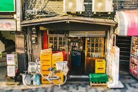

I did email Ben to ask him about his practice, unfortunately I didn’t hear back (I suspect he’s exceptionally busy). In regards to the equipment he uses and how he promotes himself, I referred to his website. He utilises three different tilt-shift lenses, which will be vitally important for me to use as an architectural photographer.
LUCA PIFFARETTI
Luca Piffaretti is a London based architectural and interiors photographer producing images for architects, designers, developers and other practices in the built environment.
Critical analysis
Luca was recently commissioned by Fletcher Priest Architects to photograph a 72 apartment housing and office development space (One Angel Court), in London. Utilising wide angle lenses, digital SLR Camera, ambient and artificial light, the series focuses on maximising the space, showing as much of each room possible. Commercially in architectural interior images, showing realistic proportions and highlighting the full space is important, it allows the viewer to imagine themselves and others in the environment, thus informing their decision about the building and if it meets their requirements. There is no point in cropping an image of a meeting room, for example, giving the impression the space is smaller than it actually is. I am impressed that he hasn’t been afraid to include people (after all arcitecture doesn’t exit without them). Historically architectural photographers could be accused of objectifying buildings and space, more and more images now show people present. In the areas such as the reception, for example, the room proportions are less important, therefore he has highlighted the design aspects and quality of the interior finish. Exploring the details of any building can reveal intricate details that are lost when an entire room or facade is shot in one frame. In the 21 image series he has balanced the need to show rooms fully, whilst not neglecting finer detail.
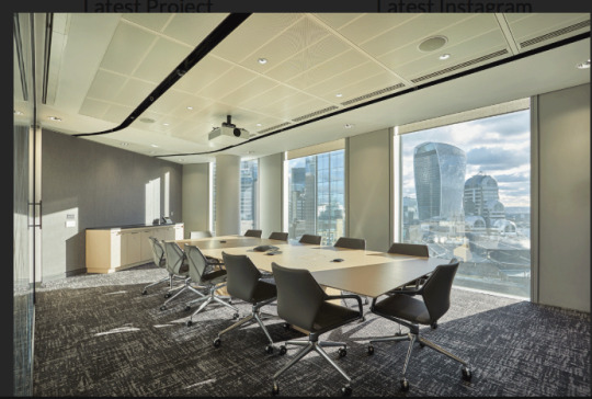
Showing the meeting room.
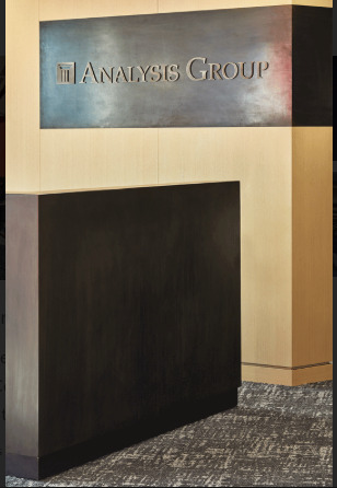
Emphasising the beautiful detail of the interior design.
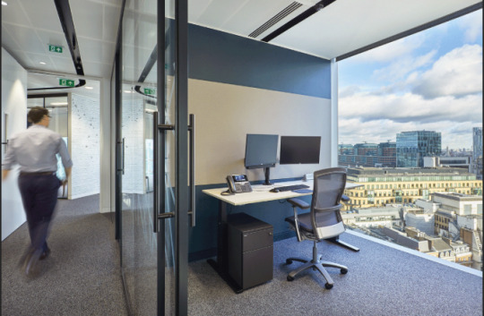
Balancing the need to show the office space with how it can be used by people.
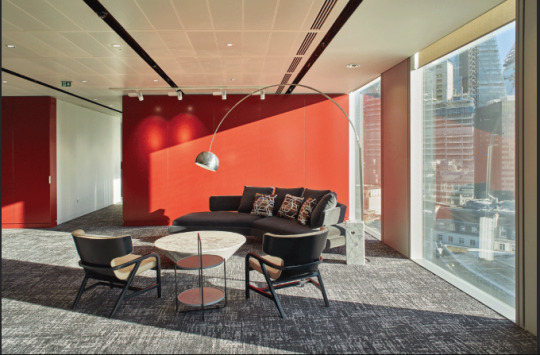
Maximising the use of natural daylight to create a bright well proportioned image. I did contact Luca to ask him some questions about his practice, he kindly obliged. I will write about this is a separate post.
SIMON KENNEDY
According to his website biography, Simon Kennedy is a London based architectural photographer, working with architects, engineers, designers, artists, journalists and visualisation companies to produce iconic architectural images and video. As a qualified architect and lecturer in architecture, Simon is in a unique position as a photographer to have a expert understanding of architectural practice and has been successfully working in photography throughout the UK, for the past 15 years.
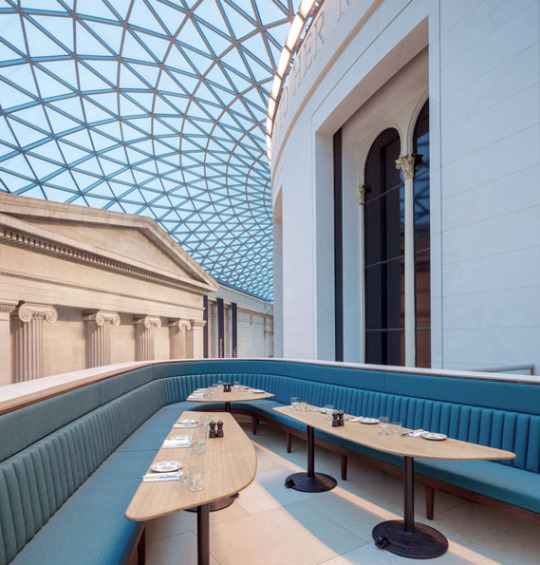
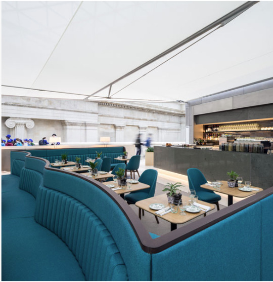
British Museum Great Court Restaurant, The British Musuem, London, 2016, Softroom
CRITICAL ANALYSIS
The brief called for a variety of spaces to be photographed, including the reading room, and the various spaces for eating. I believe Simon carefully and skilfully composed images that compositionally are outstanding. They accentuate the beauty of the space beneath the Sir Norman Foster designed glazed ceiling, whilst highlighting the fine materials used, such as the limestone flooring and the wooden and teal-coloured furniture. Shooting on a sunny day was paramount to the success of this first image, the blue sky perfectly complimenting the colour palette. Showing people in the restaurant highlights the spaces function as well as its aesthetic qualities. I think this is a really beautiful project that inspire me to photograph the space myself, it is full of interesting shapes and angles.
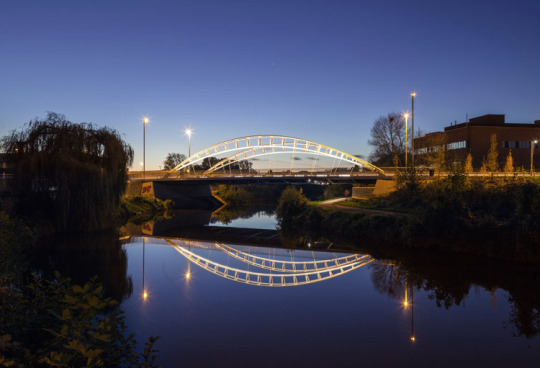
Third Way Bridge, Tauton, UK, 2015, Moxon Architects.
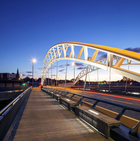
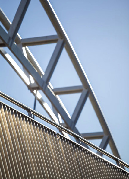
CRITICAL ANALYSIS
I think this series of images brilliantly fulfils the brief to capture the new bridge over the river Tone, because Simon has combined images of the complete structure, within it’s environment with detailed images that show a sculptural quality. He shot in the evening, the night time lighting beautifully accentuates the simplicity of bridge’s silhouette. He has carefully highlighted design features such as the seats and footways which are cantilevered off the structure to maximise the river aspect and open views for pedestrians, which physically separates them from a busy road. This is not something I had given much consideration to before, having a good understanding of why something was designed in the way it has been is significant in producing diverse work. I think that it has taught me that talking to architects and designers is really important, to maximise the chances of creating good images.
I did email Simon with my questions about his practice but have not had a response, which is a shame as I am a big fan of his work.
MORE REFLECTION An interesting thing I did notice on Simon’s architecture website, was a link to a his fine art website. So...how has this influenced me? I am clear that I want to pursue architectural photography professionally, but I don’t want to limit myself to just one genre. I have struggled in the past in terms of promoting myself as a certain type of photographer, as I didn’t have a clear idea what that was. I think i feel more confident now, that I need to strike a balance between defining what I do well (as in a specialty) and not limiting myself in being an authentic practitioner. On my website I will definitely add a link in the future to a site to view my other work.
0 notes
Text
Networking and book review.
I attended a photo social at the Francesca Maffeo Gallery in Leigh-On-Sea, Essex. The purpose of these evenings are to listen to visiting speakers, and network with like minded creatives. There are a wide range of people who attend, amateur, professional and student photographers.
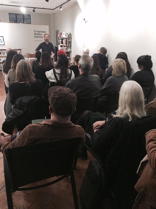
Rodrigo Orrantia talking about photo books.
This evening, art historian and curator Rodrigo Orrantia gave a talk about photo books. He talked about books he has recently discovered, what he liked and didn’t like and showed us a few examples. He judges photo book competitions competitions and curates shows often combining traditional gallery based art with photo books. It was a very useful talk to listen to as it has given me a better understanding of this area of the photographic industry. One of the books he gave very positive views to was Blanco, by Awoiska van der Molen, a dutch photographer.
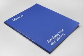
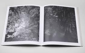
This is a book, according to Jack French from Lensculture is “Meditation, presence and connection. Mystical and absorbing black and white landscapes which offer an antidote to the ceaseless, noisy distractions of modern life.”
Orrantia felt the booked worked so well due to the following reasons:
1. The book never dominates the images, the book allowed the work to speak for itself, it “didn’t try to hard”.
2. The design layout was simple and consistent, white boarders surrounding each image that were presented as the same size on every page.
3. The high quality of the paper chosen enhanced the textural feel of the work.
4. The simple, yet beautiful stitching gave the book a hand made feel, yet was produced to a very high standard.
SO WHAT HAVE I LEARNT?
This book certainly made me re-evaluate photo book production and what purpose they serve. Books don’t have to have hard covers or contain many pages, to be be successful. Looking at the many examples of photo books that he talked about helped me to widen my understanding of the range and diversity that can be achieved. One piece of advice that was really emphasised was “take your time”, rushed work will never be sucessfully realised. Network and build relationships with graphic designers, and printers, experiment and start again if you’re not happy with it, or just take a break from it for a while and come back to it. He said the majority of photo books are self published, unless you win a competition or get some media attention, you are unlikely to make any money from producing photo books. However, the exposure they give you, if you have a way of sharing it with influential people can be significant.
MY BOOK REVIEW
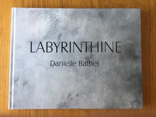
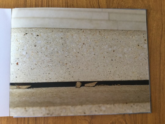
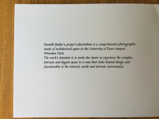
Rodrigo Orrantia, along with gallery director Francesca Genovesse kindly reviewed my photo book Labyrinthine. It is a book about architectural space at the University of Essex. Both of them were positive about my work, which i found really encouraging. Rodrigo suggested that I go back to the images and think about refining my image selection, however he did state the pace of the book was a “real achievement”. Francesca was not keen on the books production in terms of the shiny finish of the cover and also the book size. She felt that the design was confused in terms of having too many variants of image size and placement. I genuinely loved creating this book. I felt their feedback was really constructive, and I will return to this project, knowing that it can be improved upon.
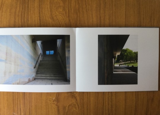
THINGS I WILL DO DIFFERENTLY
1. Take my time....by creating an ongoing project and carefully refining the final body of work, asking for advice from people with experience but having the courage to make creative decisions.
2. Research materials and printing techniques more thoroughly, and have the confidence to experiment with different options.
3. Keep in mind the purpose photo books serve, who are the intended audience and how best do I reach them? Is it better to coordinate realising a photo book in conjunction with an exhibition?
4. Consider carefully the cost of self publication versus the profit.

When people advise and help you, its important to thank them.
0 notes
Text
Professional work - Baby sensory and toddler activity class photo shoot.
I was approached by a friend who is a early childhood educator to do a photoshoot. She is developing a baby sensory and toddler activity business in Norfolk. She requested I do a shoot at two classes, she provided a brief.
THE BRIEF
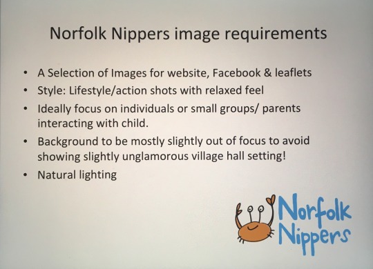
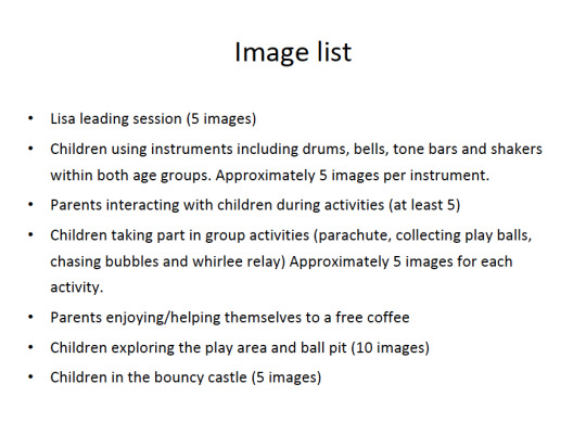
When I agreed to do this job I considered a number of things before providing a quote. Such as travel, equipment required, time, and post-production editing. I thought that £350 was a reasonable amount. The client did come back to me and said she hadn't budgeted for this much. As she is a friend I agreed to £250, which is not great money, however I wanted the experience and accepted less rather than loose the job completely. (I’m not planning on undervaluing my skills like this in the future).
I had never done this type of photoshoot before, I was quite apprehensive about it, because it would take place as the classes were in progress, rather than in a controlled environment, using willing models.
Some examples from the shoot.
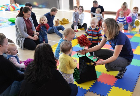
Discovering some coloured pompoms.
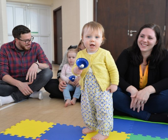
Enjoying making music.
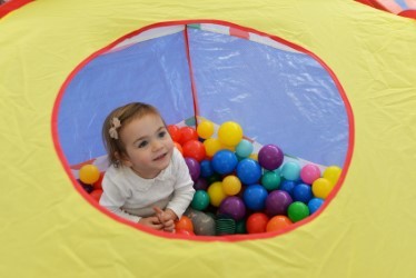
Playing in the ball pool.
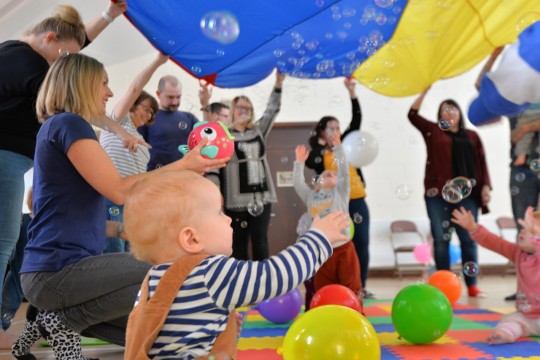
Enjoying bubbles and balloons under the parachute.
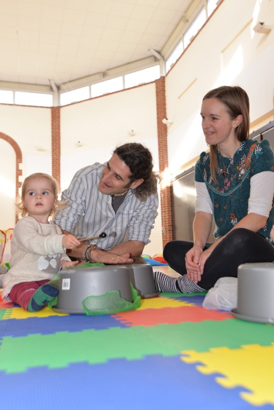
Learning to drum with parents interacting.
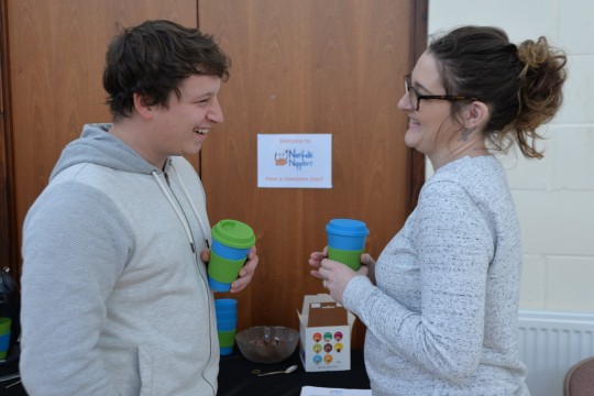
Parents taking a break, helping themselves to drinks.
CRITICAL ANALYSIS
On the whole the shoot went reasonably well, I did feel under pressure to get the required number and style of images in a chaotic environment, it was quite stressful. One toddler screamed every time they saw the camera (obviously I had to adapt by trying not to photograph them, in a group environment that wasn't always easy). The lighting in the hall was an issue at times, there was harsh sunlight in some areas, the double height floor to ceiling curtains couldn’t be adjusted, creating strong shadows. Sometimes children, but more often parents, became aware that they were being photographed meaning they would pose unnaturally which wasn’t the aim.
I sent contact sheets of suitable images for the client to choose from, then edited the requested images, this was really time consuming as she chose nearly 200. I think in future I would send a much smaller quantity of suitable images so I had less work post-production. I don’t particularly crave to do this type of photographic in the future, however it’s what many photographers might refer to as a “bread and butter” job i.e.. it’s income. Reflecting on this experience if I were to do it again, I would suggest that children who were comfortable being photographed could have images taken individually in a more controlled way, having the time to set up the environment and direct people would have improved the work overall.
The photo below is an example of one of my images that the client used on her website.
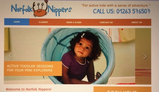
0 notes
Text
Third year-areas for improvement.
As I head into the third year of my photography degree I thought it would be good to start by identifying areas of professional development that I feel I need to work on.
I have always struggled with assimilating computer skills, especially if there are a number of steps involved. I do want to work as a professional photographer, computer skills in terms of post production editing and distributing work to clients is a large part of a photographers life and unavoidable.
I learn best by being shown and then practicing skills repeatedly, the difficulty I find is not knowing what questions to ask when I am stuck and also how to learn independently.
I have followed a number of online tutorials to improve my photoshop skills, however if I encounter a difficulty, I feel frustrated because I can’t always resolve the issue and there is nobody present to ask.
My workflow is often slow and unproductive, if i am going to work as a professional photographer I need to become more efficient in the management of my images, currently i take to long and this is not cost effective in terms of time or finances.
Current concerns.
1. How and where images are saved (separating work from personal images) and what and where is the best way to backup work.
2. Creating contact sheets that separate jpg from Raw files.
3. To understand the use of Layers in Photoshop.
4. To utilise lightroom effectively
5. To learn techniques to edit multiple images at once.
6. To learn techniques to supply multiple “web ready” files.
It is disappointing that we are not to continue to have any formal teaching this year in post-production editing. It will be challenging to learn this independently, but I am determined to acquire new skills and practice them.
0 notes