Don't wanna be here? Send us removal request.
Text
Week 14--Your Choice
Perhaps the most intriguing benefit I’ve gained while learning about the history and foundations of graphic design is the perception of and interest in different architectural styles while going through daily life. Especially in the downtown areas of cities are these different styles most prominently and diversely displayed, showing a three-dimensional history of how the area was built through different trends and eras. Having an appreciation for the architecture and where it comes from historically, culturally, and geographically provides a deeper satisfaction than simply admiring the artistry and design involved in the building.
Around Madison’s Capitol Square, one can take in a wide range of excellent examples of different architectural styles, each telling their part in the growth of the city, all while walking circling one of the best examples of American Neoclassicism, the Wisconsin State Capitol building. Art Deco and Beaux Arts buildings sprung up first around the square, followed by the brutalist government structures around the outside ring thereof. The State Office Building is a fine example of Gothic Revivalism, and the Justice Center is a prominent Modernist structure nearby. The Monona Terrace, designed by Frank Lloyd Wright, melds Art Deco with his own Plains-style and a forward-thinking postmodernism for his time. Finally, the Park Bank and US Bank buildings introduce the Madison downtown area to Postmodernism, explicitly vis-à-vis it’s varied use of stone, metal, and glass in interesting and unique forms with the former, and with a clear influence of the Bauhaus, de Stijl, and International Style in the latter.
Being able to identify and appreciate the diverse architecture found in Madison, and more so in larger cities like Milwaukee and Chicago, let alone everywhere else, has not only enhanced my observation skills in the context of design and architecture, but in every facet of life, as design has crept its way into every crevice thereof.
1 note
·
View note
Text
Week 13--New Media
The Digital Aesthetic, which came about, almost inherently, through the proliferation of the internet and its use among both graphic designers and the larger consumer public, presents a style that utilizes the (constantly updated) digital technology available to both physically produce the designs and establish a visual and rhetorical framework from which digital design is borne. As every aspect of human society and interaction transitions towards the digital realm, so too is graphic design increasingly focused on augmenting public experience to increase ease of use, visibility, and accessibility for both consumers and the businesses that rely on them.
In this, the Digital Aesthetic, if not a direct descendant/offshoot, is a logical evolution of the International Style: where International Style intentionally worked to depoliticize graphic design and separate it from its ideological—and thereby deeply divisive—foundations in order to economize and popularize it in the face of an increasingly cosmopolitan, competitive, and complex world, the Digital Aesthetic continues this ethos into the Internet Age to support the ever-expanding international community in a positive feedback loop. With the global democratization of graphic design and communication, more inputs and influences are available to affect graphic design on micro- and macrolevels, diversifying the Digital Aesthetic to align and identify with multiple views and preferences in any given situation. However, to prevent the Digital Aesthetic from appealing to any one group at the exclusion of others, it is also reduced to its lowest common denominators to be both accessible and understandable to the greatest number of people across the largest spectrum of global society.
As the world becomes more cosmopolitan and (at least) digitally accessible to its inhabitants, the homogeneity of digital design becomes broader both in what consumers expect and desire in the design of goods and services and the scope with which businesses and products purvey themselves to the public at large.
Social media provides perhaps the most prescient example of this current situation. In addition to the internationally ubiquitous Facebook, Twitter, and online gaming platforms that a provide homogenous and globally understood framework (within which consumers are counterintuitively empowered to personalize and make unique their profiles and assets to differentiate from others, a microcosm of the larger hypercompetitive and stratified digital landscape), regional corollaries have sprouted up, whether out of conflict or symbiosis with their international counterparts—but virtually always following the same basic model, to better serve their particular consumer bases through cultural nuance and/or government policy.
Weibo, a social media platform in China, is one of the most predominant examples. Loosely inspired by Twitter, Weibo provides a similar service as that of Twitter to Chinese citizens (thereby inherently one of the largest and most popular social media platforms available), although it is restricted to those topics which the ruling Chinese Communist government deems acceptable, thereby combining the internationally-accepted and -expected design principles of the present-day Digital Aesthetic with what Chinese government officials consider a healthy online presence to be: culturally- and politically-pure.
0 notes
Text
Week 12--New Media
In the digitalization of the world and how we interact with it, those fields that form the foundations of and build these interactions, such as programming, micro- and nanotechnology, and systems-building and analytics, have become ubiquitous in helping and allowing us to complete tasks in every facet of life. Smart phones and the apps they support give everyone the ability to take pictures, draw digitally, animate, make music, and set up and design any number of accounts. From social media profiles such as Facebook, Twitter, and LinkedIn, to accounts meant to “broadcast yourself” in YouTube parlance, such as itself, Spotify, and Etsy, and a whole host of games and virtual reality avatars in massive online multi- and/or role-playing games and online forums, any and everyone has the tools to draft, create, publish, and market design, and inversely design every step along the way, because of products modern megacompanies—Facebook (Meta), Google (Alphabet), Microsoft, etc.—put out that provide the frameworks for people to design and operate and interact within.
Perhaps the most recent development in emerging media will present the next paradigm shift in how we interact with the world around us, or more specifically, how we interact to create a world online, is the present popularization of augmented reality, especially with VR and AR headsets, such as Oculus, and the spaces Oculus’ parent company, Meta, hopes to create and provide. Within this ultimate alternate reality framework, people would have the ability to create every aspect and every thing they could and/or would want others to interact with, from avatars and their clothes and accessories to Design-It-Yourself advertisements and posters to be displayed and proliferated and architectural spaces and designs in which to house, store, and present such items. Companies and professionals would also be able to use alternate reality spaces to promote and propagate their own products. Essentially swapping out the real world for this augmented, virtual alternative, we are given the option, and encouraged to choose, to design our lives and the environments in which we live them to a degree inherently unattainable physically to achieve the total personalization, individuality, and sovereignty of our selves.
0 notes
Text
Week 11--Graphic Design
Drawing upon the nascent ideas first introduced by William Morris and his ethos in founding the Arts & Crafts movement, the modern concept of the “citizen designer” implores designers to consider farther-reaching techniques, ideas, and goals in producing their work to affect activism and debate in other—and larger—aspects of modern society. Likewise, the term can, and should, be interpreted more literally: as design becomes more integral in every facet of everyone’s life, so too are regular people, not necessarily educated in design and its principles, emboldened to participate in (the) design in their own lives and in the world around them.
Recent technological innovations are at least partly focused on streamlining and simplifying the use of previous technologies to reach wider consumer bases, and the modernization of the tools and methods of production of the design industry is no exception. Digital cameras, Photoshop (and Adobe as a whole), and 3D printing have democratized the design industry so that every layperson has at least the tools accessible to them to be able to accomplish was what once only the purview of highly trained artists and craftsmen.
In a time where the concept of design has become so nebulous and ubiquitous within the function of every other part of our political, economic, and cultural societies, it is fair to question whether design has reached its capacity insofar as its own innovation. However, it is precisely because design has become almost instinctual as a part of daily life—from people designing and decorating their own interiors and other DIY projects, to corporations and governments using principles of design (sometimes those ironically introduced by Soviet constructivists and postmodernists) to improve their operations and appeal—that it (design) and its influence in the ways and means of modern society are more necessary than ever.
0 notes
Text
Week 10--Graphic Design
What fascinates me most about the history of typographic design is the direct relationship abstract letter forms have with the technology of the day to produce and replicate them into tangible objects. The earliest known forms of writing, cuneiform, bears its distinctive clay tablets and triangular-linear forms precisely because it was those materials available to the Sumerians: the clay and the reeds used to impress the forms into the clay. Ancient Egyptians used papyrus from along the Nile River, nomadic and herding peoples used animal skins and leathers, and into the middle-ages, as technology and craftsmanship slowly evolved, Western, and specifically European, writers combined these forms of recording word- and letterforms to bind plant-based pages within leather casings and book-bindings.
When Johannes Gutenberg invented his printing press, although it revolutionized writing, typography, and information altogether, he was nevertheless restricted in letterform by what could be physically carved into the woodblocks that would be set in the press to create the type. This resulted in a typeset that was still calligraphic in nature, like its handwritten forebears, although much more uniform and thereby legible. That the printing press, even in its nascent form, is almost singularly influential in and responsible for modern typography and information dissemination is evident, for instance, in that we call majuscule letters “uppercase” and minuscule letters “lowercase”, a reference to the cases in which the respective letterforms were kept, and that the former terms are relegated to typographic and designer jargon. Additionally, that Nicolas Jensen, printing during the early Renaissance, derived a typeface from Latin majuscules and minuscules that would be the foundation for the most influential family of serifed types today is a testament to both the continual evolution of type from antiquity to modernity, and, paradoxically, the perpetuity and continuation of that same type throughout the ages.
0 notes
Text
Week 9--Industrial Design
As a city built upon its manufacturing and heavy and brewing industries, Milwaukee was and is home to a large clientele base hiring industrial designers to produce, modernize, and unify industrial identities and product designs. Whereas contemporary designers such as Loewy, Dreyfuss, Dorwin Teague, and Bel Geddes set up shop in New York to increase their visibility to potential clients and their prestige amongst the larger design community, Brooks Stevens found staying in Milwaukee beneficial to remain in proximity to the businesses and industries that formed his customer base, rather than have them come to him. Through this philosophy, Stevens maintained a veritable monopoly on the industrial design of major Milwaukee industries, including Harley-Davidson, Miller, Oscar-Meyer, and Outboard Marine. While only a small portion of the much larger context of American industry, these companies and their corporate identities remain ubiquitous and even infamous in modern American culture, and, especially Harley, the larger international zeitgeist.
Additionally, Stevens was the only founding member of the Society of Industrial Designers based in the Midwest, cementing both his and Milwaukee’s statuses as regional leaders in industrial design and its appreciation. This is highlighted in Stevens’ solo retrospective at the Milwaukee Art Institute, which was widely highly regarded as well as being the first of its kind. However, it was in Minneapolis that Stevens secured his legacy in global modern design thinking, separate from his numerous tangible contributions to industrial design which are also still widely proliferated. Channeling his ethos of being “a businessman, an engineer and a stylist, and in that direct order”, Stevens introduced his foundational theory of “planned obsolescence” to an advertising club, in which he elaborates designers should “[instill] in the buyer the desire to own something a little newer, a little better, a little sooner”. While idealistic in his hope to keep demand for continual industrial design high, Stevens unwittingly laid the groundwork for the modern consumer culture of buying an item with its replacement already, at least latently, already in mind.
0 notes
Text
Week 7--Architecture
The first principle of universal design is equitable use, wherein a design is made with a broad spectrum of people with diverse abilities in mind. Ideally, the design should enable an identical means of use for all users, and where that isn’t feasible, equivalent methods so that the greatest breadth of people may be accommodated. To that end, designs should be inclusive (hence the term “universal” in universal design) rather than stigmatizing or segregating, both in its operation and its appeal. A growing number of bars and restaurants are taking more proactive roles in providing alternatives to their service and goods to be as inclusive and considerate of as many peoples’ needs and accommodations as possible. Providing nongendered, handicap-accessible bathrooms allow equal access and equivalent, where not identical, use of facilities to the greatest number of people without restricting anyone to certain spaces or norms. The offering of alcohol-free beverages, both n/a beers and spirits and the addition of curated mocktail menus, better includes those who can’t have alcohol (those who are sober, Muslim, etc.) in the same experience as is created for everyone else having a drink around them. This can be extended to the food served as well, with vegetarian and vegan options to better include those with dietary restrictions, as well as gluten- and lactose-free options, and the ability by the kitchen to remove or substitute items, for those with allergies or intolerances.
The simple and intuitive use of a design refers to how easy it is to understand across a diverse set of skill levels, concentration skills, knowledge, experience, and physical and mental capacities. Regardless of the language (skill) of the user while fitting to their expectations, a design should effectively prompt its use and arrange its information in a way that is consistent with importance. A pedestrian street-crossing button simply involves that, a button, which is clearly and redundantly marked by both text and image to indicate its function of changing the light and giving the user the right of way. An arrow raised on the button refers to which direction the button serves, and directions after the button is pushed are announced audibly whether to wait or cross, to better serve blind or sight-impaired individuals or those who may not yet understand the procedures around a crosswalk. The bright colors also indicate that it should be noticed and used, with written instructions further prompting pedestrians to use it to cross the street more safely.
0 notes
Photo
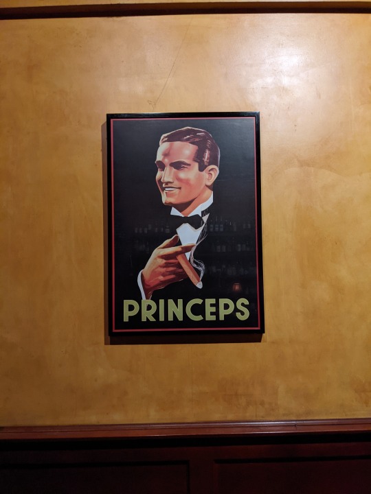
The Art Nouveau era at least partially grew into its aesthetic through “Japonisme”, or the influence of Japanese woodcuts and the growing collections thereof in European, especially French and English, design circles. Flat-tone backgrounds and the removal of contour lines to make a more two-dimensional image are a couple of the techniques that came out of this Japanese influence. The poster the Beggarstaffs made Harper’s, for instance, is “clearly indebted to Japanese prints…the silhouetted figure in [the] poster is more radically abstract than comparable images of the time; its contour line disappears in several places so that the figure blends into the background” (Eskilson, 78)1. In much the same way, the poster pictured at top—an advertisement for Princeps cigars on display at Maduro in Madison, WI—features a gentleman in a tuxedo holding a lit cigar on a flat black background. However, the contour lines for the tuxedo have been entirely removed, blending the tuxedo into the background, and thereby marrying the image to the larger print. Dynamism is still insinuated in the image, though, with the man’s hand just in front of his chest and smoke rising from the cigar.
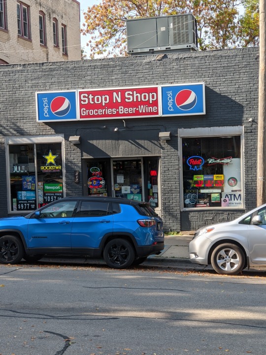
Among all the signs and placards in the storefront pictured middle, there are elements that make them, by design, unique entities. Much like Peter Behrens created Behrens-Antiqua for AEG as their own corporate typeface (Eskilson, 101), most of the signs have unique lettering designed as an integral part of their respective corporate identities. For instance, the Ps in Pepsi are circles at the top and as with the other letters the corners have been rounded to mesh with the circle Pepsi logo. Additionally, the middle line is wavy in the E to memorialize the old logo. Other logos also have typefaces that extend, or even wholly encompass, the logos and identities those companies are conveying. Juul has sleek, sans serif lettering to evoke modernity and high tech, with the J and L essentially mirror images of one another, while Pabst has a serifed, cursive typeface that suggests quality and longevity.
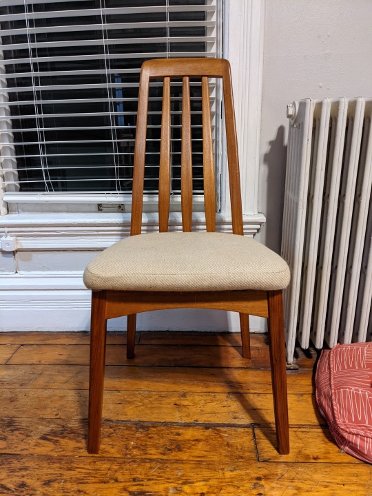
The Scandinavian modern chair pictured above evinces the same qualities William Morris wished to reproduce with his establishment of the Arts & Crafts movement; high-quality craftsmanship to provide a contrast to the shoddy mass-produced alternatives (Eskilson, 50), this chair is nonetheless marketed for the broader public to democratize and proliferate the appreciation of well-made goods. Made of medium-toned wood in sloping and gently curving forms, with the legs at an angle as to give the whole chair the vague shape of a triangle or pyramid, the chair has a certain Art Deco influence insofar as it “stresses the streamlined look whereby ornamental geometric lines [determine] the form of the composition” (Eskilson, 248). This again speaks to eschewing of modern materials and machines, unlike in Bauhaus, and espouses the timelessness and quality inferred by the craftsmanship.
1Stephen J. Eskilson, Graphic Design A New History (New Haven: Yale University Press), 2007, 50-248
0 notes
Text
Week 4--Found Object
My found object is a wine cork. Light tan in color, the cork measures approximately an inch and a half long and three-quarters of an inch in diameter. Along the length of the cork on one side is the name of the winery, “Chappellet” and its logo, consisting of three smaller triangles in the form of a larger single equilateral triangle. On the other side is the phone number and the website of the winery, again along the length of the cork. The lettering on the cork, apart from the website, is all square capitals and in either a modified Garamond or Roman typeface given the thin, legible letters with modest serifs. The website is in all minuscule lettering.
The function of the cork satisfies the problem of needing to seal a bottle of wine from air, thereby preserving it and keeping it from spoiling or further fermenting. This cork is made from artificial cork, or plastic, in my best estimate, which meets a couple more needs than a natural wood cork as a design choice. Firstly, it further prevents the chance of a wine spoiling, or being “corked”. Real corkwood is natural, and therefore intrinsically prone to decay, infection, and/or harboring particles that may catalyze spoiling. Plastic corks, as well as twist-offs known as Stelvins, eliminate the natural, and possibly corrupting, element of the bottle stopper. Plastic corks also save trees from being felled, which protects corkwood trees, their forests, and the ecosystems they are a part of and help make up. However, being made from plastic, this cork is not easily recycled, nor will it decompose naturally, creating more trash and pollution in our environment. Additionally, this cork is single-use, being put in the bottle by the winery for consumption by the end-user, instead of potentially being made of glass or metal for repeated at-home use.
0 notes
Text
Week 3--History of Design
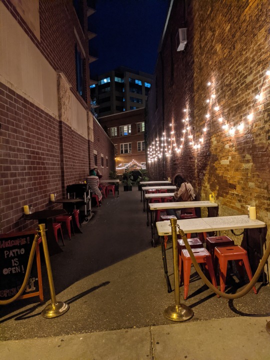
Outdoor seating area at Natt Spil, Madison, WI. Although not yet necessarily history, this is an example of the ad-hoc redesign bars and restaurants had to undergo in order to facilitate business during the Covid-19 pandemic. Once a thru alleyway, this space is now a safe and compliant dining area. Some details of note are the stools and tables, both being almost entirely function over form; the tables are plastic and foldable, and the splash of orange paint on the stools is the only levity to an otherwise utilitarian piece of furniture. Between those and the lights, the space exudes a space of ephemerality, ideally only a temporary space to everyone.
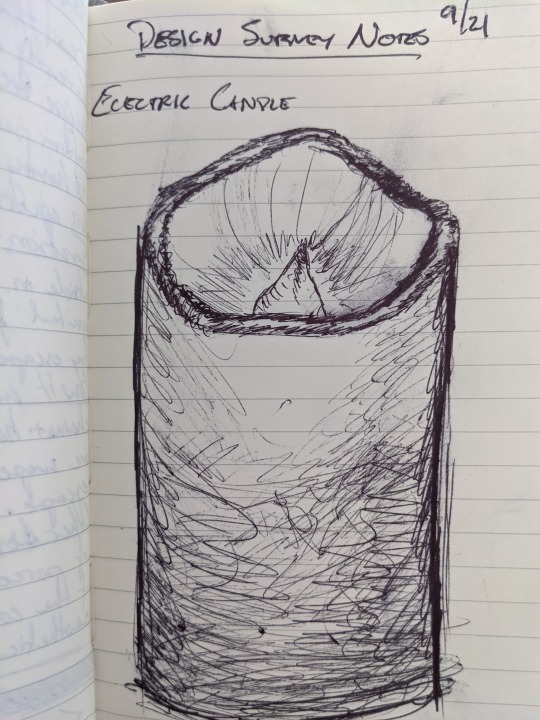
Drawing of an electric candle, Natt Spil, Madison, WI. The interesting feature is the imitative quality the candle has of a real wax pillar candle, complete with the soft, rounded, undulating rim at the top to emulate wax melting naturally. The light within the “flame” bulb also flickered in order to mimic a real flame.
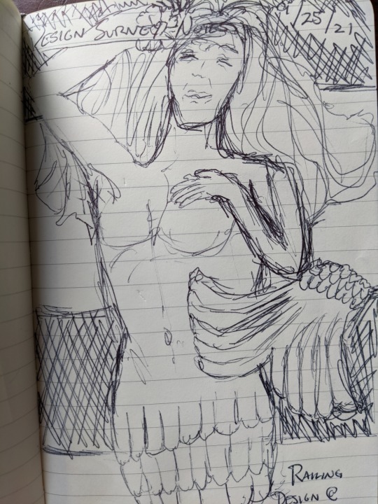
Railing holder, Naut-i-gal, Madison, WI. This bronze figure holding a railing to the bar at this restaurant exudes Art Nouveau, or at the very least inspiration therefrom. The curvilinear, sweeping fin and hair spreading around the torso harken to la style Mucha, and the way Alphonse Mucha portrayed hair as intertwining and swirling tendrils. The use of a topless mermaid as a motif as a whole is also reminiscent of Art Nouveau, wherein that era began the use of sexually implicit messaging in advertising and design.
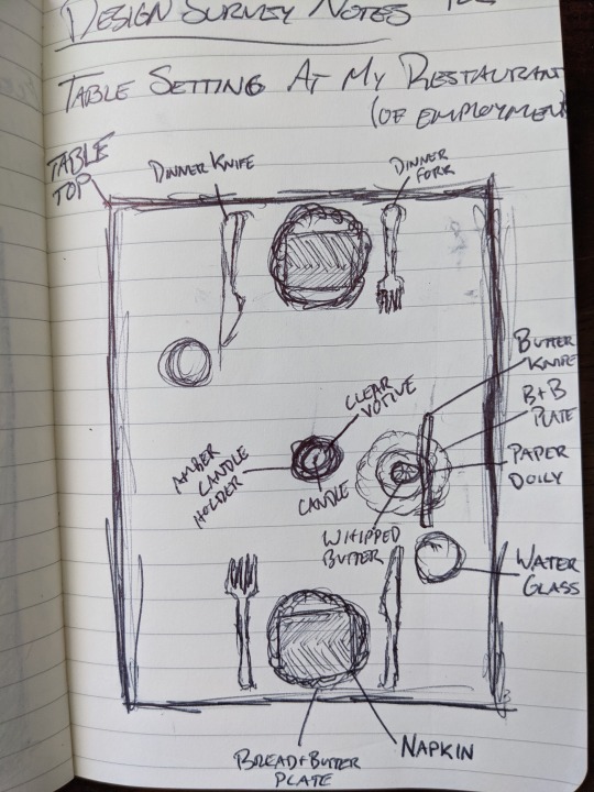
Set table diagram, Harvey House, Madison, WI. Apart from the pre-set butter, ideally the table should be mirrored symmetrically. The straight lines of the cutlery, napkins and table edges are offset by the circles of the candle, plates and glassware, evoking Peter Behrens’ Jugendstil, wherein the geometry of a design is simplified down to it’s most basic forms. Not drawn are the details on the plates, which include plant embellishments around the edges; these depart from Jugendstil, but only insofar as bringing in curvilinear lines of French or Belgian Art Nouveau.
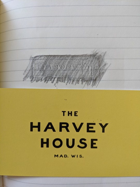
Logo and business card, Harvey House, Madison, WI. The logo conveys the essential information of the restaurant: the name as well as the integral train car, being that the restaurant is in an old baggage-claim building at a train station. The font was specifically chosen to evoke a sense of early 20th century/mid-century Americana. The lack of serifs, similar to the original sans serif typeface by William Caslon IV, allows for seamless conveyance of the message, while the bottom curve of the “s” is extended and softened, adding some levity and ease to the eye vis-à-vis the otherwise starkly geometric type.
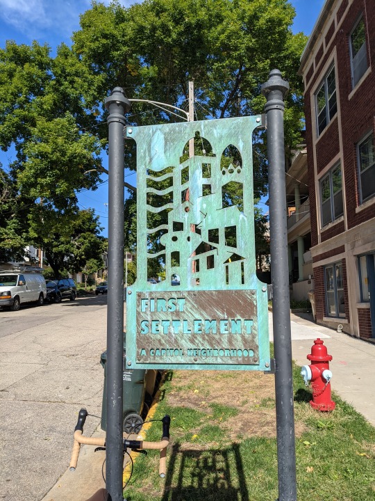
First Settlement Neighborhood sign, Madison, WI. Simple geometric shapes and lines set so as to create a dimension of depth to the otherwise two-dimensional design. Likewise, the lettering is of simple geometric shapes, but just as much as that is for stylistic purposes to harmonize with the image, functionally, block letters are much easier to cut out of metal. This sign is clearly custom and bespoke for this neighborhood, as the buildings depicted are the main landmarks in the area, thus marking an example of the Arts & Crafts movement, however indirectly, as it is an artisanal work celebrating the craft of metalworking within the context of celebrating the neighborhood and its own history.
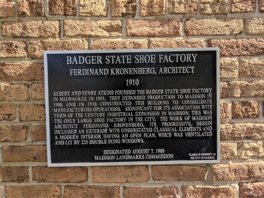
Landmark plaque, Madison, WI. Both the typeface, as well as how the text is organized, is very reminiscent of Roman square capitals and the inscription at the base of Trajan’s Column. Although not scriptio continua, it is entirely majuscule lettering, and the text itself is justified, and centered top and bottom, evoking a feeling of authority and legitimacy to this proclamation that this building is a historical landmark and should be respected as such.

Badger State Shoe Factory, Madison, WI. An industrial building that, although out of brick instead of concrete, still reminds of Jugendstil. Basic geometric shapes, mostly quadrangles as windows, doors, and walls, are embellished by subtle arches, adding an element of verticality and softness to the openness provided by the sheer number of windows.
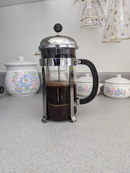
French press, my kitchen. This displays Peter Behrens’ other design ventures in Jugendstil, mixing clean straight lines with the bold curves of the handle, spout, and sphere with which to press down. Additionally, the marriage of stainless steel and glass, with minimal plastic to add a tertiary element, are typical of Wiener Werkstätte, but like Behrens’ electric tea kettle, mass-produced for the general consumer.
0 notes
Text
Week 2--Design Thinking
Previously, I had envisioned design as merely the tangible aesthetic of any given item or service, even putting whatever function the design serves in perspective only insofar as to how it pertains to how the design “looks”. However, reading “Thinking”1 by Tim Brown has crystallized in me not only the idea that design is both the form and function in equal measure, and inexorably intertwined into each other, but also that it encapsulates the entire process that leads to a final product and its design, from identified problems and nascent ideas to final implementation, upkeep, and proliferation of a good or service into the wider market. The context of this whole process is the end-users needs and desires regarding any and every item, as design for design’s sake disregards solving any problem and slips down a slope towards the realm of art.
This focus on what the consumer wants leads to sometimes vast arrays of different designs all fulfilling the same basic need. Brewing my coffee this morning, for instance, from the first to last step is informed by my personal preferences and desires as to how I want to brew my coffee. Buying coffee beans, I prefer buying whole bean instead of pre-ground, and grinding it myself. Boiling my water, I would rather use a stove-top kettle, rather than an electric one; even then, boiling water itself is a preference, as I could just as easily opt for drip or k-cup coffee and just fill the machines. But just as I am accustomed to using a French press and enjoying the slower manual process, others may want or need a quicker cup of coffee to fit in their routines. The one basic need, getting coffee, has been passed through “a system of spaces rather than a predefined series of orderly steps […to] demarcate different sorts of related activities that together form the continuum of innovation” (Brown, 88) so many times, that it almost seems as though every end-design—whether it be French press, drip coffee, or Starbucks—now occupies each of these metaphorical spaces as tangible preferences of every niche so far found.
However, what impressed upon me most from the article was the proliferation of design thinking, instead of just for the end-products or -services businesses produce, into the services, systems, and processes within up those businesses and how that improved holistic experiences from without. In changing and updating Kaiser Permanente’s nursing staff shift-change procedures, including “passing on information in front of the patient rather than at the nurses’ station […] and some simple software with which nurses could call up previous shift-change notes and add new ones” (Brown, 87), the design team “were able to create a relatively small process innovation that produced an outsize impact” (Brown, 88). Coming to this realization that how a business is designed is just as important as what it designs/produces as given me a new and deeper appreciation for how businesses of all types are put together, especially the restaurant I’m currently employed at and the stores I frequent.
1Tim Brown, “Thinking,” Harvard Business Review, June 2008, 85-92
0 notes
Text
Week 1--About Me
My name is Sebastian Zens, and I am a new transfer student at UW-Milwaukee studying political science. I have enjoyed learning about the subject, specifically international relations, since social studies have been a part of my curriculum and started focusing on it while participating in Model United Nations in high school. Although a better word for “design” in most of international relations is “draft”, i.e., documents, treatises, pacts, etc., there are a couple of areas where design and political science overlap that have fascinated me for as long as I can remember, namely the design of maps as well as flags. From sea charts and illuminated maps to subway maps and globes embellished with the elevations of mountain ranges, the history of mapmaking as it intersects with both the evolution of art and its various styles and eras as well as the advances in the science and technology necessary to further refine and enhance cartography has always been a source of personal curiosity and bemusement in drawing parallels to and understanding the human world more broadly. Similarly, the history of flags as a means of communication and identification is interesting to me between the utilitarianism of signaling and racing flags and the artistry, subjectivism, and symbolism associated with flags of group, national, cultural, political, etc. identity.
In taking this class, I’m hoping to learn some of the context and schools of thought within art and design during these different periods that saw new maps and flags arise, whether out of necessity to solve a new problem or to refine previous work to whatever standard of design and/or precision was held at the time. I am also in this class to sate a more general desire to learn about the subject, as I enjoy making and taking in art and would like to know more as to how and why the world around us is designed the way it is. Living in downtown Madison, WI, one is surrounded by different styles of architecture and product design, often overlapping, and melding into one another, and learning when and how these styles came about can paint a more vibrant history for me of Madison, Wisconsin, the United States, and the world more broadly, and all the people therein.
1 note
·
View note


