Video
vimeo
A Lot Like Christmas
(more than) 5 shot
0 notes
Video
tumblr
Photoroman
song used: Going to Georgia by Aaron West and the Roaring Twenties
0 notes
Video
tumblr
Urban Landscape Slideshow
1 note
·
View note
Text
How Can I Increase the Appeal of a Design?
Aesthetic-Usability Effect: Aesthetic designs are perceived as easier to use than less-aesthetic designs
Alignment: The placement of elements such that edges line up along common rows or columns, or their bodies along a common center
Archetypes: Universal patterns of theme and form resulting from innate biases or dispositions
Attractiveness Bias: A tendency to see attractive people as more intelligent, competent, moral, and sociable than unattractive people
Cognitive Dissonance: A tendency to seek consistent among attitudes, thoughts, and beliefs
Color: Used in design to attract attention, group elements, indicate meaning, and enhance aesthetics
Defensible Space: A space that has territorial markers, opportunities for surveillance, and clear indications of activity an ownership
Entry Point: A point of physical or attentional entry into a design
Exposure Effect: Repeated exposure to stimuli for which people have neutral feelings will increase the likability of the stimuli
Face-ism Ratio: The ratio of face to body in an image that influences the way the person in the image is perceived
Fibonacci Sequence: A sequence of numbers in which each number is the sum of the preceding two
Framing: A technique that influence decision making and judgement by manipulating the way information is presented
Golden Ratio: A ratio within the elements of a form, such as height to width, approximating 0.618
Mimicry: The act of copying properties of familiar objects, organisms, or environments in order to realize specific benefits afforded by those properties
Most Average Facial Appearance Effect: A tendency to prefer faces in which the eyes, nose, lips, and other features are close to the average of a population
Operant Conditioning: A technique used to modify behavior by reinforcing desired behaviors, and ignoring or punishing undesired behaviors
Prospect-Refuge: A tendency to prefer environments with unobstructed views (prospects) and areas of concealment and retreat (refuge)
Rule of Thirds: A technique of composition in which a medium is divided into thirds, creating aesthetic positions from the primary elements of a design
Savanna Preference: A tendency to prefer savanna-like environments to other types of environments
Self-Similarity: A property in which a form is made up of parts similar to the whole or to one another
Signal-to-Noise Ratio: The ratio of relevant to irrelevant information in a display
Similarity: Elements that are similar are perceived to be more related than elements that are dissimilar
Storytelling: A method of creating imagery, emotions, and understanding of events through an interaction between a storyteller and an audience
Symmetry: A property of visual equivalence among elements in a form
Top-Down Lighting Bias: A tendency to interpret shaded or dark areas of an object as shadows resulting from a light source above the object
Waist-to-Hip Ratio: A preference for a particular ratio of waist size to hip size in men and women
1 note
·
View note
Text
Photo Exhibit Review
The exhibit that I chose to go to was New Horizons by Sze Tsung Nicolas Leong. I was drawn to this exhibit because I love photographs of nature/scenery, and was interested in the style of the work.
When I arrived at the gallery, I was the only one there, aside from a few employees downstairs who I nodded to when I walked in. The exhibit was upstairs, in an all white, open space. There was one partial wall that separated the section with large prints from the section with smaller prints, but other than that it was an empty room. I liked the set up of the gallery for a couple reasons: first, there was nothing to distract you from the art, and second, the bright environment made things feel more exciting - it wasn’t dark and drab and boring. Something else I noticed about the brightness of the room was that I could see my reflection in the frames of the photos. First, I thought it was kind of annoying, but then I found it pretty cool that I could see myself “in” the photos.
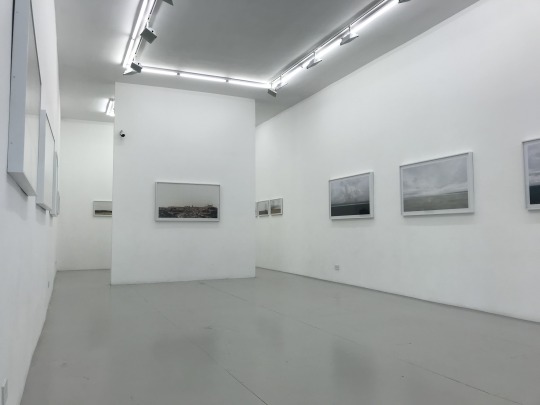
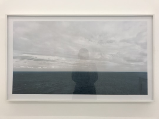
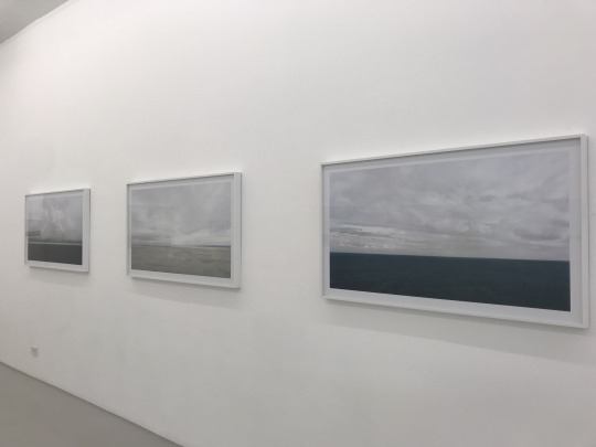
Aside from the large prints being separated from the smaller prints, the only other indication of a particular order of the photos was that all of the large ocean prints were together on one wall. Other than that, there didn’t seem to be a clear connection in the way the photos were placed. However, I think that may be purposeful, because these photos span diverse countries and continents, yet bring them all together in one room. The obvious connection between the images is that they are all of horizon lines. The cohesiveness of the series comes from the similar structure of the lines in the photos, and the scenery as subject matter. It’s striking to see the horizon of the Pyramids line up with the horizon of Venice, and so on. I think the series as a whole calls to mind a sense of interconnectedness throughout the world, and through the world, the earth, itself.
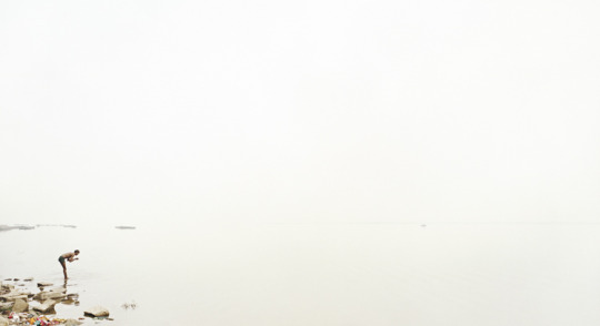
The first image I chose to critique individually is Ganga (Ganges) II, Banaras. The photo is of a man on the edge of the water, where the water and the sky melt into each other. It looks like the man is standing on the edge of the world. For an image that is almost entirely negative space, and almost entirely white, it is absolutely gorgeous. The scale of the man compared to the environment and vastness that surrounds him gave me a feeling of “smallness.” Like, I am only a tiny part of this giant, beautiful world. I was glad the photographer chose to have only one person as the subject of this photo, compared to some others that had multiple people or animals, because I felt it really emphasized that point, and makes the image more personal. To be honest, when I saw this image as a thumbnail on a link to the gallery website, I thought it was a mistake. And maybe some people may see a mostly white photo with only one small person in the corner as a mistake, but - and especially after seeing the photo in person - I think it’s indicative of a photographer who knows how to achieve a feeling that they want, both technically and creatively.
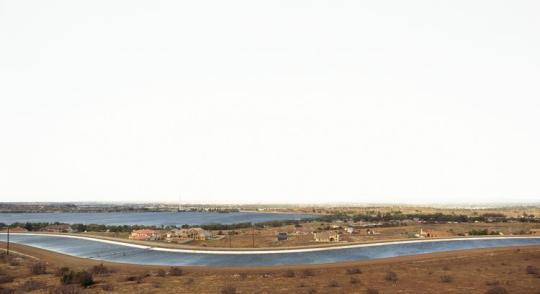
The second image I chose to critique is Antelope Valley, California. The photo shows wavy sections of clay-red land, with dark blue water running between. The way the colors contrast and give shape to the landscape is what I found most interesting about this photo. I also didn’t realize that it was California, I probably would have guessed somewhere a bit more exotic than that. But since learning where there picture was taken, I feel like I appreciate it more, because it takes somewhere almost familiar and makes it seem way more extraordinary. In terms of composition, it differs from the first photo because it has a much more clear horizon line running through it. And while the sky is, again, bright white, below the horizon the lines of the land make it interesting to look at and interact with. They lead your eyes all over. I can imagine some may argue that taking pictures of landscapes or scenery isn’t super creative because what you’re taking a picture of was already there, and you just clicked a button. But something must be said for scouting the right location, framing, perspective, and having an eye for engaging visuals, not just something that’s “pretty.” I think the photographer does a great job of that in this photo, and series.
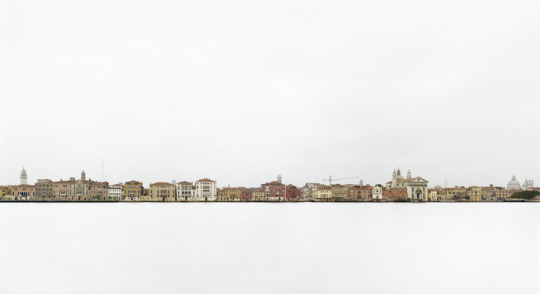
The next photo I chose to critique is Canale della Giudecca III, Venezia. The subject of this photo being Venice made me super excited, because it reminded me of my own time there. I think people really love to see cool pictures even more when they can say “I’ve been there.” Anyway, I found this to be a particularly unique view of Venice, because, maybe unless you’ve been there, you can’t really tell it’s Venice. I’m sure there were many gorgeous horizon views that show off the famous canals, but the photographer chose to go a different route, and show the city from more of a distance, and I can really appreciate the thought put into that. Compositionally, I think this photo is one of my favorites. The sky is white, the water is white, the city is the horizon - an uneven skyline of color and architecture and history cutting through the white. I think it was also especially striking because it was such a large print, and the first you walk to when you come into the gallery.
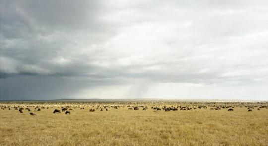
The final image I chose to critique is Masai Mara I. I really loved this photo because I am an animal lover and it makes me genuinely happy to see animals free and in wide open spaces in nature. Compared to the other photos I’ve critiqued, this one is different in one noticeable way: in this photo, the sky isn’t blown out and completely white like in the others - you can see clouds, even dark rain clouds, and gradient. However, it does stay true to the principle composition of the series with the large blocks of color (or lack of) separated by the horizon. .This difference makes me wonder the intention of the photographer when choosing not to overexpose the sky. Maybe to stay true to the environment of the photo, because this one is completely nature - no buildings, no people? Intention of an artist can be difficult to understand sometimes, but I don’t think that necessarily has to take away from the art.
(p.s. in this picture, you can’t tell any of the details of the animals, but in person you can. And that made it way better. There are zebras in this picture!!)
Overall, I loved the New Horizons exhibit. It was gorgeous to look at, and I really appreciate the overarching message of connectedness. It made me feel connected to each and every place featured in these photos, and I think one of the best parts of art is feeling like you belong to it, too.
0 notes
Text
Soundscape pt. 2
Madison Square Park...
Sitting on a bench in Madison Square Park, with my eyes closed and my ears open to everything around me, I can hear the tiniest sounds of a dog’s pattering feet among the roaring of a bus pulling away from the curb behind me. I can hear the newly fallen leaves scraping across the concrete as the wind blows. One lands loudly on the seat next to me, and because I’m so focused on finding the hidden sounds, it makes me jump and open my eyes.
There is a constant background noise made up of so many different things: cars running, brakes squeaking, people talking, birds chirping. These sounds fade into the atmosphere of the city unless you are listening for them. Sometimes a bird will get close and I can actually hear the sound of flying. Sometimes people will pass by and their conversations become so close, only to drift away again.
The woman on my left seems to be on the phone, talking in another language I don’t recognize. The man on my left takes a deep sigh. A stroller rolls by. Someone is dragging their feet. Of course there are sirens - there are always sirens. I am surprised to hear a helicopter overhead, though.
It’s so easy to walk around New York with a kind of tunnel-listening. Most of the time I have headphones in. But when you sit in the park, on a gorgeous September day, it’s easy to sit for hours and just listen.
1 note
·
View note
Text
Media Log
Week of 9/19
Hulu
The Handmaid’s Tale
Top Chef
TV
Project Runway (the only show I watch on actual television)
Podcasts
Stuff You Should Know
The Memory Palace
Pod Save America
Alice Isn’t Dead
Song Exploder
Music
Melodrama (album) - Lorde
Burst and Decay (EP) - The Wonder Years
Acoustic album of a selection of full band songs and its beautiful)
Notes: I’m super into podcasts. I listen to all different kinds: history, politics, storytelling, educational, etc. One of the best I listen to in terms of sound design is Alice Isn’t Dead. It’s a story told from the POV of the main character who is a truck driver and transmitting her story over the CB radio. There’s ambient music to set the mood, and sound effects that put listeners in the truck, hearing the sounds of a car on the road, radio static, slamming on the breaks, etc. It’s really immersive and plays a huge part in the success of the story itself, in my opinion.
Another really awesome podcast is Song Exploder where artists break down their songs from concept to production to release and its so interesting. This week Lorde was on and I loved it
0 notes
Text
Media Log
Week of 9/12
Netflix
BoJack Horseman (the whole new season in two days because I have no self control)
The Confession Tapes
Podcasts
Stuff You Should Know
Up First
Pod Save America
The Dollop
Stuff Mom Never Told You (new addition!)
Music
Melodrama (album) - Lorde
After Laughter (album) - Paramore
Ctrl (album) - SZA
Apps
Instagram
Facebook
Snapchat
Twitter
Websites
Facebook
Youtube
Other
Ruff Cuts films
0 notes
Audio
Song Used: Hard Feelings - Lorde
Poems Used: Pansies; Honey; Maybe I Need You; Prism - Andrea Gibson
0 notes
Text
How can I enhance the usability of a design?
80/20 Rule: A high percentage of effects in any large system are caused by a low percentage of variables
Accessibility: Objects and environments should be designed to be usable, without modification, by as many people as possible
Aesthetic-Usability Effect: Aesthetic designs are perceived as easier to use than less-aesthetic designs
Affordance: A property in which the physical characteristics of an object or environment influence its function
Confirmation: A technique for preventing unintended actions by requiring verification of the actions before they are performed
Consistency: The usability of a system is improved when similar parts are expressed in similar ways
Constraint: A method of limiting the actions that can be performed on a system
Control: The level of control provided by a system should be related to the proficiency and experience levels of the people using them
Cost-Benefit: An activity will be pursued only if its benefits are equal to or greater than the costs
Entry Point: A point of physical or attentional entry into a design
Errors: An action or omission of action yielding an unintended result
Fitts’ Law: The time required to move to a target is a function of the target size and distance to the target
Forgiveness: Designs should help people avoid errors and minimize the negative consequences of errors when they do occur
Hick’s Law: The time it takes to make a decision increases as the number of alternatives increases
Hierarchy: Hierarchical organization is the simplest structure for visualizing and understanding complexity
Iconic Representation: The use of pictorial images to improve the recognition and recall of signs and controls
Immersion: A state of mental focus so intense that awareness of the “real” world is lost, generally resulting in a feeling of joy and satisfaction
Interference Effects: A phenomenon in which mental processing is made slower and less accurate by competing mental processes
Inverted Pyramid: A method of information presentation in which information is presented in descending order of importance
Layering: The process of organizing information into related groupings in order to manage complexity and reinforce relationships in the information
Mapping: A relationship between controls and their movements or effects. Good mapping between controls and their effects results in greater ease of use
Mental Model: People understand and interact with systems and environments based on mental representations developed from experience
Mimicry: The act of copying properties of familiar objects, organisms, or environments in order to realize specific benefits afforded by those properties
Performance Load: The greater the effort to accomplish a task, the less likely the task will be accomplished successfully
Progressive Disclosure: A strategy for managing information completely in which only necessary or requested information is displayed at any given time
Readability: The degree to which prose can be understood, based on the complexity of words and sentences
Recognition Over Recall: Memory for recognizing things is better than memory for recalling things
Signal-to-Noise Ratio: The ratio of relevant to irrelevant information in a display. The highest possible signal-to-noise ratio is desirable in design
Visibility: The usability of a system is improved when its status and methods of use are clearly visible
Wayfinding: The process of using spatial and environmental information to navigate to a destination
0 notes
Text
Working as a Director
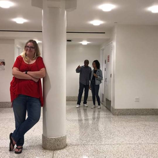
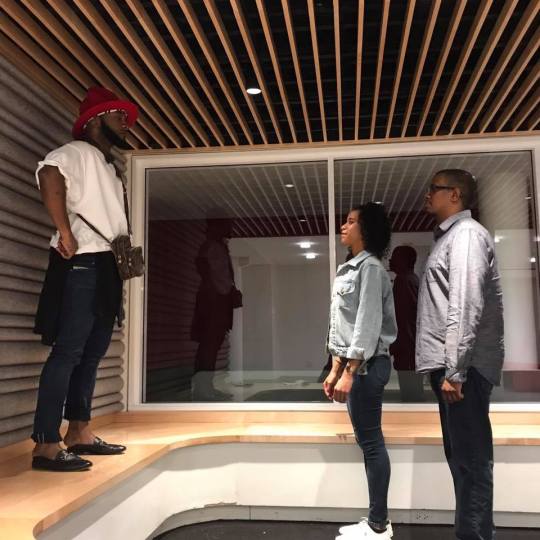
Overall, I really enjoyed the experience of directing my center of attention photos. My favorite part of photography and film is framing and composition, so I love being the one behind the camera and in control of how everything looks.
My classmates in my group were very cooperative and open to being directed, which was super helpful. We all even gave each other feedback and suggestions while shooting. I’m typically a very methodical and organized worker - I like to have a plan and stick to it for the most part. I did notice that a couple members of my group worked in a way that was different from how I traditionally work, but I found it to be helpful because that way we were all able to collaborate on some photos and think of certain ideas on the spot as we were shooting. Working in a group where everyone gets to be a director is a very different experience than working alone, and I think it was valuable to see how others work.
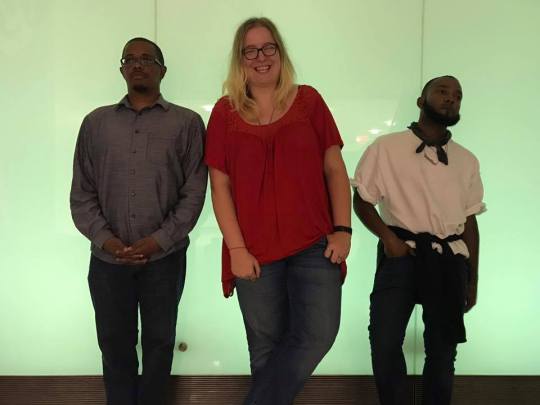
Something I did find challenging was not having total control over locations or wardrobe. It was easier to adjust for location because my sketches were in open space, but I had to rethink who I wanted in each of my photos based on what my group members were wearing. Two members of my group were wearing bright colors, and the two others were in dark, neutral colors. More than once I wanted someone in a bright color to be the center of attention - for a reason that had nothing to do with their clothes - and then had to make sure not to use the other brightly dressed person so they wouldn’t distract from the point of the photo. I think things did workout overall, though, and my group was very helpful in making my photos work.
On the other hand, being directed is always strange to me. I find myself asking the director a million questions (Which way should I look? Just my eyes, or my whole head? Is this right? What is my face doing?). I will say that I am willing to try whatever I’m directed to do, but I honestly do get embarrassed in front of the camera pretty easily. I do think it is important to have experience in being directed as a director, though. It teaches you a lot about how to direct, what your models/actors are thinking and going through, and different techniques that might be helpful in communicating to your actors/models.
Ultimately, I found this exercise very fun, a bit challenging, and definitely helpful!
0 notes

