Text
Sprint 9
I started this sprint by alalysing the data we gathered from the previous tests. I went through all the data we collected during out test and analysed each piece and what it could mean for our game, then compiling a list of every bug or change that needed to be made and added it to the scrum-wise before meeting with my team to discuss what was to best tackle each task and who should be allocated to each one.


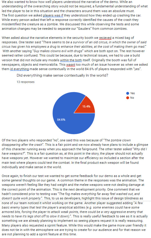

I also prepared for our final presentation.

0 notes
Text
Sprint 8
During this sprint the main focus was getting our demo ready for the next testing session. I was in charge of this and decided that the main focus of our test should be the level design and narrative and how well that came across, as well as a small combat test to run through our improvements since the last session. To achieve this we built the first part of our level up until the player finds a weapon, followed by a small arena in which players were instructed to dispatch the enemies, first using melee weapons, then using firearms before finally being able to use any combination of the two. To gather data for this test I created a test plan, highlighting all the different test conditions, a test tracker to keep information on each test, a data sheet to keep track of any bugs found and their status and a questionnaire for players to fill in after their session. I was also in charge of running the testing session.
I also created a digital overview of our first level using Photoshop to create a birds eye view. Unfortunately due to my main hard drive corrupting and having to be replaced, this was lost.

0 notes
Text
Sprint 7
During this sprint I returned to level design. To begin with I I created a basic run down of exactly what needs to happen in this level to fit our narrative. This included all game play elements and necessary plot points that needed to be hit.

After this I drew up plans for the layout of the level so that the modellers had something to reference. I also created an asset list for them.

My main aim for this level was for the player to feel as if they were making all the decisions and not following a set path, which in reality they are. An example of this is when the player first leaves the car, there are no signposts or quest markers but the placement of lamp posts guides the player to the heart of the forest where they will then be able to see the light coming from the main circus. It is then the player that decides that they want to investigate rather than the game telling them to.
One challenge I found during the designing of this section was finding a way to have the player locked into an area to force their first encounter with an enemy while also making them learn some of the lore. The solution I came up with was getting the player into an office with lore aspects dotted around and having them search for a key in the room, encouraging exploration within the environment. to get them in their without an exit I had them climb in through the roof and once they would drop in they would see that the previous tenant had barricaded the main door so the only exit would be through the lockup, which is where the enemy encounter happens.

0 notes
Text
Sprint 6
Our 6th sprint mainly consisted of bug fixes and adjustments as a result of our first testing session. The first thing I did was go through all the data we collected during out test and analyse each piece and what it could men for our game, then compiling a list of every bug or change that needed to be made and added it to the scrum-wise before meeting with my team to discuss what was to best tackle each task and who should be allocated to each one.
I then decided to attempt to improve the menu code I started in a previous sprint to get rid of any bugs and make the cameras move as smoothly as possible. I originally estimated that this would take around three hours to fix, however I spent all week on this, discussing problems in forums, watching many videos and even reading a paper on how virtual; cameras work under the surface, but to no avail.
At the end of this sprint I met with my co-leader, Josh, and we decided that I would return to the design side of things and I handed this task on to Jed, who is a much more experienced coder than myself.


0 notes
Text
Sprint 5
During this sprint the main focus was getting our demo ready for testing. I was in charge of this and decided that the main focus of our test should be our combat mechanics, specifically, how well our weapons work and the base Gauder AI. To achieve this I decided on a small section of our game would show general things like lighting and basic controls, so we included the first section of our level (the cut-scene, car crash and walk through the woods to the carnival) followed by a small arena in which players were instructed to dispatch the enemies, first using melee weapons, then using firearms before finally being able to use any combination of the two. To gather data for this test I created a test plan, highlighting all the different test conditions, a test tracker to keep information on each test, a data sheet to keep track of any bugs found and their status and a questionnaire for players to fill in after their session. We also planned to record the sessions with a capture card and webcam but software restrictions on the university computers would not allow this.
I was also in charge of running the testing session.

0 notes
Text
Sprint 4
As well as my usual duties as project manager, during this sprint I also decided to try and implement my designs into our game myself. I began by building a test scene represented the different sections that my menu system will be built around. Once the basic models were in place I set up virtual cameras for each section using Unity’s built in virtual camera system. Then, to chance which camera was being used I created a simple script that increases the priority of one camera and decreases the others on a button press, as I believed this would be less draining on the engine than constantly enabling and disabling components. A short GIF of this in action is shown below.
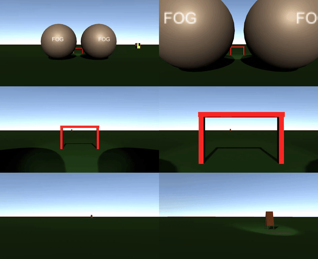
Once we have our final models I will be able to transfer this into our menu scene and it will be complete. The next step for the menus will be the pause menu system.

0 notes
Text
Sprint 3
During the Third sprint we mainly focused on our other module, however we still made some time for Hilarity. Again I started and ended the sprint meeting with each group member.
I also spent some more time on the menu system, finalising each aspect of the design ready for implementation. For this I drew up what each screen will look like, how each screen interacts with each other and small details to include such as clicking certain objects triggering a small animation like the battle screens in hearthstone.

0 notes
Text
Sprint 2
As will be the standard for all future sprints, I started this sprint by preparing the scrumwise for the upcoming week, allocating each person’s jobs, speaking with each team member about what they are hoping to contribute this week and having a team scrum to see what needs doing. I also ended the sprint by again meeting up with each team member, discussing what they achieved during this sprint, what went well, what went wrong and how we can improve as a group.
As lead designer, I decided to create a fun, dynamic menu system that wasn't just an overlay with buttons like you find with most modern games. For this design I took inspiration from the menu systems of the dishonoured franchise.
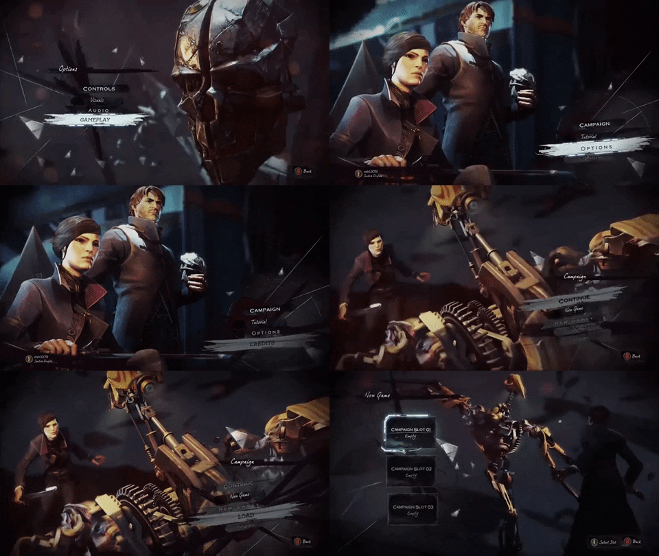
What I liked about this UI was how it felt like you were moving around a living scene, really affecting the world around you. Another note about this menu is how cathartic it feels navigating the different screens, with sound design and animations playing a key role in this.
For our menus I came up with a system that will hopefully replicate the emotional response one gets from the menu system in dishonoured. For the main menus the player would be shown a scene from the fairground with an enemy just out of view and a shadow being cast across a wall. This would hint at the themes of the game without revealing the enemies before they are introduced in our story. From the top of the screen a wooden sign suspended by chains depicting the game’s logo would drop down and shortly after this three more signs would fall down, each connected to it’s neighbour like a jacob’s ladder. Each sign would represent a different button (new game, load game, options and quit). When a button is clickedd, that sign will disconnect by the chain breaking and the camera would fly through where it once was to a different section of the park (fully 3D space). at this section there will be another menu themed to that area, for example one is a ticket booth with the menu on a board normally showing ticket prices or one in the food tent on a specials menu. Each new locations will be a full 3D model and pressing back would take the playyer back to the park entrance. This will increase the player’s familiarity with the park layout and cement the idea of the setting in their head.
Similarly, for the pause menu, the same signs would drop down but after clicking an option the player would pull out a park brochure and the different menus will be different pages. For the weapon wheel and inventory you will see the player physically opening a bag and the inventory will be shown overlaid the bag and the player will reach in the bag to actually take out any items.
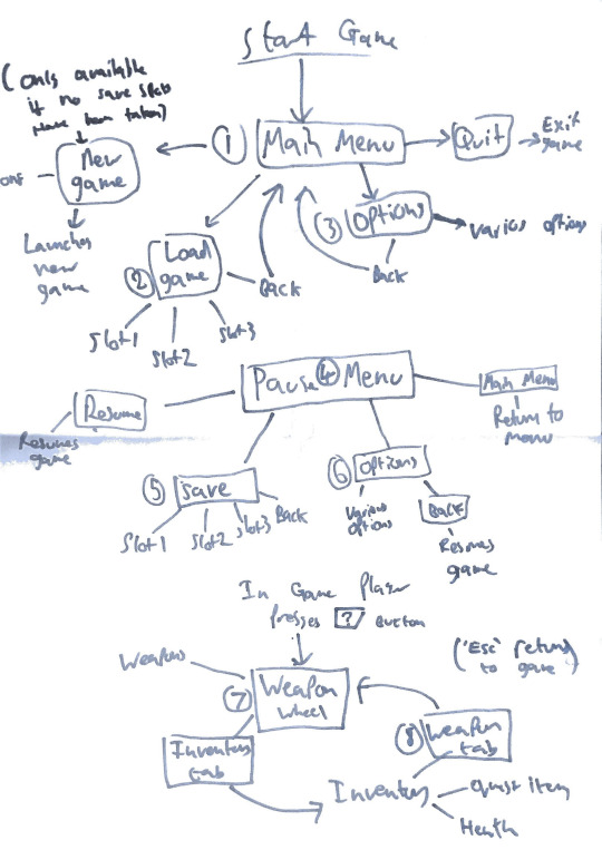
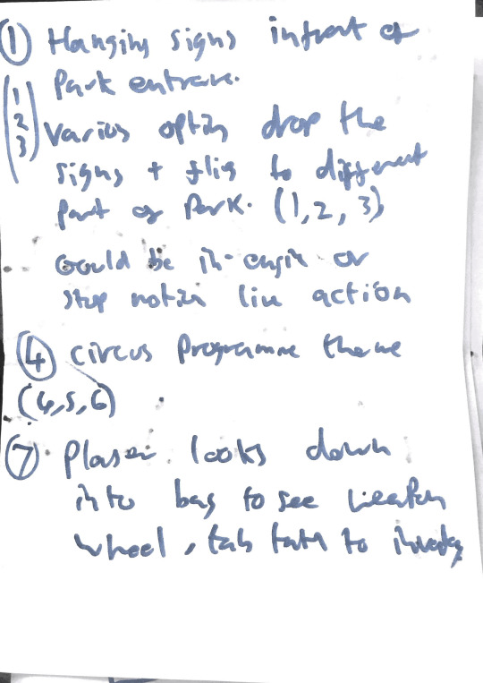
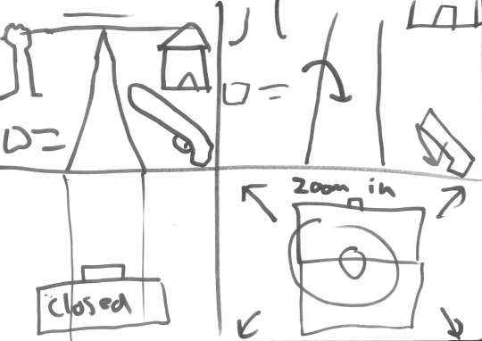

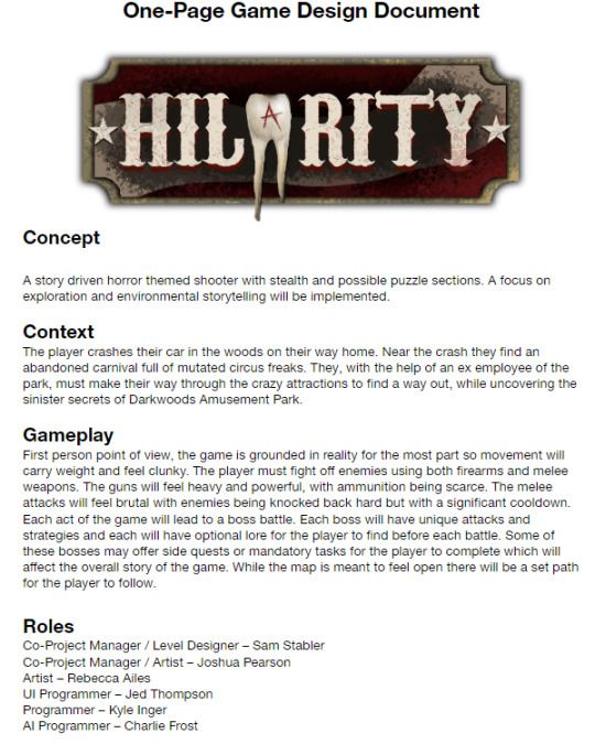
During this sprint I also met with each group member to get a good idea of exactly what is needed for our game, with asset lists, coding spreadsheets and design plans. I then used this to fully map out our semester on scrumwise with each task fully mapped out, with the ability to add more tasks or change them as per the agile methodology. I also Completed the on epage game design document.
0 notes
Text
Sprint 1
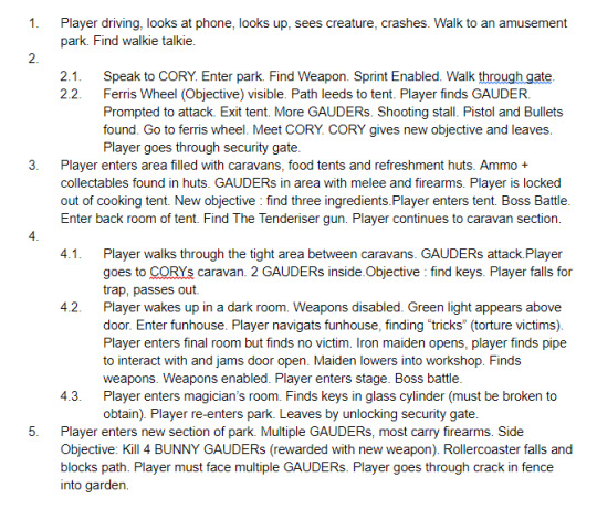
For our first sprint my first priority was to get the whole team on the same page on what the experience of our game is. To assist with that I created a game outline of the first five acts. This is more than we plan to make for our project but eventually we hope to complete all 8 acts. This outline simply highlights the key game play moments without the narrative.
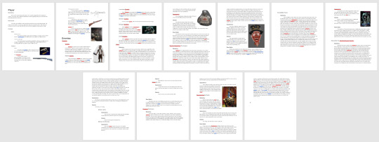
To expand on this document I put together a sheet that shows each weapon (including real world reference, damage and details), character and enemy. For the enemies I included their background and attacks.
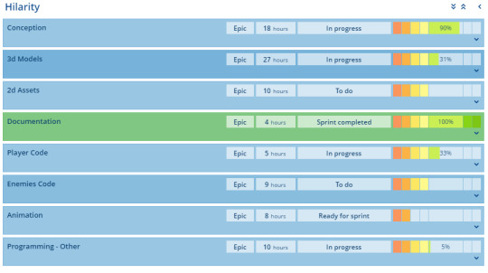
I also created a Scrumwise to help organise the team and maintain an Agile methodology. This is software we have used countless times and each time it has proven to greatly improve productivity within the team.
Finally to allow members to collaborate easily from home I set up a discord server.
0 notes
Text
Hilarity
Continuing with the same team as previous projects, we have decided to create a first person horror game. This blog will now follow my part of the development of this game as Co-Project Manager.
0 notes
Text
Week 12
During the final week of this module I created the opening cut scene for our game using the assets that josh made. I put the pieces together in Photoshop and used the animate feature to create the video. Eventually this will be put together in unity and have a parallax effect.

I also completed the Game Design Document for our game.

0 notes
Text
Week 11
This week was spent working with my group on the improvements we needed that we discovered through play testing. As jumping was an issue I created a script that could be added to the player that would improve the jump. This worked by setting the initial jump height to be reached only when the jump button is held. If the button was released before the maximum height is reached the gravity on the player is increased so it returns to the ground. This allows the player to have more control on their jump height.

I have also began working on the Game Design Document for my group. For this I have highlighted the key aspects for our game and the design process. This will be used to mark out game and would be used to show developers, publishers or investors what our game is at its core without having a finished product.

0 notes
Text
Week 10
This week we conducted internal testing for our games. To make the most of this I created a document for each test participant.
This document was vital for the testing process as it collected data about the participant, information about where they struggled in the level and their thoughts and feedback on the level.


From this testing it is evident that the two big things we need to work on are the jumping mechanics and making sure the obstacles stand out from the background.
0 notes
Text
Week 9
In our lecture this week we showcased our prototype game to our lecturer. He pointed out that the strong points of our prototype so far are the game play, level design and aesthetics. Some things we need to work on are pacing in the levels, adding checkpoints to difficult sections and overall polish. As a group we decided the next step was to implement a menu system, more detailed animations and a cut scene to establish the narrative. I set myself the task of creating a storyboard for the cut scene so that the artists could create assets that myself and the programmers could put into unity.
The scene begins with a shot of the moon shining light through a skylight. The purpose of this shot is to show the player the setting and time that the game is set in and to establish mood. The shot then changes to an overhead view of a walkway along side a vat of molten wotsits bubbling away. This further establishes the location as well as highlights a key part of both the story and the game itself. The janitor’s boot is then shown stepping in front of the camera in a side on view. This is the first time the player is introduced to the janitor character, who is the first boss that the player faces later on in the game. The camera then zooms out and shows the janitor pushing the cart, with the camera tightly fixed on the cart. This look will be achieved by simply animating the floor and keeping the cart stationary. The cart is then shown in an overhead view with the cleaning products rattling around within. Follows is a letterbox view of the janitor’s eyes which are notably tired. This is to make the player understand the janitor’s mental state and understand why he may make mistakes.

The janitor is then shown taking a swig from his hip flask, with his arm swinging by his side. This is to further build the character and once again make the player realise he may not be good at his job or may be prone to mistakes due to his mental state. We then see the world through the eyes of the janitor as he notices a stain on the walkway and the camera zooms in on the stain to show his focus. The janitor then reaches into his cart to retrieve a cloth, shown with an overhead view. When raising back up he knocks a bottle of glowing green cleaning liquid over the side of the walkway and it falls into the vat. The liquid is then shown sinking into the vat and it begins to bubble.

The janitor then runs back the way he came, looking very worried. We end he cutscene with a letterbox view of the vat as it begins to settle and the hand of the character reaches out (think terminator 2). The game then begins with Puffy emerging from the vat.

I also created some sounds for my game using household items which i planned to make sound retro using a computer. However I was robbed and the sounds were on the device which was taken. Due to this we will be sourcing our sounds from the internet.
2 notes
·
View notes
Text
Week 8
We were off for Easter this week so did not have a lecture or workshop. I used the time to work out and design a second level for our game. The main focus on this level was to introduce players to the power up mechanics. The power up in this level was the fire power as it was the power we believe will be easiest for new players to understand and the most visually appealing.
The player starts off at the bottom of the ladder that they ended the first level with. This illustrates to the player that they are traversing the floors of the factory, starting at the top and working their way down. It also shows players that each level is connected. Puffy must then time their movement to avoid a swinging obstacle. This is the first of many clues that show how haphazard the factory was built with no care for safety. After avoiding this and jumping over some crates to gain elevation the player must time their jumps to get through a rather difficult section of the factory what transports crates and ingredients. The unnecessary complexity of simple tasks such as transporting crates was influenced by the transportation of the weighted cubes and parts in the Portal games, as well as the packaging and unpackaging of the turrets in the sequel. As well as timing the jumps through the crates like in the first level the player has the additional obstacle of moving the platforms which increase the difficulty of timing the jumps and waiting for the perfect window.

The next moving platform the player jumps onto breaks and falls down, breaking a gas pipe. Out of this pipe comes a fireball (identical to the ones the player will be able to throw once they have the power up) which bounces off the floor and kills a nearby rat. This is to show the player the shooting mechanic and that enemies can be killed and not just avoided. Puffy then must jump up some crates, avoiding raising crushers.
The next section, which will most likely start with a checkpoint depending on testing, involves conveyor belts, crushers and pipes. Players will most likely spend a little while on this section so I have placed posters here for the power ups which will hint at what they will do and give context to them within the narrative. The player must avoid the crushers while being moved in different directions by the conveyor belts and crouch under pipes. I think this will be a memorable point in our game.

After the difficult last section and hints at the power ups it is finally time for the player to get one for themselves. This section is quite empty with a light shining directly on the power up. This shows the player that this is to be collected. The long conveyor belt will build up the suspense for the player before the reveal. along this conveyor belt will be more posters.
After the player gets the power up they are faced with a rat that is blocking their path. Without killing the rat the player will be unable to progress. If in testing we see that players fail to realise this we will add a poster that tells the player which button to press to shoot the fire ball. The layer then must traverse some moving platforms whilst simultaneously killing enemies. This slow introduction to moving combat will be vital later on.

The next section of the level involves more timing obstacles with crushers. implemented correctly within unity this shouldn't be too difficult a section as long as the distances and timings are correct.
The final section on level 2 involves some more combat. Following this the player must pass through some flowing water to progress. The water washes off any power ups and this will be important for puzzles and sections later on in the game. The level, as always, ends with a ladder.

The second level of our game overall is to teach the player new mechanics, with fun little sections in between.
0 notes
Text
Week 7
This week we worked on designing a game interface, complete with interactive buttons and a parallax background. This was a challenge but with the help of Juan I was able to get my interface up and running.
For our project I created a paper prototype for our game. This included all the menus and a level selection screen that showcases the whole factory in which the game is set.


I also designed the first level of our game. I decided to design it in such a way that requires the player to figure out the mechanics for themselves rather than with a patronising tutorial. This was chosen to make the player feel accomplished for figuring it out for themselves.
It starts out with the player jumping off the start platform which is a long jump. This is to show the player that there is no fall damage. The player must then figure out the basic jump mechanics to get past a number of crates. The player is then faced with a pipe that is too tall to jump over. The player must crouch under the pipe to continue. The next section has no floor to walk on and a moving conveyor belt. This section comes just after the pipe so that the player has time to see two boxes be dropped onto the belt and be moved and understand the mechanic. One box is crushed by a crusher to show how that obstacle works and the other is moved onto a moving platform to similarly showcase the mechanic.

After traversing multiple platforms the player sees how the vats in the game are filled (with ingredients being dropped onto conveyor belts and dropped in. A rat is trying to get some cheese on the conveyor and is dropped into the vat. This is a comical introduction to the rat. The next section involves some challenging platforming and some crushers that the player was previously introduced to.

After having to time a jump between falling boxes you see a worker killing a rat and exiting the room. The rat is caught because it enters the worker’s cone of vision (flashlight) and this shows how the worker enemies work as they will play a big part later on into the game.The player must then crouch under a long pipe and climb over some more crates. Upon writing this post I have decided to move the worker/rat sequence to above the long pipe to give the player more of a chance to witness the whole encounter without having to focus on platforming.

The penultimate section has the player jumping over crates to avoid rats and roaches. Whilst jumping over the rat, an enemy the player has seen before, they have a chance to view a roach climbing over a crate. The player must then time their jump to avoid the roach. They must then climb a ladder to leave this section. The player then travels along a conveyor belt and is dropped into an empty room with nothing but a ladder and no way to go back (left). This shows the player that the ladder is the way to exit the level.

The levels in our game are going to include checkpoints but we are going to wait until we have chance to test the levels to see where they are needed. We are also considering including a hard mode that does not include checkpoints for advanced players.
0 notes
Text
Week 6
In this week’s session we worked on a 2D side scroller which had a shooting mechanic. This was a new concept for me as i had never worked with prefabs or projectiles. With the help of Juan i got my game to work however the collision detection wasn't quite working. To fix this we used raycasting to make the bullet detect the collision no matter which framerate the game was running in.
For the group project I created a script for the opening cutscene which provides the player with the backstory of our character and shows off the setting in more detail. I am going to create an animatic for this which will be used as a placeholder before a final animation is made.
Our artists put together a fantastic menu screen, complete with a pixelart logo.

0 notes