
Don't wanna be here? Send us removal request.
Statistics
We looked inside some of the posts by sammyhunterfmp and here's what we found interesting.
Average Info
Notes Per Post
0
Likes Per Post
0
Reblog Per Post
0
Reply Per Post
0
Time Between Posts
4 hours ago
Number of Posts By Type
Text
17
Last Seen Tumblr Blogs


Fun Fact
The Tumblr app for Google Glass was released on May 16, 2013.
Text
24/04
Outcomes - animation
Taking a break from generating ideas for poster designs and logos, I thought having a website for the installation to go along with promotional posters would match the modern style of advertising I wish to achieve in this project.
I will most likely have the website represented in a graphic mock-up, however, to include another form of artwork to my final outcomes, I thought I could create an animation that would be the loading screen to the website.
As loading screens are typically quite simple, I decided to only include two main elements in my animation: the maze design from my first failed poster designs to represent the exhibit, and the white rabbit head from my logo designs to travel around it.
The beginning of the animation process involved moving the rabbit head slightly, saving the file as an individual JPEG, and repeating until the rabbit head had navigated the entire maze and reached the centre. This was a long process and I ended up with over two hundred individual JPEGs to be used as the frames of my animation.
As well as the frames showing the rabbit head movement, I also included the rabbit head increasing in size and turning green to indicate the website has finished loading.

Once all the JPEG frames had been saved, I reloaded all of them into the Photoshop document as different layers. Next, I changed the workspace into Timeline so I could make the frame animation.


I changed Create Video Timeline into Create Frame Animation and selected Make Frames From Layers. All the layers were then made into frames and when played made the final animation.

As the end file was quite big, I had to render the animation as a gif to save it so that it could be pasted into other formats, such as in this post.

Overall, I believe the animation is smooth and appropriately simple to be used as a loading animation for a website.
0 notes
Text
22/04
Jodi - Outcomes - developing posters - patterns
Feeling slightly disheartened by my unsuccessful initial poster design, it was suggested that I make my illustrations into a pattern, much like on Coralie Bickford-Smith’s book cover designs.
I began the pattern process by using the Live Paint Bucket Tool in Illustrator to fill in my previously drawn Alice in Wonderland element illustrations. I chose colours for my illustrations that I believed would compliment each other when used in a similar compilation to Coralie Bickford-Smith’s style.


Once all the illustrations I wanted to use in the pattern were coloured, I needed to paste them into a square artboard so they would line up in the right format when the pattern is created. Keeping each design an even distance from one another as well as close to the edge of the artboard means the pattern will be repeated evenly.

I then selected all of the illustrations on the artboard using the Selection tool, went to Object, then Pattern and finally selected Make.

After making the pattern, I adjusted the composition of the design slightly in Pattern Options; I found putting the pattern into one of the Brick styles looked the best for what I was going for. Happy with the adjustments made, I named the pattern and clicked the Done button to the pattern would save into the colour swatches bar to be used.

On a new artboard, I drew a rectangle using the Rectangle Tool and filled it with the pattern I just made from the colour swatches palette.


I tried making different compilations of my original illustrations into patterns and experimented with the pattern scale to find what was aesthetically most successful.

Although this lesson taught me a very valuable skill that I will be sure to utilize in future projects and graphic design work, unfortunately, this style of repeating pattern does not match the modern, digital theme I wish to achieve in my final outcomes. Instead, I will focus back into the overlapping collage idea that has inspired me from my research.
Coralie Bickford-Smith works

0 notes
Text
21/04
Charlotte - Beginning outcomes: posters
As planned I began my initial poster designs by creating illustrations in Illustrator using the same techniques I did for my logos from elements directly taken from Alice’s Adventures in Wonderland; I drew four elements from each chapter


I decided at this moment that the installation I am promoting will be in the form of a maze. Instead of meticulously creating a maze by illustration, I found a circular maze generator to create a maze design.
Next, I pasted the maze into a Photoshop document to manipulate and add my illustrations to. Inspired by a clock face, I put guide lines into the document so I could line my illustrations up adjacent to the central maze design.

Unfortunately, I really disliked this idea, it wasn’t in the style I wanted my outcomes to take and I wasn’t sure how to add colours to the design.
RESEARCH - Pinterest patterns and screen prints
Once again, I went to Pinterest to find inspiration for my posters. I found a selection of works that reminded me of the overlapping colours I experimented with in the double exposure lesson, however these designs use flat coloured illustration that may work with the illustrations I made this lesson. I think creating a collage in this style would look really good as the central design to a poster.


0 notes
Text
Research - Dominic Murphy, Down the Rabbit Hole series

After researching Alice: Madness Returns I decided to try researching more disturbing adaptations of the Alice in Wonderland story for more inspiration.
Dominic Murphy created his ‘Down the Rabbit Hole’ inspired my Lewis Carroll’s Alice’s Adventures in Wonderland. What first drew me to Murphy’s work was the muted colour scheme with a particular use of blue and green washes that remind me water which is quite the difference from the typical high saturation of many artists adaptations of Alice in Wonderland.
The majority of Murphy’s pieces focus on the figure of Alice, often looking pale-faced, calm but unsettling. Murphy brings an eerie realism to his Alice in Wonderland illustrations that produces a an almost visceral response of discomfort in me. It is an interesting feeling that I am not used to while viewing artwork and I don’t think this style will work with the feeling I want to create in my final outcomes.
What I do gain as inspiration from Murphy’s illustrations is his ability to form very distinct shapes that are instantly recognisable from the Alice in Wonderland story, I aim to also produce very recognisable shapes and designs in my own work.
0 notes
Text
Research - Street Art Advertisements- KAWS
At this point in my project, I am considering the best way I can present my outcomes to a particular demographic. As I want my outcomes to have a very graphic and digital aesthetic to best represent the modern installation, I think directing my outcomes towards a young adult audience will make them the most effective.
Whenever visiting big, urban cities, every spare wall, sign post, or bin is covered in graffiti tags, posters and stickers. I can recognise designs repeated in different areas that get ingrained into my memory and street artist’s tag promoting themselves. I think this method would be a very effective way of promoting my installation advertisements to a young adult audience
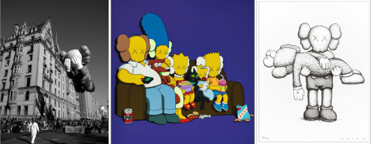
The artist KAWS has created an iconic, recognisable motif that can be transformed into different designs to promote himself. I believe if I use my logo design in a similar fashion, in many different forms, its design and and name of my project/installation would become as memorable.
0 notes
Text
15/04
Jodi - Developing logos with feedback
In this lesson I decided to continue developing my logo designs with feedback from multiple people.
The original designs in black and white were most liked because the green versions were not very striking so tried changing the colour of them to see if they still worked in different colours; the pink designs were better received.
It was also said that the font on the rabbit head’s ear was perhaps tool small so I tried enlarging it but I believe it distracted from the overall design.

It was then suggested to me to try writing the test on a circular path around the rabbit head designs. I think these gave my designs a more polished and professional style so I tried it in multiple colour however ultimately I believe it looks best in black. In future lessons I plan to develop on these designs further as I think another additional element would add more interest.


0 notes
Text
14/04
Charlotte - Beginning outcomes: Logos
I began the process of creating my logos by drawing a rabbit head to be the main feature of the motif. The white rabbit is the character that first lead Alice to Wonderland so using it almost as the mascot of the installation I am advertising. This is were I also decided to name my project ‘Follow The White Rabbit’ as it relate to the journey I wish the installation to take and overall the phrase is enticing enough to draw attention to my advertisement.


I used the paint brush tool to draw over a photo of a rabbit head so that the shape would be accurate. I adjusted the lines I drew using the selection tools and then drew an encompassing circle with the ellipse around the rabbit head design.
I downloaded the Couture font of off dafont.com to add the installation title to the logo.


Because the original font alone was admittedly quite boring, I decided to adjust it slightly using the warp tool

To save the adjusted font, I created outlines from it so it would be an image instead of text.


I began experimenting with fills and colours using the Live Paint Bucket Tool. With the suggestion from peer feedback, I tried moving the elements I drew and the text to create new, interesting compositions, I believe the design with the text in the ear is the most innovative and successful.
0 notes
Text
Research- Gina Kiel
Due to Alice in Wonderland’s historical association with drugs, I decided to research an artist whose works remind me of psychedelic artwork, similar to that of the 70′s where the art style was most popular, but modernised.

Gina Kiel is a New Zealand based artist whose work focuses on exploring human experiences with feminine imagery with bold flowing lines, minimal compositions and strong colour palettes.
I found Kiel’s way of producing liquid effect with linework very satisfying and aesthetically pleasing. Kiel’s very strict colour scheme with a lack of gradients very enjoyable and the style is something I would love to take influence from in my own artwork. I think creating a liquid effect with lines, or perhaps the liquify tool in Photoshop will link well to Alice in Wonderland due to the pool of tears and ‘drink me’ bottles in the novel.
0 notes
Text
Weeks 4+5 Evaluation
Over the fourth and fifth week of this project I began to create various outcomes in workshops so I could start brainstorming the options I have for final outcomes. Due to the research I conducted on the Alice: Madness Returns video game and advice from lecturers, I now know that I want to produce an advertisement scheme for an Alice in Wonderland themed interactive exhibit.
The workshops I found the most beneficial in the process of deciding what to include in my final outcomes were the typography lesson on 10/03 and the double exposure lesson on 18/03. The typography workshop was my first taste of creating my own unique typography and I believe something written in that style links well with the Alice in Wonderland theme as it is quite unconventional. From a graphic design point of view, I think this style of typography would work really well on a poster design. The double exposure lesson showed me that I visually appreciate the technique of overlaying different coloured layers in Photoshop to make a new colour where they overlap. This reminds me of what happens when working with screen prints. I plan to research this effect in screen prints and to push my final outcomes I will look into possibly producing my own screen print designs.
Over the next couple of weeks, I plan to start the the first stages of my final outcomes. I will begin by digitally illustrating elements from Alice’s Adventures in Wonderland and form some kind of design with them. Also, as I’m making an advertising scheme, I think creating a logo would be great to use as a motif on any possible outcomes or posters.
I will seek constant advice and guidance from lecturers as well as peer feedback so I know my designs with work in a commercial environment and will appeal to audiences.
0 notes
Text
Research - American McGee’s Alice: Madness Returns

American McGee’s Alice series (American McGee’s Alice and Alice: Madness Returns) is a horror, puzzle, level based video game. Inspired by Lewis Carroll’s novels, the Alice video game series follows the events of the sequel, Through the Looking-Glass.
Set in Victorian England, 1863, the game follows Alice Liddell who has mentally created the world of Wonderland to cope with the death of her family in a house fire of which she is the main suspect of.
The artwork of the second game and the especially dark and gruesome twist on the children’s book story is what drew to research the game for this project. The game follows the real life Alice as she receives psychological treatment in the orphanage she stays and her Wonderland.
Wonderland is split into the opening area and five main domains, in each domain Alice unlocks dresses and weapons.
Vale of Tears

Showing what has been typically has been seen in a lot of Alice in Wonderland adaptations, the Vale of Tears is full of greenery, flowers, mushrooms and is where the main controls of the game are demonstrated. Most similar to the original story, in the Vale of Tears, Alice meets the Cheshire Cat who gives advice and additional knowledge and after drinking purple liquid from a bottle, Alice is able to shrink and reach different areas of gameplay.
Hatter’s Domain

Here, following the original story of Alice and Wonderland, we are introduced to the domain of the Mad Hatter. Alice has to fight tea-inspired enemies and finds out more about the situation in Wonderland. I enjoy the refreshing change of aesthetics each domain brings to the game; The Hatter’s Domain is inspired by the steampunk art and fashion style.
Deluded Depths

The Deluded Depths is inspired by the Mock Turtle character from Carroll’s novel. The Mock Turtle guides Alice through the underwater world and her enemies consist of sea creatures and the ghost of sailors.
The Oriental Grove

Home of the Caterpillar now in chrysalis form, a staple character of guidance in the novel, The Oriental Grove features elements from various Asian cultures including paper fans and lanterns, script and cherry blossoms. The characters she meets here are origami ants and samurai wasp enemies.
Queensland

Also including imagery often associated with the Alice in Wonderland story, Queensland consists of playing card and red rose motifs as well as her enemies being playing card guards which is a direct reference to the playing card servants of the Queen of Hearts from Alice’s Adventures in Wonderland. What I believe to be the most striking and grisly element of this domain and perhaps the whole game in the castle seemingly made of flesh were the Red Queen resides. The Red Queen is a representation of Alice’s sister who she lost in the house fire that killed her family.
The Dollhouse

The final domain that Alice visits before returning to reality fully, The Dollhouse’ does not relate to Carroll’s novel. The Dollmaker is representative of Alice’s therapist from the orphanage, the dollhouse is a prison representing the orphanage and the deadly dolls Alice encounters as enemies represent the other children of the orphanage. I find this domain particularly disturbing because of the juxtaposition between the bright, childish colours and drawing and the overall grime and destruction.
The reason I enjoy this game so much is because of the completely unique and honestly unsettling story the creators extracted and adapted from a children’s book; I am inspired to read between the lines of the story and create my own impression of the story. Another factor from this story I appreciate is the world building that has been produced, following the events of the game and seeing the outlandish designs of each domain makes me wish I was experiencing it first hand. An interactive exhibit to experience Alice’s journey through Carroll’s novel would be amazing, but as I work in graphics, creating a full installation doesn’t appeal to me. However producing advertisement for an installation fits the brief I set for myself so I will create that for my final outcomes.
0 notes
Text
19/03
Sophie - Intaglio prints
Intaglio is a style of print that involves etching designs into Perspex plates or metal using an engraving tool. Printing ink can then be rubbed into the plate, getting stuck in the etchings leaving the rest of the plate clean, so only the design produces an impression when printed.

I began by choosing imagery straight from the descriptions of Alice’s Adventures in Wonderland. I tried both individual illustrations and a collage of elements so I would have various outcomes. I also tried to vary the marks I made of the Perspex, from spiral shading, cross hatching, line work and solid sections of etching as I knew variety would create interesting prints.
Once I had completed the etchings, I used the side of a ruler to paste printing ink all over the plate so it was fully pushed into all of the design. After applying the ink, I used cheese cloth swatches to further push the ink into the etchings and to wipe of the excess ink from the rest of the plate.
I then prepared cartridge paper by dampening it slightly so that the ink would successfully transfer onto it. Finally I layered felt (to protect my paper and the press) with my paper and plate into the rolling printing press and firmly pressed the ink onto the cartridge paper.


Following the printing process, I found my most successful and clean outcomes were the ones I made sure to apply the most ink into the etchings, while completely cleaning the rest of the plate. The designs with messier applications of ink also look nice, but weren’t quite the right look I was wanting to achieve this session.
Although I sure I don’t want to use these prints in my final outcomes, as I wan to to stick to a current, graphic theme that modernises the Alice in Wonderland story, these designs are still inspiring to my project. As well as in the other collage-based workshops, the way I overlapped and created a compilation of elements in my design really appeals to me and I am now sure on the fact I want to include some form of collage in my final design.
RESEARCH: Carrie Lingscheit

Carrie Lingscheit is an intaglio print artist. I believe Lingscheit’s work relates directly to my project as her imaginative designs are inspired how memories are often imperfect and her forms remind me of impossible dream-like scenes similar to that of the scenes in Alice’s Adventures in Wonderland. Lingscheit’s amazingly detailed designs and her spectacular way of creating smooth shading in such a difficult medium as intaglio etching is what initially drew me to her work.
I am fond of Lingscheit’s fairy-tale like style and the fantastical combinations of pattern, animals and the human form which remind me of Alice in Wonderland. Lingscheit’s work has inspired me to consider not just combining elements of design, but actually try to morph them with one another to produce something bizarre, similar to the visual descriptions in Carroll’s novel.
0 notes
Text
18/03
Jodi - Double Exposure workshop
In this lesson we explored and experimented with multiple Photoshop techniques to produce a set of double exposure inspired work.


To begin, I layered the two images (doll head and rabbit photograph) I wished to edit and create the double exposure effect with in Photoshop. Then I put a layer mask over each layer so I could edit the images separately.
I first went into layer style and adjusted the opacity of each layer until I was satisfied with the visibility of each image.

Next, I experimented with selective colour, removing two channels of colour (R-red, G-green or B-blue) showed the image in only in the remaining one. For example, I removed the channels G and B from the doll head image to leave it just in red and I removed the G and R from the rabbit image to show it in only blue.


After selecting the colours, I went back into the mask, adjusting the levels to add more contrast and the hue and saturation of each image until I was satisfied.


To add the spiral pattern overlay to the image, I went into Filter, Filter Gallery, selected the Halftone pattern and then changed the pattern type to circle.


For my other two outcomes, I deleted the background of the subject in each image before adjusting the colours, levels and saturation.
I began by selecting the Quick Selection Tool from the tool which opened the Select Subject and Select and Mask buttons. Clicking the select subject button creates a rough outline around the main subject of the layer’s image.

After the selection was made, I went into the Select and Mask feature which allowed me to further refine the the selection.

Using the Refine Edge Brush Tool, I was able to pick out certain details that the first selection did not include, especially around the hair. After I was happy with my final selection, I clicked the OK button to take me back to the layer.

Next, I inverted my selection so it was around the background of the image, deleted it, and then on a new layer, added a plain black fill.
I believe that this process was really effective and I enjoy how adjusting the opacity of the selective coloured layers when overlapped, creates a different colour, similar to coloured plastics or glass being overlapped.
I found that using the selective mask technique does not work successfully if the subject of the image doesn’t have a crisp edge, or the background of the image is too busy, this is evident in my last outcome of the falling girl double exposed with the book shelf. The falling girl image had many smaller elements around the edges and the effect works much with something solid, such as a portrait seen in my other outcome.
RESEARCH: THE MASHUP Ad campaign 2018

MASHUP is a female clothing brand, who in this campaign attempted to represent their different clothing styles with glitchy, colour selected photography.
I really enjoy the visuals, they give off a modern and even slightly futuristic feeling that reminds me of holograms. I really appreciate the bright, artificial colour palette that has been selected to offset the portraits; it is complimentary and instantly eye catching, which is something I always wish to achieve in my graphic based outcomes, especially ones for commercial use. The overall composition is also aesthetically pleasing, the pieces feel energetic and represent movement without being too busy as the appropriate negative pace has been left in on off white as not to be too stark or off putting. The subtle, yet still legible typography compliments the theme of the poster and doesn’t distract from the imagery.
If I was to return to the double exposure technique in the future, I will consider adding similar glitch effect shapes to my work as I like how it looks on these posters, and how it instantly gives a futuristic quality. What I have mainly gained from this research, and what I wish to carry on to my future outcomes is the appealing selection of colours that have been used as well as the central composition seen in THE MASHUP’s advertisement posters.
0 notes
Text
17/03
Charlotte - Typography Posters
In this lesson I really hit an artistic block, I tried to incorporate the work I created in the previous week into the typography but nothing really visually worked out.
I tried creating colour palettes taken directly from the illustration lesson but formatted in this style did not work as effectively and the cup shapes I created in halftone may have looked better in a different context but here they looked awful.

RESEARCH: Some posters found on Pinterest
To not waste this lesson completely, I spend the rest of the day on Pinterest looking how other artists have manipulated shape and typography to produce stunning posters. I especially enjoy how each poster has font as a different visual resource and not necessarily made the text immediately legible. As I am considering using type as a prominent feature in my final outcomes, this research will become more useful later in my project.


0 notes
Text
Research - @lemon_zhaoxiaoli

Inspired by the more playful feeling that I received from Alice’s Adventures in Wonderland and the direction my in lesson work has taken, I decided to research this concept further with an artist who’s work reminds me of dreams and fairy tales.
Lemon_Zhaoxiaoli is the Instagram handle of this stunning Beijing-based painter who along side her picturesque paintings, posts videos of her chaotic painting process. ZhaoXiaoli uses unconventional materials and tools to create her masterpieces; she takes decarded surfaces such and doors and windows, cleans them, throws on multiple paint colours at a time and mixes using her hands and sometimes even flower bouquets.
ZhaoXiaoli’s art style most appeals to me as it reminds me of a modern take on traditional painting styles, she takes inspiration directly from her environment to make beautifully intricate compositions of predominately female faces, florals and small animals (which reminds me a lot of the visuals described in Alice’s Adventures in Wonderland)
Zhaoxiaoli paint in a way that suits her, without concern for surroundings as she wishes to create captivating visuals, this inspires me to take risks in my own creative processes.
0 notes
Text
12/03
Sophie - View finder illustrations
This session I tried focusing on line work by cutting a square out of some card, holding it somewhere in the room and drawing the lines and patterns I saw.
I used fine liners, markers, pencils and highlighters to try add as my line weight variation inspired by the works of Lucinda Rogers as well as add a splash of complementary colours.
Although I currently don’t know how to incorporate what I learnt in this lesson into my digital outcome, I still value this session as it refreshed my mark making and illustration skills as well as being the first time I used my own chosen colour palette during this project.

RESEARCH: Lucinda Rogers

Lucinda Rogers is a London-based illustrator who works directly from life to produce her busy drawings. I really enjoy how Rogers capture perspective and movement in her line work, her particular use of colour also really visually appeals to me. The part of Roger’s work that most inspired me was her variation of line weight; it adds so much more interest to the illustrations as the eye is effectively drawn around the whole image.
0 notes
Text
11/03
Jodi - Digital Collages
In this lesson I produced two collages inspired by the whimsical feeling of Alice in Wonderland including a colour scheme inspired by the 1950′s referencing the 1951 Disney film adaptation of Alice in Wonderland.

I began by collecting various imagery that is described in Alice’s Adventure in Wonderland off of pexels.com.
I selected certain parts of the pictures by either using the quick selection tool or by carefully tracing them out using the polygonal lasso tool so that they could be used more effectively in the collages compilation.
I also used the elliptical marquee tool to take circular sections of some images and the ellipse tool to draw a complimentary blue circle partially inspired by the collages of Cristiana Couceiro.
To give the collage more depth, I tried playing with other features such as inverting the pocket watch circle and adjusting the opacity on some of the objects.


In this collage I used the same techniques of using the quick selection tool to pick out certain areas of the woman and flowers, inspired by the works of Ben Giles, but I also adjusted the hue and saturation to give an overall warmer aesthetic to the collage.


To create the 50′s inspired polka dot background, I drew a rectangle using the rectangle tool and then on the same layer, I drew over it with a small halftone brush in white. These backgrounds were also partially inspired by the works of Cristiana Couceiro.
RESEARCH: Ben Giles

Ben Giles is a British collage artist who works physically, manipulating photography by hand to produce large floral arrangements. I was inspired by his work as I enjoy how he combines the human form with flowers and how it appears that his collages are growing as you look at them. I tried to imitate a similar feeling in my second collage and the outcome was very visually appealing whilst having an odd and almost creepy undertone as the growth of plants from humans is unnatural.
Cristiana Couceiro

I really enjoy the collages of Portuguese artist, Cristiana Couceiro. The colour palettes are always aesthetically pleasing and with the addition of greyscale photography and lively compositions, they are visually stimulating. I tried to use colours inspired by Couceiro’s work but if I had considered it more, I would have tried to make my compilations more interesting like hers.
0 notes
Text
10/03
Charlotte - Typography Workshop
In this lesson I produced typography inspired by Alice’s Adventures in Wonderland using the type_builder Illustrator pack.


Overall, creating these outcomes was quite a simple process but I really enjoy how easily it is to produce totally unique typography just from a selection of shapes.
For each letter I copy and pasted a selection of the shapes seen below and overlapped and compounded them to make the final letter shape.
In my final outcomes I also played abound with colours, the fills and outlines of the shapes using the corresponding tools on Illustrator. I believe my final coloured outcome was very successful, the combination of shapes and colours is very pleasing and the edition of the daisy makes it even more pleasant to look at and links even more to the story of Alice in Wonderland.


The incentive of type_builder was to have students and artists spread more joy during the dark times of the pandemic by creating positive messages with is this typography pack.
This lesson showed me such an innovative way to use typography instead of just using premade ones, I will definitely be using this technique in future outcomes and projects.
0 notes