My art blog, mostly cetacean art Main: @cubooseAnticap blog: @saddlepatchkid
Don't wanna be here? Send us removal request.
Photo
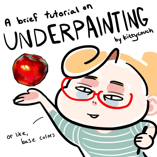
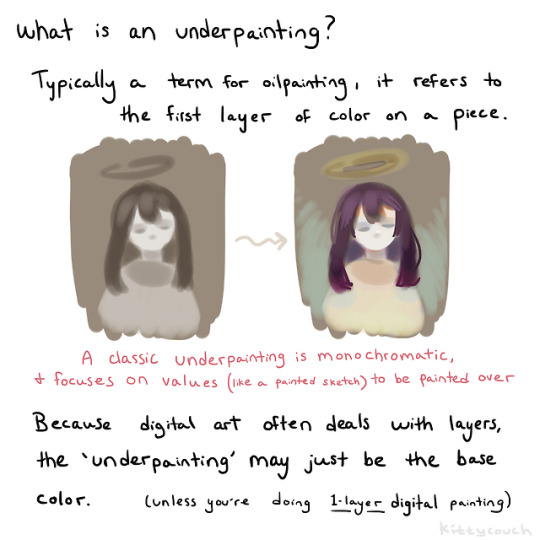
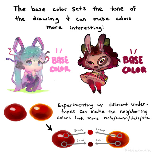
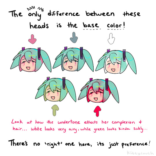
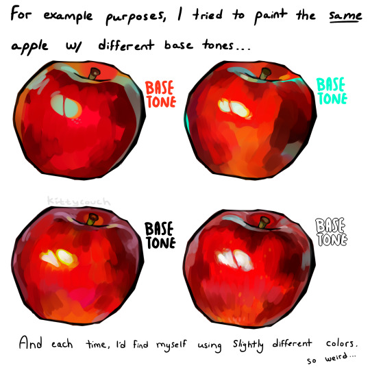
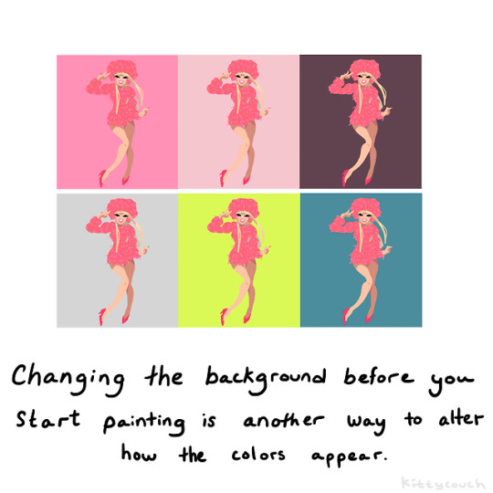
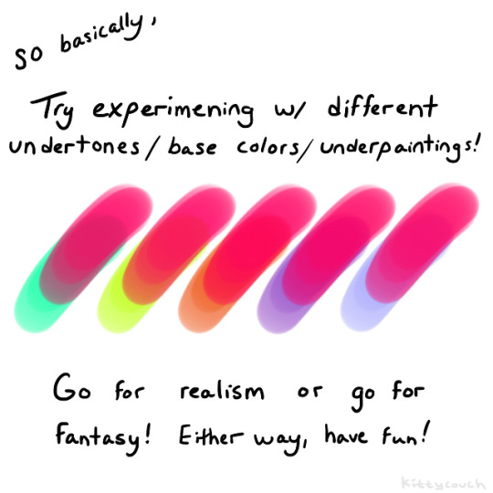
No one asked but here’s a brief tutorial on digital underpainting and how it can add some extra flavor to your art!
(I got asked this a couple times so just to clarify: I used “overlay” in the second slide… but the rest of these examples are JUST painted on, no effects! Try playing with the opacity on your pencil/water/brush tool to allow the base color to show through!)
52K notes
·
View notes
Text
HEY THIS IS IMPORTANT whats your favorite place to find drawing references?
213K notes
·
View notes
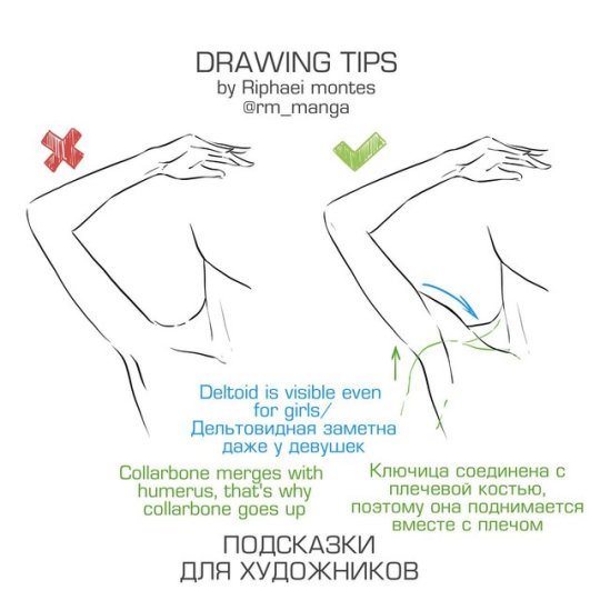
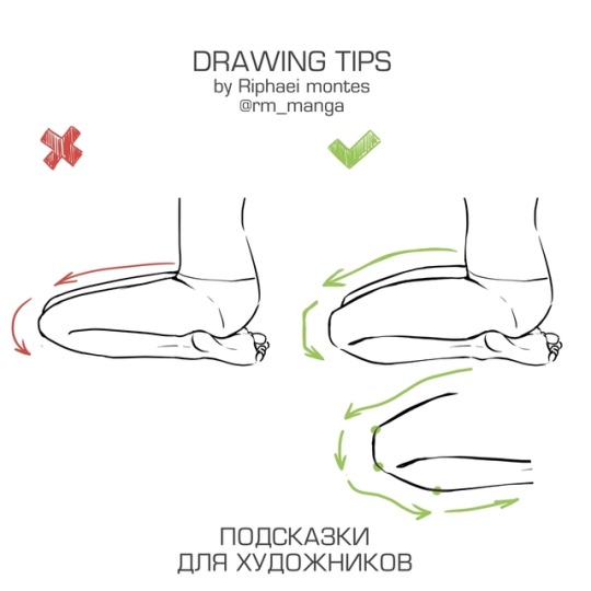
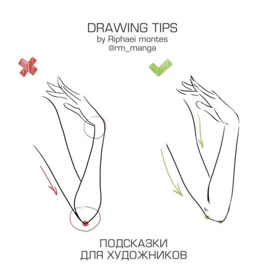
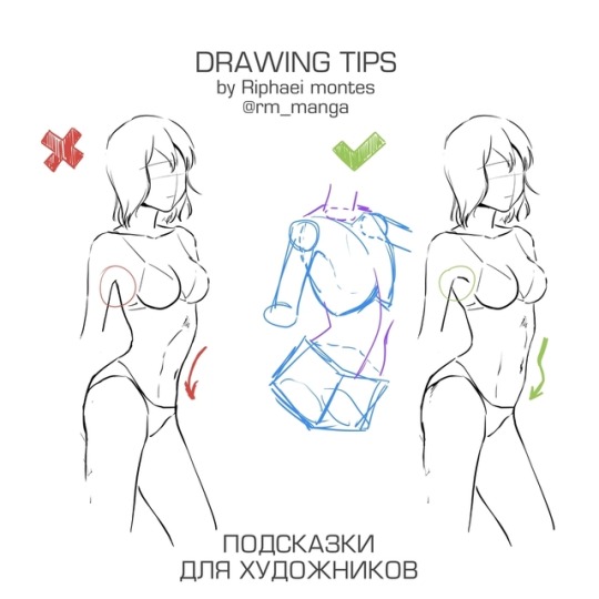
Photo
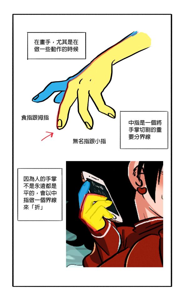
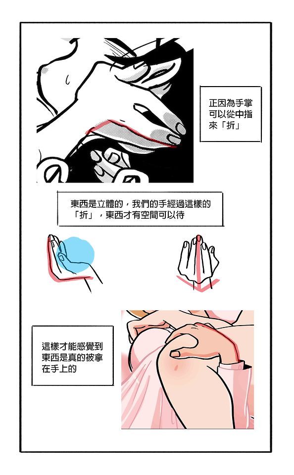
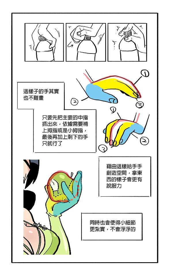
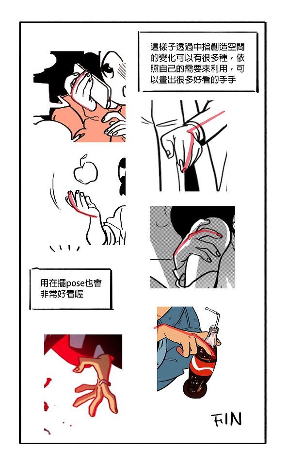
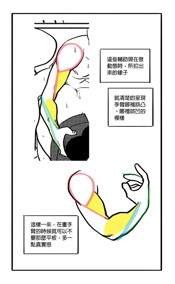
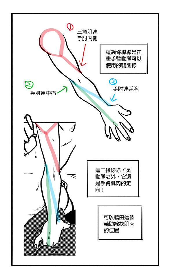
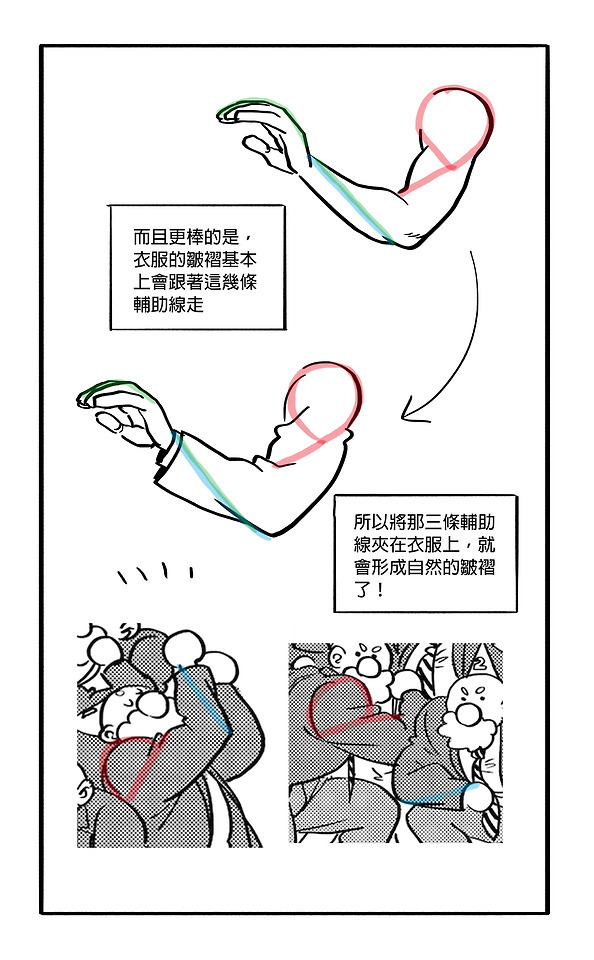
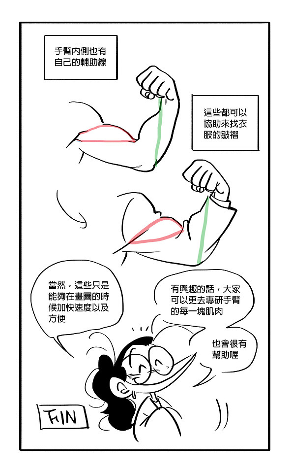
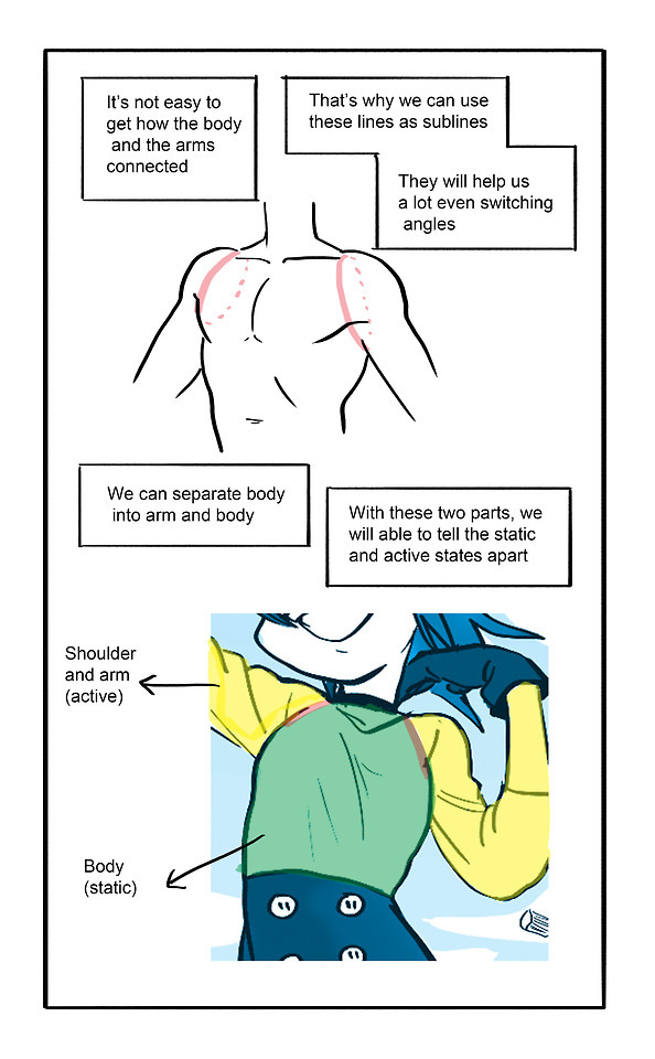
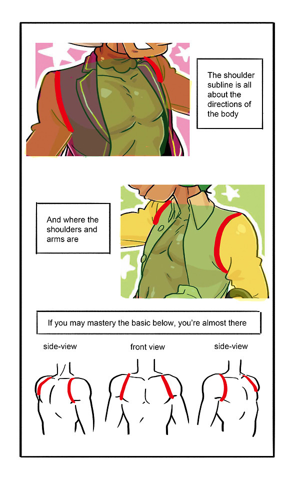
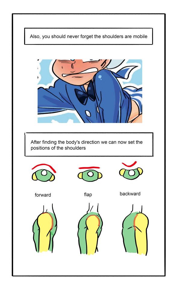
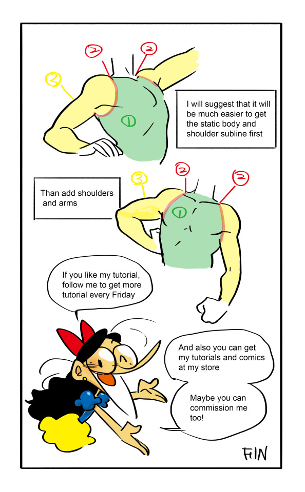


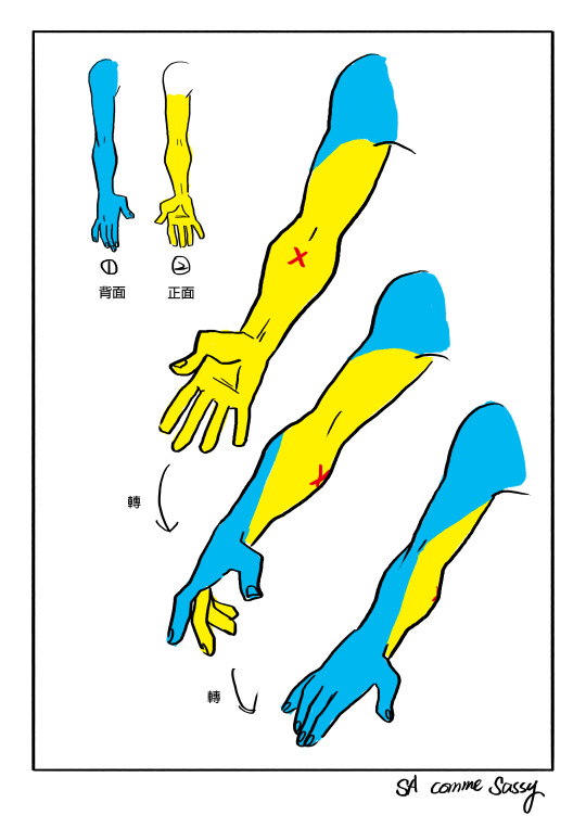
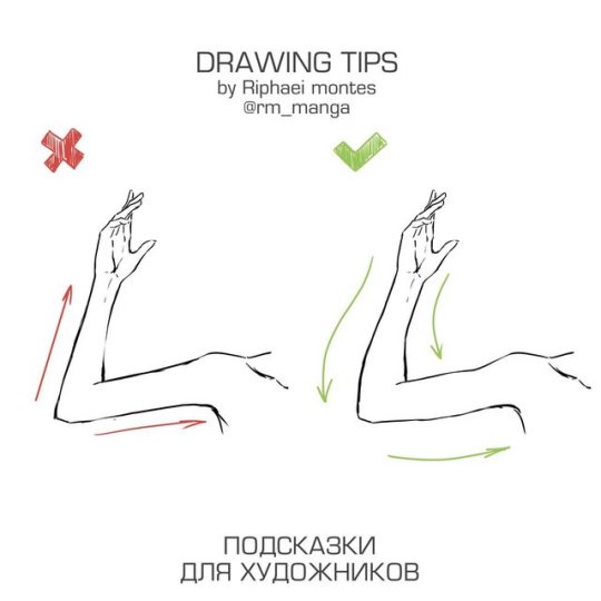
Found some hands tutorial by me
Not in English but hope it will help???????
146K notes
·
View notes
Text
I had a couple people asking me about mouth charts, so here goes. I want to preface this by saying that as with everything in art, there isn’t really a “right way” to do them, there are just things that work and things that don’t, and it’s important to understand why the things that work do and why the things that don’t… don’t. Personally, I find it extremely distracting when the teeth pop on and off and create a strobing effect like this;

Again, there isn’t a “right” way to do mouth charts (because some of the best comic effects come from really goofy, unrealistic, or overly detailed mouths) but if I had to guess I would assume this style of mouths came from thinking of the characters as static illustrations before considering what they would look like animated. When you look at a Family guy illustration (such as the ones used in marketing and merchandising), they don’t put any teeth in the mouths

So (and again, this is just an assumption) I think what happened was they decided they liked the imagery of smiling toothless Peter and decided to preserve it by only adding teeth when absolutely necessary. Unfortunately, that makes for distracting speech animation. They probably don’t think many people care that much (which I’m sure they don’t) and have decided it’s more important to make sure he looks as much like the stationary model they decided they liked as possible at all times (this is also the reason you don’t see the same deformation and antics that you used to in shows like the Simpsons).
I think the thing to remember about teeth is that only the lower ones will (realistically) move in your skull. Obviously cartoons aren’t bound to realism and there are plenty of situations where you could throw that rule out the window, but for the sake of learning the rules before you break them; Upper Teeth Are Rooted In Place.

(these are kind of scribbly but I guess they communicate the point)

People have all sorts of different mouths, some people primarily show their upper teeth, some people primarily show their lower teeth, some people are really toothy and show both sets, some are really tight-lipped and you almost never see their teeth at all (there’s a great bit on this in the Animator’s Survival Kit by Richard Williams), but the difference will always be in how the skin wraps around the skull. The lower jaw moves independently of the skull, fleshy parts of the mouth can move independently of the skull and lower jaw alike, but the upper teeth remain anchored.
There are a lot of different ways you can go about doing a basic mouth chart for a character. Almost any animation book worth it’s salt will outline the shapes you’ll need to start with (like this page from Preston Blair)

I’ve worked on shows that had cycles of everything from ten (the absolute minimum that will hit all the phonemes) to twenty mouths for each emotion. Here’s a (somewhat lopsided) chart I made for Blue with 36 frames (18 happy, 18 sad/neutral)

You can get by with one mouth per phoneme, but you can run into problems easing in and out of vowels that way (for example the “sh” that leads into “shoot” is not the same shape as the “sh” that leads into “sheet”) I usually figure out my chosen pallet of mouth shapes, so to speak, like this;

INB just indicates where I would add mouths to ease from one shape into another, how many you add depends on how smooth you want it to be. It gives you something a little like this;

I just kind of slapped this together in an hour or two a while back to test out the mouth, but it looks a little like this when you actually use it to animate with

Again, I cannot stress enough that these are not hard and fast rules and there are as many ways to animate a mouth moving as there are animators to draw them, but this seems to be a decent way to go about getting a solid selection to use for casual conversation that doesn’t pop and strobe.
5K notes
·
View notes
Photo
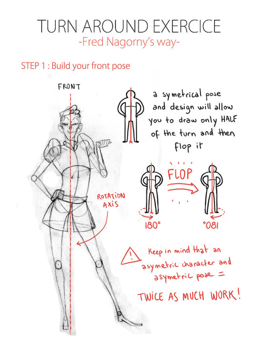
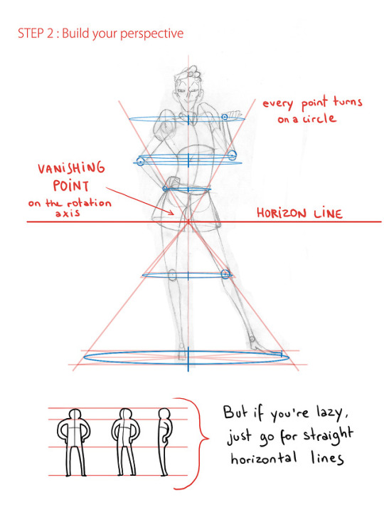
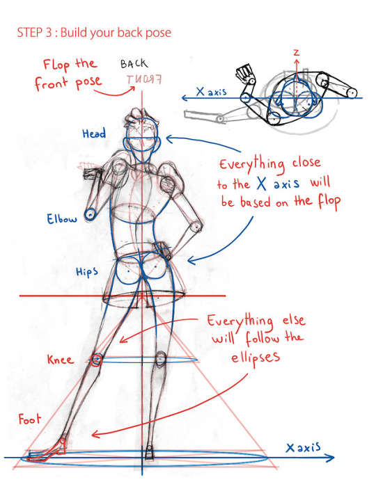
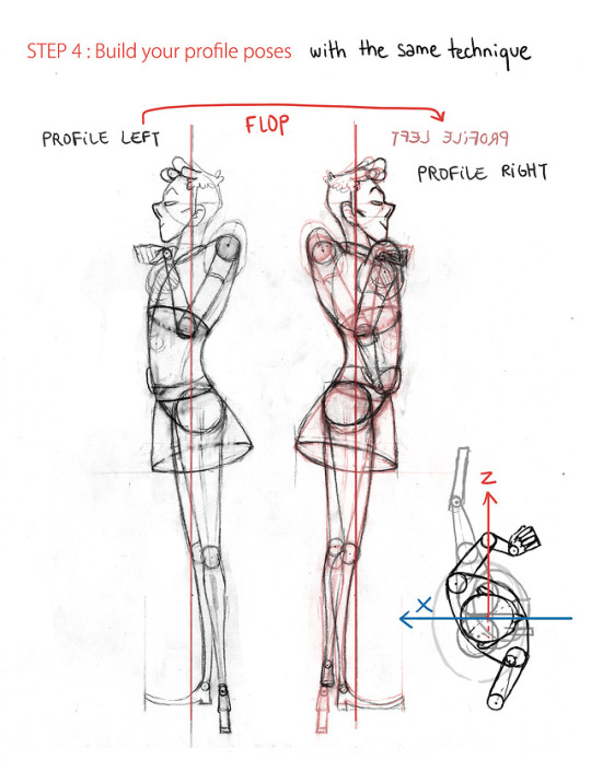
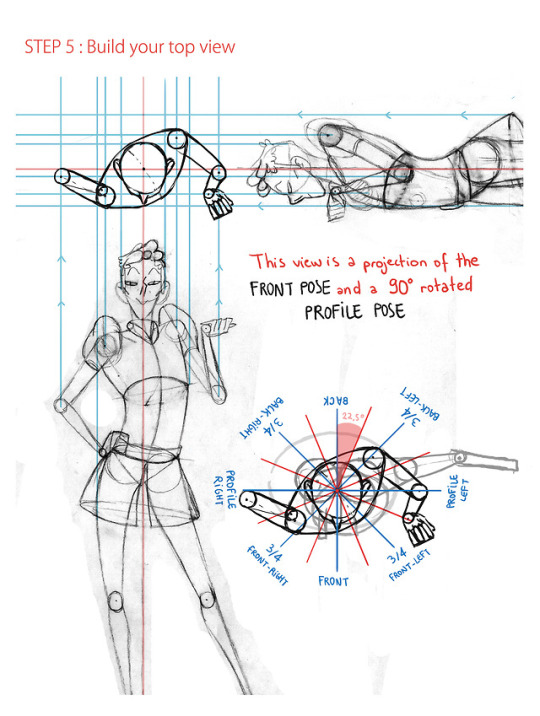
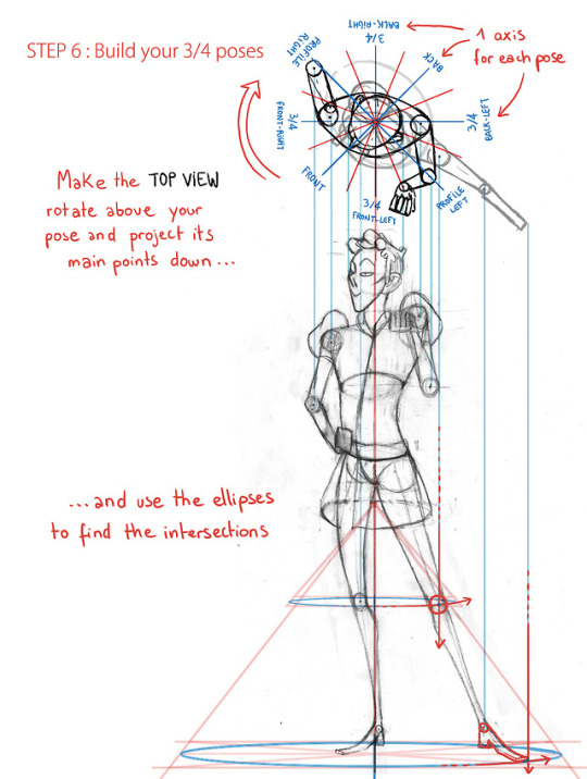
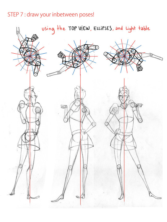
Halo! A friend of mine asked me to teach him the Gobelins’ way to animate a turn around, so I drew this tutorial. I thought maybe you guys might be interested too c:
22K notes
·
View notes
Note
Hello! :D Do you have any advice on drawing creatures at different angles? I struggle a lot with coming up with a pose and trying to draw it at another angle, and in your work your anatomy, shading/lighting, proportions and foreshortening are always just so perfect ;w; In particular Tau’s reference sheet, those greyscale headshots of him are so incredible that they look like 3D models :’) Thank you for your time!
*starts sweating*
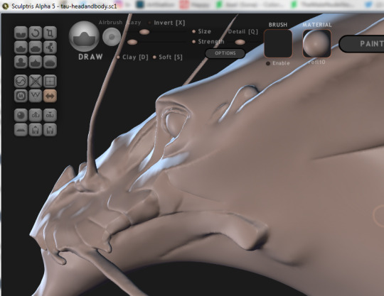
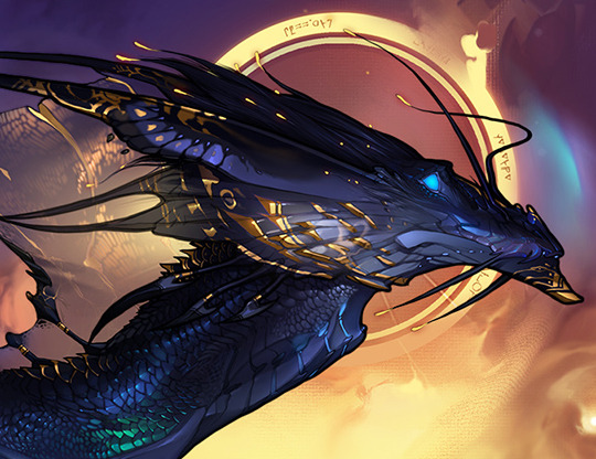
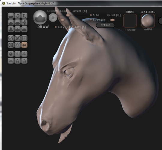
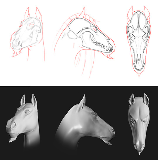
make a 3D model
When i know that i’m looking at a figure or an environment that i will draw a lot more and very regularly in the future, i make a 3D model.
But most of the time i don’t use the model. It’s best to use it in specific situations, like when you are trying to get the hang of the design (the end goal of that is being able to draw it from memory alone with ease). Or when you make a reference sheet, because the accuracy should be top notch there. Just sculpting a model of it alone helps, because the knowledge you gain from sculpting the design will carry over to 2D, whether you like it or not, you really have no say in it, fortunately. :p
draw, fail, delete, draw, fail, delete, draw, fail, delete, until success
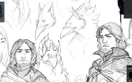
In contrast with that, i don’t have a model for most of my designs, including these two. Most of the time what i like to do i’d call “brute-forcing” accuracy. That is… drawing it and deleting it over and over and over again, without help, until it looks right. I like to think of it as making my brain’s 3D software stronger.
observe & learn & memorize & draw relevant real life things
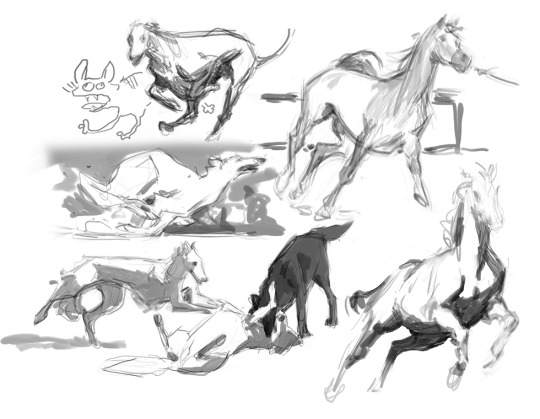
Drawing from life/photo is to train your brain software too. You basically suggest to it, for example “this shading is correct in these lighting conditions on this material, code it into System32”. By this, while drawing from memory/imagination, you relegated the task of accurate shading to your subconscious and you can spend your active concentration on better things.
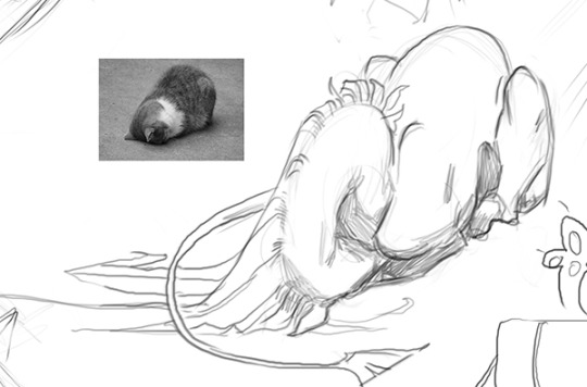
(this example image is more like a joke, but if i ever draw Pegasus in a catbread pose again, i will have a better idea of what to do and what not to do - and i will certainly not be drawing him like this next time i use this pose)
construct and transform the figure using basic shapes
You can also use that tecnique everyone keeps recommending for everything that is basically “break the figure down into simple shapes like cylinders, orbs, cones, squares, etc and transform those shapes”. E.g.: don’t think of it as a bird’s wing, think of it as a sheet of paper. If the base shape looks ok after you draw it from a different angle, it will also look ok after you put the details back on it. Probably. Art is an art, not a science. The reason everybody keeps recommending this technique is because it’s really effective, when done right.
https://en.wikipedia.org/wiki/Perspective_(graphical) - and train your brain to make use of this thing too.
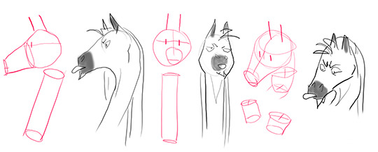
(like this but with more effort)
get intimately familiar with your design
Practice/repetition/familiarity can’t (or maybe shouldn’t) be skipped, needless to say. If you already drew pigeon wings 4999 different ways, the 5000th will not be as hard to draw as if you have only drawn pigeon wings 50 times before.
Also pays off to get familiar with your creature’s range of motions, behaviors, relative sizes of bodyparts, etc. Every new pose and angle for every different design you draw is more or less like uncharted land.
if it looks wrong, it isn’t necessarily wrong
Maybe this is a very niche scenario, i don’t know, but sometimes when one design looks terrible/wrong from another angle it’s because that is how it looks from another angle. It tends to happen when i couldn’t predict that the design will not look good from any other angle, or when my brain gets stuck on a belief (e.g. when i was like 8, i thought that bones can’t have a bent shape because they are rigid so if they bent they would break. I drew very… very straight limbs for a while). This is another reason for me to make a 3D model. It’s good for troubleshooting.
embrace the struggle
“I struggle a lot with coming up with a pose and trying to draw it at another angle” is how i feel too. More often than not. If you want to be varied and draw many kinds of Things, new things all the time, struggle will be riding shotgun in your car forever. Name your struggle. I’ll name mine Bob. Bob might be a douche canoe, but he is my douche canoe. Life is never dull when Bob’s around. I hope these tips will make your Bob more fun too.
4K notes
·
View notes
Note
How do you manage to do poses? I can’t draw poses for shit without a reference.
Dude, you think I don’t use references?
Reference is one of the most valuable tools you can use as an artist.
My biggest tip for drawing poses is never forsake the time to look up reference. Even if it doesn’t turn out 100% like you wanted, you taking the time to study WILL come in handy and will make a difference in your art. The only time I don’t end up using reference is because I have a pretty clear idea in my head of what I want to draw–usually thanks to having used reference to draw something similar at some point in time LOL.
Don’t forget to just take time to just doodle poses for practice. Posemaniacs is a great resource for practicing full body poses. When I’m in a mood, I’ll do a warm up sketch or two, and then dive into doing a bunch of short 60-90 second sketches. The time limit forces you to stop worrying about accuracy so much and focus on getting the general flow and feel of the pose down.
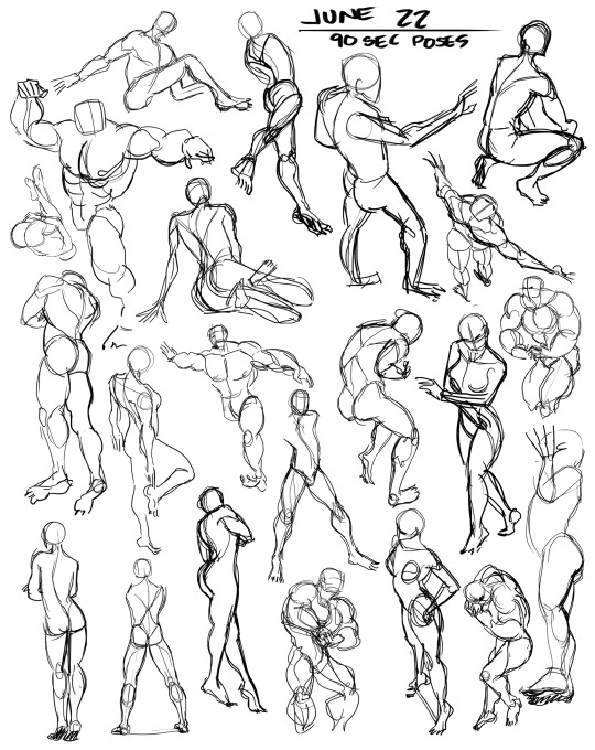
148 notes
·
View notes
Photo


☆ a long time ago someone asked me for a tutorial on how I draw cats, so here it is. “How to Draw a Cat: By someone that is not qualified to teach you how to draw a cat.”
[art commissions / portfolio @ god-bird.com] do not repost my artwork or remove my comments.
2K notes
·
View notes
Text
fellow artists,
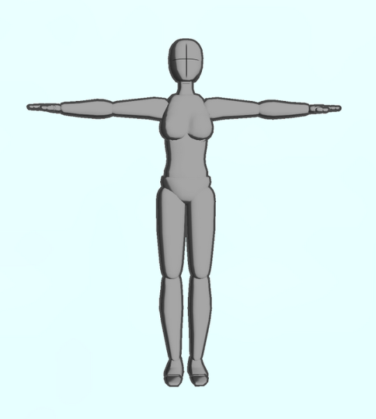
if you have an ipod or iphone or ipad or whatever then Please download the app “Make a Pose”
it gives you a lil figure like this
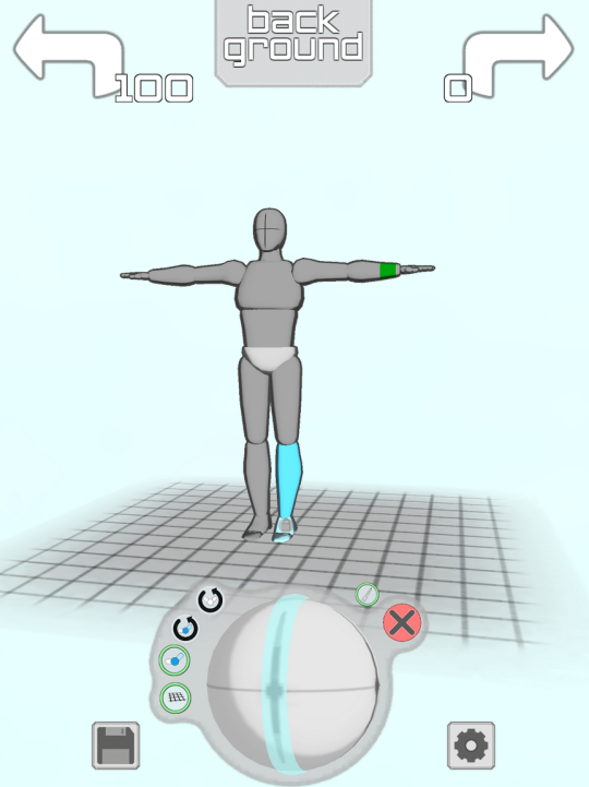
and you can make them do whatever you want!! Like

Took me about 1.4 minutes to make this sad little guy it’s Really easy to get the hang of

they Happy
you can change the camera angle so easy too so you can get perspective + foreshortening reference
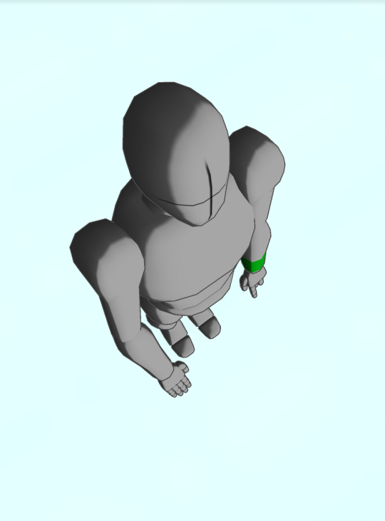
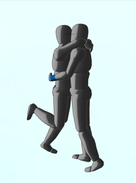
THIS IS ALL FREE TOO but if you pay $2 you unlock the ability to have two figures onscreen at the same time so you can make COUPLE POSES

AND YOU CAN CHANGE THE LIGHTING,
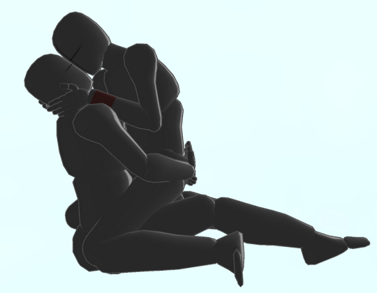
you can also make rooms and place some objects or characters like so:

YOU WANT A CHARACTER W/ A BIGGER CHEST? HERE THEY ARE
YOU WANT A FRICKIN HORSE?

NEIGH NEIGH MOTHER FUCKER
ANYWAY YOU CAN PAY ABSOLUTELY $0 TO GET THE APP WITH THE ABILITY TO POSE ONE FIGURE AT A TIME AND IF YOU PAY $2 YOU GET TO PUT UP TO 6 CHARACTERS ON THE SCREEN AT ONCE AND YOU ALSO GET A GOTDAMN HORSE. again it is called “Make a Pose” and it’s for iphone or ipod touch or ipad and i cannot recommend it enough
75K notes
·
View notes
Photo
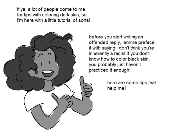
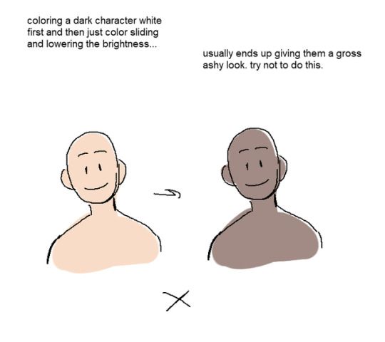

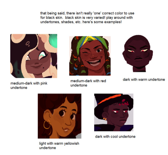

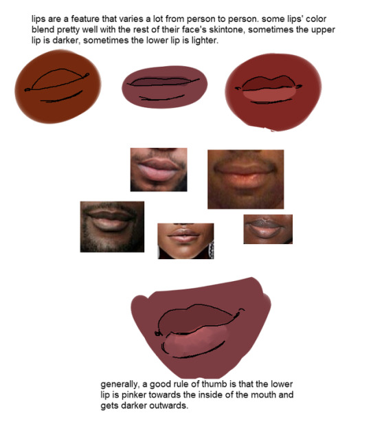
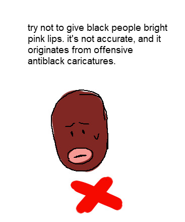
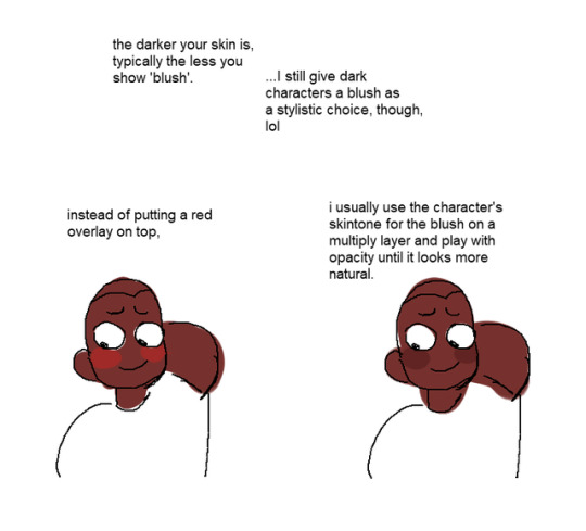
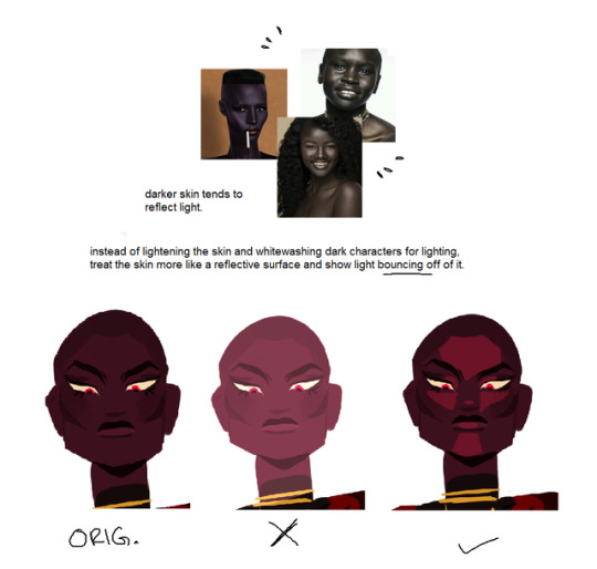


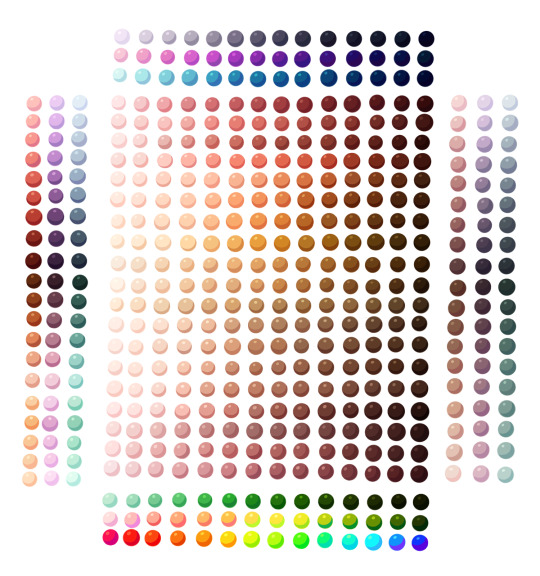
I get asked a lot for tips with coloring black people, so i put together a little tutorial! (and bumps my kofi if you found this helpful)
223K notes
·
View notes
Photo
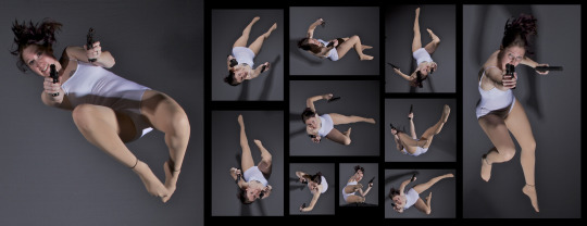
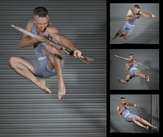
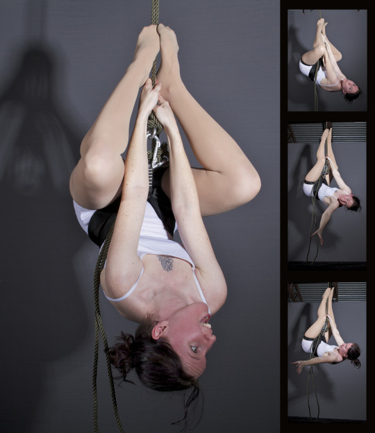
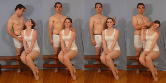
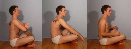
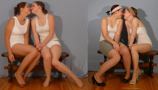
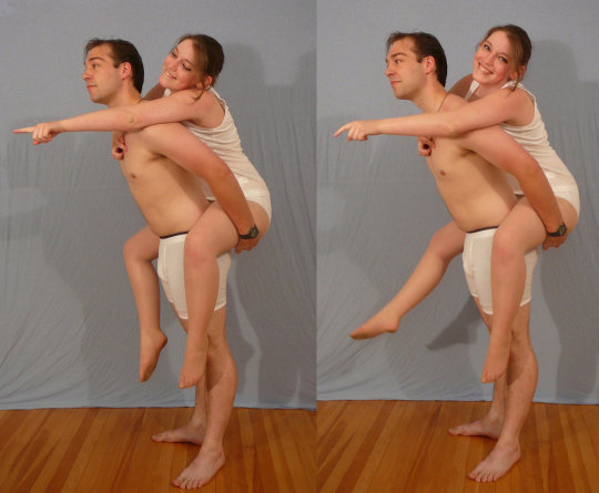
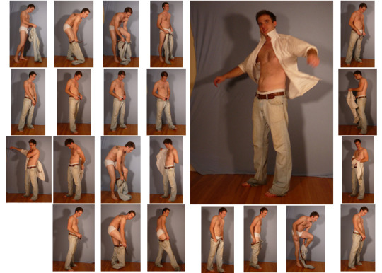
SenshiStock’s gallery consists of millions of pictures that are free to use as reference.
General Drawing Poses Sit and Kneel Dramatic and Reaching Drawing Poses Magic and Hogwarts Drawing Poses Staff Weapon Pose Reference Hammer, Axe and Bat Pose Reference Sword Weapon Drawing Reference Small Bladed Weapon Pose Reference Gun Weapon Pose Reference Bow and Arrow Archery Stock Foreshortening and Perspective Poses Dynamic Flying Falling Action Poses Deafeated or Laying Drawing Poses Magic Crystal Magical Girl Wand Weapon Transformations and Dance Cards Back Pose Reference Pin Up Inspired Poses for Drawing Performances Poses Life in General Poses Fights and Fighting Pose Reference Leaning Poses Classic Sailor Senshi Poses Wings Sailor Moon Villains Pairs Romance or Couples Pose Reference All the Male Stock Hanging Stock Drawing Reference Three or More Groups Instruments Mirrors Whip Technobabble
439K notes
·
View notes
