Don't wanna be here? Send us removal request.
Text
Research Post #6: Mariko Mori, 1994

Born in Tokyo in 1967, Mariko Mori would begin her career as a fashion model before pursuing art at Chelsea College in London. After finishing her education at a Whitney Museum of American Art's Independent Study Program in New York in 1993, Mori began working on some of her most iconic works. By 1994, Mori would produce pictures like Subway and Play With Me which portrayed her as a female cyborg wandering around the streets of Tokyo.
While initially starting off with just photography, Mori would utilize various types of techniques and media in her later works, such as video installations and panoramic photography. Mori's work is often compared to Cindy Sherman's work, as both model in photos which portray archetypal female roles in pop culture.

Focusing on just her earliest work from 1994, I find the correlations between Mori and Sherman's work interesting based on their topics of choice. Despite Hollywood and Noir films having a strong influence on American culture, it seems non existent nowadays when you consider Japan's influence on modern American culture. I don't think that makes much of a difference in the artist's messages, but I feel like Mori's work feels ahead of its time in ways that are both intentional and unintentional.

Within Mori's work, it 'feels' like there is a more ambiguity on if these photos are objectivications or celebrations of women in media. Compared to Sherman's Film Stills, it feels like there is more room for interpretation (although this is coming from someone with "American sensibilities"). Titles like Play With Me help convey these seemingly innocent yet perverted undertones; undertones which exist due to our modern culture being informed by representations in the media we consume. It's easy to view the 'cyborg' as a sexual object in nature when you consume media which reinforces women as sexual objects. With resources like social media, it's become more and more difficult to not live in a world of hypersexuality regardless of where you live. While Mori's initial work was likely a response to the sensibilities of Tokyo's environment, I find it interesting in how universal her work has seemingly become overtime despite having been created roughly 30 years ago.
References
https://www.guggenheim.org/artwork/artist/mariko-mori
https://smarthistory.org/mariko-mori-pure-land-2/
1 note
·
View note
Text
Research Post #5: Man Ray-O-Graphs

Born in 1890, Man Ray (Emmanual Radnitsky) is one of the most influential artists and photographers of the 20th century. Prior to his use of photography, Ray would create art in connection to the growing Dada movement which emerged after the first World War; themes of Dada art were intentional rebellions of modernity and the status quo (war, capitalism, industry, etc.). His work had an emphasis on playing with negative space and irregular object compositions. While Ray identified himself more as an artist than a photographer, this doesn't make his work with a camera any less notable.

When staying in Paris, Ray would begin to make his first 'rayographs'. Made without a camera, these rayographs involved a traditional photogram process of placing objects on photosensitized paper and exposing them to light to make negative images. Like in his paintings, the compositions were created through happenstance rather than intentionally, leading to a more abstract appearance. The images he produced were created during the heights of various artistic movements like Dada and Surrealism, leading them to be iconic symbols of 20th-century avant-garde art. While rayographs weren't a new concept at this time, Ray is credited with bringing back this technique in the age of modernity.
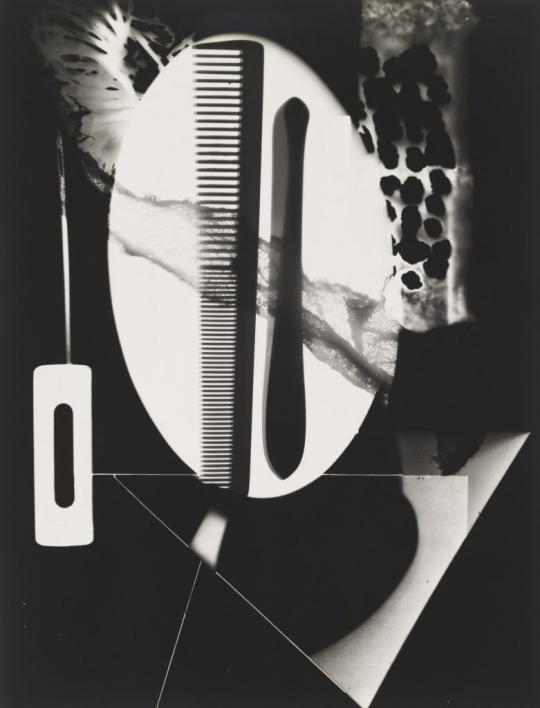
From the various rayographs that I've seen, I'm surprised at how strong and engaging many of the designs are to look at. There is a very dream-like quality to these images, and it feels like the objects in frame would start to break up or drift away if you lose focus of them. Even if Ray might've not known what the final result would look like, I believe there was still some amount of intention with the objects he chose, or atleast their general position. I would imagine he'd have a good eye on the placement of objects and from playing with negative space in much of his work.
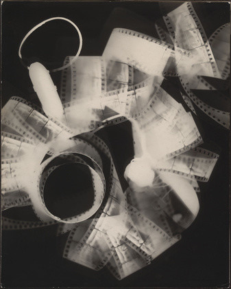
Just looking at the images makes me think that the process must be pretty fun itself. Various artists during this time seemed to have been inspired or incorporated the process into their work, and I can see why if you only need just a few resources. While that could be seen as detracting from rayographs as an art form due to its reproductive nature, I think the process especially at the time must've been a type of catalyst for helping artists look at things in new ways. Pretty appropriate that this movement of 'seeing things in new ways' was made accessible through a seemingly outdated process that was discovered almost a century prior.
References:
https://www.moma.org/artists/3716
https://www.metmuseum.org/art/collection/search/265487
https://arthistory.uchicago.edu/happenings/events/man-ray-and-rayograph#:~:text=soon%20as%20possible.-,This%20seminar%20concerns%20the%20rayograph%2C%20a%20type%20of%20photogram%20%E2%80%9Cinvented,Ray%20while%20living%20in%20Paris.
0 notes
Text
Research Post #4: Cindy Sherman

Cindy Sherman is one of the most influential photographers of modern artists of the 20th century. Born in 1954, Sherman grew up in New York where she graduated from SUNY in 1977 (where she majored in photography). That same year, she would begin her Untitled Film Stills series, her most popular work. This series includes over 170, 8x10in black-and-white photos that depict Sherman in stereotypical female roles vaguely based on contemporary media tropes such as the femme fatale in noir films. Sherman orchestrates everything within these works, as she is the photographer, makeup artist, and model for every photo in the series.

Much of subject surrounding Sherman's work involves these female representation, and some the dangerous side effects of stereotypes. Throughout the 20th century, Sherman would create photos with themes of disorders and bodily mutilation, continue her work of the absurdity of female tropes in media, and would even direct the film Office Killer in 1997. She's had various exhibitions across the country, including the Museum of Modern Art in New York, and the Museum of Contemporary Art in both Chicago and Los Angeles.
For this post, I will specifically be covering her iconic Film Stills series. To start, I have to acknowledge the quality of these pictures. Film Still #21 (The first image in this post) feels like its pulled from a High-Quality Hollywood film from the mid-20th century. In your head, it's easy to image what scene this would represent in a film. I get the impression that it's a young woman who just moved into the city, as she's just stepped out of the subway and may be overwhelmed. I think it's this kind of dialogue that Sherman wants us to have with these photos, challenging our understanding of gender roles through scenarios that seem familiar but are completely made up. Based on the context of films from this era, it's hard to not think of the 'actor' within these photos as the supporting role rather than the main, male protagonist which dominate these films.

Looking at them without context, the photos in this series remind of various items related to films/media that tend to get auctioned off overtime like props and animation cels. It feels like could've been found within a dusty box within a studio; a film buff's collecting dream. While I think photos like #21 are very effective in their mimicry, there are various photos, especially ones that take place indoors, that feel more 'candid' than intentionally 'performative'. Its seems as though Sherman improved in perfecting this aesthetic overtime, as some of the early photos take place in her apartment and feel less focused in comparison. Regardless, this series has a very ephemeral quality to them, and its evident that Sherman has a high level appreciation for film choreography to be able to capture their quality and plan them out so intentionally and effectively; especially during a time when photography was still a relatively young artform.
References
https://www.moma.org/collection/works/56618
https://www.moma.org/calendar/exhibitions/1154
https://artlead.net/journal/modern-classics-cindy-sherman-untitled-film-stills/
1 note
·
View note
Text
Research Post #3: MIKSYS' DISKO

Born in 1969 in Seattle, Andrew Miksys initially developed his photographic sensibilities from his father's amatuer work and through socializing with various classmates and teachers. After graduating from college and some doing some assistant photographers jobs across the country, Miksys recieved 2 fellowships which allowed him to travel to Lithuania for a year each. Miksys' most well known works like DISKO and TULIPS would be created as a result of these trips.
The book I'll be focusing on for this post is DISKO. Published in 2013, DISKO is a 12"x10", 104 page book which contains over 45 colored photos on its pages.

The core subject of photos in DISKO are young-adult Lithuanians whose communities were left war-torn after the fall of the Soviet Union, along with other conflicts throughout the 20th century. Disco itself was popular in the 80s in these countries, making it one of the few outlets for young Lituanians to express themselves with whatever resources they had. For example, much of the discos were mostly created from Soviet-era offices and buildings. The world of DISKO is a very uncertain one among its people and environment. You can't help but feel like there's a chance something might go wrong despite the attempts of the Lithuanians for some fun.

This kind of desolation and optimisism can be seen within the photo content. From abandoned buildings repurposed into dance halls, to young Lithuanians seeming to pose or dance within these buildings, there is a great sense of isolation; a sense that these are just a group of kids who just want to opportunity to have some fun. While the general nature of these parties might seem depressing, there is a clear intent from Miksys to show the courage of these people to enjoy themselves despite the harsh conditions from wars prior.

At first glance, I personally found these images to be quite comical and ironic since the tone of these images seem way too candid and depressing despite the disco connotation. This contrast between DISKO's subject and tone is what makes this book effective, as it helps to build a natural curiosity around these people and the context of their environment. It felt like Miksys really wanted us to get to know these people, much like how somehow might be introduced to a group of friends at a party. The people here aren't being performative for the sake of the camera, you can see that they just want to enjoy themselves as much as anybody else would in a world of uncertainty.
References
https://www.northwestschool.org/nws-stories/andrew-miksys
https://www.andrewmiksys.com/shop/disko-book
0 notes
Text
Research Post #2: Truab's Do's and Dont's

Born in 1945, Charles H. Traub has been a significant contributor to the world of photography. During the early 1970s, Traub taught photography at Columbia College in Chicago. Once he became a chair member within his department, Traub founded what is now the Museum of Contemporary Photography (MOCP). Traub is likely most known for his Lunchtime book, a complation of extreme close-up street portraits of people from cities he resided in throughout his life such as New York City and Chicago.

For this post, I won't be covering a direct piece of work from Traub, and instead will go over some of his lessons, compare some photos I've taken with his rules, and come to my conclusion on their validity. You can the lessons here: https://www.flakphoto.news/p/charles-h-traubs-dos-and-donts
The first "Do" rule which stuck out to me was "If it can be done digitally, do it":
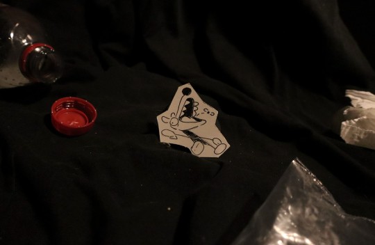
This one sticks out to me as much of my projects this semester involves the use of crafts to create characters within a setting. My understanding of this rule is that there's no reason not to use the tools available to you, so working digitally can save you much more time and stress. For my Project 3, I was questioned about why I didn't just use digital drawing tools instead of paper drawings. In hindsight, the paper motif was something that I wish i could've executed better, especially in a "cartoony" context (I had an idea of the doodle character lighting themselves on fire with a cigarette). Using digital software for touch-ups would've definitely helped the quality, but to me using mediums like paper and clay for these projects is the whole point; I personally don't want digitally drawn characters to be the 'subject' of what I'm working on (although there are ways to cheat it in ways that save time). I do agree with Traub for using digital if possible (I almost lost most of these drawings from a 2mph wind), but I tend to be more intrigued by more analogue works whenever they pop up. I'm still proud of my attempt, but I can see how it might further prove this lesson's point.
One of his "Do Not" rules which caught my attention was to not take photos of your grandmother (especially if they're dying/sick).

It's hard not to feel called out in some ways by these 'lessons' but I have my interpretation of what he means. While I tried to avoid this with my own grandma in earlier posts, having a sick family member seems like a recipe for easy sympathy points that can be farmed for clout. Not only is it completely disrespectful and exploitative, but it also just seems like a obvious subject matter that some people like me will just randomly have access to. In the context of my weekend post, I must disagree since my grandmother just happened to become a daily part of my life at this time; it's simply worth mentioning her. In a 'higher art' context, relying on this kind of subject exclusively seems inherently manipulative and quite lazy.
References:
https://www.charlestraub.com/biography
https://www.icp.org/browse/archive/constituents/charles-h-traub?all/all/all/all/0
https://www.flakphoto.news/p/charles-h-traubs-dos-and-donts
0 notes
Text
Here is the third project for my photography class. My goal was to create a narrative where paper cutouts of characters interact with the real world. Let me know if you'd like to see more of this type of stuff!
0 notes
Text
Research Blog/Book Report #1
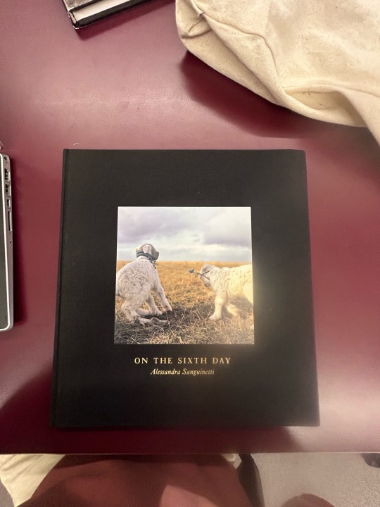
#1: Alessandra Sanguinetti, One the Sixth Day
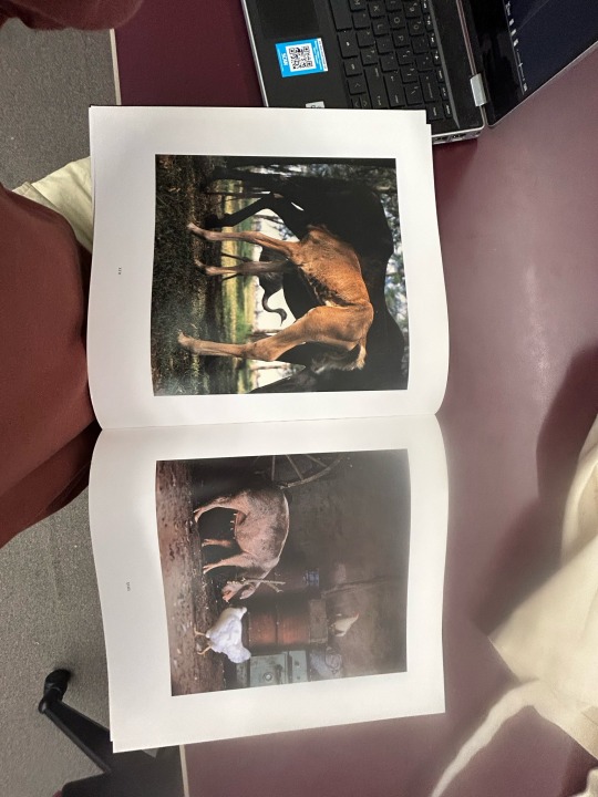
1.The first work I’ll be covering is a photobook called On the Sixth Day, created by Alessandra Sanguinetti. First published in 2005, this book contains 30x32cm pages of photos, all of which seem to share a 1:1 aspect ratio. The hardcover is made of embossed buckram, giving it a great texture and quality.
2.Based on the initial photos and title, my first impression of this photobook was that it would quite tame and likely contain some religious themes. The first photos are of farm animals like chickens and dogs, directly relating to the sixth day of creation when god created the animals and humans. So far my understanding of the theme is of our coexistence between human and animals. Animals and livestock provide us food, and we make the effort to keep them secure and healthy. I think these first few photos get the point across, and I feel like were meant to ease the audience into the rest of the book, making it more approachable.
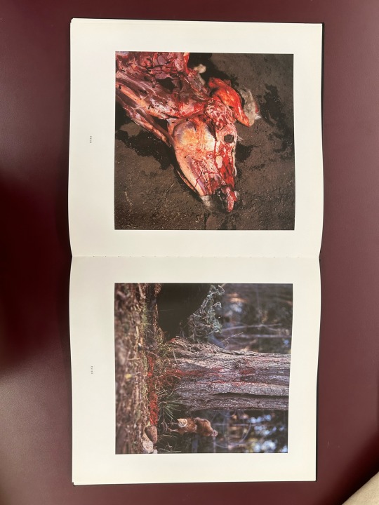
By about midway through the photobook, the content of the photos get much more gruesome. Corpses, Unborn fetuses left for chickens to eat, butchered livestock, etc. While these photos are naturally unpleasant, they seem to have been taken unobjectively, as if the photographer happened to stumble upon these situations. By this point, I feel like the photographer is now communicating the harsh realities of taking care of these animals, and how difficulties are an inevitability regardless of how hard you try. The scenes of butchered animals also show the reality of what we receive in exchange out of our relationship with them. It also seems to be a theme of “making do” with the resources you have, like leaving these corpses out for other livestock to feed on. It’s a stark contrast to what was shown initially, but these pictures are not taken with malicious intent. They seem to highlight the inevitable truths of these environments what we do to respond efficiently.
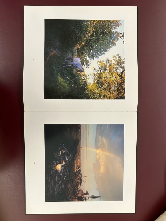
By the end of the photobook, everything seems to have come full circle. Pictures of animals, farmers maintaining livestock, all of which seem to highlight the cycle of this relationship between humans and animals. I like to think of the tamer photos as a ‘period of rest’, where animals roam around while the farmers do their daily chores and enjoy some leisure from their efforts. While it would be nice for moments to always exists, there will always be those harsh and conditional truths to the services we provide.
While we might see this relationship between us and animals as mutual, the true nature of our relationship will always be somewhat ambiguous. The closing statement quotes Sanguinetti and how “Each sacrifice gives us back a disturbing image of the border we cross when we end a life, and what it means to turn another living creature into a source of food”. For me, I think the layout of these pictures is especially effective in this message. Slaughtering an animal for food is an inevitable threshold to cross, no matter how strong our relationship is with them. It is also a burden we share, knowing that these animals aren’t be capable of perceiving their surroundings like we do. While the subject matter of each photo is unobjective, they do a great job in creating some introspection in better understanding our relationship with those who coinhabit this world with us.
https://www.mackbooks.us/products/on-the-sixth-day-br-alessandra-sanguinetti?srsltid=AfmBOorLRgDMaUbixw9oSQi1O0ikBlSnDpAY34uk5EJ5byN03_4Tu-zC
0 notes
Text
CARTOON DOODLE EXPLORES THE REAL WORLD
Why?:
a.) What I’m planning to photograph:
My plan for this project is to create a “storybook” narrative about a cutout cartoon sketch exploring a real-world environment.
My idea for this theme is to make various drawings of a crude/childish cartoony figure, cutting them out, and then posing them in an outdoors environment that makes it look like they’re interacting with it (ex. Cartoon goes to a pumpkin patch). For a pumpkin patch, the cartoon might be climbing sunflower vines, pushing pumpkins, etc. The paper texture might be adjusted to enhance character’s emotion (Making the paper wet when the character is crying, crumbled when angry, etc.).
b.) Why?:
From a narrative side, I believe project can be a fun and unique way to explore our real world, as we look into the perspective of a small, paper character and their ability to maneuver around it.
From a technical side, I think this project would also be a great demonstration of understanding literal perspective and shot composition in order to enhance the narrative and to help portray the character’s internal thoughts as they explore. This type of content would also require some much needed preparation beforehand, so it will be a great exercise in planning and execution.
c. Gameplan/approach:
My gameplan for this project will require various steps.
Research the location. This will require visiting the location and taking initial photos to get familiar with the environment and its ‘interactable’ elements.
Create a storyboard. Based off research/understanding of the location, various character sketches will be created to get an
Film the drawings within the environment. Once the storyboard is finished, I will go back and recreate my idea of the story/shots at the scene.
d. Objective
With my understanding of perspective, I think this would be a fun and creative exercise that shows off what I’ve been learning in both my drawing and photography courses. This will likely be framed as a children’s book, or rather a parody of one.
0 notes