Don't wanna be here? Send us removal request.
Text
Week Twelve - Final Animation
This is the final animation output for my assigned speech. Overall, I'm pleased that I now have an understanding of After Effects and the possibilities of the application. I found this assignment quite challenging, as working for digital outputs isn't my preferred style, and After Effects was a completely new program to me. Despite this, I still managed to create some animated type that I quite like.
For this project, I was assigned a speech on human motivation and helping others by famous eye surgeon Fred Hollows. After researching him and his foundation, and listening and storyboarding the speech, I decided on a visual style I wanted to work with. I chose to use a bright orange colour because it has positive and uplifting connotations that connected to the tone of the speech. It is also the primary colour used by the Fred Hollows Foundation, so using the colour situates the animation with other content on the foundation website. The typeface I decided to work with was Basic Sans, a simple and clean sans-serif typeface with quite friendly forms. This typeface worked well as it connected to the personality of Fred Hollows as a down-to-earth, friendly, and focused individual. It also resembled the type on the Fred Hollows Foundation site. I worked with two different weights in the Basic Sans family; bold and light italic. This allowed me to create a hierarchical system in the typographic messaging, bringing higher contrast to frames and emphasising keywords.
The soft, out-of-focus gradient used in the background and in the title text connected to the idea of vision, which was key to Fred Hollow's career as an eye surgeon. The soft and gentle qualities of this created a friendly and calming tone that matched Fred Hollow's personality and the content of the speech. Many of the transitions and animated features in the animation work with the blur effect. Using the blur and focus effects allowed me to transition through words and speech content in a way that connected to the idea of vision and vision restoration. I really liked the subtle connection this had to Fred Hollows and his career. On keywords and phrases I wanted to emphasise, I used faster, more dynamic transitions and larger type to create contrast with the softness of other transitions.
In the background, I employed the use of a low-volume instrumental track that enhanced the tone of the speech. Like the content of the speech, the music track is very simple but uplifting and positive in its tone.
I used multiple different principles and concepts of animation in this to make it feel more natural and fluid rather than mechanical and computerised. I found the tools such as motion blur and easy ease in and out very useful in many of the different effects and keyframes, as they allowed me to create more completed and natural animations.
0 notes
Text
Week Twelve - Full Animation
This is the first full animation I have created, combining the different elements from the previous posts and finishing some sections. It is nice to see the animation as a whole, and it's useful to look at to note down some parts I want to change/fix.
I think I need to create more continuity with the capitalisation of the text, to make sure the right areas are emphasised throughout and that the tone of voice fits the tone of the animation.
I think I will try out fading in the audio of the speech a little so that the background buzz isn't too distracting.
The transition in the words 'less fortunate' doesn't look quite right, I think because the words come in suddenly with no transition. I want to add in a blur keyframe here to reveal the words and make it fit in with the rest of the animation.
At the end, I think the music fades out too early which makes the last credit look a bit like a mistake, which I need to fix as well.
I also noticed a few moments where the gradient in the human motivation text stopped moving, which didn't look very good. I will need to add in some more keyframes of the four gradient points to ensure it keeps moving.
1 note
·
View note
Video
tumblr
Week Twelve - Credits
In this animation of the end credits, I wanted to bring in the blur and focus effect that was used throughout the animation, to connect this section to the rest of the animation. I really like how this links to the idea of vision, which Fred Hollows restored in many people around the world. I think the hierarchy of the credits is working well, but the two lines of text are a little close together, as the ascenders and descenders of the lines are quite close. Having more white space would allow the words to breathe a little better.
I struggled a bit with the keyframes on the audio, as they work slightly differently. It was challenging to work out how to fade out the music as the value works in decibels. Eventually I figured it out but it doesn’t fade as gently as I would have liked.
0 notes
Video
tumblr
Week Twelve - Ending + Credits
To get started on the ending section and credits of my animation, I wrote out the content I needed to include and made a quick storyboard of the section. I need to include credits for the music, speech, and animator, and I also want to include one for the typeface I used.
Planning
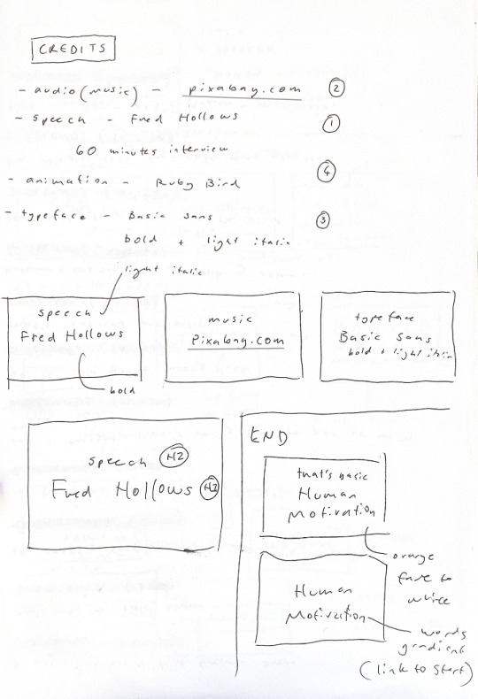
The animation above is the first test of the ending, where the orange gradient fades out, and the gradient words ‘human motivation’ that were used at the start come in as the last words of the speech. I wanted these to be left last by themselves as these are the most important words of the speech and connect the beginning to the end. I think this effect is quite nice, but I think I will add some more opacity key frames on the gradient text as this comes in quite abruptly.
For the credits, it will be important to create a hierarchical difference between the actual credit and the heading. In my opinion, the actual source is more important than the heading. Using the two different weights of the Basic Sans font, I will differentiate between the two to give the source a bolder look.
0 notes
Video
tumblr
Week Twelve - Feedback
I got some feedback on my work so far which was very helpful. One really helpful tip I got from George was watching it back without the volume, to see how the treatment of the word conveys the tone of the voice. Some of the sections I have seem like he is shouting, or emphasise the wrong word.
Another thing I need to do is make sure I treat the repeated words the same. The word motivation in particular has no consistency in the typeface or size which is distracting and a bit confusing. In some type arrangements, there isn’t enough contrast. I need to make the word ‘Nick’ the smaller type in the ‘you’re wrong, Nick’ section, as there is currently no contrast in this. I can also put more emphasis on some key words by making them larger, such as the word ‘shit’.
0 notes
Video
tumblr
Week Twelve - Animation Iterations
This version has motion blur, which looks a bit better. I think I will add in some ease to make It look a bit smoother as well. I’m not happy with the placement of the word ‘and’. It looks odd off-center, but when I centered it I found that the movement of the words going upwards overlapped which looked quite messy. The scale keyframe animation is a bit jolty and uneven for some reason, which also doesn’t look good. I tried a position animation where the word came in from the left, but It was hard to get the timing right as the word is said very quickly. It might be better to make it a lot simpler, perhaps with just the opacity keyframes and have it fade in.

Motion path for the word ‘and’
0 notes
Video
tumblr
Week Twelve - Animation Iterations
This is the animation style I’m testing without motion blur. The result is quite unnatural and mechanical which I don’t like. What I do like is the way the word ‘the’ stays on screen, as I think it makes it easier to view and digest. Because the word is repeated three times, I didn’t want it to come in and out each time as this would be a bit distracting from the more signifcant words; halt, lame, and blind. I want to experiment with adding in the and before the words ‘the blind’ to see how this would work.
0 notes
Video
tumblr

Screenshot showing keyframes for the reveal and blur

Screenshot showing keyframes for the mask entering and exiting + blur effect
Week Twelve - Animation Iterations
In this section, I tested using a mask to reveal and then hide the words ‘is looking after’. I also used some blur to soften the transition, and make this section more cohesive. To make the mask movements more natural, I adjusted the path using the graph function to ease the movements. This adds a very subtle effect, but makes the movement less mechanical.
0 notes
Video
tumblr
Week Eleven - Animation Testing
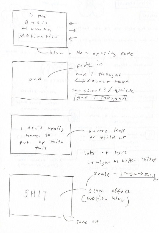
This section of the animation uses source text keyframes in a light italic font for the first part of the audio, transitioning into the bolder weight with a slam animation effect for the key word ‘shit.’ I wanted to put emphasis on this, which I did by using the opacity and scale transform effects and motion blur to make it look less mechanical. I think the contrast between the small text at the start and the bolder text with the faster effect and larger scale works well. One thing I need to try out is changing the source text keyframes at the start, as it makes the text move very fast and could be a bit hard to follow along with. It might be better having the words build up one after the other rather than swapping out the previous word.
Story Board
To help me plan out this section of the animation and the different emphasis on the words, I made a quick storyboard to refer to when in after effects. This was quite helpful.
0 notes
Video
tumblr
Week Eleven - Animation Testing
In this animation, I have experimented with adding a positive and inspirational sounding backing instrumental track. I think adding in music is beneficial, especially at the beginning as it makes the speech audio much less abrupt when it comes in. It also softens out the background hissing noise from the audio recording. This track is a royalty free tune from https://pixabay.com/music/search/positive/?pagi=5 (Music by <a href="https://pixabay.com/users/romarecord1973-28931782/?utm_source=link-attribution&utm_medium=referral&utm_campaign=music&utm_content=132333">Romarecord1973</a> from <a href="https://pixabay.com//?utm_source=link-attribution&utm_medium=referral&utm_campaign=music&utm_content=132333">Pixabay</a>). I like the tone of the music but I might want to find something a bit more simple as it would suit the tone of Fred Hollows and the typeface better.
In this animation section I experimented with blurring and fading away the words ‘basic human motivation’. I like this effect, as it fits in well with the other blur oriented transitions I have used and the overarching concept of vision. I think the source text animation needs work as the timing isn’t quite right and it comes in quite soon after the other words fade out. I do like how the animation style and typeface positions it in the same way as the filler words ‘and ah he said um’, as these two segments of the audio are both not super important. This also makes the animation as a whole so far more cohesive.

This screenshot shows the effects and keyframes I used for the blur and fade out transition. I experimented with different values/amounts of blur and found that 100 worked well.
0 notes
Video
tumblr
Week Eleven - Animation Testing
In this test I tested out using a more dynamic orange gradient background, which adds some depth to the animation. It also connects to the idea of vision as the shades blur together to create the gradient.
For this text animation, the words basic human motivation are very important. I identified these words as important in the story boarding phase, so I used the bold font of Basic sans and a face paced swipe in with motion blur. This made the words contrast well against the light italic font of the ‘is the’, and the soft and slow fluid motion of the background.

This screenshot shows a still of the animation I tested on the ‘self motivation’ words. I used a blur animation with offset that brings the word into focus from left to right. I think this connects nicely to the vision idea and how Fred Hollows demonstrated his lack of self motivation by restoring vision to those in need. By bringing the words from his speech into focus, it ‘restores’ the vision. This animation style might be better suited to the words more related to the idea of human motivation as helping others.

Settings used for the motivation blur to focus animation
0 notes
Video
tumblr
Week Eleven - In-class Tutorial
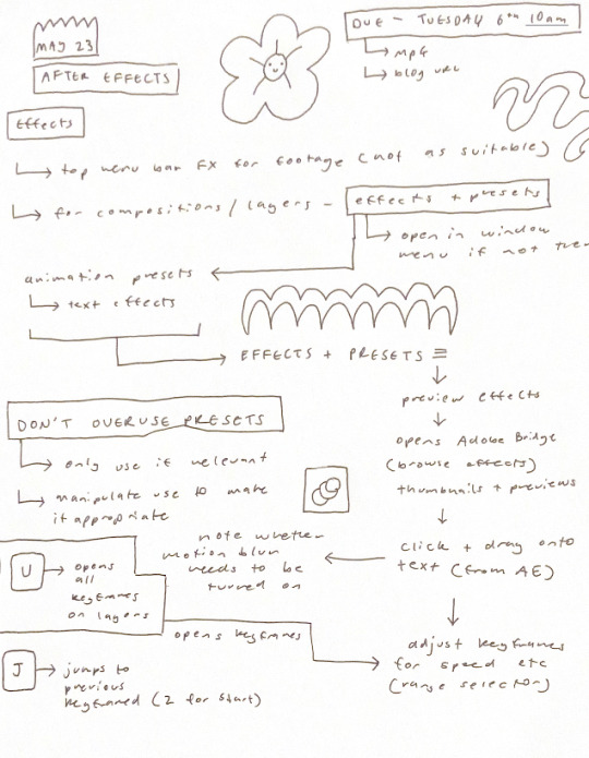
This tutorial was focused on the After Effects in built effects and presets. As well as previewing and applying the effects, we were shown how to manipulate the effects to suit our own requirements. This is a good way of saving time for some techniques, but it will be important to be selective with the preset effects.
Class Notes
0 notes
Video
tumblr
Week 11 - Animation Testing + Class
After testing working with the eye motif to connect back to Fred Hollows and his work, I found that it was too obvious and perhaps didn’t work that well for the provided audio as he doesn’t actually mention his work as an eye surgeon. In this test I decided to try a more subtle way of incorporating a link to his work by using the blur effect. The blur and focus effects connect to the idea of vision which I prefer to the very obvious eye illustration.
In this class I got some feedback from George about the progress so far. George agreed that the eye icon wasn’t the best fit as well which was good. He said the typeface was working well, especially with using the light italics and bold weights only. The contrast between the two works well in the animation. He also said that it is important to make sure that the content is centered on the screen, and not too close to the edges. Because it is designed to be viewed full screen, content too close to the edges will get lost.
1 note
·
View note
Video
tumblr
Week 10 - Animation Testing
In this animation I made some final decisions about the visual style I want to use. This was selecting two styles of the Basic Sans typeface; light italics and bold, as well as only using the white and orange colours (no black). I think using only these two fonts of the typeface will make the work more cohesive. I chose these two as there is lots of contrast between them, which makes more interesting layouts.
In this test, I tried out animating a magnifying effect on the type, following a tutorial. I think the magnifying effect works really well to link back to the idea of vision and sight restoration, which Fred Hollows dedicated his life to. I do like this effect, but it is a bit clumsy and doesn’t work as well as I would have liked. I think this needs a lot of refinement, but the concept is good.
I also want to work on incorporating some other elements into the animation, maybe illustrations, pattern, or texture as it is quite flat.
0 notes
Video
tumblr
Week Ten - Type Animation Testing
I used this type animation to practice some skills learned in class, such as easy ease, source text keyframes, motion blur, and other basic keyframe properties. I also followed some tutorials for transitions, such as the emerge up animation of the words self motivation.
Although some small parts of the animation work well, such as the ‘beside Nick Greiner once’, and the filler words section, this animation was really focused on testing my skills and getting a better feel for after effects. I don’t think the tone of this animation fits the audio as well as it could, and it all feels disjointed. I want to make sure my actual animation is cohesive and feels like it fits with the audio.
I also need to make sure I keep the text more centered on the screen, as words ‘and um of course’ get lost in the corner.
0 notes
Text
Week Ten - Class Content + Animation Prep
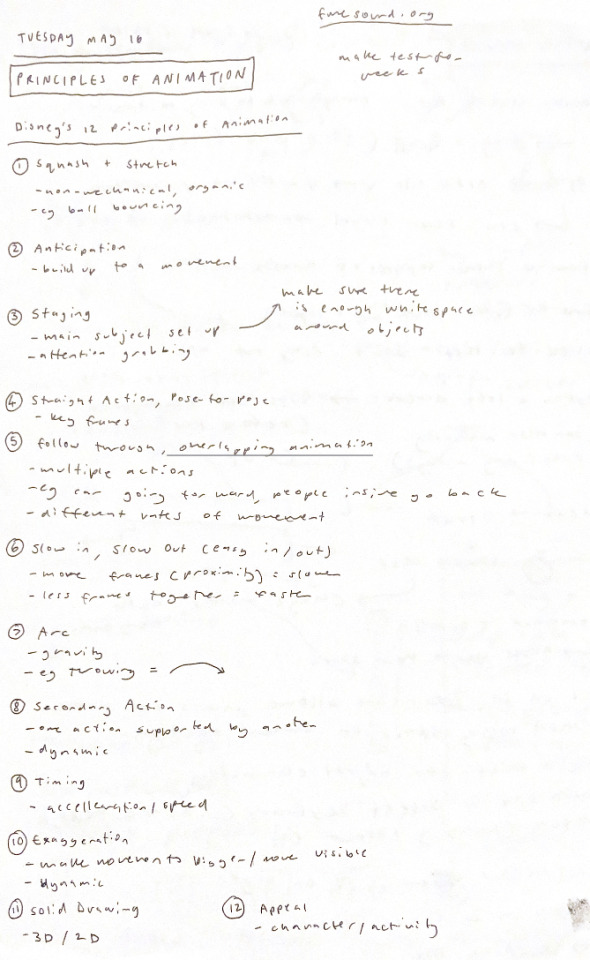
This class presentation looked at principles of animation. We were shown the 12 Disney principles of Animations, with examples for each. The presentation was quite short because the class had multiple tutorials.
Presentation Notes
Tutorial Notes
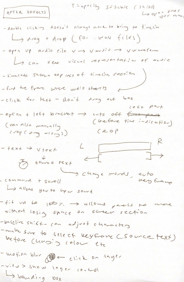
Typefaces
I want to use a sans serif typeface for this project. This gives a clean and not showy look which reflects Fred Hollows and the foundation, as well as the tone of the audio. The Fred Hollows Foundation website uses clean sans serif typefaces which I want to reflect. Because the type will be moving, it will be important to pick a clear typeface that is easy to read.
Type from the Website


Forma DJR Banner
I like the simplicity of this typeface. Like Fred Hollows, it isn’t flashy or showing off, it is understated and clean. The typeface has lots of variables as well which I think could be useful. It also reminds me of the sans serif type used on the Fred Hollows Foundation website.

Forma DJR Display

Elza
This typeface is another simple sans serif. This has a taller x height and narrower letters, giving it a more condensed look. I like this typeface, but at a fast frame rate, I think a less condensed type would be easier to read.

Basic Sans
This is another sans serif typeface, but it is more rounded and spaced out. It has lots of different fonts in the type family, which gives the typeface some variability in use. I think this is my favourite typeface I’ve looked at, as it is clean and clear, with humanist and friendly qualities. This works really well for the content of the speech and the tone, which focuses on helping others. It connects well to the type on the website as well as the personality of Fred Hollows.

0 notes
Video
tumblr
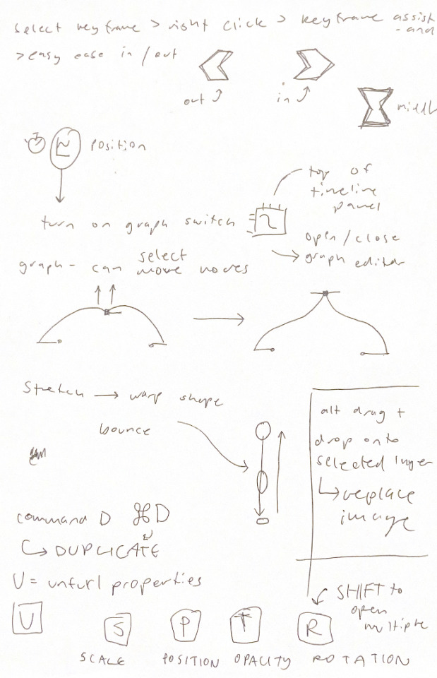
Week Ten - Class Tutorial Two
This animation was testing the bounce, stretch, and ease functions to make the animation more natural and less mechanical. We also learned how to import and replace objects in the animations. It was a bit challenging to get my head around working with the graph editor, but I think it is a useful feature. All of these tools come from Disney’s principles of animation, where all animation was done by hand.
0 notes