Text
Week 11: Module Reflection
In this module, I learned a lot of things: the power of cropping, what camera aperture and shutter speed are, the influence of light at different angles, and so on. I think the most important thing I learned about photography was not how to take a photo, but how to read one. Photographic attributes and composition were never really taught to me before this class, at least not in the sense that they were given official definitions and meanings. I learned what made photographs boring and what made them interesting, even if it was just a matter of the shape of a line or the placement of a subject in relation to its background and foreground.
I learned that I really appreciate images that convey some sort of deeper emotional message, and that not all images are going to mean something to me. At first, I struggled to describe the importance and technique of images that didn't strike me as interesting. It took me a while to realize that is okay, and it doesn't take away meaning from the image for everyone else. On the other hand, becoming more visually literate made it more fun to look at and analyze images that I did find interesting. It also trained me to pay more attention to how I'm taking pictures, even for purposes outside of this module. I think photography is a powerful phenomenon and tool, and I'm glad I got the chance to take this class as I think it helped develop my skills in the field. It's not just about taking the most pleasing photographs, it's about taking an image that means something to you and others. It's something that connects us.
0 notes
Text
Week 11: Photographic Series Progress Report, Part 2
I feel I am very close to finishing my photographic series. The only real work I have to do is pick six or eight photos (most likely six) from the two dozen images I've collected and caption them with the emotion I felt they provoked. I'll most likely use captions as my means to sequence the photographs as well.
I decided to keep the images as just water and not include any landscapes or objects. I want to be able to show how water by itself can exude feelings, without the aid of something else. Though I took pictures of 'mundane' instances of water, I decided to remain to steer more toward bodies of water because I still feel like they are much more likely to make me feel something. I think water is a truly beautiful thing and I don't necessarily want to include 'uglier' images of it. I'll need a little more time to finalize which pictures to include in my series.
0 notes
Text
Week 10: Cropping and Captioning
Cropping Activity:

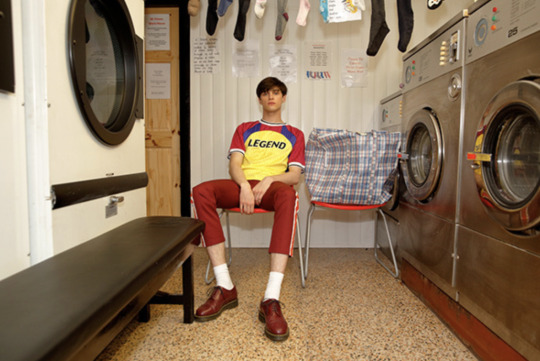
Before cropping this image, the photograph centered on a young man, presumably waiting for his laundry to finish. It could have been about patience, or possibly the day-to-day lives of people like him. The cropped image shows several hanging socks on a clothing line. I cropped it this way because it almost looked like the socks of members of a family. When it's cropped, I think it represents unison but still recognition of differences.
The original image, by Martin Parr:
Captioning Activity:
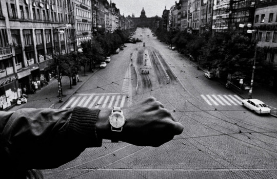
Three potential captions for the given image include:
'12:22'
'Five More Minutes'
'Sunday's Lunch Rush'
I think there are rules in captioning, but they are more lenient and aren't super restrictive. It all depends on what the photographer wants to convey or what they want the viewers to know about the image. They can be short stories, years, single-word or single-phrase titles, names, etc. I think the only thing to avoid is blatant misinformation or anything offensive. Other than that, a photographer can approach captioning their photographs in virtually any way they want.
0 notes
Text
Week 10 Exhibition: Deutsche Börse Photography Foundation Prize
Photographers Gallery

An Ode to Yemana by Deana Lawson (2019)
I like the focus on the primary colors and white in this photograph. It centers on a young girl and who I believe to be her mother or grandmother. The red couch contrasts starkly against essentially everything else in the image. The young girl is dressed up and has something covering her face; the headdress in general seems to be of significance. There are a lot of interesting shapes and lines in this photograph, and the angle it was taken from is from eye-level so it looks like the viewer is right there with the two women.
I think this photograph relates to the overall message of Lawson's series as it is about the Black experience and creating 'an ever-expanding mythological extended family.' It seems that the little girl is dressed up in a way to pay homage to a tradition. The title also helps with understanding the photograph, as an ode is generally something people do to pay their respects and honor someone or something. I can't put my finger on why, but something about this image seems familiar. I can definitely tell that it is an homage to some sort of cultural tradition.

Saturday from the series Whatever You Say, Say Nothing by Gilles Peress (c. 1970s)
These photographs are in black and white and seem to have a higher level of contrast (darker shades are very dark and lighter shades are very light). They are both taken from higher angles as well, and since they are images of children and a dog, it may make the viewer feel like an adult looking at them. The shapes of people, the dog, and shadows make the photographs very interesting to look at, and it is evidence of a bright sunny day. These images are also very clear, most likely taken with a smaller aperture.
I don't think I would have correctly interpreted these images if the series wasn't explained. I would have interpreted them as innocent photographs of youth. They are about living in a space that experiences constant violence. I think the overall message is that even in places like these, there are still innocent minds who know no different than the violence. I think the reason I didn't read too much into these images is that they reminded me of other images of children in the 1970s and 1960s that I have seen that did not really have a dark context.
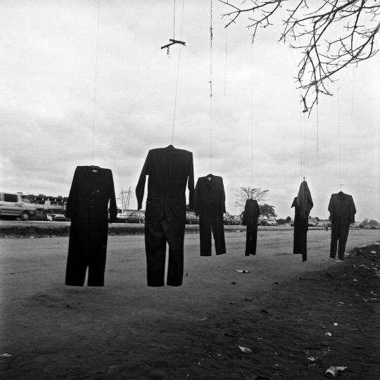
Roadside stall on the way to Viana from the series Terreno Ocupado by Jo Ratcliffe (2007)
The contrast between the dark clothing and the light sky is the most interesting part of this image to me. The shapes the suits are making are also interesting to look at. The image in general, for lack of a better world, is just cool to look at. I think it was an important choice to keep the image in black and white even though color photographs were most popular in 2007.
It took me a while to realize what this image was about, and the series' explanation confirmed it. This image is about Apartheid--whoever hung these black suits from the tree is symbolically replicating something that is beyond evil. It goes to show how the fight for civil rights and racism is still a very big issue, and it doesn't exist just in the US (US education tends to frame issues like these in only American contexts). The photograph is now quite disturbing to look at knowing what it's actually about, and I think it is very likely to spark conversation among its viewers.
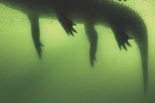
Gator by Anastasia Samoylova (2017)
I like that this photograph looks dirty, even though it's just the glass in the image. It gives it an interesting texture. I also like the stark contrast between the gator and the water it is in, it makes it seem very dangerous. I also like that it is framed so we cannot see its head or the surface of the water, it makes me feel like I'm stuck there with the gator. It's a very aesthetically pleasing yet unsettling picture.
This image is part of a series that was pretty easy for me to understand the meaning of, but that might just be because I'm familiar with Florida and what it can be like there. It's about the duality of paradise and catastrophe that resides there, and while I don't think the title of this particular photo adds to that, the image itself definitely does. There is a strange elegance and grace to this photograph, even though it is also murky, gross, and scary.
I think the winner of the competition should be Jo Ratcliffe. His images shed light on a world that I think doesn't receive enough attention; the images themselves are also just very well-shot and thought out. I think they are purposely shot to make the viewer at least a little uncomfortable, and I think that them being in black and white when they don't have to emphasize the message that 'sites of massacre, forced removal and violence with a mute intensity' are still in existence and thus there is social change that needs to take place. I think the images are particularly powerful compared to the other artists' and because of what they are about, Ratcliffe should win the prize.
1 note
·
View note
Text
Week 9 Homework: The Londoners


I wanted these photographs to be very wide, almost like the same dimensions of an action movie. I think what I've noticed about the way Londoners live is that there is constant motion; there are always people marching down the streets, there are always taxi cabs crossing intersections, and there are always people shuffling to get their drinks at the bar. It happens all day, every day, which is why I decided to sequence the images from morning/midday, to evening, to night.
The subject of each photograph is a group of people, but I also like how they exist in a foreground such that the viewer can also see the context they are in. I think each of the places these photographs depict is also essential to the personality of London and its people, at least as an American, I perceive them to be. With these photos, I wanted to capture Londoners in the places that are normal to them and not me, doing things that I generally don't back home. After all, Londoners live a much different life than a rural American does.
0 notes
Text
Week 9 Exhibition: America in Crisis
Saatchi Gallery
From the Historical Section: 'Jackie Kennedy at John F Kennedy's Funeral, Arlington, Virginia' (1963) by Elliott Erwitt.

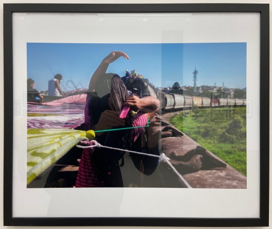
From the contemporary section: 'Andrea, 14, brushes her hair on a freight train known as "La Bestia," on her way to border city Tijuana, Mexico, to seek asylum in the U.S. with her mother and brother' (2017) by Verónica G. Cárdenas.
The photograph of Jackie Kennedy is her at her husband's funeral. It drew my attention because of her facial expression--the sheer sadness and deep despair. I have never felt loss like this, but for some reason, the way she looks like she feels is exactly how I think I would feel if I lost someone so close.
The second image is a young girl brushing her hair, presumably at the start of the day, in the car of a freight train. I can't tell if the train is moving or not, but either way, it stood out to me because of how she seems to be doing it so casually, like this is her everyday experience. It made me reflect on the privilege I have had in my life.
Both of these photographs display aspects of 'America in Crisis' but in different ways. The first is an image of a national tragedy--the death of a president--while the second shows the struggle of crossing the border; trying to get to the 'Land of Opportunity.' I think they capture two completely different crises that aren't necessarily related.
The first image's vantage point is of special interest, as it captures Jackie Kennedy from above. It also seems like she was zoomed in on. This allows the viewer to easily read her facial expression, but I think it also has a humanizing effect. It shows Jackie in a very vulnerable state and causes the viewer to feel a great amount of sympathy, which America as a whole felt for her when JFK died. The second image uses an interesting line, made by the cars of the train in front of the little girl. The curve is interesting to look at, but as it is a train leading the girl into the distance, it also accentuates the message that people who are migrating across the southern border often face a long and difficult journey. The US does not make immigration easy, and neither does the heat of Mexico in the summer.
I think that the technical aspects or compositional ideas behind these photographs have changed from 1968 to the 2020s simply because of the change in contemporary issues. Honestly, I think it would be bluntly incorrect to suggest they're the same; the way photographers try to convey meanings may be the same but the issues in general have changed. I think even the same issues are looked at under different lenses and thus the approach to presenting them in photography has shifted as well.
0 notes
Text
Week 8: Photographic Series Progress Report
I think my photographic series is coming along nicely. I have a pretty concrete idea for what it will be about and some images that go with it.
I want it to be about water, its symbolism, and how it represents different emotions. Personally, water represents both stability and change, in that there is stability in the concept of something being everchanging. I think that because it can exist in countless different ways, water can provoke different feelings. I think I want all the images to just be surfaces of water, but I am still deciding if I want to include landscapes or objects if they help get my message across.
I need to take more images of water in general, and possibly focus on more 'mundane' instances of water (as it exists in sinks, puddles, etc.), not just on bodies of water. This is a challenge though, because I tend to be attracted to larger bodies of water and how they present themselves in different lighting and contexts. Either way, I definitely need more photographs and should go as far as spending a day or two seeking it out and taking time to reflect near it.
0 notes
Text
Week 8 Homework: Photograph Recreations & Inspirations
The image I chose to recreate, and then use as inspiration to take another photograph, is a portrait by Todd Hido titled #8869:
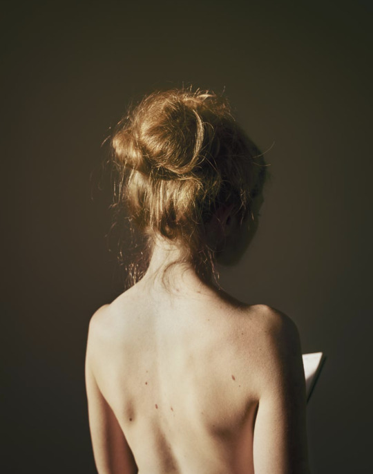
The light in this image seems natural, like the sun through the window. It's fairly bright, but still pretty soft. The most noticeable shapes in the photo are created by the woman's body, as well as her book, and the line created by the shadow on her front half is also of particular interest. I also think the decision to have her facing away from the light speaks to the tone of the image, which is gentle yet a little mysterious since we cannot see the woman's face or the contents of her book.
The mood of the image is calmness and daziness. It feels like how one could expect to feel on an early spring morning on the weekend. It seems to be free of stress or worry. Though the photograph seems like a simple depiction of a woman reading her book, I think it is an attempt to convey the simple pleasures in life--the ones that make us comfortable and warm. It's a very aesthetically and peaceful image.
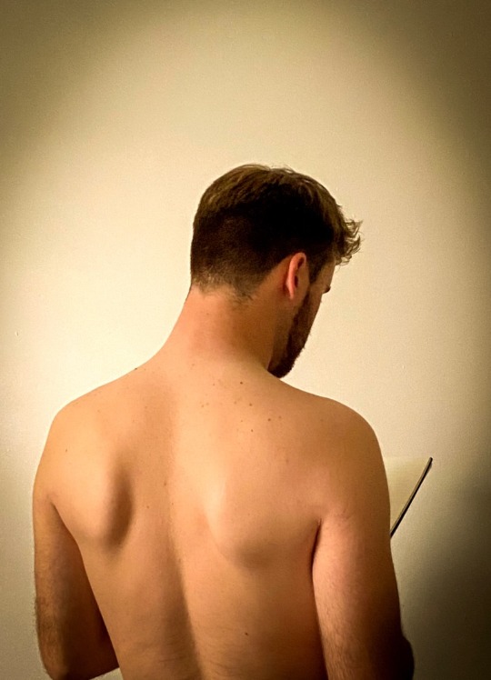
Here is my recreation of the photograph:
And here is a photograph inspired by #8869:

I thought it would be interesting to create a photograph that had cooler colors (blues and purples) instead of the warmer oranges and golds and beiges of the original. I think correlating those colors with a bright device, and having that be the greatest source of light, makes for an interesting juxtaposition. I think the image is similar to those people see about the dangers of too much screen time, whereas the first images do not necessarily present a problem of any sort.
0 notes
Text
Week 7: Group Presentation on Tom Hunter
In-class activity
This presentation was on Tom Hunter's photographic series titled Life and Death in Hackney, which took place from 1999 through 2001. It was a collective analysis of the series, but the following will be my personal analysis of it.
First I would like to include two photographs that the presentation did not include. The first is titled 'After The Party' and the second is titled 'The Way Home.'
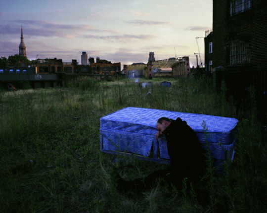
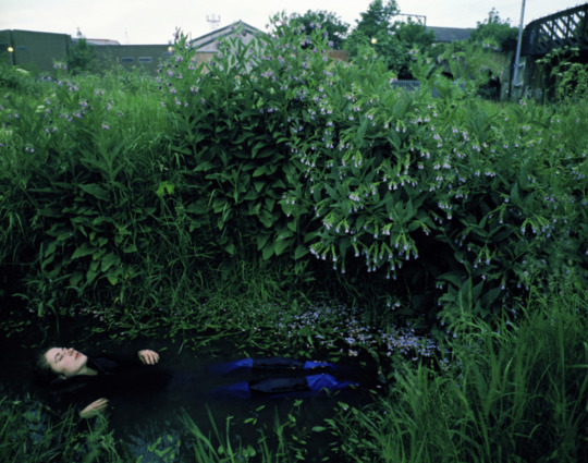
I think the most important aspect of this series is the degree of juxtaposition it displays. It shows a lot of overgrown nature in industrial places that seem to have been very active. I think that this also conveys the level of poverty that East London experiences compared to other parts of London, as many people call this blend of nature and concrete home. It went from a place of prosperity to a place that many would describe as 'run-down.'
A certain compositional element is what unifies this series the most effectively to me: color and tone. There is so much green in these photographs, and it all comes from the overwhelming amount of greenery in them. My takeaway from this is that nature is the end-all-be-all; that left unbothered, nature takes over and flourishes. These images are proof that people can live in it, too--which may suggest that the people of more affluent parts of society have something to learn.
Obviously, I wish that the people in these photographs were not experiencing the hardships they are encountering. But part of me wants to believe that they are ahead of the curve and that they are already living in a way that most humans in the future will be. I think climate change is a very real, dangerous threat to our planet and that it will result in many deaths and a change in the way humans interact with the Earth. I think we must accept nature as part of our identity instead of continuing to destroy it. I believe that the primary reason the people in these photographs live in poverty and desolation is that they have fallen victim to the cruelty of human progression; they have felt first-hand the negative effects of human greed and the reality that people are left behind. These images should be an indication that people like me, who are writing blog posts on their thousand-dollar computers, should to better and enact change before it is too late.
0 notes
Text
Week 5 Homework: Ugly Pictures of Something Beautiful
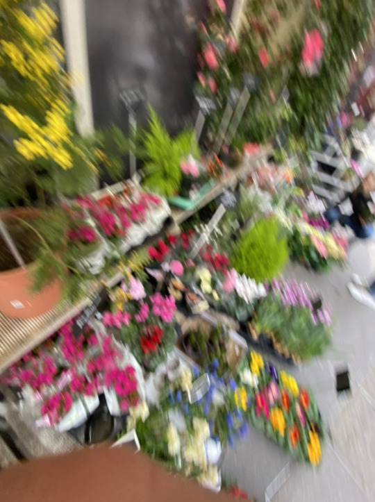
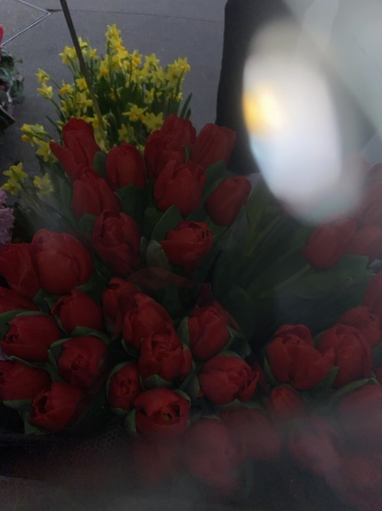
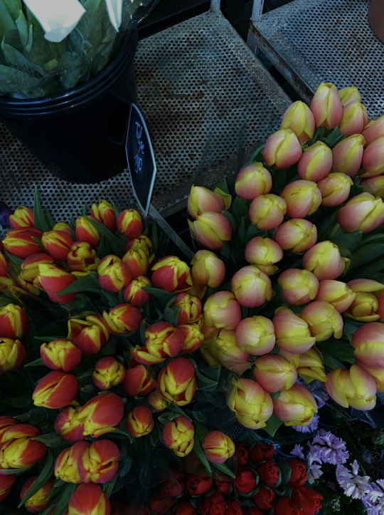
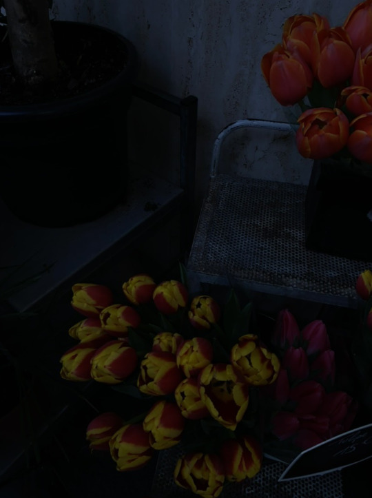
These are four ugly images of a flower stand that had some really beautiful flowers in Paris. In my opinion, there is nothing aesthetically pleasing about them. It was actually extremely difficult to capture these images--taking purposefully ugly pictures proved to be harder than I thought. I ended up repeating the process of taking these pictures several times.
My approach to photographing these flowers was by spamming my camera as I physically approached and left the stand. They are also sequenced that way: the first image is me walking up to the stand and the last image is me about to leave it. I didn't stop moving and would even tap my phone in random places so its camera focused on anything but the flowers. The results were blurry and poorly lit images that don't convey anything. They tell the story of visiting a flower stand in a state of delirium and confusion.
I do like the idea that ugly pictures can tell a story, though. Sometimes things don't turn out the way you think. Though these ugly images were taken as such on purpose, it was difficult to actually produce them which is a testament to the challenges photographers may take on. As someone who does not necessarily identify as a photographer, I appreciate it when photographers can do this sort of thing, though.
0 notes
Text
Week 5 Exhibition: Artist & Society
Tate Modern
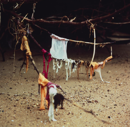
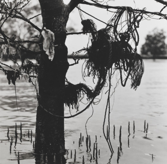
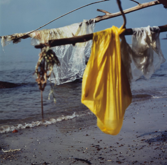
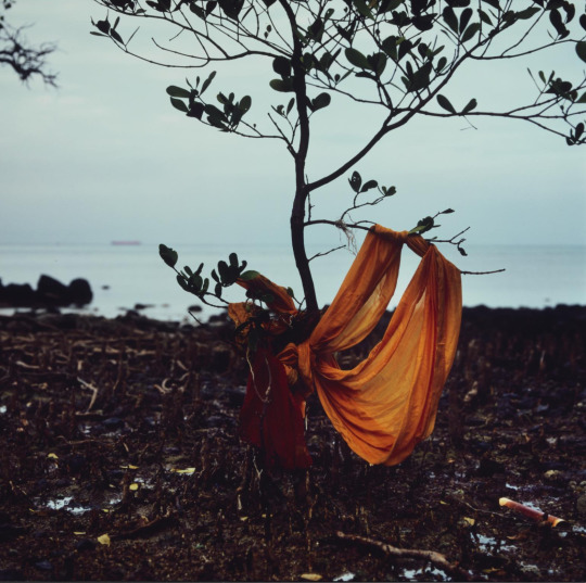
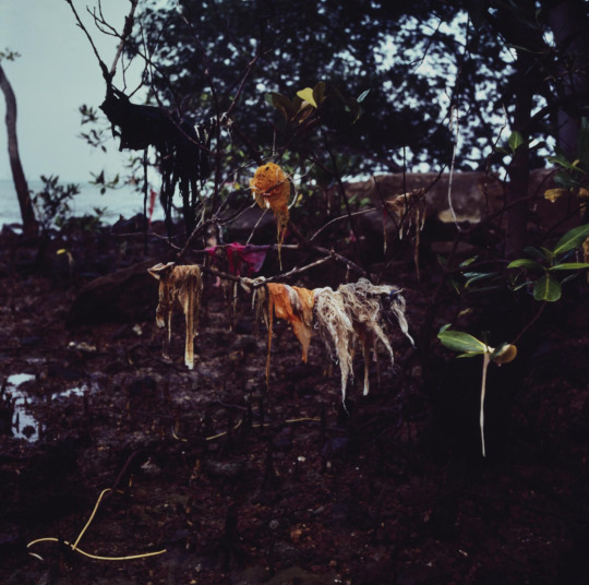
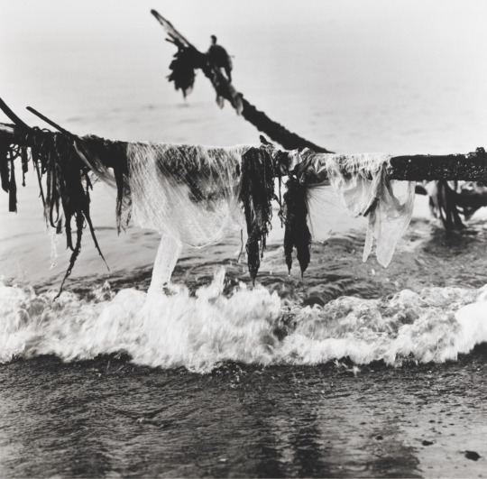
Channel photographic series by Simryn Gill (2014)
Gill aims to depict the amount of trash that ends up in our seas and on our shores in this series. The images show that our oceans have become so polluted that it results in trash washing up and becoming almost as common as the vegetation that lines beaches.
The most noticeable technique Gill uses to highlight this message is focus. Every image centers on the trash that has ended up in tree branches. Most images are in color, which also shows how misplaced the trash is--orange and yellow garments and trash bags do not belong where a tree has grown. In terms of composition, the tree branches, water lines, and trash all make for some very interesting shapes and lines, and the use of foreground and background makes for a clear sense of depth. These images feel very real in that it could be as if the viewer has seen these images in real life.
I consider these to be very good photographs. They aren't boring to look at and I think they help Gill get her message across quite effectively. They are pleasing to look at but nevertheless instill a feeling of disgust and disapproval because of what the photographs are actually depicting. I think the fact that this is six of several dozen images of the same caliber shows how extensive the problem of sea pollution is, which is exactly what the written information about the series suggests. It is a good thing that the series is easily understandable because it allows everyone to comprehend the issue at hand. If it was too convoluted or metaphorical, the message may not have been clearly communicated.
0 notes
Text
Week 5: Reading a Photographic Series
In-class activity
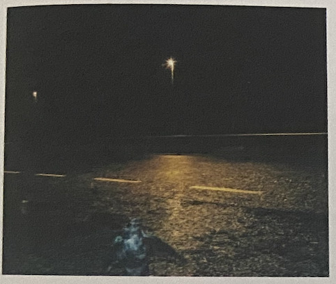
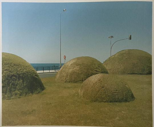
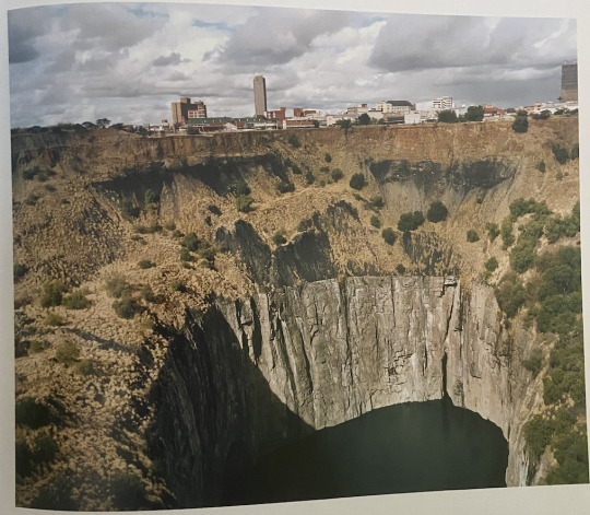
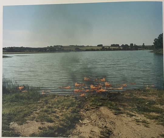
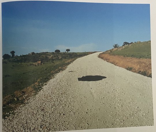
Black Holes & Other Inconsistencies photographic series by Edgar Martins (2002)
My first impression of this series is that it seemed to have a very obvious theme going on, but I just wasn't sure what it was. Furthermore, the places these photographs are depicting felt familiar even though I've never been to them (the bottom three in particular). They all seem to have something in common, which is human-altered spaces. In other words, they all have elements of natural places that look different or unexpected because of human activity--for example, a lake set on fire or a hillside with a road, which has was seems to be oil spilled on it.
The title Black Holes & Other Inconsistencies is a very interesting one, particularly because I can't really wrap my head around it. I think it frames the series in such a way that the viewer won't really know what to expect, which I think Martins does well. The images aren't outlandish, but they do present things in an inconsistent way (again, the example of a lake on fire). The title makes me eager to search for the hidden meanings within the photographs and the meaning they convey together.
In terms of sequencing, Martins doesn't really seem to have the photographs put together in a certain way, at least not in a way that is obvious or understandable to me. I suppose that the photographs go from areas that are more city-like to areas that are more rural, but other than that I don't think there is a sequence.
After considering the overall theme of the series and pondering its meaning some more, I think this series is about how we perceive the space around us. We shape and mold our surroundings to serve us, whether it be for utility or aesthetics. I also think that because of this, we tend to view spaces as individual from one another, and thus it makes it harder for us to comprehend a landscape or city as a whole. We tend to think of pieces instead of entireties, which I believe is the overall message Martins intends to convey.
0 notes
Text
Week 4 Homework: Making a Portrait (feat. Haley)

I took several pictures with Haley and I thought this one encapsulates her as a person the most. I’ve only known her for a few months, but I can say with complete confidence that she is one of the kindest, funniest, and most spirited. I like that the background is an open road in this image and that she’s walking towards it, like she’s leading me somewhere. Her pose—looking back at the camera and taking her sunglasses off—captures her adventurous spirit. Furthermore, I think that the contrast in light between her figure and the background emphasizes this spirit, as you can see that where she’s walking is bright and full of opportunity while Haley is cool and mysterious, looking like she has some sort of plan with what is in front of her.
Other compositional aspects I like about this photo are that the lines of the bending road lead to Haley, the image has a grayscale tone and implies lots of color even though it’s in black in white, and there is motion in her pose and hair. I think the image has a lot of personality to it suggesting a cool and fun mood.
0 notes
Text
Week 4: Mayotte Magus Portrait Analyses
In-class activity

The overall composition of this image is one full of several different patterns, shapes, lines, and angles. The window with the trees outside, the wall with the shelf of records, and the woman’s pose on the couch all create a cohesive piece that points toward the woman as the main focus of the image. The light seems to be coming from above and to the left, having an illuminating effect—that is, the woman’s face and body, as well as essentially all of her surroundings, are well lit and thus do not have any sort of threatening mood. Furthermore, the tone of the image is extremely grayscale. The darks are not too dark and the lights are not too light, making nothing seem too stark or blunt. The woman and all of her surroundings are in clear focus, even though the woman herself is the primary focus of attention. Despite this, it seems that doing this makes the woman’s surroundings just as much of her identity as her own figure. Viewers can infer things about her not just by looking at her, but by looking at the things around her. Lastly, the woman is sitting very casually in this image, resting her arm on the back of the couch she’s sitting on with her other hand placed on her hip with her elbow out (normally, this arm position could be perceived as stern, but in her case, it makes her approachable). The woman seems like she’s kind and lighthearted, easy to talk to, and someone who is wise but doesn’t take herself too seriously.
I would say that the most interesting aspect of this photograph is the woman’s pose and all of the patterns present. I have no idea who this woman is but because of the way she’s sitting and the combination of all of these patterns, something about it seems familiar and inviting. The patterns on her couch, shirt, and curtains paired with her lenient posture suggest a fun, laidback, easygoing mood.

There are many staggered and irregular lines in this image, primarily from the cracks in the glass. Because of this and some other elements, this image is much more chaotic than the one above. There is not a lot of organization or symmetrical structure to it, which is definitely on purpose, though it creates an entirely different mood. What’s interesting about this image is that the glass is so broken and misshaped that it is rather difficult to determine where the light is coming from. It seems like it is coming from above and to the right just a little bit, which would explain how the woman’s face, though split into pieces in the reflection, is well lit. Regarding tone, the darks in this image are very dark and the lights are almost blinding. There does not seem to be as much of a depth in grayscale, as things are either quite dark or quite light, whereas in the first image, there is a plethora of shades of gray. Everything in the foreground in this image is in focus. The reflection of the woman is very clear, but because the mirror is a reflection of light, so is the glass. This has an effect on the way the woman is perceived, as it emphasizes the cracks in the glass just as much as the woman herself, sending a certain message about her. In terms of pose and posture, though the woman is facing forward, she is looking behind her. This, paired with her cracked reflection, makes her seem ominous and gloomy, or like she knows something that we as the viewers do not. The most interesting aspect of the photo is the atmosphere of mystery that it creates. The image is not easy to understand and it seems there is a lot of hidden meaning, which may be exactly the point. We as the viewers do not know what the woman is doing or thinking, all we know is that she’s fractured like the glass suggests. Why or how, though, is anyone’s guess.
Both images by Mayotte Magus, unknown date and titles
0 notes
Text
Week 3 Homework: The Influence of Light


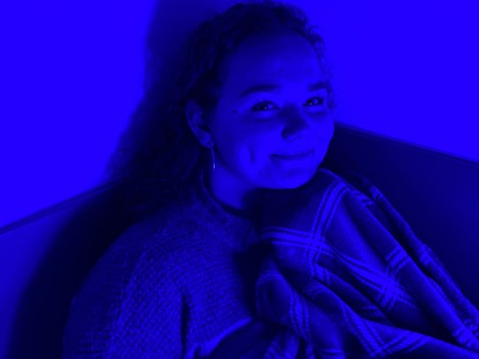
All six of these images have different color lights coming from different angles, thus creating a different feeling and tone for each.
The first image has white light coming from a tad left of center—I used this as somewhat of a control image, showing my friend under casual and common light.
In the case of these images and her pose, lighting that comes from front and center, from the left, and from above has an inviting effect (light blue, orange). The subject is thus seen as friendly and there is no feeling of danger.
On the other hand, lighting that comes from below creates an intense atmosphere of hazard and mistrust (red, dark blue). The subject is thus perceived to be less welcoming and may be approached with caution.
Light coming from the right creates an effect that resides in the middle of the last two described (violet). It does not necessarily create a dangerous tone, but it also lacks some trust. It creates an atmosphere of mystery and questioning.
The colored lighting is meant to amplify the effects of the different angles of light.
EDIT: After presenting these images in class, we found that the different colored lights are distracting from the overall goal of showing how lights at different places and distances can have an effect on how we interpret the subject. Here are four of six images but in black and white, without the different colors so as to more easily focus on the effects of lighting placement and distance:
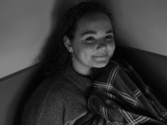
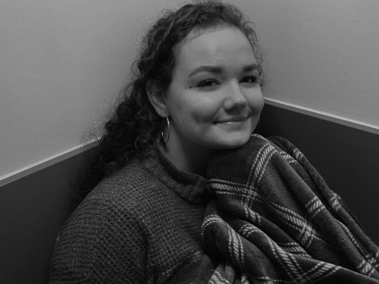


(Tumblr doesn't allow for more than 10 photos per post, but I think the point is still made: that light angle and intensity play a role in how we perceive the subject in the image.)
0 notes
Text
Week 3 Exhibition: Photography Centre
V&A Museum

Bulb Rack by Maurince Broomfield (1958)
This image was most likely taken with a larger aperture as it has a clear focus on the first two rows of bulbs in the front of the image, but the following rows get increasingly blurry. If this image was taken with a smaller aperture, many more bulbs would be in clear focus and the image would not have as prominent of a blur.
A significant photographic attribute present in this image would be the vantage point, that is, the point of view. This image looks like it was taken within the rack of bulbs, as if the viewer were a bulb looking out at other bulbs. This makes the image feel personal and upfront, allowing the audience to imagine themselves as if they were right there in that factory with the bulbs. I think that by imagining ourselves as a light bulb, it reminds us that we are delicate, like glass.

Untitled from the series Illuminance by Rinko Kawauchi (2009-2011) in the Known and Strange exhibition
The photographic series captures what would be considered normal everyday things—things that we have seen so much during the spans of our lives that we don’t pay much attention to them anymore, like a vehicle’s side mirror, some greenery, and a sink. Though these images are of ordinary things, this series illustrates the beauty in these everyday things by looking at them under new lights and angles. It’s about the subtle elegance in the simple things in life, reminding us that even the experiences that seem the dullest or most insignificant are worth our appreciation.
These images have very bright elements. The subjects are very reflective and Kawauchi likely took measures to take these images with high exposure to absorb a lot of light. This unifies the series, as they are not only of ordinary objects, they are all showing these objects under bright light. The angles these images are taken from also unify them, as they are taken from rather irregular vantage points, such as being close up and tilted.
0 notes