fourth year film student @ edinburgh napier university
Don't wanna be here? Send us removal request.
Text
Moth! - The highs and lows of problem solving on set
The most challenging day on set for me personally was the day we shot scene 6 (dining room). We faced some unexpected issues this day so, as a team, we were truly put to the test of overcoming problems under pressure.
As soon as lighting and camera were done setting up for our first take of the day, our sound recordist Lewis realised that our sound equipment was not working. This put us under a massive time crunch because we lost a lot of shooting time while members of our crew travelled back to Craiglockhart to retrieve a replacement sound recorder/boom mic. This meant the assistant director and I had to go through the shooting schedule/shot list and cut out some shots as we no longer had time to shoot everything we’d planned (especially because this was one of our busiest shoot days in terms of the sheer amount we had scheduled to film, so we truly had no time to waste). I got Lilith’s approval to cut certain shots and then we were ready to go once the replacement sound kit arrived.
This caused Lilith to start feeling faint from stress to the point she had to lie down until the feeling passed. This was completely out of her control, so I don’t blame her at all, but the entire situation put me under a lot of stress which I feel has been reflected in the quality of this scene’s cinematography.
Since Lilith was ill and unable to work at this moment, our AD asked me to take over as director for the time being. This, on top of the stress of adjusting my shot list to make up for any lost coverage, was an extremely stressful situation to be in. I had far less time to set up lighting and frame shots to the best of my ability, so this scene has a far more basic-looking approach than I would have liked. In my personal opinion, the framing looks quite amateur because I had to shoot more for the sake of getting coverage than aesthetics, which I know is equally as important, but I do feel a sense of disappointment watching this scene back and knowing it could have been much better under better circumstances.
That being said, I do feel a slight sense of gratefulness towards this experience because it proved to me that I can successfully work under pressure and am capable of problem-solving, even in a high-stress environment. I am very proud of our crew for not letting the stress of this day get to us too much and I feel this only proved further how well we work together as a team to support one another. One of our actors gave feedback that, out of all the student productions she has worked on, ours was by far the most organised and well-run set they had ever worked on.
Here are BTS pictures from this day, all taken by Abi Avery:


Working on Moth! this year has been a huge privilege. I feel confident in saying that we truly managed to achieve the goals we set for ourselves during the beginning of pre-production, and I feel an immense sense of pride as I reflect on how hard our team worked – both as individuals and as a group. I came into this project feeling nervous that I wouldn’t manage to do Lilith’s script proud, or that I may not have the skills to produce a final project that lived up to the expectations of my fellow crew members. However, through putting in hours of research, practice, and persevering through any challenges I faced throughout the production of this film, I have proved to myself that I am capable of producing cinematography work at a level I am proud of. This project has taught me so much and I have come out the other end knowing exactly what I would do again and what I would not. While it isn’t perfect, it has been a great lesson and I look forward to whatever project may come next as I can take what I have learnt working on Moth! and continue to learn and improve. I am proud to call myself a member of the Moth! crew.
0 notes
Text
A Guide to the Cinematography of Moth!
Colour theory:
I kept Sophia in cooler blue light and only brought warmth in as the film progresses and she finally starts letting the love of her friends and family in to take over the initial feelings of sadness and isolation that are engulfing her in the beginning of the film.
When Sophia is alone, the colour palette is very flat. The actress herself is very pale with almost white-blonde hair. This external look lent itself to what is going on with her character internally. The flat, duller colour palette is to represent the idea that when her boyfriend left, he took Sophia's warmth and colour with him.
When Caitlin is on screen, there is never a dull moment (both literally and metaphorically). I added warmth back into Sophia’s bedroom when Caitlin is there to show that her support towards Sophia brings the life back into her. Even when they are walking in the park, the bright pink of Caitlin’s jacket casts a pink glow onto Sophia. This was sort of a costume/lighting accident at the time of shooting but in the end I allowed it because I loved how it works as yet another metaphor for Caitlin bringing the light and colour back into Sophia’s life.
Movement:
Utilising camera movement in scene 2 was very important for me to heighten the intensity and emphasise the quick back and forth that is so common in arguments between mother and daughter.
These two characters (Sophia and her mum) are both so separate to each other yet intertwined by the similarities of their own dilemmas during this scene.
I wanted to make the audience feel these heightened emotions by incorporating a feeling of closeness and a rush to the camera movements. Keeping the camera tight onto Sophia was a purposeful choice to feel the claustrophobia of her mum’s annoyance really getting under her skin. It adds to the awkwardness of their fight.
I felt that using the camera as if we are an onlooker looking back and forth between them on their punchy lines added another layer of awkwardness as if we are intruding onto this private, intimate moment between mother and daughter.
In the final edit, we ended up not leaving this shot as the intended single continuous take. I’m glad I did shoot more coverage because, in the end, we did need that in order to add breathing room and have more control over the scene’s pacing within the wider narrative of the rest of the film around it. This has proved to me the importance of getting coverage of a scene, even if I may not initially think it’s necessary – it is always safer to have more footage and not use it than to leave an editor with not enough footage and have a scene suffer because of it. It has also shown me not to give up on ambitious ideas because, even if the blocking or framing within the continuous long take wasn’t perfect, it was an educational challenge, and I was still proud of the outcome.
Here are some notes I jotted down after my first couple of meetings with the rest of the Moth! HODs:

These were some of the first solid ideas I had that focus on camera movements, which I find so interesting to look back on now that we are in the last couple days of post-production, and see which of these ideas changed and which remained. Most of the changes made to these ideas were due to locations being different from what I'd originally imagined, and so I had to alter ideas to fit around the new space. For example, my idea to shoot Sophia from outside the window (inspired by A Ghost Story) in scene 1 had to be changed entirely because we were no longer filming in a bedroom on the ground floor.
Conversations with our director/writer Lilith also led to quite a few significant changes to my initial ideas for this film. I was keen to incorporate a lot of movement - I think because in my head, lots of camera movement = tricking people into thinking I was very skilled. Lilith however explained that she wanted me to tone down the slightly dramatic movement and pull more ideas from the inspiration she had looked to herself when writing the script (lots of teen rom coms/coming of age films like Mean Girls, Ladybird, etc). Ladybird especially is a film I left in minds when brainstorming how to meet mine and Lilith's ideas in the middle. It cinematography has a very still, static approach while incorporating beautiful lighting and utilising the beautiful set design/scenery to create a beautiful world.
0 notes
Text
Moth! PRODUCTION DIARY
NIGHT SHOOT
The night shoot was my first time lighting a night scene. I hadn’t had time for a test shoot at night so I went into this shoot day with my fingers crossed that all the research I had done, and lighting plans I had made would work on set. With every shoot – even if I have done meticulous lighting plans, blocking, planning, and photographing locations in advance – there is a possibility that things won’t go to plan when translating my pre-production plans and ideas onto what I see on camera.
Here are some of the notes I'd taken for this scene's lighting plans during pre-production:
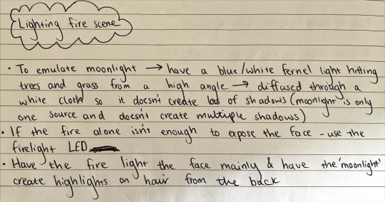
(I had drawn up an official blocking plan for camera and lighting too but I think I lost it on set as I'd torn it out of my notebook to show the camera crew when we were on location)
I felt so grateful for my ACs (Gordie Bryce and Gonçalo Góis) and gaffer (Dan Young) this shoot day. I think this was one of my most stressful days on set since I was already feeling uncertainty around what I’d shot that morning in the dining room. Luckily we had to wait for it to get dark outside before we began to film the night scene, so I had time to go over my lighting plans with my ACs and gaffer (aka my lifesavers). I was so grateful for this extra prep time because we had the opportunity to test out a variety of placements for lights – testing out different levels of brightness, gels vs. no gels, and placements until we settled on the lighting look I was most content with.
I could definitely feel my stress levels rising as the time to shoot grew nearer and nearer. I felt guilty making actors stand in to test lighting because of the low temperatures outside, and the overall tiredness of our longest shoot day was starting to get to me a little. Luckily, the Moth! team were excellent at looking out for each other, and Lilith (in true director style) directed me to sit down for a little while my ACs finished setting up under my instructions. While I often talk about how fulfilling I find the long hours and hard work on set, this day did show me the importance of taking breaks on set when they are needed. While it is good to push yourself, working with heavy kit and having to be constantly mentally switched on all day does begin to take a toll after some time. That being said, after a short break, seeing the scene set and hearing that the actors were ready for our first take of the night shot the excitement right back into me and I was raring to go once again.
Here are some BTS pictures from the night shoot:
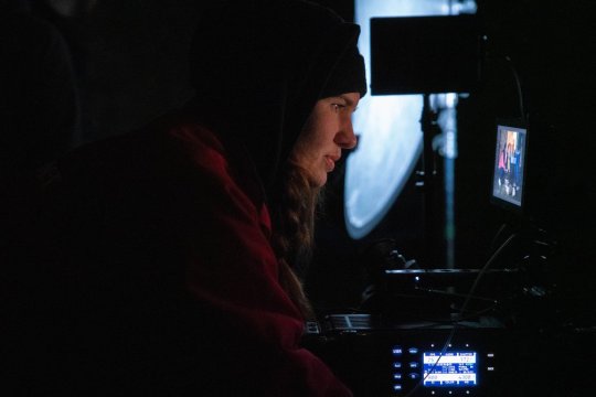
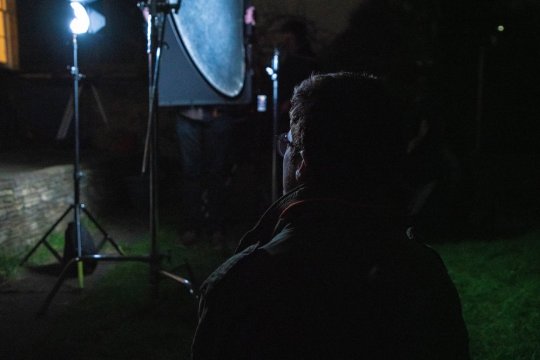
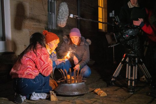
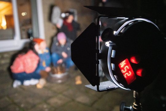
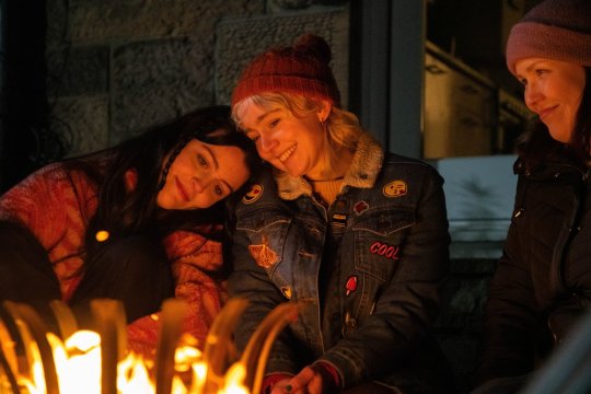
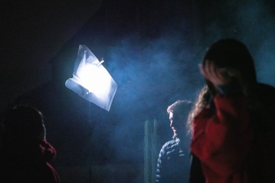
(Photos taken by Abi Avery)
KITCHEN ARGUMENT CONTINUOUS TAKE
I shot one long continuous take for scene 2 (the argument between Sophia and her mum in the kitchen) which didn’t fully make the final cut. Since this idea first popped into my head during discussion with Lilith in pre-production, I have been SO EXCITED to finally film it. Shooting a scene as one continuous long take was something very new to me, but something I had always dreamed of doing. This is our most intense scene in the film. It’s the first time we are introduced to Sophia’s mum and the first time we show the dynamic between these two characters to the audience. I felt that I had to do this justice by emulating the highly string emotions through the camera.
During rehearsals (which I have written about in a previous blog post), I could practice the blocking with stand in actors, which gave me footage to review and find what I liked and disliked with the continuous take. My main takeaway from the rehearsal was that I felt the emotions I wanted to convey didn’t come through the way I wanted with a wider lens. It didn’t feel intimate enough. So, I knew on the day of filming to shoot with a closer lens to create this feeling of claustrophobia that I felt the character Sophia was feeling throughout this scene. I’m glad I made this decision because it definitely got across the pace, visual style, and mood that I wanted from the very beginning. We also did a couple of takes with a wider lens for safety and editing sake.
Considering this was the scene we thought would take the longest to shoot, we ended up having some spare time on set. We took this as an opportunity to add in some extra coverage shots including close-ups of the flowers (a significant element in this scene) and experimenting with different angles of the scene that our editor Brontë could use if need be.
Shooting these extra shots turned out to be really useful in the edit because the pacing of the scene was much quicker than we would have liked in the context of the rest of the film. By cutting up the continuous long take and splicing in cutaways throughout, we could create breathing room in the scene and spread of the pacing to a much better point. While it is a shame the entire take won’t be used in the final cut, I am still content knowing that my original idea went to plan. It is a good feeling to know I have the ability to bring ambitious plans to fruition and this experience has motivated me not to hold back on plans in the future out of fears it won’t work.
0 notes
Text
Moth! - my week in Kilby the week before production
In the last week running up to filming, I spent every night in Napier’s Kilby study centre doing any final research/planning that I felt was necessary. I think these late nights were fuelled by nothing but pure caffeine and the fear of failure but, looking back after wrapping the film, I am so glad that I took the time to make sure I was completely confident in all my ideas/plans for my own peace of mind.
The things I did this week included:
Making a spread of film stills for each scene that I felt captured the tone/atmosphere accurately in terms of lighting, actors blocking, lens choices, etc. that I could share with the group for a final confirmation that everyone would be on the same page on set:


Schedule how long I thought each shot and lighting set-up would take so our producer and AD could make a schedule and call sheet for set
Watching videos made by cinematographers setting up lighting for the same settings I would be lighting (i.e. lighting an intimate, warm dining table scene or lighting a kitchen during daytime, etc.) so I could pick up any last minute tips and tricks that may come in useful
Finalising lighting plans by drawing up blocking for where I planned to place lights, flags, etc that I could take to set each day and show my gaffer and ACs for a quicker set-up time on arrival to set. Here are some examples of those:


:)
0 notes
Text
Moth! - Andrew’s Friday camera masterclasses
Dolly rehearsal
One of the scenes I had planned that required the most practice included a long take with a dolly. Therefore, I thought a good use of our time in Andrew’s first camera masterclass would be to book out the dolly and spend the whole day blocking out the movements and getting comfortable with all the focus pulling and camera pans that this scene included. This day was also my first time working with my ACs Goncalo and Gordie so it doubled as an opportunity for them to get used to the Alexa camera and pushing the dolly while I was standing on the track operating the camera and pulling focus.
Having the opportunity to spend a day practicing this shot saved so much time on the day of filming because we could focus on the actor’s performances hitting the emotional beats needed instead of having to do lots of camera rehearsals before any takes. It also got me back into practice with the Alexa since I hadn’t had the chance to use it since the Alexa camera test a couple of months prior. This meant I felt a lot more relaxed and confident going into filming.
At the end of this day, I had time to talk Andrew through Moth!’s locations – showing him pictures I had taken on location so he could get an idea of the space and lighting (showing him where windows are and what sort of lighting was already in the rooms.) He gave me advice on different ways to achieve the lighting I want and the best methods any unwanted natural light. This advice came in very handy when writing up lighting plans.
Lighting tests
During my chat with Andrew about lighting in the previous Friday class, he told me that a Chinese lantern style of light would be a good choice for lighting the dining table scenes, and possibly the bedroom. I did my research on how to utilise this type of light by watching YouTube videos with people using them to light similar scenes – taking note of any tips they gave that I thought would elevate my own shoot. I ordered the parts I would need to assemble my own and used it in my lighting test.
We booked out a room and I had Kate and Bronte stand in so I could photograph them with the lantern in different position to test out what lighting positions look best. Unfortunately, the room we booked in Craiglockhart had large windows with blinds that didn’t close fully so it was difficult to block out all unwanted natural light, but I used black flags to stop as much as I could from hitting Kate and Brontë so that the test would be as accurate to the shooting location as possible.
Here are some images from this lighting test:


Having this time to play around with lighting without the pressure of being on a scheduled set was extremely useful and will be something I always make sure to do with any future film projects. Lilith unfortunately could not make it this day and so having these lighting tests to show her was great for everyone involved as she could get a clearer idea of my plans, and I could ensure she was happy with my work.
0 notes
Text
Moth! - actors rehearsals
After confirming our casting choices, we arranged a couple of dates that they could come in to Merchiston/Craiglockhart for rehearsals. This was a perfect opportunity for Lilith and I to work together on scene blocking so I could know where to position the camera in alignment with the actor’s positions so I could move on with finalising shot lists and story boards.
We started the rehearsal for scene 4 (location: Sophia’s bedroom) by setting up tables and chairs to roughly replicate the bedroom’s layout in the location we would be filming in. Lilith took the time to direct our actors for Sophia and Caitlin and I watched as they ran through the rehearsal a couple of times to get used to which lines the actors would be moving marks on, etc. I then spoke to the actors about which lines of dialogue would be covered in each shot, then got to work shooting the rehearsal based on the rough story board I had made at that time.


This was really useful for me to be able to have a visual aid to show Lilith and the rest of the group so they could have a clear idea of my plans for camera. It also allowed me to notice any shots that didn’t quite work out. For example, I noticed that some of the movements I had blocked with the camera broke the 180 rule, and so I was able to re-block some shots in the moment. This saved time in the long run and meant Lilith and I could start building a strong communicative relationship with the actors.
0 notes
Text
Moth! - all day meeting 2 (8th February 2023/10.30AM-5PM)
Since our first all-day meeting was such a success, we decided to have another one to check back in with some of the bigger progressions of work we had each made since we last met.
I had finished the kit list to give to Kate so she could book everything out on SISO (which was due to possibly have some things added/removed depending on if Lilith wanted any more changes to my updated shot list and story boards/lighting plans).
I had made sure to do a lot of research into the lights I would be booking so I wouldn’t run into any issues with having lights that were either too strong or not strong enough for the environments I’d be shooting in. One of the scenes I would be filming involved a bonfire, and so I wanted to look into what lights available to me would have settings for faking firelight in case the practical bonfire we made didn’t provide enough natural firelight to light actors faces in the dark.
The rest of the lights I booked out included:
Kino Flo Celebs (these give off a softer white light that doesn’t flicker or shift colour temperature when dimmed I had planned to use these in the bedroom if the natural daylight from the window wasn’t bright enough since these lights were big and could be used to wrap a sift light around faces)
1k ARRI fressnel (I wanted to have a stronger light that I could use to shine through windows to emulate daylight if need be when light outside begins to fade if we were to run overtime in schedule I never ended up using this light)
300W ARRI Fresnel (despite being small, it still has an impressive light output which may have come in handy for more compact locations if I needed strong light also did not end up using this)
150W Dedolight kit (output light equal to much larger light sources with precision beam control that can light from quite a distance I used these for lighting tests and they came in handy but did not end up using them on actual shoot days)
Rotolight NEO kit (The compactness of these lights made them perfect for scenes set in the bedroom location since they left enough room for actors to move within the space without the lights effecting blocking The fact they were LEDS also meant they gave off a soft, even light and were ideal for seamlessly switching between a colder or warmer colour temperature when need be or matching daylight These lights also have a firelight setting so I was able to have one of my ACs control it to fake a stronger firelight on our actor’s faces when it was needed during our final scene with the bonfire)
We had been given word that Andrew was starting up camera workshops across the upcoming Fridays, and so I spoke to the group about what I thought would be the best uses of our time during these classes. I decided first we should book the dolly to practice blocking and timing of camera movements for a scene involving an argument in the kitchen. I had originally wanted to film this handheld, but die to the extremely heavy weight of the camera and the extended time I’d have to hold it for, I decided to change it so this scene was filmed on the dolly and panning the camera between each actress to keep up with the beats of their argument instead. Therefore, this so what we would practice in the first Friday camera workshop. I also felt like I was out of practice with lighting set-ups and so decided this should be what I practice in the following class after doing more of my own research on how I wanted to light each scene and speaking with Andrew about how to execute these ideas best. (Detailed descriptions of these classes can be read in upcoming blog posts!)
At the end of this all-day meeting, I’d given myself the goal to have penultimate drafts of story boards and shot lists to show Lilith by the following week (penultimate so that she could give any last feedback before I locked in the final versions)
0 notes
Text
Moth! - all day meeting 1 (25th January 2023/ 10.30AM-5PM)
In the last couple of months leading up to our shoot dates, our producer Kate kept us all very organised – ensuring that we always checked in with weekly meetings. However, as time loomed on, our usual schedule of 1-2 hour long meetings just wasn’t cutting it anymore. I offered up my flat for us to have a day-long meeting from 10.30am-5pm so we could spend the whole day as a group finishing up any final decisions we could make as a team (such as casting choices, location choices, etc.).
Kate also scheduled time for each of us to share what we had been working on in our own department, so I was able to update everyone on my latest cinematography progress.
I explained my vision for the film using references to films and stills that had the same lighting or shot types as what I had envisioned for Moth!
Since Lilith had written the character Sophie to have an emotional arc across the film, I wanted to emulate this in the lighting choices. For example, in the opening scene where Sophia is alone in her bedroom and her monologue touches on her feelings of loneliness and sadness, it didn’t feel right to use any warm or overly staged lighting. I wanted to keep it as natural as possible and avoid any warm tones – using flags and bounce materials to shape the natural daylight coming through the large window in the bedroom location.
On the other hand, in later scenes where Sophia returns to her bedroom with Caitlin (whose character acts as a source of happiness in Sophia’s light), I wanted to then incorporate more warmth and include practical lights this time to match the idea that Caitlin is, in a way, a source of light in Sophia’s life.
I had written out a first draft of shot ideas for each scene that I talked through with the group. However, much to my disappointment (but also I understand why lol), Lilith requested that I change some of the shots that involve a lot of camera movement so that they are more static. This is because a lot of the films she had looked to for inspiration within the coming of age genre didn’t actually include much experimental camera movements. Therefore, I agreed to look back at films she mentioned (Lady Bird being a big one) to mimic their styles of cinematography and redo my shot plans. Having constructive criticism and having to change things I like is a natural part of working in a team and I found that being able to adapt my ideas to the director’s preferences has made me stronger in the pre-production parts of being a cinematographer.
I also had to decide which lenses I wanted to use in our shoot by this date so Paul could know which group was using what kit to avoid any crossovers. I did research by watching YouTube videos about each lens brand that was available to me so I could make a well-educated decision based on what would work best for our film. I went with the Zeiss Prime lenses because of their sharp clear images that I knew would be great for adapting to the various environments and differentiation in lighting through the film.
0 notes
Text
Moth! - Christmas break & schedule moving forward
Christmas break:
Over the Christmas break, we wanted to keep up momentum with our workflow. We did so by making sure to have meetings every once in a while to keep each other up to date on any work we were doing and check in to see how the fundraiser was doing. Lilith was making updates on the script between meetings which we would then give updates on in each meeting, meaning we were able to keep up the habit of helping each other collectively.
A homeowner had replied to our location call offering up their house for us to use. The timing would have been perfect as it was empty and getting refurbished in time for when we would need it (so it would be a clean slate for set dressing) and new tenants wouldn’t be moving in until a while after our shoot dates (so it would be empty for us to use whenever we needed). We went to view it during the break and, while the kitchen had the open spaciousness I was looking for as cinematographer, it had lots of natural light which would be hard to control. The bedrooms and garden were also smaller than we wanted. So, while we aren’t entirely ruling it out as an option, we are continuing our search for a location.
Since we put the casting call out at the end of November, we’d had a lot of self-tapes sent in for us to look over during the break. Our producer, Kate, put together a slideshow of all the self-tapes, separating them into sections for each character for us to all watch through. We had a meeting to discuss who we thought would suit the characters best, and Kate got in touch with our favourites to call them back for in-person chemistry tests.
Only Lilith (writer/director) and Kate (producer) attended the in-person chemistry tests, but they were filmed so Bronte and I could have our input. Luckily, the entire group had the same opinion on the actors we felt worked best as a duo for the best friend characters, and so our next step is for Kate to contact them to confirm their roles in our film.
Schedule moving forward:
After our first tutorial with Paul (18th Jan 2023) upon returning for our final semester (FINAL??? EEK!!!) we had a meeting to plan our next steps moving forward. Dates are being arranged between groups for the final shoots, which means now that we have a date to work towards, the pressure is on to be prepared ahead of time. In the meeting, we gave ourselves tasks to complete before the next time we meet.
We have scheduled an all-day workday as a group for the 25th with the agenda of:
Creating a production schedule
Update on filming location
I will explain a more detailed vision for the cinematography including links to film clips and a visual story board using stills from films that are as similar as possible to how I picture each scene
Organise crew and create group chats with crews outside of just the department heads
We hope this meeting will give us the chance to get lots of organisational tasks done and ensure we are all 100% happy with each other’s creative decisions before we get into the final weeks of pre-production before shooting. I am really excited for this meeting as it will feel so productive and basically be an entire day of what I love about the film making process - working together to break through creative challenges and feed into one another's creativity to ultimately create something great :)
0 notes
Text
Moth! - final pitch
Planning – It finally got to that time in the semester we had all been anticipating from the very beginning…pitching our films to be green lit. Our fantastic producer Kate made a template for our PowerPoint and we each took turns filling in our sections.
Presentation – The morning of the pitch, the Moth! crew came together one more time for a run through to ensure everyone was confident with what we were saying and to double check the runtime was within the required time limit. When it came down to the presenting, I was extremely nervous as always but managed to keep the shaking and crying down to a very minimum! Woo! Everyone spoke concisely about their roles, and after class people said we seemed to have a clear vision of what we want for our film, which was super nice to hear. The main things I touched on in my part of the presentation were: the test shoot, what kit I used during the test shoot and what kit I plan to use during the official shoot, camera movement and lighting. Here are some of my slides from the presentation:


Grade/feedback – In the end, I was happy with our grade. I also received some good constructive criticism which will be helpful moving forward knowing what to work on with future pitches and knowing what people want to see. A summary of the feedback I got was:
I would benefit from further developing my approach to style by narrowing down the technicality
0 notes
Text
Moth! - Test Shoot
After multiple meetings in which we reworked the script, discussed character traits in detail, etc., it was time to plan the test shoot.
Aim – Our aim for the test shoot was to create a scene that showcased all the most vital elements in the wider script so that we had an accurate representation to show people how we want our final film to turn out. We began planning a good while in advance of the deadline – partly so we wouldn’t be rushing to finish everything around the time of our dissertation deadline, and partly so we didn’t have to rush the shooting process, so we’d end up with a piece of work we were all happy with and proud of.
Preproduction – The script ended up being complete later than I would have liked it to be to give me time to prepare the story board and shot list, but I made do with the time I was given. This did mean I didn’t have much time to discuss what I had come up with before the shoot with Lilith and the rest of the team.Here is the story board and shot list I made for the test shoot:


I also went through Siso and put together a list of camera and lighting kit that I wanted so that our producer Kate knew which kit I needed booked out for my camera department.
Location – Our production designer Brontë wanted the colour purple to be a running theme throughout much of her work since it appeared in a lot of the inspiration, she had been looking at running up to the test shoot. Lilith sent us pictures of her flatmates room, which had a purple wall, and so we ended up using that. While the production designer did an amazing job at transforming it from the former boyish room it was before into a typical teenage girl’s room, I do wish I had gotten the chance to see it in person before shooting. It ended up being far smaller than it had looked in the pictures Lilith had sent, which meant many of the shots I had planned deemed very difficult to execute – especially the wider shots. This is mainly because of the lack of space within the room and because the large furniture could not be moved to give more space. While this was disappointing, I am proud of myself for being able to adapt so quickly and cover any missing shots with new ideas – some of which turned out better than I expected which shows sometimes spontaneity.
Production – One of my goals for this test shoot was to create the feeling that Sophia’s bedroom was a haven for her in a time of hardship in her life. I wanted to make it feel cosy and safe with the lighting I used. First, I tried out different ways to light the room using the Arri Fresnel lights. However, since the room was so small, these lights looked too powerful and didn’t give the natural, warm look I desired – even when bouncing them off sources instead of shining them directly onto the actors/room. So, I experimented with lighting using solely practical lamps. By using some as backlights and bouncing others off reflectors, I achieved the look I wanted. Here are some stills from the test shoot:


What went well – The test shoot was extremely beneficial. It gave me the opportunity to try out different shot styles and ways of lighting to create a look I am happy with, as well as seeing what does and doesn’t work.
Post-production - My part in the post-production process was to colour grade the footage after our editor got to picture lock. Unfortunately, picture lock didn't happen until 2 days prior to the deadline, leaving me only 1 full day to do the grade. Since I haven't had that much experience with grading, I would have liked more time but this time management is something I know we can improve on in the future when it comes to post-production of our official shoot.
When exporting the test shoot after finishing the colour grade, the finished product did not look like the grade had been exported with it. It turned out that my settings had to be changed from rec709 to rec709 gamma 2.4, which is not something I was aware of. This change in settings caused the grade to look different to how it did within Davinci.
Since the picture lock did not happen until two days before submission, I only had one day to work on the grade and, since we ran into this issue very last minute, the grade ended up looking slightly darker and not as warm as it was intended. That being said, I am glad this issue happened for the test shoot so I know how to go about things properly when colour grading our final film. Here are some screenshots of how the grade should have looked:


What to improve on – The preproduction aspect has taught me just how important location recces are…never.trust.a.photo. I also want to make sure that next time we definitely give everyone in the group enough time before each step i.e. not leaving picture lock until 2 days before the deadline so there is only 1 day to work on the grade, or not finishing a script so late there is limited time to rework the shot list/storyboard if any issues are noticed.
0 notes
Text
Moth! - cinematography research
Inspiration
A huge part of my research this semester was looking at both film stills/photography and scenes from films that centred around similar subject matter to scenes from Moth! (i.e., the note burning, kitchen argument, Sophia’s bedroom). It was good for me to see the way other people within my field tackled the subject matter – did they capture it from afar? Up close? Was the lighting moody and dark or bright and inviting? By looking at lots of different types of media and seeing what I was most drawn too, I got a feel for the way in which I would like to bring Moth! to life visually.
I put together a big mood board that I plan to keep adding to right up until I finalise my own ideas for the proper Moth! shoot, but until then, it has been a good way of showing the rest of the crew what I have in mind to make sure I am on the same page as our director Lilith. Lilith was happy with the mood boards – claiming it was as if I had “climbed inside her brain” – which is always high praise when first showing a writer/director how you visually perceive their work.
Here is an example of some images from the mood board:

The key elements I have been looking at for now are lighting and framing.
Cinematographers
I have also been looking at cinematographers who have worked on projects that are similar in tone or have similar characters/subject matter to moth!.
One person who’s work I really admire is Rina Yang. Much of her work revolves around lots of handheld and dolly work and has been described as “a subtle style that doesn’t require brash composition, nor does it force you to consider ‘The Cinematographer’”. One project of hers that I looked to most for inspiration both for the test shoot and the film as a whole, was Yang’s cinematography on ‘All Too Well: The Short Film’. A lot of the visual elements I want to include in the cinematography for Moth! have been used in this project – especially the handheld work. It was interesting for me to see how she had shot some of the longer scenes using handheld camera. It was interesting to see the blocking se used when holding the camera on each subject during an argument in a similar setting to one included in our own film’s script.
Another cinematographer who’s work I found to be a relevant source for inspiration was Oli Russell. While the work of his I looked at was for TV instead of film, it was still relevant. He worked as cinematographer for both Sex Education and Derry Girls – two shows which have a similar mix of comedy and drama to the script for Moth!, as well as having a cast of young characters going through strong teenage emotions like our main character Sophia. It was good for me to see his approach to bringing this type of story to life visually. While the cinematography for Derry Girls was more set in social-realism, Sex Education had a brighter approach. The colour grade had pops of saturated colour. This is something our director Lilith said she wanted in the grade for our film because, when watching teen films for inspiration when first writing the script, she noticed films like Mean Girls and Legally Blonde incorporated this look.
Here are some stills from Sex Education and Derry Girls:


0 notes
Text
Moth! - Meeting 1: reworking the script
After being confirmed as the cinematographer on Moth!, I immediately started jotting down any shot ideas that came to mind (these will be spoken about in more detail at a later date) as I was reading through Lilith’s latest copy of the script. I always find this is a great method for me when first joining a project as a cinematographer. Whenever reading through a script I enjoy, I get flooded with ideas and different ways I visualise scenes, and so writing them all down immediately keeps my thoughts in order. It also gives me a good jumping off point later down the line when telling the soon-to-be-confirmed director what I had in mind to ensure we are on a similar page before I can go ahead with putting in more detail and finalising shot ideas.
When I joined the team, Lilith was already writer and Kate was already confirmed as producer. We wanted to get an editor on board quickly as we had a couple people in mind and were wary of them being confirmed by other film groups before us. Luckily, one of those people – Brönte – was also very keen to work on Moth!, and so, our team of three became four.
Not long after that, the four of us sat down to have our first meeting as the Heads of Departments. This meeting took place on 6th October 2022. We all mutually agreed the script needed some reworking around its timeline of its events, how prominent some characters should be over others, etc. and so we dedicated this meeting to develop these things as a team.
We all made sure to keep Lilith’s original vision for her script in mind, and having only recently joined the team, going over it in detail allowed Brönte and I to gain more connection and insight into the characters/story.
Here’s a photo of our whiteboard after having worked through the script:

It shows the way in which we split the script into 3 main parts, with sub-parts within each one. We took our time moving number around until we all landed on an outline we agreed on – with Lilith getting the final say as writer, of course.
All in all, the meeting deemed really helpful for everyone involved and was a good example that we all work well as a team. Lilith’s next step is to rework the script. Mine will be to create a mood board to show the team what I have in mind as cinematographer in terms of colour palette, lighting, and general style of cinematography.
0 notes
Text
17th October 2022 – Seminar 5 – films
This week’s films are all ambitious in their mode of address and narrative structure. They all explore personal experiential stories while also containing within stories.
Here are the initial thoughts I had when first watching these films:
As I Am https://vimeo.com/48312847
While I enjoyed much of this film’s cinematography, I did feel that after a while, the effect of its mode of address began to wear off. The visuals were beautiful, but they went on for too long. I felt that this film begged for some sort of change mid-way through to keep the audience’s attention as I found myself drifting in and out of paying attention to the voice over/having some of the visuals wash over me.
That being said, it still gave a real sense of the community, showing characters that I felt well represented a light in the dark times this community faces.
Krista https://vimeo.com/259943563
This film is constantly pulling you along with its high-paced narrative and I adore it.
The two locations within this film are tied together perfectly by the cinematography. Despite there being far more fast-paced blocking in the acting class compared to the street, the camera’s constant movement and tracking throughout the whole film worked as an invisible string that tied both acts together seamlessly.
160 Characters https://vimeo.com/189536800
The story itself mixed with the tone of the filmmaker’s voice initially made me feel for her
However, after discussing this film with others and taking my time to think it over again post-viewing, part of me feels this film can be seen as slightly unethical? Of course the story is hers to tell, but part of me wonders if she should have kept names and her son’s identity more private in case he may, in future, not want to have his story so public.
This film definitely opens up an interesting conversation around ethics and who a story belongs to in film making.
0 notes
Text
19th Sept 2022 - seminar 2 - films
The focus for this seminar was how all departments involved with making a film can contribute to its world-building and mis-en-scene. Paul sent us some films that he felt had well defined mis-en-scene, and so we had to watch them with this in mind.
Here are the initial thoughts I had when first watching these films:
Sevilla https://vimeo.com/90798046
Bright sunlight and laughter lulls the audience into a false sense of security that this will be a joyful film exploring the characters’ friendship. This is quickly met with a duller/darker tone shift. I like this way of storytelling done by intersplicing two parts of the same story from different time periods. It lets the audience try to figure out where it could be going by tying together the two parts as the film progresses, which I always think is a fun, fresh approach.
A perfect example of how silence can speak louder than words, as can an actor’s expression over the lines they speak.
Show don’t tell is a prominent rule in this film and allows the story to be led by emotions
Submarine https://vimeo.com/233685439
This film had such gorgeous set design (gorgeous, considering it mainly consists of garbage). It gives such a clearly well-though out, well-rounded idea of the world we enter when watching this film.
Loved the tracking of the camera
Listen https://vimeo.com/196593911
I loved the edit at the start, staying on each person for the duration of what is said and then repeating the dialogue but focusing on each new face. I feel this helps you get to know each character far better and determine the part they all play in this story when the film works with such a short amount of time to do so
Edited and shot so simply yet holds so much emotion through the words being said
Skeleton Heart https://vimeo.com/319704456
There doesn’t always have to be a clear narrative/arc in a film to tell a story, and this film proves that. The shapes and light matched together in Skeleton Heart ties a story together in its own unique way, working as a through line that leads this story from day to night.
0 notes
Text
Film craft disciplines
'Without You'
First start
After getting sorted into my role as the cinematographer for Alexa’s film ‘Without You’, I met with her and Molly – who is the director – to get the ball rolling. One of the things we talked about was details like colour palette, lighting, tone, etc. we all came to the same conclusion this film would suit a warm, homely feel with lots of deep oranges and browns. Since the subject matter is rather dark, we thought setting it in this visually comforting environment would give it a different focus – making it more about the sister’s family relationship when dealing with such a hard subject than about the subject of death itself.
Pre-production
So that myself and the director would be on the same page when planning the cinematography throughout pre-production, I made a collaborative Pinterest board with Molly that we could both use to save and share inspiration and reference images.
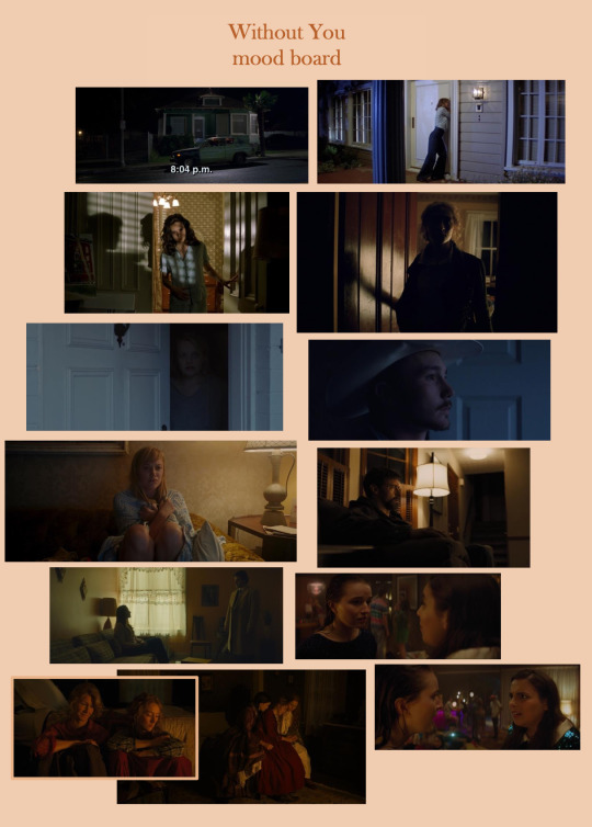
I then went on to make a more precise document of how I personally imagined the film looking. I made a collection of ‘shot inspiration’ that turned into a sort of loose story board formed of stills from a variety of different films that I wanted to draw from in terms of their lighting, blocking, colour palette, etc. This turned out to be useful for communicating my image through to the rest of the group and having as a reference point when setting up shots in rehearsals and the shot-list later during the pre-production process.
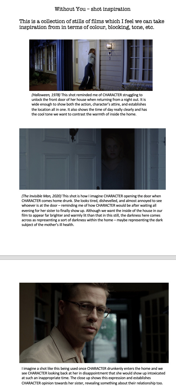
Actor rehearsals
After casting our actors for Natalie and Stevie, we had two rehearsals with them. The first was under the supervision of Andrew and Demelza, where we ran through one small section of the script, and the second was for us to work in more detail with the actors through the entirety of the script.
In the first rehearsal, I got the chance to show Andrew the cinematography mood board and shot inspiration lists I'd come up with, and he gave me tips on how to recreate the lighting from a lot of the still I'm taking inspiration from. This came is so useful and has helped me to feel much more confident going into this project, as I was feeling a little doubtful of myself beforehand :)
The second rehearsal, where it was just us and the actors, was also extremely beneficial to my role as cinematographer. Seeing the whole script come to life meant I could see what Molly wanted in terms of blocking. This meant I could get to work on creating a shot list now that I knew the movements of the actors and could consider camera placement, moves.
Here is the shot list so far - Molly is still to give her input, and after visiting our filming location and having a test shoot, this may be subject to change:

Location Scout
After our producer Kate made and sent out a location call, a woman got in touch with us offering her cottage in Leith as a filming location. It is a 30-40 minute bus ride directly from the door of our campus to the door of her house, and so we decided to visit to see if it would suit what we were looking for since access was already easy.
As soon as we arrived, it had already ticked all the boxes we wanted (especially the fact there was a couch!!! victory!!!!)
The owner of the house was lovely and told us we were welcome to move some furniture around if need be, so there will be plenty of room for camera and lighting equipment.
The look of the room was also just what we had in mind. This means production design will be an easy task to master, which makes our lives a lot easier considering we don't have anyone specific who is officially filling that role.
I took some pictures to show the group members who couldn't show up, and to use as a reference for a floor plan:
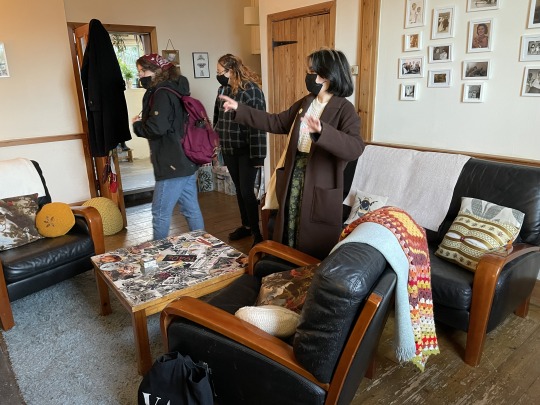
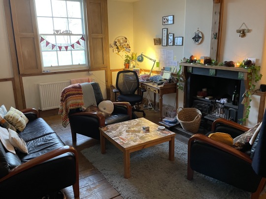
So far, we're all really excited for production to go ahead now that all the pieces are falling into place!
Kit rehearsal
Next, Molly and I booked out the camera and lenses we planned to use during our shoot so we could have a rehearsal. We used this time to decide what lenses we preferred for each shot, and camera placement in correlation with where Molly wanted to position the actors in each shot. I found this time to be very beneficial as it gave us to opportunity to spot any issues or changes we wanted to make ahead of time, saving us the problem of having to deal with them on the actual days of shooting.
Shooting
Despite lighting set up on the first day of shoot setting us back a little in our schedule, it all turned out okay in the end and we managed to finish shooting at the time we had planned. We couldn’t book out the lights we wanted since they had already been completely booked out, we had to make do with what we had. I was trying to be cautious not to make lighting look too bright or harsh as I was determined to achieve the warm homely lighting we had wanted from the start. This meant I used gold reflectors to bounce light onto the actors faces instead of shining lights directly onto them to get the warm look we wanted – mimicking the light from a lamp instead of a bright overhead light.
In post, this did cause a slight grain in some of the wide shots due to there not being enough light in the frame. However, with the grade I managed to brighten it up so this was no longer such a big issue.
'Fallout' - secondary role
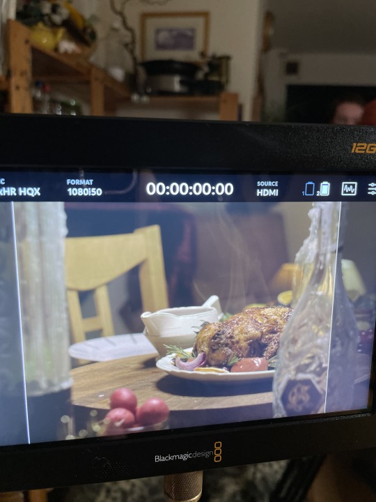
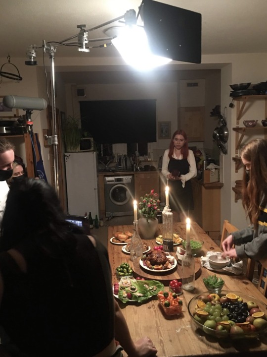
My secondary role was as the production designer for ‘Fallout’. When I first joined the group, I read through the script and asked Maddy if she had any initial ideas. The film features a huge dinner that plays quite a big part through out and so I knew that would be the focus of my job. Maddy wanted it to look grand and as delicious as possible, and so my mind went to a classic Christmas dinner. I knew I could have a lot of fun with this as I could use a big roast chicken as a centre piece and build up from there with all the extras, using sauces and veg to add colour into the set.
Once Nina was brought into the group as the production design assistant, I briefed her on what Maddy wanted and shared with her what I had in mind so far. We then put our heads together to talk about references in film that we thought would suit our theme for ‘Fallout’. Because of the film’s tone, we wanted to have a slight creepy, unnerving feel to the dinner, and so Nina suggested the tv show ‘Cannibal’ as a reference point for us. There are a lot of scenes in which he makes food that looks delicious out of human remains – just the creepy touch we wanted!
We also thought it would be interesting to include some visual metaphors within the set design. For example:
- a stag’s head on the wall as a trapped animal to represent the way Craig is trapped within the relationship
- a lot of pink and more feminine-centred objects like pink wallpaper and flowers to show the control Jodie has over their home as well as the relationship
- wilted flowers held up by sticks to show that even though produce is low because… it’s literally the end of the world… Jodie still wants everything to be perfect, she’s holding up a failing relationship with all she can pull together at this stage
After our discussions, Nina and I had a meeting with Maddy to fill her in on our ideas so far and see what she liked and disliked.
We then went on to buy everything we needed ready to set it up on the day of shooting.
Unfortunately, Nina couldn’t make it to the shoot, so it was my job to set everything up which was So. Much. Fun. I never expected production design to be something I’d take such a great interest in, but I loved arranging things to look just right, taking into consideration what would be most prominent in frame and wear, arranging subtle little references to the characters in the background and so on.
One of the most interesting things for me was the hack used to make the food look hot over the course of the day. After my work setting it all up was done, I spent the rest of the day going back and forth to microwave wet tampons and hide them in between dishes. This really is the perfect way to make steam appear on camera.
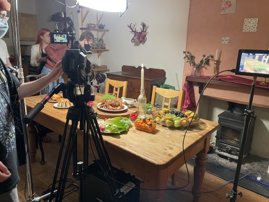
0 notes
Text
Film Craft Disciplines - CineHaiku project
BRIEF
After reading through the CineHaiku brief, I started to think about what I might like to do, and decided I would rather work alone on this project than in a group or duo. This would that mean I would save time by not having to travel through to Edinburgh to work with my group members, and instead can create a project at home that is entirely my vision.
Since the idea of a CineHaiku to me is something rather romantic, I came up with the idea to create one that represents the feeling of calm and serenity one may experience when waking up besides their loved one, and then the immediate juxtaposition of being torn away from that comfort to get on with the working day outside of your bed and loved one's arms.
I feel that this is an achievable idea to create on my own, as it only requires one subject (my own boyfriend, who I feel comfortable enough directing without the help of others) and one location (either my own room or my boyfriend's room, both easily accessible without the need to request permission or film on a tight schedule).
PRE PRODUCTION
When coming up with this idea, I could visualise it quite easily as it was one I was actually really happy with - and whenever that is the case, I find that ideas start flowing fast and full. I want the 3 'scenes' of this CineHaiku to be:
(1) Shots of someone's lover through their POV, meaning the shots would feel dreamy and intimate to represent the feeling of seeing someone in a beautiful light/through rose tinted glasses that happens when you love someone. This would include close ups of hands holding each other, hands running through another's hair, arms draped over shoulders lazily. All very mushy romantic stuff. yuckkkk !!! stop already!!! you get the idea...
A film that has really inspired how I want my film to look is 'Air' by David Findlay. Zoe showed this to the class during one of our lectures the other week and I fell in love with the soft intimate look of the shallow focus. I emailed Andrew O'Conner about how I can achieve this look and he gave me a number of options to try out that could make this possible. I am really looking forward to getting behind the camera and experimenting with the techniques he showed me.


Here is a mood board I made of images that influenced how I took the direction of my film’s cinematography, on top of taking influence from films like ‘Air’:

I also got to work creating a story board as a way to get the order of shots I had imagined for this film in my mind, out of my head and onto paper to see how they would look in a very basic paper edit type layout:

In terms of the sound element, I thought about what noises you might hear in a quiet bedroom early in the morning as you slowly drift in and out of sleep. The most prominent sound that came to mind was a clock ticking. This then gave me the idea to tie this in with the cinematography of my film by having the movements of fingers tracing over another hand, a hand running through hair, etc. to happen in time with the clock - for example, brush (tick), brush (tick), brush (tick).
(2) The big mental jolt or trigger that our film must include. This is the shot that represents that horrible feeling of getting forced out of the comfort of your bed/safe space/safe person to get on with your day - wether that be the coldness of outside the covers, the working day that lies ahead, etc, basically everything you DON'T want t face when you pull the covers off yourself in the morning. This will be a POV shot from the perspective of the couple in bed. I want it to include a mush of covers in the foreground of the shot, to continue with establishing where we are/who's eyes we are seeing this from. in the background of the shot - curtains. At first I want them to be closed and then WHISKED open quickly, flooding the shot with the bright morning light that will shine through the now open visible window in the process. This motion will happen at the same time as the sudden loud sound of the curtains being opened as well as an alarm going off (or something of the sort). I also want this shot to be slightly blurred so it has the feeling of looking at something with sleep in your eyes, as I find my eyesight is always blurry when I wake up early in the morning.
(3) This will be the aftermath shot. A wide shot of the bed, but now it is empty. There will be nothing on it but two dents of where the couple lay the night before. This will be a silent shot. The calm after the storm type shot.
Zoe's notes after 1st tutorial:
- instead of having a consistent clock noise throughout the first shot, the clock noise could start quietly and build a crescendo of volume to create a feeling of the impending doom of knowing that soon you must get up. I like this idea as it actually ties into the narrative I want to create far more than having the clock sound added in without thinking about the levels of volume.
CRIT
In the first section of my film, there was obvious visual ‘noise’ over the shot of the couple lying in the bed. This was definitely due to the lack of lighting used when shooting this scene. This was done partly because I wanted to give this scene the sense it was set in the early morning when it’s still dark outside, and the couple are lit by just a bedside lamp to make the room look cosy. It is also partly because I had to make my film in Dundee, where I had no access to good quality lighting equipment. I know for next time to be careful when shooting with low lighting so as not to pick up any visual noise in future.
When hearing my project played during the crit, I immediately recognised that my sound levels were far too low. I think the reason for this is because I worked on my project with headphones and on full volume. Since I was so used to hearing my project over and over I had probably tuned so much into when every sound happened that I didn’t take into account that people who are hearing my project for the first time may not pick up on subtle sounds. I also feel that I was playing it a bit too safe and was scared to make anything too loud. In future, I will have more confidence in raising the levels and not hold back on sound, as playing it too safe with the levels definitely sacrificed a lot of my subtle sound effects that I chose to create the film’s narrative.
In future, I will be more particular with what sound effects I chose, because even if I have multiple different effects of the same sound i.e. people laughing, each one may give ff a different mood. I had found one that – while the sound quality was very clear – didn’t give off the tone I wanted it to, which in turn made people read the narrative of my differently from how id intended it. For example, they took the laughter as sounding quite negative, judgemental, laughing at rather than with, whereas id intended it to sound like a couple laughing together in a nice, friendly way.
1 note
·
View note