Text
final product!
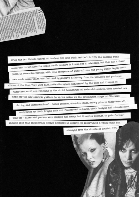
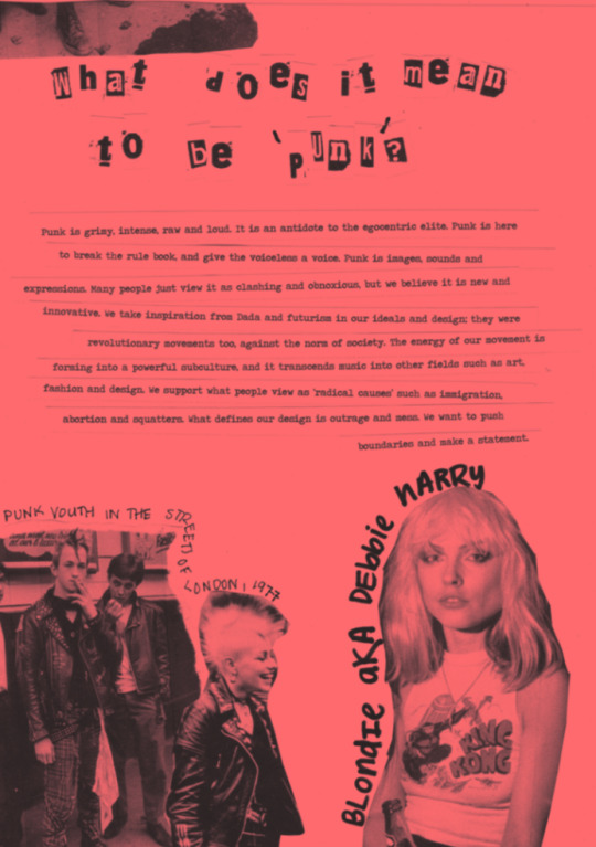
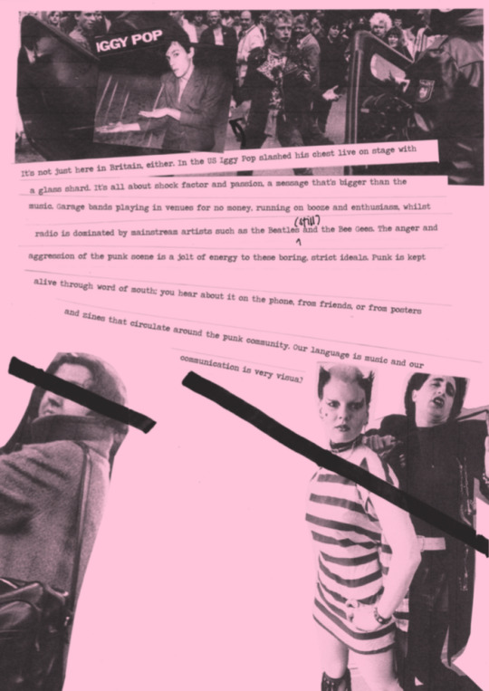
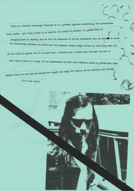
Finally finished my punk zine! Not going to lie, I really struggled with the punk aesthetic. My comfort zone is composed of grids, colour palettes and well proportioned imagery, so researching and creating this punk aesthetic really threw a spanner in the works in terms of the way that I design! I spent hours upon hours of looking through punk album covers, posters and zines, and while doing so became pretty accustomed to the way they talked and expressed things on the page. In the end, I kind of loved it. The freedom and mess is unlike any other design movement, and there was just so much to explore and experiment with. I was doing both manual and digital cutting and collaging, photocopying and scanning in random objects fro around my house, scribbling, gluing and doodling. It was a blast.
Some of the technical components trumped me for a while though; such as creating a coloured paper ‘background’ for some of my images (photoshop - solid colour layer - multiply overlay) which took WAY too long to figure out, as well as resizing and compressing a lot of the images. Just goes to show that in the chaos of punk you still can’t forget about those crucial things! Anyways. I have really enjoyed being a part of this class this semester. It has challenged me creatively, and I loved getting to know more about the history of design, especially from two legends of the industry who have so much knowledge on the subject. Here are a few pages from my final assignment:
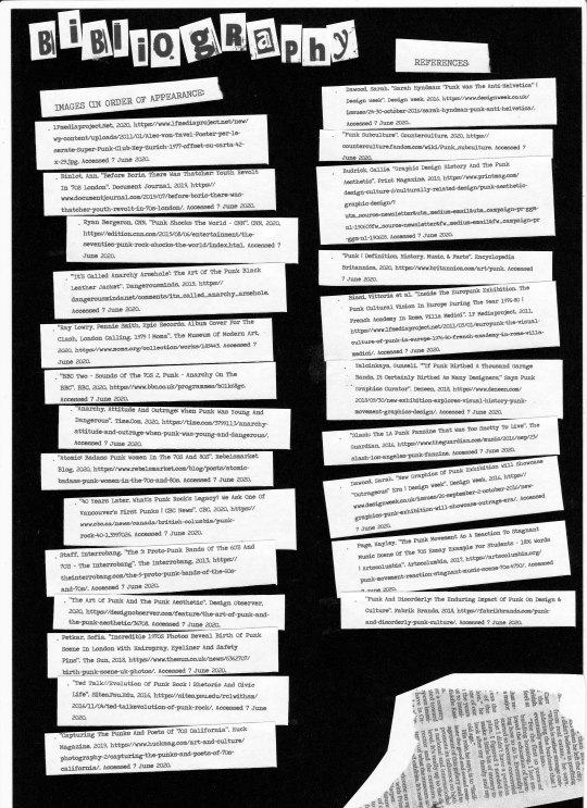
(sources above in bibliography)
10 notes
·
View notes
Text
the end (for now)
This class has probably been my most challenging class this semester. It has pushed me to explore new techniques, try new things and work in ways that I am not really familiar with. One thing I do really appreciate, however, is the amount of work and effort that Andy, Karen and Bailey have put into our lectures and classes. Watching the weekly lectures and the depth and analysis that Andy and Karen do into the history and realms of design is so interesting and has really opened my mind up to different ways of thinking and seeing. It was definitely a huge influence on my decision to choose Punk Culture as my zine topic. Looking back, I wonder why I chose a topic that was so unfamiliar to me and difficult to replicate, but I think it was because the lectures had sparked a real curiosity to see what goes on behind the scenes of the famous design movements, and why these things look the way they do.
One thing that Andy said during a tutorial really resonated with me and stuck with me - design doesn’t just happen when we open our Adobe Suite. Design is in the materials we use, the way we think and we we express these processes. The potency of the different topics in the lectures are a key reminder of this. The projects and tasks we were assigned were not digital based - they were hands on. Use spaghetti to make words! Carve play-dough! Make a collage! Write a question out of objects! They all pushed me out of the comfort zone of my computer and into the real world, where creation began. In our classes together, Bailey asked tough questions to challenge us and encouraged class discussions. During one class when we looked at our collages we had made, she made a lot of comments that made me look at our designs in different ways. ‘The balance of colour in your collage really makes it engaging’, she said about mine, which I never would’ve thought about otherwise! In one of our last classes we had face to face, she got us to look at a poster and analyse what was wrong with it. Our usually quiet class all started picking apart the different components, thinking of new ways to order it and trying to look at the poster from the experience of a viewer. It was these little things that all helped me develop as a designer over this last semester. I will miss the challenges of these classes, but I know these skills will help me in the future.
Image idea from Adrian - he made a really cool GIF of this balloon!
0 notes
Text
zine progress
This is one of the trial covers I made for my punk zine project! Almost done the final product, just putting those finishing touches on before submission.

4 notes
·
View notes
Text
Love this GIF animation Adrian! A lovely little full circle to the start of the course. I will miss that balloon every week.
Thank You

Designed by @adriansfolio
Wow, this semester done and Communication Design is in the books. It’s crazy how 6 months has gone so fast and I wish I did this class face to face and meeting all the students in my class. But I would like to thank Karen, Andy and Bailey for this semester, showing me all these new aspects of design. Exploring to different movements, typefaces, designers that I did not understand previously. Thank you, Andy and Karen for going out of your way and providing content for not only myself but for everyone. Andy always made the lectures funny and exciting for me and Karen I deeply appreciate insightful knowledge. I would like to say thank you to my teacher, Bailey. I knew we did not get to know each other properly, but you truly helped me a lot in this subject, getting feedback from you for my designs really helped. The fact you started class early in the morning and always willing to help and ask if we have questions shows how great a teacher you are.
For myself I learnt a lot and from now on I want to get myself out there, be proud of what I design and surrounded myself with design students friend who together embrace our creativity. Looking back yeah sometimes I was stress, felt tired, sick of working, irritated and alone but that did not make me give up. This is my dream and I will keep practicing, I will showcase my work to everyone and not be afraid to be who I am. I am still learning to appreciate myself and I will follow my passion of design through the ups and downs.
Thank You Karen, Andy and Bailey
It’s been a pleasure
✌️
24 notes
·
View notes
Text
readings roundup
I have fallen off the wagon a little when it comes to the readings for this class, but since all the cafes shut down (and with it my job), I’ve had a little extra time on my hands and I have been flicking through the different books and images that Karen assigned to us. In this post, I am going to post a few of my favourite articles, quotes and images that I have consumed in the past couple of weeks.
1. ‘What is a Designer?’ by Bruno Namari
‘The designer is therefore the artist of today, not because he is a genius but because he works in such a way as to re-establish contact between art and the public. He responds to the human needs of his time and helps people to solve certain problems without stylistic preconceptions or false notions of artistic dignity’
This article really went into great depth and detail about the role of. designer in society, offsetting them from the historic role of an artist and their purpose in recording history and following movements at the time. Rather, the designer is one of the people by helping them solve problems and issues through design, working in a sector of human activity.
2. ‘A Living Language’ by Bruno Namari
‘A rose is a rose is a rose. You go up and see it, for the sake of argument, that it is an artificial rose. Then you become aware of the material it is made out of, cloth, plastic or paper. But at first glance you were certain of one thing only, that it was a rose.’
This reading I think is trying to portray the message that in this current age we are so conditioned to everything around us, and we do it without even thinking. Moreover, the rose, no matter real or artificial or what it is made out of, is still simply a rose in the persons mind. In design, we draw on these preconceptions and held notions to create impactful designs.
3. ‘Industrialisation of Print’ by Elizabeth Wilhide

‘The Human Firefly’ by Janice Kerbel, 2007 (source: http://digbeyond.com/readme/PDF/RM_Design_Musuem_Industrialization_of_type.pdf)
I thought this poster was really cool as a recreation of what a printed material would have looked like after the early industrialisation pf print in the nineteenth century. the many different typefaces show the explosion of font that was now available and viewed by the public after the beginning of mass production.
4. ‘What is Design?’ by Charles Eames (1972)
‘What are the boundaries of design? What are the boundaries of problems? Is design a method of general expression? No. It is a method of action.’
These two statements from legendary designer Charles Eames are short but powerful. Design is only limited by the problem that is solving. He asserts that Design is an action, one that a designer undertakes, an expression of the purpose. Interestingly, when asked about the future of the design, Eames simple sent back (no answer).
5. ‘The Politics of Design’ by Paul Rand (1981)
‘Unlike the salesman, however, the designers overriding motivation is art; art in the service of business, art that enhances the quality of life and deepens the appreciation of the familiar world. Design is a problem solving activity. It provides a means of clarifying, synthesising and dramatising a word, a picture, a product or an event.’
Rand, similarly to Namari, connects designers directly with their audience. Designers serve the needs of the population, and are the artists of function, and it is about creating a design that has a purpose - people can look at it and understanding the message or information that you are trying to convey. Design is also se in layers; what may be an obvious interpretation can often have subtle or underlying messages and movements embedded in the visuals.
6. ‘How to Work Better’ by Fischli and Weiss (1991)

(source: https://www.thisiscolossal.com/2016/05/how-to-work-better/)
This street installation, which was actually mentioned during the most recent lecture, is text found on a factory in Thailand and has been reproduced all around the world. The steps are simple, but hold meaning. I think everyone can learn from these 10 simple steps, that are easy to implement in our own lives. My favourite is ‘Do one thing at a time’. I am often guilty of switching between projects too quickly, and never getting into that ‘flow’ of work which we all strive for.
7. ‘To Criticise or Intervene’ by Seth Price (2009)
‘Artists rummage through the toolkits of past artists for approaches they may make use of. For those reasons, the modern idea of a renovated ruin may be more relevant for art than the nineteenth-century model of picturesque decay.’
Price holds a valid point in his article comparing historic and modern design. Is it better to look to the past, or look to the future? Price argues that the past can be beautiful, and hold importance which we can learn from, but we must create. Newness is refreshing, engaging, and will become the history of tomorrow. We may look to nostalgia and find comfort in what we already know but we will only succeed in design when we experiment and develop.
3 notes
·
View notes
Text
week eleven lecture
This week’s lecture is all about ‘what’s next for the design world’. Andy and Karen explored design in the present day, and discussed the direction design is heading in taking into account the rapidly developing technology and resources that designers are now able to use at their fingertips.
Data visualisation, although quite scientific and corporate at its surface, can actually be quite artistic and engaging depending on their layout and topic. The movie barcodes is cool in that it explores colour and film, and blends together all the different frames of a movie and puts a strip of each frame together. It creates quite a narrative of colour. An interesting way of looking at en entire movie in one single image.

‘Purple Rain 1994’ Movie Barcode, (source:https://moviebarcode.tumblr.com/image/143383584144)
Something else that was quite scary but interesting was random, computer generated design. The computer generates pixels to form a human face, using two algorithms that generates pixels and reviews pixels. This to me still seems so advanced and odd that a computer could create these realistic, human faces. I kept refreshing the page to see if I could generate a face that looked like someone I knew, but no luck. Maybe one day they will create a program that can generate images of yourself that have never been taken! THat would be interesting.
2 notes
·
View notes
Text
social distancing
In the midst of lots and lots of overwhelming statistics, bad news and a global pandemic, this was a little playful little video that I found spreading awareness about social distancing using one the films of Wes Anderson (one of my favourite directors).
youtube
0 notes
Text
week ten tutorial
This week Bailey challenged us to create a collage in an hour using magazines, newspapers and any material we had around us.

In the magazines that I had, there were a lot of images of fabric and faces, I decided to make these the motif’s of the piece, with a few other images of the human body and actions that I thought could frame the piece well. Bailey mentioned that she liked the colour journey in the collage. The warm colours on either side hold the balance for the cooler colours both top and bottom, which I didn’t notice but I thought was interesting. I really enjoyed this activity and I think I might try it more when I have some free time after all these upcoming assignments!
3 notes
·
View notes
Text
week ten lecture
mArt and activism go hand in hand, as explored in this weeks lecture covering the 1990s, and how design developed with the new technology that was available in the world. Just like in the world, there was a conceptual change happening in design. People were united over symbols, such as the Peace Symbol (for the Campaign of Nuclear Disarmament) which was derived from the semaphore flag signal. I think design and activism is particularly potent right now in the midst of the Black Lives Matter and George Flloyd Protests. Social media is littered with many different imagery and posters surrounding the topic, here are a few that I liked:

‘Black Lives Matter’ by Gabby Lord, June 2020, (source: https://www.instagram.com/omglord/)

‘Black Lives Matter’ by Christina Campbell, June 2020, (source: https://www.instagram.com/christinacampbell_/)

‘No Justice, No Peace, Prosecute the Police’ by Shannon Levin, June 2020, (source: https://www.instagram.com/great_sneeze/)
The lecture went on to talk about how design became much more accessible for the public after the development of computers and programs. One of the things that caught my attention was the Adbusters magazine. It was ‘outrageous and satirical’ and became a part of a movement that mocked popular culture. I like the raw, messy style of the cover that looks like someone just picked up an ad and scribbled on it with a marker.

‘Adbusters’ Cover by Jonathan Barnbrook,(source: http://alfalfastudio.com/2016/12/13/the-graphic-design-of-jonathan-barnbrook/)
The lecture also went on to talk about how popular brands and companies made statements on issues through advertisements and imagery such as Benetton, who used imagery and metaphor to convey a deeper meaning and really shock and engage their audience.
0 notes
Text
Absolutely love the idea of a website! I think it is perfect for the subject you have chosen - a free flowing, modern object.
Assignment 2 progress
How the website layout looks like for now. I still have to include the last two questions before class next week. Progress is kind of slow since I was originally planning to make a video but it was not working out for me. Shayna made sure I have plan B so I decided to just make a website last minute but honestly I’m quite liking how this looks. Let me know what you guys think!
17 notes
·
View notes
Text
stamps
As we have been slowly going through the history of design week by week, I thought it was particularly relevant to my grandpa’s old stamp collection that he gave me and I have been continuing for him. This little book has stamps from all over the world from about 1890-2000, and it is really interesting to look at what design motifs and styles went in and out of fashion over the years.


4 notes
·
View notes
Photo
Early protest design. I love the feminine and delicate style of the image contrasts heavily with its assertive message!!

81 notes
·
View notes
Photo
Such a cool poster! The collage style layering of the paper to create the different letters is a really unique technique that I think works really well in this context. This inspired me to chose punk as my zine subject after imagining some of the different design possibilities that grunge, text and collage could culminate into!

Communication Design Studies Brief 1
6 notes
·
View notes
Photo
Love the style of these little constructivist drawings. They are really mesmerising to look at and I particularly like the layering of the different inks and colours.


Constructivism Experimenting
Sharpie, copics and white paint pen on cardboard.
Playing around with shape, line, and contrast. Creating focal points. Attempting to be dramatic and imperative.
2nd image has some digital manipulation. Clone stamping to introduce chaos, creating some unexpected combinations.
3 notes
·
View notes
Text
distortion (class acitivity)
This week in our final (official) class, Bailey challenged us all to take a simple, clean layout and play around with it. One of the tasks was to distort the image as much as possible, even to an extent where the text wasn’t readable. I took this to quite an extreme level, and my final image didn’t even look recognisable from the first.

I think the lesson here is it is important to experiment and not be rigid in your mindset and your ideas. Don’t take your work too seriously, and don’t be afraid to step back once in a while and try different techniques and approaches.
0 notes
Text
wash your hands!
This is a poster I made in light of the current global pandemic about proper hand hygiene, and why it is important that we all wash our hands regularly to stop the spread of corona virus.

1 note
·
View note
Text
some other work
This is a poster I did recently for another class but I think it has some potency here regarding the amount of history that Andy and Karen have been teaching us over the past few weeks. Being exposed to more and more work from different time period with different influences has definitely been on my mind a lot more as I work and create.

0 notes