Don't wanna be here? Send us removal request.
Text
Topic 7
Based on the feedback given to us, we were praised for having a strong brand identity that went hand in hand together as individual products and together. Our stall also received positive feedback as it linked back to our brand identity of organic and homey themes.
A few things were discussed for two components of our project, the first was the logo design. The logo needed to be more refined and designed with more iterations of it. This will be an easy fix as I have started to change and create different variations. This step meant going back to the conceptualisation phase and taking steps back to refine and tweak the logo.
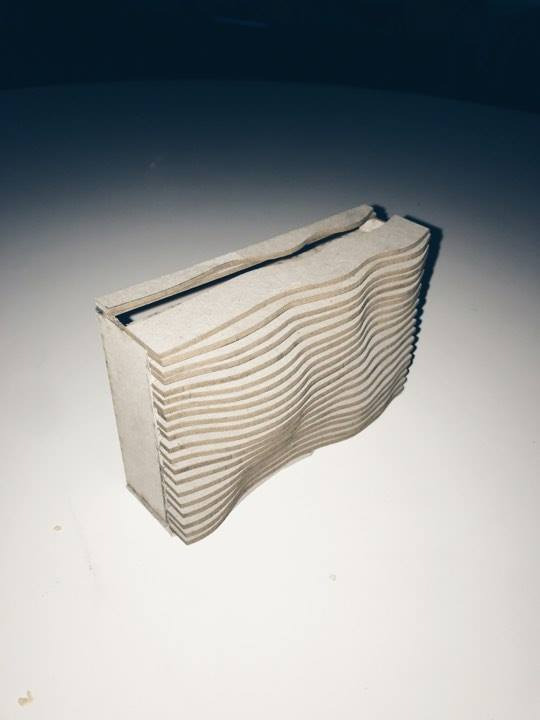
The other issue was in relation to the material use of cardboard and how we can minimise the use of excess sheets. This was resolved as the final design did not require more then 2 sheets. The front was shortened and the layered pieces were shortened which worked out several issues as it still had the curved aesthtic and made room for the storage of our products.
concepts of the logo:

0 notes
Text
Topic 6 - A short history of sustainable packaging
Part 1: Give an overview of the online lecture and show your understanding of your content.
The definition of sustainable packaging can be defined as the production and use of packaging which results in the contribution and improvement of sustainability. Sustainable packaging considers every element from the supply chain, marketing, start and end of use. To effectively execute sustainable packaging, it involves meeting all of these needs in the present, without damaging the future. The topic of sustainability has been a major topic in recent years but eco packaging origins date back to when ancient hunters used simple vernacular solutions to carry items such as securing things with the vines and large leaves, animal skin and wood.
With harmful materials, such as plastic have taken a large majority of the packaging in today’s society although there have been alternatives such as sugar cane based paper and vegetable based plastic are proving to be positive alternatives for more environmentally friendly packaging methods. While these alternatives are more expensive to conventional plastic packaging, they are receiving the spotlight in the mainstream production as more people are demanding more sustainable options.
products/packaging. For your blog entry you can upload a link to the presentation and a brief overview of your brand (1 paragraph).
https://1drv.ms/b/s!Ar-CA62KAC5jkWhQctjJPts6y49U
0 notes
Text
Topic 5: Sustainable packaging - “Packaging is Rubbish”
Topic 5: Sustainable packaging - “Packaging is Rubbish”
Part 1: Watch the video on sustainable packaging and give an overview of your understanding of the content.
In the documentary, most people who were asked about their thoughts on packaging expressed the fact that they liked eye catching designs on packaging and saw it as an everyday part of life.
The co founder of Lush, Mark Constantin is against the use of unsustainable packaging. He executes successful packaging without even using any in the first place and proving this method is achievable. Today many products come with excessive packaging such as the cellophane on the outter of a perfume box, the actual box itself and then crepe paper in the within. Camera film, tea bags, rice, tablet bottles chip packets are just some of the products that are excessive in their packaging by too many materials or being too big for what’s actually inside.
Supermarkets have a great deal of duty for their environmental footprint in the packaging they sell, consumers also have a right to promote sustainable practices. For example, in Britain, consumers can contact an organisation and can send a formal complaint about the packaging.
Part 2: The whole concept: branding, packaging and display. Research a major retail brand (examples of brands are Kikki K, Tea 2, Typo etc.) that sells products in a similar category to what you thinking to create for your final product. Discuss why this brand are successful by answering the questions below:
How does the company integrate packaging, branding and display to give you an all-round idea of their brand?
The product im thinking of making is a concrete self watering pot plant. This product fits in the world of pot plants with brands such as the homeware and furniture kings, IKEA.
The Swedish company that designs and sells ready to assemble furniture, kitchen appliances and home accessories. The Scandinavian design of this company focuses on high quality modern, mass produced, flat packed and self assembling products. These principals that Ikea follow also keep an environmentally conscious initatives as they take consideration of the longevity of all its products and how it will affect the environment weather it’s the transportation of the products and when it leaves the warehouse. Ikea uses a pick up method where all consumers pick up the furniture from the warehouses and diminishes the use of delivery trucks.
What does the brand “say” to the customer and why would someone pay more for this brand than another brand selling a similar product?
This brand has been the largest retailer since 2008 because of its core ideas which are the modernist designs of various types of appliances and furniture, these products also consider the sustainability and whether it’s the environmentally friendly materials used or the pickup method reducing further use of delivery trucks. The brand is also well known for its affordable prices and continuous project development.
What materials have they used to achieve the overall “look” and feel of the interior and what does this “say” about the company?
Older IKEA buildings are usually blue buildings with yellow accents (derived from the Swedish national colours) and few windows. The lay out is usually designed with a one way layout leading the customers counter clockwise along what IKEA calls “the long natural way” which is designed to encourage the customer to see the store in its entirety.
Concepts and prototyping
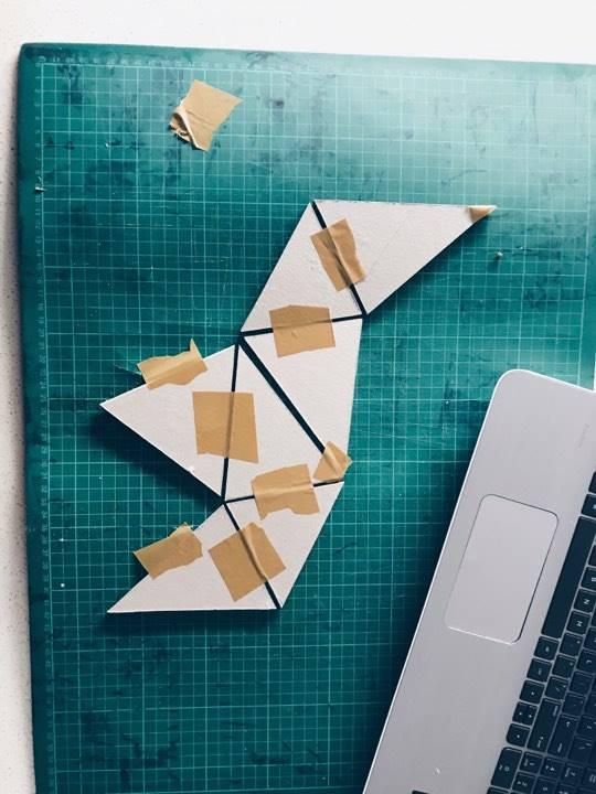
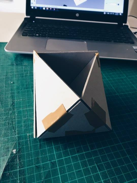
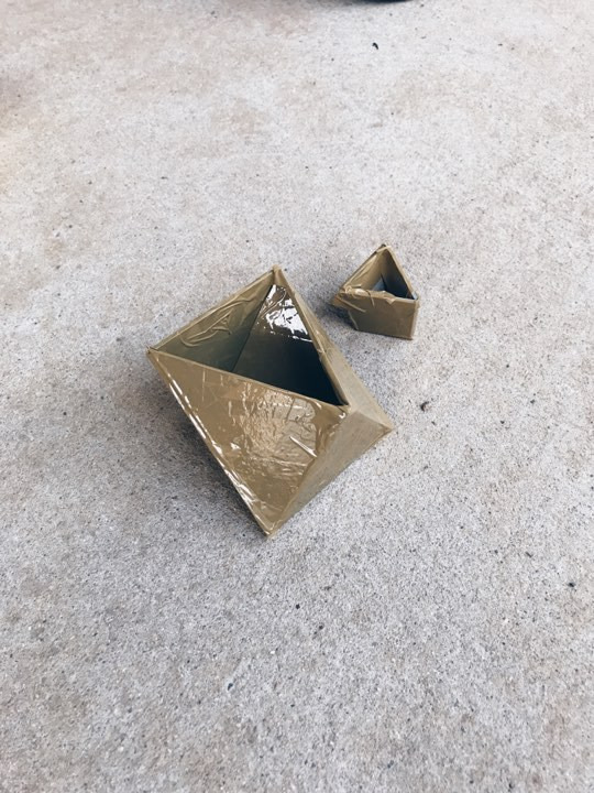
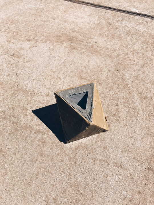
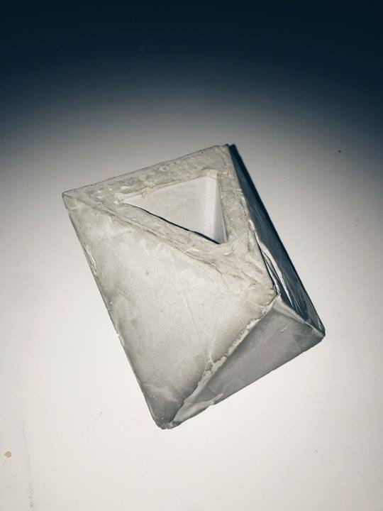
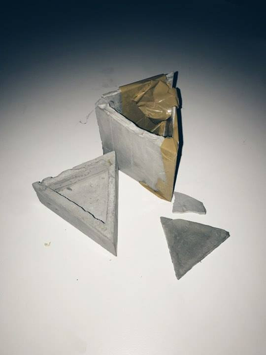
Failed concept:
Walls were made too thin and broke once taken out of cast
Stall design mock up
0 notes
Text
Topic 4 -A Short History of Plastic Packaging
The development of plastic is primarily due to the evolving materials, these include: Natural plastic: chewing gum and shellac Chemically modified Natural: rubber, nitrocellulose, collage, galalite Synthetic molecules: Bakelite, epoxy The initial stages of plastic development included contributions from bio derived materials such as egg and blood proteins, natural rubber and treating milk proteins with lye. Although, its development was forwarded by the finding of vulcanisation and materials came from natural rubber.
Part 2: Work with your groups to create a mood board and overall concept for your market stall. The mood board should give an overall concept of the feel and context of your brand. Your blog entry should define your target audience and give examples of other retail displays, materials and packaging that inspire you and create the “brand feel” that you would like your stall to have.
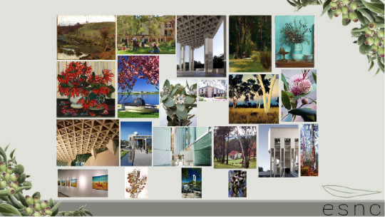
Stall Mood Board
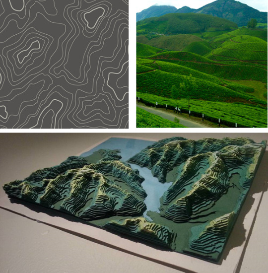
This moodboard is inspiration for out stall design. The main idea is that the stalls overall design is derived from topographical maps and the layering sequence it uses to represent the level changes and curved gradients of the terrain. In order to stand out and link our stall back to our brand, we looked at curved and organic forms to represent the natural shapes of nature, this ties back to our brand and products that focus on these elements as well.
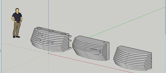
Stall concepts
These concepts were initial ideas that were inspired from the layering of the topographical maps to show height and curves of terrain.
After looking at the concepts, all three failed to respond to the brief appropriately for a number of reasons. The first was the stalls were too large in size, this lead to a large consumption in cardboard which would defeat the purpose in sustainable design of the stall, cost effectiveness and flat packed and transportable.
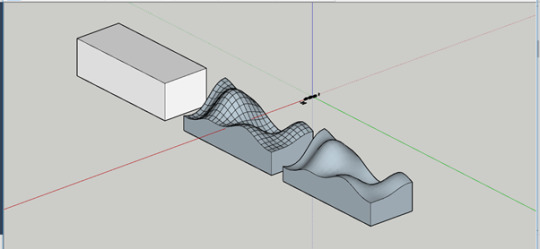
Form
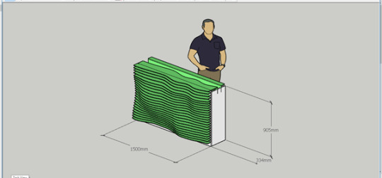
Final Design
After combating several issues with the concepts, the final design stall was a workable design that kept the initial idea. It was able to meet the brief and the requirements starting from the layering plains, instead of having the plains run through the entire bench top, the back of these plains were shortened which still gave the effect of curves along the front face. This also opened up the back for more storage room where the rest of our products would sit. the idea of this stall is each product will individually sit and showcased while the rest of the products are in hidden in the back storage.
braand

0 notes
Text
Topic 3 - A short history of the milk carton
Review the online lecture content and write a brief overview showing your understanding.
Before 1860, the invention of milk cartons, this product would be delivered to the person’s doorstep and packaged in a glass milk bottle which was contained in a large metal milk container. During 1884 the New York Dairy Company was crowned the first factory to produce milk bottles. One of the first patents was credited to Lester Milk Jar for a milk container. Soon after numerous patents emerged with different variation of the glass bottle such as crockery type jars, wide mouth jars and a bottle with a small glass lid with a tin clip. The milk carton was crates after John Van Wormer was inspired by the idea of a paper bottle. This idea of paperboard packaging was to be light and easily transportable constructed through folds gluing and dipped in wax.
Characteristics of early milk packaging: - lack of insulation, making milk go bad - came in 5, 8 and 10 gallons - Transported by rail shipment - Milk bottles were a sanitary way of holding the ingredients - Emptied milk bottles still needed to be collected by the milk man - The thought of reusable containers was deemed unhygienic
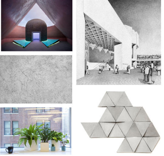
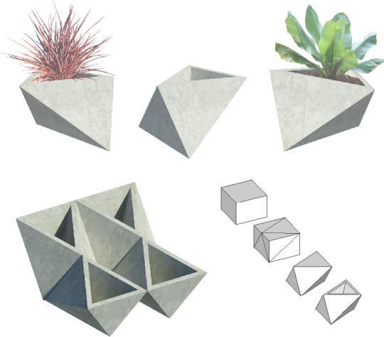
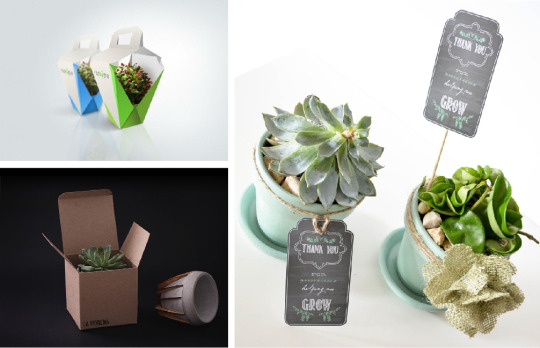
Prepare a mood board and short presentation about your initial concept for your product and packaging next week.
0 notes
Text
Topic 2 - A short history of the cereal box
Review the online lecture and give an overview of your understanding of how cardboard as a packaging material came about to be used to protect, contain and promote cereal companies.
In the brand was founded in Battle Creek, Michigan. In 1985 John Harvey Kellogg introduced the Cornflakes brand which established itself as a modern-day concept for breakfast cereal. William Kellogg (his bother) chose to focus on heavily advertising the product and the usage of commercial appeal In the design of the packaging. The first use of the logo and current logo have not changed since the product was born and was based on William Kellogg’s signature. He used colourful mascots that were decorated on each box and used the box to engage the consumer in competitions that they could partake in.
The use of cardboard boxes was first used to contain cereal in 1879 by George H. He packaged his cereal within this box which was a wheat based cereal known as ‘Wheatena’. He chose cardboard as a sanitary alternative to barre lots. Barrel lots were generally used as an easy way to scoop the cereals out and bought by the pound at grocery stores. This method inspired Kelloggs by initially boxing the cereal and then enclosed it in a bag. However, they refined the packaging later by having the cereal package in a bag within a box.
Part 2: After viewing the collection at NMA - discuss two to three key pieces that have caught your eye and that you can potentially see develop into a product line.
The collection at the NGA hade many different types of products but the one that stood out to me was a collection called Kaninjaku. This collection contains stories from the Cannining stock Route. The collection centralizes a special road known as the Canning Stock Route which contains importance in Aboriginal people for its status in colonial history. In the early days of colonialism, local Aboriginal people were employed as guides to identify waterholes.
The collection is made up of 116 paintings, sculptural works, contemporary cultural objects, documentary material, and oral histories by 60 artists who travelled along the Canning Stock Route on a return-to-country trip in 2007.
Two pieces in the collection that interest me are Kaninjaku, 2008, acrylic on canvas, (by Kumpaya Girgaba, Manyjilyjarra language group, Parnngurr community, Martumili Artists) and Canning Stock Route Country, 2007 by Patrick Tjungurrayi.
Kaninjaku
Canning Stock Route Country
This route is longest recorded path with a total distance of around 1,850 km. its size meant meant that the route became a notable feature of the landscape. Today Aboriginal communities continue to live at either end of the route. Both artworks connect the significance of the route through their dot paintings on canvas, a traditional art form with a wealth of history amongst Aboriginal people.
The paintings use bright and vibrant colours that directly catch the eye such as pink, yellow, orange and red. The painting highlights its importance in Australian culture by portraying the waterholes that became stock route wells, significant natural resources among the natives. The waterholes are the central point of the piece, emphasised through their repeating pattern of geometric-like shapes.
Kaninjaku, 2008, acrylic on canvas accents the cultural significance of the route with its repetition n in linear dots, that reflect an invisible road and express the most remarkable features of the route’s natural landscape known as tali or sandhills.
The story telling of the aborigines is what I would like to incorporate into my product. My product will focus on the NGA’s architecture and how I can tie my product back with the architecture and pull elements out and incorporate it into my own product. This can include, concrete pot plants, Smart phone docking ports and a zine about the photography within the parliamentary triangle. These products are to reflect to its origins in a vernacular way. For example, locally sourcing, building and using local knowledge to influence the product.
Inspirations that I would like to use form the architecture is the geometric triangular ceilings found within and the exteriors of the NGA. Similar to the repetition to the paintings the use of repetition is one design element I want to incorporate in my product.
0 notes
Text
Topic 1 - A brief history of packaging design
Part 1: Watch the first packaging online lecture video - give an brief overview of your understanding of packaging and its applications
My view and understanding of packaging is the containment, protection, presentation and presentation of a product. Just like the product, packaging involves critical thinking which includes concepts of design, evaluation and the production of the packaging. Examples of packaging include boxes, pallets, crates, containers, bags and sacks. In this lecture, packaging is described as a synced system of preparing good for various purposes such as transport, warehousing, logistics, sales and disposal.
Below is a summary of the history and the origins of packaging and how they have been applied today.
In 1810 French nationals were early ambassadors for packaging and made its first appearance as food preservation and protection which is now widely known as the tin can. Two years later the patent was sold to two English men who further refined the idea. The first tin can commercial factory was soon born after the two English men set up in London where they produced the very first tin canned goods for the British Navy.
Initially made from moulded paper Mache, the modern-day egg carton was created in 1911 by a newspaper editor from Canada. The refinement of an earlier carton design lead him to create a carton which reflected the characteristics of the eggs dimpled form. These adjacent dimples were made to absorb shock during its transport, holding each surrounding egg in place efficiently and securely.
Another innovative type of packaging was the mason jar. It was invented in 1858 by John Landis Mason. The jar is well known for its glass use of material accompanied with a band that is found on the mouth of the jar in order to seal and preserve the goods securely.
Retail brand research: Research a local Canberra-based brand (a shop and or market-startup) and answer the following questions:
What is the company’s “brand story” and how does is this communicated in the design of the products and packaging?
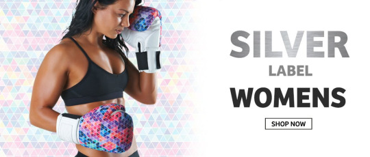
The local Canberra brand Red Corner is a fitness fashion brand label that ideates high craftsmanship for its unisex boxing gear. With a well experienced team with over 70 years combined in product research and development experience for sporting and fitness products. The tailored gloves are exclusively made to perform based on the hand shape of the user. This expertise is what separates them from other boxing labels as this functionality design of custom gloves is mostly overlooked. Pckaing plays a major role as the brand message is told through the packaging of the gloves which is simple to understand and contains all of the necessary information to help a customer understand the benefits such as the glove mechanics and its adaptability. Whilst the packaging lists important information about the functionality it also represents the brand identity and is a form of communication. This is executed through visual cues, for example the sliver series separates itself from other fitness brands by centralizing the focus on the colour sliver. The glove is showcased with well-considered packaging as it has a clear front surface.
Who is the target market of the company? How do you think they address this target market (ie. use of colour, graphics, type of products).
As the brand caters to both male and female and all fitness levels, the designs are compiled of bright colours and a fun aesthetic. The audience of Red Corner were also considered, the younger demographic reflected bold and unique patterns. Different products of Red Corner include punch mitts, boxing gloves and focus pads.
What type of packaging does the company use (branded carry bags, tissue paper, branded boxes etc.)? What does the packaging say/make you feel about the brand?
The company chose to package using branded boxes. The branded boxes are made up of a clear front for showcasing and to clearly show the main design of the glove. It also contains a brief explanation of the gloves functions and why its effective. The box small box minimizes space and is made from sturdy material. After looking at Red Corners the branding executes a professional brand in terms of identity, design materials and packaging. Like this company I want to introduce a high level of these design elements and principals and incorporate this in my own work.
0 notes