Don't wanna be here? Send us removal request.
Statistics
We looked inside some of the posts by rheaspencerjohnsonindustrys-blog and here's what we found interesting.
Average Info
Notes Per Post
0
Likes Per Post
0
Reblog Per Post
0
Reply Per Post
0
Time Between Posts
5 days
Number of Posts By Type
Text
10
Last Seen Tumblr Blogs


Fun Fact
Forty percent of Tumblr users are between the ages of 18 to 25.
Text
Potential Uses For Graphic Desing
When you create a piece of digital work, there are so many options that you have as a graphic designer with what you want to do with your work.
You are able to go to a shop and have your work printed, this makes your work actually real instead of it just being on the computer. Also when you do this it can slightly change. I have visited a printing place called DizzyInk (http://www.dizzyink.co.uk/) and see how they print and what they can do with your work. There are so many websites out there that you are able to print your work on that have so many option with what to do with it. One of the good things about having so many different websites that are available to print on is that you can match prices and see which ones are the best and even look at reviews. There are also quite a few shops out there like DizzyInk that you are able to walk in and talk to them, communicate about what you want your work to look like, which is better if you can go see them then doing on the phone or email.
You can have them printed on poster, labels and even t-shirts. Say you have designed a logo and you print it out onto a t-shirt or any item of clothing it can them seem very real, it also will then attract more people to it because they can buy it and wear it. It is also a nice feeling if your work is printed and say post them over town (if its a poster) then when you go past it it is like that my work like my work is actually out there in the world and people are going past it and seeing it. When printing it gives you many opportunities to get your work noticed by people and you never know it may one day get you a job or an apprenticeship. The opportunities you can get from putting your work into the world via printing are endless.
Stickers/ Labels:


Clothing:


Leaflets/Flyers:


Business Cards:


Stationary:


Banners:


Wedding or Party Invites:


0 notes
Text
Hero 7
Leading on from the Owen project we were givem the task to look at creating logos for a brand called Hero 7.
SKETCHES


0 notes
Text
Computer In Art & Design
What is a raster image?
They are often refereed to as bitmap images due to the millions of tiny squares knows as pixels that create the image, if you zoom in far enough into a raster image you can see these pixels. When all the pixels are placed together all of separate colours, when you zoom out the pixels blur together to create the image.
Advantages:
1. Rich and detailed images.
2.All the pixels can be of different colours.
3. Almost every program is able to work with raster images.
Disadvantages:
1. When enlarged you ca fer find that you are able to see the pixels.
2. The files that hold bitmap images are very large.
3. Raster images are not great if you are doing embroidery.
What is a vector image?
They are made up of thin lines and curves that are known as paths. They must be created in a computer software that has been designed to create intricate wireframe-type images. Each of the lines include a number things such as: node potions, node locations, line lengths and curves. All the lines and curves have thew ability to have a colour value assigned to them. Due to this each of the images can be sized and scaled repeated without loosing resolution or looking pix-elated, you can do this as many times as you want and the resolution will still be the same.
Advantages:
1. Ut can be duplicated many times without loosing resolution.
2. The file sizes are very small so it doesn't take up much space.
3. Easy to transmit to other computer or to the internet.
Disadvantages:
1. There is a limited software that you can open vector images on.
2. Small errors will be very obvious when you enlarge the image.
3. They colour details are often very limited.
What kind of areas within the graphic design/animation industry would you use Photoshop for?
1. Fashion.
2. Logo Design.
3. Photo Editing.
4. Cartoon & TV Programmes.
5.GIF’s.
What kind of areas within the graphic design/animation industry would you use Illustrator for?
1. Logo Design.
2. Editing Typefaces.
3. Editing drawn objects.
4. Creating characters and detailed art work from scratch.
5. Cartoons.
What sorts of technologies can you use to work with Photoshop/Illustrator?
1. Wacom Pad.
2. Camera.
3. Scanner.
4. Keyboard & Mouse.
5. Ipad’s
How does a camera, Wacom pad or scanner help you develop your creative ideas in software?
Camera: You can use it to take photographs of anything that you see in your everyday life that can potentially give you inspiration.
Wacom Pad: A common use for the wacom pad is drawing sketches and designs on a computer software.
Scanner: It is very useful for copying images on paper and also to share photos and archive them.
0 notes
Text
Glitch
How did you make this?
To create the glitch art I have taken images from a website called unsplash. I have then opened them up onto photoshop. You then go onto the channels section and select either red, green or blue. Then use Ctrl+A to select the whole image and then Ctrl+T, this gave me the ability to change the scale, size, rotation etc.. You then use the same technique and use this on each of the RGB layers. Afterwards you can then go to Filter>Distort and la around with the wave, twirl, zig zag etc.. styles.
What is glitch art?
It is a practise of using digital images and changing the colour channels, so it appears like the image is “glitching out”.
What kind of graphic design could this be used for?
They ca be used in so many different types of graphic design, you can use it to make logos and put it into a poster that is promoting a festival or a band. There are many possible ways in which you can use this method.
1 BEFORE

AFTER

2 BEFORE

AFTER

3 BEFORE

AFTER

4 BEFORE

AFTER

5 BEFORE

AFTER

0 notes
Text
Spirograph’s
How did you create you Spirograph?
To create a spirograph there are 2 ways in which you can do this.
Way 1
One way is to create a shape, say an ellipse. You then select your shape, go to your rotate tool and hold down Alt. This will then bring up a small box in which you can change the degree of your shape, you can preview the degrees. Then when you have the degree you want press copy.

After that you press Ctrl+D and it will repeat the command that you just made, creating the spirograph. Afterwards you can experiment with the appearance.

Way 2
This way is more complicated but it does the same job and more. As you do in the first way you create a shape and then go to Effect>Distort&Transform>Transform, this will bring up a box.

Here you can experiment with the degree of the rotation and also how many copies were made. You can also change the scale and where the shape is.

After doing so you press okay and you will create a spirograph that looks like this.

My Work:


0 notes
Text
Isometric Illustrations
What is isometric projection?
It is a way of representing a 3D solid on a 2D surface, this can be done either digitally or drawn. Often when it is drawn it is called perspective drawing. The term ‘isometric’ comes from the Greek which means ‘for equal measure’.
What is it useful for?
This type of drawing is very common in video games like minecraft. The drawing side is commonly used in technical drawing for engineers, illustrators and architects.


0 notes
Text
Op-Art
What is op art?
It is a form of abstract art that portray movement within the images. They are made up from a variant of images and shapes that are multiplied and angles changed. It can also consist of lines as well as shapes.
How did you use illustrator to create you designs?
I used Illustrator to create my op-art images, I experimented with the @ key which when you draw a shape it multiplies this shape for you which gives you the op-art look. On top of that I also found out that when you pick a shape you can use the up and down keys to add edges to the shape.So you can go from a start then use the up and down keys and get a triangle and then also an enneagram. Further on from that you use the @ key + alt you are able to create multiples of the shape you drew and they will rotate automatically.
What kind of design and products could this kind of art be used for?
I think that op art is has limited products that you can use it on. The thing that you will possibly use it on the most would be album covers and then maybe branding for clothed and logo design even.


0 notes
Text
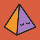
Pixel Art
How did you come up with the concept?
We went onto a website and we were randomly given a superhero in which we then had to form a character out of the description that was given to us.

What were my ideas behind shape, form and colour in my design?
My idea behind the shape was based on the character being called ‘The Shining Jewel’, so therefore I thought one of the most well knows jewels is a diamond. I then went onto using a variation of blues to represent the character’s ability to control and manipulate light. The bottom of the diamond is lava which is created by using a variation of reds, yellows and oranges, this is representing the ability to transform the skin so it is indestructible. I then used some variations of grey for the head and greens for the arms and legs.
How did you create your art?
To create this piece of work we had to open up a link that would take us to a superhero generator http://superhero.namegeneratorfun.com/, this was where we got the name and abilities for our superhero. After that I went on to using the paintbrush at a very small size, and a variant of colours to create the look that I have made below.

What area of the creative media industry could this type of art be used in?
There are many different areas of the creative industry in which pixel are can be used in. For example: logo creating, fashion, animation, tv programmes, films, art... There are endless possibilities that you can potentially use pixel art for this is mainly down to how broad your options are with what you create using pixels.
0 notes
Text
Silhouettes
Process:
I took an image of off the internet as the base for the car silhouette. I used the pen tool to create the body of the car, and for the windows and the slats in the car. I made the body of the car black an the windows grey. I then used the ellipse tool to create the 3 circles that surround the car object.


Process:
I took the image of an elephant from the internet and began working with it by using the pen tool to outline the whole elephant, I only outlined the image because if I added any more detail it would be exactly the same and not really a silhouettes anymore. I then filled it in with a grey and used the rounded rectangle tool to create an shape that went over the elephant, filled it in with a coral colour, then decreased the opacity of the shape.


Process:
As I have in the other 2 images I took an image from the internet and used that has my base. I traced over the image using the pen tool and filled it in with a purple. I then went on to using the ellipse tool to make an oval for the face to sit on, I used the line segment tool to create the 2 lines, then the curve pen tool to curve the lines. I then used the crystallise tool on the whole image. Looking back now I do think that using that tool was a mistake because, I think it made the image look tacky.


What kind of brands could these be used for?
Car: Due to it being a car I would think that it would be used to advertise cars, or a car shop, pretty much anything to do with cars you could use it for. Maybe you could use it as a clothing brand.
Elephant: Personally I would use this as a zoo logo or an animal friendly shop. It cold also be used as a type of food for elephants.
Face: When I made this i liked it but looking back at it I would not use this on any brand because frankly I don not think it is very good.
Why are silhouettes important in design?
0 notes
Text
Kawaii
What is Kawaii?
The Japanese concept of kawaii is ‘cuteness’, it has grown into a national phenomenon. It began in Japan in the 1970′s, created by young teenage girls which is why some people say that the style can be interpreted as very childlike. In Japan it is used for many different things such as: clothing, food, entertainment (film/TV shows), personal appearance. Hello Kitty is probably the most famous thing that has been created using the kawaii style. In Japan the word kawaii is used in sentence, like how we would say that baby is cute they would say “that baby is kawaii”.
What did you make?
I made 3 donuts and 2 pandas.

I created the donuts by making 2 circles using the ellipse tool this made the inside and outside of the donut. The inner circle has to be white without a stroke. I then used the eye picker and took the colour from the image, I then used the pencil tool to create the icing on top of the donut. Then once again used the eye picker to take the colour from the image. I then used the rounded rectangle tool to make the sprinkles, also taking the colours from the image. To make the face I used the ellipse tool for the eyes and the blush on the cheeks, and then once again for the mouth but this time using the path eraser tool to cut it in half.
After creating a replica of the image I decided to go a bit further and make some donuts that looked different, using all the same tool and techniques but changing the appearance. For example I have used the ellipse tool to create freckles and the rounded rectangle tool to make a tongue, also changing the colour of the icing and sprinkles. Then I went onto using the star tool, and then once again changing the icing and sprinkle colour.

I used an image to create the pandas (furthest to the right), I used the pen tool to create the body, as you can see I have not traced the image of the panda like I did with the donuts. I used the ellipse tool to create the head. I also used the pen tool to create the black part of the eyes and then the ellipse tool for the white parts of the eye and then used it again for the blush. The pen tool came in handy once again when I made the nose. For the ears I made 2 circles using the ellipse tool and then to path eraser tool to half the circles. The pen tool was used once again to make the arms and legs. I had then gone onto putting a black stroke on the head and body and then making the outer part of the eye, arms, legs and ears black. Then a light pink for the blush.
After creating the first panda as I did for the donut I made another one I used Ctrl+J to duplicate the first panda. Then deleted the blush and replaced it with 2 striped using the rounded rectangle tool, then filled it in with a khaki colour. I changed the shape of the eyes using the pen tool. I used the pen tool to create the shape for the mouth and then the rounded rectangle tool again for the teeth.The look I was going for was a sort of ninja/army panda.
Conclusion
All in all I have enjoyed creating the kawaii pandas and donuts, it was my first time using illustrator and at first I found it very difficult to use the pen tool but the more I used the easier it became for me. I found it fascinating that you could use the same base for the panda and the donut and completely change the appearance.
0 notes