
Statistics
We looked inside some of the posts by ranhaozhecen3d and here's what we found interesting.
Average Info
Notes Per Post
1
Likes Per Post
1
Reblog Per Post
0
Reply Per Post
0
Time Between Posts
12 days ago
Number of Posts By Type
Text
5
Last Seen Tumblr Blogs


Fun Fact
Tumblr is used by 21% of adults online aged 18-29 years.
Text
CTS B manifesto
During week 11, session 1, we mainly talked about Manifesto in the field of design and also our personal lives. And here is our group work manifesto.

As a young individual, collaboration and communication are always vital because they allow me to create innovative and effective solutions within a team. Other people’s ideas help me to consider different perspectives and to reflect on myself when receiving feedback. Thus, they can lead to my personal development.
I have also developed a personal design manifesto that allows me to show my vision for the future of design and society. And I believe they are essential for successful and responsible design.
First, I should always consider social impact while designing. Shepard Fairey, one of my favourite designers and street artists, inspired me a lot on this. Among his works, auspicious symbols and icons, like lotus flowers (one of the Buddhist symbols) and the peace dove, are recurrent themes. His works always show a pursuit of racial harmony, unity, justice, and triumph over adversity. And this is what I should do when designing to promote civilization and harmony in society.


Another point of my manifesto that Shepard inspired me with is to have clear visual communication. The first thing that he intentionally developed to be an icon was the well-known Obey Icon Face.
“And the amazing thing is that with the simplification and the familiarity through repetition that image has, now a viewer can see just a portion of the image and recognize what it is.” Said Shepard.
And this is the way to make a design iconic, simple, and memorable. In my studio project, creating a visual identity system design for Baybeats Festival, me and my partner Luther tried to keep our key visuals really minimal but powerful. We used a hand-painted texture to have a more organic and authentic look. The imperfection and high contrast of black strokes and a paper-textured background create more memorable visual elements compared to the often detailed and precise calculation of vector graphics when making illustration-style designs.

I must also respect all kinds of cultures and traditions while avoiding discrimination or misrepresentation. I have created one of my favourite works with Japanese Ukiyo-e woodblock print culture before, and I did a lot of research on their traditional masks “Hannya”, “higanbana” flowers, and “Inka” shadow fire, to keep the cultural symbols and elements I use accurate and logical, which, in my opinion, is a great way to respect one’s culture.

CTS B lessons have been of great help to me, as they allow me to consider more about our society, culture, and how I see myself as a young designer. It provides me with important manifestos and teaches me to respect, to collaborate, and to create responsibly and successfully.
(464 words)
Fig. 1. Group work Manifesto. 24 Oct. 2023.
Fig. 2. Shepard Fairey " Barb Wire Dove Collage (2023)". Artsy. www.artsy.net/artwork/shepard-fairey-barb-wire-dove-collage. Accessed 16 Nov. 2023
Fig. 3. “Obey Giant - the Art of Shepard Fairey.” Obey Giant, 27 May 2022, obeygiant.com. Accessed 17 Nov. 2023
Fig. 4. Baybeats Festival Poster Design. 9 Nov. 2023.
Fig. 5. "I want a home" 2022.
0 notes
Text
artistic vision statement and Social engagement
In week 10, I learned how to craft a statement of artistic vision. During the activities this week, we discussed our personal strengths and visions in five years and even further.
My design strength is mainly illustration, so I would like to be an illustrator who does advertisement and book cover designs in the near future if possible. I have done some personal and commercial commissions before, and I plan to do more as part of my further practice and to add to my personal portfolio. At the same time, I would actively participate in internship programs, working for graphic design agencies based in Singapore like Design Start and Graphic Masters, to gain more experience.
One of the best designers I admire is J.C. Leyendecker, the pioneering American illustrator and graphic designer. He is best known for his illustration posters and magazine cover designs. More than 600 original paintings, photographs, advertisements, and magazine covers, including all 322 for the Saturday Evening Post, show the brilliance and importance of this powerful designer. He has created impactful advertising illustrations, and this set of Arrow Collars advertisement posters is my favourite, which I consider has greate social engagement at that time.

In this refined poster, the well-known Arrow Collar Man was right at the centre. The black background within the elliptical frame enhances the contrast of the portrait and makes it the impressive focus of this work. Beautiful and symmetricla patterns and words “Arrow The Aristocrat Of Collars”on the frame allows people to associate their product with elegance and nobility.
With the help of Leyendecker's illustrations, Arrow went to the top of the industry. Their impressive rise drew much attention and changed everyone's perception of marketing. J.C. Leyendecker’s design for Arrow appeared everywhere in the 1920s, often with beautiful frames around his images of collar designs. Leyendecker's work with Arrow Collars marked a shift in advertising strategy. The emphasis on creating distinct brand images and icons, makes great impact on design in the future.
The poster not only promoted products but also contributed to shaping American cultural ideals and trends. The Arrow Collar Man, Charles Beach, set the standard for elegance, for what a sophisticated gentleman should not just look like but be. The Arrow Collar Man represented the American Spirit. And by such association of their product with a certain lifestyle, consumerism was well promoted. This is one of the reasons why it was so successful.
I prefer using illustrations in design because they are extremely alluring and easy for readers to empathise with, thereby arousing potential customers’ interest in the product. What I wish to do in the future is to create impressive brand images with my illustrations and create advertisements and products that can affect certain customer’s pursuit of lifestyle and aesthetics, just like J.C. Leyendecker.
(470 words)
Fig. 1. Arrow Collar Man. Borrelli-Persson, Laird. “The Secret Life of the Arrow Collar Man.” Vogue, 12 June 2017, www.vogue.com/article/pride-2017-leyendecker-arrow-collar-man-sex-symbol.
0 notes
Text
Artistic Traditions and Lineages
In weeks four and five, we had a field trip to the National Gallery and critically analysed artistic traditions and lineages, mainly focusing on Chua Mia Tee's 1959 painting National Language Class.
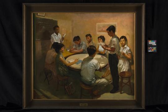
The painting National Language Class has a style of Social realism. It is a realist-style of painting that usually consists of elements like flowers, sunlight, youth, flight, industry, and new technology. In this art style, art became more than an aesthetic pleasure; instead, it served a very specific function: it tried to call attention to the real social and political issues of the working class in order to speak out against the power structures. The picture was painted in 1959, the year Singapore gained independence from the British, and portrays a Malay-speaking teacher teaching a group of Chinese students the Malay language. The artist's social identity, which has been mentioned in week two's discussion, is that of an immigrant.
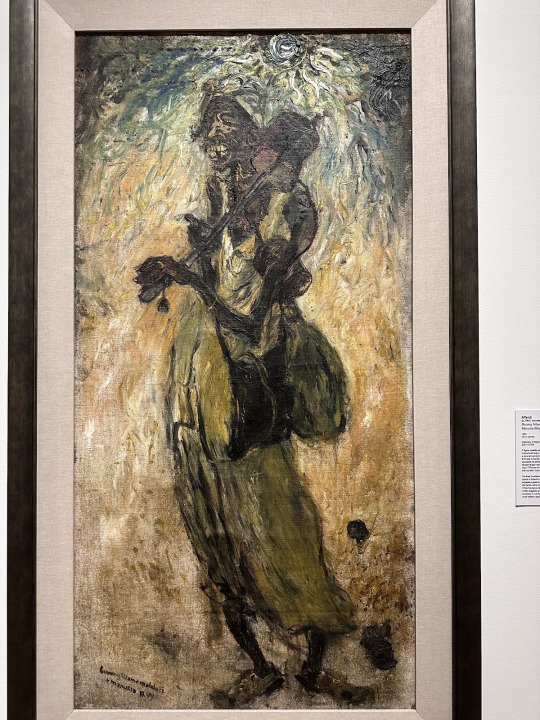
Another piece of artwork that caught my attention is Affandi’s Burung Hitam, Matahari, Manusia (Black Bird, Sun, Man), 1950. It depicts a thin, miserable old man carrying a musical instrument. His look is full of pain and grimace compared to the background, which is full of energy—the sun radiates vibrant blue rays across a canvas suffused with warm colours. There is a quote from him I like: “Matahari hidup saya, dengan tangan saya bekerja, dengan kaki saya maju." (“The sun is my life, with my hands I work, with my feet I move forward.”) In my understanding, this art work is to show the courage to be unremitting in the face of adversity and life struggles. As long as the sun still rises, we should always keep going.
(279 words)
Fig. 1. "National Language Class by Chua Mia Tee, 1959." Roots, https://www.roots.gov.sg/Collection-Landing/listing/1030759. Accessed 18 Sep 2023.
Fig. 2. Affandi’s Burung Hitam, Matahari, Manusia (Black Bird, Sun, Man), 1950. Oil on canvas. 169.5 x 84.5 cm. Collection of National Gallery Singapore. © Affandi Foundation
0 notes
Text
Connect Theory and Practice
In week two, we talked about personal and social identity. In the video we watched during class, three main words, Self-Concept, Self-Identity and Social Identity, are mentioned.
Self-concept means people’s entire perspective of themselves, which includes different aspects of identity and self-evaluation. Self-identity is more focused on the personal, individual components of identification, such as distinguishing characteristics, values, and personal experiences. Social Identity is about where a person belongs.
Self-identity often involves people's life story, experiences, and values, contributing to their sense of self. It is deeply personal and relates to people’s sense of authenticity and their understanding of who they are as unique individuals. Therefore, it has a close relationship with artistic identity.

In week two's activities, I made this collage that describes my self-image. In this work, I used elements of moths, like the wings, to decorate a photo of me. The image filters are used to create a sense of nostalgia and psychedelia.
I find moths unsettling because of my insect phobia, but at the same time I am always drawn into their amazing patterns somehow, especially those that look like huge eyes. The reason I used moths as a metaphor in the collage is because, in my opinion, they were something I could personally relate to—something weird but oddly alluring. I further developed this idea about butterflies and moths in my illustration class project, and in this self protrait I am trying to show the idea that deep inside me, there is something rotten but also life and wonder.

(253 words)
Fig. 1. collage 2023
Fig. 2. ''Flesh and Blood'' 2023
0 notes
Text
Creative Practice and Critical Thinking
In week one, we reviewed the basic concept of critical thinking skills and talked about similarities between creative practice and critical thinking in class.
While critical thinking requires a lot of actual facts, logic and evidence, creative thinking requires us to imagine and think outside the box, thereby allowing us to observe the world from different perspectives. In design, we need creative thinking to come up with possibilities and critical thinking to decide the outcome.

To sharpen our critical thinking, we should beware of conformation bias, as we cannot always be right. No subjective views should be deeply held unless there is solid evidence and clear logic to support them. Even something that seems totally self-evident can be more nuanced than we expected. Which means we need to be open to changing our minds and understanding different perspectives when having open discussions and collaborations during study and work to achieve a more productive working outcome.
In the video shown in class, one of the interesting fallacies, the straw man fallacy, was mentioned. It is a commonly used fallacy that distorts or exaggerates others’ opinions to an extreme degree and then attacks the ideas as well as the original claims. There is another fallacy I have done research on, appeal to the stone, which basically means to state an argument wrong without providing any evidence. And this is linked to my opinions about conformation bias. Whether stating an argument right or wrong, evidence and proof should always be provided, but not a subjective view. Fallacies, the logic gaps that invalidate arguments, are not easy to spot. We should be careful not to fall into them so that we can sharpen our critical thinking.

(282 words)
Fig. 1. '' six-nine-69-conflict-disagreement''. AdobeStock, https://res.cloudinary.com/cebt/image/upload/w_700,c_fill,ar_16:9/v1628662171/tools/six-nine-69-conflict-disagreement-AdobeStock_77979084-with-credit.jpg. Accessed 19 Sep 2023.
Fig. 2. "File:Process of Appeal to the Stone". Wikipedia, https://en.m.wikipedia.org/wiki/File:Process_of_Appeal_to_the_Stone.jpg. Accessed 18 Sep 2023.
1 note
·
View note