Text
Week 15 – Final Thoughts
Because of this course, I can see that nearly everything can be related to design. In the future, I see it being more involved with virtual reality, there would be someone that has to think about how we interact with the unreal world, the environments. Unreal Engine 5 just showed the capability of next-generation graphics, Epic presented a Matrix game that looks hyper photorealistic. We could be interacting with such worlds, and someone has to plan and structure how to best utilize this technology.
I see designing would use more software to help realize plans and ideas. There could be programs that simulate the properties of real-world materials, and these materials will interact physically accurately. These would eliminate the need to make physical prototypes. Imagine also using virtual reality to interact with the design, tests could be performed there instead.
In the industrial or consumerism world, I believe that 3D printing will soon overtake other means of production, so I thought, maybe people would design products that would be optimal for printing. The process would use up fewer materials, instead of subtractive manufacturing where parts that don't need gets chip off, it would be an additive process where the needed parts are printed layer by layer. Maybe in the future, we can just print whatever product we want in the comfort of our home. I imagine rural places having such accessibility to help improve their lives, and when the item breaks or is no longer needed they could 100% recycle it and be used again by the printer.
I also see the design in the future will allow everyone to have accessibility. Imagine using something that you have no prior knowledge of, but because there's a very intuitive interface, you wouldn't need any prior knowledge. Maybe you could just tell what you want a program to do, and the program knows exactly how to execute the commands to achieve your request. There's a lot that designs can be involved in, and they all make lives better, experiences unique, and the future exciting.
The Matrix Awakens Unreal Engine 5: The Matrix Awakens Unreal Engine 5 Full Demo on Xbox Series X [4K 60FPS] - YouTube
0 notes
Text
Week 14 – Your choice
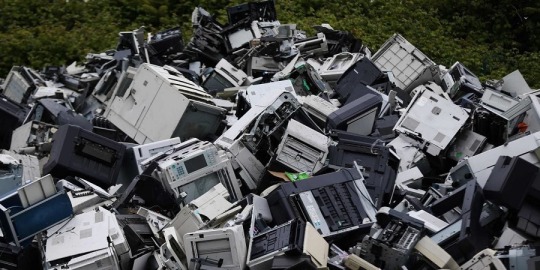
One thing about industrial design that I have mixed feelings about is the idea of "planned obsolescence." I know that technology changes rapidly, and understandably, some things become obsolete because of that. There are just products that have a big difference from their predecessor. But some things have little to no innovation for years, and intentionally designing them to be replaced immediately seems wasteful and harmful. I like to think sustainable, from harvesting the materials, using the actual product, and the end of its cycle, and if ever things aren’t made like that, I feel like it's a waste of resources. I would prefer things be made to durable, have several uses, use the latest technology or feature, and, if possible, remain stylish for a long time. Though I also understand that it can drive costs higher, our appeal changes and some consumers don't need products to last long, that's why I have mixed feelings. Still, planned obsolescence reminds me of some companies (usual tech-related) that delay their innovations, releasing features incrementally. I believe Intel did this, they released new chips with similar performance or with just little improvement (5%-10%), but when AMD released a chip that suddenly performed much better, Intel released a chip that would outperform AMD. There are also designs that make the products unrepairable, instead of allowing people to DIY fix the item or get it repaired in a store, users are forced to buy a new one. There's also Apple, which releases a new phone every year with few upgrades. And people buy into it, some thinking it's just a lifestyle to stay up to date with Apple. I guess the human behavior of always wanting something new and shiny is also a thing I dislike. I wish we are always reminded that new isn't always better. Anyway, I do hope that something could be regulated here that changes this emerging pattern.
0 notes
Text
Week 13 – New Media
Digital Aesthetics have changing definitions. Initially, it relates to imitating the style of digital technology. And now, it can be related to stuff made digitally or with the aid of computers. During the 1990s, fonts, product design, posters, advertisements, and other things were designed having computers and videogames as their inspiration. The style could be characterized as being pixelated, linear, sleek, futuristic, grid-like, retro. Some fonts were made to look low-res or constrained by old cathode monitors. Some advertisements utilize characteristics of games and futuristic ideas, like prominent blues, shiny surfaces, cubes, minimalistic. In today's time, many things can be associated with digital aesthetics, since most of them are made with the help of computers, which means that their appearance is influenced digitally. Staying within the digital world, commonly linked to digital aesthetics are website layouts, user interfaces, icons, text alignments, videos, animations, graphics, arts, vectors, designs, and so much more. In the physical world, we have objects made using computer-aided design software, printed material composed using photo editing software, logos made of vectors. Recently even artificial intelligence can create appealing art. There are so many things that are related to digital aesthetics since computers are capable of a wide variety of services, and these services are made accessible to many of us. We have CAD, Adobe software, game engines (that could do more than just games), rendering software, and utilizing these tools can make the output related to digital aesthetics.

Here is a Pixel art made by Anasabdin titled مجلس الجن, (2021). It captures my first definition of digital aesthetics, and instead of using paint, it presents colors with large square pixels to look low resolution. Instead of using brushes to create textures, the artist chose to work with a 2D surface. Some artworks even create pixel art with paint which seems ironic, but it does create a fascinating piece.
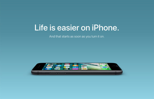
This is an iPhone ad; you could tell that it was made with the use of digital tools. They took a photo of the iPhone, crop the background, add their own background and the text field. This gives it its clean appearance, the phone and the text looking seamless with the background. If I were to recreate it with traditional means, I would probably use cutouts and paint, and it would look different.
0 notes
Text
Week 12 – New Media
There are two ideas that I find intriguing with interactive design. First, it relates to making stuff interesting, fun, engaging for the user or consumer. Such interaction was made possible with our phones, computers, the internet, and other technology. Taking in news and other media used to be one-sided; we get our information from newspapers, magazines, TV programs, and radio. Those were preset information delivered to people, hence being one-sided. Now we have search engines and social networking sites to curate and find the specific information we want, and we can engage in media since we can share our own information. We don't just read anymore; we can comment, review, search, share, post, react, and so much more. in that way, we can influence others and the media we use, which is what makes it interactive. Because of our phones, we have a camera, GPS, access to the internet, communication device, all in one device that is portable. People utilized these features to make real-world also more interactive. We can see our current location on a map, and some applications can direct us to different destinations. Our cameras can scan QR codes which can be used to provide more details or give information. There's also augmented reality, which combines real-life with what's digital, which enhances our experience. The other idea relating to interactive design that I am fond of is related to software or programs. Interactive design improves the user experience in terms of using our computers, devices, and other applications. I personally like using Adobe programs, such as Photoshop, InDesign, Illustrator, and Premiere. They have tons of features and are capable of handling many things, they help the users by providing previews of what different tools do, and you can search up tools or commands within the program itself. Our phones commonly have a built-in simplified photo editor, allowing us to make quick changes moments after we take the photo. The interactive design has made our lives better, faster, and enhanced our experiences.
0 notes
Text
Week 11 – Graphic Design
Citizen designers, just like any other designer, are responsible for creating or planning for their client or target audience, and in this case, the citizens or ordinary people. These designers study and understand the behavior of people to create something that would be enticing, appealing, or it could actually be the opposite, depending on the intention. These designers know how to execute something to achieve a certain goal. They could promote a new product by showing how different it is from other of its similar kind or featuring what is new in it. They could discourage people from smoking by adding an image on the packaging of what it could do to our lungs. They could create an animated advertisement for a toy, so kids are more captivated and are more likely to annoy their parents into buying it for them. These designers are technically able to manipulate us in various ways, affecting our decision-making, our viewpoint, our preference, and so much more. What is harmful with what they can do is that their designs aren't always aimed to be good and positive to everyone. That is something we should always be mindful of, and we should still look at another point of view, the good and the bad side.
Despite all that, the role of a citizen designer is still very important, they motivate and inform people. They could possibly bring awareness to a boring subject through creative means and attractive visuals. They create a more vibrant experience because they use endless tactics just so they can influence us. They bring diversity, nowadays we like seeing something different, something that stands out, and these designers could always bring something to the table that can do just that. They can identify problems to be solved and create products that we never knew we needed. And can adapt their approach to our ever-changing preferences and desires.
1 note
·
View note
Text
Week 10 – Graphic Design
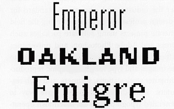
I found the change of typography interesting when monitors were introduced. Monitor in its early days wasn't capable of displaying a lot of pixels, so previous fonts became ineligible or just difficult to be used in this new form factor. Monitors are like square grids, they can show horizontal and vertical lines well, but not well for diagonal lines. Zuzana Licko was able to understand the limitations and potentials of this new technology and was able to create fonts that were well suited for monitors. She also considered the printing capability at that time; the matrix printer is capable of only printing at 72 dots per inch(dpi). Most printers now can print at 300 dots per inch (dpi). I conducted my own test to show what it is like to type words in a one-by-one-inch box, you'll notice that with only 72 dpi there's not a lot of space for intricate fonts, and the simple low-resolution font is more eligible. I also added what a 300 dpi looks like just to show how advanced our technology is now. Zuzana Licko recognized this, and that's why her Emperor, Oakland, and Emigre fonts worked so well before.

The pixel bit fonts have also inspired a different type of font style, they have tried to imitate, incorporate the aesthetics of these bit fonts to newer fonts even if there is no limitation that made the bit font what it is.

Contemporary Typography mentioned the rise of programs that helped in making fonts, such as Fontography, Adobe Illustrator, FontLab. Because it is now easier to create fonts, more variations of the same font are made. Erik Spiekerman release FF Meta that has six different weights (thickness), different weights look better depending on how large they are on the screen. Nikola Djurek went even further with his Brioni Font, he has variations of different weights for the normal font and italic. It's interesting that there's a lot of history behind typography. I personally like using different variations of the same font to show emphasis and lead readers. Now there are countless fonts that have different appearances, some having a different psychological effect, or aesthetic appeal, some that look more appropriate for the text and content.
1 note
·
View note
Text
Week 9 – Industrial Design
Milwaukee is known for many things, one of which is the Miller brewery. Stevens Brooks helped them become iconic through their logo, but that's not his only contribution, he has changed the lifestyles of many Americans, brought economical growth, and developed the design industry. Brooks settled here in Milwaukee instead of New York making Milwaukee a birthplace for innovation and growth. He has produced more than three thousand products in his career, ranging from everyday products, appliances, gadgets, automobiles. With that many items, it is bound that some of his works will gain a lot of attention, like Harley Davidson, lawnmower, cloth iron, station wagon, and so much more. Stevens Brooks is a great idea man, he was able to modify objects and factories meant for producing military use to objects that an average person would want to buy. His concept in design is also influential, claiming that design would pay for itself and "planned obsolescence." It implies that with the right design people will be willing to purchase goods. For designers, it would mean that there is always be a reason to redesign objects, because consumers do sometimes want something newer and better. Stevens Brooks' presence in Milwaukee became beneficial, encouraging markets, creating new jobs, inspiring others, reviving the economy, making life easier with his designs, and more.
I believe Steven Brooks stayed here in Milwaukee because he is also a businessman, and it would be a disadvantage to him if he were to move where there are other designers. Being in a more familiar place and where you have a reputation is a better starting point. Milwaukee is also developing greatly during his time, providing many opportunities to improve its industries. He could easily gain clients and manufacturers with little competition. Milwaukee is a great place since there is business; there are people to be consumers, clients, and companies wanting to introduce a new product or need a redesign, and there is convenient proximity to resources.
1 note
·
View note
Text
Week 8 – Industrial Design
Here are some of my design observations:
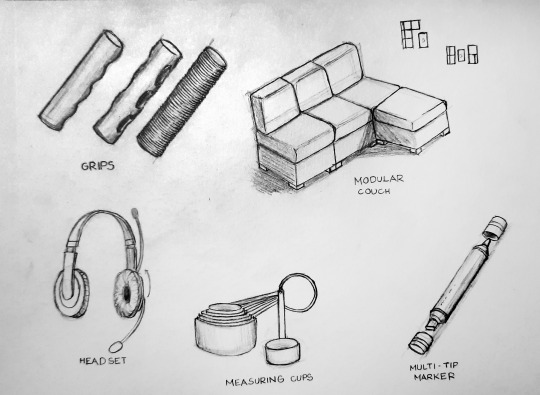
Some products have different sorts of grips that help users in handling the items or prevent slipping.
Modular Couch allows for interchangeable layouts and uses, and it can accommodate different room shapes and sizes. It is also easier to move or carry around since it is not one single unit.
A headset is a combination of a headphone and a microphone, reducing the equipment that needs to be plugged into your device. This would then be cheaper, space-saving, and organized. The mic can even be rotated to hide it when done using.
Measuring cups that fit nicely onto one another. They are made and sorted in such a way that they can be stacked, which saves space.
Multi-tip markers are designed to have two different tip types (usually pointed and broad) at both ends. It is another space-saver, also can easily change from doing precise linework to wide.
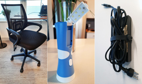
An office chair has several elements that are different from its basic form, it is designed for long uses and mobility. It has cushions and armrests to reduce fatigue and discomfort, is some chairs also have a tilt function for additional comfort. They usually have wheels and pivots for rotating and moving the chair. There is also a lever for adjusting the height of the seat to accommodate different people.
This flashlight has a retractable plug and an LED lamp. It eliminates the need to replace the battery and is useful for working in dark areas where the user needs both hands.
My laptop charger has a built-in strap to help organize the cable when not in use.
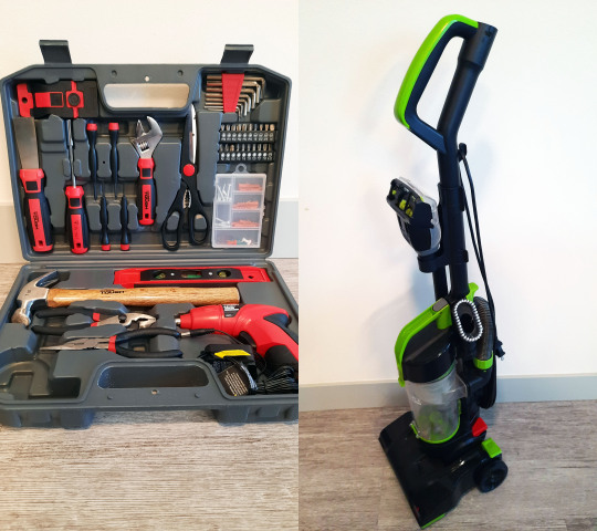
The casing of this toolset is made to fit tools in specific slots to keep them neat and safe from moving around during transport. The tools stay in place and can easily be taken out. In other boxes (phone and instruments), the objects within also fit nicely to protect them from exposure.
This vacuum cleaner has multiple modes and multiple accessories attached to it. In its current form, it is a carpet or upright vacuum. But you could remove its hose to be a handheld vacuum, and you can add different accessories to add more functions.
0 notes
Text
Week 7 – Architecture
Two principles of Universal Design that I like are Simple and Intuitive Use and Low Physical Effort. "Simple and Intuitive Use" is very commonly applied to the designs of objects but is often overlooked by users, and that's how it should be. Users are able to predict or guess how to objects work, and how to use them with little thinking or understanding, that's why the principle is overlooked. Users know how to use the product even if it's their first time using it. We could see this principle used on our mobile phones, every time we get a new phone we don't always read the manual; we immediately boot it up and set up our credentials, and that process too is made simple. We usually know what buttons or switches would turn on appliances or devices since it has iconic traits like being the larges button, being round, being red or green, or having a line from top to center. Some objects are deliberately designed to indicate to the user that it's the only thing they could interact with for something to occur, like handles on doors, windows, cabinets, and drawers. The input and output of plugs and ports are made to look relatively similar, so people recognize what goes in where.
"Low Physical Effort" is a principle that is being applied more often now due to technological advancements, like sensors for automation. Actions needed to get something done are getting reduced or easier, making it efficient and faster in most cases. Proximity sensors are now built into many objects, so people don't have to physically interact with them like faucets, doors, dispensers, and lights. The wireless transmission also reduces repeated actions, we now have remotes for many objects like our TVs, garage doors, and we can even communicate with some of our home appliances with our phones. I remember my parents telling me that they were the remote before, being called to switch the tv for their parents; I'm grateful not to experience that. Interactive Kiosk helps in making processes efficient, they are used in vending, ticketing, setting orders, providing information, and so much more. The best application of a kiosk system that I often interact with is ticketing on buses, I simply tap my card; I could imagine how difficult it is to prepare the right amount of cash every single day.
1 note
·
View note
Text
Week 6 – Architecture
Milwaukee holds many diverse buildings, some of which utilize or imitate the architectural styles of the past, while some are more contemporary and modern. I went on a walking tour recently along E Wisconsin Avenue, and in that area alone you would be able to find lots of interesting buildings.

On E Michigan Street, there is an area where four historical buildings are all located. These buildings are Hilton Garden Inn, Mackie Building, Mitchell Building, and State Bank of Wisconsin. These buildings use these styles correspondingly: Renaissance, Victorian, Second Empire, and Neoclassical. It's are really fascinating area since you can see so many architectural elements like arcs, orders, moldings, entablatures, pediments, statues, and endless ornamentation. Here are some of my sketches of the architectural elements that I have seen used.


The Iron Block building is another building that I was fond of since I immediately noticed that it is not made of stone, but it has similar elements as the buildings above. It is actually made of cast iron, and it just goes to show the capability of manufactured products. You could see Corinthian order, arched windows, and dentil molding, which I found is funny since the Dental Associates reside in the building. The U.S. Bankruptcy Court is a building that I fancy, and it follows Romanesque architecture that is why it has similar features to a castle. Instead of sharp-edged walls, they have tower-like corners. You could also see small window slits, pointed roofs, ornamentation along the roof apex.

The Gas Light Building is an Art Deco tower, what I found intriguing is that it's not really that tall, but because of its shifting floors, it gives the impression that it goes higher. On the ground floor, you could see engravings of a sunburst. The Northwestern Mutual Life Building has an amusing façade since it uses Corinthian order that spans five floors, and it also employs cast iron as seen on the window frame. So this building is mixing different materials, which makes it interesting. The last building I would like to highlight is the US Bank Center. It is the tallest building in Milwaukee, it just shows the great feat of engineering; it lacks decorative elements, but it still has its charm.
2 notes
·
View notes
Text
Week 5 – History of Design

Reading about the history of graphic design, I found ideas and examples from the past that we still use and have been improving on until today. Constructivists from Russia (1920s) were the first to work their art with industrial products. Soviet graphic designers were the first group to integrate both text and photographs into a single composition. In today's time, illustrations and text in one image can be seen everywhere. The process of making such images has become much easier due to technological advancements and everything being digital. Advertisements now always feature images of the finished product.

The second idea that I found interesting is about the New Typography, where clarity of formats became the focus instead of beauty. Jan Tshichold(1902-1974) described the principles of New Typograph involves the orthogonal design, bold rules, positive use of negative space, asymmetry, and san serif lettering. Tshichold renounced axial symmetry as the negative element of the old typography. Axial symmetry cause text to break apart in the middle, which impacts the overall clarity of the text. Nowadays, asymmetry is seen in many of our books, and it helps readers know where to focus, and text is continuous.

Finally, the idea that I found to be very significant is the use of iconic symbols to represent information. Charles Coiner designed a set of symbols for the Citizens' Defense Corp (1942) using simple iconic drawings, each with different roles, like fireman or policeman. Symbols are used for many things now, making it faster to provide information. We use them in signs, user interfaces, icons, markers, emojis, identification, and so much more. Using symbols eliminates the need to use texts that could span several words, and they can easily be magnified to be more visible or distinguishable. On the street, signs are better since we only have a few moments to take in information as the car moves. In programs and games, symbols make the interface cleaner and thinner, providing more space for the work screen. Symbols are just everywhere, and they make our lives easier while still looking slick.
1 note
·
View note
Text
Week 4 – Found Object
Having to commute here and back in Manila, I tend to compare the state of transportation in both of these places. Whenever I go somewhere here in Wisconsin, I would search the destination on Google Maps and take the suggested bus route. It is simple, stress-free, reliable, and fast for getting from point A to point B. And it amazes me that the Milwaukee County Transit System made commuting so much easier.

Here, there are designated bus stops, and some even have a shed to wait in. Google Maps and the MCTS App could show me all the possible routes, notify me when to stop or transfer busses, and provide a considerably accurate ETA so I could time my leave. I could even monitor where the busses were and when they would arrive. The busses itself offers several accommodations and accessibilities such as an area for wheelchairs and carts, bike racks, air conditioning, security (cameras), and much more. The bus lines are well-planned since they're spaced based on density, more buses would pass populated areas compared to less dense areas. My experiences so far have always been great, and even my first trip went well. The busses never became very crowded, are rarely late, and bus interval is bearable.
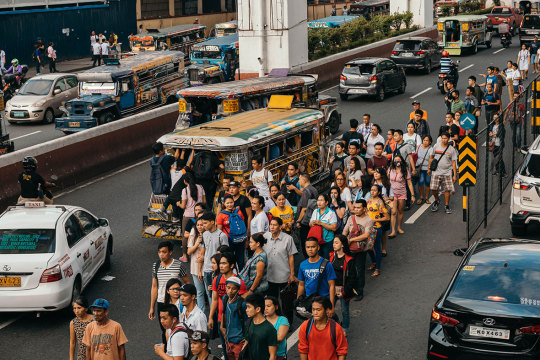
Back in the Philippines, there are four ways to get around, which are busses, trains, jeepneys, and UV express. Even if we have these many modes of transportation, commuting is still stressful, difficult, and time-consuming. Jeepneys and UV express are the best choices for getting to the closest drop-off from your destination but provide the worse experience. Knowing how to get to your destination is beyond Google, you usually have to ask someone who has traveled there several times or recently, or you would have to do a practice run if you'll be going there more often for the first time. It is only recently that a third-party app is attempting to help commuters navigate in the Philippines, but even the app struggles when routes change. Very commonly, there are no loading and unloading areas for jeepneys, so people tend to make a line parallel to the street since no one knows where the jeepney would stop, but when a jeepney actually pulls over, it's always a race to get in first. Since so many people are trying to get a ride, we would sit tightly next to each other to make room, so tight that only a quarter of your butt would touch the seat, and others would even hang from outside. There are no accommodations and accessibilities, it's a mode of transport for the capable. Commute in the Philippines is something I hope to never experience again.
1 note
·
View note
Text
Week 3 – History of Design
Here are some of my Design observations.
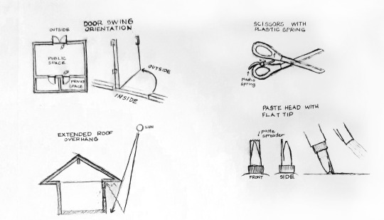
The door swings are oriented outward from the building; they considered the possibility of a panic where people might not be able to pull the door inwards, and there isn't enough space to open it, so they oriented it the other way. Doors are oriented towards smaller or private spaces where there are fewer people and less traffic, so it is safer to be opened that way.
Roof overhangs are extended to reduce or prevent direct sunlight. This also helps keep the indoor space cooler, which also reduces the use of air conditioners. Light can also bounce to the overhang then into indoor space, this light will be defused and provide comforting ambient lighting.
Using a standard pair of scissors involves closing and opening of fingers to use, with a plastic spring, it helps in opening the handles once again. When done using or prefer to use the scissors without the spring they could be rotated aligning with the handle's curve.
A nozzle with a flat grooved tip. It was designed to help with distributing paste on a flat surface. Its saves time from using your finger or another flat object to spread the paste with.

A mechanical pencil uses a thin lead which gives us a consistent line weight. Comparing to a regular pencil, it eliminates the need to constantly sharpen it if you would want to maintain a consistent line weight. Mechanical pencils can also hold multiple leads when the one being used is worn out.
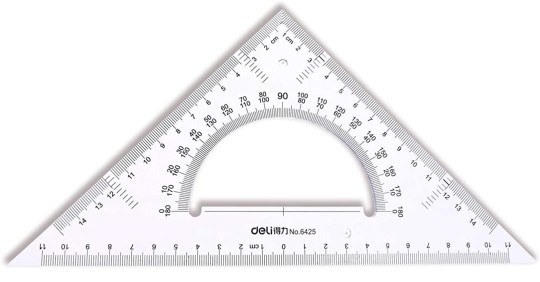
This is a 45-degree triangle with a protractor. with just one piece of equipment, it easily helps make and identify lines that are straight, right, and every angle in between. Since it serves two uses and is hollow in between, it becomes really compact and portable.
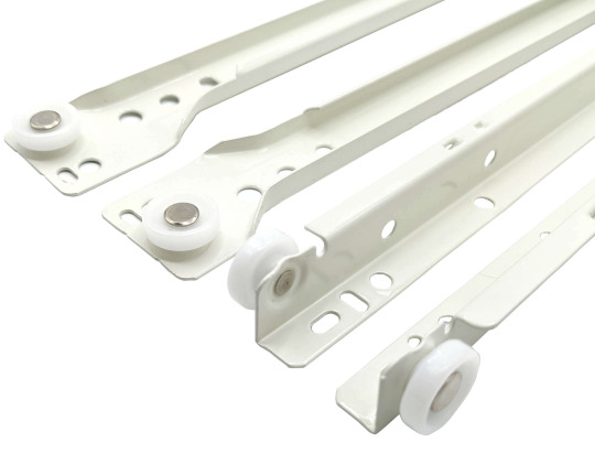
Drawer slides are fascinating components of furniture, because of them, you could easily push and pull drawers. they have four wheels to reduce friction and carry the weight of the drawer and items in it. It has multiple holes to accommodate different sizes and is L-shape to carry weight from beneath.
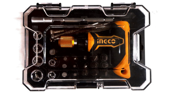
Multi-bit screwdriver. Instead of having multiple screwdrivers with different tips, it saves you from that hassle by just having the tips interchangeable. This item saves money and storage space. The one I have can also ratchet and has a better handle grip.
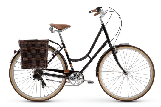
There are many different bikes in our current time, but all of them are very different from when it was first introduced. Before, it was all made from metal and wood. Now, it is designed to be functional, aesthetic, and convenient. They are made more lightweight; comfortable with soft cushions, rubber tires, and sometimes suspensions. They sometimes have additional features like a gear shift, baskets, lights, bells, locks, and more.

1 note
·
View note
Text
Week 2 – Design Thinking
I have always found the definition of design to be broad, but it has consistently revolved around finding a solution to a problem. Design is usually a plan, concept, structure, or composition that would satisfy our endless needs. It evolves an understanding of human behavior, issues, experiences, limitations, and more, and that's just looking at humans as the focus of the design; one could also consider the environment, budget, resources, technology available, and many more. Design is a continuous process of improvement, development, trial, and error to find the best solution at the time. Designing doesn't even have to start with a problem, it could begin with a "what if" question. However I define design, it has a uniform goal to provide a better experience to users.
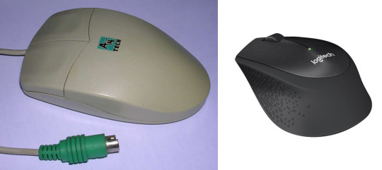
A product that I use nearly every single day is my computer mouse. I have been using a mouse since I was probably seven years old, and I have witnessed how the design has changed over the years. I have read and experienced what has brought the changes to this device. I remember using an old A4tech mouse that only has a ball in it, two buttons, and a circular port; now I am using a Logitech Wireless Silent optical mouse (M331), and one could tell the huge difference between them. Long gone are the cables that dangle around the table, the ball that catches dirt from the table, and the ancient port. New features and technologies were introduced like; having rubber parts for comfort and grip, a scroll wheel that acts as a button and helps navigate vertically, more lightweight material components, better ergonomics, using a universal port, and much more. I even remember some mice have a double click button since it is a common action even today. The design has evolved to accommodate our computer use behavior and provide a better quality of life features.
Another item I really appreciate for its design is bags, there is a devise selection of bags with different designs to suit different people. My bag, in particular, is a laptop bag which suits me because I am a student and tech-savvy. Amazingly, bags are designed differently because of their potential users, items that they would carry, the amount and weight, how they would be carried by people, and so much more considerations. My bag has paddings within the straps for comfort and at the bottom and back of the bag to protect the items. There are separate compartments for different items too. All together providing a great experience for me.
A concept from the reading that I was fond of was about the designer's personality profile. A designer has to think about how the users would interact with the product. They have to go the extra mile to predict other considerations and see if there might be other approaches to reach the design. And crucially, knowing how to work with others and accepting ideas from others, because we all think differently and we all have different skill sets that can complement one another.
Reference: Glass, D. (2018, January 23). The Evolution Of The Computer Mouse. Retrieved September 17, 2021, from https://www.theversed.com/86383/the-evolution-of-the-computer-mouse/#.UBtI14BI1R
Gradin M. (2011, April 4). The Simple-Basic Backpack. Retrieved September 17, 2021, from https://deepblue.lib.umich.edu/bitstream/handle/2027.42/83803/mbgrand_1303339715.pdf?sequence=1
1 note
·
View note
Text
Week 1 - About Me
Welcome to my journal. I am Rafael Lukas S. Pallasigui, a transferee from the country Philippines. I have recently moved here to the United States last June. The reason I moved here is to be with my mother since she has felt lonely being separated from our family, besides that, I also found it as an opportunity to gain better quality education. Some educational background, I took up architecture in MTI (probably not the one that most of you know; it stands for Mapua Institute of Technology, the school for engineering in my country). Because of Covid-19, I only finished 3/4 of a school year and got halted for more than a year. So here I am now, continuing my academic journey at UWM. So why did I pick this class? Well, because I like to think and solve problems; I like math, physics, science, technology, and art; and I like combining those things to influence the world around me. I'm the type of person that would question the efficiency of things, think of the smartest way to achieve the goal, or ask if we can do something better. I thought this class could help me with that and even more, so that's why I am here. I hope to learn how others create their design, their thought process, principles, and more when solving a problem. What inspired me a lot to learn more about design are actual architectural planning, my day-to-day activities, and video games. When I plan out rooms and other elements for a building, I usually prioritize convenience to affect my design, like putting a door from the garage to the kitchen, so there's a quick route for when the client unloads groceries. My definition of design is something more than physical, so I consider the structure of how I do things is design, like my schedule and routine. An example would be doing all the tasks that are located in the bathroom like bathing, brushing, and waste management in succession, so it saves a lot of time and I don't have to go back and forth. Lastly, games, there are some games that I actually spend more time thinking than playing. During my break from college, I was playing a game called Oxygen Not Included, its a colony-sim, physics-sim, resource management, base building game and I love the game very much because of its complexity. The game gives you different elements or components to work with, and it all depends on you and how to use those to solve the problem of your colony. I have spent a lot of my time reading mechanics, understanding others' designs, and designing my own builds, making sure that it's more efficient and sustainable when possible. I am amazed that I became very invested in the game to design everything myself, it was estimated that 90% of the player base just copy designs (because it really is time-consuming to understand mechanics and design). With regards to my purchase where design is a deciding factor, I think my table applies to this. I had to pick between a textured table that looks really nice and one that is simple clean surface and has a drawer. As much as I liked the textured one, I could tell that it won't be great for what I do, I thought my drawings would be affected by the texture. So I choose the other one, and I am actually happy with it.
2 notes
·
View notes