Don't wanna be here? Send us removal request.
Audio
0 notes
Audio
0 notes
Audio
0 notes
Text
Research logo design and iconography
logo colour theory
when choosing a colour for your brand you have to be accurate on the colour you pick snice every colour has an emotional attachment to it. For example the colours green and blue suggest a feeling of calm because blue and green present nature. As a designer it’s really important to understand psychology of colour’s so we can deliver what the customer ask for. Some examples are female cosmetics product has the elements of pink and white snice white are seen as feminine colour and it will attract the attend target audience. If I’m designing a male perfume product I would go for dark and masculine colours like dark blue black and grey snice these colours are the colours men are more attracted to.
What makes a good logo
To make a good logo you will need to meet the 5 basic points, which is
. Simplicity
. Memorable
. Timeless
. Appropriate
. Versatile
When I say simplicity It means keep the logo nice and clean. Don’t over complicate the logo by adding too much details to it. The reason why is because if you add a lot of details to your logo it will make it harder to remember and you will lose customers. A great example is the Nike swoosh logo it’s a simple black swoosh that everyone will remember and recognised snice it don’t have too much details to remember that’s one of the biggest reason they are successful. The more simple it is the more customers will remember it which links to making it memorable. By making it memorable is by making the logo as simple as it can be.
A timeless logo means that will the logo still be effective in 10,20 and 50 years down in the line because trends come and go but changing your brand identity is going to be very hard and expensive which cost you a lot in the long run. Great examples are the Bulova horns and the coke cola logo these brands has been around for 100 plus years and never changed the brand identity which shows that no matter what trend is going on they will be still be relevant.
To have an appropriate logo you will need to think about your target audience, by knowing your target audience you have an rough idea what appeals to them. Kids like big fonts with multi colours and adults like simple basic bold colours. And your logo don’t have to be an exact representation of your company like a restaurant doesn’t have to have a picture of a food on their logo or a watch company doesn’t need a picture of a watch.
Versatile logo makes a great logo because it doesn’t matter how it look with different size and scale so when you think your logo is versatile ask yourself how will it look across all multimedia platform?
How will it look in one colour and multi colour?
Does it look good if it was on a billboard
Does it look good in reverse colour(black/white background) ?
What makes a bad logo
A logo should be memorable and should represent the brand in all ways and should be easy to recognize.
Bad logos are frequently are too bright, too loud or too confusing. It won’t make sense to your brand and wont show what type of product you are selling. Another point that makes a bad logo is over-complication and merging ideas together that just don’t fit. Flashy colors, textures, and poor spacing create terrible relationships between text and symbols.
Typography is crucial to logo design because lettering is always part of branding. The lettering you choose should match the company’s goals and products.
https://www.vandelaydesign.com/examining-bad-logos/#:~:text=What%20Makes%20A%20Bad%20Logo,complexity%20and%2For%20poor%20recognition.
0 notes
Text
Ergonomic
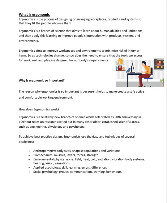
What is ergonomic Ergonomics is the process of designing or arranging workplaces, products and systems so that they fit the people who use them. Ergonomics is a branch of science that aims to learn about human abilities and limitations, and then apply this learning to improve people’s interaction with products, systems and environments. Ergonomics aims to improve workspaces and environments to minimise risk of injury or harm. So as technologies change, so too does the need to ensure that the tools we access for work, rest and play are designed for our body’s requirements.
Why is ergonomic so important? The reason why ergonomics is so important is because it helps to make create a safe active and comfortable working environment.
How does Ergonomics work? Ergonomics is a relatively new branch of science which celebrated its 50th anniversary in 1999, but relies on research carried out in many other older, established scientific areas, such as engineering, physiology and psychology. To achieve best practice design, Ergonomists use the data and techniques of several disciplines: Anthropometry: body sizes, shapes; populations and variations Biomechanics: muscles, levers, forces, strength Environmental physics: noise, light, heat, cold, radiation, vibration body systems: hearing, vision, sensations Applied psychology: skill, learning, errors, differences Social psychology: groups, communication, learning, behaviours.
0 notes
