Statistics
We looked inside some of the posts by quagsi and here's what we found interesting.
Average Info
Notes Per Post
791K
Likes Per Post
432K
Reblog Per Post
358K
Reply Per Post
954
Time Between Posts
5 hours ago
Number of Posts By Type
Text
15
Photo
2
Last Seen Tumblr Blogs


Fun Fact
Tumblr Inc. is funded by 13 investors.


Text
"What made you follow your mutual" I don't know. I don't remember anything. In my mind we were mutuals at birth. Since the dawn of time. The start of the earth's spin
15K notes
·
View notes
Text
was measuring out some sugar and i scooped out one spoonful and fucking said "two." i didn't know you could even lose count that fast
35K notes
·
View notes
Text
THERE IS NO DELTARUNE
THERE IS NO SILKSONG
AND THERE IS NO QUEEN OF ENGLAND

25K notes
·
View notes
Text
I know whenever people rave about Pokemon's sprite era, it's usually about gens 4 or 5 (for good reason!), but maaaan does gen 2 have such a distinct visual identity that I adore, and I think a large part of that is how creative they get around their limitations
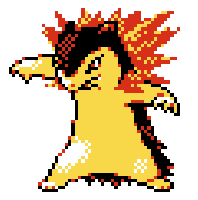
Like! Look at Typhlosion's Crystal sprite! See how many colors it has? There's yellow, there's red, there's black, white... and that's it! Most if not all sprites operate under a four color palette - and since they all have black and white, that means each sprite only really has two unique colors to work with. And man, MAN do they work with them so well. Look at how the reds aren't just part of the fire, they're used to highlight Typhlosion's fur, to give it the illusion of depth. See how the yellows scatter into the flames, how the whites of the legs spread out where the highlights bleed away?
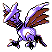
And look at Skarmory! The reds aren't just part of the wings, they're the outline of the eyes that make the sclera look more yellow than white (and I had to color pick to be sure! that's how effective color palettes can be, when it allows your eyes to 'fill in the gaps'). Most of the metallic shine comes just from how the purple and the white are applied- they made this bird METALLIC. on a GAME BOY COLOR. with TWO COLORS
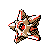
Staryu's shading is complex by design (shining gemstone center, geometric star shape where the light source hits the faces differently), but look how the face-covering-thing around the gem is lighter than the rest of its starfish body. They both use the exact same shade of brown, but one part uses it as shading and the other uses it as its base! And the reds?? Not just how the gem can look so shiny, but it's used so well to complement the outline!
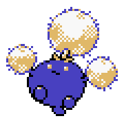
And look at Jumpluff! It's body is mostly a flat blue, but it helps accentuate the detail on its cotton puffs. Look at how scattered the yellows are, how specks of blue will poke out, making each puff look... well, puffy!
I had to size them up for readability in this post, but these sprites are only 56 x 56 pixels. That's so tiny!! And yet they're able to convey such key details for such a tiny game system, all while using such cozy color palettes!
gen 2's era of art design you will always be the moment of all time to me <333
4K notes
·
View notes
Text
We literally cannot let them start charging 80 dollars for video games 70 dollars was already outrageous 60 was pushing it. 80 fucking dollars. ARE YOU OUT OF YOUR DAMN MIND. For MARIO?!?!?!?!?
55K notes
·
View notes


Text
oh god I got a picture of the moon you tumblr bitches are gonna LOVE
122K notes
·
View notes

Text
Guys I just refreshed the site and everyone's profile pics went round
18K notes
·
View notes


Text
no sentence fills me with utter loathing so much as "i asked chatgpt"
45K notes
·
View notes