Don't wanna be here? Send us removal request.
Text
Week 8 Post

Week Reflection:
In all honesty, this part of the book was boring but, in a way, also eye-opening. The things they talk about are boring, but they give perspective on the things we use every day, like books and the internet. It's almost hard to follow what the books are trying to say because there are a lot of general statements, like "Graphic designers, eager to give shape to the web’s wide and flaky text bodies," that give me no value. Other than that, it's cool knowing how typography is interwoven with the internet.
I am excited about this new project for the logos. I've never used all of the programs I have at the same time, so it's an entirely new experience. Hopefully, it gives me some insight on how to deal with clients in the real world. All in all, honestly, I'm a little bit anxious because I already have the idea in my head, but I'm struggling with how I can implement it.
0 notes
Text
Week 6 Blog

Reading/Week Reflection: The further I look into typography, the more complex it gets. For example, I didn't even know typefaces had a universal structure. I wasn't aware of terms like terminal, ascender, and descender, even though we look at these structures every time we read. Before I even started reading, I didn't know the difference between a font and a typeface. Project 4 is a little confusing for me, but I think I'm starting to get it. I'm trying to at least make it look visually satisfying, but I don't really know how to use InDesign or Adobe Illustrator. At least I'm trying, though. One part that I'm struggling with is trying to find a format to go by that's uniform and neat. It's just hard when the spread can't be in equilibrium. To be honest, I understand that graphic designers stray away from it because it is boring. All I'm asking is: Why haven't graphic designers found ways to make equilibrium look less boring? Where's the evolution of thinking?
0 notes
Text
Blog Post #5
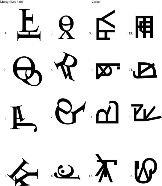
Reading + Writing Reflection: To be honest, I've never really thought of the origins or ownership of typefaces before. I wonder how payment would work over time. Like, would you have people for it once and then you could use it forever? Would it be where you can only use it up to a certain time? Then you would have to think about whether you could use it for business purposes or not. Kinda weird. Honestly, the week hasn't been too bad, especially since I now have the time to complete everything I need to. The whole font manipulation thing is new to me since I haven't used Adobe Illustrator that much. However, the letter flower project wasn't too hard. At least I learned how to use the pen tool properly through some tutorials. One thing that I do understand now is that it takes an extremely long time to create a font from my point of view. If I were to try, I would say the hardest part would probably be trying to come up with something original.
0 notes
Text
Week 2 Post (9/7/2023)
Reading Reflection (Grid (pgs 111-138): I find it crazy how the arrangement of text itself can be its own art in typography. I don't really think about the allusion of text that much, but now I see it as something that is integral. In all honesty, though, I haven't really seen creative uses outside of things like movie posters and album covers. One of the examples in the book showed a normal paragraph aligned to the left, but there's a certain part of the text that's isolated on the right, and the same pattern is repeated with the other paragraphs too. I wish I could see more examples of that type of typography in regular books. I find it cool to see something out of the ordinary for once instead of seeing the same format over and over. Although maybe the fact that I don't really see a lot of creative alignment makes it slightly more special.
Work Reflection:
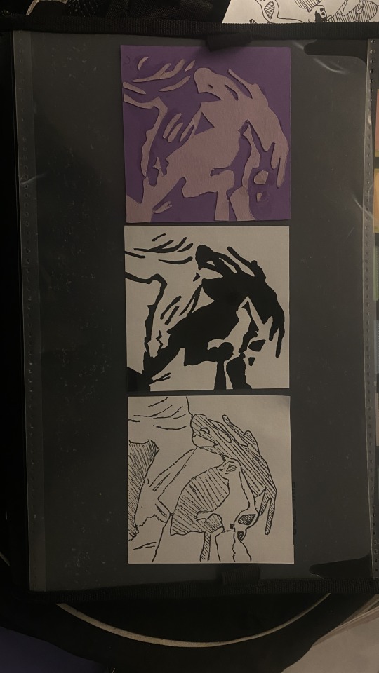
Now that I'm almost done with this project, I will 100% admit that it this project was challenging. It felt like I was working on a final project. I've never had to work with my hands this much before. A majority of the things that I regularly do are done on a computer, so this was really eye-opening. I learned that I am generally not good with craftsmanship; I think it might have to do with how I'm naturally heavy-handed. I had to constantly recut the squares because there was always a side that had to be slightly slanted or a little bit longer than what it needed to be. Somehow, I managed to cut good squares, though, so that's pretty cool. If I were to change anything about my project, it would probably be the person I chose. It would've been better for me if I had chosen a person with much bigger and distinct facial characteristics.
0 notes
Text
Week 1 Post
Reading (pgs. 11-34):
While I was reading the book, it seemed like I was watching a slide show of how fonts evolved over time. In my opinion, the fonts started off very similar to each other with slight deviances that made them "unique", but then people started to find more uses for fonts as time went on, so fonts then started to change. I was honestly surprised at how far typography actually went back. I also found it funny that people were more likely to switch to a font that would give them more freedom with their writing. I wonder if the people who originally created the font receive some sort of compensation for it. One of my favorite fonts that I saw in the book was Fette Futura. I really liked how it was smooth and circular at the same time. If I were to choose a font today, it would probably be something simple and easy to look at.
Project 1:
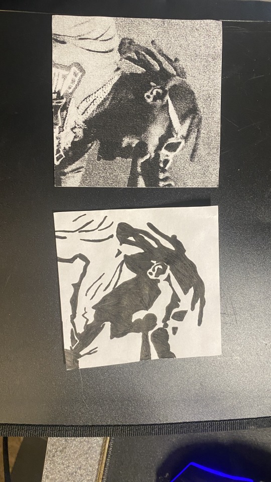
This has to be one of the most frustrating things I've ever done, besides taxes. I'd say that a large part would have to be cutting out the squares by itself. I honestly have a really bad memory, so I kept forgetting how to cut out squares properly. The whole drawing part is fine, though. A small part of me wishes that I got a better picture because for the second square, I have to create the illusion of T-Pain holding a microphone. If you just look at the picture by itself, it looks like he's holding a cone of literal darkness. I've looked at other people's projects compared to mine and came to the realization that mine isn't that bad. For the most part, I have to recut some squares and redraw the second square. The quick fixes should be pretty easy, though. I also think I've found the cheat.
0 notes
Text
Final Process Blog
I feel like i've learned alot from this course. There might've been times where I didnt pick up certain concepts, but I'm willing to relearn them again. One thing that I regret when taking this course was not having a set goal to when it came to completing projects. I think the thought process I had when doing them made it feel like the projects were more of a chore rather than me actually working on them. For the process journal I want it to intentionally be different from everyone else. I say this because In my eyes everybody's seems to be so similar to each other, I find it weird. It also has this effect where if someone does something that doesn't fit in with the standard of the project, it looks "bad" or "unorganized". I think it's definitely going to be a challenge, but I should be able to accomplish what I'm looking for.

0 notes
Text
Process Blog #6


Reading Reflection (pg. 292-327):
On the pages 292-327, there was a lot of talk about graphic designers learning how to program and having a different way of thinking called "algorithmic thinking". Honestly, I understood the part of having programming as a skill, but the way "algorithmic thinking" was being described was, in my eyes, really vague. In my definition, I would simply describe algorithmic thinking as having directions/an outline to do/create something. I think the majority of people might already do this, but I'm not completely sure. The book described it as if it was some new "revolutionary" way of thinking when in reality it's been done for years. Reading this made me realize that getting to the point saves a lot of time. I understand the book is getting this information through interviews and the people they interview have to uphold a certain image to be "respected", but the simpler you explain, the better.
Working Reflection:
Project 5 was really simple, but I got the point of doing it almost immediately. It allows me to think of the structure. In a way, it made me also come to the realization that I was basically following a template. The project also highlights how information is displayed and interpreted by others. I'm not sure why, but I felt it stronger than every other project I've ever done. I wish I could've done this project sooner to already have this concept nailed down. I feel this way because how things are visually interpreted is a very big part of creating designs, logos, or any other creation. I really want to apply this to project 6 while also making sure the structure of everything doesn't interfere with the visual satisfaction of the project negatively. I can tell that project 6 is about to be a challenge for me. Not necessarily because it's something new, but because I am having trouble finding the balance between the information and the design of it. I think it might become a problem in the future if I can't find the solution to what I'm trying to achieve with project 6.
0 notes
Text
Process Blog #5
Reading Reflection (p.230-291):
The book gave me a new perspective on what it takes to get into the graphic design scene. You have to be more than just a person who can make digital art. You have to expand beyond yourself. For example, learning how to code would be a big plus. In my eyes, it seems like it's hard to stand out in the field. You have to find ways to adapt to the current times, constantly learn new concepts, and even sometimes relearn old concepts. There's also the new wave of graphic design where nothing is being printed anymore and it's more digital than everything. It was slightly intimidating once I realized how much the concept of graphic design is expanding. Honestly, I hope that I'll be able to keep up in the field and be able to catch up to people that are currently in design now because it seems like there is a lot of competition.
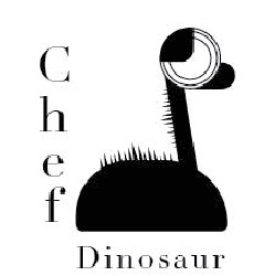
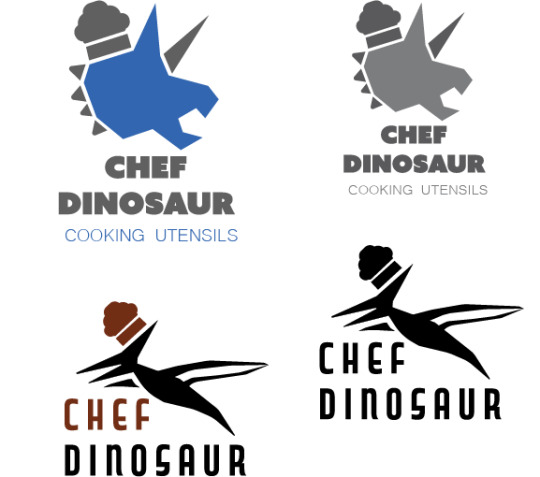
Week Reflection: When I was working on Project 4, it made me realize I wasn't trying hard enough. I say this because it was the first time where I found a project to be difficult. I describe the project as different because it was hard for me to think outside of the box. I couldn't really think that much about the concept of "chef dinosaur". That caused the project, in my eyes, to become too simple and really boring. One thing I noticed while doing the project was that I wasn't thinking of anything at all while I was doing it. It was like my mind was blank. That was probably because I'd never made a logo before. The hardest part about the project was finding a reference because I couldn't find anything that satisfied me.
0 notes
Text
Art 102 Blog #4
Reading Reflection:
The reading made me think about the type of people that manage to become "big". I thought of different characteristics like being disciplined, being able to think outside of the box, and being a quick learner. Also, it’s better to have multiple skills when you are a graphic designer such as being able to code websites or being able to adapt to different formats.
Week Reflection:
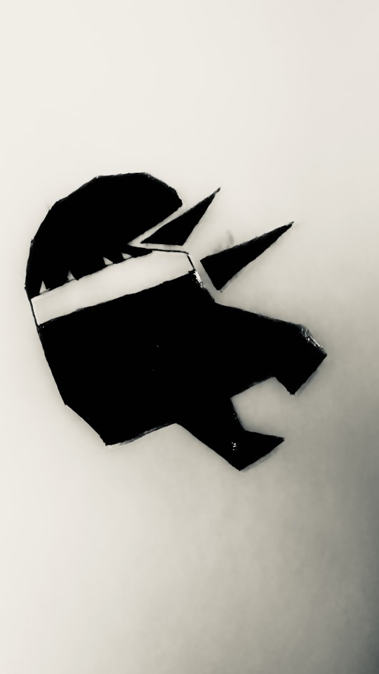
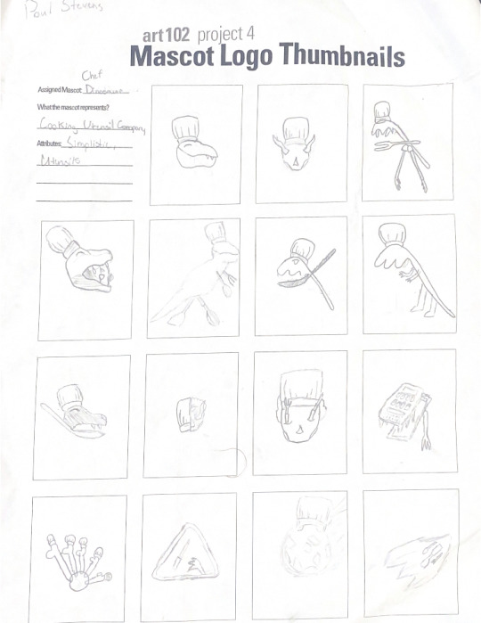
Project 4 has definitely opened my eyes to how logos are made. I thought it was simpler for how logos are made, but it turns out it takes a good amount of time to make a GOOD logo. I'd say the hardest part about it is implementing the idea to the point where it looks good and make sense at the same time. My words were Chef Dinosaur. One thing that I realized was that it's hard for me to do simple designs that don't have a lot of detail, so it forces me to think outside of the box.
0 notes
Text
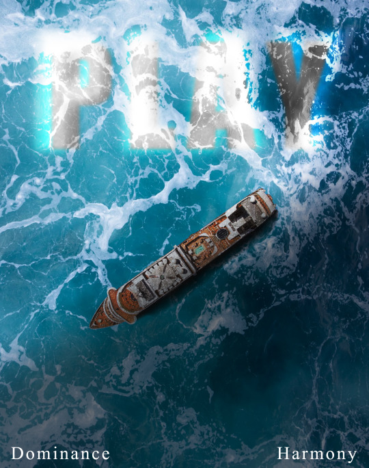
Art 102 Blog #3
Reading Reflection:
The reading made me think of how the concepts of graphic design can be applied to different career fields like books, clothing, and much more. It also makes me think about how the ideals and processes of design have changed over time. I wonder what type of graphic design the best for me would be to go into. Another thing that I’ve noticed is that a lot of design studios tend to be looking for the same types of people who are driven, creative, and overall positive person. It honestly makes sense to look for those types of people because I’d be looking for the same type too if I had my own studio. Another path I haven’t looked at was being a freelance graphic designer. I’ve seen it mentioned in the book a couple of times about how freelance designers are hired by different studios to contribute to different projects.
Week Reflection:
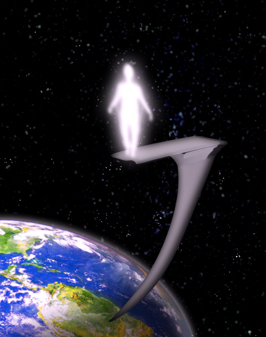
This week has shown that when I design different things, I like to focus on the smaller details. I’m not sure if that is a positive trait or not, but it makes it hard for me to do abstract work. Abstract stuff isn’t hard for me to make; it’s more like it’s hard to approve it or be proud of it. I watched some tutorials on how to use other applications other than photoshop such as Adobe Illustrator and InDesign. However, it looks like the functions of both apps could be combined and recreated in photoshop. I want to create my own style of graphic design centered around intense surrealism. I am not completely sure how I will do it, but I’ll try to find my own way. The work that I did this week barely scraped the surface of what I wanted to do. The main thing I focused on is lighting using gradients and making colors look powerful but realistic.
0 notes
Text
Art 102 Blog #2
Reading Reflection:
The reading presented to me the type of partnerships you could have in the graphic design industry. I got some insight into how other people started their art studios. I think I might start off as a freelancer just like how others have. I don't think I'm going to have a partner, but my mind is open to having one. If I was to have one, I'd want to split the workload half and half, but we do the same things on the creative side and business side. There were also moments when I thought of the difference between people who self-taught in graphic design and the people who started in college. Also at some point, I want to create my own style of design like other art studios do.
Week Reflection:
This week I worked on a project have to do with abstraction and typography. It was not the greatest experience. I don't like working with abstraction because in my eyes there is no topic or main idea to go by. It doesn't really make it difficult it's just annoying that I couldn't put any sort of idea behind it. My mind in this project went blank. I don't have a lot of experience with abstract work, so it was a little difficult trying to think of something to do with the typography. The end result didn't satisfy me, but that was mostly because I kept it simple. One thing that I discovered was that I do not like simple or abstract things.

0 notes
Text
Art 102 Blog (Week 1)
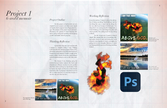
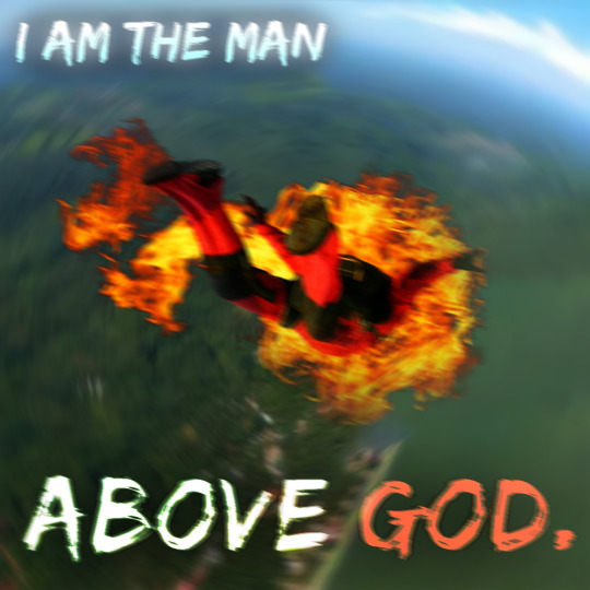
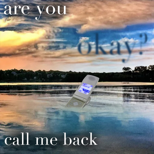
Week 1 Reflection: I joined this class late and entered with a project to complete within 3 days. Nothing could describe the amount of panic I felt as I realized this information, but I did what I did best. I improvised. I made a rough of the project within 3 hours, while my other classmates had about an entire week. It was also a good thing I started brainstorming as soon as the class started. For some reason, the themes I was thinking of revolved around darker subjects like death and abandonment. Human emotion was also another idea. More specifically, capturing the highs and the lows of the human experience. In my first picture, I chose the adrenaline of doing something "death-defying" and the first thing that came to mind was sky-diving (the fire was added just because it looked cool). One thing that it was missing was the background, so I went openart.ai and tried thinking of the most dangerous place possible. The result was sky-diving in brazil. I typed it in as a result and got the background I have for the picture now. For the second one, I wanted to keep it simple. The original idea was of something sinking inside a body of water and having the words around it come together to create a metaphor for getting lost in your thoughts. However, it ended up changing into the process of leaving something behind.
Reading Reflection (pg. 14-77): The book gave more insight into what it takes to become a graphic designer. The graphic designers' experiences were different but also similar at the same time. It makes me wonder if I am going to have an experience like theirs too. I wonder if I am going to be interviewed and have my responses in a book too. One of the main parts I paid attention to was what the studios were looking for when it came to graphic design. It made me look at the skills I have now and reflected on what I needed to work on. Some of the big things that it seems that I'm to have to learn are marketing and how to have good communication skills. Furthermore, it gave me some insight into opening my own studio and the aspects behind it. I'm not completely sure if I would want to start my own, but it definitely seems like something worth going for. Also, I never knew that were so many notable graphic designers.
1 note
·
View note
