
Just a side blog dedicated to posting and discussing Harry Potter stuff. Especially to do with my favorite character - Albus Dumbledore. My inbox is always open to questions or comments.
Don't wanna be here? Send us removal request.
Statistics
We looked inside some of the posts by pro-dumbledores-office and here's what we found interesting.
Average Info
Notes Per Post
33K
Likes Per Post
19K
Reblog Per Post
13K
Reply Per Post
53
Time Between Posts
10 hours ago
Number of Posts By Type
Text
14
Photo
2
Note
1
Last Seen Tumblr Blogs


Fun Fact
After the announcement of the deal with Yahoo!, there were 170K signatures of unhappy Tumblr users petitioning to prevent the sale in 2013.
Text

🦋🌷Fleur Delacour🌷🦋
Can we just take a moment to appreciate Fleur? She is unapologetic, confident and knows what she wants. Talk about a powerful woman⭐️ I like that she doesn’t feel the need to be nice to everyone, or smile at everyone. She doesn’t have the patience for it. She’s smart and resourceful. She did get chosen to be a Triwizard champion, after all!
I never liked that the women in book 6/7 were so annoyed with Fleur when she stayed at the Burrow. It was a misogynistic piece of writing and I do not agree with it, nor do I tolerate it 😤
So, here’s to celebrating Fleur Delacour✨🌈🌷
56 notes
·
View notes
Photo

Hi @blakedin ♥ here’s my Grindeldore Valentine gift for you~
© Melli ~ Don’t share/repost without credit please.
849 notes
·
View notes
Text
205 notes
·
View notes


Text
What never fails to amaze me in hp fandom is how people actually manage to see Lily as a bad person for calling Snape “Snivellus” or almost smiling. Lily, the only real victim in this entire situation, the most vulnerable member of the entire wizarding society, literally under threat of death. There’s a war going on, people are disappearing, dying, the Ministry is failing, baby Death Eaters in Hogwarts barely even hide and “mudblood” is thrown around left and right.
But sure, Lily is the bad one because she called Snape “Snivellus” after he called her a mudblood when she was trying to help him 🤡
Or they call her a hypocrite, saying like “well, Snape called others mudbloods before, but when it was her turn, she suddenly turned away from him”. Listen, Lily had tried so many times before to pull Snape out of that awful ideology. But when he finally called her that, she realised it was… pointless.
Once again: the real victim in this situation has always been and always will be Lily. This war was literally being fought against her and people like her.
Some people just can’t separate the wheat from the chaff.
112 notes
·
View notes
Text

them in 1980 (albus thought he was a demon and sev was in the market for a father figure)
651 notes
·
View notes
Text

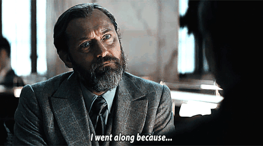
In the third movie, Dumbledore should've taught Jacob Occlumency (the ability to block his mind so it can't be read). It's never said to require magic. Only discipline, and Jacob as a solider is more than capable of that. It would've made for such interesting interactions with Queenie.
24 notes
·
View notes
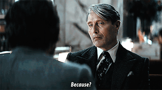
Text

I see no point in Kama going over to Grindelwald. They said Dumbledore sent him to spy, but we literally saw no rewards for these actions. Lally and Theseus would have been fine if he hadn't shown up when he did. It felt like something they forgot about and had no bearing in the story. Or just a way for his memories of Leta to be erased and diminish the importance of her character even further in any later installments, unless a big plot twist with her was coming.
9 notes
·
View notes
Text
So, last night I got to thinking what I want Snape in my interpretation to look like, so please take this offering with my thought process
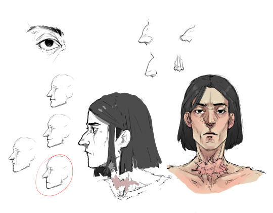
And after that I also made a rough sketch for a fun idea with a late night sneaking around that I l've got, so here's that as well
"Detention, Potter."

383 notes
·
View notes
Text
the last couple of days I've been noticing way more buds than usual on the branches of trees and bushes. I think something big is about to happen
29K notes
·
View notes
Text
I love how Dumbledore in the hp movies is like analying everything and anything n trying to defead voldemort and shit
And in the fb movies hes like "bitch i'm gay and depressed deal with it"
22 notes
·
View notes
Note
who is your favourite Dumbledore sibling? :)
If Albus counts which I am assuming he does then him always #1. I would put Ariana #2 and then Aberforth #3 right now :)
11 notes
·
View notes

Text
This is so exciting to see Grindeldore & Fantastic Beasts fans on here yes !
18 notes
·
View notes
Text
I'm sorry, but Voldemort is an incredibly complicated and dark person whose character centers around the fact that he never loved anyone or respected people who highly valued love. Any ship with Voldemort (if it's romantic) will therefore require some tweaking of circumstances to actually make him fall in love with someone. It is possible to keep him in character, but those circumstances didn’t exist in canon.
Voldemort isn’t a normal person, not even someone like Snape. It would be pretty hard for him to fall in love with anyone. He’s been avoiding love his entire life on purpose, so of course his life would have to change in some way for him to fall in love. He can’t be as "comfortable" as he was in canon.
So I think all Voldemort ships are fanon, but there’s nothing wrong with that! This is fandom, and we can play with fiction however we like. But people who call tomarry shippers delusional and say tomarry Voldemort is ooc baffle me. Do they think any Voldemort in any ship is ooc too then? Are they against fanfiction? I don't know! 😭
21 notes
·
View notes