Don't wanna be here? Send us removal request.
Text
Embracing Diversity: Nina Davuluri against the backdrop of Fair & Lovely
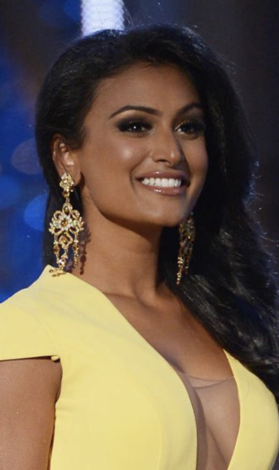
I remember this vividly: in 2013, Nina Davuluri, an American woman of Indian descent, made headlines and history as she was crowned Miss America. Her victory was a moment of pride and celebration for many, especially those who saw in her win a broader acceptance of diverse beauty standards in America. However, the reaction to her crowning was not universally positive. Davuluri faced a barrage of racist backlash on social media, with some calling her un-American, and others linking her to terrorism. This stark response highlighted a deep-seated issue with race and beauty standards prevalent not only in America but also in other parts of the world, including India.
All I could feel was joy that a dark-skinned woman, of the same shade as me, was able to take such a prominent stage.
Parallel to this scenario in the United States is the ongoing controversy surrounding Fair & Lovely, a skin-lightening cream widely popular in India and other South Asian countries. Marketed by Hindustan Unilever, Fair & Lovely has been criticized for promoting fairness as a preferred aesthetic, implying that lighter skin is somehow better than darker skin tones. This message resonates with deep historical and cultural biases that associate skin color with status, beauty, and personal success. Many commentators even said that Nina Davuluri would not have been able to win the parallel Miss India competition because she was "too dark."
The Cultural Impact of Fair & Lovely
For decades, Fair & Lovely has dominated the skin-lightening market by promoting the idea that fairness leads to success and love. The brand's advertisements traditionally showcased transformational stories where a darker-skinned woman applies the cream and subsequently achieves her dreams—be it career success, marriage, or social approval. This narrative taps into the societal pressures and prejudices that exist around colorism—a form of discrimination based on skin color that is not just prevalent in India but globally.
The brand's influence is so pervasive that it has shaped beauty standards across generations, often marginalizing those who do not fit the 'fair skin ideal.' The impact of such branding is profound, affecting women's self-esteem and social dynamics. However, the narrative around beauty and fairness is changing, driven by social campaigns and changing consumer awareness about the implications of such products.
Changing Tides: Response and Responsibility
The backlash against Nina Davuluri in America and the criticisms of Fair & Lovely in India highlight a global need to reevaluate beauty standards. These events urge brands and societies to reflect on the messages they endorse and the values they propagate. In response to growing criticism, Fair & Lovely announced in 2020 that it would rebrand to "Glow & Lovely" and changed its advertising approach to emphasize skin health over fairness. This decision marks a significant shift in how beauty products are marketed, reflecting a more inclusive and diverse understanding of beauty.
Moreover, the response to Davuluri's crowning and her handling of the criticism also illustrates the resilience and grace with which individuals can confront entrenched stereotypes and advocate for a more inclusive vision of beauty. As the first Miss America of Indian descent, Davuluri used her platform to speak out against racism and promote diversity and cultural understanding, embodying the change she hopes to see in society.
Looking Forward: A Call for Inclusivity
The discussions around Fair & Lovely and Nina Davuluri serve as a reminder of the power of representation and the importance of inclusive beauty standards. They challenge individuals and corporations alike to think critically about the messages they support and the impact these messages have on individual identity and societal values.
As consumers become more conscious and vocal, brands must listen and adapt, not just for the sake of profitability but to foster a more equitable society. It's time for all stakeholders—corporations, consumers, and communities—to embrace a broader, more inclusive definition of beauty that celebrates diversity and empowers all individuals, regardless of the color of their skin.
3 notes
·
View notes
Text
East Meets West: Bridging Fashion from Burberry to Sabyasachi and Papa Don't Preach by Shubhika
This case about Burberry made me think of Indian fashion and the axis of traditionality/heritage to modernity. It’s fascinating to see how global brands like Burberry parallel or diverge from Indian counterparts like Sabyasachi and Papa Don't Preach by Shubhika, especially in their approach to blending heritage with modern trends.
Burberry's Timeless Elegance Burberry, with its quintessentially British roots, stands as a pillar of luxury and tradition. Famous for its classic trench coats and the iconic check pattern, the brand merges historical elements with modern needs seamlessly. Under leaderships like Angela Ahrendts', Burberry expanded its reach while keeping a tight grip on its classic British heritage, ensuring that each piece tells a story of timeless elegance.
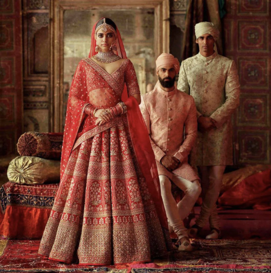
Sabyasachi's Regal Craftsmanship Crossing over to India, Sabyasachi is a brand that echoes similar sentiments but in a decidedly Indian context. Sabyasachi Mukherjee, the founder, emphasizes the grandeur of India’s artisan traditions. His designs are a homage to the past—lush fabrics, intricate embroideries, and vibrant palettes that speak volumes of India’s rich textile legacy. Much like Burberry, Sabyasachi caters to an elite clientele, offering pieces that combine the old-world charm with contemporary silhouettes.
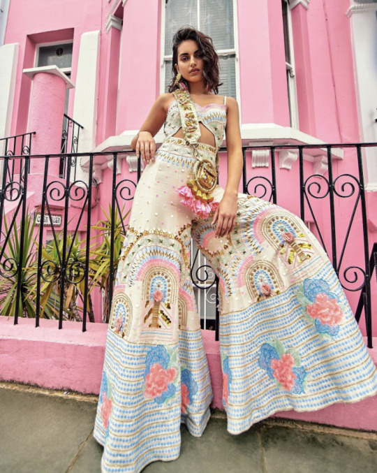
Papa Don't Preach by Shubhika's Bold Modernity On the other end of the spectrum is Papa Don't Preach by Shubhika, a label that challenges traditional norms and embraces a more rebellious, modern aesthetic. Shubhika Sharma’s creations are colorful, edgy, and experimental, incorporating unconventional materials and bold designs that stand out in a crowd. This brand caters to a younger, more daring demographic, looking to make a statement rather than adhere to classic styles.
Comparative Analysis: Tradition and Innovation What’s interesting is how each of these brands, though operating in different cultural and market contexts, manages to find a balance between tradition and innovation. Burberry, maintaining its luxury heritage, adapts to the modern market with digital integration and global expansion strategies. Sabyasachi, while deeply rooted in Indian craftsmanship, continues to evolve, embracing new techniques and styles to keep his designs fresh and relevant.
Papa Don't Preach by Shubhika represents a leap towards modernity, focusing less on tradition and more on creating new trends and expressions in fashion. This brand is much like the new voices in the fashion industry worldwide, which prioritize breaking norms and setting new boundaries.
Conclusion: A Tapestry of Styles The comparison between Burberry, Sabyasachi, and Papa Don't Preach by Shubhika illustrates a global tapestry of styles where every thread counts. Each brand, whether British or Indian, tells a story through its fashion, influenced by its heritage but driven by the modern world's demands. As global consumers become more interconnected, the influence of traditional and modern design elements blends even more, creating exciting, dynamic fashion landscapes for us to explore.
These brands show that whether in the lush countryside of England or the bustling streets of Mumbai, fashion remains a universal language, spoken fluently with both classic and contemporary dialects.
2 notes
·
View notes
Text
The Emergence of BB, CC, and DD Creams
As someone who prefers to wear minimal makeup, discovering BB cream and tinted moisturizers was extremely impactful. I came across these products initially online when looking for coverage on my darker skin tone, while not wanting "cakey" or heavy makeup. I've since learned that few products have made as significant an international splash as BB creams. These multi-functional creams, which combine the benefits of skincare and makeup, have transformed beauty routines around the globe. In this blog post, we'll explore the intriguing journey of BB creams from a specialized dermatological solution to a mainstream beauty staple.
BB creams originated in Germany in the 1960s, formulated by dermatologist Dr. Christine Schrammek. Initially designed to protect and heal the skin of her patients post-procedure, the product's potential was quickly recognized beyond the confines of dermatology. However, it wasn't until the early 2000s that BB creams exploded in popularity in South Korea and Japan. They were lauded for their ability to provide flawless skin coverage while offering benefits like SPF protection, moisturizing, and anti-aging properties—all in one tube.
By the early 2010s, Western beauty brands took notice of the burgeoning craze in Asia and started introducing their versions of BB creams. These Western formulations were adapted to a broader range of skin tones and types, recognizing the diverse consumer base. Brands also emphasized the all-in-one time-saving aspect of BB creams, appealing to busy Western consumers looking for efficient beauty solutions.
However, the reception in the West was mixed initially. While the allure of a multi-purpose product was strong, many consumers found that BB creams didn’t offer enough coverage or the targeted skincare benefits they sought. This feedback prompted brands to innovate and expand their offerings to include CC and DD creams, each promising additional benefits, from color correcting to heightened anti-aging properties.
Today, BB creams have firmly established themselves in the beauty market worldwide. They are cherished for their ability to provide a natural look while promoting skin health. The evolution of BB creams highlights a shift towards hybrid products in the beauty industry, where consumers are increasingly seeking items that combine cosmetic and skincare benefits.
The story of BB creams is a fascinating case study in global beauty trends and consumer behavior. It underscores the importance of cultural adaptation and consumer education in the successful global diffusion of a beauty product. As beauty standards and consumer preferences continue to evolve, BB creams remind us of the dynamic interplay between skincare and makeup, promising exciting innovations in the years to come.


1 note
·
View note
Text
Corona Blog Post
When I think of Corona vs. Heineken, completely different demographics come to mind. A bottle of Corona implies that the consumer is in warmer weather and is drinking a Corona on a beach with a lime wedge. On the other hand, I would associate a bottle of Heineken with a colder climate. The advertising I have consumed over the past two decades have also supported, if not created my associations with the beers. Corona advertisements have featured celebrities on tropical beaches, while Heineken advertisements have included less color and more technology.
Even according to the case, Heineken is perceived as a premium, sophisticated beer with a history and a reputation for quality. The brand is associated with European heritage and is often consumed by individuals seeking an “upscale” drinking experience. Corona, on the other hand, is associated with relaxation, fun, and the beach. Its marketing campaigns emphasize the "Fun Sun Beach" theme, promoting an easygoing lifestyle. The ritual of adding a lime to the bottle has become a distinctive and defining characteristic of the Corona experience.
The primary difference in consumer minds between Heineken and Corona lies in their brand positioning: Heineken as a premium European beer versus Corona as a laid-back, fun-loving brand. I would even call out the difference in perceived accessibility between Corona and Heineken, despite similar price ranges. While Heineken appeals to consumers looking for sophistication, Corona attracts those seeking relaxation and a casual drinking experience.
Heineken's advertising campaigns have historically focused on the brand's quality and European heritage, reinforcing its premium positioning. Recent shifts towards a more market-driven strategy suggest an effort to refresh the brand's image and appeal to a broader audience. A TV ad of Heineken that has stood out in my mind from 2006 was the DraughtKeg ad (https://www.youtube.com/watch?v=l-NfrBgYIEQ&t=16s), with human-droids, implying that those who drink Heineken are sophisticated and “technologically advanced.”
Corona's advertising has been instrumental in shaping its brand image. The consistent "Fun Sun Beach" theme across campaigns has effectively communicated the brand's laid-back and fun-loving identity. The visual and thematic consistency across advertisements has solidified Corona's distinctive brand meaning in the minds of consumers.
In summary, both Heineken and Corona have strong brand identities shaped by their marketing strategies, but they appeal to different consumer sentiments and lifestyles. While Heineken's challenge lies in revitalizing its growth and adapting to changing demographics, Corona's brand equity in fun and relaxation positions it well in a competitive market landscape.
2 notes
·
View notes