elijah/prism ⚔︎ pfp from @sandersidess ⚔︎ main blog is at @prismartist ⚔︎ any pronouns ⚔︎ archive blog for references
Don't wanna be here? Send us removal request.
Photo
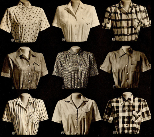

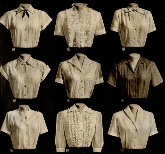
I’m lousy with blouses.
Montgomery Wards catalog Fall and Winter 1953-1954
67K notes
·
View notes
Text
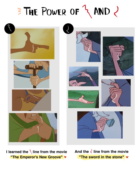
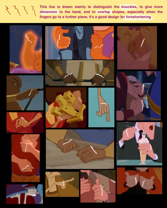
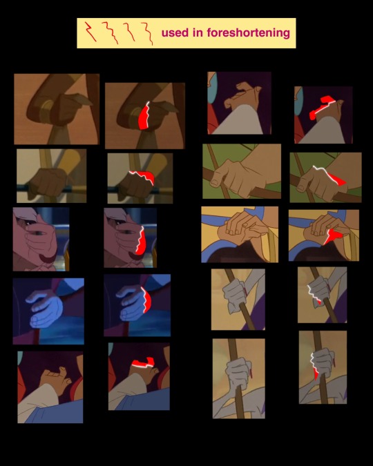
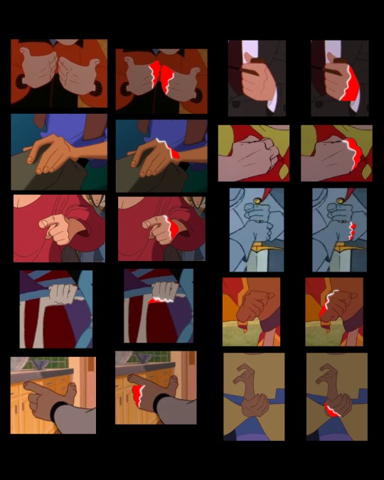
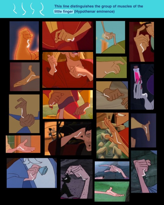
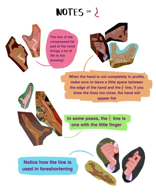
Support me on PATREON or Ko-fi 💕
101K notes
·
View notes
Text
A general cane guide for writers and artists (from a cane user, writer, and artist!)
Disclaimer: Though I have been using a cane for 6 years, I am not a doctor, nor am I by any means an expert. This guide is true to my experience, but there are as many ways to use a cane as there are cane users!
This guide will not include: White canes for blindness, crutches, walkers, or wheelchairs as I have no personal experience with these.
This is meant to be a general guide to get you started and avoid some common mishaps/misconceptions in your writing, but you absolutely should continue to do your own research outside of this guide!
This is NOT a medical resource!!! And never tell a real person you think they're using a cane wrong!
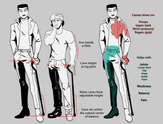
The biggest recurring problem I've seen is using the cane on the wrong side. The cane goes on the opposite side of the pain! If your character has even-sided pain or needs it for balance/weakness, then use the cane in the non-dominant hand to keep the dominant hand free. Some cane users also switch sides to give their arm a rest!
A cane takes about 20% of your weight off the opposite leg. It should fit within your natural gait and become something of an extension of your body. If you need more weight off than 20%, then crutches, a walker, or a wheelchair is needed.
Putting more pressure on the cane, using it on the wrong side, or having it at the wrong height can make it less effective, and can cause long term damage to your body from improper pressure and posture. (Hugh Laurie genuinely hurt his body from years of using a cane wrong on House!)
(some people elect to use a cane wrong for their personal situation despite this, everyone is different!)
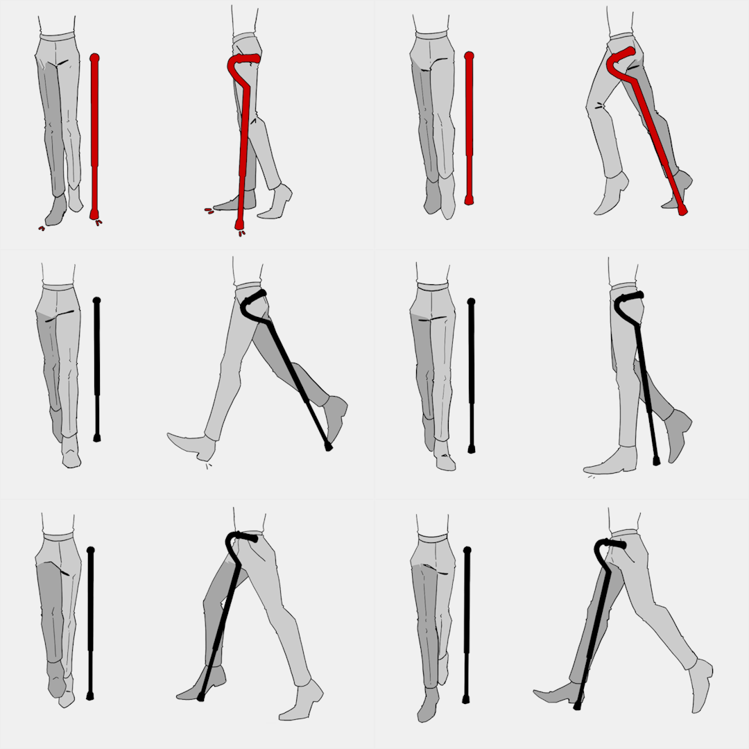
(an animated GIF of a cane matching the natural walking gait. It turns red when pressure is placed on it.)
When going up and down stairs, there is an ideal standard: You want to use the handrail and the cane at the same time, or prioritize the handrail if it's only on one side. When going up stairs you lead with your good leg and follow with the cane and hurt leg together. When going down stairs you lead with the cane and the bad leg and follow with the good leg!
Realistically though, many people don't move out of the way for cane users to access the railing, many stairs don't have railings, and many are wet, rusty, or generally not ideal to grip.
In these cases, if you have a friend nearby, holding on to them is a good idea. Or, take it one step at a time carefully if you're alone.
Now we come to a very common mistake I see... Using fashion canes for medical use!
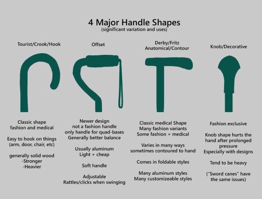
(These are 4 broad shapes, but there is INCREDIBLE variation in cane handles. Research heavily what will be best for your character's specific needs!)
The handle is the contact point for all the weight you're putting on your cane, and that pressure is being put onto your hand, wrist, and shoulder. So the shape is very important for long term use!
Knob handles (and very decorative handles) are not used for medical use for this reason. It adds extra stress to the body and can damage your hand to put constant pressure onto these painful shapes.
The weight of a cane is also incredibly important, as a heavier cane will cause wear on your body much faster. When you're using it all day, it gets heavy fast! If your character struggles with weakness, then they won't want a heavy cane if they can help it!
This is also part of why sword canes aren't usually very viable for medical use (along with them usually being knob handles) is that swords are extra weight!
However, a small knife or perhaps a retractable blade hidden within the base might be viable even for weak characters.
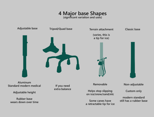
Bases have a lot of variability as well, and the modern standard is generally adjustable bases. Adjustable canes are very handy if your character regularly changes shoe height, for instance (gotta keep the height at your hip!)
Canes help on most terrain with their standard base and structure. But for some terrain, you might want a different base, or to forego the cane entirely! This article covers it pretty well.
Many cane users decorate their canes! Stickers are incredibly common, and painting canes is relatively common as well! You'll also see people replacing the standard wrist strap with a personalized one, or even adding a small charm to the ring the strap connects to. (nothing too large, or it gets annoying as the cane is swinging around everywhere)
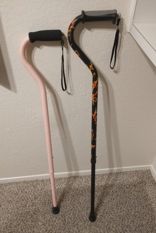
(my canes, for reference)
If your character uses a cane full time, then they might also have multiple canes that look different aesthetically to match their outfits!
When it comes to practical things outside of the cane, you reasonably only have one hand available while it's being used. Many people will hook their cane onto their arm or let it dangle on the strap (if they have one) while using their cane arm, but it's often significantly less convenient than 2 hands. But, if you need 2 hands, then it's either setting the cane down or letting it hang!
For this reason, optimizing one handed use is ideal! Keeping bags/items on the side of your free hand helps keep your items accessible.
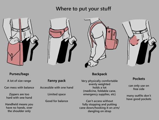
When sitting, the cane either leans against a wall or table, goes under the chair, or hooks onto the back of the chair. (It often falls when hanging off of a chair, in my experience)
When getting up, the user will either use their cane to help them balance/support as they stand, or get up and then grab their cane. This depends on what it's being used for (balance vs pain when walking, for instance!)
That's everything I can think of for now. Thank you for reading my long-but-absolutely-not-comprehensive list of things to keep in mind when writing or drawing a cane user!
Happy disability pride month! Go forth and make more characters use canes!!!
93K notes
·
View notes
Text
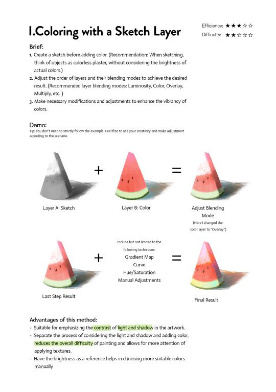
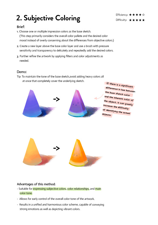
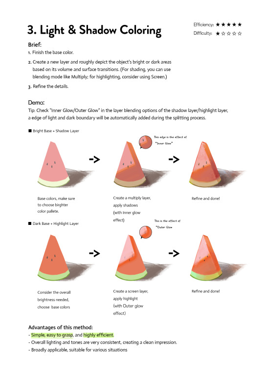
Art Tutorial| 3 coloring methods
If you're frustrated at coloring or don't know how to do the color, please check and try them. They may inspire you to find a new way. Any feedback and suggestions are welcome!
3K notes
·
View notes
Text
a list of 100+ buildings to put in your fantasy town
academy
adventurer's guild
alchemist
apiary
apothecary
aquarium
armory
art gallery
bakery
bank
barber
barracks
bathhouse
blacksmith
boathouse
book store
bookbinder
botanical garden
brothel
butcher
carpenter
cartographer
casino
castle
cobbler
coffee shop
council chamber
court house
crypt for the noble family
dentist
distillery
docks
dovecot
dyer
embassy
farmer's market
fighting pit
fishmonger
fortune teller
gallows
gatehouse
general store
graveyard
greenhouses
guard post
guildhall
gymnasium
haberdashery
haunted house
hedge maze
herbalist
hospice
hospital
house for sale
inn
jail
jeweller
leatherworker
library
locksmith
mail courier
manor house
market
mayor's house
monastery
morgue
museum
music shop
observatory
orchard
orphanage
outhouse
paper maker
pawn shop
pet shop
potion shop
potter
printmaker
quest board
residence
restricted zone
sawmill
school
scribe
sewer entrance
sheriff's office
shrine
silversmith
spa
speakeasy
spice merchant
sports stadium
stables
street market
tailor
tannery
tavern
tax collector
tea house
temple
textile shop
theatre
thieves guild
thrift store
tinker's workshop
town crier post
town square
townhall
toy store
trinket shop
warehouse
watchtower
water mill
weaver
well
wind mill
wishing well
wizard tower
115K notes
·
View notes
Photo
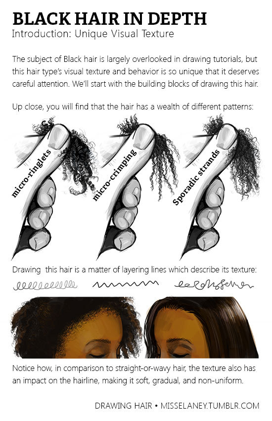
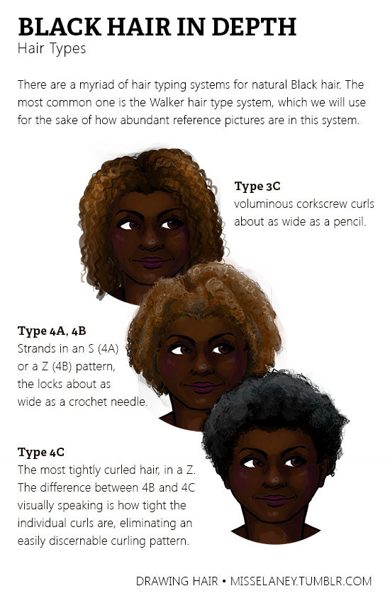
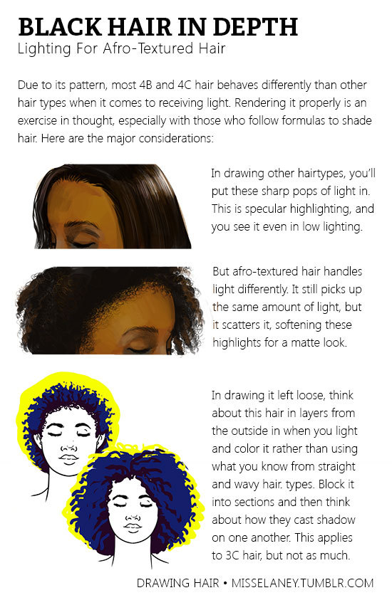
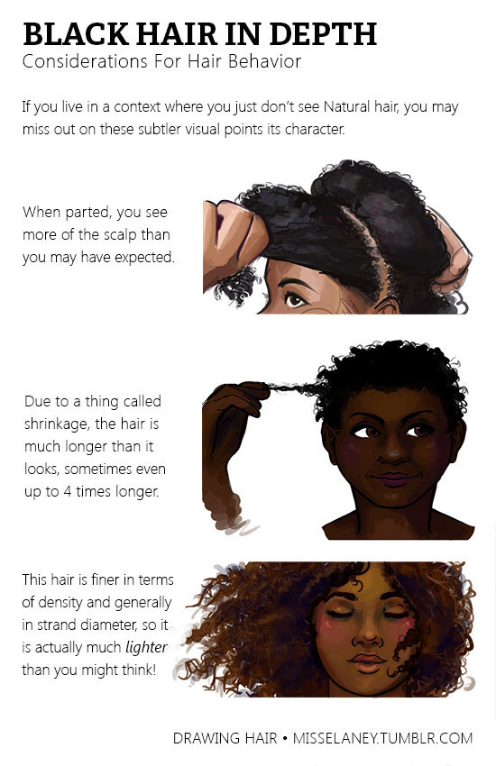
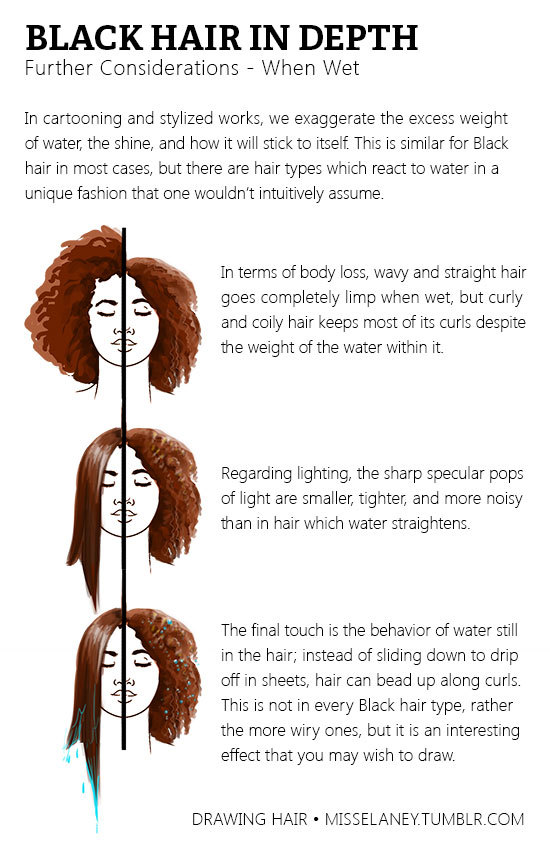
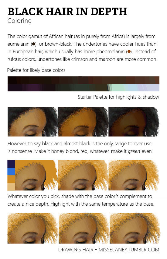
Natural Black Hair Tutorial! Usually Black hair is excluded in the hair tutorials which I have seen so I have gone through it in depth because it’s really not enough to tell someone simply, “Black hair is really curly, draw it really curly.”
The next part of Black Hair In Depth will feature styles and ideas for designing characters and I will release it around February. If you would like to see certain styles, please shoot me a message!
271K notes
·
View notes
Text
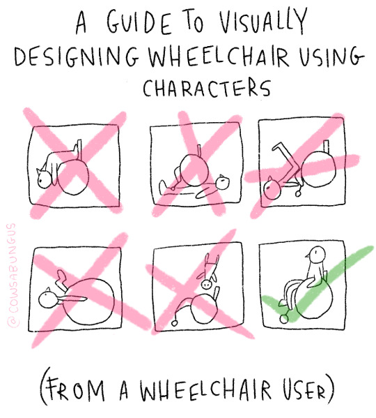
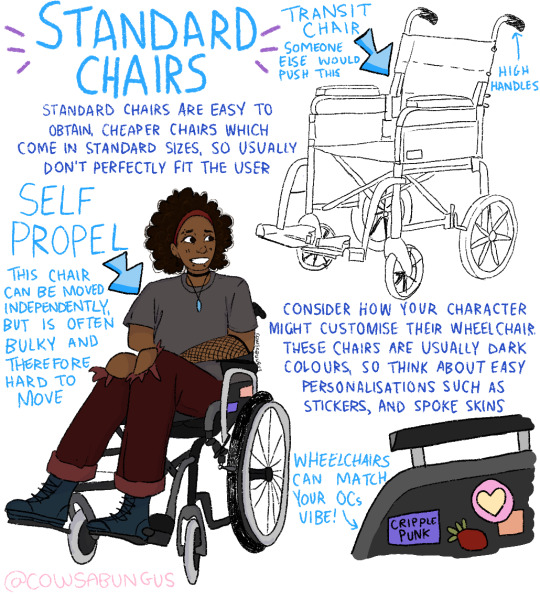
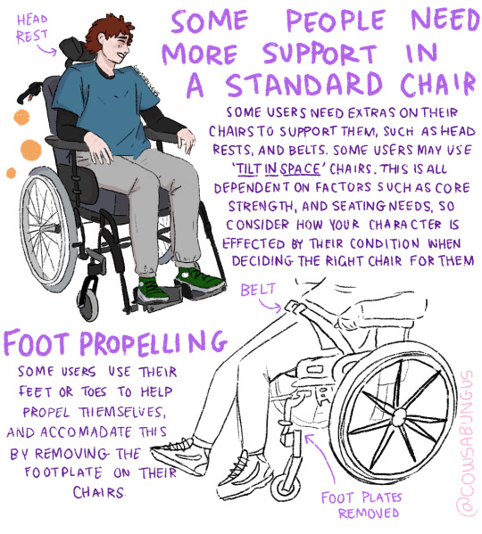

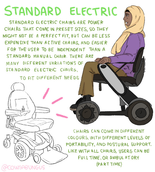

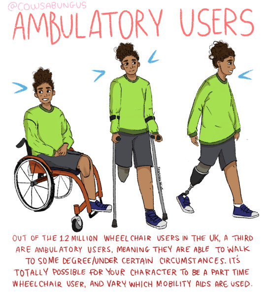
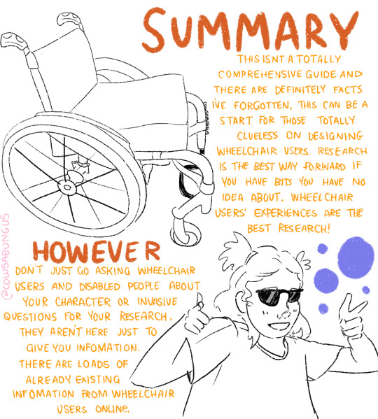
A guide to designing wheelchair using characters!
I hope this helps anyone who's trying to design their oc using a wheelchair, it's not a complete guide but I tried my best! deffo do more research if you're writing them as a character
114K notes
·
View notes
Text
I just discovered foodtimeline.org, which is exactly what it sounds like: centuries worth of information about FOOD. If you are writing something historical and you want a starting point for figuring out what people should be eating, this might be a good place?
224K notes
·
View notes
Photo
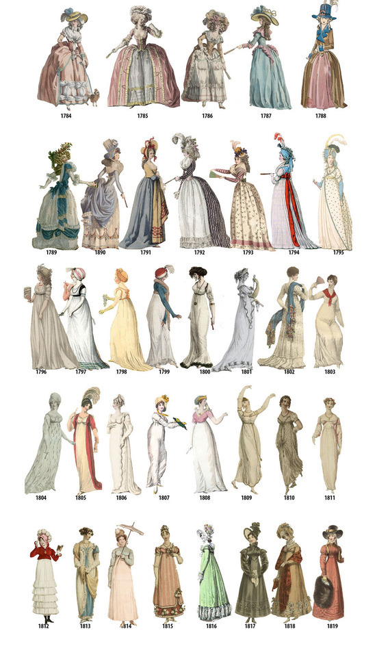
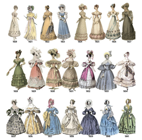
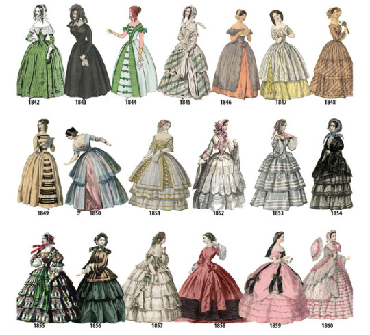
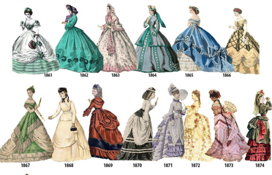
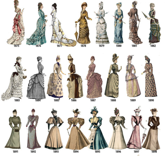
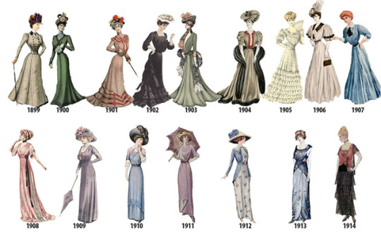


A Timeline of Women’s Fashion from 1784-1970 (source: http://kottke.org/17/07/a-timeline-of-womens-fashion-from-1784-1970)
144K notes
·
View notes
Text
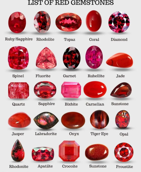
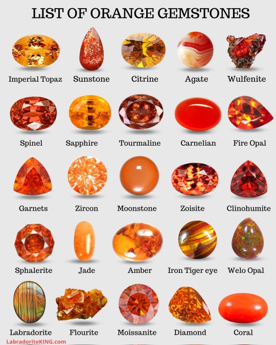
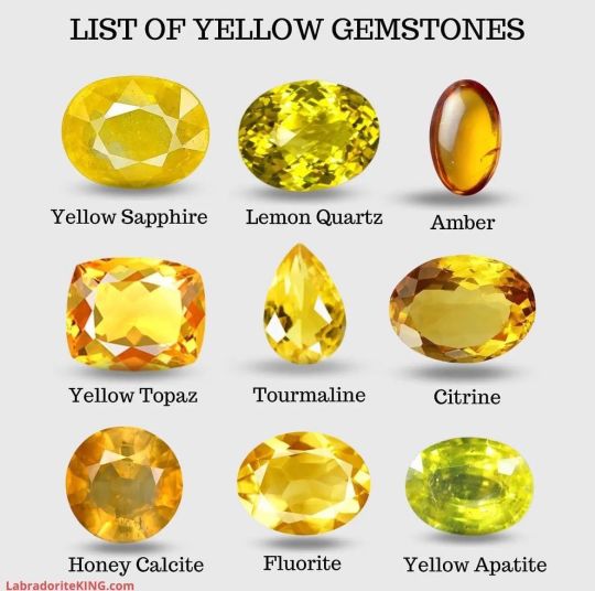
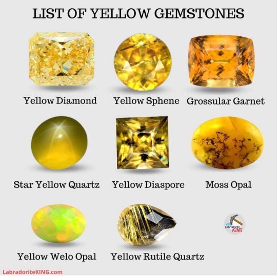
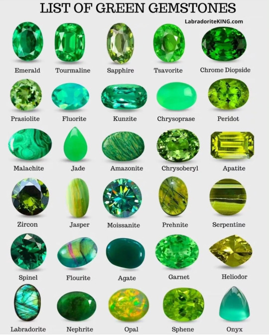
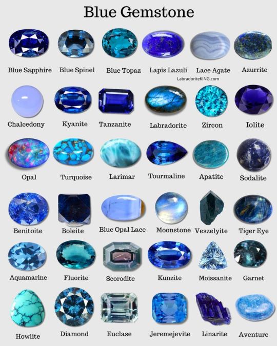
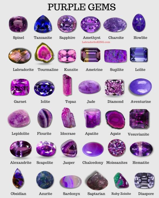
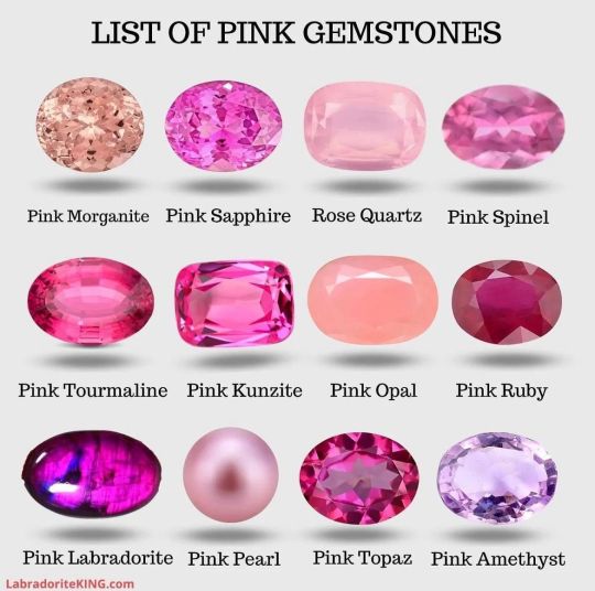
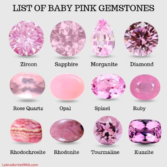
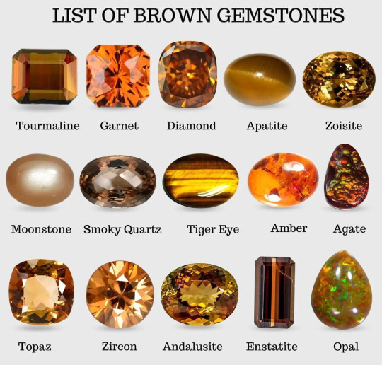
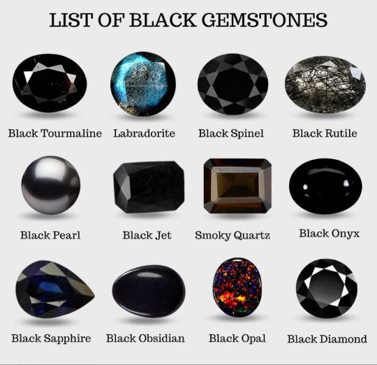

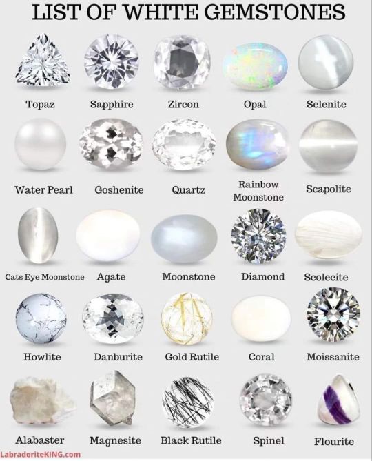
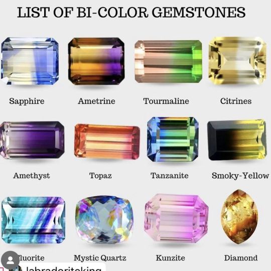
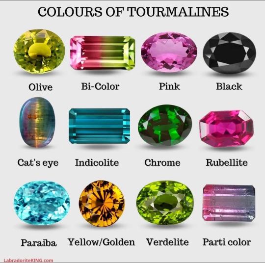
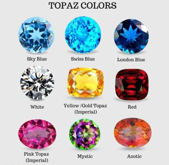
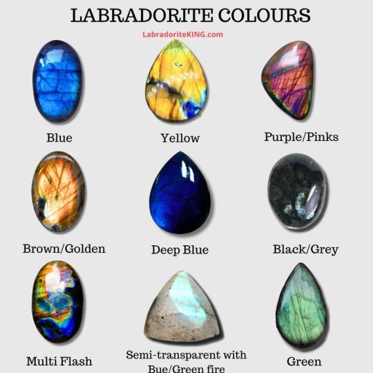
By LabradoriteKing on Pinterest
169K notes
·
View notes
Text
hot artists don't gatekeep
I've been resource gathering for YEARS so now I am going to share my dragons hoard
Floorplanner. Design and furnish a house for you to use for having a consistent background in your comic or anything! Free, you need an account, easy to use, and you can save multiple houses.
Comparing Heights. Input the heights of characters to see what the different is between them. Great for keeping consistency. Free.
Magma. Draw online with friends in real time. Great for practice or hanging out. Free, paid plan available, account preferred.
Smithsonian Open Access. Loads of free images. Free.
SketchDaily. Lots of pose references, massive library, is set on a timer so you can practice quick figure drawing. Free.
SculptGL. A sculpting tool which I am yet to master, but you should be able to make whatever 3d object you like with it. free.
Pexels. Free stock images. And the search engine is actually pretty good at pulling up what you want.
Figurosity. Great pose references, diverse body types, lots of "how to draw" videos directly on the site, the models are 3d and you can rotate the angle, but you can't make custom poses or edit body proportions. Free, account option, paid plans available.
Line of Action. More drawing references, this one also has a focus on expressions, hands/feet, animals, landscapes. Free.
Animal Photo. You pose a 3d skull model and select an animal species, and they give you a bunch of photo references for that animal at that angle. Super handy. Free.
Height Weight Chart. You ever see an OC listed as having a certain weight but then they look Wildly different than the number suggests? Well here's a site to avoid that! It shows real people at different weights and heights to give you a better idea of what these abstract numbers all look like. Free to use.
332K notes
·
View notes
Note
how do u write fighting or do u have any tips? i have an idea for a fanfic not mcyt related but im terrified ill write the fight scene poorly as it makes up a majority of the fic.
Fighting and fight scene tips! I have a couple I guess! The tricky thing is fight scenes are really subjective. It's hard to give a "and here's all the puzzle pieces you need for a good one" kinda answer. But I can at least tell you the stuff I think about while I'm writing.
You know the drill, writing tips under the cut:
1. Research
I feel like I put this on every tip list. Research the thing you're doing. The Internet is your greatest friend and confidante. Look up YouTube videos of fighting competitions. Look up the weapons your characters are using. Figure out how many bullets are in the magazine for the gun type your character is using. Research how far you have to be to survive that explosion. Figure out if the cool sword breaker was actually useful in combat and why. Get a reasonable measure for how much blood your blorbo can lose before they pass out. This will help you paint a clear picture for yourself about what needs to happen, and why. Your readers don't necessarily have to have that clear picture, but the more you, the writer, know, the more likely you are to write a consistent, understandable narrative.
2. Character POV is important!
What does your character even know about fighting anyway? <- the most important question to ask of your POV character. This establishes what your character can tell your audience about what's going on. Has your character never fought before? Are they familiar with the weapons used? Do they know counters for fighting styles? Do they even know how to throw a punch? Do they have a high pain tolerance? These things will inform how the character informs us, the readers, about what's going on. Generally speaking, lack of consistency is what makes fight scenes frustrating, in my opinion. Sitting there and going "hey wait, how did that teenager know better battle tactics than the general they're fighting?" Takes you out of the moment and ruins whatever cool thing that teenager just did. Going "hold on, what do you mean the sniper didn't realize he was out of bullets?" Does the same thing. Keeping the characters consistent stops your readers from questioning the validity of the scene.
3. What can your readers see, and is it the same as what the characters see?
Similar to above, but a little more meta. Fight scenes are often played for drama. You're putting the character in peril, and that peril is for a reason: to make the audience have an emotional response. Can the readers see an ambush because of your 3rd person omniscient perspective, but the characters can't? Is that a good thing? Will it ruin the shock and surprise of the ambush, or will it induce dread and up the stakes? The enemy has a poisoned sword. Is this obvious to the audience in a way that isn't for the character? This is playing with suspense in a fight, adding and subtracting stakes for the readers, and it needs to be balanced against what the characters know.
I'm mentioning this as a thing because revealing your hand to the audience can be a really interesting way to add suspense, but if the audience feels like a character should've been able to see it coming [ex. How come the assassin didn't anticipate someone poisoning a blade during a fight?] it ruins the immersion of the scene, and makes it feel like you the author are shoving the characters in a direction. Generally speaking if the readers can see the hand of the author moving, it breaks immersion.
[Notably, I don't write in 3rd person omniscient. I write in 3rd person limited. I don't often have a chance or reason to reveal information to the audience that the main character doesn't know, because the audience is observing the world through that character.]
4. What are the guys in the back doing?
Everyone knows the Main Character has to fight the Antagonist at some point, but normally the MC isn't alone. They have friends and allies, or their pet dog. They have a supporting cast, and that supporting cast wants to help the main character. So... where are they exactly? A pitfall I see in Big Final Fight Scenes pretty often is, the MC brings an army, or their crew, or their super friends or whoever, and yet somehow, they end up fighting the bad guy alone, and the writer just... Doesn't address the other people in the room. And you the reader are left going, "Wait, why is no one intervening?" This gets especially immersion breaking when the main character inevitably starts losing their fight [because drama, few fights are easy]. Our MC might die! Why is no one trying to run even a basic distraction on the Antag? This isn't to say you have to have your supporting cast get involved in the final fight -- sometimes you need that solo showdown! But you do have to have a convincing reason to keep the rest of the cast away. If we the readers are under the impression there's six other people in the room just standing there, because you the writer forgot they were there, it gets kinda awkward.
5. Zoom in! Feel it. Zoom out! See it.
Okay so, you now know: Basic information on how your character(s) fight, what your POV character(s) know, what the readers can see (either the same or different from your characters), and you know where everyone is and what they're doing. You have your god's eye view ready. How do you show it?
Zoom in, zoom out.
There is a balance to fight scenes, in about the same way there is a balance to an art piece. There is a foreground, middle ground, and background. Each have importance, each need focus. The foreground is what is happening immediately in front of your POV character, it's their thoughts, what their weapon feels like, any wounds they've taken. It's bullet time, and observations, and right in their face. The middle ground is the surrounding 5-10ft. It's the people beside them, it's what's just past their opponent. It's the rest of the room, or the sound just out of view, or the object just out of reach. The background is everything past that. It's distant explosions. It's their friend getting wounded. It's an archer on the next rooftop.
How much of that you want your audience to see, how you want to vary that, depends on what you as an author view as important. If you want to focus more on the character, their struggle, their opponent, you will write most of the fight scene in the foreground. Focus on what the character feels, the sensation of movement, the pain, fear, exhilaration. Focus on the words they're saying [or not saying]. Focus on what they know, what they're telling the audience. If you want to highlight the battle, how the main character is working in their surroundings, you will focus on the middle ground. This is what the character looks like from an outside perspective, how they fight against their opponent. This is them trying to reach an item, or shove their opponent into something. This is running, and kicking, and trying to figure out if your friend is still by your side. This is seeing your comrade go down out of the corner of your eye, or admiring someone's fighting style, or screaming orders at someone. The background is anything further away, a distant problem that is putting on pressure. A ticking time bomb. This is the building catching fire, the lightning in the storm overhead. This is superman fighting off the alien army while your MC is trying to kill the general. This is you reminding the audience the rest of the world hasn't stopped turning while the MC has been doing MC things.
Generally speaking, I like to move through all three spaces several times during a fight scene? The main character is hurting and holding onto their sword, and breathing is hard. The antag is pressing the advantage, trying to back them through the space. But they can't lose too much ground, because their friend is fighting the second antag over there, and they're bleeding from a fresh cut. They have to win, they have to escape, because the sound outside says the building is groaning on its foundation-- and the main character stumbles as the building rocks. [And I've just moved through all three types of ground, giving the audience a clear view of what's happening].
You don't have to bounce reliably through the space. Not showing the background for a long time means you can surprise your audience with a new hero or villain swooping in! Or leave us in suspense about that magic ritual we're supposed to be stopping. Not showing a middle ground side character implies your MC is so distracted they won't know their friend is hurt until it's too late -- etc.
If it helps, I like to imagine there's a little invisible camera panning around, taking dramatic shots of everything, like you're making a movie, and writing accordingly.
Uhm!! Hopefully that's helpful?
Some broader quick tips:
Fight scenes are very fast, and generally happen over a period of a few minutes. That time will feel significantly longer because it's jammed packed with Stuff Happening, but the fact remains, it's only a few minutes. Keeping the timing in mind helps you figure out if backup can arrive to help, or if it's reasonable for someone to miss the fight happening, etc,
On that note, if it's a battle specifically, battles [especially medieval ones] are short. They don't last all day, unless they're a siege, and even then, sieges are long periods of digging in and waiting with short clashes peppered around.
This might just be me, but try not to overuse metaphors? We get it. The swordsmen look like they're dancing. But not everything they do is graceful or dancer-y. Sometimes you can just say "and he punched him in the face." Unless your writing style is naturally super flowery, in which case, do continue. Consistency is key.
Do some basic research on wounds. Suspension of disbelief can only carry so far, and pain is genuinely debilitating. Also, yes coughing up blood is a very dramatic "the character is dying" cue, but in real life it only happens on very bad lung/throat wounds. If what you're writing is Super Realistic, maybe don't throw that in there.
Write confusion with care. You might not want your audience to know what's going on all the time, but if your audience genuinely can't figure out what's going on, why something is happening, or who it's happening to, you will eventually lose your immersion.
Write comedy with care. If your fight is non-serious, or if your character in a serious fight doesn't normally take things seriously, jokes are allowed to happen. But sometimes if you don't take it seriously enough, you will chop the knees off your drama. Maybe save some of the jokes for after the life-threatening battle is over.
I think! That's everything I can think of just now! I hope it helps :'D
81 notes
·
View notes
Text
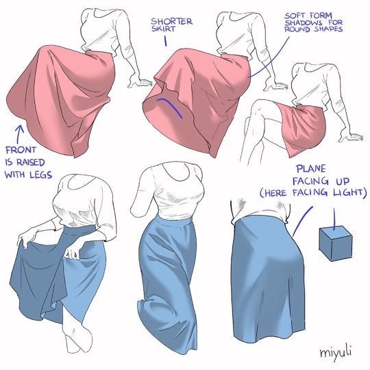
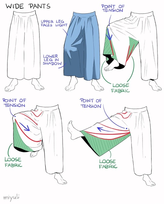
“Notes on skirts and pants”
Source: miyuli on twitter
63K notes
·
View notes
Text
Anatomy Quick Tips High Res Tips Edition
https://bmc.xyz/l/quicktips - $5
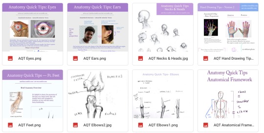
This is different than the Art-Res Anatomy Ebook. This file simply gives you access to the current 7 Anatomy Quick Tip tutorials you see in the pic above, but in high resolution images for easy offline viewing. No Tumblr compression here!
All of them are available for free already on the website/this tumblr, but this just puts them in a more convenient format and allows people who have the means to help keep this site free for everyone else, hopefully forever!
Thanks for looking!
Free versions are kinda scattered, oops! look through https://art-res.tumblr.com/tagged/anatomy or https://artres.xyz/categories/anatomy/
299 notes
·
View notes
Text
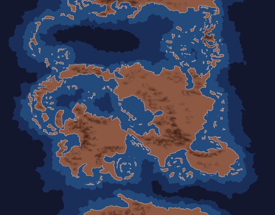
A tutorial on a (bit cheating) way of creating fictional maps.
Open your editing software (RECOMMENDING Krita, since it's free and it's very good).
Step 1: Google "X country silhouette" and copy it.
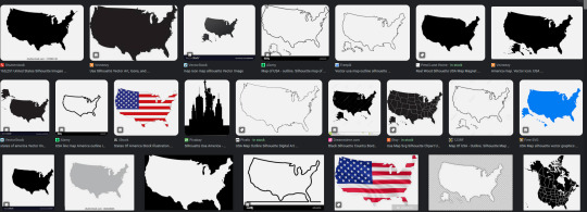
Paste it onto the canvas.
Step 2: Separate the silhouette from the background you copied with it! You can do that by using magic wand selection tool or by making a gradient map with black on 49,9% and transparent on 50% on the slider.


Step 3: Repeat several times with numerous countries and/or islands, cities, municipalities, communes, continents et cetera.
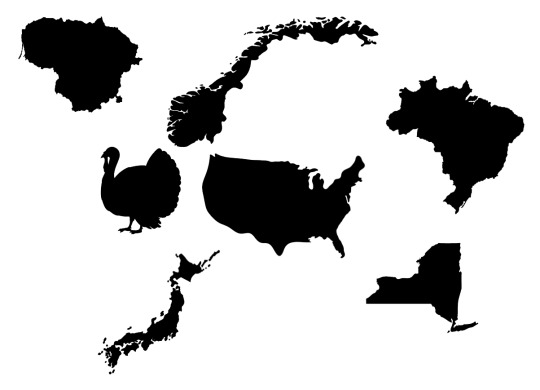
Step 4: Combine, mesh, stretch, rotate, mirror - go ham, make it work.
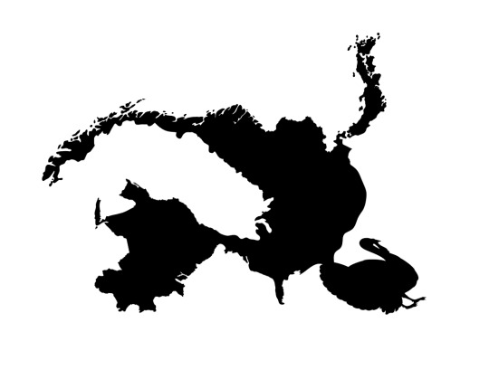
Step 5: Erase and add.
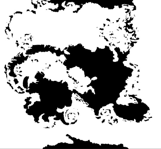
Step 6: Have your map outline ready, copy/paste it several times in the same doc on different layers and edit in different ways like biomes, kingdoms, mountains and other.
Step Mountains+: To figure out mountains, make another layer on the doc and do something like this:

-and then in every polygon you add an arrow.
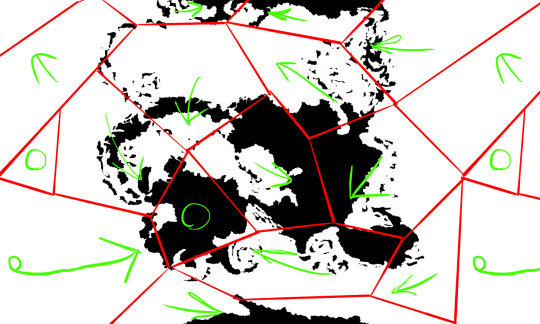
Where arrows meet or transfer onto continents, add mountains.
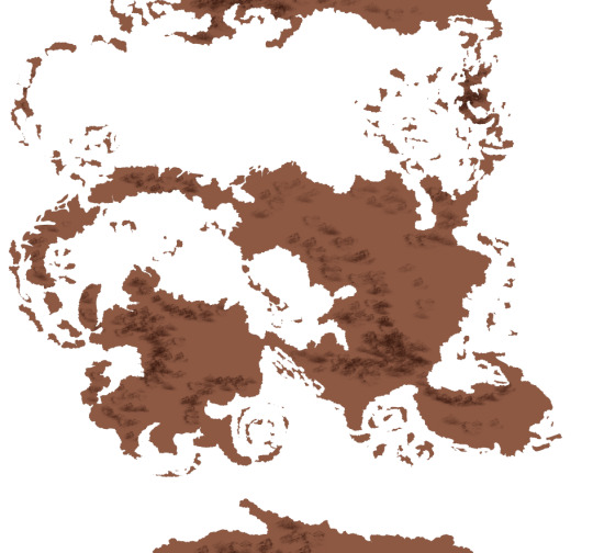
Color the sea with a couple layers of depth and you're done :D

12K notes
·
View notes
Text
WORLDBUILDING RULE NUMBER ONE: PUT A FUCKING EQUATOR IN YOUR WORLD MAP
WORLDBUILDING RULE NUMBER TWO: IF THERE ARE POTATOES IN YOUR WORLD THERE MUST BE AN ANDES FROM WHERE THEY CAME FROM
WORLDBUILDING RULE NUMBER THREE: PUT. A. FUCKING. EQUATOR. IN. YOUR. WORLD. MAP.
WORLDBUILDING RULE NUMBER FOUR: ANY PLACE SOUTH OF THE EQUATOR CAN AND MUST BE AN ARGENTINA EQUIVALENT
15K notes
·
View notes