Don't wanna be here? Send us removal request.
Text


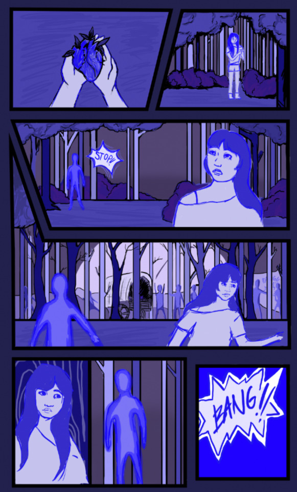

This is my final comic which depicts a scene that relates to my canned project.
I firstly created the boxes in the way that I wanted my comic to be set out and then I started planning out the scenes and where the characters would go in that. Unfortunately i’m missing some screenshots but I made the first couple of scenes in the first two boxes and fully coloured them with normal colours but I can’t find it now, I didn’t like how that looked so I decided to opt for a colour palette consisting of blues and purples.
Creating the colour palette was more difficult than I thought and I tried a couple of things before settling on a select few shades and hues of a blueish purple.
I don’t particularly like how it turned out and I think it looks quite messy and also unfinished. I definitely think I rushed this comic but I would like to carry on working on it and making it into something I like.
0 notes
Text


My other prompt is comics, i’ve been researching and finding out more information about comics and how they are produced.
These images are from my first project, which is to create a comic based around a UFO. Firstly i had to learn how to create the shapes for my comic on photoshop. Once i’d learnt that i just got straight into drawing my comic. Weirdly enough I don't really plan what i’m going to draw until i’ve done it or unless i’ve thought about it for a really long time, (which is difficult to do when just given a prompt) but i feel like drawing my ideas out as they are made helps me chop and change things a lot easier too.
0 notes
Text
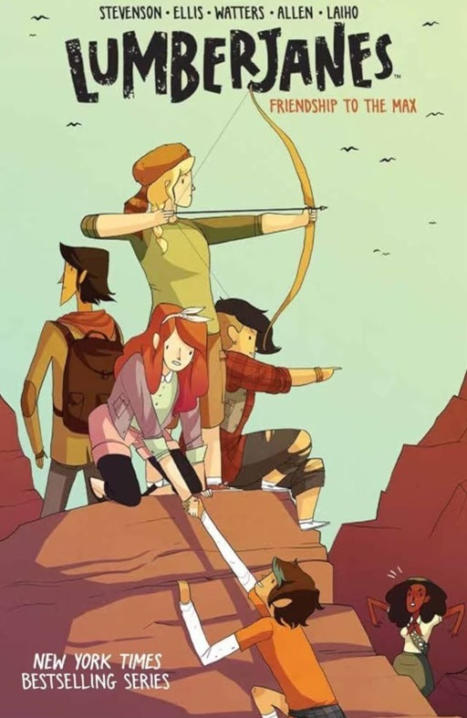
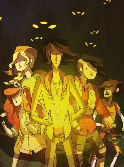
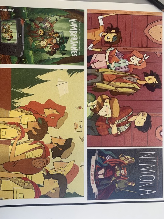
LumberJanes
I think that the story and general plot of these comics is really wholesome, I like how the comics are drawn and I think that the style is cool. I remember having a similar drawing style of straight clean lines and simpler features a couple of years ago but in my opinion I prefer my personal style more now because I found the other hard to colour with as it usually turned out too flat. In contrast to this, the artist of lumberjanes manages to build depth in their work in a way that I admire.
0 notes
Text
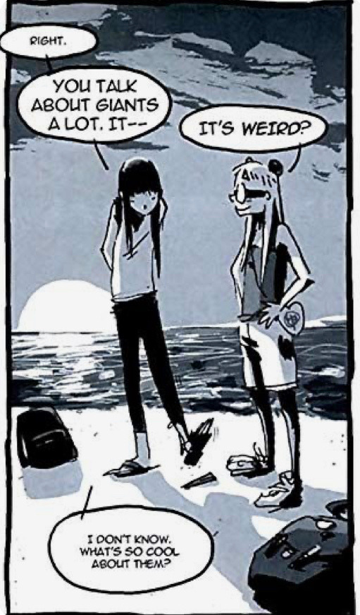


I Kill Giants
I’m actually familiar with the story in I Kill Giants because I’ve watched the film. I didn’t think it was that great but I liked the props and the locations in which the film was set. Personally I think that the characters were rather well written yet could maybe be improved on but I haven’t read the comics.
I think that the illustration style in this comic is very cool, and likewise makes the comic stand out among others. I think that it adds a more dramatic feel with the powerful line art and minimal use of colours.
0 notes
Text


Saga
I’m not particularly interested in the story of saga however I think that the comic’s style is really cool and I really like these two covers (above). I think that the comic is really well illustrated and has its own unique look to it, despite not having a strikingly different art style to more known and classic comics.
I love the way that the second cover uses colour and light and i would very much like to use it as inspiration in the future.
0 notes
Text
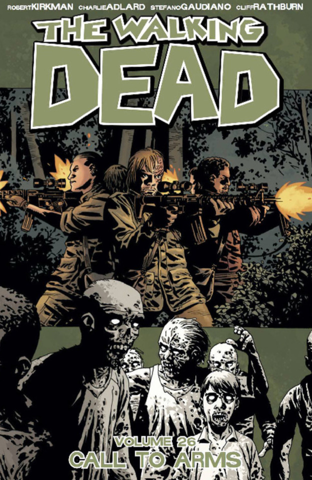
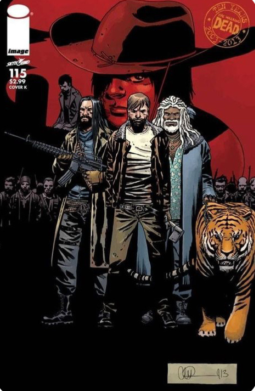
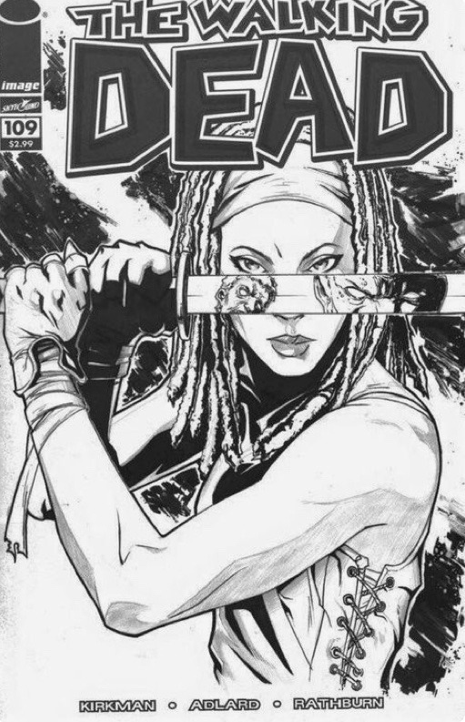
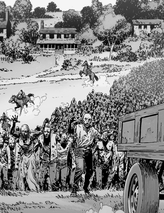
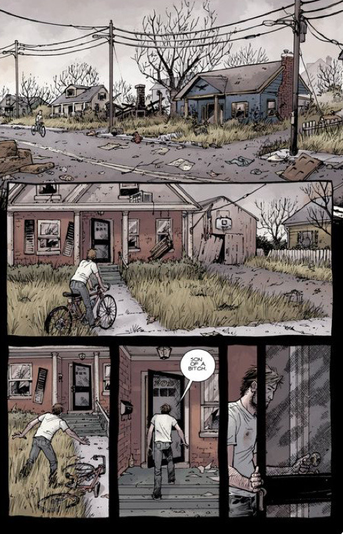
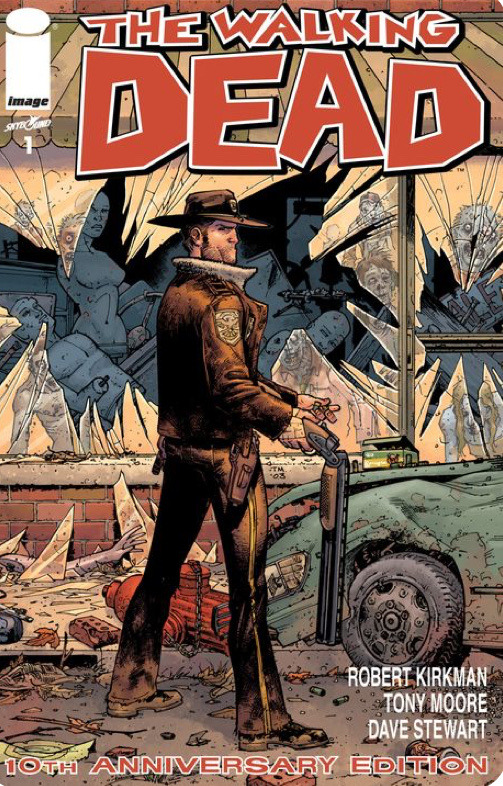
The walking dead
This comic book series is much more known from the tv show in my opinion, and that’s how I first found out about it. I actually really like the style in which this series is illustrated. The only thing that I don’t like as much is the colour scheme because I think it’s more muted, however it is still very cohesive and also reflects the sort of melancholic nature of the apocalypse. It still manages to keep the classic comic book vibe but with its own unique look.
I think that the story is good too, however when it comes to comics I prefer there to be a less amount of writing, and more illustrations. The walking dead includes a lot more writing than I thought but with that in mind, the writing is necessary in order to properly understand the plot especially because it’s an extensive series.
0 notes
Text
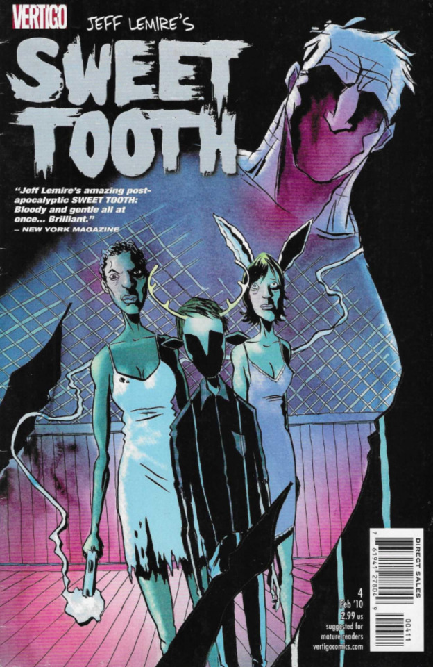
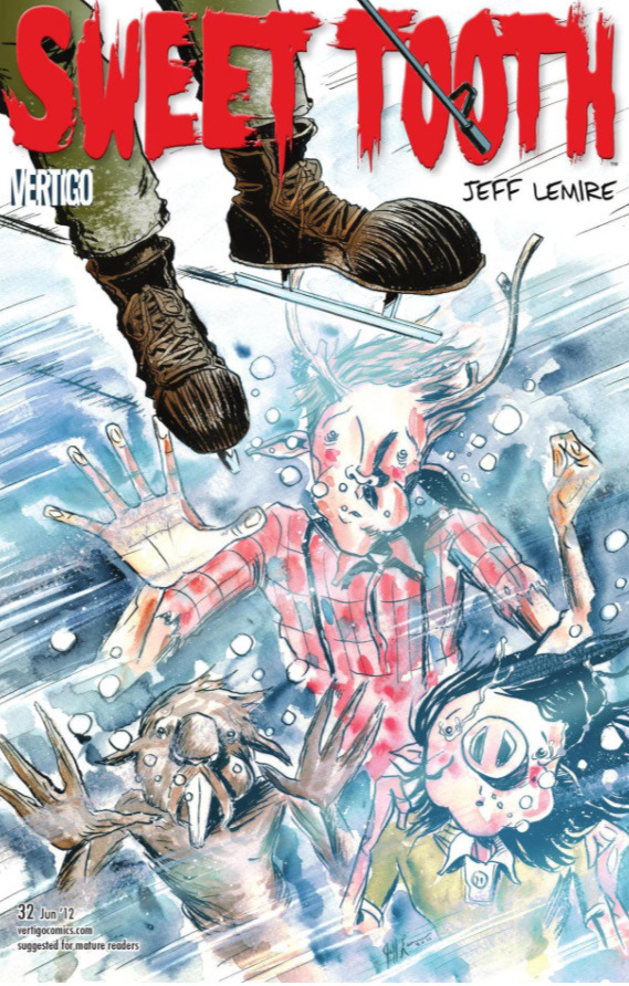
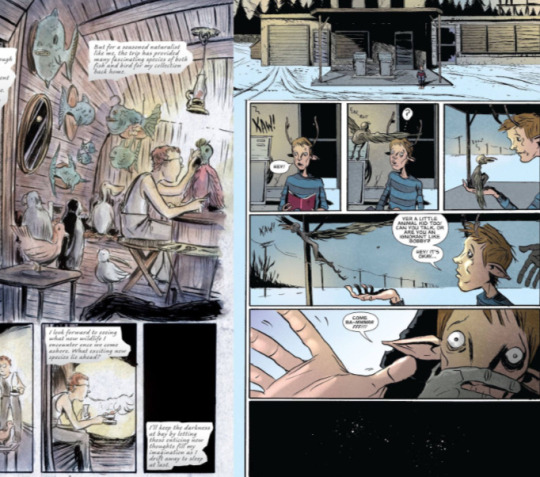
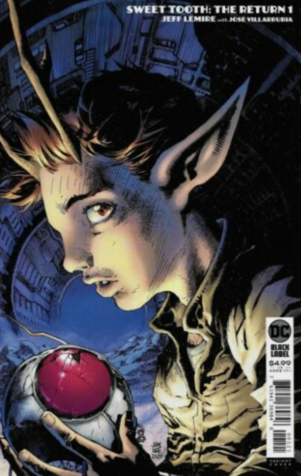
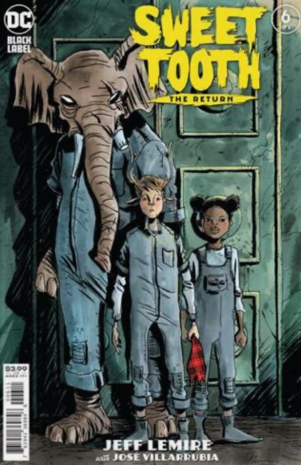
Sweet tooth
I’ve watched a couple of episodes of the Netflix series of sweet tooth, however I haven’t read the comics. From reading about it,the comic seems much more serious.
The style of illustration in sweet tooth seems to vary sometimes, and it’s help remind me that there isn’t a specific way in which to draw comics. Sometimes I get caught up in trying to draw a comic in a more usual way like marvel and dc, but sweet tooth is so different that it stands out and draws you in. I also like Lemires use of visual texture and movement in the comics, I think that it’s done very well.
0 notes
Text


Chew
I think that this comic series has really interesting concepts and ideas, and I really like their idea of solving crimes through visions that Tony Chu (the main protagonist) sees when he consumes things. After reading more about the comic and about Tony’s first assignment, in which he finds out a cook has been killing people and using them for his chicken soup, I’m much more interested about actually reading the comics.
Personally, the art style is not my favourite because I quite like heavier lines and less characterised features however I value Rob Guillory’s use of colour and how he creates these varied characters, in turn making them more recognisable and iconic.
0 notes
Text
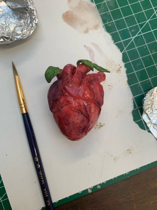

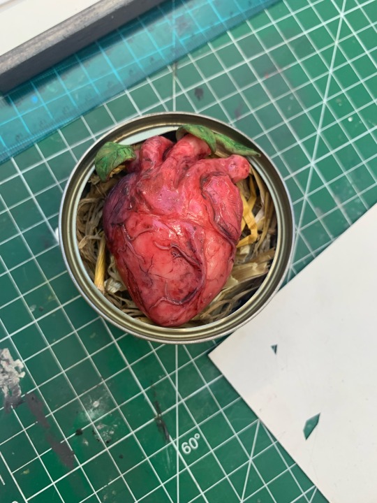

This is my most recent fruit heart with the label on the tin and another layer of gloss. Personally I think I could’ve made it look a lot redder which I would’ve liked but the watercolour didn’t seem to stick as well so I’d probably use another type of paint.
I also aged the label with watercolour and used an ink pen to write the name of the heart fruit, and a warning on it. The name is just heart fruit/ cardiac fruit translated into Greek. I wanted the label to reflect the object and it’s backstory by making it almost look like it’s a specimen in the jar and is studied as well as consumed.
Overall I think it was pretty successful but I would’ve liked it to be more bloody and red.
0 notes
Text

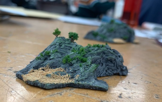


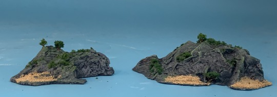
My plaster pirate island. Firstly I painted a flat darker grey base, and then I dry brushed a lighter grey in top so that the rocky texture of the plaster is highlighted. On top of the grey I dry brushed a mossy green over it too so that I could add greenery to the island.Once I was happy with how it was looking with the paint, I brushed glue on different points of the cast and then added some of the cut up sponge so that it looked like grass and shrubbery. To make the trees I was taught to cut the spikes off of a dry chestnut shell so that they aren’t sharp and then dip the spikes in glue and add some more sponge to them. It ends up giving you an almost perfect mini tree. For the finishing touch to my islands I covered the lower parts in glue and sprinkled some sand over them to create coves and beaches. I actually really like how it turned out and I think it was pretty successful.
0 notes
Text


The paint that I used for this heart was just watercolour. Watercolour doesn’t stick particularly well onto super sculpy however it does stain the clay and was great for this sculpt because the pale pink ended up showing through the rest of the paint, which gave it the more realistic look. I also ended up adding more blue later so that it mixed with the red because I looked at a reference and despite the fact that they were all more red and less purple, I felt like something was missing and the blue was good for shadows and adding to the veins. After I was finished painting the sculpt I really wanted to make it even more realistic so I found some gloss and covered the heart in it. Unfortunately when the gloss dried a bit more it was less shiny but I think that I might add another layer when I come back to it.
I am yet to design a label for my tin but I’ve really enjoyed sculpting and painting my canned fruit for this project and I’m looking forward to doing more things like this soon.
0 notes
Text
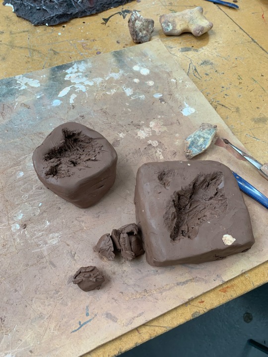
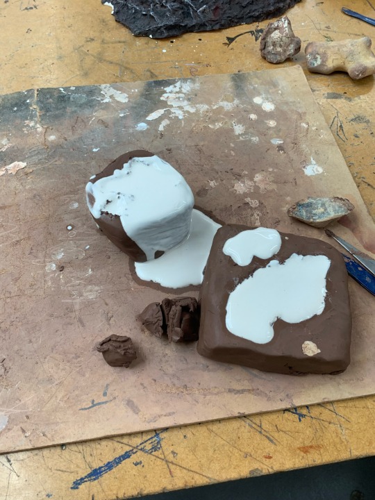


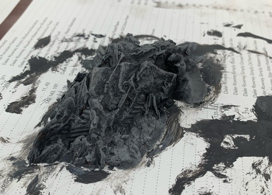
For another part of my project I’m creating some small pirate islands. Firstly I made the clay mould for how I wanted the island to look. I dug it out with some tools and also used a real rock to create a more natural look however I don’t actually like how it ended up as much. I think it looks cool however not very realistic because of the marks from the knife I used show. After I made the mould I filled it with plaster and let it set. When it had set I then peeled the clay off of the cast itself rather than trying to dig the cast out because it would be more at risk of breaking off.
0 notes
Text

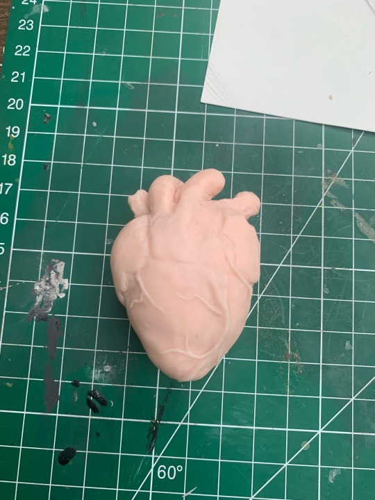
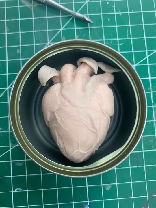
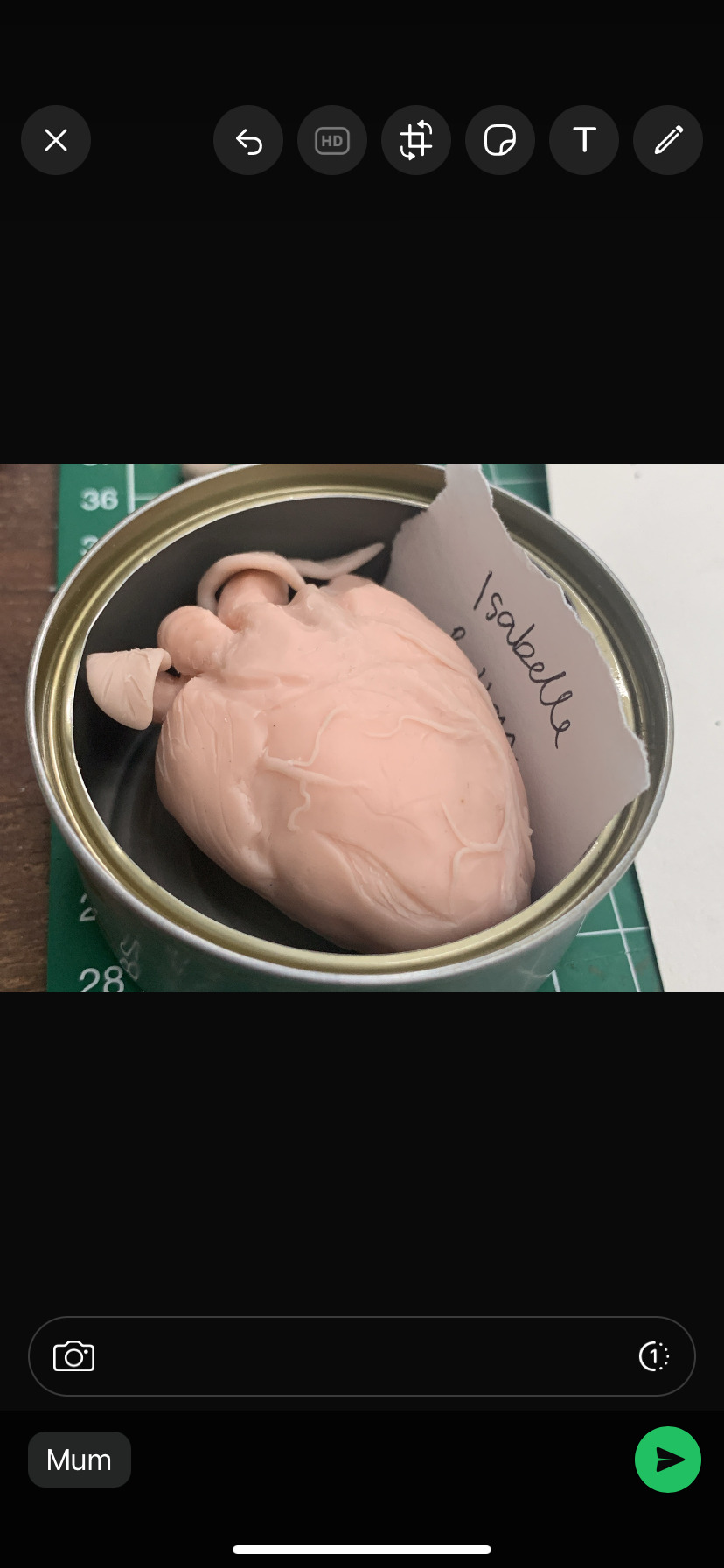
These are some pictures of the different stages of me sculpting my heart fruit. I used tin foil for the shape and then put super sculpy over the top of it, then rolled up very small pieces of the clay and smoothed them on for the veins. I also sculpted the left and right atrium. I think it was rather successful but I definitely prefer it with colour rather than plain like this.
0 notes
Text

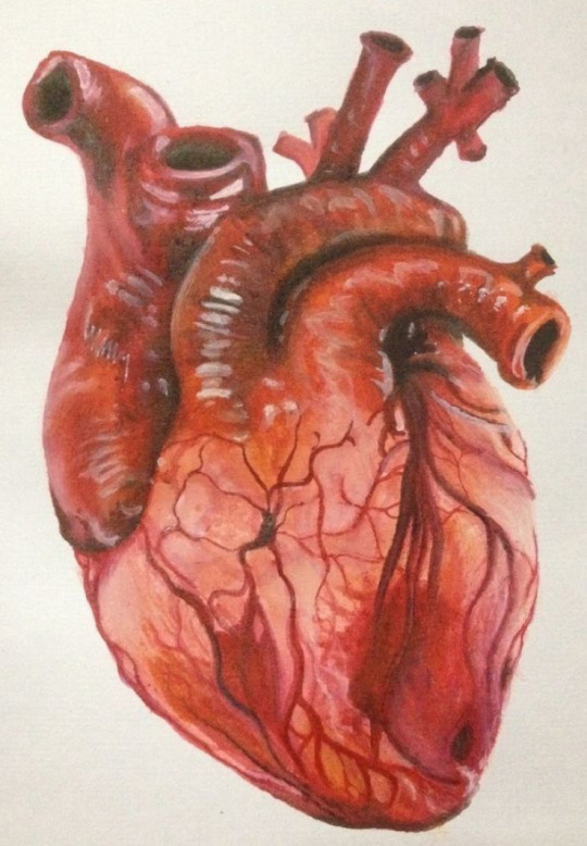


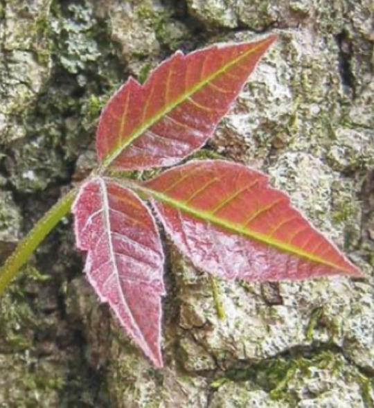
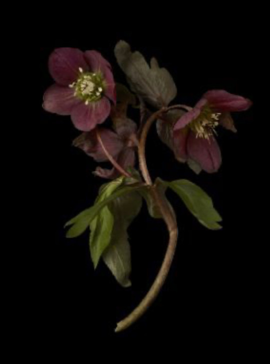
These are some of the references I used for my heart fruit.
0 notes
Text
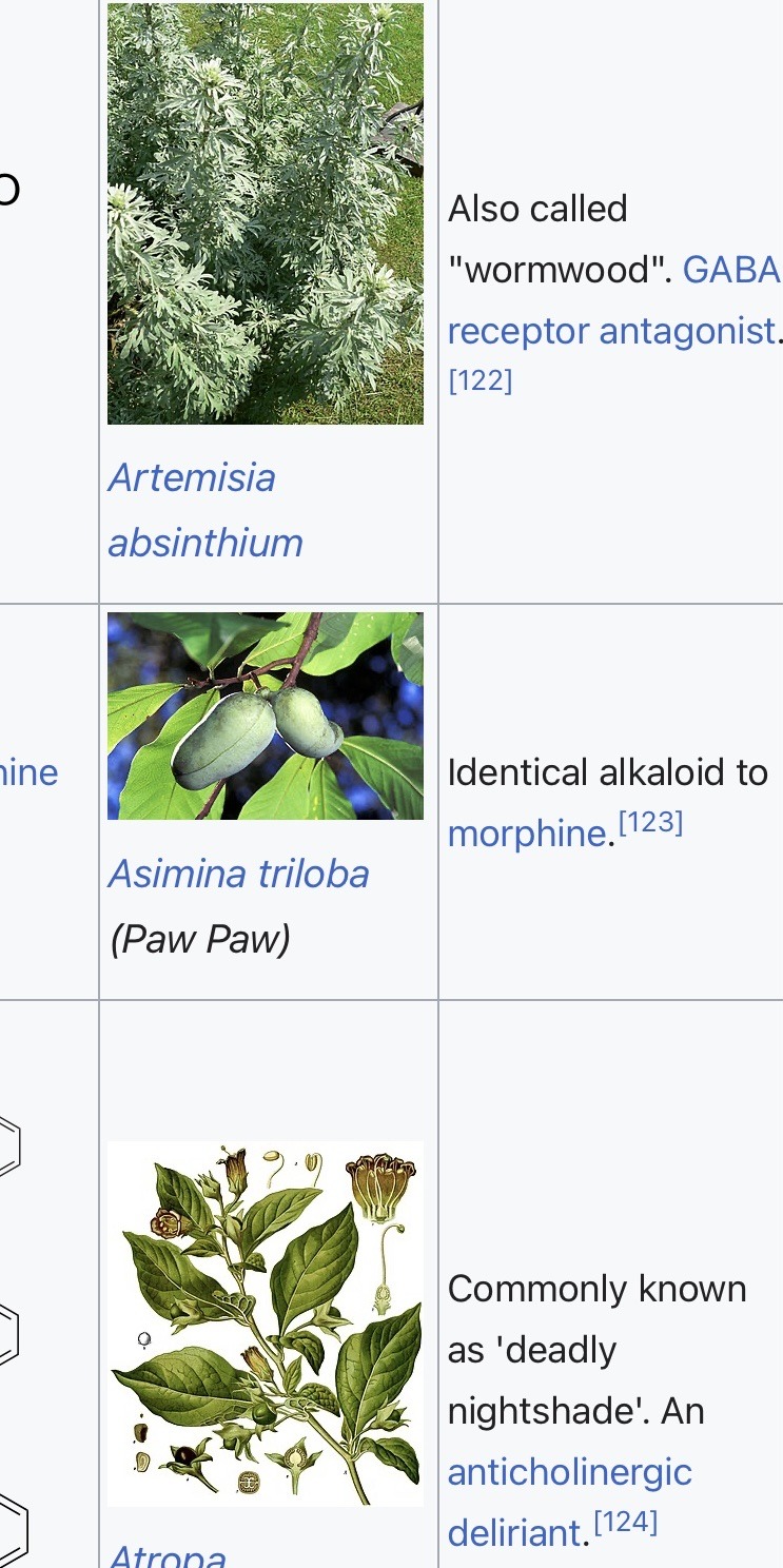


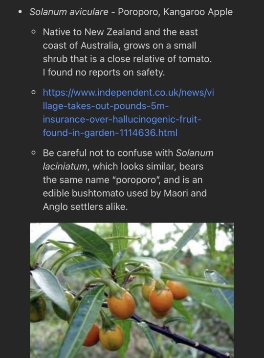
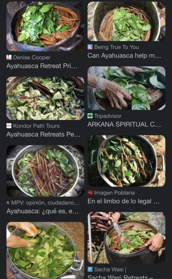
Whilst I was working on my worksheet and trying to figure out how I’d incorporate leaves onto the heart fruit and also whilst I was thinking about my background story, I researched hallucinogenic fruits and plants. Some of them pictured above have little effect on humans but others can be quite strong. I found this helpful because it showed me real life plants that would cast a similar effect to my fictional heart fruit, and what they actually look like. I also researched ayahuasca leaves and their uses, which I found really interesting. It’s mostly used for spiritual practises and is consumed in a sort of tea. It has also been used to help with depression, anxiety and ptsd. I actually find this topic really interesting and I think it’s one that I will dive deeper into further down the line.
0 notes
Text
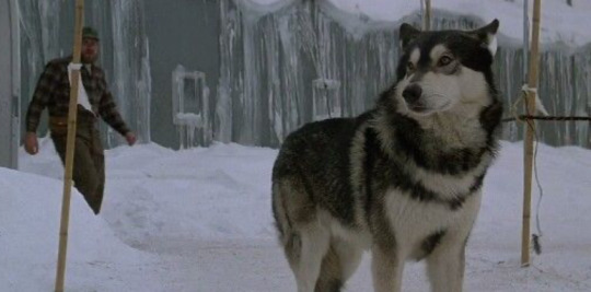
Something else that loosely inspired the idea of making the fruit look like a human heart was The Thing (1982). I watched it recently, and at a part in the project when I didn’t yet have an idea of what I wanted to make, but I decided on the design because like the thing it mimics a human (in this case organ) rather realistically. I also wanted the idea of the heart fruit to beat like a human one too however I’d have to create the heart out of a different material and add a working machine inside it, which would be rather difficult, especially given the time frame for this project.
Anyways, I really liked the film and thought the props in it were skilfully made, the directing and acting was great, the sets and locations were brilliant and so was the sound design. Overall I think it’s a great movie with a great plot and idea.


0 notes
Text
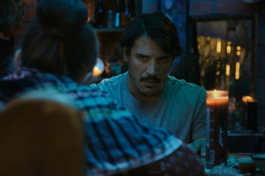
My inspiration for the background story to the heart fruit was mainly Snowfall, a show that I’ve been watching lately about the cocaine industry in La in the 80s.
I personally think that the writing in the show is great, I love how everything is shot and I also think that the characters are incredibly written and acted.



0 notes