It’s not the amount of courses you take, degrees you get, weight you lift, or how far you go. It’s about the work you put in, the intensity you have and the drive to give it 100%, every time and all the time. This coupled with consistency will make you rise above, allow you to lead and be the captain of your boat, not just a passenger. So get after it.
Don't wanna be here? Send us removal request.
Text
RN Portfolio 7: Period Style
Art Nouveau

This cover of Jugend, an art journal, designed by Otto Eckmann in 1896 is an example of Art Nouveau. We can see the dynamic curves, flowing lines and powerful uses of color creating dramatic contrasts. The use of the entire space, along with its asymmetry gives it an organic feel.
Art Deco

This picture was of Desiree Lubovska in a dress by Jean Patou in 1921. This design represents Art Deco. Art Deco represented the new world and was seen in Hollywood films. The fashion had clean lines, was delicate and comfortable. This luxury clothing set the stage for other costumes and creations that exploded in the 1920s.
1960s Counterculture

The fashion of counterculture was a visual expression of anti-establishment. People created a movement against extensive military intervention in Vietnam and gave change to the Civil Rights Movement. This 1968 outfit, called Electric Skin, was designed by Haus-Rucker-Co, was also called “wearable architecture" and represents the counterculture fashion of the 1960s.
1 note
·
View note
Photo


WEEK 6
These pictures show my dining room/kitchen. I believe that this room has a renaissance typestyle with a modern-day look. I believe it to have a renaissance feel because of the solid, and wide pillars that separate the kitchen and dining room. There is a strong layering connection from the floor to the ceiling with the use of basic materials. The room is visually lighter through the open and high ceilings and the look of “load-bearing” pillars that seem to support the room. I believe that the furniture also helps to create a Renaissance feel, as the dark wood of the dining room table, chairs, and picture frames display craftsmanship and elegance as seen during the Renaissance. The modern aspect of the room comes from the precise use of clean straight lines, lack of texture and shape creating a minimalist feel.
2 notes
·
View notes
Photo


PORTFOLIO 5 AND 6
The first picture is the “Ospedale Degli Innocenti,” an architectural masterpiece, representing the views of Florence, Italy in the early Renaissance. Designed by Filippo Brunelleschi and constructed in 1419, opening in 1445. We can see that the early Renaissance design had solid, wide bases that created a strong visual connection to the ground as if the building rose out of the ground. The visually heavy building is emphasized with the use of small windows and layering of textures to help create scale. The second picture is of Renaissance design but at a later point in time, 1578. The Fontaine des Innocents, designed by Pierre Lescot, shows a narrower base and has a visually lighter presence. The visually lighter presence stems from the larger windows. We also see greater finesses in texture and scale, creating a more detailed look.
Pictures 3 and 4 represent the interior design of Baroque architecture. Picture 3 is the St. Peters Baldachin, designed by Gian Lorenzo Bernini in the year of 1623. Picture 4 is the Wiesekirche in Bavaria, designed by Dominikus Zimmermann in 1745. We can see the design of Baroque architecture containscComplex shapes, usually oval, created dynamic interpretations of spaces, where walls seemed to disappear. There was an emphasis on height and open spaces, with a grandeur, dramatic contrast with curvature and rich surface patterns and textures. The ceilings were painted with colors, and vivid shapes and pictures. These design techniques came together to create a sense of airiness and fluidity creating an emotional and sensory appeal.
0 notes
Photo


RN Portfolio #4: SCAMPER - Elements analysis - redesign
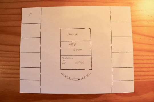
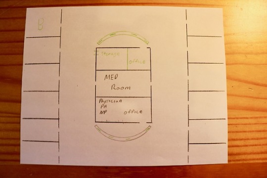
Naccarella (2016) explains that the physical environment has an effect on nurses workflow, and that workplace design can make a meaningful contribution to a hospitals staff attraction and retention. The design change I would like to make would be one that creates a new nurses station on the opposite end of the hall, picture B. The one nurses station, picture A, creates a cramped, overcrowded and ineffective work station. Nurses are “stepping” over each other, “rubbing” elbows and can't seem to find adequate room to place paperwork or other items while documenting. Not only is it crowded but noisy as well. The proximity to each other seems to amplify the conversations which can be distracting. After utilizing the SCAMPER method, I would modify and elaborate by creating a new nurse station at the end of the hall, and divide the storage room so that another office could be added. This would lessen the number of computers and people at one station and create a more comfortable and spacious work environment. This would also allow healthcare professionals to be closer to the patients at the end of the hall. This design change would be beneficial, as Naccarella (2016) states lack of appreciation can be countered by providing an effective, efficient and comfortable workplace.
0 notes
Photo


RN Portfolio 3: Elements
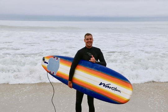
Color and Line Aspelund (2015) along with the video “color and line” emphasizes the importance of color as it can be approached emotionally, psychologically and from various disciplines. These surfboards display various hue is that outline a spectrum from lighter hues to darker, from the inside out. This broader spectrum creates more contrast and creates a more dramatic effect (Aspelund, 2015). The intensity and temperature of the various colors create a vibrant, and warm emotional response. The boards display vertical dynamic lines that are implied. The lines are drawn by the color themselves that create a sense of fluidity, a sense of looseness and motion: as if you are riding a wave just by looking at it.
Pattern and Texture The pattern is one of fluidity, basic symmetric repetition of hues from light to dark. This visual pattern invokes synesthesia, as our visual sensation leads to an emotional one. The 2D patterns used instinctively interact with texture to create a comprehensive emotional experience. The sense of looseness, motion and fluidity felt by looking at the design plays into the soft, smooth texture of the board. One knows what it feels like before touching it, allowing texture and pattern to create an experience with visualization. Experience The design object creates my experience through its color, lines, texture, pattern, shape, space and time. These elements of design come together holistically to create an individual experience. The experience I feel when looking at these surfboards is one of enjoyment, excitement, curiosity, and danger. The experience is one of emotion; this is the most significant experience out of all the sensory input. I reflect on past experiences of surfing and remember the joy and excitement surfing brings to me. The design arouses my curiosity as I contemplate when I can surf again, where will I go, how big the waves will be, and the type of rides I will get. This stimulates my adrenaline as I wonder if I will take a big wipe-out, get held under, break my leash, or get caught in the break zone. The design of this board comes together to create an emotional experience that has deep sentimental value.
1 note
·
View note
Photo


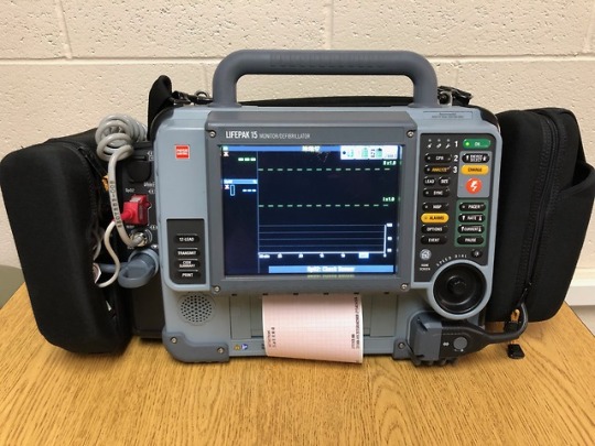
I would give a PowerPoint presentation that included pictures, and videos that highlight the design of the LifePaK 15. I would focus on the functionality, reliability, and creativity. These topics will help create the narrative in why this product design is superior.
I would describe the design of this product as a durable, reliable, monitor/defibrillator that has the functionality and usability that empowers teams to coordinate and administer lifesaving tools. The device has proven technology that provides data needed to narrow the focus of a group to work together more effectively.
The six images I would use to convey this product to the audience would be pictures of the front, back, left the side, right side, display screen monitoring the patient, and a picture of it charging to 360J.
Physical objects at a presentation for this product would include the product itself, a simulation mannequin, the user manual, in service DVD, accessory catalog, and a posterboard highlighting significant features of the device.
I feel that this device would fall under the “Uniquely Qualified” section of Eagle 2016. Nurses are uniquely qualified to provide constructive input on the ease of use, benefits, pros, and cons of working with the LifePak 15. Nurses must be able to use monitor/defibrillators during life threating events; therefore nurses have great insight into what works and what doesn’t. Nurses know the challenges of life threating situations and the performance needed to work efficiently and effectively to ensure a positive patient outcome.
1 note
·
View note
Photo


The design flaw I would Correct would be the placement of the nurse’s break room, picture A. I was in the ICU when a patient that had been extubated, a couple of days prior, began a conversation with me and opened up about how the smell of popcorn “drove her crazy.” She said the smell of food made her feel helpless, sad, lonely and triggered flashback’s of movie nights with her family. She wondered if she would ever get to enjoy those movie nights again.
A solution to this design flaw would be to switch the break room with the supply room, picture B. To execute this change I would revert back to stage four of the design process. As Aspelund (2015) emphasizes that during this stage one must place him or herself within a situation so that context can be given from a certain point of view.
This solution would fall under the ADAPT phase of SCAMPER, as I would modify the purpose of the room to serve another situation. This adaptation would fall under the usability phase as the faculty would have to relearn the purpose of the room.
1 note
·
View note
Text

This photo was taken with my canon rebel t6i during the 2017 RI air show. I edited it to have a “spacey” feel. When I look at this photo I think that this pilot had to get through clouds, and turbulence, to achieve his mission. This pilot stayed focused, and reaped the benefits of a beautiful view. Like life we may go through the clouds, not see where it ends or how, and we will have turbulent times, but if you can stay focused and achieve your mission, you too will be rewarded.
0 notes
Photo


Backpacking trips require a comfortable, well ventilated, durable backpack with plenty of storage pockets. My Osprey Atmos AG 65 backpack is amazing as it has AntiGravity suspension, easy to use stretch mess pockets and stow-on-the-go trekking pole attachments. The problem is that it does not have front pockets to hold a water bottle. I have to store my water in the backpack itself, which requires me to don and doff my pack when I need to hydrate. This slows me down, requires energy and can get annoying. Aspelund (2015) states that inspiration for designing can come from a creative, technical, emotional or situational side: my inspiration would come from a technical side, as the problem stems from its technical use. Inspiration is the first step toward a design solution, and my final solution would hopefully lead to a water bottle pocket in the front, on the shoulder or hip straps, so that you can easily access water. Although the pack does have two hip pockets they are not big enough to hold a water bottle.
Picture 1 shows the shoulder and hip straps. This is where I would like to design a water bottle pocket.
Picture 2 shows the pack itself.
4 notes
·
View notes


