
Hey, I am a space engineer, guy with a camera, manager of a dog shaped hurricane, promoter of workers participation
Don't wanna be here? Send us removal request.
Statistics
We looked inside some of the posts by placeofpluto and here's what we found interesting.
Average Info
Notes Per Post
1M
Likes Per Post
583K
Reblog Per Post
472K
Reply Per Post
1K
Time Between Posts
5 days ago
Number of Posts By Type
Text
15
Photo
2
Last Seen Tumblr Blogs


Fun Fact
Tumblr was created by web developers David Karp and Marco Arment.
Text

wow now white people want to adopt Palestinian orphans like they are rescuing poor little exotic pets fuck white savourism fuck genocide Palestine will be free
19K notes
·
View notes
Text
BEHOLD
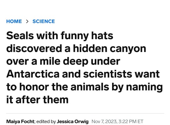
THE SINGLE GREATEST NEWS ARTICLE OF 2023!
funny hat seal and article link under the cut
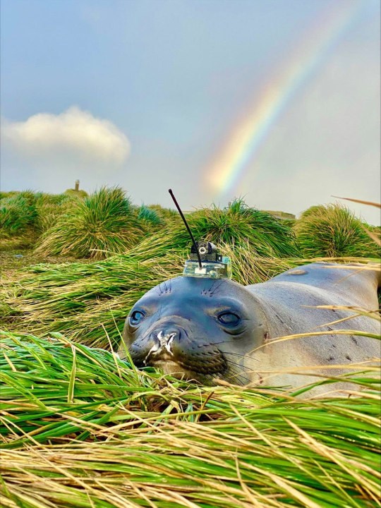
HAT IS INDEED FUNNY!
Here's the article btw, give it a read! It's very interesting.
1K notes
·
View notes
Text
I’m convinced if ppl on this site knew how crappy gifs look before you color them properly, they would appreciate editors more
194K notes
·
View notes

Text
Jet Lag hit a million hours streamed on Nebula!

[ID: A tweet by Nebula @/WatchNebula. It reads "Congratulations to @/jetlagthegame on hitting 1,000,000 hours streamed on Nebula ✈️🎉" with the photo from streamys where the lads are posing against a dark background. The alt text reads "three professional athletes wearing impressive outfits".
A retweet by ben doyle @/thewheatgerm. It reads "it's mostly my mom". End ID]
44 notes
·
View notes
Text
Not just the ancient, the bilbao guggenheim

Fits in a small spot between abig road and dense neighbourhood

I really like how many of the world’s most iconic structures and places are just right next to some of the most mundane stuff imaginable, for example
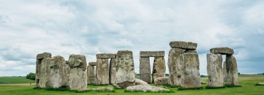
Stonehenge
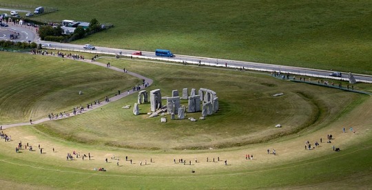
Is right next to a busy road

The Pyramids of Giza
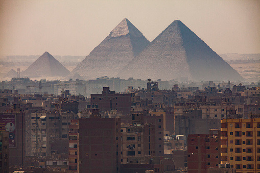
Are at the outskirts of Cairo
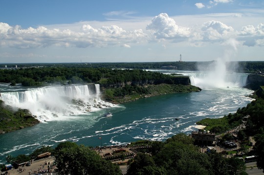
Niagara Falls
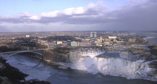
Are part of the town of the same name
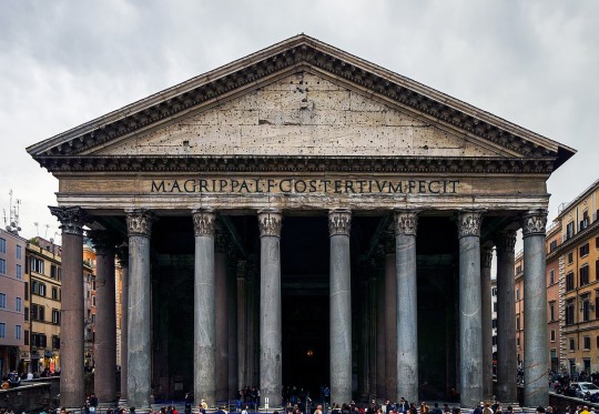
And Agrippa’s Pantheon
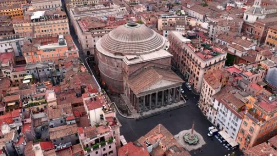
Is crammed inside downtown Rome
It just so interesting to notice.
78K notes
·
View notes
Text
Seeing the notes on posts about the Burning Man Debacle™ and for fucks sake I am taking the phrase 'eat the rich' away from y'all until you can CORRECTLY IDENTIFY the rich
Rich is 'arrived by way of their private jet', is 'dropped $500k on a submarine ticket', is '$500 is a rounding error'.
'$500 dollars for a nine day event they must all be rich white people' no you reactionary rotten potato that is actually an entirely reasonable price for an entirely normal person to pay for an annual event! $500 over the course of a year is approximately equivalent to one big takeout a month! Being able to afford that doesn't make you rich it makes you probably not poor! The 'rich or poor' narrative is a false dichotomy that completely excludes the fact that 'richness' or 'poorness' is a SCALE! It's not fucking categorical! You don't one day magically flip a switch and go from 'poor' to 'rich' or vice versa you see incremental changes over time! Wealth distribution is a (these days, admittedly, rather wonky) motherfucking BELL CURVE! . The fact that capitalism is driving more and more people to either extreme of said curve is just evidence of a broken system, but it doesn't change the fact that most people should have a decent amount of disposable income!
The fact that many people don't have said disposable income doesn't magically make the ones that do 'rich' it makes everyone else poor. And the people at fault for the massive and growing percentage of people living below the poverty line are not the ones managing to stay above it, it's the fault of the actually rich, the ones stealing our time and our health and our wages and our future in pursuit of a number on a screen. And the rich are the only people you're helping by hating the people struggling slightly less than you.
When it comes time to 'eat the rich' you're going to be murdering dentists and librarians and scientists while the actually rich point and laugh from a safe distance as you solve their problems for them.
23K notes
·
View notes


Text
Some identifiers for AI generated fashion images that I've noticed
So, recently and not unexpectedly, I've seen a major uptick in AI generated images showing up in my searches for fashion photos, specifically. I've seen people make posts like this for specific art styles, and for 2D art in general, but I wanted to share some observations I made regarding clothing, fashion, and runways specifically. I've seen a lot of people getting fooled by these, but it seems like for every one person thinking it's real there's about three people informing them that it's AI, fortunately. I'll admit, a lot of them look somewhat believable at first, but once you look closer it becomes apparent that they're off somehow.
To clarify: this is about common inconsistencies I've personally noticed in AI fashion images, so that you can learn where to look for these and similar inconsistencies and avoid sharing AI content by accident.
There's this one "collection" specifically that seems to come up a lot:
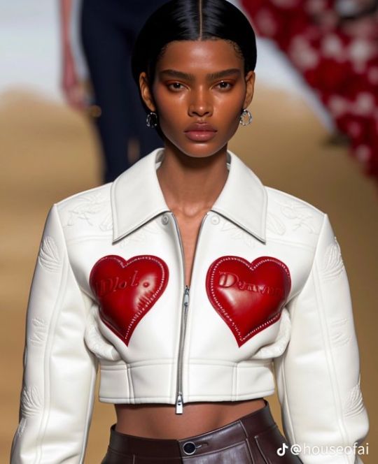
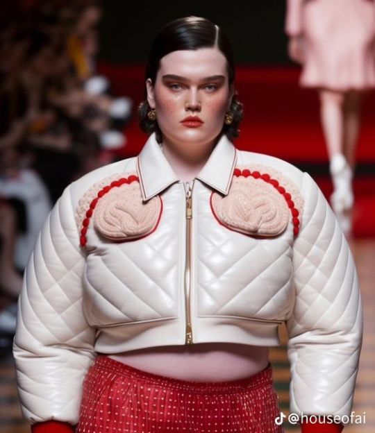
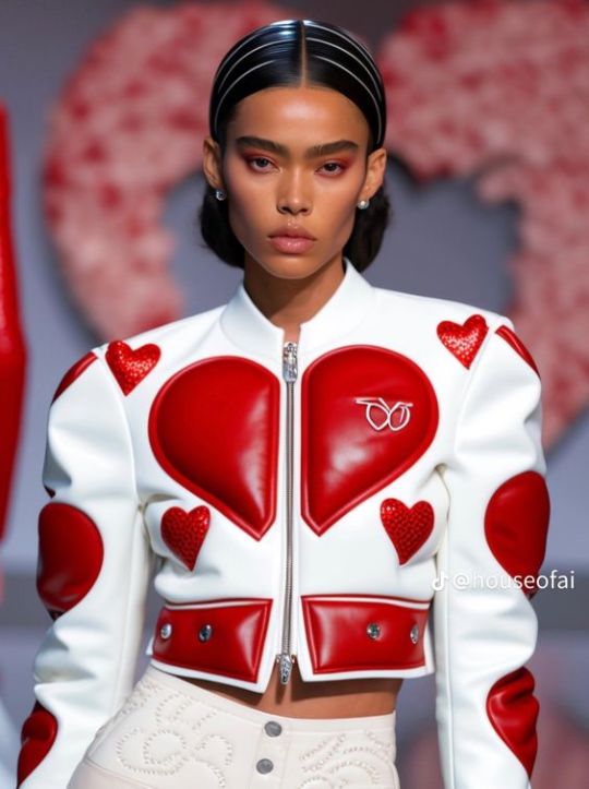
There's more images like this and yes, despite the "houseofai" watermark I still see people asking who the designer is, or saying that they genuinely thought it was real at first. First and foremost: these are all clearly meant to be from the same runway show, right? Then why does each image look like it was taken on a different runway? The lighting and coloring are different in each one, and the middle one has vague red stairs in the background while the other two look like just a plain light-colored runway. This is something you'll obviously only be able to notice in groups of images and not singular ones, but it's a pretty dead giveaway if you see it.
Secondly: AI generated images, as a whole, tend to have this specific kind of super dramatic lighting with very bright, white lights and soft grey shadows. I'm not very knowledgeable about photography, so I can't explain it exactly, but I know it when I see it (and if someone reading this can properly explain it , please do.)
Thirdly: AI generated fashion tends to attempt perfect symmetry, but always fails somehow.
As for the actual outfits: the best that I can describe it is that a lot of the shapes and patterns just don't look like intentional human choices.
What in the hell is that monogram on the upper right supposed to be? It's clearly mimicking a logo of some kind, but it's messy and indecipherable, not actual branding.
The heart motif is clearly the running theme here, but the hearts don't really make sense. Like the main one in two halves across the chest here: why does it have those two notches missing at the bottom that prevent it from coming to a point at the bottom like a heart is supposed to?
The bottom hem is way longer on the left than on the right.
The little shoulder hearts are like, bleeding into the shoulder seams; those lines in the hair look like they're supposed to be headbands, but they disappear at the part with the rest of the hair; the embroidery on the pants isn't in a clear or intentional pattern.
Again, compare the lighting on this one's neck with the lighting on the last one's neck, totally different.
Those pink things on the chest look like they're trying to be hearts, but they're so clearly not actually hearts. If your collection is heart themed, why aren't you using actual hearts?
The quilting effect is uneven and the individual lines don't follow through and finish in the places they should. Look at the upper right sleeve, where the diamonds are misshapen and the diagonal lines are clearly disconnected. On the lower right chest, the lines just disappear. This can't actually with quilted garments IRL because the top layer is literally stitched to the bottom one along those lines with material in between. It can't fuck up like that, especially not a designer garment that costs your monthly rent.
Smooth zipper. Zippers seem to be a common fuck up.
You can't read the text on the hearts. It's nonsense. Nonsense, unreadable text and fucked up hands are the absolutely surefire ways to identify AI art like this. Conveniently, there are no hands in these photos.
What are those embossed shapes on the sleeves? They're not identifiable as anything in particular.
That is not how zippers work.
I suppose that weird folding beneath the hearts is something technically physically possible. But it's much, much more likely that they would create smoother, less ugly seams with less excess fabric.
These generative AI programs don't actually comprehend what they're trying to depict. Thus, they make mistakes like these. Physical inconsistencies that are often totally impossible, but even the possible things are just... stupid choices that an actual designer isn't going to do. Yeah, sure, designs can be weird, asymmetrical, and imperfect on purpose. But it's way, way more likely that this is just an AI.
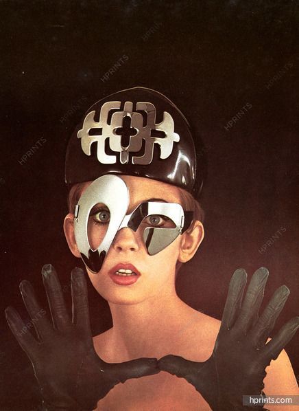
Experiment: look at these two images of retro-futuristic headpieces/eyewear and determine whether they're real or AI.
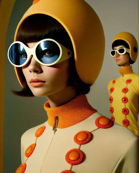
Right one is easy, mostly because of the wonky bitch in the back. But some other inconsistencies I specifically wanna note: if the blue goggles color the "model"'s skin, hair, helmet, and the background behind the lenses blue, why doesn't it do the same for the eyes? And also, I've noticed that a lot of these images have trouble properly rendering the corners of the mouth, which is a weird detail but one you won't be able to unsee once you know to look out for it. Yes, there's a dark line where actual human lips meet, often with some subtle divots at the corners, but in the image on the right, it's rendered as a harsh, gaping hole more like something sculpted out of plastic than actual flesh. On the note of imperfect symmetry again: the left lens isn't perfectly round. And finally, this is a really good example of that giveaway lighting I mentioned. I don't know how you would actually achieve that lighting IRL, but it's so, so common in AI images.
The left photo is an actual model in 1967 wearing pieces designed by Pierre Cardin, a designer that the right image is definitely trying to emulate. The model has a look on her face that isn't super duper expressive, but it's still far beyond any of the AI images I've seen. Every AI fashion image I've seen thus far has totally blank-faced, expressionless "models". They might pout slightly, but I haven't seen any with visible teeth. Something tells me the AI would render teeth the same way it renders fingers. The emblem on the hat is actually perfectly symmetrical, and the glasses are clearly asymmetrical as an intentional design choice, not like the shapes are supposed to be the same but got messed up somehow. And she has ten fingers total, five on each hand.
Two more:
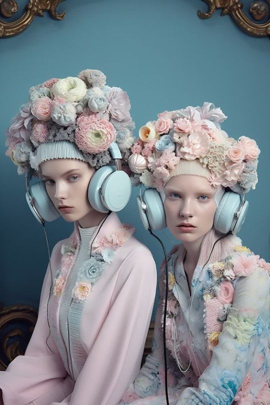
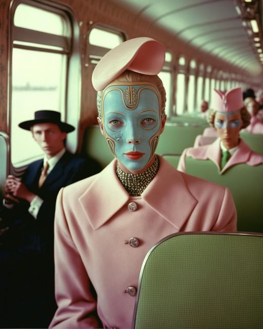
These are both AI generated. I'm not gonna lie, i fell for the one on the left at first. The right is easy:
distorted faces
woman in back is being absorbed by the train(?) seat
those middle buttons on the jacket are totally useless
AI Lighting (TM)
But the "models" on the left look very, very convincing, and the lighting doesn't immediately register to me as AI lighting. The only really wonky thing on the faces is the mouth on the left "model". However, there's one dead giveaway: the headphone wires. Why are they different thicknesses? Why does the rightmost wire disappear into the jacket sleeve? Where the fuck does the leftmost wire even go? AI, I've noticed, struggles with thin lines, strings, and strands of things. Like with the quilted jacket above, you can often try and trace a single line, only to find that it drops off, distorts, or disappears. And sure enough, as soon as I noticed something was weird with those wires, I went to the Pinterest profile that posted it and found that they exclusively posted AI content. Speaking of the actual headphones, the leftmost ear cushion is sitting on an angle that doesn't make sense, and the one to the direct right of it is significantly thinner than the other three. Again, subtle failed symmetry.
This is by no means a comprehensive guide, and I encourage anyone seeing this to point out ways they've found to identify AI images like this. These are things I've just been on the lookout for lately. And when in doubt: conduct reverse image searches and try your best to identify solid sources for your images. AI images won't list designers, model names, photographers, stylists, makeup artists, etc., while actual runway and photoshoot images will, because there are human creatives behind them.
784 notes
·
View notes
Text
One of my favourite bits of media history trivia is that back in the Elizabethan period, people used to publish unauthorised copies of plays by sending someone who was good with shorthand to discretely write down all of the play's dialogue while they watched it, then reconstructing the play by combining those notes with audience interviews to recover the stage directions; in some cases, these unauthorised copies are the only record of a given play that survives to the present day. It's one of my favourites for two reasons:
It demonstrates that piracy has always lay at the heart of media preservation; and
Imagine being the 1603 equivalent of the guy with the cell phone camera in the movie theatre, furtively scribbling down notes in a little book and hoping Shakespeare himself doesn't catch you.
168K notes
·
View notes
Photo
More like ABERSICEIUS

BRICS admits six new members
Argentina, Egypt, Ethiopia, Iran, Saudi Arabia and the UAE are set to join the core group of Brazil, Russia, India, China and South Africa. These 11 countries have a combined population of 3.7 billion.
211 notes
·
View notes

Text
13K notes
·
View notes