The personal blog of your favorite professionally unprofessional buffet of insanity. Welcome!
Don't wanna be here? Send us removal request.
Text
Dead Head Build
So, one of the coolest things anyone can play with are foam heads. They're cheap, relatively inexpensive and have some real production value when it comes to projects. If you have a keen eye, they're all over the place in Jigsaw's workshop. Take from that what you may ;). I had actually modeled a foam head after a slasher from the 'Dead Space' series and was really pleased with it. I may post about it later. But for now, let's get into this build!
First things first, let's give this thing some nasty bits. I started off by marking out places I wanted to subtract from the head form, paying particular attention to the eyes, nose and mouth. From here, it's as simple as using an x-acto knife and your fingers to dig at these places and open them up. With my original Slasher head, I admit that I went a little overboard here, particularly around the eye socket. I made this one more anatomically accurate (or as accurate as I could).
Next, I used some red spray paint to add to the carved out areas. This will do two things. First, it will add a base coat for the simulated exposed meat. Secondly, as stated in the video, Styrofoam dissolves when exposed to aerosol spray. DON'T PANIC. It'll only slightly dissolve but it will add another layer of detail the weathering will find later!
As with my first Slasher Head, I added teeth to this project. Using a "Fix it Stick," or plumbers epoxy, I made the teeth as well as an eye. This worked okay, it's a two-part epoxy stick that will harden after they're mixed together, but they are a little sticky. Thermomorph plastic would be neat and probably a bit easier to use, so I may use that in the future. Spoiler alert: I'm gonna make more of these. Heck, even in a pinch, Play-Doh would even work.
When the spray paint had completely dried, I touched up the areas with some more red acrylic paint before hitting these areas with a black wash. A wash is a watered down paint that will settle in the low points, creating some depth. I used an acrylic black paint diluted with water. I did kind of go a little heavy with it, but I'm going for a rotted look for this head, so it didn't bother me that much.
Painting the teeth and eye are pretty self explanatory- a base coat of ivory. For some reason, my camera stopped recording while I was working on the eye. But it's fairly simple. I used a Q-tip to paint on a black pupil and did light powder coats of white spray paint over the eye to create a "glazed over" very dead look. Using the same Fix it Stick, I also added a spiked eye stem that will poke into the head and add some stability.
Before adding these pieces in, I wanted to add some luster to the hard-to-reach places. Using some gloss finish Mod Podge and a foam brush, I added it to both eye sockets and mouth. I wouldn't use the spray Mod Podge because it contains aerosol spray. And remember- foam dissolves when exposed. Don't do this and give yourself a headache. You can kick up the dry time by using a hair dryer. Adding all these pieces is simple. I used them to poke a hole in the desired spot, add hot glue and replace. It seems kind of unremarkable but trust me, people freak out when they see that your piece has teeth. Now you can sit back and chuckle at them a little.
Now we can tie it all together with a paint job. For the base coat, I used a flesh tone. I had some already but if you don't, you can make your own out of red, white, yellow and a small drop of green. Brush this in all areas that aren't open wounds. Now, since this is a rotted head, let's make it look the part! When my base coat was dry, I went over all the flesh tone with a dark green at full strength (meaning it wasn't diluted). I then tried to wipe most of it off. The point is to not clean it back up, it's to add a layer of grime and nastiness to it. It'll make more sense in the finished product. I covered the entire head with this and let it try. Then I did the same thing with black. If you want to do another layer with brown in some places, that'll add another level of color detail; I just didn't have any brown on hand. Also, if some areas are lighter than others, it's no issue. Decomposing things aren't one color and look pretty gross, so little areas like this add to it.
To finish it all off, I sealed everything with gloss finish Mod Podge. Not only does this seal things, but the glossy finish makes it look as though it's still decomposing. Just like out juicy friend from the sarcophagus. You get brownie points if you get that reference! ;)
ALSO, BRIEFLY ADDRESSED IN THE VIDEO... the neck area also got the nasty meat treatment.
Want to assert your dominance as a zombie hunter? Mount this thing on your wall! Got some pesky post-apocalyptic survivors you wanna send a message to? Throw this on a pike! This build is a ton of fun and can be done fairly cheap and in almost no time at all. And the cool part about Styrofoam is that it's very versatile. Especially with this build. One could easily add some more flair to this and add some more bang to it. Expect to see more of these in the coming months!


#zombie#diy#diy projects#one day builds#haunted house prop#halloween deocration#zombie head#rotted head#work in progress#from start to finish#horror#scary#creepy#gore
4 notes
·
View notes
Text
Budget Freddy Glove Build
Watch the video here: https://www.youtube.com/watch?v=35iyT-aNNhE
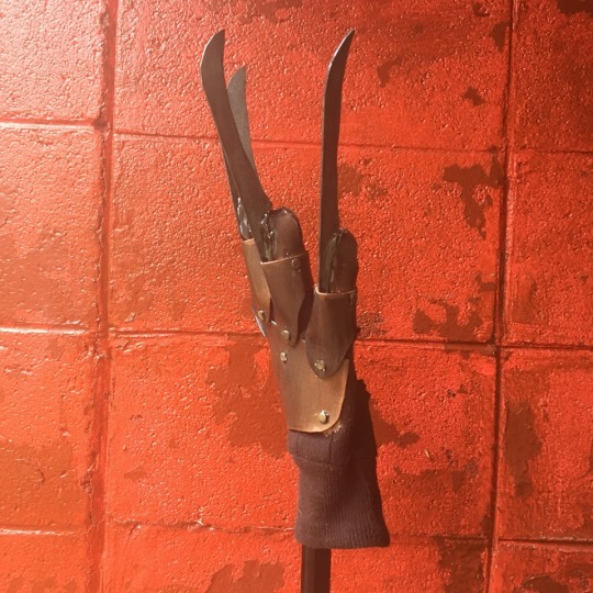
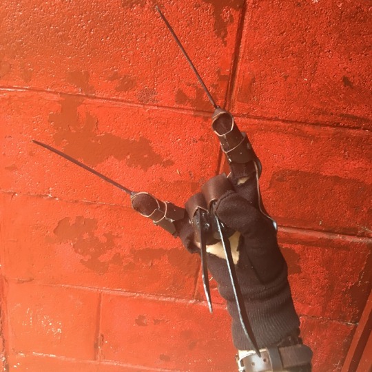
I’ve seen quite a few people make their own versions of Freddy Krueger’s killer claw from the “Nightmare on Elm Street” series and have really enjoyed seeing everyone’s work. I wanted to make my own but thought about some alternatives. Most builds I’ve seen use actual steel or copper for the segmented pieces, which is absolutely killer (pun intended)! But after using craft foam to simulate metal, I thought that would be a good substitution. Plus, it can go to show that one doesn’t necessarily need to use sheets of metal to make this project. I dug through some of my crafting supplies and used what I could. The only purchases I ended up making for this was a set of gloves, large tongue depressors and a pack of hot glue sticks, which came out at $7. Even cooler, this build isn’t limited to what I used and depending on what one has laying around, this budget is completely flexible!
I started out with wrapping masking tape around a cheap glove, which would be used to make the pattern out of poster board. From here, it’s fairly simple, cut out, make template, cut out, trace on foam and cut out again. I did end up having to resize the back of the hand but it was an easy fix.
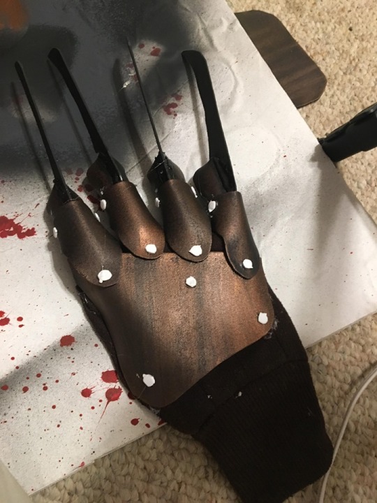
After having my plates pinned to a sheet of foam core, I went over each piece with a layer of Plastidip. Plastidip is a foam-rubber coating that makes a wonderful sealant and adds some durability. As an alternative, watered down glue or Mod Podge will work too! Foam can’t be painted straight up. It will actually absorb paint instead of being covered, so sealing it is important, especially if you’re using spray paint. After the Plastidip dried, I hit everything with a layer of flat black spray paint and let it try.
As for the glove, I know it’s a leather glove, but I tried to keep this cheap. To get a dark leather look, I just hit the glove with some brown spray paint after cutting some holes in it. As a happy little coincidence, it also produces a texture similar to that of a leather glove. Thanks, happy little coincidence!
I was kinda stuck on what to use for the blades. I didn’t want to use something like plexiglass because of my main goal of keeping this build low-budget and having the materials easy-to-obtain. I found some jumbo sized tongue depressors at Walmart and thought those would be perfect, and I was right. Perfect size and perfect about of strength. After free handing the blades, I used a sander to shape each one and an Emory board to smooth everything over.
Now we move on to gluing. And gluing. And some more gluing. And sure, why not more gluing? My original idea was to use leather rivets but: a.) I had none. b.) Walmart didn’t have any. c.) Don’t spend any more money. So instead, I opted to make faux rivets out of foam pieces cut from a hole punch. Good ‘nuff. But as for the hot glue, don’t be scared to glue while wearing the glove. I kept my gun on a low setting so it didn’t take too long to cure and didn’t run as much of a risk of burning me. Trust me, I wouldn’t show y’all something that’ll get you hurt and be like: “Yeah, you can totally do this, mang!” Ya boy’s gotchu! Also, I did have to re-glue some pieces with super glue; mainly all the joints on the index finger. Everything else was fine. As for the blades, get sloppy with it. This will give the appearance that they were welded on.
Painting is simple. Using some metallic acrylic paint, I covered everything. Using a technique similar to Rub-n-Buff, I dabbed on some copper paint with a glove and used uneven strokes on all the copper pieces. Rivets were painted gold and the blades and surrounding hot glue was painted silver. After touching up some areas, I went over everything (except the glove itself) with a coat of glossy Mod Podge. This will add some luster to it and add some more protective sealant over it.
This build was actually a ton of fun to make! And believe it or not, I actually made mine in a single day! And on a budget of less that $10, I’m really content with it. It looks good, it’s durable and it’s affordable! And you know this is definitely gonna be a conversation piece in the homestead!
Thanks for reading/ watching and I hope you’ll check out next week’s build!
-Picklewulf


#freddy krueger#killer claw#robert englund#wes craven#a nightmare on elm street#diy#wip#cosplay#prop#prop making#horror#slasher#make something
17 notes
·
View notes
Text

“The Waking”
14 notes
·
View notes
Text

“Full Circle”
#black and white photography#dark photography#dark art#black metal#creepy#horror#kentucky#appalachia
2 notes
·
View notes
Text

Portrait of the legendary Slashmaster, himself
3 notes
·
View notes
Text

“Shades”
2 notes
·
View notes
Photo

“The Summoning”
8 notes
·
View notes
Photo

This almost looks like an album cover. I like it!
12 notes
·
View notes
Photo

-Untitled- I really love the overcast Kentucky lighting and have been wanting to use this creepy statue we’ve had in storage for some time.
30 notes
·
View notes
Photo

Untiled photo from one of our explorations
5 notes
·
View notes
Text
Guess who’s back?
Well, after about a year or so of having deleted my tumblr, the Wulf is back! I deleted my account last year because I had a lot going on. It was a pretty bad time and I ended up retreating inward and deleting a lot of the media I didn’t use often. But with time, art and dear friends and family, all is well. Be prepared for my weirdness :D
2 notes
·
View notes