Note
India in a breaking wheel NEOW!!! /j


@itstokkii a double whammy HEHE... ignoring that this took me months to get to but shhh
#ask#hetalia#hetalia ocs#hws india#aph india#hws kyrgyzstan#aph kyrgyzstan#historically inaccurate hair is historically inaccurate
36 notes
·
View notes
Note
Aren't a lot of people of color uncomfortable with white people having OCs of color? Or is the problem not giving more visibility to OCs of fans of color?
Well, I would highly suggest finding and making community with fans of color to see these things in action. But the issue is not that they have OCs of color. The discomfort includes when white creators:
Poorly create characters of color, usually including overt racism due to lack of research or empathy (from poorly drawn skin and hair, to stereotypes, to blatant tokenism)
Poorly create those characters and then getting defensive when fans of color- especially the ones being depicted- point out the racism in their work.
Poorly create those characters not even for those who are being represented, but for the applause and approval of other white fans (this includes when they apologize for racism... And it isn't actually directed to or accepted by said fans of color. But that doesn't matter, bc that's not who they did it for to begin with.)
Tokenizes those OCs/characters of color while mistreating fans of color- so, if your "favorite character" is Black, but I either 1) never see you interact with or support anyone Black in the fan base or 2) I only ever see you argue with the Black fans (or your politics are sus, tbh), odds are, you're just tokenizing that Black character. Because you don't actually like or respect Black people, just the puppet Black character that you can control. A "good Black", if you will.
Speak over fans of color on their own experiences, and don't make space for fans of color and their own OCs (which is what you said), while simultaneously claiming ignorance to said issues (how are you 'not racist' but you don t even know what that looks like? You 'cant spot' fandom racism, so how do you know when you're not doing it?)
If you're not willing to put in the effort to depict us correctly or respectfully, don't do it at all. We're not points for your "diversity clout" or to assuage your feelings of unaddressed racism. But many white creators of OCs of Color, or even fan characters, are not considerate of or concerned by these things. It's something I hope I address enough here to bring awareness to those reading.
770 notes
·
View notes
Text
want more juice but i drinked it all. this is, i cannot stress this enough, utterly fucked
15K notes
·
View notes
Text

«Ытарҕалаах эр киһи»
artist: gumunksveet (twt, tg)
oc belong to @irithnova
design belong to @peonycats
In ancient times, Yakut men wore earrings that were no different from women's earrings. The tradition of wearing earrings by men has its roots in the world of ancient nomads of Central Asia and Southern Siberia. The tradition of wearing earrings by Yakut men can be traced in folklore and ethnographic materials. Earrings in men's ears were a kind of information carrier: earrings were not just decoration - they could be used to establish the social status of their owner, the history of the family, and in some cases, when the decoration was worn by heirs - such earrings were amulets that protected against evil spirits, and wearing one earring in one ear may have been one of the ethnogenetic markers of culture.
#HE LOOKS SO FIRE WITH EARRINGS AND LONGER HAIR GAH!!!!!#mr erchim.. JUST ONE CHANCE#beautiful piece to begin w!!#hetalia#aph sakha#hws sakha#hetalia ocs#rb
21 notes
·
View notes
Text
youtube
Possum Apple CRUNCH ASMR
48 notes
·
View notes
Text
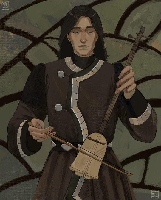
«Playing the kyryympa»
artist: winternighch (bsky, tg)
oc belong to @irithnova
design belong to @peonycats
Kyryympa is a Yakut bowed musical instrument, invented on the basis of a hunting bow and string in the early 20th century. Its sound and timbre are most closely suited to the Yakut ethnic sound. It is believed that the kyryympa contains the archaic sounds of the ancestors and the soul of the Sakha people.
#WAHHH THIS IS SO GOOD!!!!! man ive been meaning to reblog this but life has just been so busy LMAO#anyways he looks wonderful in this especially playing an instrument and his solemn expression... i really want to draw him more often!!!#<3333#rb#hetalia ocs#aph sakha#hws sakha
49 notes
·
View notes
Text

@itararepairweek day 1: Hurt/Comfort - Saudi Arabia/Veneziano
Saudi Arabia oc belongs to @peonycats HEAR ME OUT ok so I know this ship seems completely out of the blue but Saudi Arabia and Italy not only have really good relations, but they have SO MANY interesting historical parallels to each other. If anyone is interested please feel free to ask because I love to yap abt them <3
#WHOOPING AND HOLLERING#hws saudi arabia#hws italy#rb#itasaud#if you do come up with that food ship name pls tell me so i can retag it w that HEHE
22 notes
·
View notes
Text
istg I don't understand why the hell rents are so fucking high
my mother and I are trying to find a new house that we can afford but it's fucking impossible
we can't stand my father anymore. he refuses to leave, so we need to leave instead.
i once tried to help my father but i gave up (you can see an old post here)
but fucking rental market isn't help. hell, when we thought we found a house we could afford, that landlord went behind his word
anyways, if someone wants to help, here's my paypal and ko-fi.
#boost#please spread this around and donate if you can ik this person and they could really use the support rn#rb#not hetalia
113 notes
·
View notes
Text
What can I do to make you care about our Black brothers and sisters? There are many times where they have asked for our help, but we only pay attention when it is too late. Look at what has transpired over the past couple of months.
There is LaKeith Smith who has been wrongfully sentenced for killing a police officer. The coldblooded murder of Sonya Massey. The cruel ruling of Brenda Taylor's boyfriend. The unjust execution of Marcellus "Khaliifah" Williams. The Haitian community has been targeted by Donald as well as the US-backed paramilitary terrorizes Haiti.
Then we go to the other side of the planet. The migrant workers are locked in wealthy Lebanese houses. There are genocides in Australia, DR Congo, Sudan, Tigray, and West Papua. Black lives are everyday, every hour, every second. We turn a blind eye every time!
Enough is enough! Please stop looking away and show your support. One way to help is donating and sharing this fundraiser. It belongs to Eman Abdelrahman (#213 in the Spreadsheet). @emiiii980 has been fundraising since January this year to rebuild her home after the RSF has bombed it and killed her younger brother. Then she has no choice but to evacuate when the RSF closes in her location. Unfortunately, the funds haven't been raised in time. The Sudanese pound has been inflated. It is too expensive to evacuate. So she and her family have decided to stay back and rebuild their home in Khartoum. So she increases the goal to 50K to purchase building materials ASAP!
You can match me! I've given 5 CHF and $5 SGD! There is also a book raffle hosted by @/magnus-rhymes-with-swagness if you show your proof of donation!
Please keep in mind with the currency exchange. It is in Swiss Franc! $10 USD = 8 CHF. There is also a fundraiser for her extended family. Please show your support to them, as well. Again, keep in mind with the currency exchange! It is in Singaporean Dollars. $10 USD = $13 SGD.
Donate Here! / Donate to her Extended Family!
7K notes
·
View notes
Note
Thank you. For everything. ❤️❤️
HAHDFHHSJD NO PROBLEM???? glad to be doing what i love and people getting something out of it!!

7 notes
·
View notes
Text


yeah
based on this (+ azekun belongs to @peonycats !)

24 notes
·
View notes
Text
a whole bunch of gazan mutual aid projects and nonprofits. if the decision of which individual fundraiser to give to feels too daunting, or if you just want to help as many people as possible in one go, these are great initiatives to support.
care for gaza - focuses on providing food and essential supplies. donate here or here.
connecting humanity - securing internet access via donations of virtual sim cards (esims). if you can't afford a whole plan yourself, crips for esims is a communal pool that will use your donation to purchase and maintain esims
gaza soup kitchen - provides food, medical care, and classes for children. also has a gofundme
glia gaza medical support initiative - provides medical care through field clinics and tents at hospitals. donations can also be sent through their website.
ele elna elak - provides clean water, food, clothing, and shelter. they also have a gofundme
life for gaza - raising money for the gaza municipality to repair water and waste management infrastructure
taawon - partners with local civil organizations to provide food, water, medical care, shelter, and basic supplies
the sameer project - running various initiatives providing tents, medical care, and necessities. they have their own encampment project focused on sheltering families with children, sick and disabled members, or members in need of perinatal care
islamic relief worldwide's gaza emergency appeal - provides food, water, hygiene kits, medical supplies, and psychological support
baitulmaal - provides a variety of necessities, including food, water, shelter, and medical supplies
gaza mutual aid fund - distributes food, hygiene products, water, and other essential supplies, including financial support. run by @/el-shab-hussein's amazing friend Mona. updates can be found on her instagram.
hygiene kits for gaza - provides hygiene supplies including menstrual products, wipes, and toothbrushes/toothpaste
anera - provides a variety of necessities, including food, water, hygiene supplies, medicine, blankets and mattresses, and psychological care
palestine children's relief fund - provides supplies and support with a focus on children. also has an initiative for lebanon
dahnoun mutual aid - provides water, food, tents, baby supplies, financial support, and other necessities. updates can be found through their instagram
certainly this is not an exhaustive list, so please feel free to add on other projects or organizations that i didn't include. and as always, please take the time to donate if you can and share. it truly makes all the difference.
114K notes
·
View notes
Text

year of the snake
4K notes
·
View notes
Text


also my take on kenya for funzies
#DANGEROUSLY BASED!!!!!!!!!!!!!!!!!!!!!!!!#KENYAAAAA MY FAVE GIRL <3#i need to draw her again she's deadass my fave <3 its great to see a kenyan take on her!!#hetalia#hetalia ocs#hws kenya#other ppl’s ocs#rb
457 notes
·
View notes
Text
🚨 We Need Your Kindness to Survive 🚨
Hello, My name is Mosab, and I live in Gaza with my family. Life here has become harder than I ever imagined, and I’m writing this with hope in my heart that you might hear our story.
The ongoing war has devastated my family. We’ve lost 25 family members—each one a beloved part of our lives, taken too soon. I miss them deeply—their laughter, their presence, their love. Every day is a reminder of this unimaginable loss.
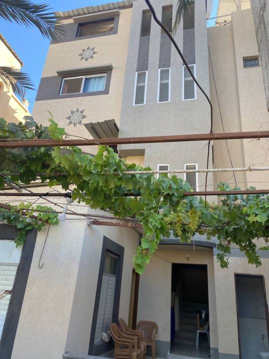
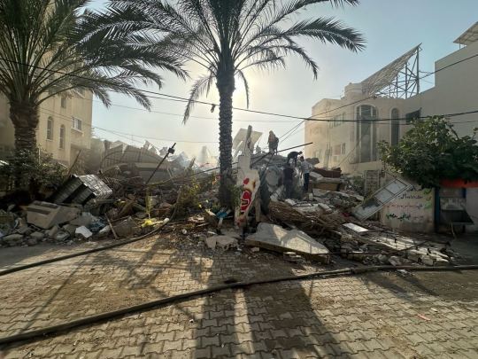
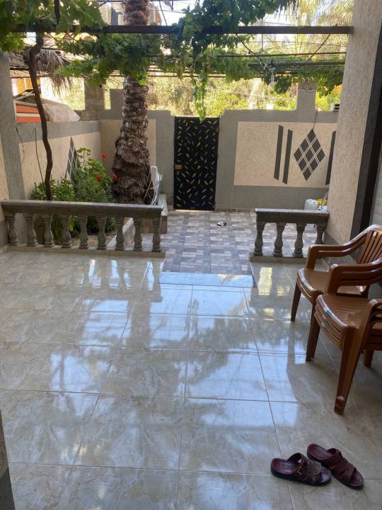
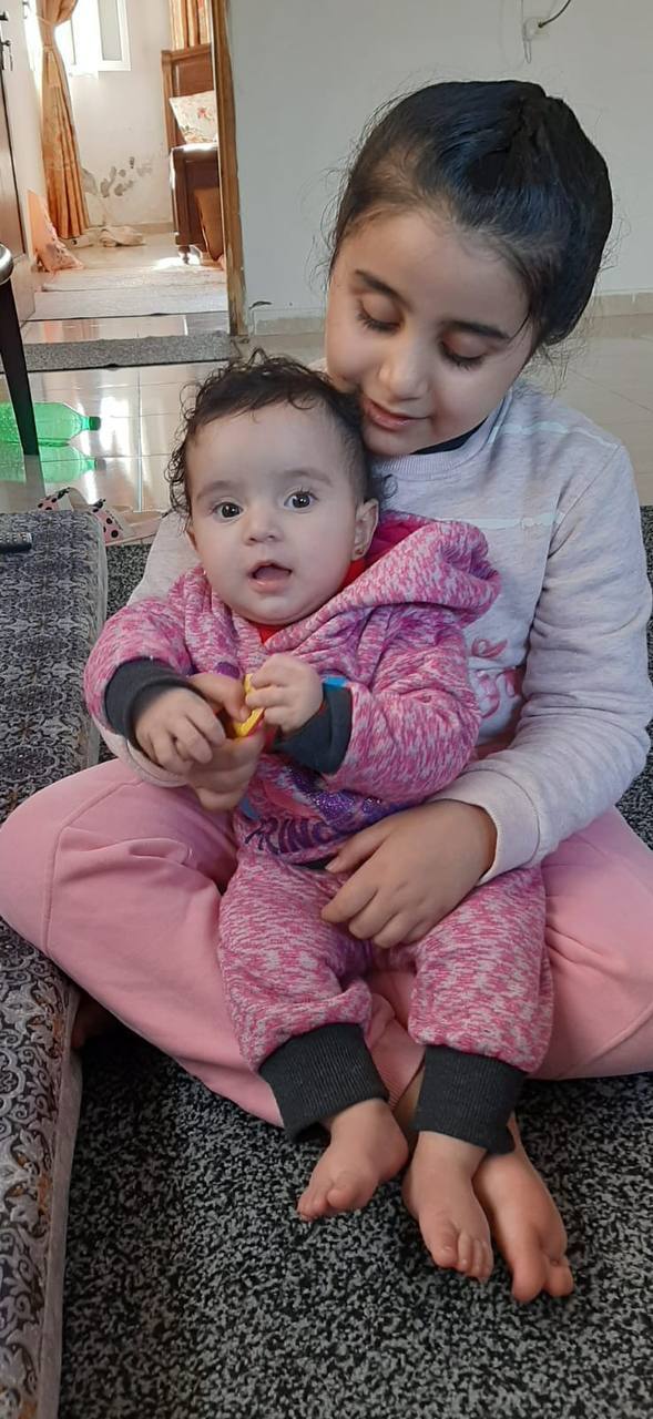
We are now facing daily challenges to survive—things that most people take for granted, like food, clean water, and a safe place to sleep. The harsh realities of life here have replaced our dreams with the constant fight for survival.
Our Current Situation:
💔 Lost Stability: The war has left us without work or a stable source of income.
📚 Dreams on Hold: Like so many here, my family’s dreams have been replaced by the need to simply survive.
😢 Unimaginable Loss: Losing 25 loved ones has left a void that can never be filled.
How You Can Help:
I’m sharing our story with the hope that someone out there might care. Even $10 can make a big difference for us, and if you’re unable to donate, just reblogging this post can help spread the word.
Your kindness, no matter how small, is something we’ll never forget.
What This Means to Us:
Your support is not about changing our entire situation—it’s about giving us a little relief, a little hope, and a way to keep going. We are not asking for much, and we understand if you can’t donate. Sharing our story is just as valuable to us as a donation.
Thank you for reading this far. It means the world to us to know that someone is listening. Your kindness gives us strength and helps us believe in a better tomorrow.
With all our gratitude,
Mosab and Family ❤️
27K notes
·
View notes
Text


MISC ART DUMP 7
long time no art posting! ive collected quite the pile of art i havent posted yet LMAO, lots of requests and gift arts!
from left to right, top to bottom
Indonesia, Singapore, Malaysia (Calavera Malaysia card art I did for mochidex!)
Nyo Portugal (Drawn for @whaddya-mean-my-name-cant-be-s!)
Rome, Germania (Drawn for the awesome @j0jorocity's birthday <333)
Ireland (Drawn for the amazing @lyresbird 💞💞)
Navajo/Diné (It's been a long time since she's shown up here!)
Vida (Drawn for @ask-vida-in-the-hetalia-world!!)
Taiwan (This was a request from someone on discord, though I'm unable to track them down again 😔)
Taiwan, again (Dude the colors are so drastically different from my ipad to my laptop im tweaking out)
#hetalia#hetalia ocs#historically inaccurate hair is historically inaccurate#aph singapore#aph indonesia#aph malaysia#aph taiwan#hws nyo portugal#nyo portugal#hws indonesia#hws malaysia#hws singapore#hws taiwan#aph rome#aph germania#gerrome#hws rome#hws germania#hws navajo#other ppl’s ocs#hws ireland#aph ireland
98 notes
·
View notes
Note
Hi! Sorry to bother you, but roughly 2 hours ago someone called Angelthefatal uploaded a post with various nyo-Hetalia art from different artists, one of yours being included. You're technically credited in the post, but they never mention if they had permission to post your art, so I guess I just wanted to ask if they have?
thank you for the concern and informing me! They didn’t, but my repost policy (which, to be fair, i haven’t really mentioned until now) is that reposting is fine as long as you credit and link back to me! still, thanks for watching out for me 🙇

11 notes
·
View notes