p_ants_ | acloudlessblue | ezregg | w0mbraider | scottfenoUTS Animated Adaptation WIP for Sun is Cat Poetry by Shrasta DeoCover Photo- Suspicious Looking Egg Photoshop Battle (Orange on cat turned into a sun with an orbiting solar system) by u/darkshiv1Display Thumbnail: Shop A Pop Opera by Jack Stauber
Don't wanna be here? Send us removal request.
Text


Very first storyboard by Ezra and Jehudah hand drawn
1 note
·
View note
Text


Scene04 shot a (SC04a) v01/02 thumbnailing, poses, expressions, mess and confusion
0 notes
Text
0 notes
Text
Scene_5_Dream_Transition_In_WIP_(Keys&Inbetweens)
0 notes
Text
Ignore dodgy masking or no masking, and the textures I've used (still looking) etc, Just want to give you a taste of some effects in AE.
0 notes
Text

Storyboard short-cutting idea 1. Paws Akimbo typography on leg and arm so it spins once onto its tummy - line is “white tuft of her tummy muse” after all - revealing stressed-out poet frantically typing on keyboard, then jump-scared by “for the ouroboros of poets who watch my (her) story play out” words.


Storyboard short-cutting idea 2: “you see this is still poetry” comes out on one frame with texta/marker looking protest type + humorous cat paw because its making a point that cats can write poetry too (this is also the part where it becomes obvious the poet is projecting herself/own thoughts more and more into the cat persona, like ‘what im writing is still poetry okay!’ :L kinda thing)
~Katherine
0 notes
Text

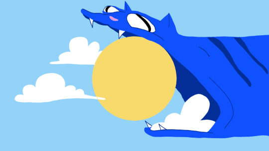
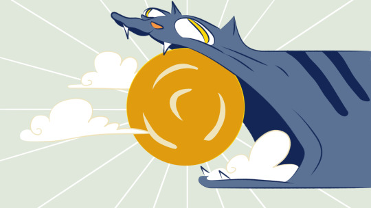
Catzilla (consuming/becoming the sun) Style Frame Process:
Version 1 redrawn based on Ezra's storyboard
Background colours from Jehudah's first draft frame and character colours from Florence's Catpitalist Institutions frame
Charcoal texture pen tool used and mostly line-less.

Version 2 coloured based on the Interim Crit palette established in the Catsplat reality frame.
Character line art is more bold with the environment line art more subtle. Line art choice was also changed to be tapered and with a less fuzzy texture (Felt)
Incorporated Tarot-card inspiration into the stylisation of the sun-rays and clouds (Tarot the cat = sun tarot card)
Done on Toonboom Harmony. Pencil tool for line art, brush tool for details, colours on colour art layer by ~Katherine
0 notes
Text


Variations of style frame #3
Drawing and initial colours by Katherine, initial storyboard ideas by Ezra & Jehudah, colour/style tests by Florence
helped with exploring possible styles- specifically line quality, outlines, sunset/afternoon colours
coloured lines & black outline style characteristics inspired by Zaoyu Lin (portfolio: https://www.caperillustration.co.uk/zaoyu-lin, instagram: https://www.instagram.com/linzaoyu/)
0 notes
Text


Jehudah- initial versions of style frame #3, lighting by florence, style frame later redone by katherine
0 notes
Text


Florence- earlier versions of Style Frame #2, based on the original storyboard/animatic frames by Ezra & Jehudah
The 1st time, I was really tired so I spelt institutions wrong. The second time I realized that I'd written it in the wrong order (institutions capitalist instead of capitalist institutions lol). Some of the buildings were originally based on the brisbane skyline since it appears in the apartment and was meant to be a little easter egg. I gave up on that since real buildings are harder to animate.
It is possible to do a detailed still drawing and warp it in our final animation, but I'm saving that effort and energy when we actually start animating.
Scott later redrew this style frame so that it spelt capitalist institutions for the interim crit (below).
I'm still considering adding colours, but that will likely wait until the lecture on colour.
Sketched in autodesk sketchbook by Florence, final style frame done in toonboom harmony by Scott

0 notes
Text


Florence
scrapped background sketches
About a week before interim crit, I attempted to make a 3D model reference in blender. In the end, I decided to just eye the background drawings since we wanted a more wonky/stylized look (also since there wasn't enough time to finish modelling everything). So it was basically a waste of time.


Shader node effect created by defining a transparent emission material only visible to the camera so the sun (fill light) is unaffected. All other furniture materials are mostly greys for values.
Rendered in Eevee in Blender 3.0
0 notes
Text


style frame#1
character drawn in by katherine, background by florence
colour edits & glow lighting created using the glow layer mode effect in photoshop
0 notes
Text


Florence
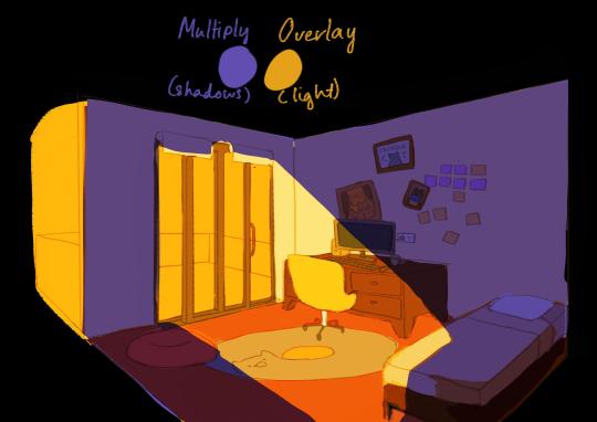
colour tests for apartment setting, testing out different colours for warm lighting and cool shadows


earlier colour tests based on colour palettes suggested by jehudah
0 notes
Text

Character Turnaround adjusted for interim crit- less rounded face. Introducing easier to draw shapes ie. triangle noses


~Katherine
Final Turnaround design combined appeal of initial design with sensitivity of interim – Adjusting human to look closer to poet (trying to avoid any anglo-saxon misinterpretations) and cat to suit storyboard transitions.
0 notes
