Don't wanna be here? Send us removal request.
Audio
This is the remix I’m turning in for my final. The write up explaining my process is next to follow. Both are aspects of my final project.
0 notes
Photo
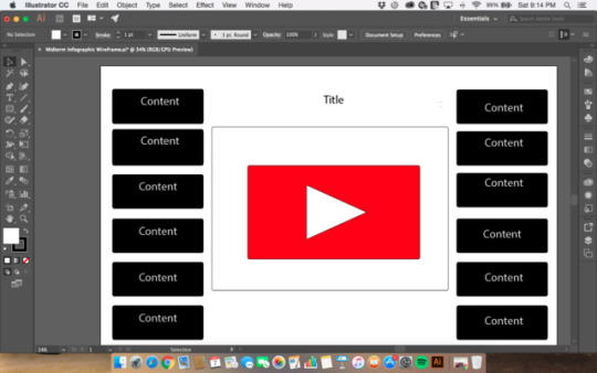
This is the finished wireframe I chose for my infographic midterm
0 notes
Photo

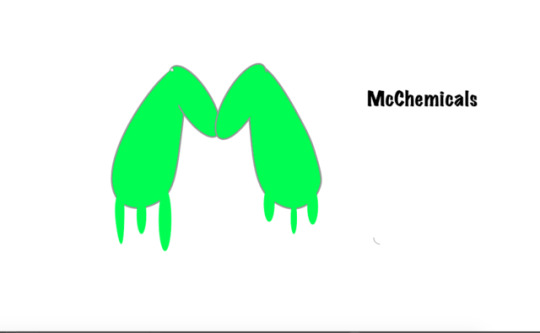
These are the sketches that I drew before picking my logo design. I ended up going with McChemicals. My original idea included unknown green fluid dripping from test tubes shaped ass McDonald’s green arches. I got the initial shape I wanted, however, after hours of difficulty trying to erase lines, fill shapes, and trying to create slime (even after youtubing multiple videos, I endd up just creating a slimy M hoping it would have a similar effect.
0 notes
Photo

This test was a lot harder than the color one. The test was unsettling because I couldn’t trust my eyes as it pertained to spacing.
0 notes
Photo
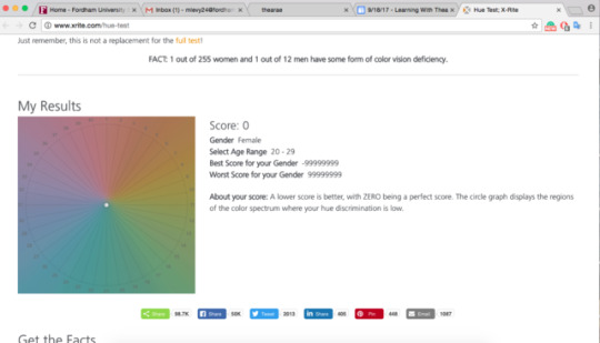
This color test was hard because it hurt my eyes after staring at it for a while. I’m surprised I got a perfect score because as it stated, the lighting made everything deceptive.
0 notes
Link

I’m not sure if this is a clickable link but I tried the link to the actual thing should be there
0 notes
Photo
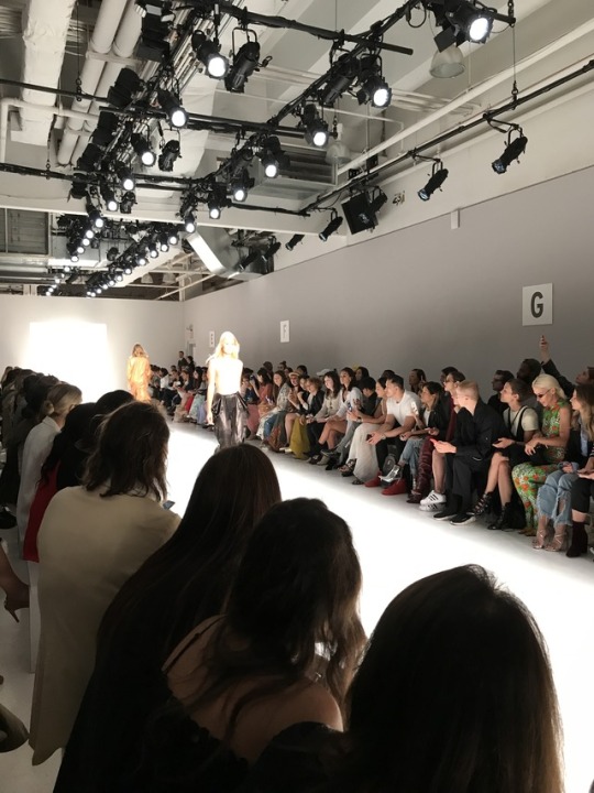
In relation to my last post about bad design, here is what I think is an example of good, or rather ‘better’ design, at NYFW. This design is better than the last because there aren’t giant pillars obstructing the view of audience participants. People can clearly see models, and the benches present, still give models a path to walk down. However, what still irritates me about this design, is that the benches are not elevated from back to front. This inhibits people in the third and fourth rows from seeing as clearly as they could.
0 notes
Photo
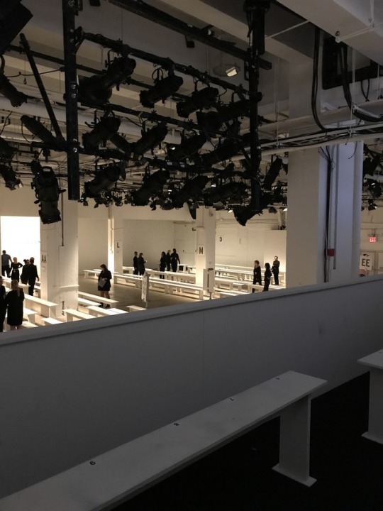
I recently went to NYFW and wanted to showcase the structure of this gallery showroom as an instance of “bad design” for homework. I think it’s bad design because of the numerous ways views of the designs being showcased are obstructed due to the pillars that are present throughout the room. Not only do these pillars obstruct the view of the audience present on the floor, but it really obstructs the view of those sitting in the balcony. There is a giant pillar, that audience members sitting in the balcony, have to deal with blocking their view. These pillars are not necessary to give models paths to walk during the show because the benches do that, given where they are placed, on their own. The only purpose the pillars serve is giving an added place to label sections. However, that could’ve been done without the pillars as well. This is also bad design because the benches in balcony and on the floor are not elevated in any way so that those who are not in the front row are able to see.
0 notes

