Note
Stumbled across your art recently, and I totally admire your work! As a complete noob to the digital art scene, I'd just like to ask whether you have any tips on colour picking (like for skin tones, under varied/dramatic lighting and such!). I have a ton of other things I want to ask, but I'll limit myself to one question and then try to google the rest, haha/ Thanks for sharing your art with us! ^^
ahh thank you so much! ♥ welcome to the digial art scene friend, i hope you enjoy your stay and ctrl + z
now onto your question! (if you don’t know what layer and layer modes are and how they generally work you should probably google that before you continue reading)
we all perceive colour differently (thx science) and i trust my intuition a lot when it comes to colour picking because of that, and also because i feel like you can make pretty much every colour combination work within the right context. context is key! but still, remember that all of this is about how i perceive colour, so you might not agree with everything i say.
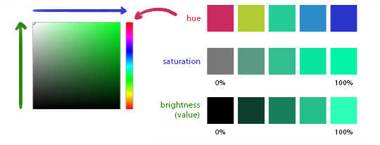
here’s a quick rundown of terms you’ll see around a lot in reference to colours and shading: the hue, which is the ‘colour’ itself, the saturation aka the intensity, and the brightness [or value] which describes how dark or bright we perceive a colour to be.
rule of thumb: when you shade don’t just add black (or white) to your base colours, that will make your drawings boring and lifeless. use different hues and saturation!
now first things first: which skin colour does the character have?
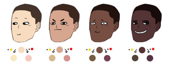
you’ll mostly be navigating in the red to yellow spectrum for the skin tone. so when i pick the base colours i usually start with the skin and adjust the rest of the colours accordingly. if you’re not sure where to begin it might help if you first determine the values (brightness) of the base colours in grayscale.
and here are a few colour variations—i stuck to the approximate values but played around with a lot of different hues and levels of saturation.
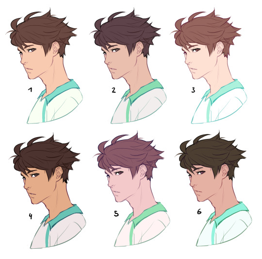
now compare 3 and 5: you’ll notice that 3 is very bright and leans towards orange hues, whereas 5 has a pinkish tint.
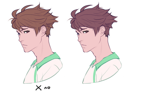
on the left i gave 5 the hair colour of 3 and in my opinion the pink hue of the skin doesn’t go well with the orange undertone of the hair. you’ll have to experiment a lot to find out which combinations work for you.
ctrl + u is your biggest friend (or image >> adjustments >> hue/saturation in photoshop, the shortcut works in sai and clip studio paint too). play with the sliders and see what happens. i do that a lot myself, because it’s easier to coordinate the colours like that afterwards instead of trying to manually pick perfectly matching ones right away.
for further adjustments i like to use an extra semi-transparent layer on top of everything with just a single colour to add atmospheric light. this unifies the colours and makes them more harmonious, if that’s what you’re looking for. this is about as far as i’d go if i didn’t want to shade the drawing.
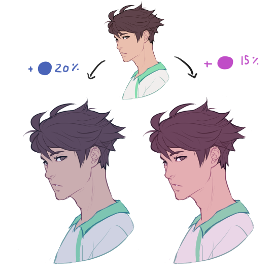
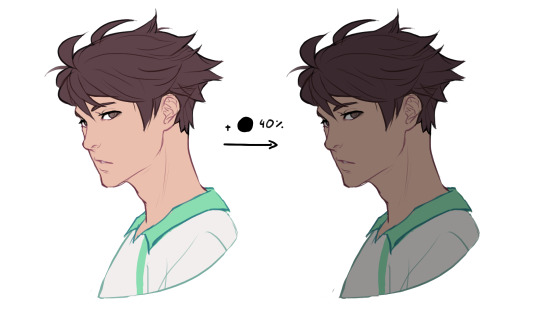
if i do want to shade, especially with high contrasts and dramatic light, i darken the base by just adding an additional black layer, here set to 40% opacity. of course you could add a colour layer like the ones i mentioned previously too.
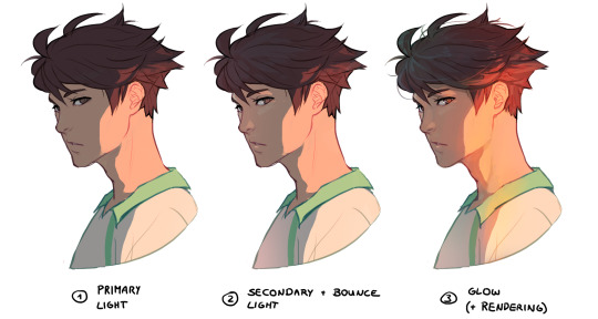
to create an impression of dramatic light you need a high contrast between light and dark areas (1). if i want additional visual intrest i often add secondary light which falls onto the main shadow areas. here i picked a faint greenish blue to balance out the yellow (2). and since light is at least partially reflected when it hits a surface you should add a faint glow that goes across the shadow/light border. i uses a mid-brown with a very soft brush on a layer set to overlay here (3).
for this shading style i like to use the layer mode colour dodge with lowered opacity + fill settings. for some layer modes opacity and fill do the exact same thing (e.g. for multiply or screen). however for colour dodge there’s a big difference:
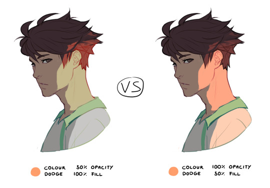
a lowered opacity merely alters the transparency of the entire layer. that looks pretty awful sometimes, because the bright orange affects the dark of the hair much more intensely than the already brighter skin. but when you lower the fill percentage you primarily lower the amount of light that falls onto darker colours. so the layer’s opacity setting treats every colour equally whereas the fill setting takes their values into consideration. it might be hard to understand if you don’t try it out yourself, so just play around to get a feel for how it works!
and to summarise, here’s a process gif:
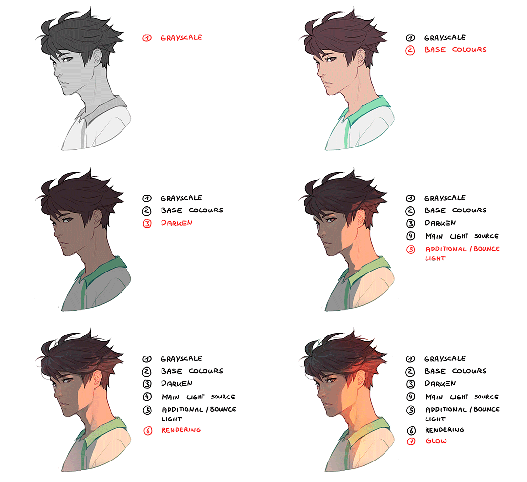
colour is an extremely big topic and i’ve only barely scratched the surface but i hope that still helped you out a little! the fastest way to learn is always to try things yourself, so grab a sketch and experiment. 👍
91K notes
·
View notes
Photo
This is literary what my two last brain cells do.
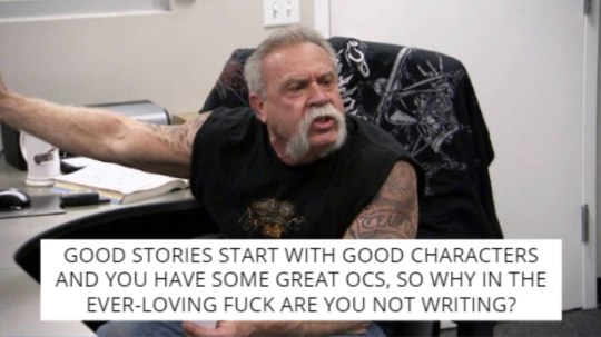
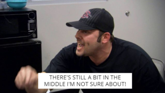

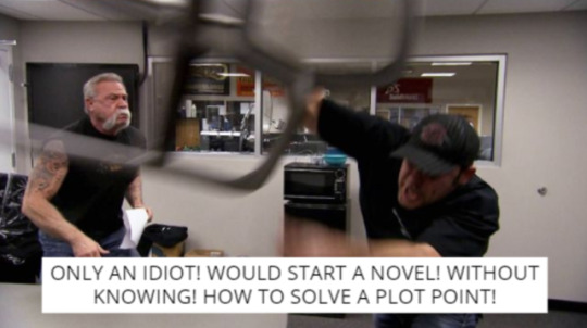
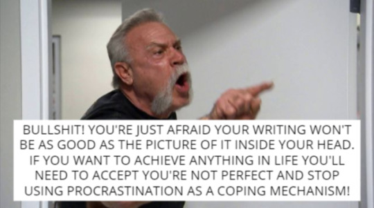
when you’re trying to write and your last two functioning brain cells start yelling at each other
223K notes
·
View notes
Text
40K notes
·
View notes
Text
27K notes
·
View notes
Photo


.。.:*・ daisuga matching icons ・*:.。.
like/reblog if you save
© on twitter @mewseok
credits to artists
4K notes
·
View notes
Photo


‘We’re like the blood in our veins. We must flow without stopping. Keep the oxygen moving and your mind working…’
ー Kuroo Tetsurō 🐱 Happy Birthday!! (Nov.17) ❤️ ❤️ ❤️
3K notes
·
View notes
Text
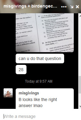
I’m screaming someone DMed me asking for me to help them with their homework
63K notes
·
View notes
Photo


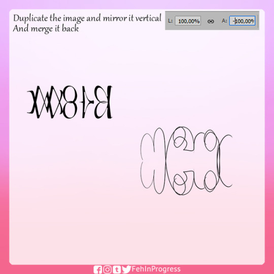


Hello! I did this on stream yesterday and then promissed a proper tutorial, I hope this was usefull, feel free to send me an ask if you have any questions!
It is a very simple tecnique that can bring a lot of details to your piece!
I want to do more tutorials, so if there is anything that I do that you would like to know the process, or just anything in general, please let me know!

10K notes
·
View notes
Text
Top 12 alternatives to Photoshop for digital painters and illustrators
Hello there!
Yes, we haven’t done this in a while… but our inbox and chat are swamped with questions on the subject, so this article was very much needed.
it’s a simple list of art apps, but we know you love those :D
Enough with the intro, here it is, a list of twelve art apps you may want to check out.

ArtRage is an art program for beginners and professionals. With its minimal interface, it’s easy to keep the essential tools at hand without stealing space from the canvas. Panels can be moved around and tools can be customised. We all know how important it is for digital artists to be able to modify brushes!
Pros: easy to use; friendly interface; essential tools from professional apps available; available for iOS, Android, Windows and Mac
Cons: it may get sluggish with big files and when using big brushes, but performances also depend on the running machine; limited selection of editing tools if compared to Photoshop - ArtRage is more of a painting program rather than an editing one.
Paid
ArtRage Lite is a different version at a cheaper price, mostly for beginners, but also for professionals if they need the essential.

Now free, Sketchbook is the famous app created by Autodesk for various platforms.
Pros: clean, friendly interface; easy to use; professional features
Cons: lack of official tutorials; doesn’t offer as many tools as other apps (it’s down to the essential); paid subscription in Adobe style for the pro version
Free and paid

Black Ink is a powerful little program few actually know, but there’s a reason: this isn’t your classing drawing app. What’s cool about it is the vast selection of special brushes, completely non-realistic, and definitely able to boost your creativity.
Pros: vast selection of customisable brushes; excellent performance
Cons: not very easy to use; non-intuitive interface
Paid

This is probably the most complete software for painting, drawing and animation. It was originally known as Manga Studio, but with its updates and addition of features, it became Clip Studio Paint.
This doesn’t say much about the quality of the features themselves considering the affordable price (if you haven’t used the app yet, that is), but among graphic apps, this one is the top seller.
Pros: professional features for illustrators; layout tools for comic/manga artists; 3D reference models; customisable tools; various sales with special prices
Cons: the interface may not appear intuitive at first; the program may lag (again, performance also depends on the running machine)
Paid

GIMP is the famous open source image editor originally created for GNU/Linux and available for OS X and Windows.
Best known as Photoshop’s main competition, this is a manipulation program for both beginners and professionals who love design.
It offers many professional features, making the program a powerful tool.
Pros: professional editing tools; supports different formats; supported by different platforms; active community
Cons: in spite of the simple design, many options are hidden and it takes time to discover all the features; slow startup
Free

Krita is an open source painting app created by artists for artists.
Pros: easy to use; intuitive interface; great brush workflow; brush stabilizer; customisable brushes; general good performance; very enthusiastic, although small, community
Cons: it may be slow or even crash depending on the running computer and the app’s version; very few editing tools compared to Photoshop
Free

MediBang Paint is a free and light app for drawing and painting, perfect for manga and comic creation.
Pros: vast selection of brushes; cloud sharing; friendly, minimal interface (non-desktop app); also available for iPad, iPhone and Android
Cons: requires an account to use all features; non-intuitive interface (desktop version)
Free

Mischief is a sketching app with essential tools, useful for brainstorming and ideation.
Pros: infinite drawing canvas; friendly interface; easy to use; cheap pro version
Cons: few updates; offers only the essential (but that’s the point); no editing/adjustment tools
Free and paid

Corel’s jewel, Painter is the most famous software that offers digital tools able to give a traditional feel to brushes and canvas.
Pros: different selection of media; many professional features; PS-friendly
Cons: certain brushes may work slow; not easy to use at first; the software may crash (this is the most common report); pricey
Paid

Paintstorm Studio is a professional software for digital painting. It’s focused on the use of brushes and blending, which makes the software a little gem in the digital painting field.
Pros: good brush workflow; brush stabilizer; “close gap” feature; customisable interface and tools; professional features; affordable price
Cons: non-intuitive interface (desktop version)
Paid

Procreate is the powerful drawing app for iOS.
With the very sensitive Apple Pencil, Procreate is so easy to use that many artists chose the iPad over the most famous graphic tablets.
Pros: friendly interface; makes it easy to organise files; excellent brush workflow; customisable brushes; video recording; affordable price
Cons: hidden features; only available for iPad
Paid

SAI is a simple app for artists who want to focus on painting and drawing.
It’s well known for its good pressure support and its essential tools for manga artists, but SAI can be used by any kind of artist who wants to paint.
Pros: easy to use; friendly interface; light software; customisable brushes; tons of (non-official) tutorials
Cons: limited selection of tools, even basic ones; limited canvas sizes and uses; it might crash from intensive work, especially with big canvases and brushes; supports only RGB colour mode; lack of support
Paid
We hope you’ll find this list useful.
If you think there are other apps that should have made this list, don’t hesitate to let us know!
Thank you and peace out,
G&M
Buy us a coffee ❤
Other articles:
10 inspiring and helpful YouTube channels for digital artists
6 inspiring Art Podcasts for digital artists
7 amazing Photoshop extensions and tools for digital artists
87K notes
·
View notes
Text
hey guys! i love bakugou katsuki
77 notes
·
View notes
Link
O forgot how to breath father seeing this. #Monsta X #Kihyun #Shineforever
0 notes


