Expression in Typography: How can Typography be used as an Expressive form of Art and Communication?
Don't wanna be here? Send us removal request.
Text
Painting - Watch Me As I Fade Away
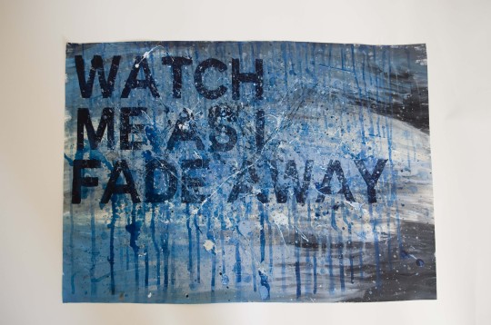

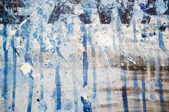
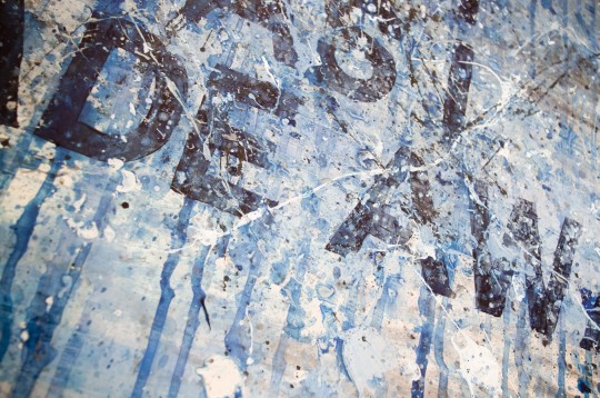
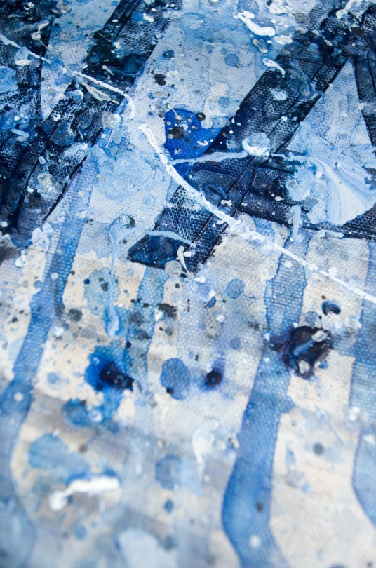
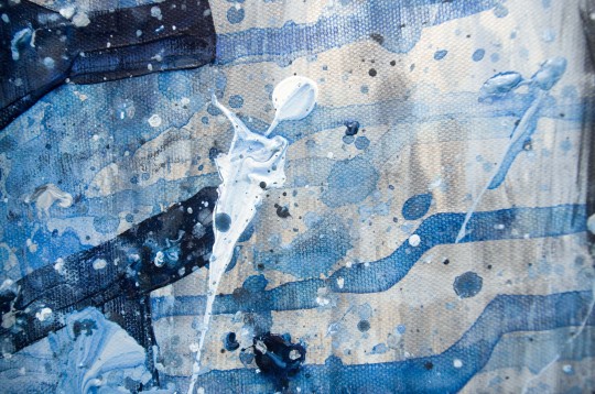
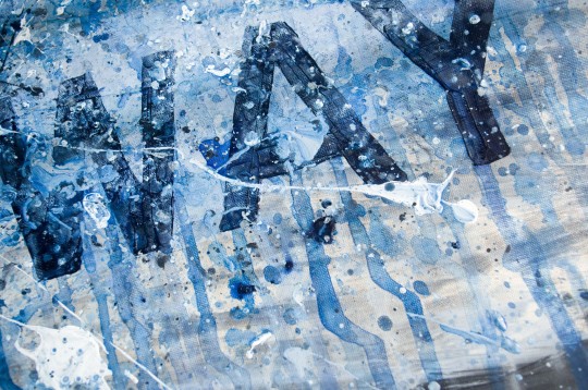
The idea of this was to create a cold and depressive appearance. The shades of blue mixed with white and black water marks from painting and then spraying the canvas with water works really well.
The bold san serif text was used to create a seriousness feeling to the overall composition, as it is not a light hearted subject matter, I decided to paint the text very roughly with prussian blue paint and then once it was dry i continued to splat more paint and water onto the canvas in order to create the desired effect.
I tried to cover up most of the text with paint splats and water markings so that the text did start to disappear like the phrase suggests. The phrase watch me as i fade away was used to represent the idea of someone fading into the background, in a state of cold emotion. I did have an idea of fading in the text but this felt like the far too obvious choice for the phrase, so I decided to layer up more different shades of blue, white and black paint splats over the letters in order to create the desired effect,
The water marks were also used as the colours is seen to be dripping down the canvas and fading, so this also really helped to back up the overall concept of the canvas.
0 notes
Text
Painting - Love
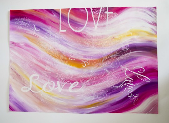
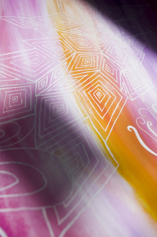
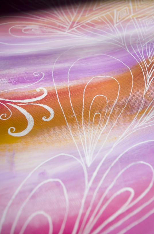
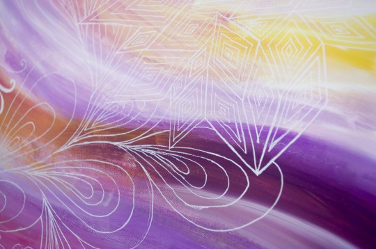
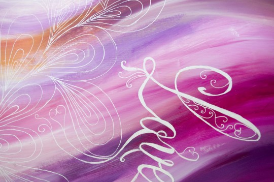
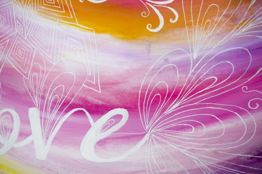
The waves of colours in this idea where used to represent the idea of waves and different values of love; which was also the idea for having three different fonts used in this composition as love is different to every person.
I decided to use colours such as pinks and purples as they represent the different levels of love and passion, and yellow to represent the happiness that we can feel when love occurs.
The white letters I feel works much better than the original idea of using a darker text as I feel that this helps to create a much softer appearance compared to a dark harsh lettering, which I feel now looking back would really ruin the composition completely. I also decided to draw shapes that can represent love on the canvas and all three of these different symbols appear on the three different typefaces, also helping to convey the idea of different aspects of love.
The diamond shapes were inspired by the idea of engagement and wedding rings often including diamonds, and the leave shapes to represent nature and an aspect of love hearts can be displayed. Love hearts felt like far too traditional aspect to include and far too cheesy. I wanted to create a much more abstract look and feel to the overall appearance.
0 notes
Text
Painting - Crazy
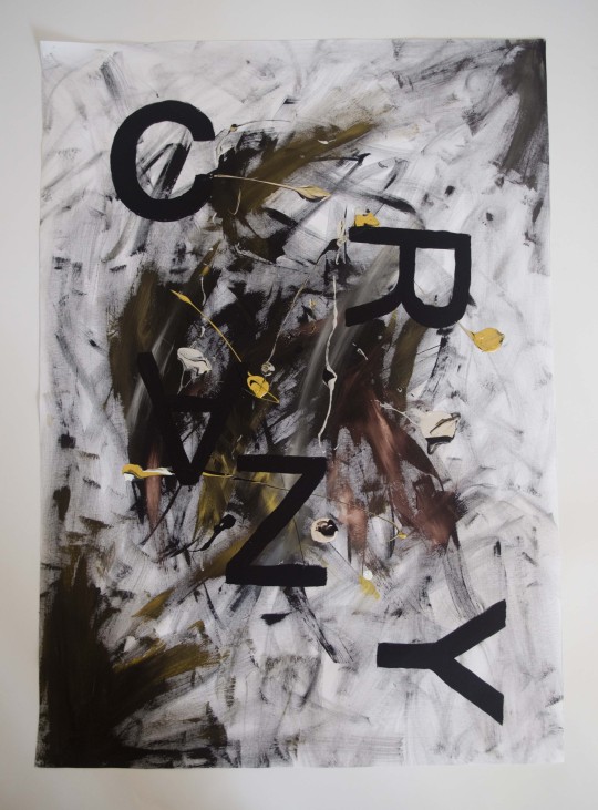
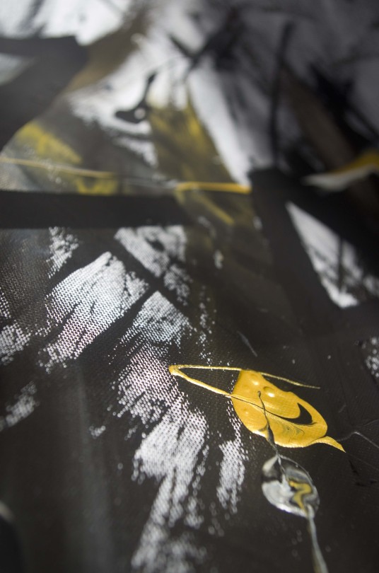
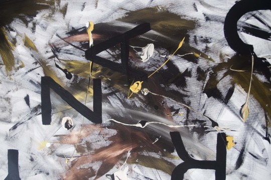
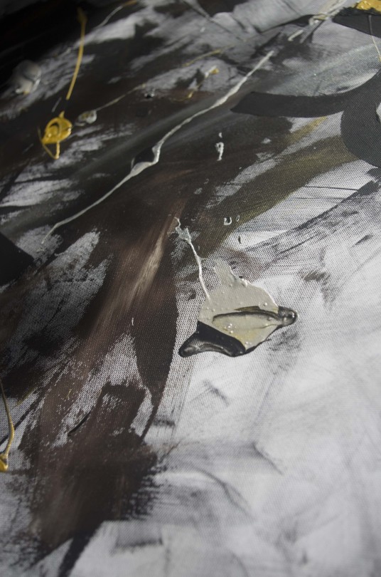
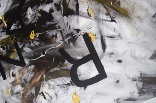
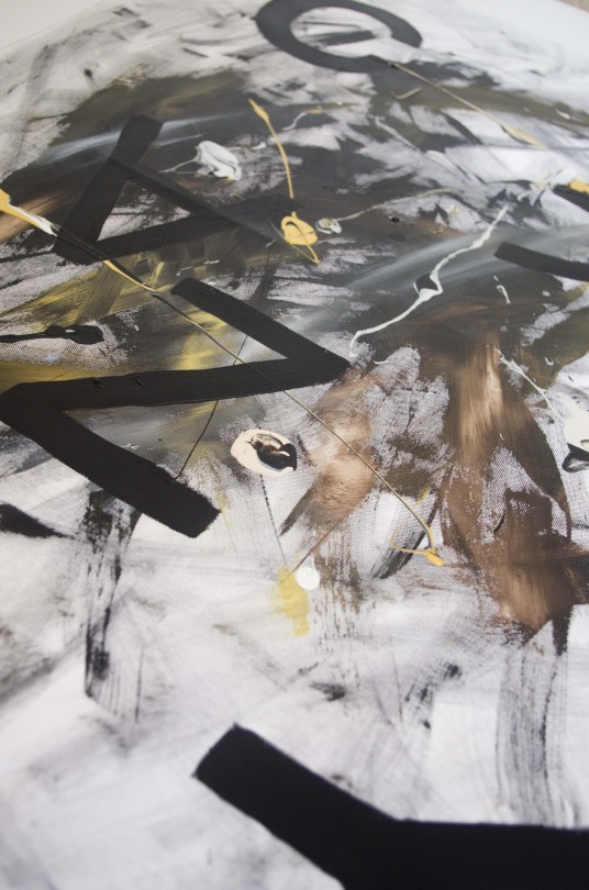
This composition I feel works really well. I decided to use darker colours with aspects of gold and bronze throughout in order to create the impression of crazy being displayed as a dark idea. I decided to use a san serif bold font, changing the thickness of the letters in certain areas of the canvas.
I didn’t want to use a lot of bright colours in this composition as I felt that it does not best represent the concept of craziness. The letters being scattered in a random fashion as well I think also works well, as crazy feelings and actions can happen at any time and anywhere.
I really like the darkness to this appearance. It really helps to create a much more abstract appearance.
0 notes
Text
Painting - Beauty
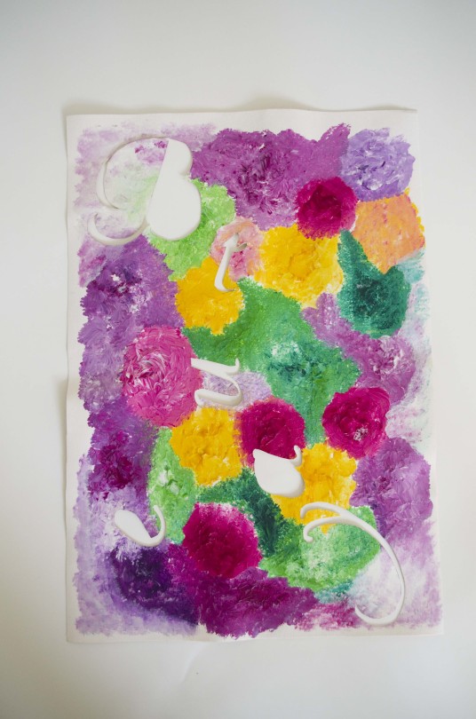
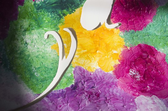
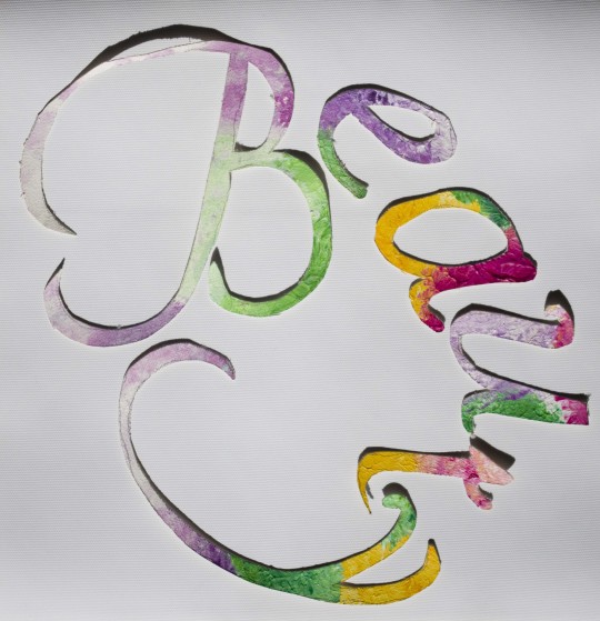
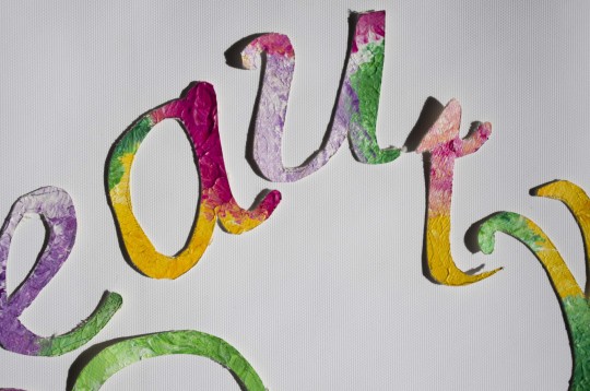
The overall idea of this canvas was the idea of nature being a beautiful aspect of life. The painting style of dabbing heavily different colours together and blending them together was to represent the different colours found in a garden. The different colours of paint were composed in circular areas that could aim to look like flowers, mixed in with greens.
I really liked the development processes of cutting letters out of the paper paintings i created, so I wanted to try this out with a canvas style as well. I really liked the idea of creating two pieces of work out of this idea, one with the cut out canvas letters displayed on a plain white canvas and one with the whole painting with the cuttings of the letters.
I really like how both of these final pieces create completely different appearances but both visually interesting and creatively representing a nice view of the word.
A script font was used for the creation of these pieces, as it resembles handwritten words, which is also a natural thing in life.
0 notes
Text
Sculpture - Relaxing

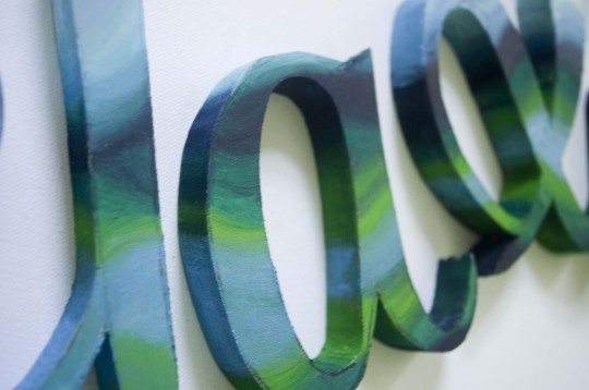
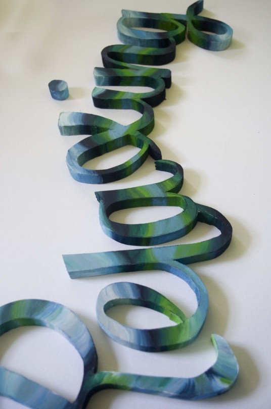
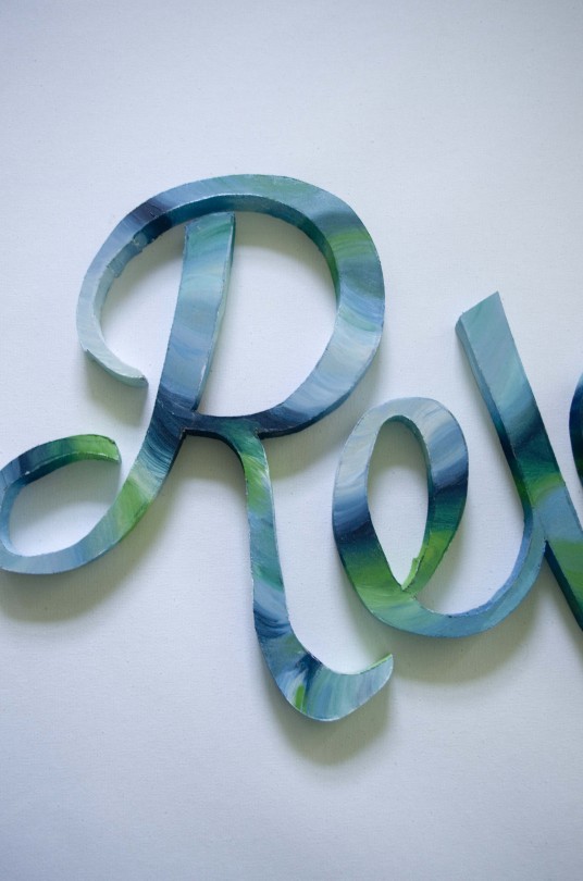
The overall inspiration for this composition was waves from the beach being viewed as relaxing. I picked a scripture decorative font and skewed the angle of the text slightly to create a wave flowing.
The flowing effect I also wanted to aim to show in the painting style of this word. I decided to use different shades of blue and green with hints of white for highlights and blending in order to create an appearance that could represent waves of water, flowing through letters.
The overall appearance of the composition I think works great with the word being represented in the painting technique on the letters. The use of the colours blending I think is also representative of water shining through water, as we can often see different shades and tones through light.
0 notes
Text
Sculpture - Happiness

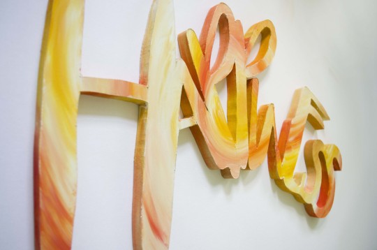
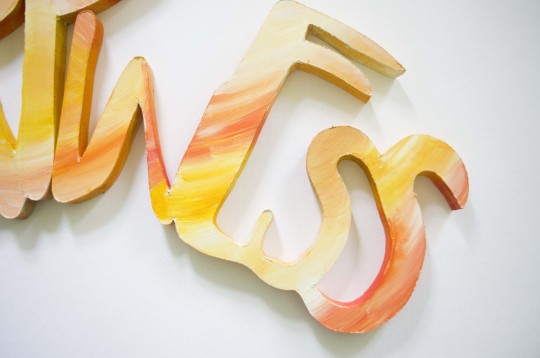

The typefaces that I was looking for in this composition was one that could appear bouncy and chirpy, in a decorative hand written sort of style but also that could look child like as during different levels of happiness we can act like children. I wanted the composition to be crammed together more than the others because happiness can be an overwhelming feeling sometimes, so to represent this aspect, the letters being much closer together I think works really well.
The colours used in this composition follow yellow and orange tones with aspects of white highlights throughout used for creating highlights and blending. I wanted to create a flowing appearance but circular feel to the painting technique so that the yellow could also be representative of the sun, to also create a summer style feeling to the whole composition.
0 notes
Text
Sculpture - Envy
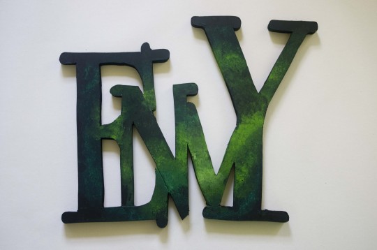
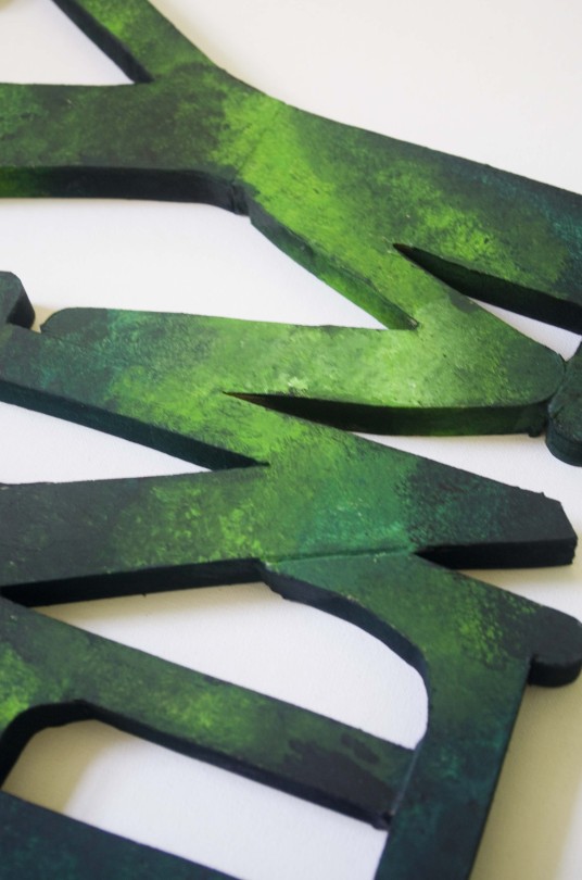
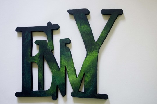
For the word Envy, the overall appearance that I wanted to create was a elegant and sophisticated approach. The different shades of greens mixed together works well in creating a smoke sort of effect, which I think really works great with the overall look and feel. Green was used in order to represent the aspects of jealousy.
The composition I feel works much better with all of the letters being upper case, compared to lower case like in the development ideas. The painting technique was created by just coating the paint brush in a mixture of colours and then dabbing the paint brush roughly all over the word.
A formal looking typeface I feel would work much better for this sort of composition, so a serif font was used in order to provide this elegant appearance. I wanted the appearance to look sort of mystical, which was the main reasons for the paint style.
1 note
·
View note
Text
Sculpture - Anger
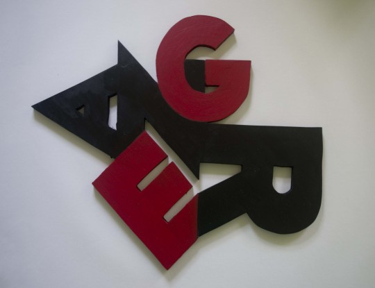
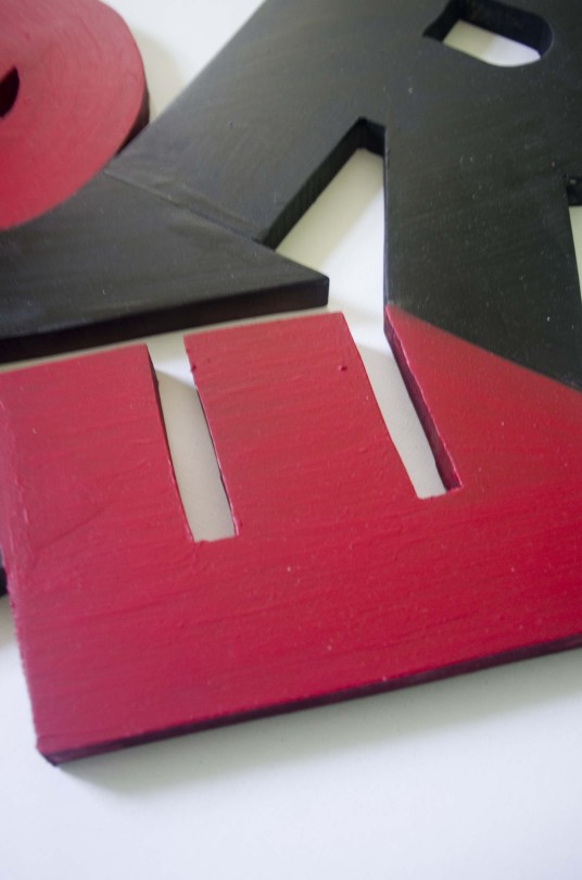
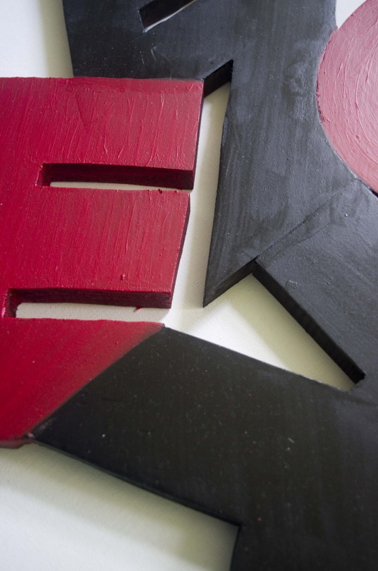
For the appearance of anger, I wanted to create a sharp angled and zagged feeling, with the way in which the letters are positioned and combined together. I really do prefer the two letters being red compared to the paint splats all over the composition. I feel that this also helps to create a different sort of appearance to the other final outcomes that I have as well.
The idea for the composition was that anger can be based upon different levels and of different strengths, so this was the reason for the letters being combined together but based upon different levels. Only having two of the letters as red I feel works better than having the whole composition as just red.
The font choice had to be bold and strong as anger is a very bold and strong emotion. I decided to go for a very bold san serif typeface which had some really sharp points in places which worked really well in combining the letters in a composition together and I feel that this really helped much more to convey the overall appearance. Although the painting style may be much more simple than the development idea, I feel it works a lot better in displaying a clean appearance.
0 notes
Text
Final Outcomes - Sculpture
These are the final Outcomes for my sculpture part of the project


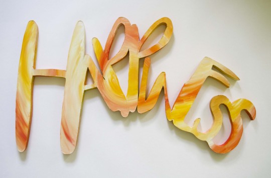
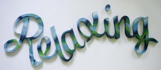
0 notes
Text
Final Production - Paintings
The canvases for crazy and beauty are also complete now, so I am going to start cutting the canvas for beauty so that the letters come out of the canvas, so I can possibly use them for a smaller display. Crazy is also getting the letters projected on to it so that the overall form is accurate.
0 notes
Text
Final Production - Paintings
I also started painting my canvas for ‘Watch me as I fade away’. I wanted a very cold, depressive look to shine through this piece. I projected the words onto the canvas so that I also got the form of the letters as accurate as possible.
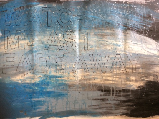
The overall look appears to be very plain at the moment but once I have coloured the text in a very dark blue and layered up more paint splats and threw more water at the canvas, the overall look will come together much better.
0 notes
Text
Final Production - Paintings
I started off with painting the canvas for love. I really do love how the colours blended together to create this appearance. I think it works really well with the concept that it holds. I drew roughly onto the canvas once the paint was dry, three different styles of the word love, which were to also include different symbols that can represent love.
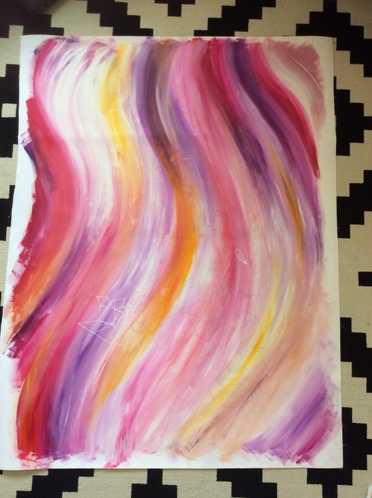
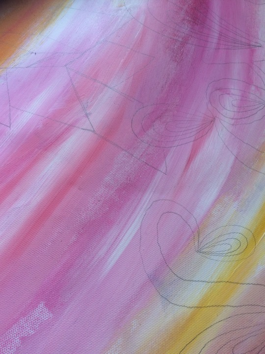
These were just so that I had some sort of guide to follow for the text so that the form was accurate. I had originally decided that going over the canvas with a dark pen would help the imagery to stand out, but I decided against that as I felt the appearance would be too harsh so I went for a white pen instead, so that the appearance was much softer and complimentary to the concept of the canvas.
0 notes
Text
Painting Final Ideas
After performing some idea testing in my sketchbook, I have picked the final ideas that I am aiming to show through the paintings.
Love - Pinks purples and yellows all in a swirl style with text above the paintings with shapes and objects that can represent abstract forms of symbolism to love
Cold - Mainly blue, black and white mixed together with paint splats and water paths around the canvas with the text ‘ Watch Me As I Fade Away’ in bold text, but to be covered with more paint so that the text is not so bold and in your face.
Crazy - Black and gold tones mixed together with lots of the canvas shining through. Bold text positioned in a random formation around the canvas, all facing different ways and portrayed at different angles
Beauty - Letters cut out of a canvas which is painted by dabbing the paint brush all over the canvas with thick areas of paint used to mix colours together. Using colours that can be representative of flowers in a garden, so bright pinks, greens and yellows.
0 notes
Text
Overview of Photography with Stencils
As fun and enjoyable as this was, the results that I gained I do not think really fit the project that well with what I already have as final pieces and what I am aiming to achieve. I do not think the test fits expressive typography in the way I am aiming to display artwork and text together so I will be focusing more now on painting canvases rather than painting with light.
0 notes
Text
Photography with Stencils
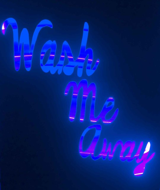
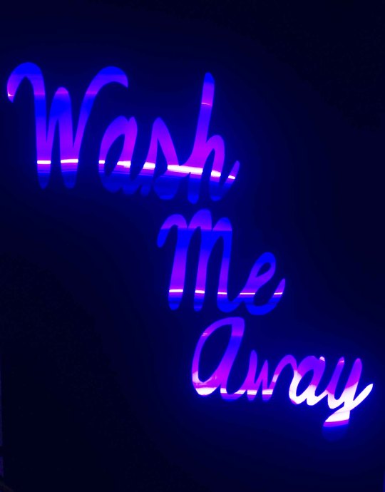
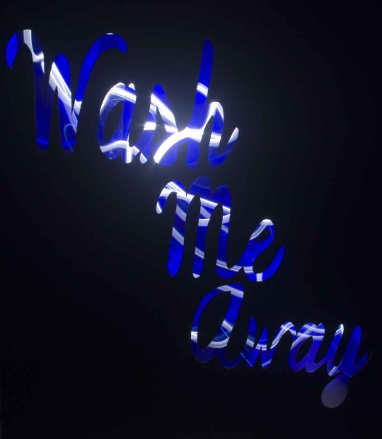
These were the results that I gained from the other stencil. As the phrase can be representative of waves of a beach, I used the colour blue as the predominant colour throughout and experimented with mixing with different torches in the process.
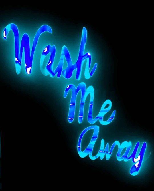
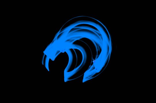
This image was aiming to get an organic display of waves.
0 notes
Text
Photography with Stencils
I decided to continue with my idea of using the stencils with the long exposure photography. I decided to try the word ‘Nature’ and also the phrase ‘Wash Me Away’.
The idea that I had was to capture the words with the stencil and then create it in a composite image to try and give off an image of that word in a habitat that would represent its meaning or give off an expressive display.
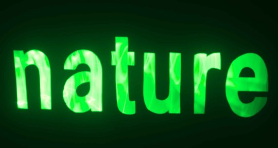
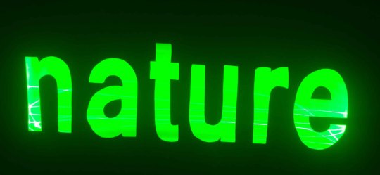
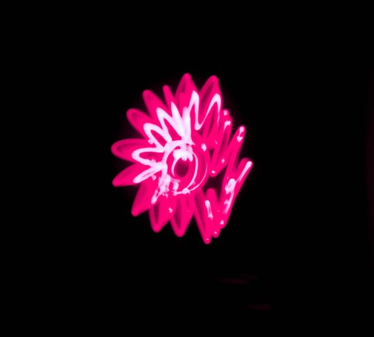
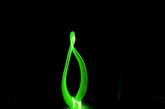

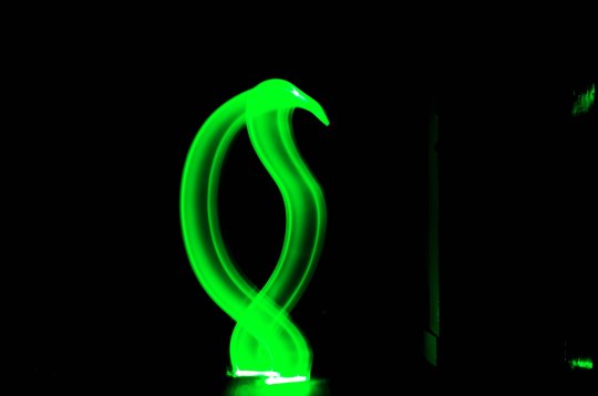
I tried to create organic shapes that might of been representative of leaves and flowers. As of yet, I am not very happy with the results so I am going to try the next stencil to see if I feel any better about it.
0 notes
Text
Mentor Meeting 11/04
After the easter holidays our mentor meetings resumed as normal. I took photographs of the work that I had been working on so far, and the two complete images of Anger and Relaxing. The feedback I received was very positive and my mentor said that the standard of work was much better. This gave me the drive to carry on with the ideas that I had and get the work completely finished to a very high standard. At this stage, I have also completed the stencils for the light trail photographs. I am still not entirely convinced that these will be worthy of being a final piece but I will test out the idea anyways and see what comes of it.
0 notes