
Don't wanna be here? Send us removal request.
Statistics
We looked inside some of the posts by nmp-rebeccacallaghan and here's what we found interesting.
Average Info
Notes Per Post
1
Likes Per Post
1
Reblog Per Post
0
Reply Per Post
0
Time Between Posts
1 day ago
Number of Posts By Type
Text
17
Last Seen Tumblr Blogs


Fun Fact
Tumblr.com rank in the US is 25.
Text
Bibliography
References
Abrams, M. (1959). The teenage consumer. 1st ed. London: The London Press Exchange Ltd.
BBC Documentary - Hells Angels - London. (1973). [video] London: BBC.
Birmingham.ac.uk. (2012). The Birmingham Centre for Contemporary Cultural Studies: connected collaboration, connected communities and connected impact. [online] Available at: http://www.birmingham.ac.uk/schools/historycultures/departments/history/news/2012/cccs.aspx [Accessed 24 Apr. 2017].
Brill, D. (2008). Goth culture. 1st ed. Oxford: Berg.
Changingminds.org. (n.d.). Masks. [online] Available at: http://changingminds.org/explanations/identity/masks.htm [Accessed 26 Apr. 2017].
Cohen, A. (1955). Delinquent boys. 1st ed. Glencoe, Ill.: Free Press.
Daoust, P. (2003). Great painters have always agonised over framing their work. [online] the Guardian. Available at: https://www.theguardian.com/artanddesign/2003/jan/02/art.artsfeatures [Accessed 8 May 2017].
Dishneau, D. (1994). Yuppie Bikers: Reborn to Be Wild : Lifestyle: The beloved steel steed of the blue-collar crowd is now coveted by cellular-phone types--and by speculators.. [online] latimes. Available at: http://articles.latimes.com/1994-09-25/news/mn-42638_1_yuppie-biker [Accessed 4 May 2017].
Dove, R. (2014). How to frame and hang pictures. [online] Telegraph.co.uk. Available at: http://www.telegraph.co.uk/lifestyle/11182524/How-to-frame-and-hang-pictures.html [Accessed 2 May 2017].
Elliott, A. (2014). Powerful double-portraits seek to challenge social stereotypes. [online] Mail Online. Available at: http://www.dailymail.co.uk/femail/article-2777122/Photographer-creates-powerful-portraits-nurses-pastors-CEOs-dressed-terrorists-thugs-vagrants-challenge-social-stereotypes.html [Accessed 4 May 2017].
Fauquet-Alekhine, P. (2016). Clothing-based Discrimination at Work: The Case of the Goth Subculture. British Journal of Education, Society & Behavioural Science, 13(4), pp.1-16.
Frank Habicht. (n.d.). Permissive Paradise. [online] Available at: http://www.frankhabicht.net/permissive-paradise/ [Accessed 3 May 2017].
Furlong, A. and Guidikova, I. (2001). Transitions of youth citizenship in Europe. 1st ed. Strasbourg: Council of Europe Pub.
Gander, K. (2017). People with mental illness reveal the common misconceptions of depression. [online] The Independent. Available at: http://www.independent.co.uk/life-style/health-and-families/mental-illness-anxiety-depression-rudeness-eye-contact-cancel-plans-social-interactions-a7658171.html [Accessed 26 Apr. 2017].
Gelder, K. and Thornton, S. (1997). The subcultures reader. 1st ed. London: Routledge.
Gilden, B. (n.d.). Faces. [online] Bruce Gilden. Available at: http://www.brucegilden.com/ [Accessed 2 May 2017].
Goldman, V. (2014). Never mind the swastikas: the secret history of the UK's 'punky Jews'. [online] the Guardian. Available at: https://www.theguardian.com/music/2014/feb/27/never-mind-swastikas-secret-history-punky-jews [Accessed 24 Apr. 2017].
Hart, L. (2014). Are tattoos a stain on your job prospects and career?. [online] the Guardian. Available at: https://www.theguardian.com/careers/careers-blog/tattoos-workplace-job-prospects-career [Accessed 26 Apr. 2017].
Hodkinson, P. (2002). Goth. 1st ed. Oxford: Berg.
Huq, R. (2007). Beyond subculture. 1st ed. London: Routledge.
Jacobs, B. (2016). Donald Trump a conquering hero for bikers at Rolling Thunder rally. [online] the Guardian. Available at: https://www.theguardian.com/us-news/2016/may/29/donald-trump-bikers-rolling-thunder-rally?CMP=fb_gu [Accessed 4 May 2017].
Jenkins, R. (2014). Social identity. 1st ed. New York: Routledge.
Jerome Taylor, N. (2013). 'The abuse has become a daily thing': punks and goths hail overdue. [online] The Independent. Available at: http://www.independent.co.uk/news/uk/crime/the-abuse-has-become-a-daily-thing-punks-and-goths-hail-overdue-recognition-8559181.html [Accessed 27 Apr. 2017].
Loftin, M. (n.d.). Myles Loftin Photography - HOODED. [online] Myles Loftin Photography. Available at: http://www.mylesloftinphotography.com/hooded [Accessed 4 May 2017].
Ltd, W. (n.d.). Mounting, Matting, and Framing | Reframing Photography. [online] Reframingphotography.com. Available at: http://www.reframingphotography.com/content/mounting-matting-and-framing [Accessed 3 May 2017].
Merton, R. (1948). The Self-Fulfilling Prophecy. The Antioch Review, 8(2), p.193.
Milestone, K. (1999). Youth culture. [online] the Guardian. Available at: https://www.theguardian.com/theguardian/1999/dec/18/weekend7.weekend5 [Accessed 3 May 2017].
Moiralovell.com. (2017). MOIRA LOVELL. [online] Available at: http://www.moiralovell.com/photo/2/2.html [Accessed 2 Feb. 2017].
Moss, C. (2015). Why don't young people want to be part of a tribe any more?. [online] Telegraph.co.uk. Available at: http://www.telegraph.co.uk/men/fashion-and-style/11624401/Why-dont-young-people-want-to-be-part-of-a-tribe-any-more.html [Accessed 3 May 2017].
Muggleton, D. (2014). Inside subculture. 1st ed. Oxford: Berg.
Newton, J. (2017). Gritty photos show the reality of Paris gang culture in the 1990s, as men proudly posed with guns and knives and smoked drugs on the streets. [online] The Sun. Available at: https://www.thesun.co.uk/living/2983981/gritty-photos-show-the-reality-of-paris-gang-culture-in-the-1990s-as-men-proudly-posed-with-guns-and-knives-and-smoked-drugs-on-the-streets/ [Accessed 27 Apr. 2017].
Pappas, N. (2015). The Philosopher's New Clothes: s: The Theaetetus, the Academy, and Philosophy’s Turn against Fashion. 1st ed. Routledge.
Petridis, A. (2014). Same but different: Hans Eijkelboom’s tribal street photography. [online] the Guardian. Available at: https://www.theguardian.com/artanddesign/2014/oct/23/hans-eijkelboom-street-photography-tribes-people-twenty-first-century [Accessed 2 May 2017].
Phillips, W. and Cogan, B. (2009). Encyclopedia of heavy metal music. 1st ed. Westport, Conn.: Greenwood Press.
Rebel Without A Cause. (1955). [DVD] Directed by N. Ray. Warner Bros.
Rosenberg, A. and Neilstein, V. (2015). Things Elitist Metal Fans Say | MetalSucks. [online] MetalSucks. Available at: http://www.metalsucks.net/2015/02/18/things-elitist-metal-fans-say/ [Accessed 3 May 2017].
Rushworth, S. (2011). EXCLUSIVE - SEPULTURA INTERVIEW - RUSHONROCK. [online] RUSHONROCK. Available at: http://rushonrock.com/2011/07/18/exclusive-sepultura-interview/ [Accessed 3 May 2017].
Sabean, R. (2012). 'Men-Ups': How I Got The Idea For My Gender-Bending Photo Series (PHOTOS). [online] The Huffington Post. Available at: http://www.huffingtonpost.com/rion-sabean/men-ups_b_1292365.html [Accessed 4 May 2017].
Sieczkowski, C. (2014). 'Judging America' Photo Series Captures Nation's Stereotypes. [online] The Huffington Post. Available at: http://www.huffingtonpost.com/2014/09/30/judging-america-photo-series_n_5907966.html [Accessed 4 May 2017].
Soth, A. (2017). Sleeping by the Mississippi « Alec Soth. [online] Alecsoth.com. Available at: http://alecsoth.com/photography/?page_id=14 [Accessed 26 Apr. 2017].
Sparks, S. (2015). [online] Psychology Today. Available at: https://www.psychologytoday.com/blog/laugh-your-way-well-being/201510/the-masks-we-wear [Accessed 11 May 2017].
Stewart, R. (n.d.). Should We Insist on Eye Contact with People who have Autism Spectrum Disorders. [online] Iidc.indiana.edu. Available at: https://www.iidc.indiana.edu/index.php?pageId=472 [Accessed 26 Apr. 2017].
Stosuy, B. (2005). Heavy metal for hipsters.. [online] Slate Magazine. Available at: http://www.slate.com/articles/arts/music_box/2005/08/heavy_metal.html [Accessed 3 May 2017].
Subcultureslist.com. (2017). Subculture theory - Subcultural theory - subcultural substance. [online] Available at: http://subcultureslist.com/subculture-theory/ [Accessed 24 Apr. 2017].
Sumner, M. (2014). Photographer destroys racial stereotypes by showing photos of the same person as a 'stereotype' and as their real selves. [online] Lost At E Minor: For creative people. Available at: http://www.lostateminor.com/2014/10/02/american-photographer-creates-insightful-photo-series-racial-sexual-prejudice-united-states/ [Accessed 4 May 2017].
the Guardian. (2016). Visible Girls: London's subculture heroines then and now – in pictures. [online] Available at: https://www.theguardian.com/artanddesign/gallery/2016/may/11/visible-girls-anita-corbin-then-and-now [Accessed 2 May 2017].
Unlimited, H. (2015). The Dangers of Social Masks. [online] Human Unlimited. Available at: https://www.humanunlimited.com/blogs/blog/19073795-the-dangers-of-social-masks [Accessed 11 May 2017].
Wilkinson, R. (2010). How Judas Priest invented heavy metal. [online] the Guardian. Available at: https://www.theguardian.com/music/2010/may/20/judas-priest-rob-halford-british-steel [Accessed 3 May 2017].
0 notes
Text
Rationale, Artist Statement & Evaluation
Artist Statement:
Social Identity
‘Social Identity’ is a portrait series by photographer Rebecca Callaghan which focuses on challenging the negative perceptions that are associated with subcultures, specifically the metal subculture as well as the ‘uniform’ we wear in our everyday life.
By creating portraits of members from the metal community outside of their workplace, wearing what they usually wear in everyday life demonstrates defiance of the restrictions that are enforced in the workplace, this symbolises how we all wear a social uniform. This series offers viewers a chance to change their perceptions on the metal community by showing members from the metal community in a setting that is familiar to the majority of people, the workplace. Also that there could be people that they work with who are in the metal community but they aren’t aware because the workplace has a dress code policy. The series also offers viewers an inside perspective to those who are not apart of the metal community.
Callaghan is passionate about challenging these negative perceptions as she identifies with the metal community and has experienced first hand how these stigmas effect members of the metal community, such as verbal and physical abuse . The aim of this project is to enlighten and help towards the fight of ending discrimination and prejudice towards members of subcultures for being different than the rest of mainstream society.
The influences behind this project are the Sophie Lancaster Foundation, which focuses on campaigning to have the UK Hate Crime legislation extended to include people from alternative subcultures. Additionally other influences include Myles Loftin and his work ‘Black Hooded Boys’ which focuses on portraying young black males in a positive light rather than the negative stereotype that is attached to the group.
Rationale:
The reasoning behind my work is one of a personal nature, as I have experienced first hand the effects of what negative perceptions can do to a subculture I felt it was necessary to represent the metal community and to challenge these negative perceptions.
I chose to shoot portraits of people from the metal community as I had wanted to do this for a while but I didn’t have the confidence to do it as I wasn’t skilled in portraiture. Another reason behind wanting to shoot portraits of members of the metal community is that I feel that they haven’t really been represented in modern media, there is documentation of goths, punks and even chavs, however the metal community is one of the largest subcultures and I feel that it has largely been overlooked.
The fact that I chose to shoot outside of people’s work places is that I feel that some workplaces really restrict how it’s employees express themselves, as I have experienced and it makes you develop a false persona of who you are whilst you’re in work and strips you of your individuality by making all of the employees wear the same style of clothing.
Evaluation:
Overall I am really happy with how this module has turned out, I have thoroughly enjoyed producing work for this project, despite how nervous I was at the start.
I feel like I have improved immensely in both my physical work and my confidence as a photographer, and as a person. I had a really difficult time coming to terms with the fact that I had to go and meet people that I had never met and take photograph them. During the module I found out that I have a mild form of Aspergers which effects my social communication with people, and also social anxiety so to actually meet up with people that I don’t know is a tremendous milestone for me. I am disappointed with the fact that the paint didn’t stick to my magnets and flaked, hopefully I will be able to amend this before CREATE.
I am pleased with size of my images, despite wanting to print 6 foot high photographs, now looking back would have been really big, and I am glad that I have printed at half the size as I feel that it makes you look more closely at the images. Although the quality wasn’t what I was hoping for, it was the best that I could have got on a DSLR, I wish that I would have shot on a large format camera but I just didn’t want to jeopardize my images by not knowing how to fully work a large format camera.
Despite this I am so pleased with the outcome of my images and how much I have achieved and overcome in the short time since Advanced Research Strategies and how much I have grown technically. I am glad that I actually did what I wanted to do and didn’t let my nerves get the best of me.
0 notes
Text
11/05/17 - Text For Display
I decided to go with using vinyl for my titles of the images, and for my artist statement, I think that this method would look a lot better on the metal sheeting than phototext, as the metal sheeting would be coming through the holes in the metal and would really nail down the theme of ‘metal’, whereas phototext would just look like a piece of paper stuck to the metal sheeting and would be quite unflattering.
To make my words appear on vinyl I had to set up my words in Illustrator, which was fairly simple considering I had never used illustrator before.
I had to choose my sizing for the document, and there was options of A4 and A3, and I thought that A4 would be too small for the display at CREATE, so I chose A3. I then had to lay my words out into my document, because I am printing my artist statement and my titles for the images I am demonstrating how I did it for my artist statement below.

After I have put my text into illustrator I have to make an outline of the words as that is how the vinyl cuts the words out, by the outline, so I have to go into type, and create outline.

Below is an image of the words outlined, despite it not looking like much that is what the vinyl software goes off of when cutting out the words.

After I have outlined the words I have to copy and paste the outline into the cutting software, MacSign. In the image below you can see a margin on the left hand side and that is the area in which you have to place your text as that is where the vinyl cutter, cuts. After that you have to go onto the subheading ‘plotter’ and there is a box that appears with setting in it.

After you apply your settings the box below appears and you just click ‘go’

Overall I think that this was a fairly simple process to do once I knew what I was doing. I am glad that I chose to use this method as a way of displaying my written work as I believe that it is will make my work stand out from the metal sheeting.
0 notes
Text
10/05/17 - Printing
Today I managed to get to the printing that was 6-9pm I wasn’t supposed to be going to this because I was in work, however I managed to get someone at work to cover the last half of my shift in order to make this printing session. I was really worried about printing as on Monday (8th) and Tuesday (9th) the printing room was busy all day, with people queuing outside of the print room to get in and I couldn’t get in. I suppose it was my own fault for leaving it so late for printing, however I was unsure where I was going to be storing my images in order to hand them in on Friday. After speaking to Matt he said I would be able to store my images in his office in preparation for the hand in. During the printing session I had to wait an hour in order to print, due to there being quite a few people wanting to print, which I didn’t mind. However when I started printing I had quite a few issues, after I printed one of my images, the computer wouldn’t respond and wouldn’t print any of the remaining three images I had queued for printing. As I had closed all of the pages down on photoshop I was quite frustrated that I would have to redo all of the images, and then the computer froze so I had to restart it, needless to say I wasn’t happy. Upon rebooting the computer and setting up all of the pages that I needed to print again, another issue occurred which was that when I was printing my images the printer didn’t cut the individual images and just continued on printing the next 3 images, so they were all on one continuous roll. Because of this I needed to cut the images myself whilst the others were printing so I could trim the excess paper I didn’t want.
I am so happy I got to come to this session as I didn’t want to be rushing around last minute trying to print if the print room was busy. My final images are being put into Matt’s office so I don’t have to take my prints home on public transport and potentially damage them.
My final images are the following:
Andy Hughes:

Adam Leavy:

Diana Irene:

Przemyslaw Wielki:

0 notes
Text
05/05/17 - Magnets
Today, to my surprise my magnets arrived. I was quite impressed at the speed in which the magnets were delivered, I will be testing out how the magnets look on my print. Upon having a play about with the magnets they are really strong, which is good, however I am a bit concerned that they may dint my prints, so I will have to be careful when placing my magnets on my final prints.


Yesterday when we were testing out the print and how well the magnets worked we left the print up, just so I would be able to test out my new magnets. When I got round to testing these new magnets on my print, I found that the 10mm x 2mm magnets worked better than the 7mm x 5mm in terms of holding more of the print down and there being no bagging of the work. However an issue that I had with the 10mm x 2mm magnets were that they were a lot harder to pry apart due to them being quite thin, but overall I feel the look was better than the 7mm x 5mm magnets. Additionally with the 7mm x 5mm magnets I would have had to use more than the 10mm x 2mm which I didn’t want as I didn’t want the print to be cluttered.
10mm x 2mm:


7mm x 5mm


As you can see in the above photograph, despite the magnets being the same in terms of the strength there is bagging on the print which could potentially cause damage to my prints. So I believe that the larger 10mm x 2mm magnets would be best suited for hanging my work up as they best support the print.
Now I know which one of my magnets I am using I am going to paint them, as the boarder I am going to use will be white I will be using white paint on the magnets. I had issues before I even started painting my magnets which was trying to pry them apart, because they are only 2mm thin it got really difficult to pull them apart from each other when there was 5-6 left. Due to this difficulty I ended up shattering one of the magnets (see image below), which is why I am glad that I got 2 sets of the magnets.

Another issue that I had when trying to paint my magnets is that when I was putting the magnets on some newspaper because I didn’t want to get any paint on my kitchen counter, the magnets kept sticking to each other when I was placing them on the newspaper. I knew I needed something metal for the magnets to stick to so they wouldn’t be sticking to each other, when looking around my kitchen I realized that I had metal place mats on table (see photograph below) which would be perfect in order to keep my magnets still.

I placed some newspaper on top of one of my place mats and then stuck my magnets onto the newspaper which kept them from sticking to each other.


Luckily for this I didn’t have to buy any paint because I already had a variety of paints from previous art projects.
When I came to get my magnets and take them off the newspaper I had an issue which was that all the paint just flaked off of them. I’m unsure what I’m going to do now as after researching it I should have used magnetic paint in order to make the paint stick, which I hadn’t realised. I don’t think that I will have enough time in order to get the magnetic paint, paint the magnets and let them dry for the hand in. I am deeply disappointed with this as I wanted my magnets to be painted, hopefully this can be corrected in time for CREATE.

0 notes
Text
Dissemination
Bloodstock Festival
For the dissemination of my work I was thinking about displaying my work at Bloodstock Festival from the start of this module. I love Bloodstock Festival and I have been every year for the past 5 years, and I will be attending again this year. What I like about Bloodstock is that it is a much smaller festival than most festivals, and has more of a community feeling to it, also it is a collection of likeminded people who share the same musical tastes and style as you. Although there are a diverse genres within metal/rock of bands that play, which attracts different types of people and there is still a community feeling to it.
When looking to contact anyone from Bloodstock I knew the best way to find contact information for the organisers of Bloodstock would be from the website. under a section titled ‘Contact Us’ was a selection of people, with what they are responsible for at Bloodstock, and their contact information.


One that first sprung out me was Paul Gregory, as I know he is an artist himself, specialising in intricate fantasy paintings, and his work is displayed at Bloodstock every year in a special gallery that they have set up. I knew that it would be work emailing Paul as he is an artist as well and know how much exposure can do for your work, additionally he is the owner and creator of Bloodstock so he would have final say on something like this. Below is an email in which I sent to Paul.

Additionally, another name in which stood out to me was that of Simon Hall. I have met Simon Hall on a few occasions, as he runs a competition called ‘Metal 2 The Masses’ which is a competition that spans all across the UK and in some other European countries. Metal 2 The Masses focuses on unsigned bands and gives them an opportunity to play at Bloodstock Festival by winning their competition in their area. My boyfriend has won this competition 2 different times for Manchester, which is how I have met Simon Hall, although he usually deals with the booking of unsigned bands he has a huge online presence on Facebook so I thought it would be worth a try messaging him on Facebook. However an issue with this is that because he is so popular on Facebook within the metal community he may not see my message, so I also sent him an email, using the email address I found on Bloodstock’s website.


As well as Simon and Paul, I decided to email Adam Gregory who is also a director for the festival and specialises in Sponsorship/Marketing & Business opportunities. I thought it would be useful to email Adam as his father is Paul Gregory, and would perhaps give in a good word to his father if he didn’t see my email. Additionally, he focuses on marketing/business side to Bloodstock and although I am not providing a business he could be interested in my work, and it’s one more person who could have seen my email when the other two haven’t.

Sophie Lancaster Foundation
As well as Bloodstock Festival I felt like the Sophie Lancaster Foundation would be another place that would be perfect for the display of my work, as they embody challenging and changing perceptions that people have on the metal community.
First of all I decided to message them on Facebook as that is where they are most active, however I know big pages on Facebook probably receive quite a lot of messages I decided to email them as well as it would increase my chances of someone seeing my work.

I got the email information from the Sophie Lancaster Foundation website under the section ‘Contact’


I hope I get an email back off of at least one person who would be considering to display my work.
When checking back on my emails I realised that I had a response from someone! It was from Simon Hall, he didn’t seem to realise that the images that I had attached to the previous email were the actual art work, I’m unsure if he thought that I meant paintings. However, I emailed him back and clarified that they were actually the artwork, and he didn’t reply after that.
I am quite disappointed in the fact that only one person out of the amount of people that I emailed/messaged got back to me, and then they just ignored me. Although I would have liked my work to have been displayed at Bloodstock I don’t want to keep emailing and bombarding people, which I probably should do but I don’t want them to just keep ignoring me.

0 notes
Text
04/05/27 - Tutorials
In today’s tutorial I showed Lawrence my prints that I did last night and he agrees that the photographs look better at 3 foot as they’re just big enough to be impressive and also not too big where you start losing detail in the prints. Additionally Lawrence agreed with my decision to not use Marta’s photograph as part of the series as it just isn’t sharp and it would take away from the rest of the images in the series.
When discussing the displaying of my work I highlighted that I wanted to use magnets on the metal sheeting that we would be getting. Knowing this Matt asked if I had experimented with the magnets to see what whether visually it would work, I hadn’t, so Matt went and got some of the magnets that they had ordered for CREATE to test how it would look. The magnets themselves were circular with a hole in the middle, and a grey colour, although this was just a mock up of how well magnets would hold my big prints I don’t think I will be inclined to use this style of magnet. Also, Matt had said that these magnets had a pull of around 0.3KG which is why I needed quite a few in order to keep my print up and sturdy. Below are images of different ways in which we tried to place the magnets:


As you can see from the photographs above, I don’t think that these size, or coloured magnets would suit my work, so I will be looking into different types of magnets that would potentially look good with my work. Lawrence had mentioned about possibly painting the magnets white, in order to match the boarder which is an idea that I will think about trying out.
A reason for which I could paint my magnets the same colour as the white boarder is because it is a way of representing that people from the metal community are just like everyone else except we have different music tastes and style, and we are not the negative perceptions that people have of us. So due to the painting of the magnets it would be a way of showing that people from the metal community are like everyone else, but we stick out due to our different tastes, which would be represented by the magnets physically sticking out of the photographs. (The magnets being those from the metal community and the boarder being the rest of society). Additionally, painting the magnets white would symbolise how the metal community has to try and blend in by wearing a uniform in the ‘normal’ clothes we wear for the workplace.
After trying the mock ups of the magnets and deciding that I didn’t want them style of magnets Matt advised me on the website that he used to order the magnets used in the photographs above as they do a variety of different styles, sizes and pulls. The website was https://www.magnetexpert.com/ and I was browsing the different styles of magnets and I realised that I wanted circular/disc shaped magnets, as I said before the magnets are going to represent the metal community, and I feel that circles represent communities as they are inclusive.

As you can see options above, I clicked on ‘Disc Magnets’, and within that category I changed the ‘pull’ option to at least 1KG, as when speaking to Matt he said the ones that we used on my test print had a pull of 0.3KG which is why I needed a lot of them, so I would need to have a greater pull to use less magnets.

When browsing the magnets there were two styles of magnets that I liked and couldn’t decide which one to get, one was more of a thin disc and one was a thicker, smaller circle.


When looking at the website I was curious as to where this company was based (which was Nottinghamshire) and whether they had any shops in Manchester, which they didn’t. So I would have to order them online and they would be delivered. Due to the time constraints I was unsure whether the magnets would arrive in time so I was very unsure about ordering so I phoned the company and they told be that if I ordered within the next 5 hours (This was at around 11am) then the order would be processed the same day and it should arrive either next day (Friday) or Saturday. So I ordered the magnets above, I decided to get two packs of 20 magnets for each style of magnets, as I will be displaying four prints and they could require 4-6 magnets each, which would be 24 magnets for all of the prints combined, and some left over incase I lost any, or I needed more than I anticipated. Also due to the magnets being Neodymium they can be quite brittle and break easy if you are rough with them so I may need more incase I break any. Overall, including delivery and added tax the total for the magnets came to £29.89, seeing as I haven’t really had to spend much on this module except transport I don’t mind paying out for magnets.

Another thing that Lawrence asked me to look at was the boarder size for my images, just to experiment with how different sizes would look.
5mm:

10mm:

15mm:

20mm:

When looking at these boarders I believe that the 5mm or 10mm boarder are the better options, I am unsure at this moment which boarder to go for.
One of the things I was told to consider in this tutorial is how I am going to display the text that goes along side my work. One method that was mentioned was vinyl, which is the process of a machine cutting out text onto vinyl and I was going to have my artist statement and the title of my individual images. However, when I was trying to use the vinyl cutter John said it would be extremely difficult to have my entire statement in vinyl as it is really tricky to get all the letters out safely without any of them unsticking or ripping, so I decided to test one of my titles in order to practice getting the letters out. I decided to print in white as I will be displaying my images on metal sheeting I thought using black vinyl would be too dark on the metal sheeting. As I have never used vinyl before I was quite apprehensive about doing this, and I quickly found out it was a lot harder to do than I had expected. Below is an example of the test cut that I did.

0 notes
Text
03/05/27 - Printing & Framing Ideas.
Today the print room times were extended 6-9pm for level 6 photography only instead of closing at 4pm. I thought this would be the perfect opportunity in order to do some test prints as whenever I go into the print room it is always busy and end up having to wait for a printer to be free. Previously I had already printed at 6 and 5 foot and I thought my final prints would be 4 foot overall, but in this session I found that 4 foot was still too big and was causing some issues with the photographs looking too digital. I then resized my images once again to make the photograph 3 feet high, I added a boarder as well in order to see what the photographs look like with a boarder.
3 Foot prints:

Even though I set the size to 3 foot of the photograph I was quite surprised at how big the photograph looked still, so much so that Matt agreed that the photograph looked bigger than 3 foot. However I believe that the addition of the boarder makes the photograph look bigger, which I like as I wanted the photographs to be quite large. Although this was just a test print for Lawrence to see what the photographs would look like full size I will be experimenting with the thickness of the boarder, below is a photograph of the test print.

After creating the one big test print I decided to see how the other photographs in the series would look at the same size of 3 foot. Out of the four remaining photographs in the series there was only 3 that I felt like I could include in the series and the one in which won’t be being included in the final images is the one of Marta. Below is a photograph of the four remaining photographs printed at 3 foot:

Despite the fact that I did the same method for each of the photoshoots something about the photographs from Marta’s photoshoot wasn’t right and when printed the face was slightly out of focus. I’m not why this happened exactly as I had changed the focus points to cover her face when shooting and done everything the same as the other photoshoots. It was heavily raining on the day I photographed Marta which could be one reason as to why the photographs weren’t sharp. Below is a photograph of the print of Marta and as you can see the face just isn’t as sharp as the other ones.

I feel like this session really helped me as I now have a clear idea on the size I am going to print my photographs at, and it also introduced me to the idea of having a boarder on my photographs which I hadn’t considered before. I feel like the boarder on these photographs represent the rest of society, which surround the metal community and that despite being surrounded by the rest of society we have to stand out and that we are proud of who we are, which is represented by the photograph of my subjects and the stance and eye contact with the camera.
Hopefully Lawrence will like the prints tomorrow and I will see what else they have to say in tutorials.
As well as the printing I need to think about the way that I am going to be displaying my work at CREATE, when I was speaking to Matt last week in tutorials he was saying that there is going to be metal sheets that will be on some of the walls for CREATE that people would be able to stick their work to with magnets.
Upon hearing this, something in my mind clicked and I remembered Shinro Ohtake’s work in the Manchester Art Gallery and the way that he had used what appeared to be magnets and no frames and knew that I wanted to display my work in the same way. I feel that there is something quite confrontational about a photograph without a frame, as frames are often used to compliment or assist the work inside of it. However when a photograph has no frame I feel like it has nothing to hide and it is making quite a bold statement such as, ‘look at me’ which I want people to get from my work. In the metal community I feel like the clothing we wear makes a bold statement about who we are and that despite how much we are belittled for our clothing choice we continue to be ourselves unapologetically, due to this I feel like my work would benefit from being displayed in a way that reflects this attitude. Because our work has to be displayed in an appropriate way which makes sense to the style of work we are making I believe that just having the print on it’s own without the use of a frame would be the appropriate way of displaying my work because of the bold statement it makes and there is nothing to hide, similarly to metal community. The viewer would be confronted with these large prints, which represents the large issues that the metal community are faced with due to the negative perceptions that are placed upon them. Additionally as I would be using magnets to hold up my work I feel like this is the most appropriate way due the fact that the board in which I will be connecting to the magnets to will be metal, as well as the magnets I will be using, this directly links to the metal community. The use of the magnets and metal sheet to hold up my work symbolizes how the metal community relies on one another to hold ourselves up, to validate the music and dress sense we wear and also to validate ourselves as people. As the rest of the people don’t understand what it is like to be in the metal community so to have other people there to understand what you’re experiencing and having all the negative perceptions placed on you makes you feel like you’re not alone and that your beliefs are choices are worth something.
0 notes
Text
30/03/17 - Tutorials
During today’s tutorial I showed Matt the photoshoots that I had done in the two weeks since we last met. Matt really liked the portraits and praised me in terms of how far I have come and what I have achieved, considering I don’t class myself as a portrait photographer. For additional research for the project Matt suggested on looking at the final outcome and how I would want to present it. As I want my photographs to be quite large, perhaps life size Matt suggested that I create a test strip which featured the faces of people in my photographs, and I should also consider what paper I would want to use. As well as printing Matt was asking what framing, if I was to frame my work what would it be, and to think about colour, depth and glass. To research this Matt suggested that I go to the Manchester Art Gallery and to have a look at the exhibition ‘Strange and Familiar’ which was curated by Martin Parr.
Seeing as I had nothing to do today in University apart from the 30 minute meeting I had with Matt I decided I would do all of what Matt had suggested today.
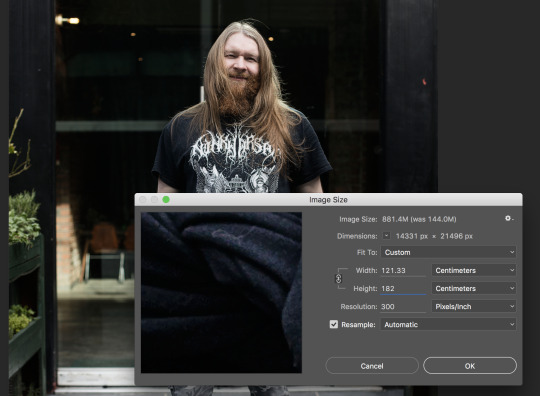
First of all I went to the printing room in university and tried to print some test strips off. When doing this I had to resize my image to roughly 6 foot high, which is 182cm by doing Image > Image size and then entering 182cm into the height box and keeping the resolution at 300. After this I had to crop the face of the photograph and paste it onto an A3 size page on Photoshop.


I also added a few of the other participant faces on to the page in order to see how they would look printed.

When printing I printed on Satin paper (270) and found that the image wasn’t as clear as I liked and looked a bit digital, so I decided to change the sizing from 6 foot, to 5 foot.

Even when changing the sizing to 5 foot I found that the images still weren’t as clear as I’d like them to be so I will be trying to print the photograph at 4 foot.

After the printing room closed for dinner I decided to go to the Manchester Art Gallery to go to the exhibition ‘Strange and Familiar’ curated by Martin Parr which displayed work from international photographers and how they perceived Britain. At the gallery I was focusing on the prints, how they were framed and displayed, I only had my mobile phone so some of the photographs aren’t amazing quality. Below are contact sheets of my photographs and I will be picking out certain photographs and talking about the framing/displaying.


I found a lot of the photograph had a thin black frame which is often the preferred choice of photographers as it isn’t too distracting from the photograph. Also it depends on the colour of the wall, if the colour of the wall is black and so is the frame then it can help the photograph stand out on the wall.
Bruce Gilden
My favourite work in the exhibition had to be Bruce Gilden’s portrait series, the large scale portraits scream to you as soon as you turn the first corner of the exhibition, their large colourful nature drew my eyes straight to the selection of portraits. What I enjoy about Gilden’s portraits is that they are largely unflattering with their immense quality, you can see all the little imperfections and pores on the person’s face. As well as the photographs the frames are slim and white which worked really well because of the colour of the wall which let the image stand out. Although the frames do stick out and make the photograph known it also isn’t too distracting and blends into the wall to give the photograph all of the attention.


Hans Eijkelboom
Additionally a piece of work in the exhibition that really corresponds with my project is that of Hans Eijkelboom. In his work ‘ People of the Twenty-First Century’ he looks at the relationship between appearance and identity in contemporary society. In the writing which came with the work it states ‘Eijkelboom focuses on the ways in which clothing and behaviour construct and reflect our place within society, as individuals and as members of subgroups and communities.’ This is saying that Eijkelboom looks at the clothing we wear and how we behave gives us our place within society, and that everyone, including those who are known to be in subgroups all adhere to a dress code within society. Eijkelboom’s repetitiveness makes you question whether there is such a thing as individuality, or are we destined to be alike? I feel like Eijkelboom’s series shows us that we all wear a uniform, whether we know it or not and it is often constructed by what society wants us to wear, and what clothing is popular. What was also interesting about Eijkelboom’s work is the way that it was displayed, the photographs were being projected in a small room onto a screen which was on a constant loop. I feel that the way that Eijkelboom has chosen to display his work was a really clever way of visually showing repetitiveness with the constant loop of his photographs.


Rineke Dijkstra
Another one of my favourite photographers was featured in this exhibition which I was really pleased about, Rineke Dijkstra’s series ‘The Buzz Club’ which involved photographing young women in Liverpool’s club, ‘The Buzz Club’. The series involved setting up a makeshift studio in the back of the club and asking the attendees to pose for her, out of all the women who posed for her she picked three images to make up her series. In the written aspect of Dijkstra’s work she speaks about why she chose these three women in particular, it states ‘She chose three to form the series, drawn to the way the three young women were wearing a kind of uniform, with their blonde hair, and dark clothes, but were still completely individual. Dijkstra says of her work ‘People think that they present themselves one way, but it is impossible to have everything under control’... The three women standing in for a vast community of adolescent clubbers who are more often depicted as a foolish or dangerous horde, rather than individuals worth of focused attention.’ In this quote Dijkstra is taking about the way she perceives these club goers as wearing a uniform to go out in as that is what is expected when you go on a night out, and that even though they all wear similar clothing they are all individuals, they’re all different people. Additionally the way that Dijkstra talks about how these women are wanting to present themselves in a certain manner but it is impossible to control everything I feel is about their individuality and that although they are wanting to be perceived as a club goer and that they must dress in this certain manner to fit in but their own individuality will always shine through. The really important part in this extract to me is the way Dijkstra talks about the ‘women standing in for a vast community of adolescent clubbers who are more often depicted as a foolish or dangerous horde, rather than individuals worth of focused attention.’ I feel that this is really important as it shows that these clubbers are often thought of as foolish or dangerous who are often not given any attention, like the metal community but Dijkstra saw past that and realised that these subcultures are special and should be documented. I really love this extract as it backs up everything that I was trying to portray in my work.
Also the way that these photographs are framed was quite disappointing to me, I feel like the photographs got lost in all the white of the card and the white/grey frame as well as the white/grey background in the photograph itself almost drowned out the photograph, however due to all of these dull colours the subject in the photograph really stood out and perhaps that is what Dijkstra was wanting, as in her text she said that these people were worthy of focused attention, and your eyes do go right to the subject in the photograph, giving them the attention the deserve.


Axel Hutte
Another photographer in the exhibition which interested me was Axel Hutte, I had never heard of him before but in the writing next to his photographs it said he was a graduate from Dusselforf School of Photography which immediately attracted me as I knew he would be focusing on repetition like the Bechers. The series was about documenting London’s social housing estates, and with the precision and neutral tones provided my an overcast sky results in quite dull looking but interesting architecture. Hutte’s work didn’t disappoint and I feel like this was relevant to my work mainly because my photographs are quite repetitive as they are all portraits whilst using the same lens, the same height of the tripod, the same focusing points and with the same agenda. Additionally the use of flat lighting within these photographs are what I was trying to replicate in my series which is why I thought it would be useful to look at Hutte’s work.


Shinro Ohtake
Another photographer’s work which caught my eye was that of Shinro Ohtake, not because of the subject of his work, but how he presented it. However Ohtake’s work was mainly him trying to document what a foreign country was like, and the lifestyle. As well as photographs Ohtake’s work included scrap books filled with mundane British objects like transport tickets and sweet wrappers, something fascinating to someone who had never seen anything like it. Ohtake had his work displayed in a grid formation and had no frames, but were attached by what appears to be magnets. I like how raw the images look, and that they are just there, however an issue that I have with this method is that the prints weren’t mounted and they appear distorted as the paper has not been pulled tight before the images were placed on the wall. However the reason for this could be deliberate because Ohtake’s experience when first visiting England could have been very distorting and strange for someone who had never experienced western society and wanted to replicate this in the way that the photographs have been displayed.


When thinking about framing I was unsure mainly about what certain frames would be suitable for different photographs, I decided to research into the art of framing and found a 2014 article on the Independent which featured an interview with Keith Andrews, a ‘Framing expert in the art world’ so I decided to have a look and see how he frames certain photographs. Below is an extract from the article:
‘Take cue from your picture - Frequently framers will identify a dominant colour within the artwork, print or photograph and replicate it in the frame. For example, to intensify a sombre-coloured painting I would choose a dark colour. Also, the subject can be used as inspiration for the frame. A typical approach to framing a seascape or beach scene would be to use rough-looking wood with jointed corners and a speckled or whitewash finish.’
From this extract I would be tempted to have my frames black as that is the most dominant colour throughout all of the photographs, as every single one of my participants are wearing black. However due to the nature of this project being about challenging the negative perceptions placed upon the metal community I feel that black would be an obvious colour and reinforce connection of the colour black with the metal community.
Another extract below talks about coloured frames and white perspex boxes:
‘Think inside the box - Because a coloured frame has a great presence and is dominant over the painting, it is easy to get it wrong. But a neutral frame rarely fails. A white Perspex box frame is very simple and there is an honesty to it because it shows the whole work and all of the paper or canvas. The artwork has to be interesting, though.’
In this extract Andrews talks about how coloured frames tend to be distracting and overbearing, which is possibly why I didn’t see any at the exhibition, additionally despite wanting to challenge perceptions placed upon the metal community I don’t think a coloured frame would suit my series, referring back to what Andrews says about finding a dominant colour in the photograph, there would be different colours dominant in each different photograph so that would mean different photographs would have different coloured frames. I don’t think having coloured frames would work for my series and if I was to use coloured frames I feel the series would look really unprofessional.
However the idea of having my photographs in a white perspex box sounds promising as I like how Andrew talks about it being honest, which is what I want my work to be, and it is simple and wouldn’t take too much away from the photograph. As my project shows individuals belonging to the metal community just how they are and them being themselves I feel like I would want my photographs to convey honesty, however I feel it would be an issue and costly to get 4 foot high white perspex boxes, and at least 5 of them.
I’m unsure whether I would like to use frames at all, as when I was at Manchester Art Gallery I really liked Shinro Ohtake’s simple images and how they didn’t have a frame, the fact that there was no frame made the images interesting amongst the many that did have frames. I feel like having no frame would be appropriate for my work as it is quite confrontational of the print to just be on its own, and I want my images to be confronting the viewer and challenging their beliefs. Additionally I didn’t want my images to be dressed up as something that they’re not, which links to the subjects of my images having to dress up in a uniform that takes away who they are.
1 note
·
View note
Text
23/03/17 - Research
As I have been busy the past few days with photoshoots I haven’t had chance to read through any of the books or articles that was recommended in the tutorial last week so I am taking today to have a read through them and discuss what they say about subcultures.
As I have said previously that the beginning of subcultures was based on gangs and that that was the start of the negative perceptions placed upon the metal community. In Paul Hodkinson’s 2002 book ‘Goth’ he states that ‘For [Stanley] Cohen the generalised negative images of subcultures in the mass media both reinforced dominant values’ From this Hodkinson is stating that the media has a large role to play in why many people have negative perceptions of subcultures as there are images and newspaper articles that talk about subcultures in a negative light. The media reinforces the idea that subcultures are negative, which could be why so many people have these negative perceptions. In an article by the Sun (2017), writer Jennifer Newton speaks about and shares photographs by Yan Morvan and his ‘Gritty photos of Paris gang culture in the 1990s, as men proudly posed with guns and knives and smoked drugs on the streets’
The article features many different types of ‘gangs’, which include photographs ranging from ‘Hell’s Angels to Skinheads.’ To refer back to the original classification of ‘Subcultures’ by the Chicago School which they were said to be gangs so it is interesting that 60 years on people are still defining subcultures by the word ‘gang’. Below is a photograph by Yan Morvan and the caption provided by the sun states is ‘Some of the members of ‘war scene’ a gang made up of unemployed, anarchist punks’. The way that this speaks about subcultures and in this case punks is in quite a derogatory and negative manner, by describing them as belonging to ‘war scene’ makes them sound quite violent by the word ‘war’ and the fact that it says that they are ‘unemployed, anarchist punks’ shows a lot about how they view the people within the photograph. They are describing them as violent people who are unemployed and anarchists and I read it a way that the Sun is looking down at people who are unemployed. Whether the people within the photographs are violent, unemployed anarchists may or may not be true, however there is no way for me to know, but as someone who has been stereotyped before just from how I look I know that this can cause lasting negative perceptions for subcultures.
I feel like this is relevant to my work despite being about punks and not ‘metal’ people however punk and metal are closely related in terms of being ‘alternative’ so I feel like The Sun article backs up what Hodkinson is saying about the media’s negative images of subcultures reinforces the existing negative stereotypes that subcultures have attached to them.

Figure A punk, Paris, squat of the Didot street (Source: Morvan, Y. 1994)
Another subject within subculture that I wanted to research is women in subcultures, as a woman I feel that it is important to talk about other women within these subcultures, as from first hand experience I know that they are often dismissed and aren’t believed when they say they are apart of a subculture, and that they can’t possibly be interested in the shared music tastes or style. In Rupa Huq’s 2004 book, Beyond Subculture: Pop, Youth and Identity in a Postcolonial World, he discusses one of the main criticisms of the Chicago School is that it is devoid of any research about the women who are present in subcultures. Huq refers to Francis Heidensohn’s 1985 work ‘Gender and Crime’ he states ‘Girls do flit through the pages of these books and articles but... they are perceived and portrayed through the eyes of ‘lads’... In almost fifty years of theoretical and ethnographic work on deviant cultures nothing has changed. Skinhead girls in Smethwick, Sunderland or the East End were as invisible to contemporary researchers and as liable to be dismissed as mere sex objects’ This is referring to how women in subcultures, as referred to in that passage as ‘deviant cultures’, were seen by contemporary researchers who are mainly men, it is suggesting that women weren’t seen as legitimate members of these subcultures and more of a sex object. However, from the research that I conducted for Advanced Research Strategies I have found that not everyone perceived women in subcultures as mere sex objects and actually saw them as apart of the their selected subcultures. Anita Corbin, although not a theoretical researcher she photographed women in the 1980s who belonged to subcultures. In Anita Corbin’s 1981 work ‘Visible Girls’ she make the women who were invisible within subcultures, visible. In Corbin’s work she acknowledged the fact that women within subcultures had been ignored, she wrote: ‘I have chosen to focus on girls, not because the boys (where present) were any less stylish, but because girls in ‘subcultures’ have been largely ignored or when referred to, only as male appendages’. I really admire the way that Corbin focused on the women in subcultures as brought them to light as it acknowledges that these women were a vital member of their subcultures.
I feel that this is important to my research, despite the fact that I am not just focusing on women but because I am also including women in my photographs. I want to acknowledge everyone within the metal community and prove that we are just people who have different tastes, and I feel the women play a large role in this as we often get dismissed so to challenge these negative perceptions against the women in subcultures I believe that this research is necessary.

Figure Kath and Em at home in Putney October 1980 (Source: Corbin, A. 1991)
Additionally in an 2016 The Guardian article about Corbin’s work there is a quote from Corbin saying ‘the way we often use dress as a means of communication/identification and how it can both inform and misinform us’. This quote from Corbin is extremely relevant to my work as it acknowledges how we use a dress code, or a uniform, as a means of identifying ourselves. Corbin also acknowledges how what we wear can inform someone of who we are, but also misinform people of who we are. I read from this that because of the way we dress people perceive us in certain ways and that because people from the metal community dress in certain ways that they are perceived in a certain way. We can dress in a certain way that gives off misleading information about us but it is what we are wanting to put across, e.g In Huq’s Beyond Subcultures he draws upon Angela McRobbie and I feel it is relevant to this, she finds that ‘slotting girls into received notions of subcultures is problematic given the difficulties of defining any such thing as female subculture, i.e. female skinheads may be rebelling against the mainstream culture of femininity.
Additionally in Rupa Huq’s Beyond Subculture he refers to Mark Abram’s 1959 book, The Teenage Consumer. Abrams states that ‘Youth Culture is an international industry for which constant regeneration is vital, ensuring a quick turnover of all the associated consumer products such as fashion and music.’
I take this as meaning that subcultures are constantly changing and have been changing throughout history, such as their fashion and music, and that they eventually run their course. I agree that fashion and music within subcultures do evolve as it is evident when looking back at the metal subculture, throughout it’s origins in the 70s, through to the 80s and in more modern times there have been emerging styles of music and fashion, as demonstrated below.
Throughout the start of 70s metal musicians were still opting for the hippie style attire such as Led Zepellin as shown in the photograph below.

By 1978 Judas Priest had reinvented metal fashion by wearing leathers.Deena Weinstein in her 2000 book ‘Heavy Metal’ suggests that the metal fashion started by Judas Priest were reminiscent of an earlier British youth culture, the rockers in an attempt to relate to the ‘toughness’ associated with the subculture. Judas Priest can be seen wearing the leather fashion in the photograph below:

For the earlier part of the 1980′s metal fashion stayed similar to the leather attire first brought to light by Judas Priest however with the creation of ‘Glam Metal’ the metal fashion soon had more than just leather and studded clothes, artists began wearing clothing similiar to the 1970′s movement ‘glam rock’ which involved wearing make-up and a more effeminate attire.

By the late 1980s the metal attire had evolved again acid-washed jeans and denim jackets had become popular. A photograph of Metallica below demonstrates the late 1980s metal fashion.

At the start of the 1990s grunge had become a popular genre and however heavy metal still continued, with the fashion staying quite similar to late 1980s fashion. People still wore jeans, and denim jackets and often wore other famous bands’ t-shirts. Below is the band Cannibal Corpse in 1993.

I feel like this is relevant as it does show that there is constant regeneration of style and music as all of the above bands are categorised as metal but they have all changed throughout the years. Additionally I feel this is relevant to my work as it shows that throughout time there has been a specific ‘uniform’ of what metal is, and if you would want to be considered metal you would wear these types of clothes.
In David Muggleton’s 2000 book Inside Subculture: The Postmodern Meaning of Style there is an interview between Muggleton and a girl named Suzie, in this interview Muggleton asks ‘Do you think of yourself as belonging to some type of people because of how you dress?’ Suzie then states that ‘The image we put across, people categorize us in that image. Usually it’s quite deceiving, ‘cos I like stuff from Bjork to Carcass and stuff like anything between that. I don’t dress to fit in with a certain type of music, I dress how I want to dress.’
This quote is saying that due to how they dress they are often put into the metal subculture, however Suzie doesn’t categorize herself as being apart of the metal community. Also Suzie has a large taste in music which people often don’t associate with metal, metal often get’s stereotyped as having an intolerance to other music genres. I feel like that is true to an extent, there is a select few in the metal community who are seen as elitists and won’t listen to anything that isn’t metal and often scoff at other music genres. In 1985 on an Australian music television show named Countdown, a music critic, Molly Meldrum, talked about intolerance to other music within the subculture, stating "sections who just love heavy metal, and they actually don't like anything else.”
However I don’t agree that all of the metal community have this mentality, and Sepultura frontman Derrick Green agrees in a 2011 interview with Rushonrock, he states ‘People are very critical. Especially in metal music, I find that a lot of people can be very closed minded – they want to listen to metal and nothing else, but I’m not like that. I like doing metal music and having a heavy style, but I don’t like to put myself in such a box and be trapped in it, because I’m not like that. I like to do different style of music but I think there’s always room for evolution in the music.’ I feel this is important as a heavy metal vocalist is stating that some people in the metal community have this elitest view and that he enjoys different types of music, so if a heavy metal vocalist can like different music genres then people within the metal community listening to his music can surely like other music genres. However you can’t force someone to like certain genres of music but there’s no reason to be hostile or dismissive of those who enjoy different types of genres.
Additionally in an 2015 the Independent article by Chris Wood he states “When I hit 16, I swapped my drainpipes and oversized Beetlecrushers for an Oxfam mac and eyeliner and went (sort of) goth for a while. Fashion – or at least clothes – underpinned music, and from that seedbed I grew into a fan of Bowie, Scott Walker, Brel, Velvet Underground, Patti Smith. My tastes widened, but never got too wide” This is stating that he never just listened to one type of music and that he broadened his tastes despite identifying with ‘Goth’
I feel like this is relevant to my work as it is another example of how the metal community has these negative stigmas attached to it, and that they are being dispersed through the media which is reinforcing these stigmas. So instead of people going out into the world and speaking with people from the metal community they could feel like they are unable to do this because people from the metal community will be dismissive of them.
In relation to the workplace and it’s influence on what we wear there is an extract from David Muggleton’s 2000 book Inside Subculture: The Postmodern Meaning of Style there is an interview with a man named Neal, and he states that he feels sorry for conventional dressing people as they don’t know anything else, and to fit into their social circle, whether it’s a workplace or in their social life they have to dress in a certain way and they get used to it. But clothes reflect lifestyle.
From this I feel like Neal is saying that ‘conventional people’ don’t know what it is like to be different because of their existing social circle, or because of work not allowing them to express themselves and they have become accustomed to wearing ‘normal’ clothes.
0 notes
Text
22/03/17 - Przemysław Wielki Photoshoot
Today was the day I photographed Przemysław in Eccles where he works as an office admin. This is the first time that I had photographed, or seen Przemysław since I photographed him for Advanced Research Strategies. When speaking to him he said that he doesn’t have a set uniform but because he works in an office setting he has to dress formally, meaning shirt and trousers.
When speaking to Przemysław he was asking if I did other photography besides art photography, to which I told him that I practice many different types of photography but I specialise in music/gig photography. Przemysław was then saying that he was in a band and that they would be needing a photographer to take some photographs of his band and asked if I would be willing to do it to which I replied yes. It is nice that I may be gaining experience and potential other clients from this. Below are the contact sheets from the photoshoot:


Because I had photographed Przemysław before, I knew where his work was so it was relatively easy to get there but unlike yesterday when I was in Liverpool photographing Andy when the weather was nice, the weather was not exactly how I wanted to be, as it was raining. Due to the rain I had to be relatively quick taking the photographs as I didn’t want to damage the equipment and also I didn’t want Przemysław having to go back to work soaking wet.
The photograph that I chose to edit was the one below. I chose this photograph because I like the eye contact that Przemysław is making with the camera.

0 notes
Text
21/03/17 - Andy Hughes Photoshoot
Today I photographed Andy Hughes who works as a bouncer at an R&B club in Liverpool. I was quite nervous today as travelling to Liverpool is the furthest I have travelled for this project, and although I have been to Liverpool a few times I have never been on my own so I was quite apprehensive about trying to find my way around. When I have been to Liverpool it has been to attend gigs at a place named Maguires Pizza bar, so I knew where that was. Andy thankfully agreed to meet me at Maguires bar and we would walk to where he works as he said it was quite difficult to find if you were unsure of where to go, which I was.
Before the photoshoot Andy asked if I wanted to get some food beforehand so we could get to know each other, which I didn’t mind so we went and got some food. Whilst talking to Andy I discovered he was quite good friends with the people who organise Bloodstock Festival, where I was planning on asking to disseminate my work. Without wanting to sound forward I decided to ask if he would be willing to talk to any of the organisers to see if they would be willing to consider displaying my work at the festival. He told me that there was a few people that it would be worth asking and that he would send me their emails when he got home, also he told me to maybe message a person named Simon Hall, who books bands for Bloodstock. Coincidentally I have been ‘following’ Simon on social media as I know he tightly connected with Bloodstock so I will send him a message asking if he knew who I could discuss with displaying my work at the festival.
I was quite worried before taking these photographs because the weather was really nice and sunny so I was concerned about the sun casting some harsh shadows. Upon arriving at the venue it was quite a nice place, and opposite the building where Andy works there was a large glass building which was reflecting the sunlight quite nicely and evenly which I was thankful for.
Below are the contact sheets from the photoshoot:


I really enjoyed this photoshoot, I think that due to spending some time and speaking with Andy that we built up a rapport which enabled me to feel comfortable and take my time. As you can see in some of the photographs from the contact sheets he also felt comfortable as he was posing in silly ways in some of the photographs, however when I asked him to be serious and do certain things he listened. The photograph which I chose is the one below, I chose this particular photograph because I really like the framing and the body language Andy is displaying. Andy naturally has a bit of a squint because he needs to wear glasses, but wanted to take them off for this photoshoot, but also due to the reflection of the sun from the building in front of him he was squinting a bit more than usual. However despite the squint I really like his facial expression and stance, it seems a really natural way to stand which indicated that he was comfortable in front of the camera. Additionally the lighting on this is really quite even and soft which coincides with the rest of the photographs that I have shot so far.

0 notes
Text
18/03/17 - Diana Irene Photoshoot 2

Today I photographed Diana again in order to get another photograph that would fit into the photographs I have taken so far, however this time the photoshoot was on a Saturday when the Manchester Metropolitan University Business School would have less students passing and coming in and out of the building.
The photoshoot went a lot better than the first one, mainly because I have grown so much technically and confidence wise, I felt confident directing Diana where as in the past I didn’t really like telling her where to stand/what to do. The only issue I had was the weather, as it was only yesterday I was photographing Marta when it was raining heavily, it was no different today. Due to the weather I had to be quick with the picture taking again as I didn’t want to damage the camera and also I didn’t want Diana to end up soaking wet. At the Manchester Metropolitan University Business School building there is a canopy where the columns are to create a shelter, I tried to take photographs under there due to the weather, however the lighting wasn’t great and didn’t have look natural or consistent with the rest of the photographs I had previously took.
Below is the photograph I chose as I think that Diana’s body language

0 notes
Text
17/03/17 - Marta Piwońska Photoshoot
Today I photographed Marta outside of her work place in Timperly where she works in an office for the company Dulux. Although Marta doesn’t have a specific piece of clothing to work due to the office setting she has to wear more ‘fancy’ clothes as she put it, and not casual clothing. This can be anything from trousers with a blouse, or a jumper. Or a formal skirt, or dress. However, when I was meeting Marta, which was a Friday the company opts for a ‘dress down Friday’ policy meaning that employees can wear casual clothing on Fridays. Although this is good because Marta gets to wear what she wants, it is quite sad that only one day out of her working week she gets to be how she wants and dress how she feels comfortable.
I had some issues with this photoshoot before I had even got there, as I had never been to Timperly before I was confused as to how to get there. However Marta instructed me that it was fairly simple tram ride from Manchester city centre, although I had thought I had been paying attention to make sure I got off at the right stop I somehow missed my stop, luckily it was only 2 stops from where the tram terminated so I just stayed on the tram and got off at the right stop.
When I finally arrived, surprisingly not late I went to take Marta’s photograph outside of the doors of her workplace, however just as I was setting up my tripod one of the security officers who worked in her building came out and asked us if we had permission to photograph the building. Marta had said she had asked her boss about it and they had agreed, despite that the security officer told us we were able to photograph but we weren’t allowed to photograph in front of the doors which had the company’s logo on it. Even though I would have liked to get the logo in the photographs I didn’t want to get Marta in trouble by making her do it anyway, so we had to settle to just next to where the doors were.
Unluckily the weather was really quite bad on this day as it was raining quite heavily, due to this I wanted to be quick when taking these photographs mainly because I didn’t want to damage the camera, and also I didn’t want to subject Marta to getting extremely wet.
Below is the contact sheet for the day:

The photograph that I decided on was the one below.

0 notes
Text
16/03/17 - Tutorials
Today I had my tutorial with Matt, although I haven’t done that much physically since the last session due to my dissertation deadline on the 13/03/17. I showed Matt the photoshoot I did of Adam and he seemed impressed with how far I had come just from the photoshoot I did of Diana. I agree that the quality of my photograph has improved in a few weeks, however I just need to photograph more. I have 4 more photoshoots lined up for the next two weeks which will keep me busy.
Additionally when talking about research I was unsure what type of research we needed to undertake for this module as I wasn’t sure whether we had to include artist research as I did a lot of artist research for Advanced Research Strategies and didn’t want to be repeating myself. Matt suggested that I look at the more theoretical research to try and back up what I’m saying about subcultures, identity and mask. We then looked at some books that I would be able to pick up in the library to look at over the next two weeks which were:
Goth : identity, style and subculture - Paul Hodkinson
Transitions of youth citizenship in Europe : culture, subculture and identity - Andy Furlong; Irena Guidikova; Council of Europe.
Beyond subculture : pop, youth and identity in a postcolonial world -Rupa Huq
However when I went to the library I found some more that would fit in with what I was looking for:
The Subcultures Reader - Ken Gelder
Inside subculture - David Muggleton
Goth Culture: Gender, Sexuality and Style - Dunja Brill
Many of the books were based on goths, which although not exactly the same as the metal community the premise of the subculture is the same. Additionally I found an article that fit perfectly in backing up my theory that the workplace strips us of our identity:
Clothing-based discrimination at work: the case of the Goth subculture - Fauquet - Alekhine, Philippe
Although this is directed at goths again it backs up my claims that there is clothing based discrimination at work for ‘alternative’ subcultures.
0 notes
Text
09/03/17 - Identity & Masks
Our identity is who we are, or who we perceive ourselves to be. As explained by Richard Jenkins in his 2014 book, Social Identity, who we are, or who we are seen to be can matter enormously. There is sometimes a difference in who we are and who we want to be seen as, it can be hard for ourselves to admit who we really are and not just who we are pretending to be for the sake of others, or for the sake of ourselves.
Identity comes in all types of forms, as Jenkins (2014) explains that the very basic starting point in understanding exactly what identity is, is that we use it to know what is what, or who is who. We use identity for our own ability to understand things, however as he goes on to explain identity is far more complex that just so we can understand things.
However, when people don’t like who they are they often wear a social mask. As Susan Sparks says in her 2015 article ‘The Masks That We Wear’, when speaking about Halloween and the use of masks she states that the origin came from the Celtic holiday on which people believed they needed masks to protect themselves from bad spirits that roamed the earth on all Hallows Eve, and how that in the thousands of years since this people are still wearing masks, but a different type. Sparks states “Thousands of years later, people are still wearing masks. They hide behind anything from a false smile to Dr. Dre headphones to my personal favourite: people who wear dark glasses in the subway—and these people aren’t celebrities.” Sparks is saying that people hide in different ways, for some it’s hiding their emotions by putting on a fake smile, for others its wanting a certain product to fit in. I feel this is relevant to my work as it supports the idea that people can often have different identities, as in my work people have a work identity and then their social identity.
Sparks then goes on to say “Think about the masks you wear and commit to taking them off. Hold your gifts out to the world—no apology, no shame, no regrets. As the old saying goes, every creature has its rightful place, and in that place it becomes beautiful.” I love this quote, mainly because it has such an empowering message, that we all wear a mask in our life, even our social masks could not be who we truly are, and that it’s okay to take these masks off and be who we are. This relates to my work in the sense that people from the metal community may wear a mask due to the negative perceptions that are placed upon them, so due to my project being about challenging these negative perceptions I feel that this is important for my project as those in the metal community should feel that they are beautiful and that they deserve to be who they are, instead of feeling insecure and scared because of the negative perceptions.
In more recent times in the surge of social media there has been a rise in social masks, as on our social media we all post the best version of ourselves, as that is the way we want to be perceived. In an 2015 article on Human Unlimited, it states that “While it’s more obvious in the virtual world, it is taking place offline too. We tells ourselves these masks are a necessary part of keeping a job, making people comfortable or being polite.” In this Human Unlimited are validating the fact that people wear social masks, and the despite the surge of online social masking, there is social masking offline as well, in terms of being someone different in order to keep a job, making people comfortable or being polite. Due to my work focusing on how the uniforms we have to wear in work strip us of our identity I feel that this is an important quote to look at as it agrees that we have to wear these masks in work in order to keep our job, this could be in the form of the uniform we comply to wear in order to keep our job. The social masking to keep our job in the metal community applies to the fact that the majority of people in the metal community have piercings and tattoos and a lot of workplaces make you take out your piercings and cover up your tattoos, and as someone who has experienced this it feels like the employer wants you to change who you are in order to fit into their ideals of what a worker is.
Another part of that article states that there are giveaways that you can tell if someone is wearing a social mask, and one of the points is that you’re different at work, than you are at home, than you are with friends. Again I feel like this is giving even more evidence that people in the metal community have to wear a social mask at work, as that they have to act differently in work that they do outside of work. However, I feel like most people have to act differently in work than they do outside of work, as when you are in work you have to focus and actually do your work, you can’t constantly be messing around as you have to get the work done that you’re paid to do, on the other hand this shouldn’t effect your personality, as you should be yourself in the way you interact with your colleagues and your friends outside of work.
0 notes
Text
06/03/17 - Adam Leavy Photoshoot
Today I photographed Adam Leavy for the first time since Advanced Research Strategies. Adam is a chef that works in Chorlton and doesn’t necessarily have a set uniform, when speaking to him he said that he wears all black clothing and sometimes a chef jacket. However, Adam has A LOT of tattoos, which for him is fine as he is confined to the kitchen when he is in work so potential customers will not see them. Although that may not be an issue for Adam as he seemed to get on well with his boss and if he did display his tattoos I feel that it would’t be an issue for him, also the type of job Adam has isn’t necessarily a serious job, and by that I mean that it is that type of restaurant Adam works in is more of a casual restaurant . However in more corporate jobs tattoos are an issue as they are considered ‘intimidating’ and ‘unprofessional’ as described by Lizzi Hart in her article ‘Are tattoos a stain on your job prospects and career?’ (2014) she explains that the traditional views of tattoos are still woven deep within the corporate world, and unless you choose a creative sector of work, having a tattoo may set you back. Although not everyone who has tattoos belong to the metal community, a large portion of those belonging to the metal community do have tattoos, so it is increasingly difficult for those wanting to have a professional career.
Below is a contact sheet:

When I was photographing Adam I stuck with my 50mm to make the photographs consistent and have the same size frame, and to make them recognisable as a series. This time I photographed Adam was different to when I photographed him for Advanced Research Strategies, I felt that I had developed a lot in that short space of time. I kept in mind the comments Matt made about being more thoughtful of my framing and the spacing between their head and feet in relation to the edge of the frame. This time I had a tripod and applied the focus points to line up with Adam���s face, what helped in Adam’s workplace that there was a small ramp which led from the street to a decking area which lined up perfectly with the restaurant’s front door, I feel this helped me in terms of positioning and framing Adam.
However there were some issues with the weather when photographing Adam, as I mentioned previously that there was a decking area in front of the restaurant which had a plastic shelter covering the decking area. On this day it was quite sunny, similarly to what the weather was like during the photoshoot for Advanced Research Strategies and due to the plastic shelter covering the decking area there was shadows being cast on Adam when I was trying to photograph him which was quite distracting in the photograph. Due to this I had to wait a few minutes for a cloud to cover the sun in order to get even lighting, I’m glad that I waited for the sun to be covered as I would have had a photograph that would have been different to the other photographs in the series and would have made the photograph look really out of place like the photograph I took of Adam. I feel like even this small action is a sign of me improving and being okay with making the subject wait in order to achieve the best photograph I can, as I had previously been anxious about the amount of time I was spending on photoshoots. Despite spending more time on this photoshoot than the previous photoshoot with Diana I didn’t take that many more photographs, I feel like this is because I knew what I was wanting to achieve with this photoshoot, I knew that I needed to wait a bit longer until the sun was covered, and I knew that I needed to make sure the empty space was equal to one another.
The final image which I chose to edit is the one below, I chose this photograph mainly because of Adam’s body language. The body language is one that is of confrontation and pride with the way he is stood front on to the camera, and the way that is Adam is looking directly into the camera suggests confidence as those who aren’t confident, have social anxiety or have autism (like myself) struggle to make eye contact. In an article by Kashmira Gander regarding mental health (2017) there is story of a woman named Sarah who describes what it is like to have depression, she states “When I’m feeling my lowest I find eye contact very hard to maintain, and the smallest interactions feel fraught.” It can be said that due to Adam staring into the camera, and ultimately the viewer that he is confident and he is confident and happy with the way that he is. Additionally the stance and eye contact is demonstrating a sense of confrontation between the viewer and the subject and causing them to think about their perceptions on the metal community. During the last tutorial myself and Matt were talking about how the black and white effect on the photographs doesn’t really work so I decided to keep this photograph in colour and I think it looks so much better than the black and white effect, the brightness of all the colours really makes the photograph pop and it also gives you a different perception of the metal community, which is bright and colourful rather than dark and depressing. Due to this I will be keeping my photographs in colour.

0 notes