19 // GDI Student // Ulster UniversityPortaferry, born and bred; aspiring illustrator.
Don't wanna be here? Send us removal request.
Photo
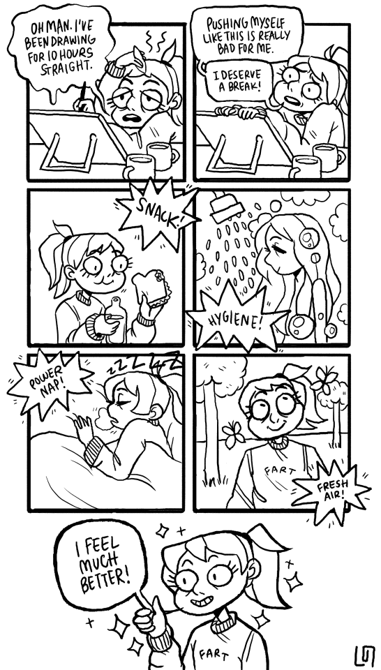
art is pretty cool. you know what else is cool? not getting burned out or sick. take breaks
98K notes
·
View notes
Text


•GRAPHIC DESIGN IN COMMERCE AND CONSUMPTION•
Graphic design is almost core to commerce and consumption, as advertisements’ principal purpose it to convince consumers to buy into the product. Majority of graphic designers end up in marketing at some point in their career as it is something that is in constant need, there is forever a flow of new products that need advertised. As an example, clothing brand websites such as Boohoo and NastyGal are always advertising certain deals and sales which immediately entices the viewer upon entering their websites, as they are typically flashing or brightly coloured and normally the first thing that appears in the viewers eye line online. Other brands such as Tesco, specifically at Christmas time, utilise the holiday period to their advantage within their advertising. Tesco in itself as a supermarket is often seen as associated with families, but over the Christmas holidays this becomes a large part of their promotion of products, playing into spending family time together over the holidays and the large Christmas dinners with extended family. Furthermore, due to their range of items, they push the idea of getting the holiday food shop and gifts all in the one store.
0 notes
Text

•GRAPHIC DESIGN AND THE INTERNET•
Symbols and icons were the first graphical communication via screens. Apple were pioneers of their day, starting off with the original pixel artworks, created by Susan Kare. According to the Museum of Modern Art in New York, Kare is a “pioneering and influential computer iconographer”. As one of the screen graphics and digital font design artists working on the original Macintosh computers, Kare has continued to specialise in simplicity, conveying information through symbols, utilising a minimalist grid style which gives us the gorgeous pixel images we all know. The development of screen graphics from then til now is an astonishing leap, the resolution of our screens that are part of our every day life were unimaginable in 1984 and long gone are the bulky large chunks of technology, replaced by slimline mobile phones and laptops. The idea of skeuomorphism was introduced into Apple software in 1990’s with their Apple CD Audio Player, which brought a more lifelike feel to app icons. However, recently there seems to be a move away from the skeuomorphic style, as big technological brands such as Apple and Windows have opted for a more minimal, simplistic design, which boasts a more formal, clean cut, luxury brand identity, which is reflected in their prices.
0 notes
Text


•GRAPHIC DESIGN IN SPACE AND PLACE•
Flying Tiger opened its first shop in Northern Ireland in 2015 under the name Tiger, and during the global rebrand in 2017 donned its current name; Flying Tiger Copenhagen. Following Scandinavian design traditions, Flying Tiger hired their first designer in 2006, and the current brand director, Tina Schwarz has held on to that traditional style while bringing in modern, unique elements that really keeps the shop timeless. Their combination of photographic elements, quirky typeface and illustrative approach create a very bold, independent brand identity, that caters for young and old alike. Small novelty items and simplistic packaging appeal to younger consumers as it is easy to interpret and intrigues their eye. The pricing also reflects their allure to younger customers, as literally everything is very reasonably priced, however Flying Tiger offers more than just novelties for a younger audience. This store stocks everything from wrapping paper to cooking spices, leading me to the assumption that Flying Tiger is a brand for everyone, which is reflected within their illustrative, quirky typeface, eliminating any sort of clean cut, formal ideas about the brand. The limited colour palette used within the branding of Flying Tiger is also a strong suit, as it is straight to the point with no bells and whistles, simplistic and monochromatic as the products speak for themselves.
0 notes
Text


•GRAPHICS DESIGN IN FILMS•
Graphic design and film are often thought of by most as a perfect pair, through billboards and posters advertising the motion picture but I’d like to focus more on the graphics design used within the films themselves, with the spotlight on a staple of my childhood; Harry Potter. The beautiful use of maps, posters and newspaper props within the movie really enhance the magical feel and atmosphere, as all the imagery in these normally mundane items dance across the paper in an enchanting fashion. The House of MinaLima, a graphic design duo in London, are responsible for such works as the Marauder’s Map and the Quidditch World Cup posters. Although the company MinaLima only became established in 2010, founders Eduardo Lima and Miraphora Mina had worked together since 2002, and have been credited in work dating back to 1995. Mina was involved in the Harry Potter franchise from the first movie and Lima from the third. Their use of whimsical, old-fashioned and almost retro text in the movie props really add to the enchanting atmosphere and almost creates a separation between the wizarding world and the time in which the movies were released. As a child I found these items one of the most memorable things in the films, as not many motion pictures include so much text and graphic based imagery within scenes, which I think shows they really nailed the attraction of their target audience; the children who grew up with Harry through his adventures.
0 notes
Text


•GRAPHICS DESIGN IN MUSIC•
Music in itself is technically branding, catering to different types of audiences through auditory means. All albums are accompanied and complimented by their cover art and Alt J’s ‘An Awesome Wave’ is no exception. The imagery based on a multi layered radar scan of the Ganges river delta in Bangladesh reflects the funky and kaleidoscopic nature of their music. The network of psychedelic veins, taken by the European Space Agency is a perfect representation of the spectrum of different genres that the band encompasses through their performance, from folk to electronic pop to art rock. The vivid colour on the front combined with the soft grey tones of the track listing on the back creates a contrast depicting the separation of the visual and practical side of music, that won Alt J the Mercury Prize in 2012. The use of leaf symbolism on the track list is another clever suggestion towards the natural world, and is used to account for the instrumental tracks on the album. The brilliant vein of colour used in Alt J’s album art is continued in their 2014 album ‘This is All Yours’. The quirky and almost simplistic nature of the bands branding is quite synonymous with its fan base that is largely made up of young people, specifically millennials and people more appreciative to the arts, catering to their visual sense through their album art and their website and media presence, compared to that of older bands.
0 notes
Photo

Bit of experimentation with my poster characters within Adobe Illustrator today.
0 notes
Photo


I perhaps owe becoming a painter to flowers. — Claude Monet.
20K notes
·
View notes
Text
okay but why the fuck do you black out when all you pokemon faint?
217K notes
·
View notes
Text
do you ever bite into a piece of cheese on bread and immediately find yourself as a true and honest shepherd boy in the 1300s who sometimes steals apples but is overall hale and truehearted
169K notes
·
View notes
Photo

Another competition entry, design for pizza boxes for a new pizza company opening in Belfast #pizzapunks
0 notes
Video
Process of Ruins
…………….
Music was composed by video game and film composer Ryan Camus
http://www.ryancamus.com twitter: @ryancamus instagram: @rycamus
6K notes
·
View notes
Photo

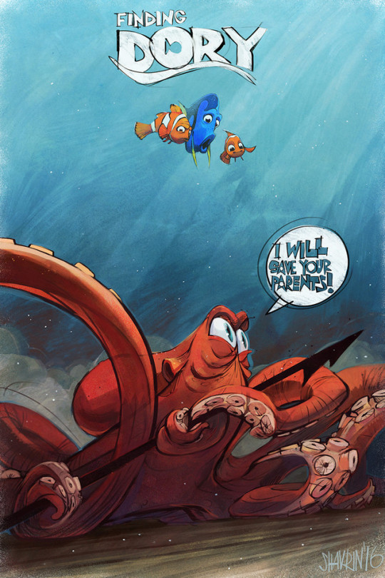
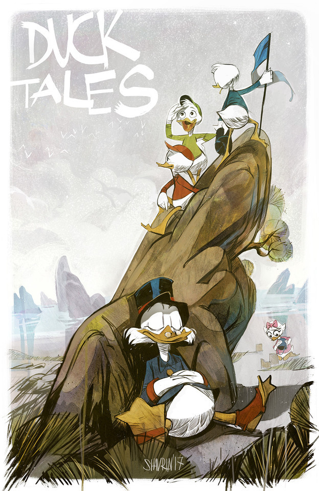

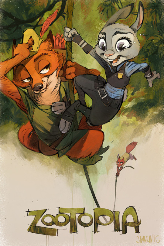
Ivan Shavrincz - https://www.instagram.com/ivan_shavrin_art/?hl=es - https://www.behance.net/SHAVRINart - https://es-la.facebook.com/shavrinart
14K notes
·
View notes
