Photo
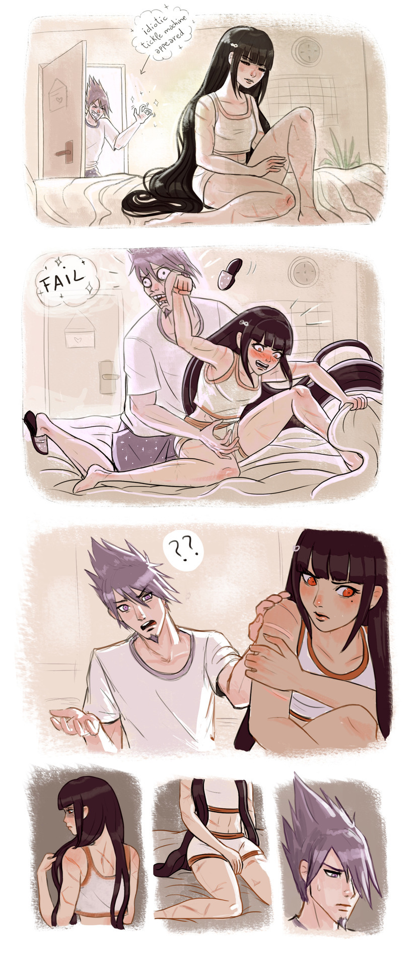
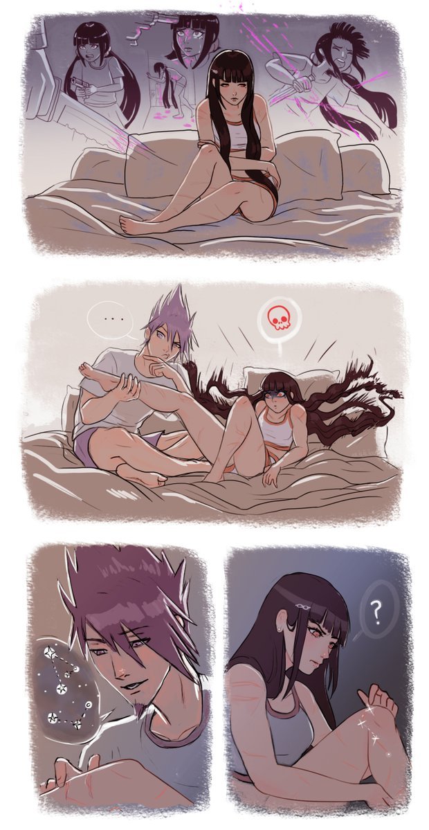
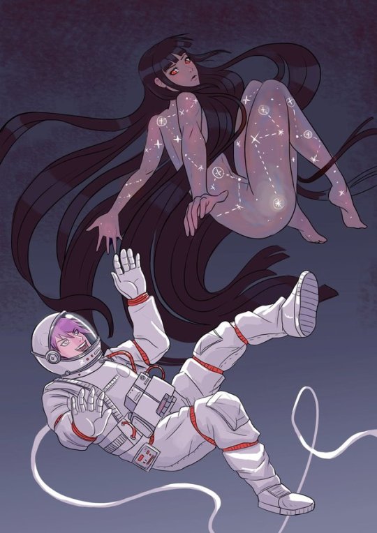
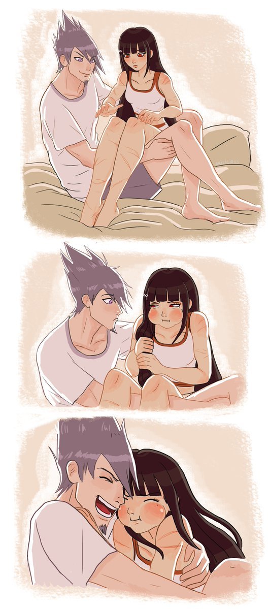
Little comic I wanted to do for the momoharu week on twitter [Fears]
10K notes
·
View notes
Note
What games are Yuki and Tomoya from? Like specifically
They are from a free tablet/smartphone game app called 狼ゲーム/OokamiGame(WolfGame) created by StudioWasabi. It’s sort of a mixture of the TRPG Werewolf(a.k.a Mafia) and Danganronpa. This app is currently only available in Japanese and Chinese (I think).↓ Here’s a fanart of Yukinari, the main character.
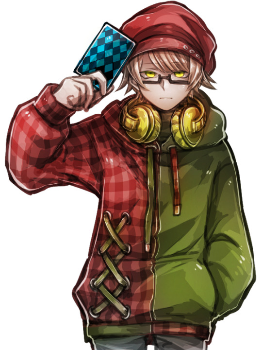
A group of random ppl gets kidnapped + trapped in an area and are forced to play a game. Each are secretly assigned roles :(sheep or wolf). the wolf needs to kill someone and get away with it, and the sheeps needs to investigate and figure out who the wolf is after a trial. whether the sheeps gets the correct person(wolf) or not(innocent), the voted person gets executed. but if the sheep gets it right, a new door opens and they can explore a new area of the building(getting closer to escape). the wolf/sheep roles are reassigned per chapter/trial/execution. ↓ Fanart of my favorite character: Rintarou
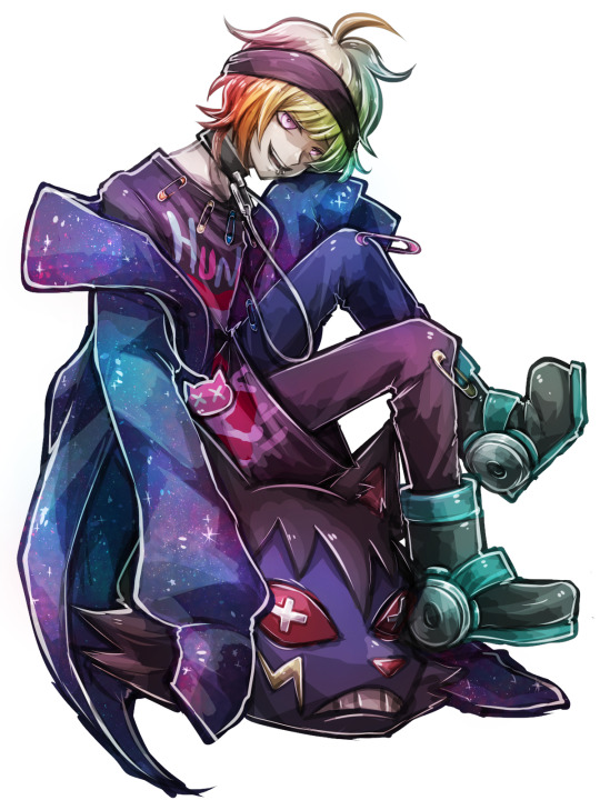
It’s a REAL exciting game and the character designs are phenomenal. I mean look at these doods.↓↓↓What they actually look like from the official game:
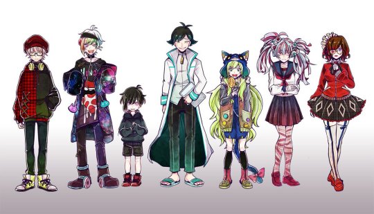
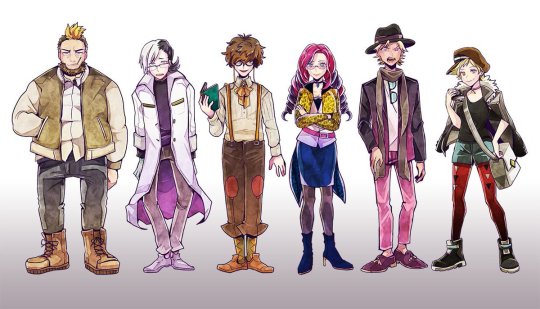
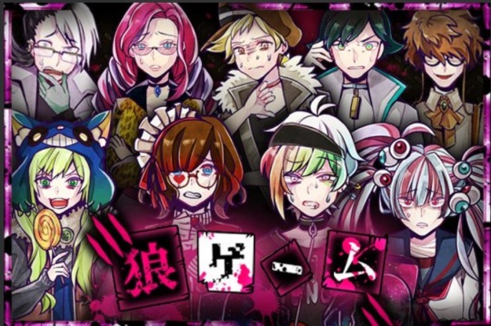
The sprites and execution cut-scenes are animated, so those are cool to stare at too. I am sorta salty and dislike the creators for personal reasons, and the recent updates are….well….too fanservice-y or doesn’t makes sense (conflicting with the original good plot) so PERSONALLY speaking I only like that original game they released and couple side-stories of the characters. but everything that came after those are kinda crappy. (again, my opinion)If this ever does gets an English release I highly recommend you playing, but just…try not to get too invested to it because i became extremely disappointed…in the creators, big part of the Japanese fandom, and the newer contents they release. Buuuuuuuuuuut again. im not forcing you so you can do whatever you want. dont tell me i didnt warn you tho. sorry for the unnecessary long response. hope you doods are all having a great day yo! oh yeah and fun fact that you totally didn’t need to know:I’m on the ending credits for this game. pretty awesome right? :D awwww yeah!
410 notes
·
View notes
Text
How to do “extra” facial expressions!
Drawing basic facial expressions is not the hardest. Most people can draw a sad face, a happy face, angry etc., but making more multidimensional expressions is more of a challenge. I have gotten a lot of compliments on how I draw facial expressions, (specifically “angsty ones”) telling me that they are very dramatic and well… expressive! And there are actually only a few things I think about when I draw faces that take them to the next level, so I thought i’d illustrate them all here!
SUPER IMPORTANT TIP BEFORE WE START: Look at your own face when you draw faces. Even making the face when you are drawing (you don’t even have to look at it), will give you some sense of how the face muscles pull and where things fold and stretch, because you can feel it. You are the best reference when it comes to facial expressions!
Angles
Draw the head in an angle that matches the expressions you want to make. It is not a requirement, but is going to add to the effect.

Symmetry vs asymmetry
A face is rarely symmetric. Unless the face the character is making is 100 % relaxed or even dissociating, the eyebrows, mouth and facial muscles will have different placements of their respective side. This image shows the dramatic impact asymmetry has on a face:
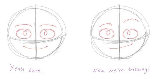
That’s the difference between a smile and a smirk!

The first one’s like “oh yeah?” and the second is like “oH YEAH??”
The “balloon squishing principle”
This is something I did subconsciously, and I didn’t know about until I made this tutorial. And this principle goes hand in hand with an asymmetric face. Basically, if you squish one part of the face, you need to even out the empty space by “inflating” the other part of the face so that it doesn’t appear shrunken. The picture hopefully explains it:
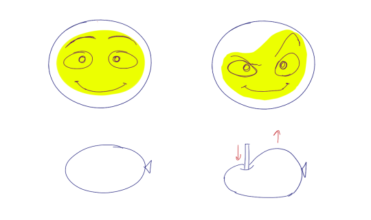
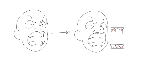
Teeth
Don’t forget to add the gum when the mouth is open to its full potential!
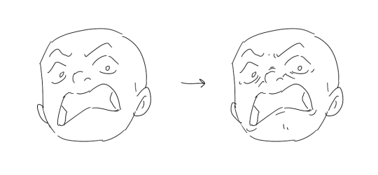
Squinting and folding
Adding folds around the eyes when a character is squinting makes a HUGE difference. It makes a smile more genuine and a growl more intimidating. Adding folds to the face in general makes your characters more lifelike and ‘visually relatable’. Like, they look human, and less plastic or fake.

and so on..
Pupils and irises
The placement of the iris and pupil in relation to the eyelids is very important! The less of the white you see, the more relaxed the character is.
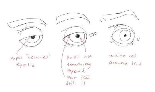
And then of course eyebrows and eyes go hand in hand!


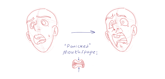
Gestures, spitting, sweating…
Adding more elements than just a face is key to making the character actually look like they are feeling what you want them to feel. Just the tiniest sweat drop adds to their anxiety, spitting adds frustration to their rage, slouching shoulders, waving hands, a double chin, extreme angles, the list goes on! Add whatever and see what kind of impact it makes! Does it do the trick? Great! Add it!
Over exaggeration!!
Remember that you can almost always exaggerate more. Don’t be afraid to do draw “too much” because you’re just experimenting. See what works and what doesn’t. What do you like to exaggerate?

Now that you know some theory, it’s time to practice!
Practicing!!
The 25 Essential Expressions (a classic! I’ve done it multiple times)

And the one I do when I’m bored:
Fill a page with circles and fill them in with different expressions. Try and exaggerate as much as you can!

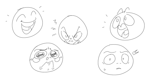
This is mostly for experimenting. They are quicker to draw than complete faces, but the same rules should apply!
And that’s about it!
I don’t know if I covered everything in this tutorial, since some things might be obvious for me, and this post perhaps only scratches the surface. So feel free to send me a message if you want an explanation about something more in depth! Thank you for reading! And now DRAW!!! ✨🎨
168K notes
·
View notes
Photo
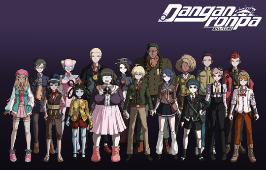
Seventeen killing game participants? And one of them is a teacher?! Here are the boys and girls of such sacrilege!
From left to right:
Maru Yokokume, The Ultimate Activist
Shiori Nakagawa, The Former Ultimate Instructor
Ikki Namiki, The Ultimate Angler
Momoe Soga, The Ultimate Local Hero
Fan Fan Long, The Ultimate Human Subject
Kunitaro Higa, The Ultimate Retro Curator
Chikuma Konishi, The Ultimate Extreme Couponer
Uta Kawagichi, The Ultimate Epidemiologist
Hiroaki Uzuki, The Ultimate Apprentice
Yahto Stone Crown, The Ultimate Mayor
Hide Osako, The Ultimate Theorist
Naiomi Danjuma, The Ultimate Social Worker
Shoko Otaki, The Ultimate Forum Admin
Bussho Saji, The Ultimate Yoga Guru
Toya Imamura, The Ultimate Broadway Dancer
Oniji Itagaki, The Ultimate Tailor
Manzo Shibue, The Ultimate Stuntman
youtube
2K notes
·
View notes
Note
Do you have any tips for someone who wants to start making sprite edits :0?
Here’s some helpful tips!
1. Sketch the outline of the body. It helps a lot with drawing outfits in general!


2. Outlining parts that you don’t need to color makes coloring easier.


3. Practice drawing! If something is hard to draw, try to draw it few times everyday even if it doesn’t look good. You’ll only learn how to draw by practicing regularly. If you don’t know how to draw something specific, try to look for reference and art tutorials about the subject!
4. Last tip: brush size. Usually Drv3 sprites require a pretty small brush size, but Sdr2 brush size is a bit bigger. Just pay attention to what brush size looks closest to the sprite you want to edit!
Hopefully these are somewhat helpful!
205 notes
·
View notes
Photo


beta girafarig looks like such a bastard and I’m so sad it’s not real so it can look at you with absolute hatred every time you have a battle

19K notes
·
View notes
Photo

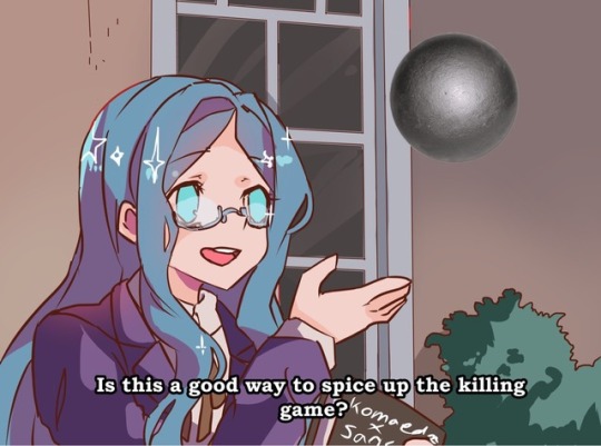

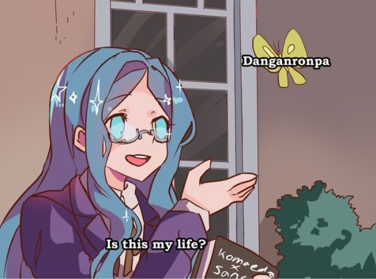

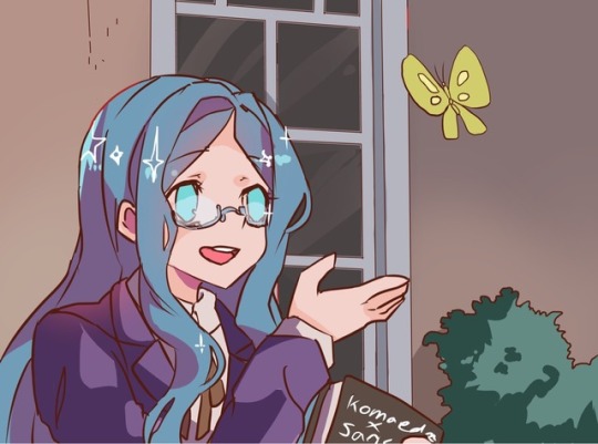
Feelin spicy, (feel free to use the last one to create your own)
3K notes
·
View notes
Photo
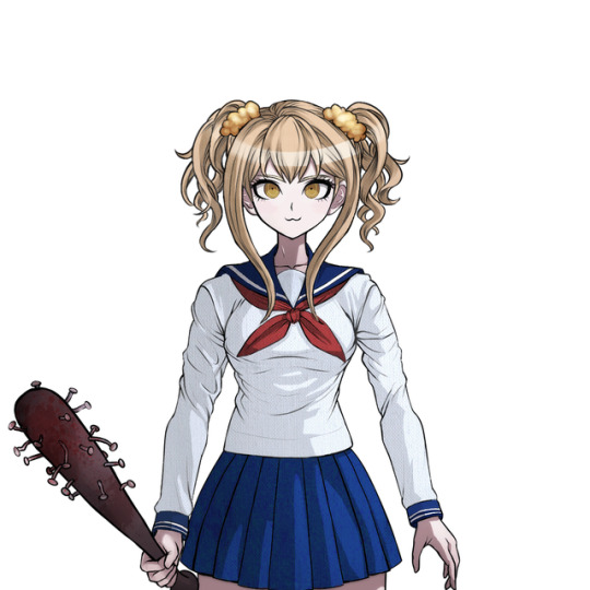
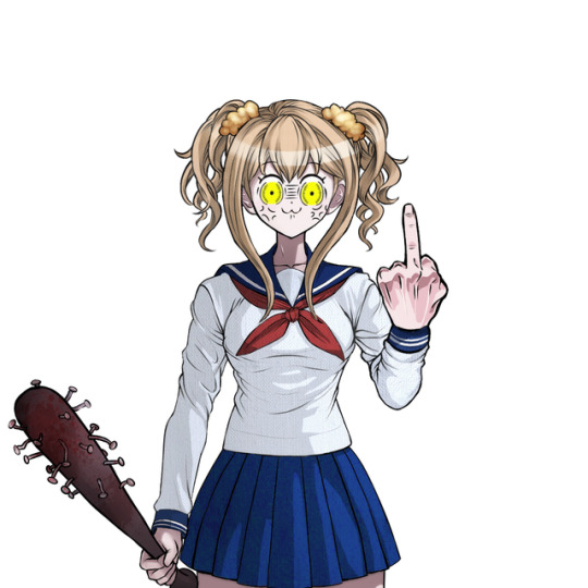
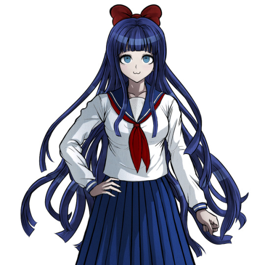
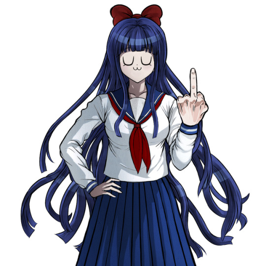
☆ ☆ ☆ ☆ ☆ ☆ ☆ ☆ ☆ POP TEAM RONPA ☆ ☆ ☆ ☆ ☆ ☆ ☆ ☆ ☆
5K notes
·
View notes
Note
hi so i attempt to make my own sprites, but I always have trouble with the lineart; it never looks right. do you have any tips cause I am really having a lot of problems with it thanks dude yo
Ok, I’d suggest PMing me for specific details, but here’s a run down of possible problems you may be having!
1. Not using correct Software/Hardware
This is the basic of basic problems, but here goes. The most important thing when it comes to sprites is the software you’re using. You’d need basic image editing software, such as photoshop, paint tool sai, clip studio paint, although these are the high end variety. You can get free software (such as GIMP), which is less reliable, but can still get the job done.Your software needs:- Ability to use multiple layers (with no cap as to how many layers you can use)- Brushes being able to change size when drawing with them (so you get a variety of line thickness when drawing. I’ll elaborate on this later)With hardware, I suggest using a pressure sensitive drawing tablet, however, if you can’t afford one or just don’t want to spend the money, you can use a mouse or touchpad on laptops, but it’ll be very hard to use.
2. Not using correct Brush Settings
Another basic problem which is relatively easy to sort out. Not having the correct brush settings can make drawing a complete nightmare, but once sorted out, it can make drawing a lot more natural.Your brush needs to be:- Round, and standard brush (just a normal circle). No blur around egdes- Opacity at 100% at all times- Uses anti-aliasing (so no hard edges between pixels), but not too blurry

For Drawing Tablet users:- Size must vary depending on pressure appliedFor Non Drawing Tablet Users:- Size must vary depending on velocity (basically speed but programs like to sound fancy and say velocity)
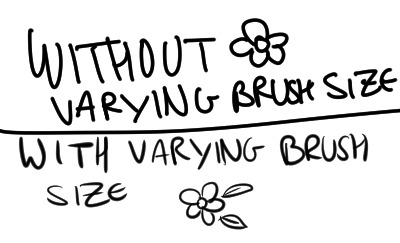
Another thing to add for outlines, use line stablisers if you have an unsteady hand (like me!) You can probably change this in brush settings, but if you’re having trouble change it, look it up for your specific program
3. Drawing it all on the same layer
Of course, it’s possible to do so, however, I advise against it, because:- if you make a small mistake on one part, trying to change it can affect the rest of the stuff you’ve already drawn- you can easily add and remove layers, to create new poses, without having to redraw everythingHow I separate out my layers:- If your program allows it, shove them all in a folder. This makes it a lot easier to manage.- Draw out each major part of your character’s body/clothing on a different layer. Eg, head, hair, hand, arm, jacket, etc.- Name all your layers!- If you’re editing the face outline, do it on a separate layer to the head, and especially the hair!

4. Not using Layer Masks to help hide and blend lines
Layer masks basically hide parts of the picture that you’ve erased on the mask. This helps with making lines go together better, and being able to edit lines back in without having to redraw them. This is especially useful for different poses/costumes for sprites.


(mask area for left arm in blue)

5. Not Using References to your best advantage
Using references sometimes feels like cheating. But when you’re trying to emulate an artstyle, you absolutely must do so. If you’re having trouble drawing out a difficult body type or piece of clothing, use references from other DR sprites! Top Tip: Danganronpa anatomy is stupid. Don’t try to draw it from memory.The main issue I end up having is with the anatomy. The body type looks just right when you look at the final sprites, but when you break it down… It looks really weird. The hair ends up taking up a massive amount of the head and forehead. Eyes must be drawn below the center. Also their heads look tiny, and only look normal sized due to their massive hair.


To check if you’re drawing it correctly, copy a sprite from the games underneath to see if it has similar anatomy. If not, adapt.
6. Not using references for faces.
Since faces are one of the most important part of a drawing, you must put as much effort as possible on getting the faces right. Honestly, I’ll just recommend tracing over a similar face from a DR sprite, and adapting to make it look unique. Be expressive, danganronpa faces are crazy! Go all out!Top tip for faces (and anatomy): Flip the image horizontally after you’ve finished drawing it! You will notice what isn’t symmetrical, and what looks off!As for the specifics of the face, it’s too different to really generalise. Use references from different characters, and try to find the common traits between them (focus on the eyes, eg eye shape, eye position, shape and size of iris etc), to try and find the right one for you character. Trace if need be.
7. Hair/Clothes looking stiff and unnatural.
This is something which is gonna need a lot of practice to get right, but I’ll try to give you a few tips. With hair, especially for girls, you’re gonna want it to flow, and for clothes and creases, you’re going to want it to look like it’s falling naturally.For the hair:- Make it flow from the top to the bottom, use stabilisers to keep your stroke steady if need to!

- Add details, but not too many. This goes with hair, but also clothes too.


Similar tips for clothes: Make sure there’s a clear difference between the outline of the skin, and the outline of the clothes, even if it’s pretty tight.


- Depending how the clothes fall, you must use creases! I’d suggest using references to other danganronpa sprites for this

and with that i think i’m all out of tips and tricks. i’m gonna go order a pizza nowtl;dr - use references a lot!
198 notes
·
View notes


