Don't wanna be here? Send us removal request.
Text
DDD submission in Cragg corridor. Took a lot to get here. 99% pleased with result. Steel wire loses some of the floating illusion, plinth is a bit thick and I would have liked it a little lower but adjusting the height for testing was not easy.
Pleased that I moved away from a standard plinth but also that the suspension worked with the objects and I think holds the notions of stillness, balance and precariousness l.
Not sure about the pole structures - they work as H&S protection and do add to the themes of balance and precariousness and the off centred leaning challenges the straight lined perfection, but will I take them forward - up for discussion.
I’m pleased with the sound proofing squares but I’m not sure they are in the right place.


0 notes
Text


Studio space submission. Worked on editing and happy with the result.
0 notes
Text


Testing screenprinting onto plaster discs. First attempt not so great, but Peter G kindly re-did the screen and it was much better. Shame about the clover in the middle (a result of the plate I used as a mould) - another opportunity to face things not being perfect
0 notes
Text


Testing the steel rope instead of the thread and trialling different heights. I preferred the thread as it was more invisible, but I think the bigger plinth is that much heaver this the steel rope is necessary for health and safety.
Regarding height, my choices seem to be between a swing and a shelf?
0 notes
Text
Hoping that I'll get to see this exhibition before it closes. I was struck by a description that talked abut his exploration of space, silence and material - which feel like words I am very interested in at the moment. Looking at the images, I think another word is despair. I am amazed at work that can convey so much emotion with such simple and sparse materials. How does he covert a few bricks into something so powerful? Artistic alchemy!! and an in depth knowledge of the body.


0 notes
Text
Created my own mould from foam board to make the plinth the length I wanted

Turned out quite well, but the surface of the foam board stuck to the plaster and for some reason left weird little dimples. Accepting the imperfections.


0 notes
Text
Test install for my DDD submission. Working out the logistics of suspension. Not too well as it turns out, knot slipped and plinth shattered.
Thinking about alternatives to the standard plinth and wanted to create something that appears to be floating, that requires a second look, a pause to check what really going on. Also continuing with the theme of precariousness and vulnerability.

I'm really pleased with the invisibility of the thread. The floating in air effect was what I was hoping to achieve. I can use the vertical sculptures either end to hopefully help people 'see' it and guide them around it rather than bumping into it.


0 notes
Text


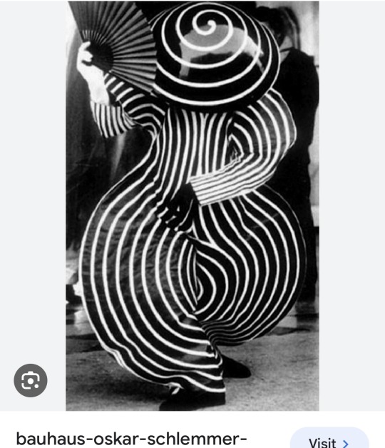
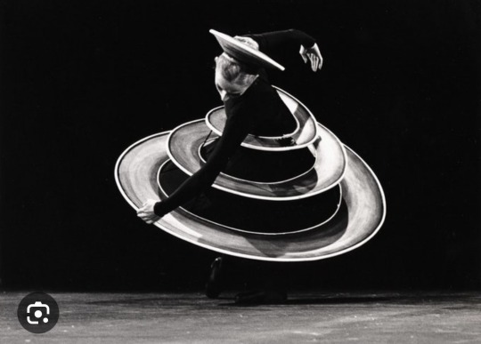
Always fascinated to see the connections tutors make when looking at my work. Thank you Peter Hofer for introducing me to Oscar Schlemmer.

1 note
·
View note
Text
A selection of moulds to experiment with plaster plinths that I could potentially suspend.
I would like to screen print a gradiant circle onto the discs. I'm really pleased with the surface and shale of the rectangular shape but it is disppointingly too short for the install I want to do.
I am pleased with the dots and am wondering about adding black into the spaces, experimenting with charcoal, ink and plaster circles made of the reverse of the mould.


0 notes
Text
Interesting talk from Moira on ‘Inside the White Cube’ which I read in the first year and meant but haven’t returned to. Made me think about my works relation to space and in a particular, relation to the wall. I noticed that in some of the works Moyra referenced that paintings moved to sculpture but were always compared back to painting in the frame.
In response to the talk I am now thinking of pairing a black circle on the all behind my optical piece as a way to enable it to converse with the wall as well as suspend in space and to create a fixed end point, a kind of grounding bit on the wall.

0 notes
Text
Dining room turnned screen printing workshop. Not really what I wanted. The centres are too dark and gradation is too granular at the edges, but somehow I felt I had to keep going. Repetition is a bit like volume, I need a lot to hear what is going on.
I am hoping to screen print onto plaster to use as a plinth but these wouldn’t work. Spoke to Peter g and it might be because the screen was to flat on the paper it needs to be raised slightly. Will try again under his guidance


0 notes
Text
When one thing turns into something else. Set up to try some screen printing at home and went to take a photo of the screen and …..


0 notes
Text


Lasercut discs from slices of pine wood. Looking at the lines of woodgrain. the little jump rings allow for much easier movement. I'm not sure if I want to take this any further?
0 notes
Text


matt black and white. can't find the right place for these tubes. Just noticed the interior shadows - i like them
0 notes


