
Don't wanna be here? Send us removal request.
Statistics
We looked inside some of the posts by nicolemdesign and here's what we found interesting.
Average Info
Notes Per Post
1
Likes Per Post
1
Reblog Per Post
0
Reply Per Post
0
Time Between Posts
8 days ago
Number of Posts By Type
Text
13
Last Seen Tumblr Blogs


Fun Fact
Mobile US users spent an average of 115.8 minutes on Tumblr app monthly.
Text
Week 9 – Industrial Design
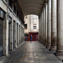
Although we think of many ideas as originating from the coasts, much of the production of the goods that those ideas spawned happens further inland. People might think of Detroit and the auto industry as the most common example, but plenty of production happens–and continues to happen–in Milwaukee. Brooks Stevens recognized this, and the ability to be closer to manufacturers in Milwaukee and the mindset allowed him to stay in his hometown rather than move someplace such as NYC that's larger or with a larger design presence. For every Harley-Davidson or Miller Brewing Company, there must be dozens of others that the general public has never heard of, each of which requires product and brand design.
Not only was Stevens able to remain where his heart was, but he helped make a place for design in Milwaukee. For example, Stevens created an auto museum and also displayed work at the Milwaukee Art Institute that received praise from local news outlets. Galleries and museums continue to honor Stevens and his work, a reminder that design has flourished in the city in the past--and still can today. In fact, aspiring designers can study at institutions such as the Milwaukee Institute of Art & Design with highly-regarded design programs, and even UWM has its own prototyping center that helps connect designers and startup companies with resources and services to bring their designs to fruition.
However, times have changed. American companies have moved production overseas, and Silicon Valley reigns supreme when it comes to designing many products (although there are smaller tech hubs situated around the country). Without someone such as Stevens to remind the world of Milwaukee's potential, I suspect that both the design and manufacturing industries look much different than they did 70 years ago when Brooks Stevens was at the high point of his career.
0 notes
Text
Week 13 – New Media
The idea of the digital aesthetic as introduced by our textbook isn't a single textbook. It's evolved over time just as trends and technology have evolved, the latter allowing designers to do more or achieve results more easily. This includes user-friendly software that enables amateurs to try their hand at designs.
The advent of the digital aesthetic in the mid-90s paid homage to the era of grunge music and culture. It can appear messy, often because of the use of layers that computer software made easy to create. It's as if designers wanted to point out "This was designed on a computer!" while simultaneously making a statement about being an individual or counterculture.
Design sometimes incorporated aspects that brought to mind computers such as code and binary. Think of the promotional materials for The Matrix, that include the black-and-green "code" behind the characters. This is a great example of digital design applied to media that aren't necessarily consumed via computer. Whenever movies feature programmers/hackers/networking, we often see similar screens full of code, some of which use the same black-and-green theme, even though computer monitors have been full-color for decades.
Of course, the design of software and websites adds another element to digital design. Not only do designers use computers to create these products, but users experience those products via computers as well. While in the beginning, many websites simply incorporated existing materials such as logos while utilizing simple layouts. We can easily see how grids are utilized in the 2002 Fedex website.
Designers continued to work with new styles made possible (or even constrained by) computers even as the aesthetic changed. For example, pixel art that brought to mind the original video games was created in the mid-2000s by professional and amateur designers alike. Hobby designers made cartoon dolls, avatars, blinkies, buttons, forum signatures, Neopets shop blogs, and website layouts using this style, while professionals create more detailed advertisements and websites. As long as people could fall back on the grid, they could become artists. Perhaps this is why many amateurs created pixel/Bitmap fonts in the mid-2000s (some of which I still have saved on my external HDD): it seemed as though anyone could design following these rubrics.
The evolution to Web 2.0 ushered forth a major change in aesthetics. Websites became less graphic-intensive. Graphics often became flat and simplified, and gradients and rounded corners (something that can still be seen on many smartphones) were all the rage. That flat minimalism is still utilized on one of the most popular websites in the world: Facebook. Its clean appearance reminds us of the international style, which has become the default for the current digital aesthetic. Just look at phone clocks, which typically depict crisp, clean fonts. Even Wired has moved on from its once experimental designs. The current logo, for example, is the name with the odd letters appearing white on a rectangular black background while the even letters are black on a white background that appears "open" on Wired's simple white website.
As we move away from the Web, we see a shift from design that points out it was digitally designed to that which almost tries to hide it. I am thinking of film design, which uses green screens and CGI technology to blend seamlessly, even in "live-action" scenes. If viewers can tell it's not real, it's considered a failure.
Finally, I'd like to comment on how traditional and digital media have been designed to work together. Consider QR codes that you can scan to add information to your address book, go to a website address, or even send people money. If you visit museums, you may be able to use your phone for additional information or even an AR experience. The design of the digital and traditional components must be complementary even when we pair a screen with physical media. And the way we add codes, links, or social media icons to physical materials such as posters, business cards, or museum walls must do so in a way that's not overly garish. While it's easy to see how it's failed, it's interesting to see how ubiquitous these elements have become over the last few years. And while companies might change their logos, we're so accustomed to "Facebook blue" or "YouTube red" that or the Twitter bird that other details can be modified to blend in while these icons remain instantly recognizable.
0 notes
Text
Week 12 – New Media
This week's topic might be the one that is the most personally relevant to me. I cut my teeth on Web 1.0 in the late 90s and early 00s. At the time, the Internet still felt egalitarian, leading to creativity and community. It was easy to discover tutorials to use HTML, CSS, image editing programs, and the simple scripts of the time to create your own website. It felt like anyone could do anything–and we certainly tried.
Of course, when there are so many options, there are bound to be missteps. My history of websites includes dated chromeless browsers, scripts that wouldn't work in every desktop browser (and would have performed even more poorly on mobile), large graphics, and dated trends, much of which required the visitor to adapt to the website and not the other time around. Usability was often an afterthought, and browsing the Web could be a confusing endeavor. However, it was a time of experimentation. The Internet was old enough that anyone who was interested enough could find information and like-minded people (although, we tended to be a bit more tech-savvy, introverted, or nerdy than the average Internet user of today).
I remember Web 2.0 becoming the buzzword in the mid-2000s. Suddenly, people were all relying on the same tools to create their blogs, which had replaced personal websites entirely. WordPress, which is no doubt a useful tool, seemed to power everything (one might argue that it still does). This means that people were using templates rather than building from the ground up. The uniformity made it easier to navigate these websites, but they became boring and remain that way to this day, perhaps because many people who had a deeper interest in design took the professional route and no longer maintain personal projects.
Of course, the same can't usually be said for commercial websites of large companies. They're bigger and bolder than ever in some ways, and websites can complement other types of media: TV ads, apps, games, etc. This is a new type of creativity. Your TV can activate your smart home device or digital assistant on your phone. You can scan a QR code to get more information from a business card. Augmented reality is good for much more than games--you can download apps to change 2D art in museums to 3D. As virtual reality becomes more of a reality, design will grow there, too. All of which relies on professionals who are skilled in software and coding, not just enthusiasts like me who mucked about in Web 1.0.
Web 2.0 might not be the Web that we all created, but it is the Web that everyone uses, even grandparents. While no single website reigned supreme in the wild, wild, Web, giants such as Google or Facebook that have become synonymous with their function (search engine and social media website, respectively) are so ubiquitous and easy to use that it's strange when we hear of someone who doesn't use them. This is how we use the Web because we're done experimenting. We expect to see all our news and content shared to specific websites rather than compartmentalizing our time and attention. We use products and services by Google, Amazon, Apple to the exclusion of all others. These companies have become giants by thinking far ahead of the game.
Still, web 2.0 had many advantages, one of which the book doesn't really discuss: usability. Moving away from large images toward HTML5 (with newly-introduced semantic options) and CSS didn't just mean that websites load faster. They became more usable for people who rely on screen readers. It's ironic that broadband really took off just a few years later. Websites now incorporate so much code and so many scripts that their sizes rival Web 1.0 websites with giant graphics or Flash videos. There's a delicate balance to be found between cramming in more code every time connection increases (moving to 4G/LTE and 5G mean that our mobile devices connect to the Internet faster than ever, and the apps or websites we use on them can be quite demanding) and remaining just faster than the competition to ensure that you rank well in search engines or don't test the patience of your visitors.
As the book suggests, designers no longer need to guess how changes will impact a project. They can use analytics (Google provides such a tool for webmasters) that rely on AI and massive amounts of data to predict. A/B testing means that designers can create multiple websites/apps/projects and compare the performance between them. In Web 2.0, nothing is left to chance, and those companies that take advantage or even predicted this have profited. But could the current face of design be so rigid as to be stifling?
0 notes
Text
Week 11 – Graphic Design
Citizen designers tackle the challenge of using design to improve the world in some way, which seemingly involves expanding the definition of design outside of traditional elements such as graphics or even architecture. Like many previous design movements, citizen design is about more than just the design; activism of some sort is an essential element.
As I read in our textbook book about citizen designers who eschew the globalization and capitalization of design--and indeed the world--I was reminded of the face of activism in today's world. While I don't generally view it as something related to design, I may simply be overlooking the design aspect, especially when citizen designers seem intent to draw cooperation and talent from all sorts of "industries." Essentially, it's crowdsourcing to have the best chance at success and perhaps the most holistic solution to our societal problems, many of which have only been temporarily relieved by stopgap solutions because people, companies, and even ideas have become so siloed in society. But working together and including those people who have not traditionally had a seat at the table can effect real change.
Not only do we see a push toward everyday people participating in activism, but some people would argue that it's the only way true change can occur. We must remove power from the corporations, the 1%, and the politicians. These activism efforts often involve uncomfortable conversations with those people who may be well-meaning (or not) who have appropriated or coopted movements or symbols, who may speak over members of their communities rather than lifting voices, or who may approach their cause as if there is only one right solution--an approach that's akin to globalization.
In particular, I think of feminism. We see pushback against "white feminism" from those people who may not be white (or educated, able-bodied, straight, wealthy, etc) by those women of color (especially black women) who have been marginalized even by other women who are fighting, ostensibly, for all women. Furthermore, it's easy to see how western feminists attempt to impose their ideals on women around the world, an example of which can be easily seen when western feminists decry Muslim women for covering up. If feminism is about choice, then these women should have the option to cover or uncover if they desire.
While I've strayed from the topic of design specifically, I hope I have illustrated the connections I am trying to make. Whether the boots-on-the-ground approach of modern activism was inspired by or inspired citizen designers, it only makes sense that similar ideologies would arise in graphic design, which has often been a tool used by various movements in the past.
0 notes
Text
Week 10 – Graphic Design
As someone who has dabbled in Web and graphic design from time to time, I’ve installed dozens or perhaps hundreds of fonts to my computers over the years. In fact, I have a folder on my external hard drive that I move to each new computer, save for the laptop that I’ve had for a few months. Realizing that I have little use for these fonts anymore makes me sad.
My experience with these fonts often involved making layouts for websites and icons for sites where I used to chat, avatars that typically depicted the user’s name and a short tagline. Thus, some of the fonts named in our book were quite familiar and I was already familiar with the ideas of serifs/san serifs, kerning, leading, and other typographical concepts. As someone who sees type mostly on a screen, I find myself leaning toward san serifs more often than not.
I was surprised to learn that many fonts are younger--or older--than I realized. For example, Calibri still seems like a new font to me despite being nearly two decades old and being the default for Microsoft Office for nearly 15 years at this point. It’s interesting that it hasn’t entirely superseded either Times New Roman or Arial. Many of my assignments simply assign a font size and not a name whereas Times New Roman once ruled supreme. Perhaps instructors realize that this is no longer the case (and that students may be using a variety of devices or software/apps to do work with each defaulting to different fonts).
While Google fonts is more than a decade old at this point, it still feels new to me. I’ve only used it once, for the layout on my current personal website. However, I still utilize Verdana for the bulk of the text on my blog. It was interesting to learn that Arial was created hastily and is sometimes frowned upon. I can recall switching between it and Verdana in an attempt to determine which would look and read better on my websites. I suppose the improvements in Verdana won out, despite me not having a trained eye. However, the ability for nearly anyone to make a font thanks to different software is apparent in fonts that lack more than the standard alphanumeric characters or do not scale well.
Finally, I couldn’t help but chuckled at the insert about Comic Sans and Papyrus, both of which are incredibly familiar to me and have probably received my ire in the past. Although it wasn’t quite as ubiquitous, I recall a font named Scriptina that was heavily overused with a certain demographic at one point in time. Something about the loopy, scripted font face seemed so cheap to me, and I wondered why others couldn’t see the same! I see it every so often and cringe in a similar way as I do with Comic Sans.
0 notes
Text
Week 8 – Industrial Design
For this week’s assignment, I thought I would partially focus on the idea from the video about industrial design about how so many things in our lives have become black rectangles. So I thought I would look for ways to disprove that in whatever way I could.

Color is an easy way to stand out as it does with my 3DS (and my phone in the reflection but not the TV reflected on the other side!) Although Nintendo’s console products are black, color and graphics reign supreme for their mobile devices. This makes sense. The more noteworthy a device that someone might have with them outside the house, the more likely it will start a discussion (and rake in more cash for Nintendo).

Keeping up with the theme of video game consoles, my PS3 used curves and ridges to differentiate itself from other device. As you can see, however, those features also collect an insane amount of dust. This design is also functional as it can be used vertically or horizontally, as I choose when placing it on a shelf where I never really look at it!

Another option for breaking boundaries is this external hard drive. It’s absolutely a black box but one that incorporates light. I believe they flash to indicate data transfer, so they’re functional, but I mostly enjoy them for their aesthetic appeal.

My microwave is not a black but, but many are! The contrasting touch buttons and clock/timer screen are pretty standard, but they remind me that so many things now incorporate full LED screens, including refrigerators. More devices than ever also connect to the Internet; although, I am not sure that this functionality is necessary.

Continuing in the kitchen and the trend of outdated appliances is my oven. It’s old and inexpensive as you can see from the lack of window, something which I have always found frustration. However, it also pays homage to universal design by placing the buttons on the front rather than the back. This purchase was a conscientious choice by my landlords to keep the apartments disability-friendly.

What can one say about a slow cooker besides, “Mmmm, that smells good!”? Mine is another inexpensive model but one that works well enough that I purchased a second. The molded plastic base that also works as handles is a deliberate design choice. I also note the inability to secure the lid in place, which is a nice feature of some slow cookers.

I think you understand the design of this lamp. It’s geometry made me feel like I could tackle it with my drawing skills. As a full-length floor lamp with glass shade, it truly appeals to my sense of style. However, the addition of three shelves between the legs adds functionality. I place decor on them, which I switch out for the holidays. This lamp is sold under many store brands (I purchased mine from Walmart), but I feel very fond about it. It’s one of the items that I’ve owned the longest and has traveled around the world and country with me. When the socket burned out, I purchased the hardware to replace it (successfully!). Sometimes simple is best.

This shelf is a newer addiction to my home. I opted for the latter style for design reasons; I was replacing traditional boxy bookcases that seemed to take up space and suck up too much light. Although the shelves aren’t deep, which can impact what and how I display on them, they serve this function. The two deep drawers at the bottom now only add to stability but provide additional storage options, something else I was interested in when I made this purchase.

Electric toothbrushes are an interesting design. The “necks” are always proprietary so consumers have to purchase a specific type of head. On mine, the mechanism that secures the brush head into place always breaks well before the bristles need replacing.

(Tilt to the right) As a left-handed person, I find many hair dryers to be awkward. I would rather the buttons are on the edge than one the side of the handle. However, this is the lightest and most compact hair dryer I’ve ever used while remaining the most powerful. The addition of a third button to blow cool air is also useful for setting hair/makeup or cooling the skin.
0 notes
Text
Week 7 – Architecture
My apartment building includes both units and features that are intended to be handicapped accessible without impeding their use by those without handicaps. They exemplify two principles of universal design: equity of use and flexibility (allowing everyone to use them despite ability and choice in usage, respectively). For example, the exterior door has a a lever handle on the inside that is lower than many door handles but still easily reached by any typical adult. I find this level convenient while my hands are full. In fact, with the risk of COVID, I can use my elbow to open the door without having to use my hands. You can see another example within my apartments: the kitchen and bathroom sinks are set into counters that are open below them. This enables someone in a wheelchair to reach the sinks and incorporates the design principle of space for approach and use that allows anyone of any mobility or reach to access amenities (especially when combined with the larger doors and bathroom design of my apartment). Because I do not need the extra space below the sinks, I use it for storage. Similarly, the bar in my shower would assist anyone who has trouble standing or changing positions but also functions as a shelf for someone like myself who does not need it.
As a left-handed person with increasing hand pain, I am also aware of universal design in the tools I use. The typical pair of scissors, for example, often has a rigid handle with sharp edges and is angled for a righthanded user. Even the most resilient leftie has struggle to cut correctly and without pain. There isn’t much thought toward equity or flexibility in use. However, by rounding and softening the handle, the scissors becomes comfortably usable by everyone. A larger handle is also often easier for those with hand issues to comfortably squeeze with less effort, which reflects the universal design principles of low effort (requiring less hand strength) and size of use. Many of my kitchen tools now feature larger, rounded handles, a nod to universal design that people might not recognize because it doesn’t impede anyone’s use... but it certainly makes it easier for those who deviate from the “norm” to use those tools.
0 notes
Text
Week 6 – Architecture
For whatever reason, my mind focused mostly on commercial buildings/businesses. I wish I had thought of all the Victorian homes in Wausau. The homes are often tall with beautiful woodwork (such as scrolling near the eaves), siding, gables roofs, porches, and turrets!
There will be some overlap with my project but some of the photos I snapped work so well for both.

The Grand Theater is such an interesting example of architecture. The building’s facade includes embossed decorations between each window and in the arch over the single arched window and fluted faux-columns that represent neoclassical architecture. It looks historic, which is why the newer marquee (that was added within the last decade) clashes so much. The green and yellow look almost garish, and the digital marquee uses bright and bold colors. One might assume the colors of the marquee were chosen because of an association with the Packers. Up close, however, you can see the golden bulbs that reflect older theater marquees, and posters even use the same motif. The marquee is far from the only modern design choice that has raised ire, too. The recent addition of new speakers vastly improved sound output, but not everyone is a fan of the new “earrings” on either side of the stage. It’s the age-old battle of form versus function.

Red Eye Brewing is a local staple, and its industrial design was on purpose inside and out. The interior features exposes metal beams from which bicycles hang, a nod to the hipster crowd it hoped to (and successfully did) attract when it was first built.

It’s easy to overlook a jail as a source of architecture, and much of it is utilitarian. But the three-story windows and san serif font near the entrance show some care toward design. I would argue the style is influenced (slightly) by Bauhaus and more recent contemporary design schools.

Chain restaurants such as McDonalds are interesting example of architecture. This one, which is part of a larger building, isn’t nearly as unique as some McDonalds. Color use is about the only thing that sets apart this otherwise nondescript building with its symmetrical brick, protruding facade, and equal windows. The raised yellow curves, especially, are designed to pay homage to the double arches in a modern way. McDonalds has been revamping its image similar to some companies (UPS, for example) mentioned in the textbook changed logos, but sometimes that modernism leaves something to be desired.

This first sketch is of the front door of my building. There are concrete panels set into the brick above the door and windows that remind me of crowns. They’re purely decorative as they are flush to the wall, but it’s a subtle choice that adds just a bit of interest.

In the back, we have something that I am reluctant to call an architectural feature (the picture is awful because there were some artifacts in my daytime photo... but it doesn’t ever look good). These neoclassical columns are clearly newer additions to the building and exist only to support the awning. Neither the style nor color fit with any other part of the building, and they were installed... interestingly.

Contrast that to the Wausau Daily Herald Building, which is also somewhat neoclassical albeit toned down. The columns in front are squared off rather than round, and the blue band toward the top of the columns and the faux-columns in the wall makes them feel more modern (and matches the blue branding of the company). The pointed awning brings to mind the style despite lack of a fully gabled roof, and there’s a bit of cornice decoration.

Finally, we have what’s known locally as the Nutter house. I’ve always described it in my head as somewhat “mod.” It’s reminiscent of Frank Lloyd Wright’s Prairie Style with its focus on horizontal lines (my proportions are a bit off; it’s flatter than it looks) and extended eaves; although, it doesn’t go that as far as he did. But the arched doorway and the smaller windows and curved awning that frame it break up the angular design.
0 notes
Text
Week 5 – History of Design
The first example of design discussed in our text that I see on a daily basis is the sans serif font. In fact, Tumblr’s editor uses a san serif font as do many other web pages. Most of us are probably familiar with fonts such as Arial or Verdana, the latter being a font that I often use on my own websites. Futura, which is mentioned in the book, has stood the test of time. It’s installed on every PC and still listed as one of the best san serif fonts. The distinctive “Hope” poster that depicted Senator Obama as he ran for president uses a san serif font as well. Outside of digital usage, there is a font on my old MP3 player that uses rounded letters of the Bauhaus style and only lowercase letters.
The second design principle that I see on a daily basis is in architecture. In a nod to the Bauhaus style that relied on a building’s steel frame to bear weight while glass windows remained visible, many professional buildings have entire “walls” made from windows. There is a building in Wausau that was entirely reflective glass. It seemed dated for many years until the glass was tinted, and the building gained a brick facade. Although this departs from the Bauhaus style, it certainly highlights how influential the focus on windows became.

Finally, I often see posters and other graphic design that pay homage to the design aesthetic that was popularized in Constructivist Russia. Red and black feature prominently, sometimes with white or tan. Blocky, san serif letters practically demand attention. Sometimes it’s an obvious nod to Russia in a story that’s historical fiction, but the style has persisted while divorced from its origins. Of particular note, posters for V for Vendetta and Black Swan come to mind; although, movie posters are quite common and I am sure I have seen many more influences in this style.


0 notes
Text
Week 4 – Found Object
This week I stumbled across a bike rack while walking. I was actually looking for other bike racks but hadn’t realized that the city removes them over winter, so it was quite fortuitous to find this one installed in front of a restaurant downtown!
This rack isn’t very complicated. It pipe-like frame is installed in the ground with the vertical posts running parallel to one another. The top is perpendicular to the posts, but it’s quite round. The bike rack features a gap between the top and a flat piece of (laser-cut?) metal that is secured between the posts. The design is intended to represent the (Wausau) cityscape. Overall, the bike rack is less than 3 feet tall and 2.5 feet wide (an estimate) and finished in as shiny, medium-blue paint. It’s fairly easily recognizable as a bike rack, which I think is owed to the fact that it’s fairly utilitarian.
I have qualms with this design based on both form and function. First, I tried to determine how well it works as a bike rack. You can certainly secure several chains around the sides or top. However, the best position for bikes would seem to be lying against either flat side because the rack isn’t tall enough for a bike’s wheel to fit beneath the city silhouette. This works fine in low-traffic areas like the one where I came across this bike rack, but it would be less than ideal if more than two people wanted to lock up their bikes.
In terms of design, the cityscape doesn’t work especially well. Wausau doesn’t have a particularly memorable skyline (most buildings are low), and this is interpretation uses artistic license because there’s no vantage point from which you can really see something that looks like a skyline. In fact, I’ve never been able to determine what two of the three buildings in the skyline are supposed to be! Unfortunately, the city uses this confusing design in other signage. I don’t think they realize how weak this branding is.

Interesting, there are similar bike racks near City Hall with arched tops and the buildings cut out of the skyline (rather than simply outlined) above the city’s name that are better in terms of branding and recognition. This makes sense because you would want the imagery to connect to the building in the background. However, they’re only slightly larger so still wouldn’t be ideal for locking up more than a couple bikes.

I do prefer the blue bike rack to the black one. While the black bike rack might be desirable in certain locations because it’s more neutral, it feels like it has the potential to blend in and be difficult to spot.
0 notes
Text
Week 3 – History of Design
(I took digital notes for this assignment; I struggle with hand pain and writing can be difficult.)
On the back of my building, you can see the faded words: Wilson Mercantile. The blocky text is practical–easy to read and paint–and almost reminds me of lettering from the original printing presses. Each letter is placed after the other with (seemingly) more care for function than form. It seems incredibly dated in 2021 (the building is over 100 years old!), but its prominence on a 3-story building at the time would certainly be noticed. Aside from appearance, the fact that it was painted (?) directly onto the brick of the building stands out to me. Modern signage isn’t typically painted directly onto buildings but is affixed in a way that can be changed. Because of this, we can see the way the words have been partially removed/obscured (even though the impression remains) and faded over time.
----------------

I would be remiss not to mention the former Wausau Club, currently Wausau’s Museum of Contemporary art. Of particular note, the columns and angled roof, which take inspiration from Greek architectural design, perhaps to suggest austerity?
-----------
Out of nostalgia, I purchased a reprint of Nancy Drew #1, which i immediately thought of when reading about yellowbacks. It’s literally a hardcover book finished in shiny yellow! The cover features a vintage image of Nancy taking apart the old clock to reveal its secret. Above the image is the Nancy Drew logo; the author’s name sits lower in front of the image. There are definite departures from the traditional yellowback style, which includes more borders and sometimes “fancier” text, but the inspiration is there
------------
One of the more interesting buildings in Wausau is a home built by one of the city’s founders: D.C. Everest. Part of what makes it interesting is that the combination of architectural styles -- English, Baroque, and Spanish -- don’t quite mesh. It has always grated me. The brick exterior, clay roof tiles, decorative concrete surrounding the main door, and for some reason, GARGOYLES are not complimentary. Perhaps I feel similarly about this house as others did to Victorian design, which combined multiple aesthetics (and maybe I am too harsh). An example of, “You can, but should you?” Also a great example of a formerly-impoverished person gaining money but not taste (See: Elvis and Graceland).
---------------
Wausau’s train depot (now a distillery that retains the character of the brick building inside and out) became iconic when it was used for a successful advertising campaign by Wausau Insurance, which garnered attention from Regis Philbin. Wausau Insurance even had the building recreated to use for meetings on their property. The “Wausau” sign that sits above the roof of the canopy is distinctive, using Roman-inspired serif fonts. Anyone who arrived would clearly know where they were.
---------------

I know I am pushing boundaries because this is clearly art, but typography is one of my favorite styles of print (as I believe I’ve mentioned). This particular one uses columns that are reminiscent of newspapers or some of the posters in our book.
--------------------

The decoration on this frame stood out as perfect baroque-inspired?
--------------

After purchasing my bedroom set, I received many comments on how it’s Asian-inspired, which never occurred to me. I suppose it’s slightly like Torii, the iconic gates that I remember from when I was in Japan. An example of how globalization meant a blurring of styles/features, nonetheless.
----------------

An example of sans serif fonts and fonts of different weights. The title is quite imposing, which is fitting for the heavy topic.
-------------

Not great compositionally but my collection of board games is a treasure trove of design choices. We see inspiration taken from Indian script and stained-glass windows (not pictured is a game that takes inspiration from Japanese art and lettering). Some of the choices remind me of busy posters. There are serif and san serif fonts and both/opposing types of gothic lettering. Wit’s End is quite vintage looking in particular. It’s interesting to see how design differs better mass market, older, and modern board games as well.
0 notes
Text
Week 2 – Design Thinking
Like many people, I tend to think of design as relating to physical objects. I can see dozens of objects from where I am sitting that were designed to serve a purpose and also to create a certain aesthetic so that I would choose those products over the alternatives. But design is about more than just objects. It’s the process of identifying a problem or a chance to do something different or better and creating, testing, and finally releasing the design for use. This process can create new products but also improve existing ones.
In this week’s article from the Harvard Business Review, Daniel Pink is quoted as saying. “Abundance has satisfied, and even over-satisfied, the material needs of millions – boosting the significance of beauty and emotion and accelerating individuals’ search for meaning.”
As a consumer, I recognize this in my own shopping habits. Because my basic needs are met, I find myself looking for things that aren’t just functional but also pleasing. It’s why my laptop keyboard is LED backlit and I spent more on a phone because of its color. It’s also why a corner of my living room has remained bare for over a year as I search for the perfect piece of furniture, not just to fill space but to do so in a way that pleases my eyes. It’s not a need to be filled but a desire. I have gone so far as to state that I wouldn’t use products simply because they didn’t bring me joy in addition to its function.
I also think it’s especially poignant to consider non-product uses of design. This week’s article in the Harvard Business Review mentioned processes such as that of nurse shift changes that were better designed to facilitate patient-nurse relationships and save time. While this included the design of a product (software), it’s the process itself that was retooled to be more efficient.
It’s easy to forget that experiences can be designed. I am reminded of the ways that businesses have tried to improve customers experiences, especially when it comes to waiting in line or for their turn. Most waiting areas are not what we would consider pleasant. But if the experience can be improved with more interesting decor, activities, refreshments, or even by allowing customers to wait elsewhere (I’ve reserved tables at restaurants via app, allowing us to wait in the car or shop instead of cramming into the lobby) can make waiting less unpleasant and even improve the interactions that staff and customers/clients have when the appointment finally begins.
This week’s reading emphasized the human element in design. How do people actually use things? What would they prefer? How can that be incorporated from the very beginning? I think we’ve all used products and wondered if a real person had ever tested them. Perhaps there was little to no testing or the tester was an “ideal” case. As a left-handed person, it’s often obvious when products have only been tested by right-handed folks. There are also times when products look nice but aren’t pleasant or even easy to use. It could be that the designers became too attached to the idea of a design rather than the object’s function or were stuck thinking about iterative changes rather than willing to make larger adjustments as mentioned in the article. In this way, it’s easy to see when the design process has fallen apart because the designers focused too much on the design and not the process of designing.
0 notes
Text
Week 1 – About me
My name is Nicole; although, most people better know me as Cole. I decided to finally start my college career at 34, and it’s been both satisfying and mystifying in ways. I’m grateful that UWM offers their psychology degree online as I am attending from Wausau (I have called Milwaukee my home in the past, however). I plan to use this degree as a basis to pursue a career in sex education.
Professionally, I am a freelance writer, which some people consider creative; though, I don’t fancy myself a visually creative person. Truth be told, I often don’t “get” some art, even though I appreciate other art. Perhaps it is related to the idea of art simply fulfilling the artist’s vision as suggested in the introductory video. I do, however, have a soft side for typographic art, perhaps because it combines the written word! I also try to absorb art where I can (easier in non-COVID times). We have a newer contemporary art museum and Wausau is finally exploring less traditional forms of art such as murals. It will be interesting to see if the city combines this art with new design features that I am sure I will learn more about in class.
Like many non-art majors, I needed a class to fulfill graduation requirements. I choose this class because it seems to cover a broad range of topics, including graphic design. In the past, I have dabbled in graphic and web design and have always felt more personally connected to digital design/art. I enjoy thinking about design and frequently tune in to the podcast 99% Invisible, which delves into the design of everyday(ish) objects. Even if we never expose ourselves to art, which would be quite difficult, design is all around us. It’s interesting to understand the relationship between the objects we use and their design. We often notice when things are poorly designed (as a leftie, this is especially true for me) but not so much when they’re well designed. Design also matters when I make purchases. Although I have a particular aesthetic when it comes to decorating my home, I’m also interested in design when it comes to other purchases. For example, I spent a bit more to purchase a new phone that was blue rather than saving money on the black version. I also upgraded my laptop’s keyboard so it would be multizone LED. I find my gaze can be a little critical and that many things aren’t visually pleasing. I simply find myself.. happier when I appreciate how things look in addition to the function that they serve. Perhaps I will appreciate the design of more things after this class!
1 note
·
View note