My name is Nicholas, call me Nick. I am a Landscape photographer, with a desire to become a photojournalist.
Don't wanna be here? Send us removal request.
Text
Week 12 -> Draft statement.
Context and Concepts.
My photographic triptych “the power of the phone” is a piece that speaks to social media and our relationship to it. Everyone uses social media, whether you’re on Facebook, Snapchat, Instagram and any other platform, it’s how we communicate with friends and family. I personally use Instagram as my main messaging platform to friends and family. It’s important to become aware of how these social apps are using us as a resource and create algorithms that show us what we like and are interested in, to try retaining our attention for as long as possible. We talk a lot in society about ‘bed rotting’ or ‘doom scrolling,’ which I shamefully admit I have done a fair share of times. Starring in these photos is my youngest sister, Philippa (Pipi.)
Research
I initially took inspiration from David Hockney and his work using photographic imagery to create photo collages. This was something I was very interested in and didn’t get to work with due to the restraints of the first assignment. However, in this assignment I wanted to utilise his style and recreate it.
After experimentations with Hockney’s method, this went further, when I started looking into similar artists, another artist I drew inspiration from was Martha Rosler, her series House Beautiful: Bringing the War Home, New Series (2004-08) was interesting to go through, and displayed a lot of juxtaposition, between the safety and home of Americans and the wars raging abroad.
I was doing further research, and I found another artform like David Hockney and Martha Rosler, this was woven photography, where you weave two similar photos together to create an effect. It was hard pinpointing a single artist who pioneered this artform but someone I looked at for this was Fernando Bengoechea.
Through these artists, this is how I landed on this method of a mix between Hockney’s and Bengoechea’s.
Methods and Making
In photography, it is important to understand the ethics of photographic manipulation and how frighteningly accessible is it to produce and consume. Recently at a family gathering we talked about the image of the girl and dog on a boat crying during the devastation of Hurricane Helene in the United States. This image when glanced upon could seem real, but when compared to another image released of the same girl, you can see many features in the photos change. It is important to stay diligent and fact check any information — or photo, you see online. This led to my response to social media through my outcome.
With my manipulation tactic, I used inspiration from Hockney and Bengoechea and through all this inspiration, this is how I landed on my outcome. The idea of little pixels revealing another image makes this artwork feel more ‘digital’ further relating it to social media.
Photo manipulation is a concept that can apply to almost any photo that has been tweaked in some way; this meant when approaching the brief, I was overwhelmed with possibilities, but not only that but my capabilities. In the first assignment, I learned how challenging it can be to create a piece that can be somewhat believable, and so, therefore, in this triptych, I decided to go a route where the manipulation is on purpose, to communicate a story.
This piece is better presented in the current sequence I’ve displayed as it tells a story about the consequences of social media.
0 notes
Text
Final Composition

These are the three final compositions for my triptych piece.
This piece shows the addiction of social media and how it can affect us.
I wanted the first image to be deliberately subtle and harder to see what was going on, almost like you're "less addicted" to it. I feel like this added a lot more depth to the image as well, as you can't easily make out what's happening until you look closer. She's looking at her phone which leads into the second composition, where the phone is reflecting a 'pixelated' image back to her. This, to me, had multiple meanings, like our perception of ourselves on social media, but also how social media is engineered to keep our interest by showing things we like, so your phone becomes more personalised in that regard. The last composition is when you put the phone down, and the 'pixelation' has become more aggressive, kind of a metaphor for how our phones and digital media rule our generation and how they're part of our daily life.
Between these three photos, I use the same image within the pixels; this is to help create consistency between all the pictures, but also, the way she stares at you directly almost makes you feel targeted and almost like you're the problem.
This is also a story taken from a very simple action that we do every day, every hour (maybe every minute if you're that addicted) of how we look and engage with our phones.
Additionally, the idea of pixelation, being digitally juxtaposed by a real human being, makes this artwork more interesting to me.
0 notes
Text
Week 11 -> Experimenting with woven photography

This was experimenting to see how I could make this in Photoshop; it was successful. I need to remember to utilise images that are similar, and maybe make smaller grid so the image is easier to see.

This is some behind the scenes in creating this art. I simply make a checkerboard pattern using the marquee tool then fill it in with the black.
I used old photos from previous photoshoots to create this imagery.
0 notes
Text
Week 11 -> Woven photography
I was browsing the internet for ideas and came across this unique art style that I found is usually is an art school activity. This is called 'woven photography'


As the art form suggests it weaves two photos together in square patterns showing two images. I am yet to find an artist who has pioneered this technique — I will continue this search.
UPDATE:
I found the artist who pioneered this technique and his name is Fernando Bengoechea.

His work basically includes taking a photo and weaving it back together to recreate the image. It gives the image ane interesting texture. However I have yet to find any work of his that shows the effect as the images shown above.
1 note
·
View note
Text
Week 10 -> Photo manipulation and media.
I was eating dinner with my extended family when I realised how lucky I am to have grandparents who can distinguish real from fake photos pretty easily compared to other grandparents. After all, it is generally the older population who are more vulnerable to misleading imagery.
I'm also thankful that my parents don't use social media at all. But that doesn't stop the idea that media and news can still produce misinformation.
Something we looked at as a family was the recent AI-generated photos that were released in the wake of the devastation from Hurricane Helene.


Comparing the two, there are so many features between these two photos that are just not correct, like the breed of the dog, the colour of the boat, and her shirt colour! I also feel like the expression she's pulling seems a bit to expressive, and cartoonish.
I want to try creating an image based on portraits of humans and their connection to media? This is an interesting standpoint I'm willing to explore.
0 notes
Text
Week 10 -> Experimentation with Infrastructure
I wanted to try overlapping two bridges to create a cool sequence between the images to see if I like this direction or not.

This was the outcome of this experiment. Simply slicing the infrastructure and overlaying it.
Some reason the image looks darker on Tumblr than it does on Illustrator, but that's okay! Noting that for further exploration.
The idea behind this is that one's a footbridge and the other is a bridge for cars. However that isn't really obvious when you're first looking at it.
0 notes
Text
Week 9 -> Bridges Photoshoot
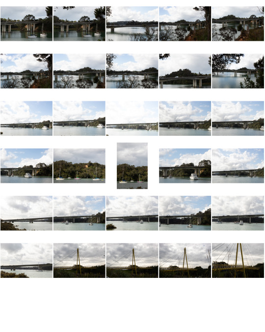
A short photoshoot and here's the contact sheet.
The weather on this day was very spontaneous and therefore the cloud cover changed a lot through taking these photos.
I used 400-500 ISO with f11 stops on these photos. It was really good when the sun was shining but I didn't pay attention to the cloud cover when it came to the yellow bridge so the photos came out darker.
0 notes
Text
Week 9 -> Photographic Collage or Photomontage
There are many forms of collage about there; the space favours the physical creation of these art pieces, but in recent years, the capability to create this style of art digitally has continued to advance. This further reflects our capabilities as human to create manipulated imagery just on a whim.
My main and biggest inspiration is David Hockney, but what about other artists who have dabbled in this digital photographic art form?
I couldn't find many artists who utilise the digital art form; however, there was one who interested me. Her name is Martha Rosler and she is a photographer who does photomontage. In her House Beautiful: Bringing the War Home, New Series (2004-08), she looks at issues plaguing America at home and abroad. At the time, the United States was at war with Iraq and Afghanistan. She also brings up the climate of national security, which all events are linked back to 9/11. This was also a response to America's war in Vietnam in the 1960s.
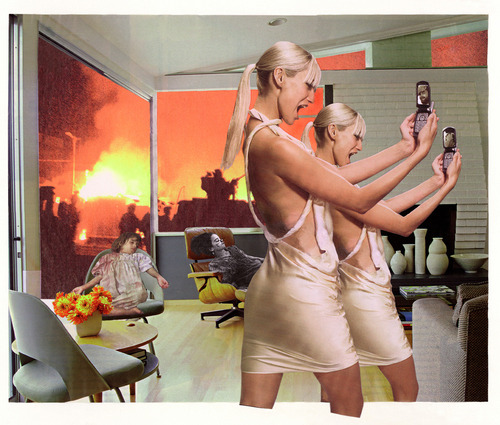
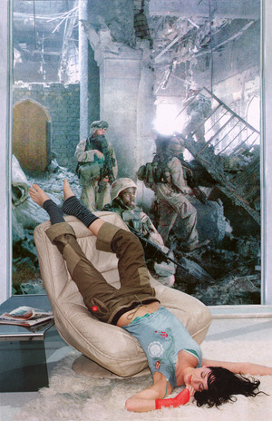
In these two examples, extracted from her website you can definitely pick up on what it's referencing. The semiotics of these paintings are clear; on the left, you can see the girl who's obsessed with taking photos, not caring for what's going on behind her, out the window. The repetition of her appearing twice emphasises the fact that she's distracted and is also a literal distraction from what's going on in the background. In other words, it's communicating that since the war is far away from American soil, there's little sympathy or care from the youth about what's happening abroad. The manipulation that causes our eyes to be distracted by an animated woman you can easily overlook what's happening in the background.
In the second image, it's easier to understand. The woman is asleep on a couch, possibly communicating how Americans aren't aware or are unbothered by the wars abroad, as out the window show's the true reality soldiers are facing while we enjoy the safety of peace from within national borders.
1 note
·
View note
Text
WEEK 8 -> Experimentation

I'm in this phase of trying to figure out where I'm going with my final outcome. With the images I have from my sister's netball tournament, I left a lot of gaps, which made it hard to stitch these photos together to create a seamless piece, and what ended up happening was a stitched-together panorama!
I think I used about six photos to create this image.
0 notes
Text
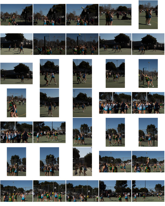
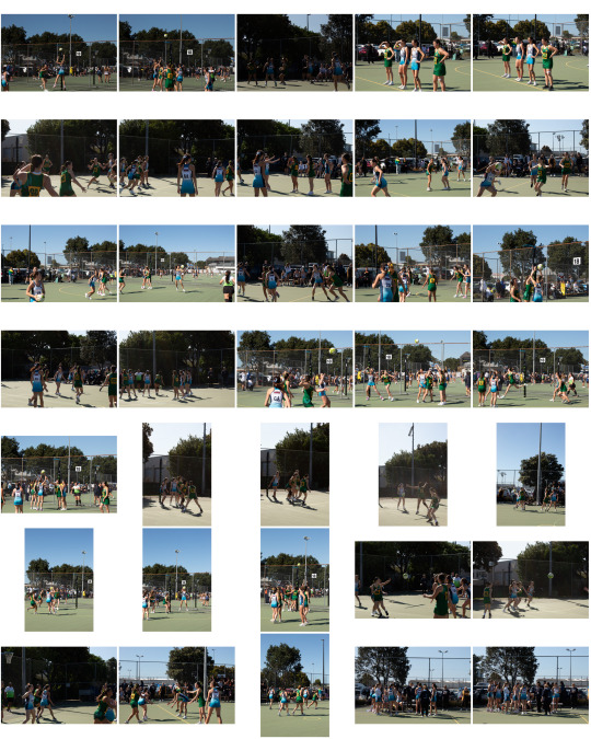
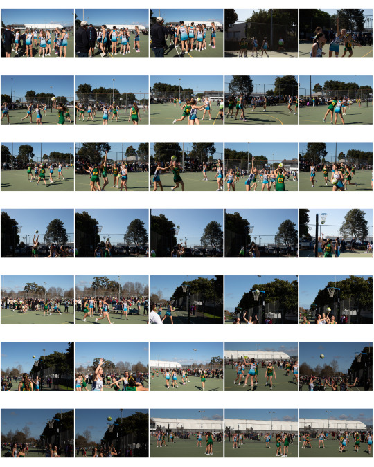
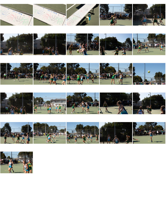
Over the Break Photos.
A lot of photos were taken on this day.
Something that was challenging was how bright the day was; there were virtually no clouds in the sky, and the sun was directly bouncing off the court. This made for a very difficult photoshoot but I think I went about it nicely.
I used 400-500 ISO with 11-16 f-stops, depending on where I was positioned.
I'm going to experiment with these photos.
*note there are more photos I took, (about 200 or so) but I couldn't contact sheet them all due to storage limitations.
0 notes
Text
Over the Break
Over the break we were required to take at least one photoshoot.
I was given an opportunity to take photos for my sister's Netball team at UNISS, a New Zealand nationwide Netball tournament. It was a lot of fun trying a different type of photography style, I'm used to capturing things candidly, but usually of nature or a "still-ish" subject.
This was really interesting as I was kept on my toes, actively trying to capture in-the-moment shoots, like when the ball was intercepted, or a goal they scored, etc.

Photo above was where I was seated waiting for my sister's team to get on the court, when I realised the seats were drawn on, so I took this photo.
This got me thinking about how I was going to move forward with my assignment coming up, and how I could combine this photoshoot with the David Hockney method.
0 notes
Text
Week 5 -> Positioning Statement
In today’s day and age, photo manipulation is rampant throughout social media; in Gen Z culture, we feel pressured to take photos, or else it never happened, and when we do, they’re likely edited or staged purposefully to present ourselves in the best way. Even though we know they're staged, we still take them for authentic credibility. This semester has been really interesting to learn and pick up Adobe Photoshop to its fullest, I have used Photoshop previously but not at a scale or magnitude like this, usually to mask an item before transferring it over to Illustrator. Methods I used to help create my compositions included taking inspiration from artists such as Geoff Lowe and David Hockney, I plan on researching more artists in the next semester. Additionally, with this inspiration, I looked into our imagery banks and started processing ideas via paper, this helped to communicate possible ideas I had. David Hockney — an amazing artist and photographer with his unique style is something that really captured me; however, due to the limitations of the brief, I unfortunately couldn’t follow through as a possible idea. Over this semester, I feel as though I have had some hit-and-misses in terms of outcomes that I’ve produced; as with everything, I’m still learning the ropes and improving my skills with the software we are primarily using to create these compositions.
0 notes
Text
Week 5 -> Second Composition
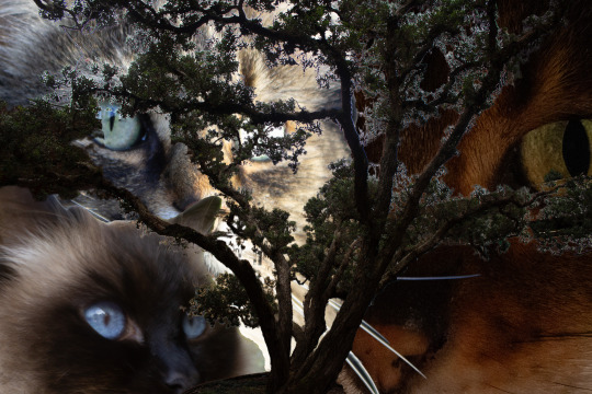
Playing purely with what's available within the repository this time — photoshop decided to get really finicky with me and I was losing patience, so the outcome wasn't entirely what I wanted but the vision was there in my opinion.
I was trying to go off of this idea of "curiosity kills the cat", and the tree is like a symbol of climate change... you get the idea.
I think what's not working here is the fact that the tree has simply too many branches and little spots between the branches that are really hard to get into to get rid of the previous background. I also think that the different lighting seen on the tree and the several different cats doesn't help make the image cohesive.
I think I definitely was overshooting in my capabilities with this one, which is fine, and I'm excited to see what I'll do for my final.
0 notes
Text
Week 4 -> Process on Paper
Looking through the available photos in the respitory and thinking of possible ideas and what I could do for my next composition.
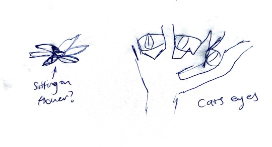
I decided to show some of my inner workings that I did on paper, as I found it quite overwhelming thinking of ideas in my head that I needed them out on paper.
0 notes
Text
Week 4 -> Research — Geoff Lowe


Geoff Lowe is a newly emerging photographer who utilises the art form to convey his creativity. He will photograph anything but is well known for his manipulative photos from sporting events.
I think the use of repetition and combining people into one image makes for some really interesting layouts, and it would be really fun to try to recreate for myself.
The photos are quite eye-catching, as you want to look closer to see what exactly is going on.
0 notes
Text
Week 3 -> First Composition

This here is my first composition using David Hockney's method of placing imagery over each other to 'rebuild' the image. I really liked this method and would love to go further with it, however, this method wouldn't pass the assessment due to the lack of other people's imagery (two at least) but I could add other elements of other people's photos, but the brief calls for ONE image of mine, whereas this is multiple...
I took these photos during sunset, and I was only there for maybe 30 minutes? Just snapping photos, but it's so cool to see how the skies changed colour within that timeframe; when I was converting the images to tiffs from Raws, the ship on the right-hand side got discoloured, which is unfortunate. Really interesting to see the lighting fleeting that quickly during the golden hour.
I also like how its so obviously manipulated, I think there's some fun in making manipulation obvious over trying to make things seem realistic.
0 notes
