Don't wanna be here? Send us removal request.
Text
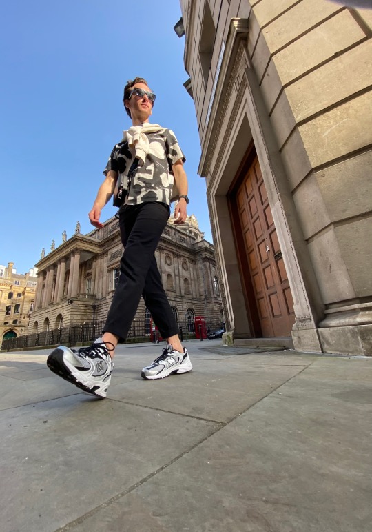
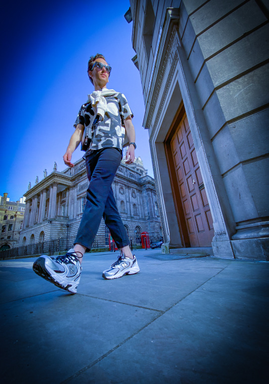
Original/ outcome :
Even though I struggled working my way around the software I am happy with the outcome comparing to the original picture, however I was just experimenting and messing around with filters etc.
0 notes
Text

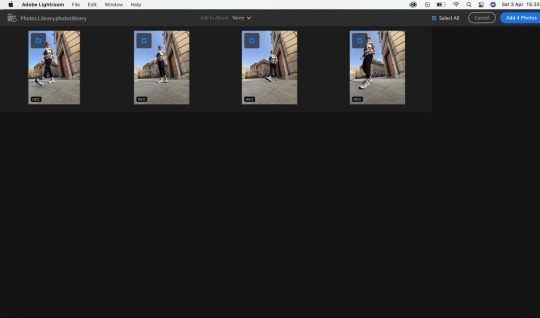
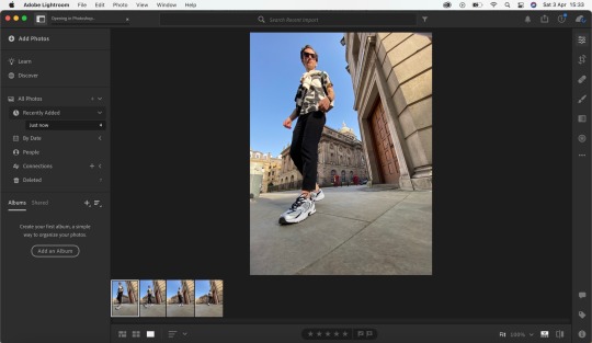
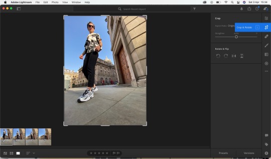
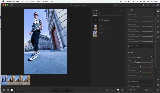

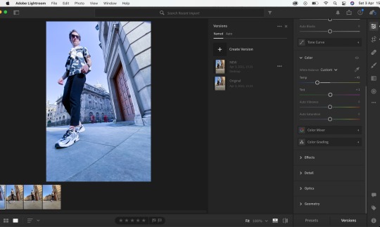
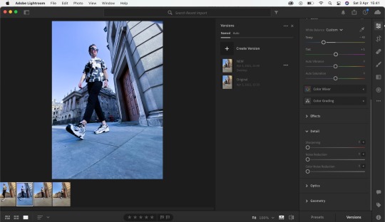
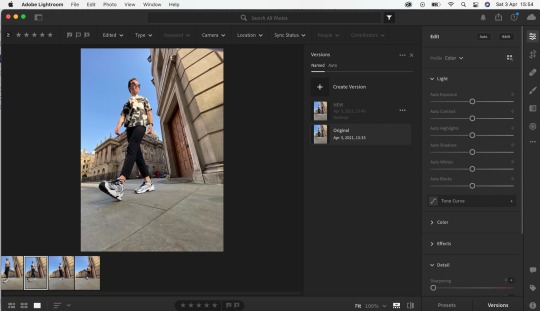
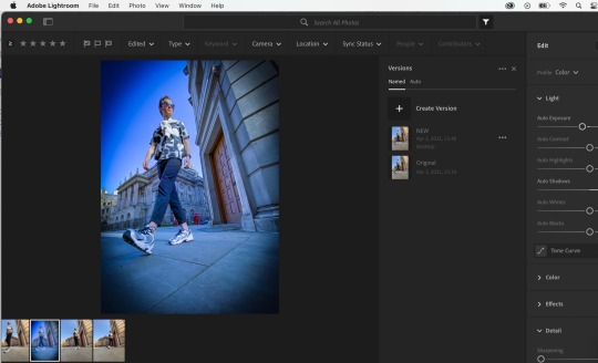
Adobe light room :
Adobe light room was a simple process if you know you way around the software, and it could be fun, as there is so much you can do to edit your photographs on how you would like it to look producing the best quality, however I struggled quite a lot as my Adobe light room didn’t quite have the same layout as my lectures so it took me a while to figure out where certain tools where, it is definitely something for the future where I will have to sit down and work my way around the software properly and teach myself more.
0 notes
Text

Experimenting with a variety of layouts :
After receiving feedback from my lectures I was advised to mess around with a variety of layouts. (Explained in more detail via image)
0 notes
Text
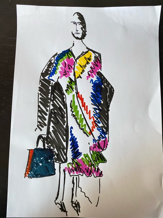
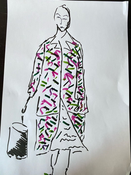
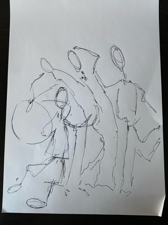
Outcome :
This was a really fun workshop to do, it brought me out of my comfort zone on what I can achieve without very thing being so precise and neatly as that is how I normally am and think when it comes to creating art basis pieces. It has definitely brought my confidence up.
0 notes
Text
Another drawing process
This process was slightly different to my other drawing task as we only had a short period of time drawing from imagery which was shown and over lapping them.
0 notes
Text
A morning with Helen Bullock :
Great morning with Helen Bullock for her workshop ! I really learnt a lot, how everything does not need to be perfect, it can be messy it can be mad, you can come out of the lines, It was a new way of thinking for me ! And definitely something I will take on board!, Helen bullock creates fun quirky illustrations, with colours materials and textures, today’s workshop was taking a photograph from a fashion show/runway and recreating whilst’s using a variety of techniques here are a couple of videos showing the process.
0 notes
Text
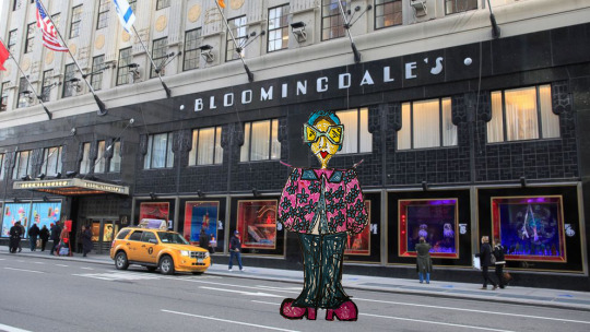
Outcome :
Eve Cavell likes to create backdrops/ find locations for her illustrations by cutting them out and placing them in front of them, our task was to do the same process, I cut mine out in photoshop and edited into a New York back drop in front of Blooming Dales I felt like the illustration I had created she was fashionable and ready for a day of shopping 🛍.
0 notes
Text
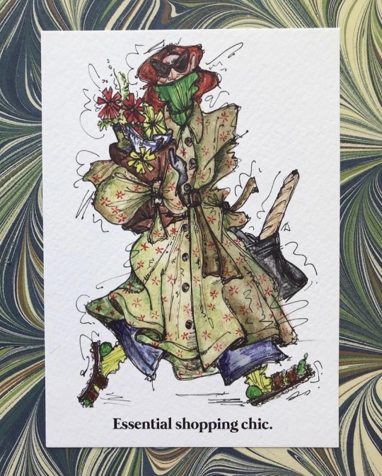
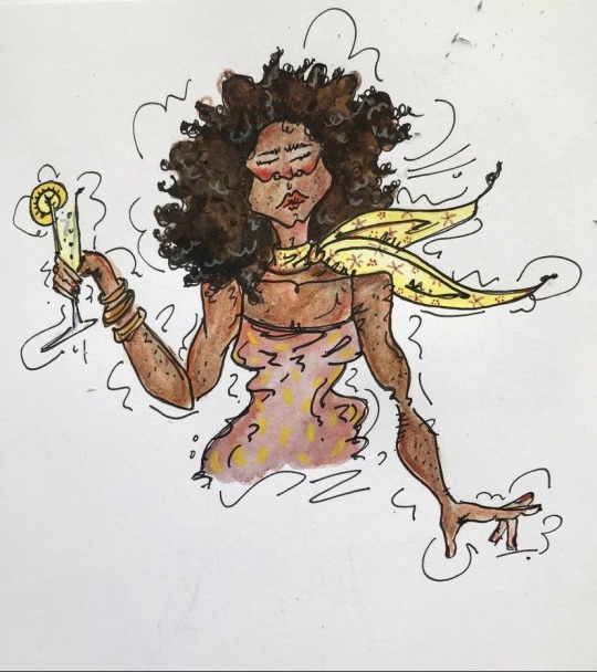
A morning with Eve Cavell :
Students had the most amazing opportunity to have a work shop with the talented Eve Cavell her work is out of this world the detail and time that gets put into each piece, I was such an amazing experience been able to have a first hand basis to watch her work and create a piece, we where then able to produce our own, I have shown a couple of videos of the process and finishing outcomes.
0 notes
Text
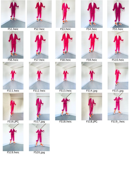
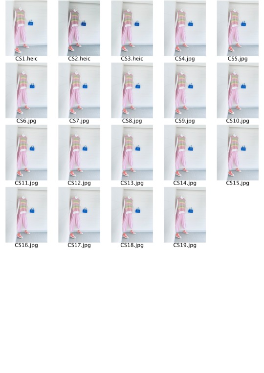
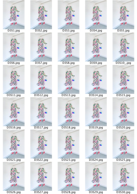
Final test shots :
These are my final test sheets which will help me decide which photographs I am going to use l within my editorial. I am really enjoyed creating this bundle of test shots as it was giving my a clear picture of what my editorial is going to look like when deciding on my layout. I have developed a lot from my first bundle of test sheets as my first ones where basically a path of what direction I wanted to take in locations and styling, did they work did they not.
After receiving feedback from my tutors, we came to the conclusion that the clear white background was the most effective which stud out from the other locations and style work. I also was given feedback to either keep the photographs black and white and not mix the two together as it didn’t fit in with the Gentlewoman magazine, after processing that feedback I decided to go with the colour images as my editorial is based on Spring/Summer 21 colour pallet.
My tutors also really found the leg kicking the shoe really effective and worked really well, so I experimented around with styling and a variety of colour pallets that would stand out against the white back ground which led me to my tutors giving me the idea of creating styled full outfit looks as still life pieces for example laying garments on the floor or hung up, again I need to make sure I chose really carefully on what clothes I needed to choose and style together as I needed them to stand out from the background.
Through out this process I also discovered how to create properly made tests sheet within photoshop as I just created my own tests sheets in my original test shoots. Over all I am happy with the outcome with my final test sheets as I think I have developed from receiving feedback and paying attention to what was going to work well and what was not.
0 notes
Text
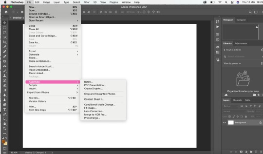
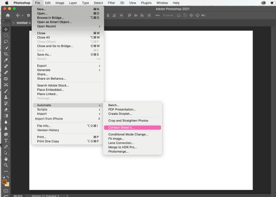
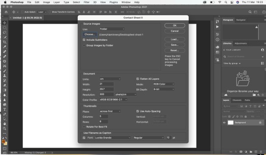
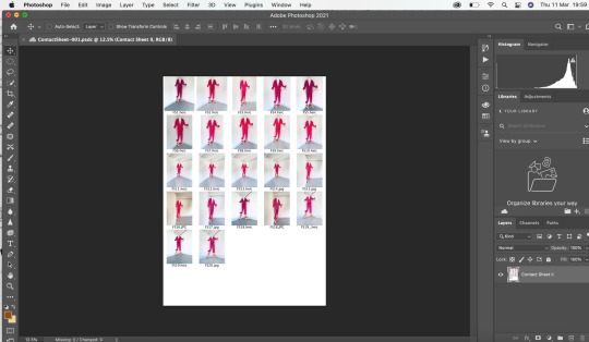
The process of creating a test sheet for my editorial photographs :
I wanted to create a properly made tests sheet without me just creating one within a word document, it was so time consuming to make a test sheet for each of my bundle of photographs that I had taken, so I decided to research how to create one within photoshop on YouTube.
0 notes
Text
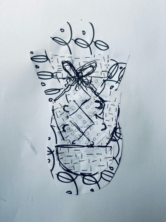
Outcome :
Finished piece, I enjoyed doing this process, however it was quite difficult re creating a shoe. What would’ve had worked better is creating more darker tones and shading to make the shoe more visible when putting the shoe together. it’s not my best work but I had fun doing it.
0 notes
Text
Starting the process of cutting out all the drawing tasks I have created a starting to form the shape of my shoe that I have chosen.
0 notes
Text
This drawing task was a three minute task focusing on darker shading areas that will become your shoe, you came up with your own design your self.
0 notes


