I’m an art student an this blog is dedicated to my assignments hope you all enjoy
Last active 60 minutes ago
Don't wanna be here? Send us removal request.
Text


The progression of my final project, from the original article to my collage. I really enjoyed this project a lot, it was nice being able to explore digital media in this class since we normally only used traditional/analog mediums like paint or the color aid paper. In a weird way using a digital medium almost adds to this project since these articles are grabbed from the web. Making this whole process soley digital from beginning to end.
I chose the article I did since I was drawn to variety of colors in it. I felt such an abundance of color would help with making the final more visually appealing. However having so much color added to the challenge of the project. As can be seen in the intial color blocking I went small to try and geab every detail I could find. And while it did take a while I did enjoy it. I found it interesting to see the way colors interact with each other when taken away from the context of the original piece.
For the collage itself I wanted to create a balance between the elements. Using chaos and harmony to reflect the nature of the original piece but not making the collage to overwhelming.
I'm proud with how everything turned out and I see this is as a great final send off to this class and everything I learned.
Original artist statement under the cut
For this final project the goal was to visualize the breakdown of colors and observe how each color choice creates visual enticement. We were tasked to choose a news article with a dynamic header and create a collage from the colors we found within the piece. The article I chose stood out to me a lot since the artwork included a variety of colors and had a lot going on in the composition. The color analysis revealed to me just how much chaos is present in the original artwork. There is a wide range of color from all ends of the spectrum that even I couldn’t fully represent here. But with what I was able to grab helped me understand this relationship of chaos and harmony in that original artwork. When I was putting the collage together I had to carefully calculate the intensity each color would display in the piece. And it was within this process I began to understand the balance between color and composition.
Which led to me creating a final piece that had the balance of the elements. I see this piece as being able to represent the chaos and variety that the original artwork has while also not being overwhelming to look at. I’m proud of the work done here with this project.
0 notes
Text


Some work in progress screenshots from the final collage project. This project has been easier than the last and I am thanful for that. Being able to do this digitally is less exhausting and time consuming than it would be in an analog medium. However that is not to say its a complete breeze. Picking all the colors have been tedious but i suppose thats what happens when you chose a piece with so much going on.
I am enjoying the work so far though. I like seeing the way the colors interact with each other when broken down like this and removed from the context of the original piece. I also like that I'm finding colors I didn't even notice at first glance.
0 notes
Text
Josef Albers Reading
I found this reading to be incredibly fascinating. It’s always nice being able to learn about art from the artists perspective and this is no exception.
To me the most interesting thing about this article was the perspective Albers approaches art with. He doesn’t like to consider himself an “expressionist” but rather a realist in the sense that he is depicting his own reality with his work even if it looks vastly different to what a regular audience would consider realism. It reminds me of what I read about Kieslowski when I researched him and how he never considered himself to be an artist, using his movies to reflect his perception of reality. I am moved by this perspective because it plays into this idea that reality is based on what we perceive. Another perspective i found interesting was that Albers specifically states that he makes his art for himself. He corrects the interviewer by saying he isn't making art to "express himself" but rather to please himself and use it as a teaching tool for others. I think this perpspective is interesting because its one that many people seem to ignore when it comes to discussions about art. As Albers describes it his art is himself, therefore he is making art for himself. And by doing so he's sharing himself to the rest of the world. He's not expressing himself in the traditional sense but rather hes putting himself out into the world for others to observe and understand. I think about this in relation to my own artistic process and how I feel a similar way. Overall this was a very interesting read.
0 notes
Text


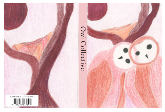
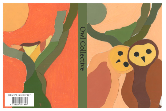
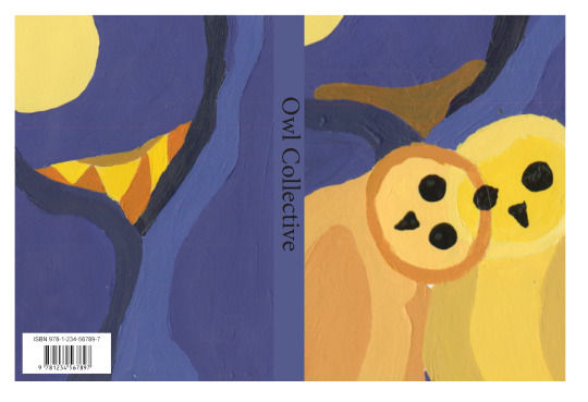
These are my final pieces for my book cover assignment. I had a lot of fun with this assignment and I like the way everything turned out. My base design was two owls huddled with each other by their nest for the front and a close up of the nest and moon for the back. for each cover I wanted to create a specific vibe with the color choices. for the painted version my triadic color scheme includes various purples and oranges. For this one I wanted to represent a night time scene with the owls being these figures glistening in the moonlight. For the color aid I went with and evening vibe, using reds and oranges to symbolize a sunset. For the color pencil version the monochromatic scheme was of red and I focused on the lighter shades of this color to create a soothing and loving mood.
While I did struggle with some bits of this project, mostly with the coloraid, I believe this project turned out well and I'm happy with the results I created.
below the cut is my original artist statement for this assignment.
For this assignment I was tasked to create various book covers with 3 different mediums drawing inspiration from book covers of the 60s/70s. Since book covers from those eras heavily focused on using simple designs with powerful colors to convey something about the book.
The subject for these covers is the barn owl since it’s one of my favorite animals. I chose owls because they have simple shapes, like circles, ovals, triangles, that can be easily broken down into simplistic designs.My design features two owls snuggled up next to each other since I wanted to depict these creatures is a more friendly way then they normally are seen as.
I drew inspiration from the example covers that demonstrated overlapping colors like the cover for Mensch und Tier since the transparent effect created from the colors fascinates me. The color choices I used play into how I depicted the birds. The painted piece contains a lot of purple and yellows to symbolize the night and the moon respectively. Likewise the colored pencil piece uses softer reds to elicit a feeling of love which reflects the way the birds are posed huddled next to each other in a nice embrace. Overall this was a fun project to work on
0 notes
Text


Exercise 3- bezold experiments
This goal for this assignment was to expire by with different color schemes to highlight how the behold effect works. Each square started out with an initial color scheme and would be changed in a certain way for the second.
The first one used an analogous color scheme and alternate version had one color altered to be a complimentary color. for this one I used a red-orange color scheme and changed one color to blue. The second was a color scheme of my choice and the alternate version of that was the same colors with a shift in their hue. For this I used a blue, purple, and orange color scheme. The third one also used a color scheme of my choice and the alternate version had the colors switched in the composition. For this I used a variety of greens and greys.
I view this assignment as a success and it helped me better understand what the bezold effect does. I enjoyed the process of experimenting with different ranges of color. Each composition has a vastly different color vibe from the last since I wanted to test out this tactic on a wide range of color not just sticking to strictly warm or cool colors. Doing it this way also helped with organizing the assignment so each technique is clear to see.
Post
0 notes
Text


These were some of the photos I took during the process of the book cover assignment. The first photo shows my initial sketch which depicts two owls huddled next to each other and the other photo shows one of my WIPs for this project. For this assignment we where tasked with designing a simple book cover and making three variations of it using different color schemes and different mediums. One had to be made from paint, coloraid paper, and colored pencil. everything was going well so far although there was a bit of struggle with the color aid and finding the exact colors I wanted to use.
0 notes
Text


From a recent finished project. this one was all about breaking down an old art piece into its basic color schemes and reconstructing it with something new. Personally using the color aid paper to match swatches was my favorite part of this project. Being able to bring it to life and see just how closely matched ,y colors were was a wonderful feeling. For the reconstruction piece I will admit its not the greatest, but in a way thats part of the point. My original idea was to recreate the piece with all organic material like leaves and flowers. However being a bit inspired by the likes of Vic Muniz I wanted to create this piece from trash and scraps. The thought was creating a certain juxtaposition from the original beautiful piece depicting the natural fruits, to using "ugly" trash in its place. Perhaps there can be a bit of commentary seen here about waste in our modern society, but I was mainly inspired by seeing all the different colors pop up in my environment when looking at old chip bags and candy wrappers. An interesting experiment indeed.
0 notes
Text
Recent reading analysis
So for this time I read an excerpt from The Elements of Color by Johannesburg Itten, and this excerpt was all about color contrast. The section talks all about the various color contrasts, such as hue contrast, light dark contrast, cold warm contrasts etc, all while providing detailed in depth explanations to how these color relationships work. The section also provides examples of each contrast in real world art pieces. Alongside that the section also provided examples of exercises that could be recreated to see these contrasts for one self, a helpful tool I’ll say.
I find it interesting how much detail is provided for each of these contrasts. It creates almost a reflection of the emotional impact these combinations can have if that makes any sense. Because the way colors interact with each other is more than just a visual anomaly. I find that this piece relates so much more to what our class is about. For one the examples and exercises provided remind me of the assignments we do in class, especially the one I’m currently working on right now, with the bezel colors, but also this reading helps elaborate that deeper connection color has that this class is also trying to teach. Overall an intriguing read.
0 notes
Text


Another bit of work in progress for my main project. The task was to find a painting and take a section of it, pixelize it, and try to match the colors with color aid paper. So far everything is going well, and I’m doing my best to get the colors mostly accurate.
0 notes
Text


Final from that color exercise i mentioned earlier. This was based around some of Josef Albers’s work and his color theories. Each piece demonstrates the different ways colors interact with each other and how certain illusions can be made with them.
1 note
·
View note
Text

A smaller color chart of some grays to demonstrate how mixing complementary colors with white can give you various shades of gray.
0 notes
Text


A few work in progress pics from assignments I’ve been working on the first three relate to the big project I’m working on and the last one is for another exercise
0 notes
Text

Final for that color chart I showed earlier. Had a little trouble getting the exact colors but I think it turned out nice enough. It’s fascinating seeing all the colors next to each other
0 notes
Text
Color Design Principle Problems Reading
This was an interesting and helpful reading that we had to do for class. It basically listed and described the various elements of color theory. Providing definitions for terms like hue, saturation, color solids, color combinations etc as well as examples of these principles found in art.
One of the topics discussed here that I found interesting was the idea of color prejudice. This basically stated that we as a culture associate certain colors with concepts and emotions, for example red as anger or passion and blue as calm. And because of this we have a bias to how we may view certain colors in the world around us.
Also I liked the variety of artwork used for the examples here, it wasn't just basic paintings but art from all sorts of styles and mediums.
overall an interesting read to go through
0 notes
Text


A few work in progress pics from the first color exercise. The task is to just color swatch a bunch of different hues to get into the habit of mixing colors. And honestly it’s working, I’m slowly becoming more comfortable with using paints and mixing colors, definitely not as difficult as before.
0 notes
Text

I have returned once again, still the same yet new at the same time. Anyway this is just a little warm up done in class today with an ar art app. The goal was to just take a nice picture using the filter and well I mean just take a look for yourself. I will say I struggled a bit trying to make this one look nice compared to my last first class warm up but perhaps the mediocre nature of this could be a reflection of this type of art. I never understand or liked this new wave of AR, nft, virtual metaverse stuff it simply just doesn’t look good to me. Comparing this to the original it just doesn’t feel the same, feels like the soul is gone in a way.
But perhaps I’m looking into things too hard and this picture just came out bad but that’s for you to decide.
0 notes
Text


A colorful festival, my final project. Very proud of how this one turned out. Took my inspiration from all of those colorful koi fish kites and pretty festival lanterns. It’s hard to believe that the main design came from the letter S
0 notes