This is my blog, here you can see my journey as an arts student and my creative processes. Thanks for stopping by.
Don't wanna be here? Send us removal request.
Text
Vis 3002 evaluation.
For the vis 3002 module I was required to create a presentation on my foundation year and how I have progressed artistically, I also had to state what BA course I wanted to move onto after the foundation year and why.
Firstly, I had to state my name, the BA course I had chosen and why, this was troubling for me as I wasn’t sure what course I wanted to go on to at first, I couldn’t link my presentation to multiple courses as I could only go on to do one so I had to make my mid up on what course I wanted to do first and then link my presentation to that course. I eventually decided that the best course for me would be Design for Performance as it allowed me to broaden my creativity as well as create works that relate to the profession I would like to go into, it also allows me to continue to develop previous and new skills and techniques that I have learnt on the foundation year. I think it’s also a good option as there is a range of fields of work I can potentially go into after I finish the course.
I then had to state my influences, inspiration and motives which didn’t have to relevant to just the BA course I was moving onto. I think that this part of the presentation was the easiest part for me as I just had to state what goals I set for my self and what inspired me throughout the foundation year. I liked this part of the presentation as I got to think about where some of the ideas I had over the last year had come from and how much I had achieved which I hadn’t really thought about before that.
Then I had to show my research and development throughout the year, this section was interesting and fun to do as well as I got to see how far I have come since my time at Sixth Form as a BTEC Art and Design student up to now, I can say that I have definitely expanded my creative and artistic ability and have developed greatly over the year. It’s clear to see in my work that I was afraid to make mistakes so I wouldn’t try new things, but now I’m willing to try new things out as mistakes are part of trying out new things, it took a while for me to learn this but once I did my work started progressing much faster.
I then had to state the highlights of the year and what I was most proud of, I would have to say that the moment I am most proud of over the foundation year was learning that it was ok to make mistakes and that you have to make mistakes to progress. Once I learned this I was able to try new things with confidence. The most fun part of the year was making the cardboard models and doing the photo shoots of the cardboard models. This is because I was able to create something and bring it to life by adding lighting and taking photos from different angles. I think that this might have been the moment where I took a liking to making cardboard models in general.
To finish off I had to state my strengths and weaknesses, and my aims for the future. My strengths and weaknesses segment was a little hard to do as I tried to turn my weaknesses into strengths for every point which wasn’t necessary as weaknesses are things for you to work on and improve and I I turned my weaknesses into strengths I wouldn’t have to improve them. This segment also allowed me to see how far I have progressed throughout the year and what I still have to work on.
I also liked thinking about where I wanted to be in the future, this got me thinking about what games I wanted to be a part of and what films I would like to be a part of also, but it also got me thinking about what I’d like to do in the future that wasn’t related to my future career but still would influence my my future career like travelling, what places I’d like to go and see and how it would influence my future ideas.
Overall, I think that my presentation is well made and displayed my journey through the foundation year well, I think it clearly states my interest in the BA course I want to go on to as well as what influenced me to make that decision, I think I have met all the criteria and have made my presentation in such a way that is is neither under detailed or over detailed. I’m happy with my presentation and I look forward to presenting this Monday coming.
0 notes
Text
Vis 3003 evaluation
My final result has diverted from my brief a bit but not massively, in my brief I wanted to make a 3D virtual zombie version of a family member, and I have have made a 3D zombie out of card board and a virtual zombie on photo shop.
I started off by researching the stereotypical zombie and how I could deviate from the norm, this influenced the first designs of a zombie doing human work. I thought these designs were comical and interesting but they didn’t look like zombies much so I decided to work on being able to recreate a zombies lifeless pose consistently.
This lead to me creating the A2 graphite crayon sketches of the zombies which I was very happy with. I liked the simplicity and the detail that was shown in the sketches, I enjoyed making them aswell which added to the satisfaction of the pieces. When I could consistently make the faces I moved onto a full body sketch.
The full body sketch was also fun to make and looked good again but it was standing upright and wasn’t slouched over really, I think that if it was in a more unnatural stance it would have looked better but I was happy with it for the most part.
Once I had completed the full body sketch I moved on to ink paintings which was interesting as I only had access to two colours bud managed to water down the colours and mix them to get more colour into the painting. I Was very happy with the ink paintings aswell as the looked good even though they were simple and sparsely detailed.
I was then recomended to try making a print with one of the ink paintings I made, I had to scratch the design into some Perspex, cover the Perspex in ink, remove any excess ink, prime the paper by dampening it, and finally putting the paper in the printing press and making the print. I was happy with the print and how it turned out but I didn’t like how some of the detail I wanted don’t show through.
After the print I started making the card board model, I intended to make a 2D model first and then a 3D model after but I realised that I could make a 2D model and turn it into a 3D model by layering up the cardboard to create depth and ultimately create a 3D model. To develop the model I decided to make it look like it’s breaking through the wall. I also gave it an arm to make it reach out at the viewer. I am extremely happy with the cardboard model as it looks like a huge zombie is reaching through the wall at you.
I really enjoyed vis3003 as it meant I could do my own thing and I could approach my final result in an alternative way to how I initially thought. I have found it quite interesting to see how my project has developed over the course of the module as I am happy with where I ended up but it’s not what I thought I’d end up. In a way I think that a physical model that you can touch is better than a digital one as you get absence of scale and proximity when you look at it in real life where as a digital piece you don’t get that feeling.
I have come a long way throughout this module and hope to continue to broaden my techniques and ideas. Overall I think that even though I didn’t meet the brief entirely I did follow it and create a digital piece and a 3D piece which is what I set my self to do initially, I have gone above what I required my self to do and I think that I have done well to create what I have. Again I have thoroughly enjoyed the module and I look forward to continuing with similar works in the future.
0 notes
Text
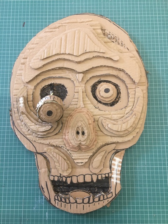
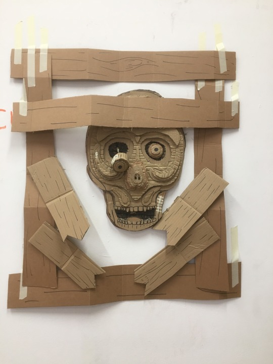
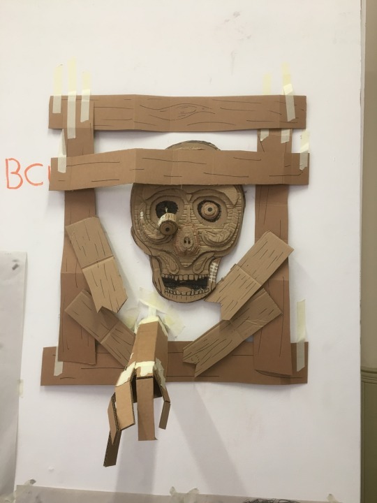
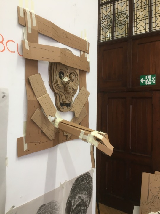
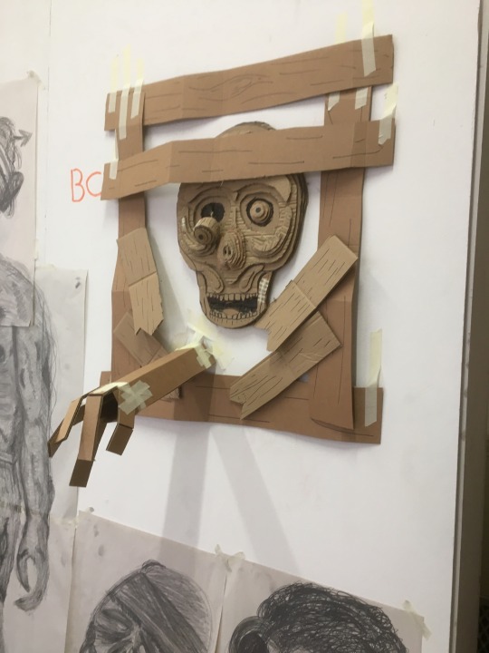
Made a card board model of a zombie face today as my next step of making 3D models of a zombie.
I made the face by layering pieces of cardboard up that needed to be built up and cutting out parts that needed to be cut out. This was done to create depth and give the face its 3D look.
To develop the model I attempted to create a scene around it. What o made was a sort of border up window or opening in the wall that the zombie has broken through and is reaching into the room at the onlookers. This would hopefully create a slight sense of fear in the onlooker as the zombie who is significantly larger than a human would be is trying to grab them.
I’m very happy with the face and I think I did a good job seen as it is my first time using that technique, However I could improve the arm that is reaching out as it was rushed and could do with some more time. I could also fill in the space around the face to make it look more like a window or an opening.
I will show the improved arm once it is made as well as the filling in of the opening when I get to it.
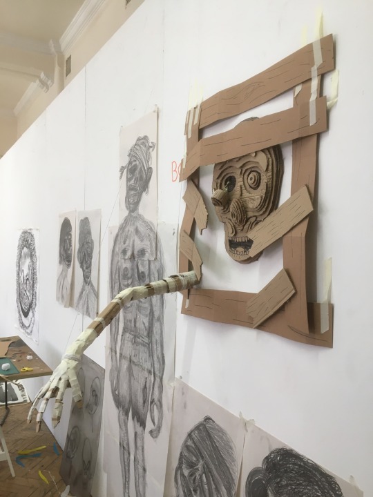
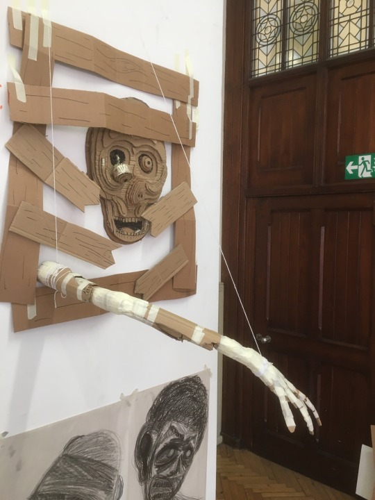
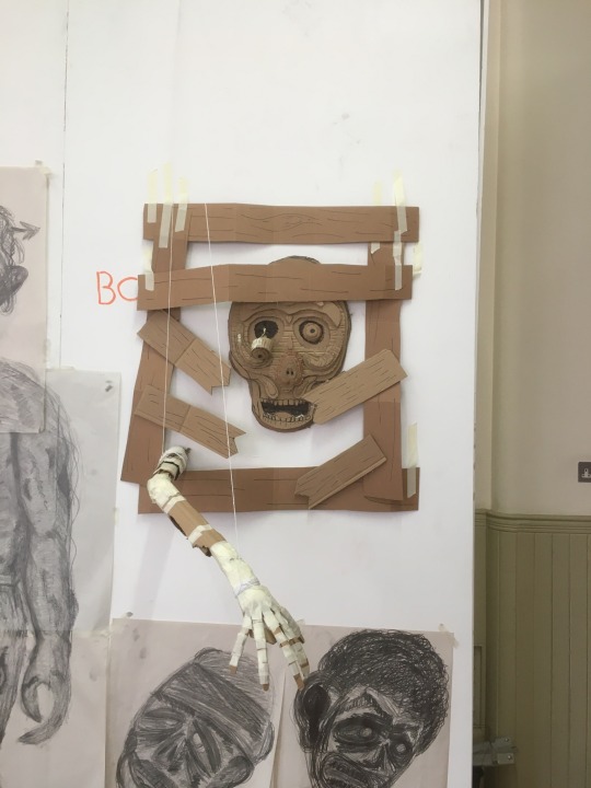
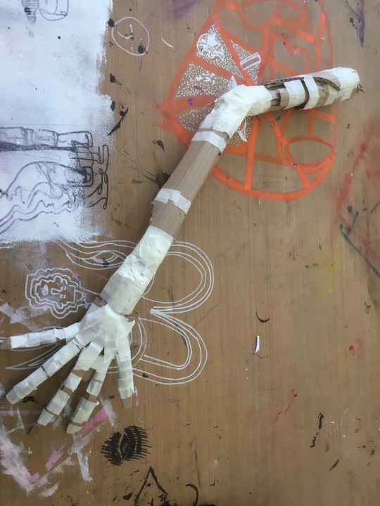
I have now created a detailed arm for the model and I am very happy with how it has turned out, the only way I could improve my piece is to use glue instead of tape as it’s stronger and would hold up the layers better then the tape does. Either way I think it looks great.
0 notes
Text
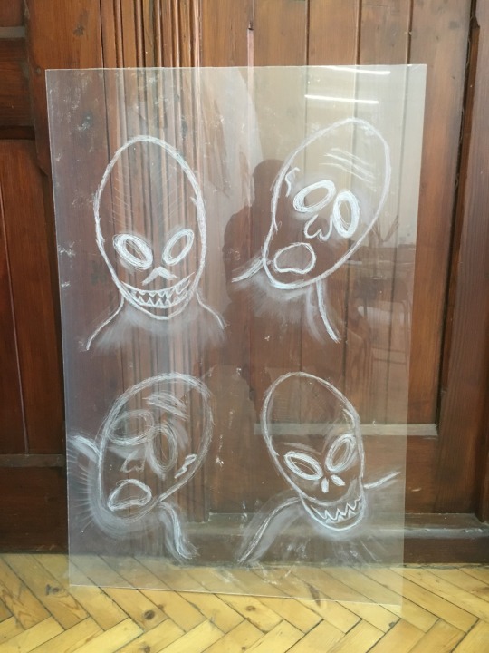
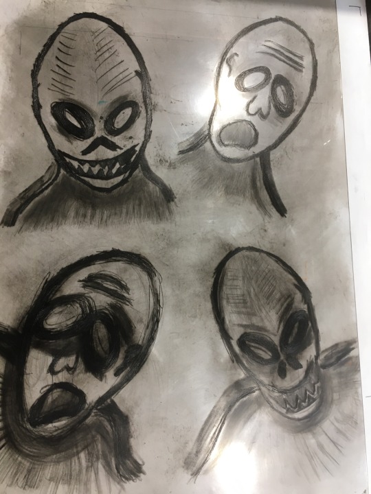
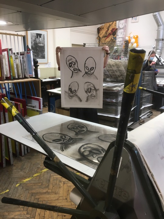
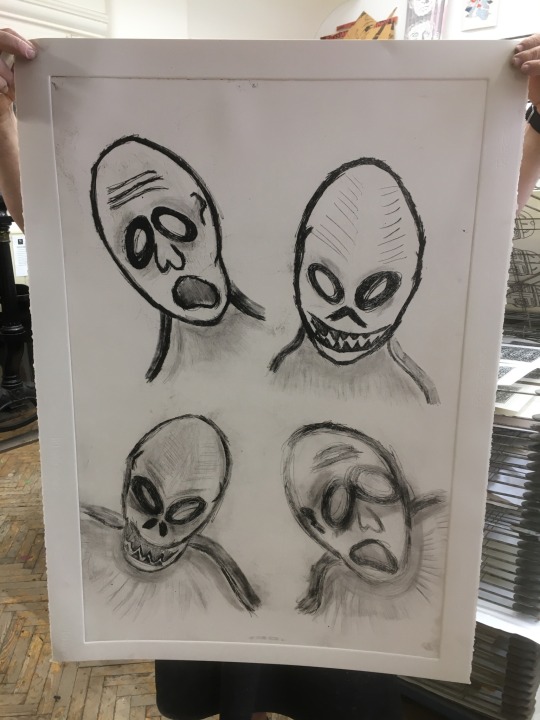
Today I made a print of one of the designs I made and I think it came ours good. The roughness of the scratching helps give the zombies that monster look.
To make the print I had to make an etched Perspex board for the ink to sit on and then ink the Perspex by covering it in a thick black oil based ink with blue added to make the print look colder like a zombie would be. Yeah then had to remove all the excess ink so that the detail would be visible. After that we had to prep the paper for the press, it had to be soaked in a water bath and then rolled till there was no shiny spots where the pater was too wet. Once it was damp enough I had to put it into the press table that was already et up by one of the technicians who also then operated the press.
I am pleased with the result however the process of making a print takes a lot of time to do, I also feel that making a print doesn’t show the amount of detail I’d like to show. I enjoyed making the print but I think that there are better methods that I can use.
0 notes
Text
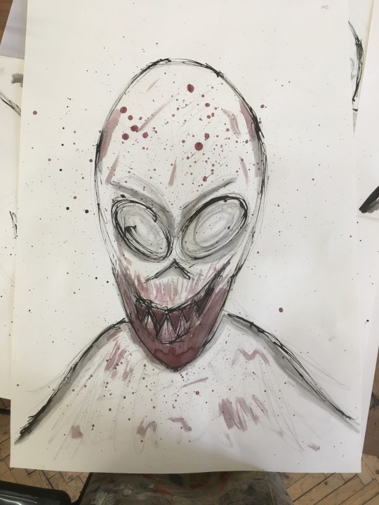
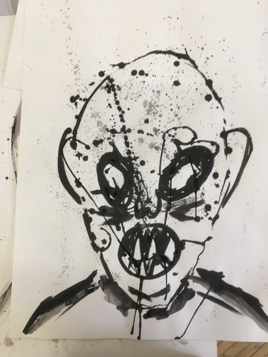
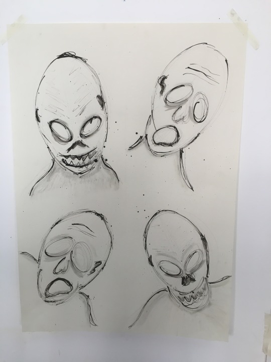
Decided to try out using ink and seeing what I could do with it, I started by testing out what I could do with the ink by drawing Patterns on the paper and thinning out the ink for different tones.
I liked the variation of tones and the different textures o could achieve with the ink so I carried on with it, I’m happy that I did as I think that these ink designs are great. I like the detail even though there are only two colours I used as a maximum.
From here I aim to develop these by making a print of it in a printing workshop soon. I’m looking forward to seeing how it goes.
0 notes
Text
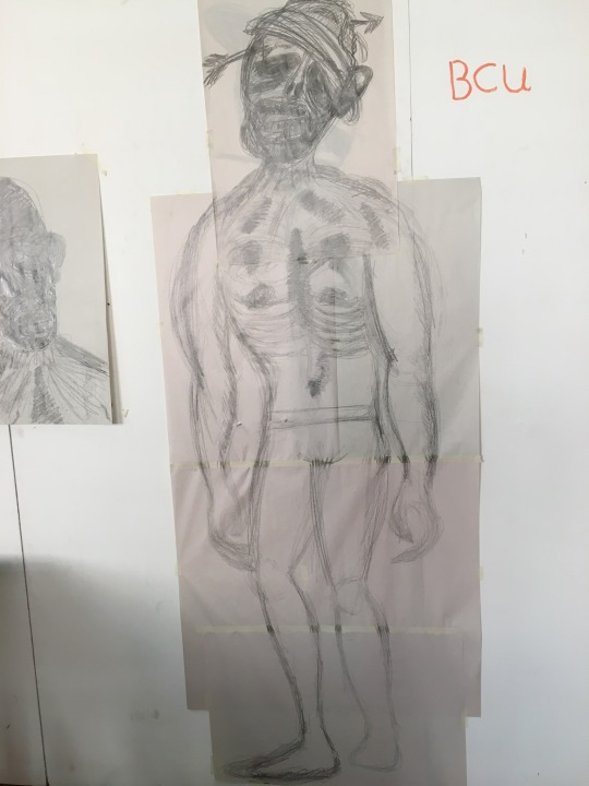
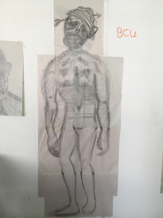
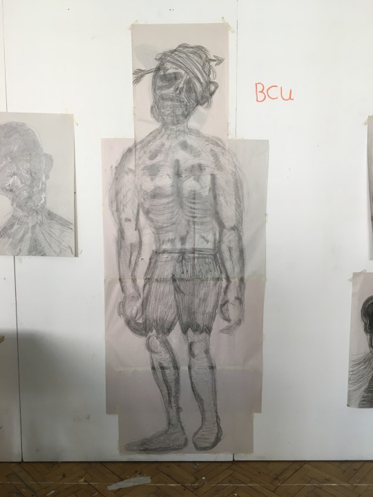
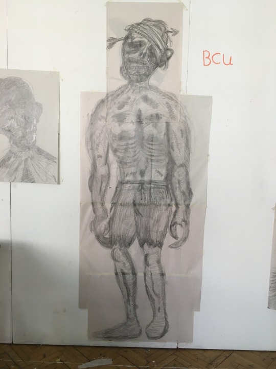
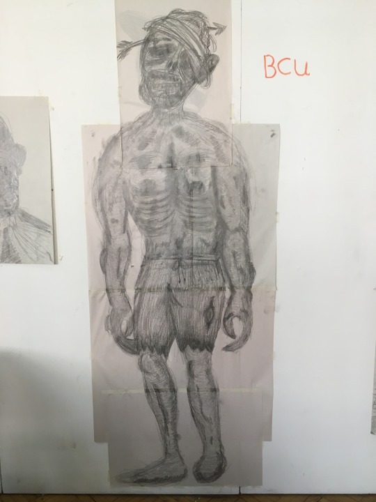
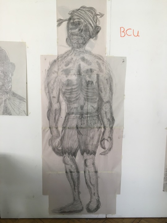
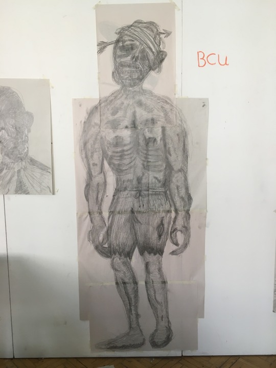
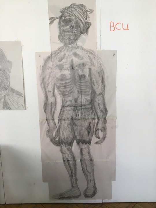
Made a full body piece today, took some time but I’m happy with the result. I developed one of the previous sketches of a zombie portrait by adding the rest of the body. I took a picture of the full piece every 10 minutes to show the development process. With these images I could make a GIF to show the zombie coming to life almost. To develop this more I could try to make the pose more lifeless and droopy like a zombie would be.
0 notes
Text
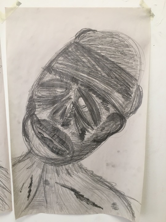
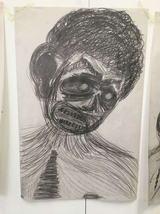
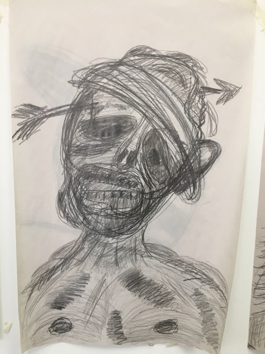
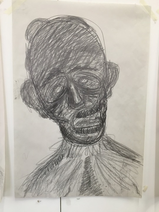
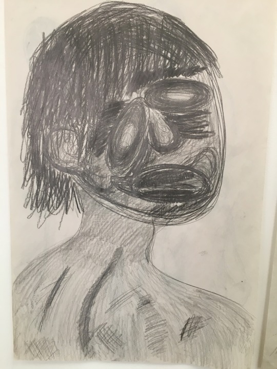
Made some more sketches today of a zombies form and I think I did well today, I think that the sketches are detailed and look like a zombie should. I have noticed that I haven’t really done a full body sketch and should do some more full body sketches.
To develop further from this I could do some full body sketches and then some 3D digital models or cardboard models, maybe even stop-motion although that is just a thought at the moment.
I feel like I have moved up a step from where I was as I can imagine what it is that I need to do to progress, I could make gifs of my creative progress by taking pictures and then putting them together. I could also layer a bunch of copies of a single image and then tare strips off to create a rotting flesh look. I’m looking forward to where I will go from here.
0 notes
Text
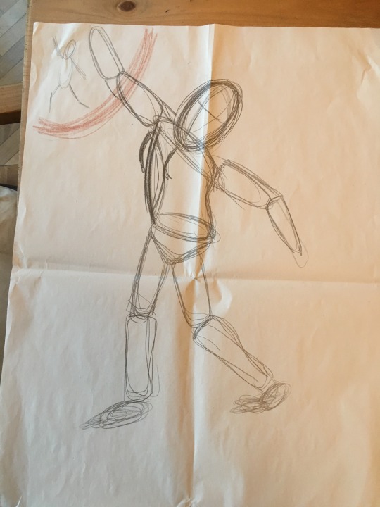
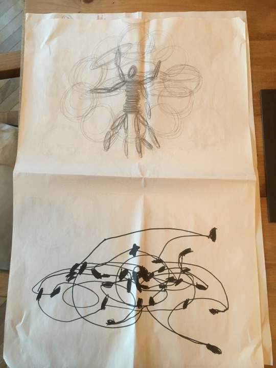
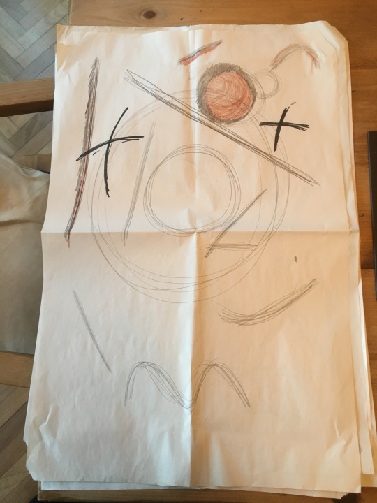
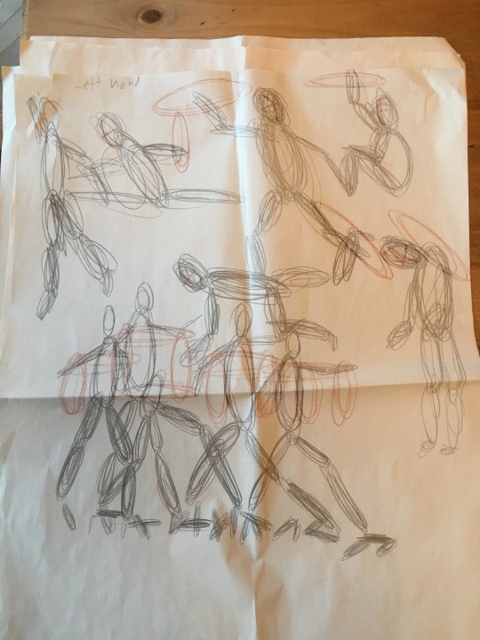
Today we had a life drawing session which was interesting, the subject was a hoolahoop dancer who would do live performance which we would have to draw and sketch out. I think it helped me with understanding human form more which is useful with my rough sketches I have been doing.
It was a little hard to draw out her form as she performed but it became easier as she moved around less and became more stationary with her performances. I enjoyed the experience and found it useful in learning different ways of displaying the human form.
0 notes
Text
Today i decided to work on trying to accurately recreate a zombies form as my previous designs didn’t look like a zombie in the way they were standing. So I did some rough sketches on A2 paper, I started with basic shapes and then worked into those shapes to create depth and detail.
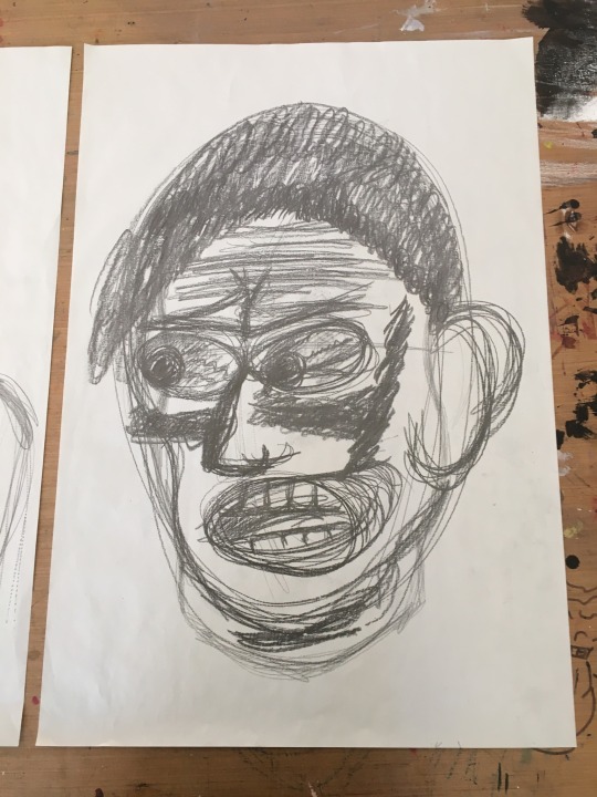
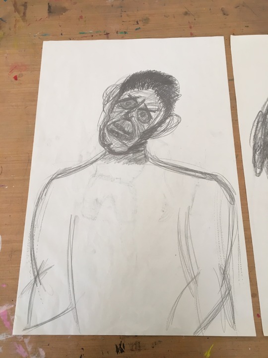
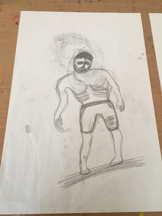
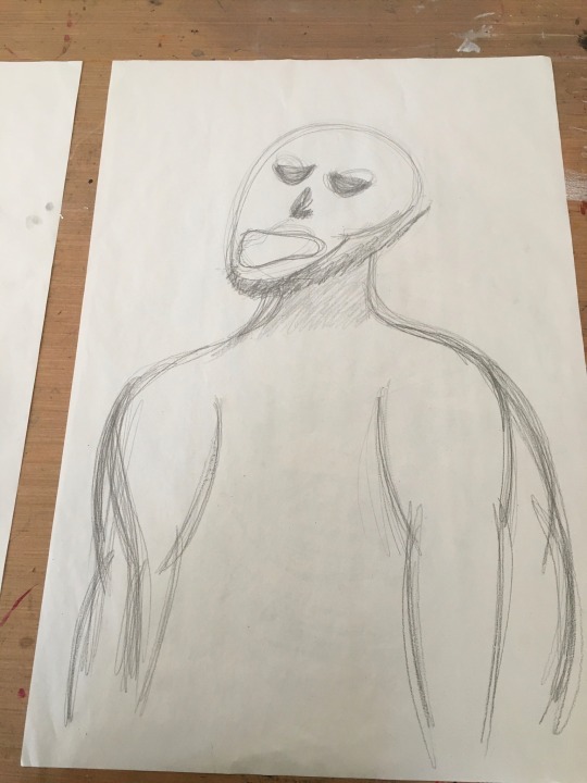
I feel that this has helped me to understand the posture of the zombies and where the weight would be shifted to when drawing the rest of the body. I like this but I need to keep going to make the process more natural to me.
0 notes
Text
Dipped my feet in the water of Adobe Photoshop again recently, I have been going through some tutorials that have been interesting to do, so far I have learnt how to import images, remove elements of an image, change the colour of certain elements and the hue in an image, edit and enhance lighting and shadows in an image and creating new layers and changing the order of the layers in a piece. I have been blown away several times by some of photoshops features and can’t wait to carry on. I haven’t made a complete piece yet but when I do I’ll put it up here.
0 notes
Text
Today we tried making collages relating to our briefs that we made at the start of the module, this is my work from the session.
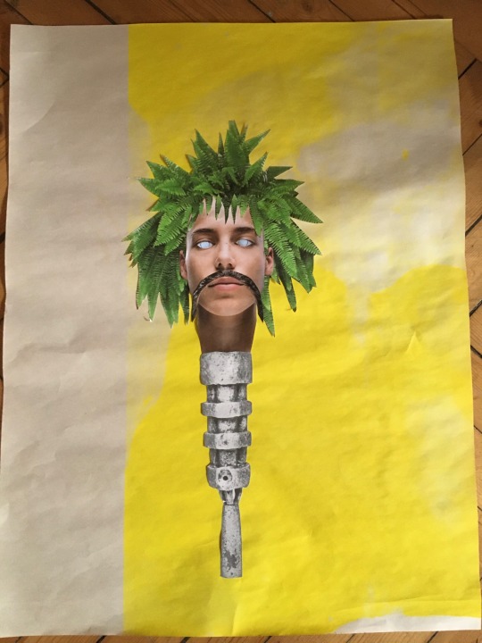
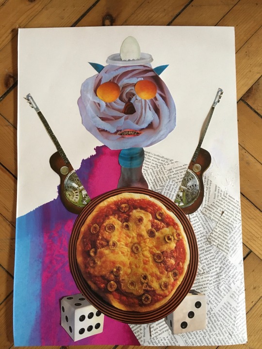
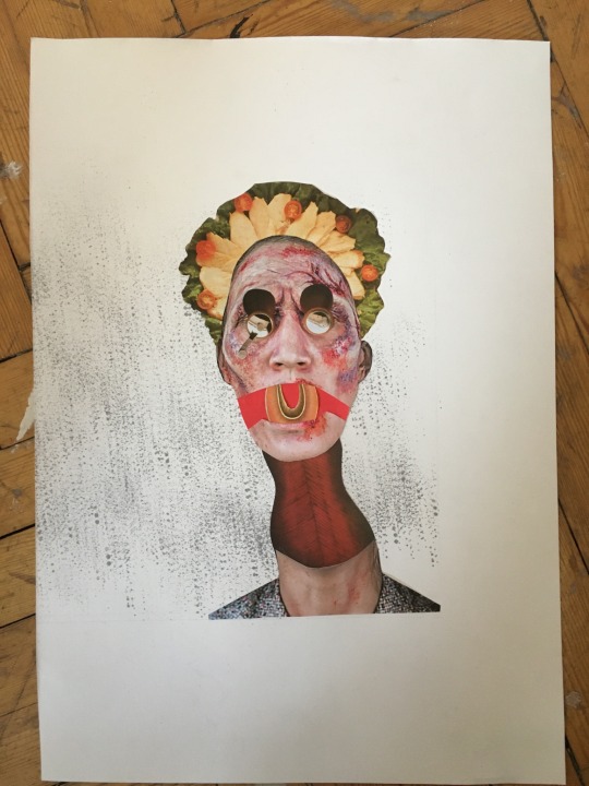
I was told by one of my lecturers that this should be something I continue to use further and I agree, this could also be done digitally aswell and I could even take it further in a digital format as effects can be added to the pieces. Really enjoyed it and look forward to trying it out digitally.
0 notes
Text
I have started to create my own character developments in a sketch book of mine.
The idea it to make an initial sketch of what the character will look like in its basic body shape and form, and then developed the pre ious design bay adding more detain each time until you are happy with the final result.
My sketches are of a construction worker that has been turned into a zombie but he still works as a construction worker putting a spin on the idea that zombies wouldn’t act like humans would as they are the living dead.
Here are my first few sketches
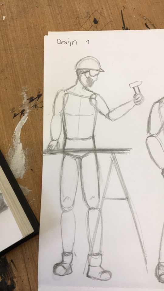
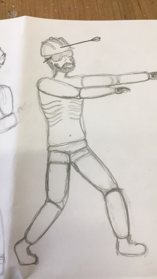
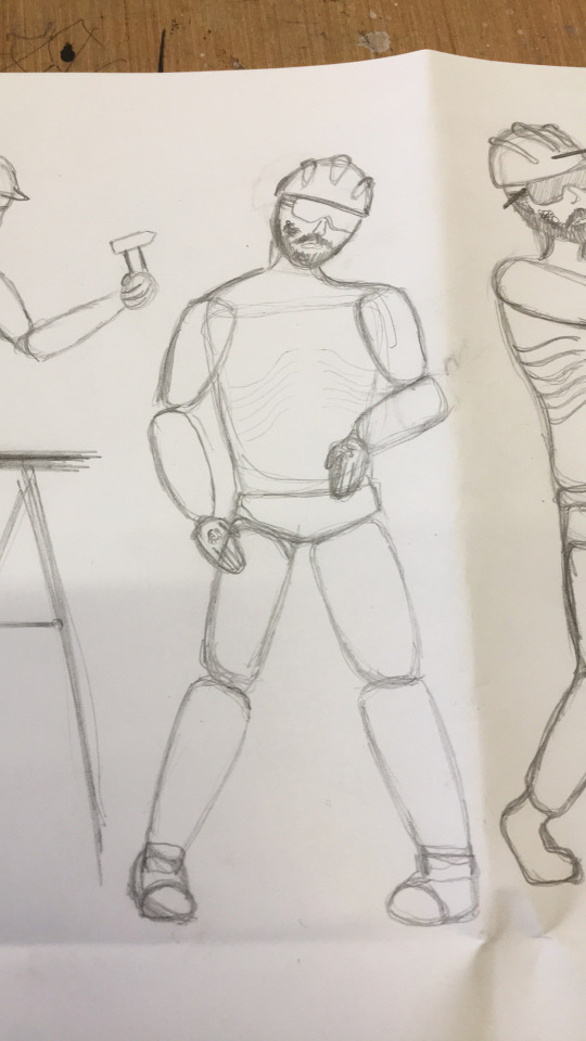
More to come.
0 notes
Text
Had a online taster session for Design for Performance today, I enjoyed seeing what the course was about and was quite interested in the model making. Could be a route I go down after my foundation year.
During the session we were tasked with gathering some random objects and a human figure of some sort and see what models we could make out of them. Here’s mine.
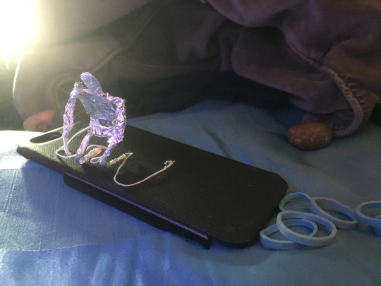
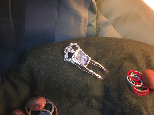
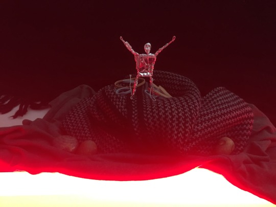
The scenes I have made carried no meaning when I made them but they developed a meaning and a narrative to others when they looked at the images, some even relating all three images to a story of a survivor of a ship wreck who found a spiritual volcano.
I enjoyed the task and the presentation a lot and would enjoy doing it again.
0 notes
Text
Continuing with my research in character design and development, I have had a look into the ideas behind the clickers from The Last Of Us game.
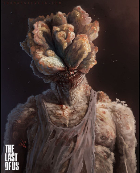
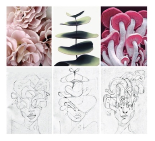
It’s interesting to see where certain details come from when looking at characters. These images have shown me that two pieces of inspiration can be combined to create a design which can then be developed further.
0 notes
Text
I was recomended to look into character design and development in my last group tutorial, I have been looking into the concept art of Darth Vader from Star Wars. Here are some of the original dsigns of the character that I found online via Pinterest.
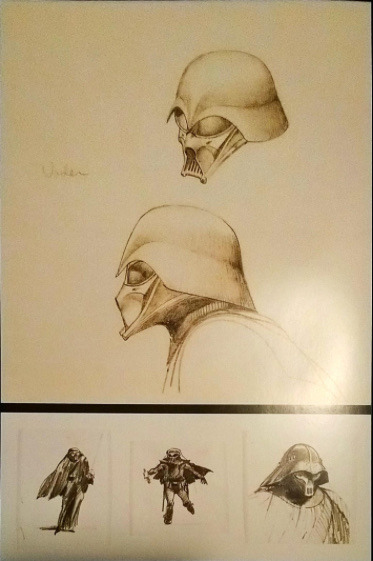
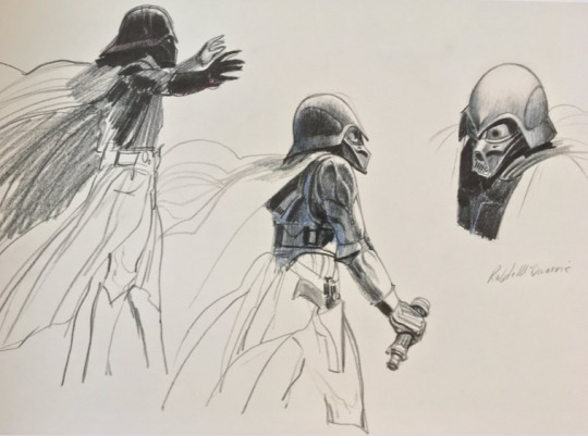
I think it’s interesting to see how the character could have looked in comparison to how he ended up looking in the films, it’s also interesting to see how the different influences show through in the final result. This has let me know that my original designs don’t have to be my final designs.
0 notes


