
Don't wanna be here? Send us removal request.
Statistics
We looked inside some of the posts by mysteriousseraph and here's what we found interesting.
Average Info
Notes Per Post
2
Likes Per Post
2
Reblog Per Post
0
Reply Per Post
0
Time Between Posts
3 days ago
Number of Posts By Type
Text
12
Last Seen Tumblr Blogs


Fun Fact
In February 2021, Tumblr had 518.6 million blog accounts.
Text


Final Project Idea
For the final exam, I used these photos that I took at Boneyard Beach in Jacksonville, Florida as inspiration. I wanted to attempt to create an Impressionistic style painting as it was one of my favorite movements we learned about. I also felt that the best way to carry this picture out into a painting would be this style as it is characterized by paintings of beautiful outdoor scenes and uses color to create the effects of the time of the day. In this photo, we see the sun setting, making the sky appear blue, pink, orange, and lavender. As I began the painting, I was met with some difficulties, one being that I realized I couldn't quite nail how to draw this fallen tree. That's when things took a turn, as you will see in the final picture, and I made my painting half Impressionist, half Abstract- another one of my favorite movements. The Abstract movement is characterized by using techniques such as gestural forms and marks to create an effect rather than painting the actual thing as seen in reality. Below I have attached a photo of myself at the beach to validate this photo's origin.

0 notes
Text

2. Art Project
Abstract, non-representational acrylic on canvas painting.
0 notes
Text
1. Writing, Thinking, and Looking Critically
Jackson Pollock was an American painter who ended up being one of the most prominent artists in the Abstract Expressionist movement. He drew inspiration and was influenced by many artists including Thomas Hart Benton, Pablo Picasso, Max Ernst, Joan Miro, and David Alfaro Siquieros to name a few. He was also intrigued by Native American Navajo paintings and Surrealist concepts about allowing the unconscious mind to guide creation. After moving to New York in 1930, Pollock was a student of Benton who was a pioneer in the American Regionalism movement, where artists focused on local and American subject matter to develop a sense of national and personal identity. From here, Pollock learned the basics of composition and eventually spread his wings to create abstract art and later his famous "drip" paintings. I believe Pollock went from studying with Benton to eventually removing all imagery in his work and making drip painting as a means to be innovative and combine what he has learned from various creators in different movements. In the video, Pollock states "I want to express my feelings, rather than illustrate them". Considering that during the time that he was creating drip paintings, he was also struggling with his alcoholism, the "chaotic" drip paintings could have been an avenue for him to express the battles in his head with his addiction, yet find a balance or escape through his creations. His drip paintings also reflected some of the core elements he learned with Benton, and I believe he applied the need to develop a sense of personal identity in his work. As Siquieros, one of Pollock's mentors stated "revolutionary art requires innovative techniques like airbrushing, stenciling, flinging paint, and controlled accidents", which I believe is something Pollock also applied to his creations.
0 notes
Text
Virtual Sketchbook #3


For this project I opted to visit the Dali Museum. The Dali Museum showcases a collection of renowned works created by Salvador Dali, a Spanish artist who was a pioneer in the Surrealism art movement and dabbled in other movements such as Cubism and Modern Art. Artists from the Surrealist movement combined rational visions of life with strange, unconscious thoughts, linking beauty and reason with the unexpected and uncanny. His flamboyant and quirky personality is easily observed through his eclectic masterpieces.
The artwork I chose to analyze is titled Gala Contemplating the Mediterranean Sea which at Twenty Meters Becomes the Portrait of Abraham Lincoln – Homage to Rothko (Second Version). This piece is an oil on canvas with collage painting, measuring 252.2 cm by 191.9 cm, and was created circa 1976. The painting consists of a sort of pattern of cubes that give the illusion of pixels to create an image. The colors used include shades and tints of blues, oranges, yellows, and neutrals such as nude, white, brown, and black. At first glance, the subject one can see is Gala who was Dali’s wife. As the title suggests, once you create some distance between yourself and the painting, you can appreciate a portrait of Abraham Lincoln created through the arrangement of cubes and colors. We can also see what looks like a cross in the “window” where Gala is looking through. This painting highlights unity and variety using repeated shapes in the same size, but they are in different colors and arrangement to create the pixelated portrait.
This painting makes me feel nostalgic, yearnful, and at peace. The setting creates a sense of peace as Gala has a relaxed posture and is gazing outside her window while nude. The setting also evokes a sense of nostalgia and yearning because of Gala staring out the window to what seems to be light emptiness. After becoming informed on what Dali was trying to communicate with this painting, I believe his art evoked the feelings he intended to. Dali was inspired to create this piece after reading an article about visual perception and how many pixels were needed to create a unique human face. He created this piece to allude to his Spanish and American identities, and counters his wife’s beauty by contrasting life and death and including the assassinated Abraham Lincoln in the portrait and dedicating this piece to Mark Rothko who was a painter that committed suicide a few years prior. Another important aspect I did not realize before was that there is a crucified Christ hidden in the sun, which further reinforces his references to life and death.
Lastly, I do think this work is a good piece of art because it communicates the message the artist intended to. Without reading the postcard or researching more information about this piece, it already evoked a feeling of nostalgia, yearning, and peace. Using allusions, Dali crafted this painting well to communicate the duality of life and death and I feel that nostalgia, yearning, and peace are all feelings one can feel when it comes to this topic. Furthermore, it is a good piece of art because it embodies what art from the Surrealist movement is meant to be. It challenges logical thoughts to create strange, meaningful and beautiful images.
1 note
·
View note
Text
5. Photo/Design: Group 2
Good layout design is used for a variety of reasons including home design, magazine/website/advertisement formatting, or something as simple as a street sign to name a few. In this post, let's compare two street signs related to parking. One is a parking sign photographed in Los Angeles, and the other is a parking sign created by a Brooklyn designer. What makes a good design is ensuring that the creator's intended message is communicated clearly. To me, a good layout is free of clutter, well-defined boundaries, and includes coloring or lettering that is complementary to the message wanting to be communicated.
Bad layout design: Los Angeles Parking Sign

In this parking sign, the instructions are unclear. The signs seem to lack any symmetry, alignment, or balance among each other. It seems that there are different rules for different days of the week at different hours of the day, but it makes it very difficult for the viewer to understand which rule applies to which day. Just by the phrases "No parking at any time" and "tow-away temporary" being in the same sign is confusing. The sign lacks organization seeing that it starts giving instructions for parking on Mondays, but then jumps to Sunday, Friday, and Saturday. As our book describes good layout design as being a logo or illustration whose message is easy to understand, this parking sign is definitely not it. It wouldn't surprise me to see many cars being towed or ticketed in this location, I can't blame them for not understanding the sign.
Good Layout Design: Brooklyn Parking Sign Created by Nikki Sylianteng

This parking sign was created by a Brooklyn designer called Nikki Sylianteng. Right off the bat, it is easy to see that this parking sign is trying to communicate that there are different schedules for allowed parking at this location. The layout is split into a sort of rectangular grid with labels located on the top and left. The top lets us know the days of the week, meanwhile, the side label gives us time frames. It is easy to see that on Monday to Friday parking at this location is free from 7 P.M. to 7 A.M., no parking is allowed from 7 A.M. to 4 P.M. and only 1-hour parking is allowed from 4 P.M. to 7 P.M. On Saturdays, parking is free from 7 P.M. to 7. A.M., only 1-hour parking is allowed from 7 A.M. to 8 A.M., no parking is allowed from 8 A.M. to 8:30 A.M., and from 8:30 A.M. to 7 P.M. only 1-hour parking is allowed. Sundays is even easier to understand that parking is free all day. According to the definition of our book of a good layout design, I would say this one is pretty good considering its easy legibility and ability to communicate the message intended to be communicated.
0 notes
Text
3. Connecting Art to Your World
Before even learning about how color can impact one's life and mood, I already knew that my emotions were greatly impacted by the colors I was surrounded by. I believe it is just part of human nature and I think it's interesting how the same color can evoke a different feeling among different individuals. Color is so powerful that sometimes a hue might evoke a certain feeling but a shade or tint of that hue may produce a complete opposite emotion. To me, for example, blue makes me feel down, sleepy, and uncomfortable. On the other hand, a pastel, light-colored blue being a tint of the hue blue, makes me feel airy, cheery, and hopeful. Another example is the hue green is not my favorite choice and gives me a feeling of unwellness. However, make the green a shade darker into an emerald green or a tint lighter into a sage or pastel green and I'm sold. If I had to pick a color scheme for my life it would consist of complementary colors. It would consist of sage or pastel green, a tint of the hue green, pastel pink, or mauve/blush, a tint of the hue red on the opposite side of the color wheel, and some neutral colors such as brown or nude.
0 notes
Text

2. Writing and Looking- Birth of Venus, Sandro Botticelli, ca. 1480, Fig 17.4
This tempera on canvas painting was created in the Early Renaissance era and is one of my favorite pieces from my favorite art era. Botticelli uses elements such as color, rhythm, balance, implied lines, focal point, and directional force to highlight the symbol of beauty which is the Goddess Venus. Through the use of delicate, pastel-like colors throughout the painting an ethereal mood is communicated to the viewer as we witness the rise or birth of the Goddess Venus from the sea foam. Rhythm is created through the use of lines giving the illusion of movement in the waves of the sea. We can also appreciate rhythm through lines as we see wind being blown from the angel to the right of Venus, and we see the movement in her hair. Balance is created through the placement of the subjects captured along with the color of their clothing. Venus acts as a sort of neutralizing point as she is depicted nude. Meanwhile, the figures around her are at least semi-clothed; the figures to the left of the frame are clothed in a cool, blue color which holds less weight than the warm, red color on the cloth seen on the right of the frame. We see implied lines create a triangle between the body of Venus, and the arms of the figure preparing to clothe Venus on the right of the frame. Lastly, the artist creates a focal point which is Venus through the use of directional force while the other figures are facing Venus, drawing the viewer's attention here.
0 notes
Text
Journaling: Principles of Design
Unity and Variety: Complementary elements of design; unity involves repetition of similar or the same objects, colors, shapes, and sizes to achieve a sense of oneness; variety strives to achieve a sense of diversity through the use of distinct features such as different shapes, colors, sizes, and angles. In this example, Several Circles by Wassily Kandinsky, we see unity and variety through the use of the same repeated shape, however, each shape is seen in a different size and color.

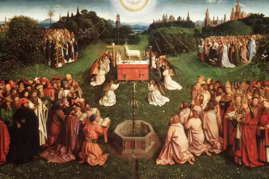
2. Balance: A necessary element in human life that crosses over for the need for visual balance. Communicates a sense of stability in an art piece. This can be achieved through symmetry or asymmetry through the use of having nearly or exactly the same matched sides or through the use of colors, sizes, or meanings of subjects. In this panel from Jan Van Eyck's Ghent Altarpiece, balance is achieved through the use of symmetry, contrasting colors, and the heavy symbolic meaning of the mystic lamb contrasted with the common folk. The left and right of this piece are nearly the same with a group of subjects gathered in the foreground and in the background, as well as the same number of subjects gathered on each side of the lamb, and the trees and castles seen on both sides in the background. The mystic lamb holds a heavy symbolic meaning which is counterbalanced by the lighter symbolic meaning of the folk gathered around. Lastly, the clothing colors on either side are balanced among each other through the use of dark, light, warm, and cool colors.
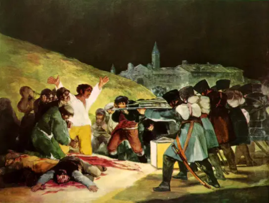
3. Emphasis and Subordination- Complementary elements of design that are used to focus the viewer on one subject or area of the piece, while also drawing attention to another area of lesser interest or importance. Emphasis and subordination can be achieved through positioning, size, and/or color contrast between light and dark. In Executions of the Third of May 1808 by Francisco Goya, the artist creates a focal point or point of emphasis on the man with his hands in the air. This draws the viewer's attention to the man who seems to be against the line of soldiers. Subordination is created through the use of color and also the body language of the subjects being viewed. The man who is the focal point of the painting is clothed with bright colors and has a tense, open body position with his hands raised, meanwhile, the surrounding men are clothed in dark colors and have a relaxed, closed body language (or are wounded/deceased on the floor).
4. Directional Forces- Actual or implied lines that give the viewer a path to follow. This can be achieved through actual or implied horizontal, vertical, or diagonal lines accomplished through positioning of subjects, color intensities, size, etc. Horizontal lines give a sense of stability, stillness, or relaxation; vertical lines give a sense of anchoring or balance; diagonal lines give a sense of motion. In Still and Alive by Qiang Huang there are implied vertical, horizontal, and diagonal lines among the dark jar and bottle on the left and the light jar and fruit on the right. These lines also create an implied triangle among the subjects. The horizontal line is seen across the table in the foreground, the vertical line is seen from the table to the top of the jar/bottle on the left side, and the diagonal line is created from the top of the bottle on the left side to the bottom right corner of the table.

5. Repetition and Rhythm- Two elements of design that create a visual flow, pattern, or continuity. Repetition can be achieved through the repeated use of a color, shape, subject, etc. Rhythm can be achieved through the repetition or recurrence of interconnected variated elements. In this piece by M.C. Escher, Lizard, we observe both repetition and rhythm through the use of a pattern and interconnected variations. Repetition is created through the repeated use of the lizard which creates a pattern throughout the work. Rhythm is created through the repeated use of the lizard, however, it is in different colors, and directions, and when you look closely you can see black lizards pictured as well.

6. Scale and Proportion - These two principles are related to sizing. Scale is related to how big the artwork will be. We use this scale to compare to our own size. Proportion is related to how items in a whole compare to the whole project. In this painting Curiosity by Jeff Jordan, we can appreciate both proportion and scale. The artist allowed us to experience scale in this painting by including a realistically sized human to give the viewer an idea of how big the chicken would be compared to us. We appreciate proportion by visualizing the difference in sizes between the chicken, human, house and tractor, and even the sky.

0 notes
Text

4. Art Project (Self-Portrait)
For this project, I opted to select a few photos from my gallery that I feel resonate with me the most and create a collage on Pic Collage. These photos are just a few and it feels nearly impossible to fit all the photos that I feel best represent me, but this collage serves as a sort of introduction or warm-up to the rest. Through these photos I would like to convey: how I aim to live my life through acts of kindness, being kind to others, and treating others how I would like to be treated. I am happiest when I am surrounded by loved ones or in solitude with nature. Lastly, I am a lover of art and meaningful literature.
0 notes
Text
3. Writing A Self-Portrait
I am 24 years old and primarily identify as female. I was born and raised in Miami, Florida but both of my parents are Cuban. Things I like to do for fun include dancing, exercising, putting together outfits on photo collage apps, putting together mood boards on Pinterest, scrapbooking, and sometimes trying recipes I find online. I am not a member of an organized group and I work in a vegan cafe. What makes me uniquely me is that I don't conform to one single stereotype personality or vibe. I would like to think of myself as a Jack of all trades in the mood/energy/personality realm if that makes sense. I believe some "baggage" I'm bringing along when looking at art is the misconception of needing to understand every art piece or the need to view it in the same light as everyone else. The beauty of art is that it can have various interpretations across different viewers. There is no right or wrong way to interpret art. There is the way the artist intends for the piece to be interpreted and then there are the countless ways that viewers may interpret it for themselves or apply it to their lives for themselves.
0 notes
Text

2. Art and Writing
This piece is a painting that is hung on the wall across from my kitchen. It is something I see every day, many times a day. This piece was a gift from my older sister Nicole. I am not sure who the artist of the work is, or what is it named (if it even has a name), but I would wager to say that the media used is oil on canvas. Because of the duller, murky-looking colors, I would assume oil paint was used on this canvas in contrast to acrylic paint. It is also easy to see the texture of the brush strokes used to create the painting. If I had to give this artwork a name I think I would name it something along the lines of Mood Ring or Mood Swings. The different colors stroked onto the canvas remind me of different moods I might experience in a day. Also, some of the painted areas appear to have a rougher texture compared to others which would further enforce differences among positive and negative moods. I believe this piece has beauty because it is simple enough that it can match with other decor easily and can be hung horizontally instead of vertically to produce a different image to perceive.
0 notes
Text

1. Hello everyone! My name is Natalie, but friends and loved ones call me Naty. One little-known fact about me is that I like to sing. When I was younger, I participated in talent shows, competitions, and plays in which I let my melodies be heard. Nowadays my vocal cords may need some tuning, but I engage in other hobbies such as scrapbooking, drawing (not very good), and dancing.
2. The artwork that I was assigned is the painting by Jean-Honoré Fragonard, The Swing. When I first saw this painting it was clear to see a distinction in the darker tones surrounding the bright-toned center of the painting. The darkness is better seen in the lower bounds of the painting, whereas the upper bounds and the center of the painting are brightly painted with pastel-like colors. It makes me feel like there is a silver lining amidst the surrounding darkness and it all balances out. Some facts discovered about this painting/artist include:
The Swing was created for a gentleman of the court who wanted to depict his mistress being pushed on a swing by her husband while the secret lover admired her from below.
It is a masterpiece from the Rococo art period, characterized by gentle, pastel colors, peaceful natural settings, and aristocrats in beautiful clothing.
Paintings from the 18th century like this one often depicted swings as this was a common leisure activity among elites at the time.
The painting embodies a type of eroticism including the girl's skirt hem revealing her calf while swinging in the air and her shoe slipping off in the direction of Cupid in the upper left corner. Swings were also seen as a sexual metaphor due to their movement and body positioning.
Jean Honoré-Fragonard was one of the most prolific artists of the 18th century creating paintings similar to this one.
3. I can appreciate the painting in a different, more symbolic way now after reading about the art piece. Things I did not notice before was the girl's shoe falling off and pointing in the direction of Cupid. I was also not aware of the significance of swings as a play and pleasure symbol for the elites of the 18th century. Originally, I would have thought that the man in the lower right corner was the one trying to admire the girl from below when in reality it is the man in the lower left corner. Given that this painting was created for a gentleman wanting to depict his mistress being pushed on a swing, I can still see this painting as a bright lining amidst the dark. The lower right corner that shows the man intended to be the husband seems to be darker than the corner where the lover is. Maybe the mistress was happier with the lover rather than with the husband or maybe that's what the lover wanted to convey.
1 note
·
View note