Don't wanna be here? Send us removal request.
Text


My name is Muneer I’m a junior and I’m studying education. The reason why I picked this class is because I needed an art credit and color sounded interested. What I learned from this class is how certain colors work with each other and how to find colors that work with each other or have the same value. And my favorite project from this class this semester is project 4 the collage idea is 🔥 and I’m planning to do some more.
0 notes
Text


This museum was a good one as-well. Its crazy how just marks of colors can be 🔥🔥🔥
1 note
·
View note
Text


#tripthrowback
Miyoko’s work is very different. It’s something about it that screams foreign and cultural. She uses dark colors more and uses all these different types of shapes.
My favorite from her collection is the photo in the bottom right.
2 notes
·
View notes
Text


#momatriprecap
What I notice about Rothko’s work is that he doesn’t blend the color. Also the edges are chippy for each color block. It seems like he wasn’t trying to be perfect with his art and was just being free. The mood for these three are dark for the first two and the yellow and red in is more happy.
1 note
·
View note
Text

#michaeljackson #project4
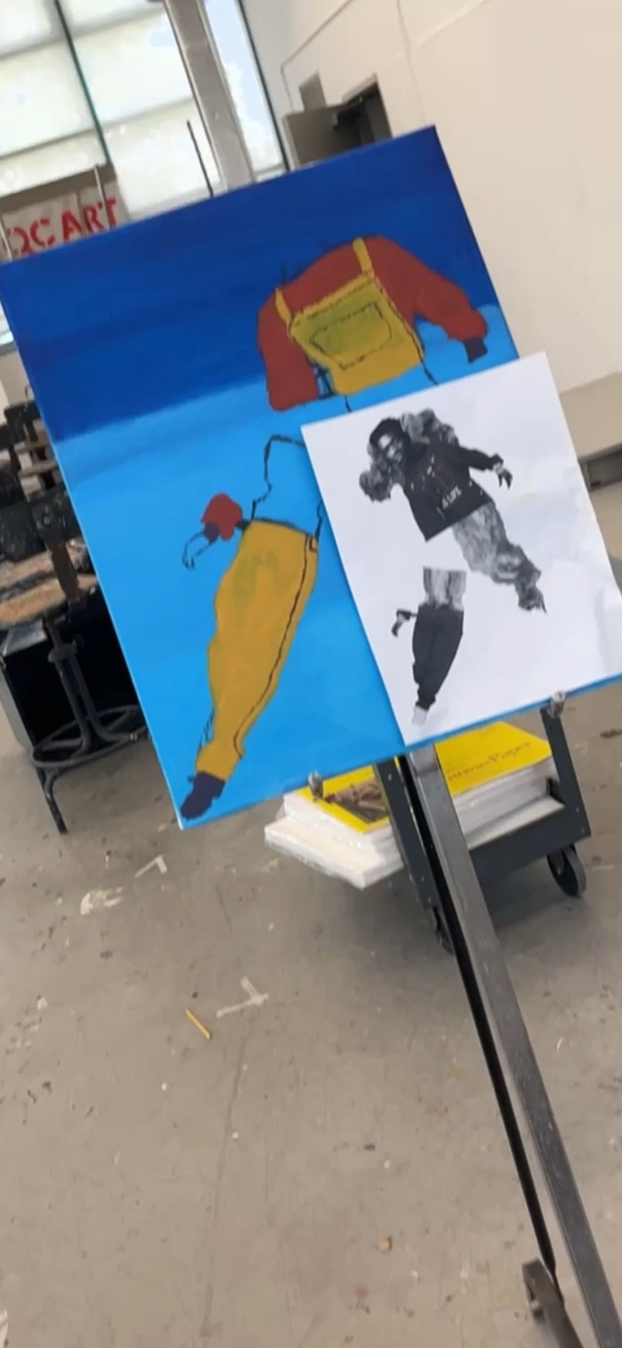
My inspiration for color comes from MJ’s Dangerous album cover.
This album cover is just 🔥🔥. It’s a lot going on and a lot of different colors being shown.
1 note
·
View note
Text

#movement
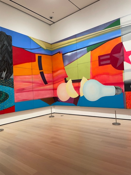
This painting from the moma forsure has rhythm. This effect is created by how it’s painted, the artist is making lines with the brush. Also the repetition of color in different places adds to the effect. It’s also shows a pattern. Lastly we can see mainly primary colors in this piece.
LMK WHEN YOU SEE THE HIDING FACE😂😂
1 note
·
View note
Text

#affectofcolor #strengthofcolor
Color can affect us. When Im in a room with colors like dark blue and dark red ,like the photo attached, I notice I become more relaxed. These colors remind me when I’m home alone and watching a movie with the lights off and the only light in the room is coming from the tv and it’s almost always blue.
2 notes
·
View notes
Text

#preferredcolors #dislikedcolors
When it comes to colors, my preferred colors are the colors that are on the left which are green, orange, and blue and that’s because these colors have energy, they are bright and loud. The colors I don’t like are the ones on the right and I picked these because I just don find them appealing at all.
1 note
·
View note
Text


Monet water Lillie’s
Cool use of color. There’s a lot going on but you can still identify what is what. #themoma
2 notes
·
View notes


