
Don't wanna be here? Send us removal request.
Statistics
We looked inside some of the posts by mpalarea-blog and here's what we found interesting.
Average Info
Notes Per Post
3
Likes Per Post
3
Reblog Per Post
0
Reply Per Post
0
Time Between Posts
6 days ago
Number of Posts By Type
Text
1
Photo
16
Last Seen Tumblr Blogs


Fun Fact
Total funding amounts to $125.3M.
Text
E: Art & My Life
In the beginning of the semester I had no idea what to expect, I was unsure of what the class experience was going to be like. All I knew going into this class was what I had read off of ratemyprofessor, all the comments were encouraging everyone to take the class because of how cool the professor was. I also came into the class only having some knowledge of art from a class I had taken in high school, so I was excited to learn so much more. I loved to paint so I hoped that we would be able to incorporate some of that into the semester because it is a great stress reliever for me.
Art 110 wasn’t like a normal class, it didn’t have a textbook required or power points or even a clear cut syllabus at first; for me this made me worried because that gave me no structure for this class. However, all these things developed with time Glenn as a teacher gave us freedom to express ourselves because art is about expressing your creativity and ideas. Glenn also expressed new ideas such as how freedom of speech is better than free beer (which it is), or the importance of copyrights, or even how influential architecture could be to people. One of the most important things that I have learned this past semester is how to have a genuine conversation in which you get the information you need but in way that you are also making a genuine connection with a person. I feel that this is important because if you constantly have conversations with people just to get something out of them you could lose touch with reality and lose an opportunity to meet with a cool or interesting person. One other thing this class has taught me is how to create a fun and interactive website, this helped me be creative in a different way that I’m not familiar with. I’m used to expressing myself through classic forms of art such as painting so being able to express myself through a new medium was interesting. My group and I made the website for our personal art gallery which discussed comic styling’s from around the world, we incorporated a slideshow of pictures and gifs of work from the artists.
This class for me personally has been a great stress reliever because it is unlike any other I have been in, it lets me express myself and relax. I thoroughly enjoyed the doodles I would create to turn in for my attendance they varied from bats to a detailed sketch of a pumpkin to a thought-out design of lines or dots. I have enjoyed creating a piece of art each week and exploring new mediums every time, if it wasn’t for this class I doubt I would have finger painted or spray painted for fun. Throughout the semester I was able to come with new ideas while also following the guidelines, I think my favorite piece this semester was the zines because I focused mine on horror. Talking to artists have helped me learn more about different kinds of art and almost everything can be art. These artists have shown me that everything doesn’t need to be philosophical or interpretive but instead it can just be straightforward and that doesn’t make you less of an artist. This class will help me with my future because I feel that I will be able to make a better connection with anyone that I may come across and it has also helped me to enjoy everything and relax every once in a while. Art 110 has been a great change of pace and I will truly miss it, 10/10 would recommend to anyone looking to relax and enrich their lives.
0 notes
Photo


Here people are not truthful, they cause bad luck. They see if you are causing problems. Most bad decisions lead to trouble. Everyone experiences mistakes, a person continues to cross the line. A victim excuses themselves too much. If they could co away every time. This sounds like someone you know, you have the option to be confidential. You may seek out peace, life can change.
I feel that with internet culture especially for people who create they often have to fear of people stealing their ideas and using them for their own without giving them credit. Even though creatives are allowed to be free through their expression and ideas, people can and will take and use whats not theirs. It’s empowering to connect with so many people through various platforms but the risks are endless because you can be taken advantage of. I feel that copyright is working as is because it can definitely help small artists keep their work as their own. If someone steals your work they also are stealing apart of you as well. I don’t feel that it should change at all because their are various licenses to choose from so that gives people enough variety. My licensing would be attribution-noderivs because I want to let anyone use my work as their own or even add onto it. Art should be able to inspire others and let them build upon that ides, art is meant to be shared. At first I had no idea what I wanted to do, I had the idea to remix with makeup somehow but my week got busy because of finals so I decided to create this blackout poem. I first found a magazine page that I liked, then began to pick out words that spoke to me, and finally I created a poem by boxing the words I wanted to use and then using a sharpie to blackout the rest of the page. Yes, it came out as I expected; it is a poem that has a meaning behind it and people will be able to build upon it. The challenges were trying to pick out words that would make sense and also what direction I wanted to take this poem into. Overall, I enjoyed this project but it was not my favorite project of the semester.
0 notes
Photo

Artist: Tatiana Mata
Exhibition: Postures
Media: Photography
Gallery: Marilyn Werby
Why is my life like this? My life is such a mess, I’m failing my classes, work sucks, and I just feel that I’m disappointing everybody. Even though they say I’m doing fine, I feel that everything in my life is falling apart. I wish I was like a plant because their only roll in life is to grow and if I were like this rose bush I could blossom and be great. Instead I’m just me, the person that disappoints everyone and feels miserable in life. At least the sun is shining so I shouldn’t be so cynical, I should focus on the little things. My life could be worse and even though it feels that everything is crashing down, I can still keep going on. This walk is really helping me clear my head, I should just take it one step at a time and enjoy the small things in life; like this orange house. I bet the people in their love orange and have a wonderful life, also orange looks rad. These roses are cool too I guess, their blooming even though it’s fall and that’s hard to do. I think I’ll be okay and I have my whole life ahead of me, so i should be fine. I will be like these roses and persevere in all my challenges in life.
0 notes
Photo


D6: Storytelling (photography)
This story was chosen for the simplicity that this is my everyday weekend, hanging with my friends and boyfriend, eating food and wearing makeup. Its not anything political or big but it is meaningful to me because these are things that i will remember for a long time. personally I don’t think they are anything close to professional photography but its how genuine the photos are of my friends. I have a professional camera but I decided to use my phone to capture the true essence of the photos, all of these are candids and mean a lot to me. I believe the best image is of my friend Jaimie because she hates getting pictures taken of her but they way that i secretly did it was perfect. The candid picture of her shows how pretty she is and how she is always on her phone. I believe the picture of my essentials is not in itself a good photo but these few items are what help make my weekend great because I like to wear makeup but once I’m with my friends that mask and everything else comes off. Next time I would capture moments from a party or place where we actually went outside of the house. However, this is all our natural selves because we always hangout at this house. I would probably like to tell a photo story of my boyfriend and I, I would use new and current photos and it would showcase our growth over the past 3 years.
0 notes
Photo


D6: Artist review
Artist: Hijiri Takeuchi Exhibition: Kalopsia Media: Illustration Gallery: LBSU School of Art, Gatov Gallery East Website: takeuchihijiri.wixsite.com Instagram: illustrobot
Hijiri Takeuchi is a senior working on his BFA for the CSULB School of arts illustration/animation program; he mainly focuses on illustration and line art. He is a transfer student who originally wanted to study fine art with a focus on painting. However, while in this program he felt that he was too constricted in his creative abilities and soon began working in illustration. On his off time he plays in a band and listens to music, he plays the bass guitar and also goes to alternative and indie concerts. Hijiri feels that as an artist you are always expressing yourself, even in your day-to-day activities. Hijiri also feels that being an illustration major you are just animating a conversation; he feels that this style of art should be straightforward and not too complicated. After he graduates he hopes to work in apparel creating art for the clothing, Hijiri feels that this job would be cool because he is still being expressive while still being himself. A lot of people have told him that he is great at teaching the craft but he could never see himself as a teacher because he would not be creating, which is what he wants to ultimately do.
Takeuchi’s piece focuses on line work and follows a black and white pallet; the lines are very curved and accentuate the body of the woman. Based on a first glance the audience can tell that the illustration is of a woman who is floating in the air. It is very interpretive but if one put some thought into it, they can figure out the hidden meaning of the piece. The shading of the piece creates a 3D effect making the illustration pop off the page; it helps make the woman more life like. Although the piece itself is average sized there are tiny details that one will only notice once they get really close to the piece. The details of both birds can only be seen if they really focus on it or the shading and details of the feet will not be seen at a first glance. The attention to detail of the woman’s outfit will be the first thing seen by the audience the shading creates depth and texture for it to look life like. The overall piece is magnificent in person because you are able to see every single detail that Takeuchi put into the piece.
Hijiri finds his inspiration for his pieces through figure art and graphic novels but more specifically Japanese graphic novels. He feels that this is a way that he is able to relate back to his childhood and fully express himself. The overall meaning of this piece is how we always want to express something beautiful or happy but in the long run we must sacrifice something even if that means sacrificing ourselves. This can be seen by how the woman is being lifted by the blue jays on the left and the ravens on the right. The blue jays represent the beauty of life and the ravens represent the sacrifices of life. Takeuchi’s main focus is with line work because it can create chaos but still look beautiful in the process. Although he has also worked with oil paint and water colors, he feels that line work is the best way that he can fully express what he is feeling. He also loves black and white because it helps to focus on the details and not the vibrant colors of the work. His signature in all his pieces is his spaghetti hair because it makes the characters have flowing hair, this at first was a problem for a professor but instead of changing what he likes to please this professor he made it his signature for all his pieces.
This gallery overall was my favorite because of how straightforward each piece was and how vibrant most of the pieces were. No two pieces were the same and all the artists had very different styles, I was particularly drawn to Takeuchi because of how simplistic his pieces were but how detailed they were at the same time. Hijiri’s pieces resonate with me because of how original they are yet they still follow a specific style. I feel that this describes me because I am my own person but I can still fit into different categories of life. I also love how he stood for his own style and did not change to please anyone, this is an important life for any career because you will not always be able to please everyone but you can for sure please yourself. His piece is very tasteful as well because it does not over sexualize the woman in the piece but makes her look like an everyday female that is just going through life.
0 notes
Photo


I am redesigning the usu wedge, by condensing the architecture around the opening. I cut down the marble and blocks to sit on, as well as some beams. It will be better because there is more space to walk through and less people that could cause traffic. The trade offs at my site are making it less of a wedge and more of an opening to get to and from class. I also removed architecture that seemed not needed or was way too big for the space like the big marble slab. No matter what I did, even if I fixed it, it would still be deemed as an unnecessary fix because it loses its wedge quality. Also by reconstructing it, students wouldn’t be able to use it and only complain about the fact. I like it the way it is, because it helps create something that only csulb has.
0 notes
Photo


Artist: Michael Rafferty Exhibition: Graduate Crituqe Week Media: wood Gallery: LBSU School of Art, A. Thomas Ferreira Gallery Website: N/A Instagram: N/A
Michael Rafferty is a student working on his MFA, for the CSULB school of Art in 3D media with a focus on wood. He is a first year graduate student, however he is not like other first years because he is older than most. This is due to the fact that he took a break from education to start his own carpentry business. He owned his own shop for about twelve years, but soon he grew bored of this tedious work and deiced to go back to school. Once he graduates he hopes to use his degree towards building up his clientele and making more unique pieces for them. Along, with building his clientele he hopes to teach; he has taught at OCC as a part time teacher for almost ten years but due to not having a degree he cannot be a fulltime teacher. Besides building, Raffertry also loves to fly fish, build instruments (specifically steal string acoustic guitars), restore furniture, and restore cars. Overall, Raffertry loves to use his hands and build whether it is his own designs or make use of something old and bring it into a new light.
Raffertry’s piece does not have a formal title but called it the little red table, it is a nightstand and it is a very simple piece. The legs of the table are fairly thin and are curved while still being straight. The piece looks like a common piece of furniture because it is very polished and put together but has a lot of secrets to it. Some of these secrets include the artist’s signature at the bottom of the drawers and a white stripe that separates the wood from the black bottom part of the leg. The table is very smooth and polished, it has a very subtle color pallet using black white a brown tones. The table is composed of African bubinga wood, Gabon ebony, and Sitka spruce. The lacquer is a deep brown with a red undertone to help the table stand out a bit. The table itself does not take up a lot of space but it is not so tiny that it can fit anywhere. The table itself is very light and functional. Raffertry uses a lot of detail with the drawers and handles by matching the handles to the color pallet and makes an etching on the drawer to give it a little extra something.
Michael has been working with wood his whole life and grew up building on his dad’s workbench for many years. His table took about three weeks to make from planning, to building, to putting the lacquer on the piece, and finally letting the piece dry. Due to his background of owning a shop for the past twelve years he did not once use a tape measure rather just used whatever felt right and his past experience in carpentry. This piece means a lot to Raffertry because he told himself that once he got into grad school this would be the first piece he creates. The table is one of a kind and there is no other like it in the world, it is unique because of all the attention to detail, color, and size. He draws inspiration for his pieces from what he already has; he says this because building is a second nature to him that eventually the piece will look how he imagined it. Raffertry’s favorite thing about building is actually having the potential to make anything you want. He doesn’t feel that he is the typical artist because he makes pieces that are polished and that can actually be used in a household. However, he feels that not everything needs to be a statement piece of have to be interpretive; it can just be a table. Rafferty states that his piece can also be an ode to how in America everything is big and takes up as much space as possible, but his piece fights that stigma by being small and simple.
I felt that although his piece seemed “normal” and not very “artistic,” it still had artistic values with the meaning it had behind why it was created. It was a unique piece because it was one of a kind and could not be found anywhere else; I would love to have it in my house because of its simplicity and size. I don’t necessarily relate to the piece itself but I do relate to the artist because of the fact that he knows what he wants to do with his pieces and with his life. I want to get to the point where I am confident with every decision I make in my life, because it was critique week he knew he would be ripped to shreds because his piece was simplistic but he was so happy with his piece that he did not care at all. I want to eventually exude that confidence and be nonchalant in most aspects of my life. I really enjoyed how he gave this everyday item a piece of himself in every way possible, by having his signature, to the tiny white stripe, and finally to the etching behind the handles. I don’t think that there is an overall theme or idea to the piece, rather he just wanted to create something that he was happy with and I believe more artists and people in general should be like him.
0 notes
Photo

With this piece I wanted to show four different cultures and how they are often seen as Halloween costumes but all these costumes are offensive to the culture. I chose to use markers and colored pencils because that is what was readily available to me. Originally I wanted to use acrylic paint on a canvas but I didn’t have the time to go buy a canvas. I really enjoy my piece and I think you can tell which culture each comes from, I love the simplicity and color scheme that I chose. the whole experience was very easy because I had the freedom to choose the topic and I truly loved that. This project helped me voice my opinions on how most people overlook certain cultures just because their costume would be cute or chic. The project was inspired by a thread that I first saw on twitter and helped me create my piece.
0 notes
Photo


Artist: Diana Yesenia Alvarado
Exhibition: Magic Touch
Media: Ceramics
Gallery: LBSU School of Art, Gatov Gallery East
Website: N/A
Instagram:deealvarado
Diana Alvarado is in her final year at CSULB finishing her BFA in ceramics, she is a Los Angeles based artist and mostly finds inspiration from that. Alvarado spends most of her time making ceramics and spending time with her partner. She emerges herself in art most of the time and decided to take a chance on ceramics. Alvarado felt that ceramics was a white dominated field; therefore in order for her to have a safe space to create she needed to be the one to make that space for her. Being creative dominates her life and it also has a big chunk of her heart, she loves to style herself with her clothing and curate art shows with her partner. In the future she hopes to be able to continue curating shows and make a living off that, but as long as she is being creative and working on her art she is happy.
Alvarado’s show Magic Touch, was her senior show, which showcased all of her work from the present and the past. These pieces don’t necessarily all go together but they are all deeply rooted in Alvarado’s life experiences. The gated fence with bunnies is very subtle and once you walk into the room, you hardly notice it but to me its what stood out the most. You notice the straight lines of the fence but also the detail of the curved metal that helps create the design in the middle. The design in the middle reminds me of hearts, which is very fitting because the piece itself gives off a feeling of love. The piece itself is of medium height, it’s not necessarily small where you can’t see it but it also is not large where it takes up the whole gallery. The bunnies in the piece have a very soft rounded shape to make them seem cuddly and cute. And although the piece itself seems new, the color palette is very muted and neutral with pops of red and subtle hints of blue. Alvarado doesn’t sculpt the bunnies to look smooth but rather with some texture on their bodies to show a difference between the front and backs of their body.
Diana states that she loves ceramics because of how far she is able to push it, before she works with any new material she likes to research it and focus on that materials history and what she can do with it. She loves to work with clay because of how malleable it is and she likes the color it gives off. The process of making a ceramic piece usually takes weeks to make but it mostly depends on the piece itself. However, the process is always the same, first you build it, then it needs time dry, fit it into the kiln, and finally it takes up to three days to dry. Not only does she create for herself but also she creates in order to give a space for others, she feels that she is able to finally by creative all thanks to her parents. Alvarado thanks her parents because they endured the struggles for her but because they took the entire struggle, she is able to be creative and her explore whatever that may mean. Since Alvarado is a Los Angeles native, that’s where most of her inspiration comes from, she feels that since LA is very chaotic people don’t notice the little things. However, by focusing on the little things and putting them on pedestals, it makes it easier for the viewer to digest. Diana says that her overall messages she hopes to bring to the viewer is that all moments are precious and should be captured as such. All of her pieces are influenced by her culture and upbringing and all tough most of her pieces are very interpretive, she wants to create a certain setting for her viewers.
I feel that I connected with the art especially because of the fact that it reminded me so much of LA because the art itself is not cookie cutter and that it was very interpretive. The artist was very genuine and answered all of my questions, she is very sweet but also kind of outspoken; her style is unique and her use of clay is nothing that I’ve ever seen. Her piece with the bunnies and the fence remind me so much of my grandmother’s house, because she had those fencing on her windows. Also because of the fact that bunnies look so weathered it gives a feeling of home and safeness, it makes me feel like I am loved and that everything will be okay. I really enjoy the fact that she is creating a safe space for herself because the Latino art community is very small, especially at CSULB so it is ideal that she creates a community for herself and others. I feel her struggles as far as being able to be herself because of her parents, I am also thankful for everything my parents have done for me in order to get me where I am today. Her pieces focus on the good and bad that life has to offer and that resonates especially with me because I am learning how to deal and even appreciate the bad due to the fact that it allows me to grow as a person.
1 note
·
View note
Photo

Standing with Hong Kong
I chose to paint for my cause as well as use colored pencils and sharpies because I wanted it to feel like a poster that was made for protests. I feel that we as Americans are being discouraged to help the people of Hong Kong because it is not our fight. However, we were once those people seeking freedom from those who have wronged us and from all the injustice. I feel that my work conveys that of a poster and helps get my message across. My art expresses how we should help the people of Hong Kong and I make that the main focus in my art. If I were to do this project again I would spend more time working on the fists because right now they look like paws and I do not like it at all. I also would explore different topics such as women empowerment or global warming.
0 notes
Photo


Artist: Charlie Roses Exhibition: Dead Man’s Party Media: Sculpture Gallery: LBSU School of Art, Gatov Gallery East Website: N/A
Instagram: charlieroses
Charlie Roses is in his last year of sculpture for CSULB’s School of Art, he is completing his BFA and is a non-binary trans artist. Roses is a true lover of Halloween and he incorporates all aspects of this holiday into his daily life. His main style of art is sculpture and illustration; he focuses mostly on horror and scary topics. Along with sculpture and illustration, Charlie has experimented with watercolor and oil painting. One of the coolest things he mentioned to the group is that he has dabbled in 3D printing and one of the first things he printed was a replica as himself portraying the sheet ghost (which you will hear more about later on).On his free time he watches horror movies and here are few of his favorites; for a scary movie he loves to watch Sinister, for a campy film he loves Beetlejuice, for a cult classic film he enjoys A Nightmare On Elm Street, and finally for a psychological horror movie he enjoyed Hush. A few movies he also mentioned were Hereditary, which he loved all the detail in it and finally he would want to watch Midsommar, because he believes it will be a great film to watch. Upon graduating Charlie would like to teach children art classes but mainly wants to make art for a living. However, as long as art is still in his life and he is able to buy groceries he is happy.
Charlie Roses piece titled Haunted Shelf From The Back Room Of Your Local Public Library is actually a performance art piece that was staged in the back corner of the gallery and it was meant to act as story time like what children get at the library. The piece itself was all over the place and had many different elements to it both fake and living. The installment was very large and focused on the creepy cute aspects of Halloween, it had fake bugs, real pumpkins, books scattered on the floor, and a strobe light of a Halloween Scooby-Doo. The color theme focused on black and whites mainly, with the subtleness of orange. There were also different textures to the piece because of all the materials draped on the shelf and floor. The big hanging spider and webbing is fluffy and soft, were the fabric on the floor is silky and almost slippery. Most of the piece is vey straight like the shelf and the red fabric on the floor but there are also rounded shapes that overwhelm the piece like the pumpkins, the mug on the shelf, the skull, and the wreath on the floor. The overall piece is large but in order to observe the intricateness of it, the viewer must come closer because at first glance one will not be able to see the fake cockroaches on the floor or the strobe light of Scooby-Doo. So in order to fully grasp the concept one should get as close as possible to see everything but not so close that you ruin the display.
Roses says his style has developed into this creepy cute art form especially while into his adult life because this is what interests him the most. The idea of the sheet ghost first came as a joke for one of his pieces but ever since that first time, the sheet ghost has returned to be in all of his pieces. In fact the sheet ghost is the main focus of his senior project, where Charlie will showcase the sheet ghosts entire house. Roses finds joy in portraying the sheet ghost and even feels that the ghost is part of his persona and when he puts on the sheet, Charlie is that character. Besides his installment pieces he also illustrates and these illustrations are mainly done in his notebook. The illustrations mainly are inspired by 1920s vintage aesthetic and they often take 1-4 hours to complete. Along with being inspired by Halloween, he also finds inspiration in anything retro and will try to combine that into his pieces. Charlie was the curator of the Dead Man’s Party Gallery and in order to pull this off he asked his friends to help with the show. Most of them aren’t as into Halloween as he is but they were happy to create for him. Half the show is even inspired by Beetlejuice because he loves the aesthetic of it. One of his favorite pieces was the salt line that was at the entry way of the door because it was laid there in order to keep the ghosts of past art in the gallery.
This by far is my favorite exhibit because it was focused on my favorite holiday, which is Halloween; in fact upon entering the exhibit it truly brightened my day. Just as Charlie does, I also try to incorporate Halloween into my daily life. I have various Halloween inspired shirts, earrings, bags, stuffed toys, and string lights. I find the idea of the sheet ghost cute and I thoroughly enjoyed the fact that he read a story to us. I think that the gallery itself was very playful and fun; it also shows that sometimes not everything needs to have a deeper meaning but instead you just do things because you want to. His art styling also reminded me of other horror inspired artists that I follow on Instagram, the horror community is my favorite community because they are so genuine and easy to talk to as well. I truly felt that when speaking with Charlie about his gallery and his pieces.
1 note
·
View note
Photo


Horror movies 101 (a guide to all things horror)
So although this is not about my identity, horror is still something that I am very passionate about. I love watching and experience all things scary. I find this genre of movie to be very suspenseful but funny because its really predictable, but the genre continues to evolve. For my Zine I used mixed media, markers, and colored pencils. This medium was the easiest to work with and I loved the way it made my Zine feel almost childlike. If I were to redo my Zine I would probably paint my pictures instead of using printed pictures from online. However, I found it very relaxing and I loved the final product. In future Zines I would like to explore more about me rather than such a broad subject, possibly something to do with my high school life and how it was to go to catholic school.
0 notes
Photo


Artist: Yaneli Delgado
Exhibition: Global Change
Media: Relief Printing
Gallery: LBSU School of Art, Dennis W. Dutzi Gallery
Website: N/A
Instagram: omequiztli
Yaneli Delgado is in her second year post baccalaureate program in the college of education, where she is finishing up her credentials to become an art teacher. She has received her BA in sociology and Spanish from the University of California, Santa Barbara; her chosen form of art is printmaking and more specifically relief printmaking. Relief printmaking is the process of taking a drawing, then sketching it out onto a linoleum sheet, next etching out the design, then painting over the etching, and finally pressing the etching onto a piece of paper and soaking in water to finish the process. Delgado chose this medium because she feels that men mainly dominate printmaking and she wants to let other printmaking artists that it doesn’t have to be that way. She first started printmaking about three years ago back in 2016, after she had taken a printmaking workshop because the works of Jose Guadalupe Posada, who is a famous Chicano printmaker, inspired her. Soon after she fell in love with the process and hopes to continue to express herself through this medium.
Delgado’s piece titled Ni la tiena nil as mujeres somos Territoria deconquista, roughly translates from Spanish to English to mean “Neither land nor women are territory of conquest”. This phrase resonates in the print not only by it being on the print but also by how the native woman is placed. The woman’s hand is in a stopping motion preventing people but more specifically men from coming near her, the woman is also doing so in order to protect her child. Delgado states that she chose the colors red and black to help represent the Zapatistas women and that is why the woman is wearing a red bandana. Even though there are only two colors in use, the way that Delgado has carved out this image, the viewer can automatically tell that the woman in the print is indigenous and most likely Hispanic or native American. The print itself is very detailed and involves a lot of straight and curved lines. The straight lines can be found within the boarders and the curved lines can be found the woman’s hands, jewelry, and breasts. There is also some shadowing on and around the woman to help show the separation of each body part and the clothing she is wearing. Although the print itself is not small it does help to come in close in order to see all the detail of the full image from the strands of her hair to the small flowers in the woman’s earrings. The full image tells a story and overall it is very simplistic yet beautiful; this is a statement piece and it will truly resonate with women and people of color.
While discussing the print with Delgado, I found out that she is from south central Los Angeles and being from this part of Los Angeles helps inspire most of her work. She is also of Chicano decent and she tries to let that aspect flow throughout her prints as well. This piece in particular was made to be for an art gallery that was focusing on global change and instead of making it about global warming she chose to focus on women, colonialism, and capitalism. She states that although the idea of conquests resonates back to the times of Columbus, we still should not treat women and native land as something that needs to be taken. She feels that women especially indigenous women need to be seen and heard; she feels strongly about this especially because her field is predominantly male. She is very in tune with her heritage and loves to explore that in her art, most of her inspiration comes from her background, books, and documentaries all focusing on the Chicano culture. She loves to make prints and has been doing so for around 10 years, as well as silkscreen, draw, and paint. Not only does she find inspiration for her work from her culture, but also from where she went to college. Graduating form UCSB has helped her meet new people, get to know her culture, get to know new culture, and finally find inspiration in nature.
This print was so different compared to the other curated art pieces in the gallery, it told a story that I could relate to because I could see myself in that woman. Although, the woman was in black and white, I could tell she was a woman of color and more specifically she was Hispanic. Most mainstream art does not necessarily showcase Hispanic woman with native features. Also, by speaking with the artist I was able to get a better picture of where she comes from and that helped me get even closer with the print. Just like the artist men dominate my field of study and I have to fight for my voice to be heard and I am from Los Angeles as well. I am not that in tune with my culture and heritage but this painting makes me want to learn more about myself. The print itself is very simplistic but it is very strong and it could stand alone in the crowd of all the other work in the gallery because of the message it has.
0 notes
Photo


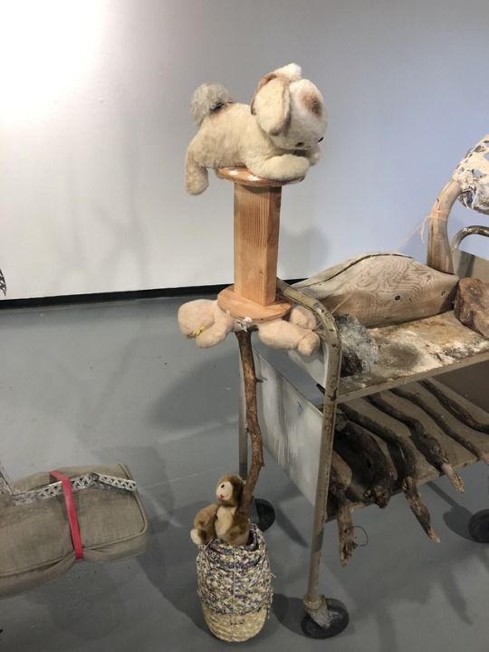


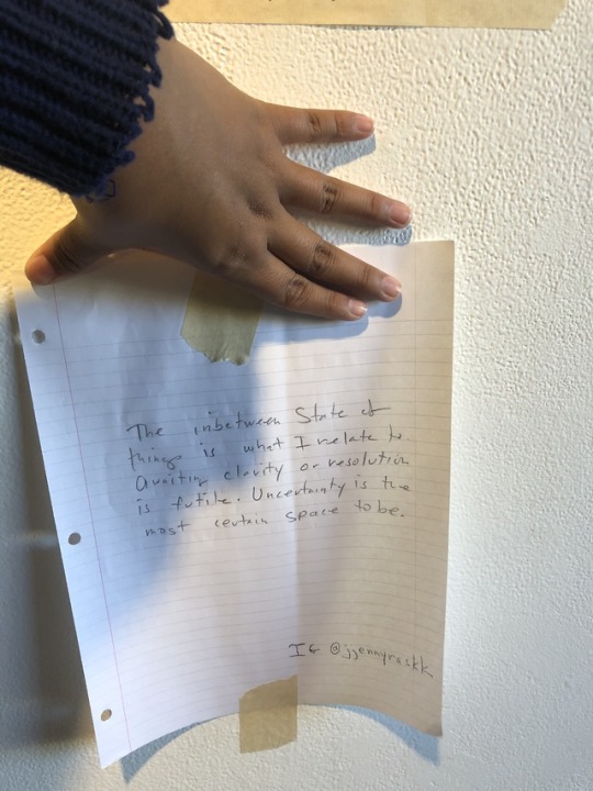
Artist: Jenny Rask Exhibition: Limbo Media: Sculpture Gallery: LBSU School of Art, Werby Gallery Website: www.jennyrask.com Instagram: jjennyraskk
Jenny Rask is a third year graduate student, in her last year to complete her Master of Arts degree. She in the CSULB, School of Art for Sculpture; her favorite type of sculpture is installment pieces, that include items that she has either found off the street or was given to her by people she knows. Along with being a graduate student, she is also a single mother to three children and she also has a job. On her free time she lets her mind wonder about her next project and she never turns it off, to ensure she never dims her creativity. She first got interested in looking at these items off the street by photographing trash and turning something forgotten into beautiful pieces of work. She is very easy to talk to but gets confused with what she wants to say about her piece, so in order to help the audience she has a note pad and will write down words that help her describe her pieces and ideas. She often finds inspiration based off the items she finds and lets those items create the piece, rather than her having a specific idea and then finding the pieces to go along with it.
The sculpture that Rask provided in the gallery, was a little all over the place in the sense that it was both organic and man made. This piece was not painting and hardly had any media on it, so from and outside view the audience at first glance has a hard time at what they are looking at but once one takes a closer look at it, they will see the beauty of it all. The sculpture had very a very natural color palette; it used various shades of greys, browns, whites, and hints of blue. The piece itself had all sorts of different textures from the fluffiness of the stuffed animals, to sleekness of the still, to the roughness of the rocks and branches. The sculpture also played with levels, many things stayed at eye level but if you took a closer look other items such as the steel beams, were hanging from the ceiling. Also, things such as the pieces of gravel were scattered on the floor and skateboard was off to the side. All of the items are at a different stage in its lifetime and that helps create certain energy of melancholy in the exhibit. The sculpture ties in many different elements of nature and man made, some are as tiny as a plant that you can only see very up close to the first thing you see if a ducks body with an unfinished head. The sculpture brings a lot of contrast into the space and hopes that everything will be noticed.
Jenny Rask’s sculpture titled Limbo, explores the idea of how everything in life is going at different paces just as the items in her sculpture are all intersecting at different time frames. She describes her work as somewhat childlike because just as child does for random objects, she forces trash to turn into art. Rask sees trash as beauty and really picks up on the energy of things and tries to convey that into her sculptures. This sculpture forces the rebirth of old items to transform into a new installment piece. The sculpture itself is all natural in the sense that nothing is permanent and she honestly loves that because that’s what the idea of limbo is about. She doesn’t mind if anything falls out of place because just like life nothing is permanent and it is always changing. Along with all her old items, she always has one new item; in this piece it was the gold lamp she was borrowing from a friend. She curates all her trash and stores them in a room, where they will all be reused at some point. She doesn’t think of herself as a hoarder but hopes to have a bigger room for more storage space.
From a religious stand point I think this sculpture is beautiful and unique because everything in it is not the same and that in a way is how limbo is described. Limbo is a place in between Heaven and Hell and you can end up there for various reasons, not all bad but it helps you decide why you’re there or what left you have to finish. Her work resonates with this idea of unfinished business in the sense that all the items are all half done and looking for a way to be reborn. For me personally this resonates with me in my own life because of how I view life right now. I personally want to have everything fall into place but I just feel so jumbled and crammed into society that I feel like an object that needs to find a way to reborn. I have no idea what I want in life or where I’m going so just as the trash once was, it will soon find a sense of belonging. This sculpture is very hopeful because it shines light that anything and everything can become art.
0 notes
Photo

At first finding an idea of what to create was hard but once I shut my mind off and just let my hands and fingers just create shapes, it was like a second nature. I thought I had to draw something very profound but at the same time it had to be a work of abstraction. I felt like a child who was creating a picture for their parents in art class because somehow this painting is a little bit more deeper than I would like it to be. This painting doesn’t have any subject or concept at all, this painting just is. this art piece is a little inspiring to me because it is a jumbled up mess and right now thats how my life feels, i have so much going on in my head that when I do have time for myself so many things intersect into that free, open space. However, this was a helpful outlet to help me let go and let loose. In comparison to professional abstract art pieces, my piece isn’t as polished but rather all over the place but, it is still open for interpretation.
0 notes
Photo


Here is my name in Bubble letters or at least here is my attempt. This project was fun but I did have some trouble with it, first off I didn’t have enough blue spray paint but it helps make my name unique. Also maneuvering the spray paint wasn’t easy but eventually I was able to finish the product. Although my final outcome is messy I loved the project and wish I would have had time to go to the beach in order to look at other peoples works.
0 notes


