Don't wanna be here? Send us removal request.
Text
Final evaluation
Overall I really liked the idea of this project, I just think I could have done more research into my theme. My final piece didn't turn out exactly the way I imagined it to but I still like the outcome. I think the thing I dislike the most about this project is being unable to find certain stuff that I wanted or be able to take pictures outside of college because I didn't have the right camera, etc. I think I could've went further on my annotations and research and included more drawings and designs.
1 note
·
View note
Text
Health & Safety
Make sure you have consent from anyone you take pictures of
Keep food and drink away from work to avoid spilling or ruining your work
Be careful when using scissors or guillotine to not cut yourself
If you are using PVA make sure not to spill and try to use other forms of glue, like a glue stick or spray glue if you don't want your work to wrinkle
0 notes
Text
My Final Piece
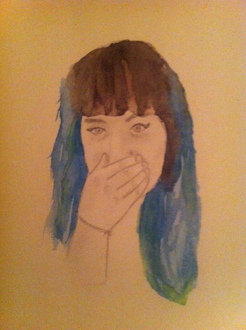
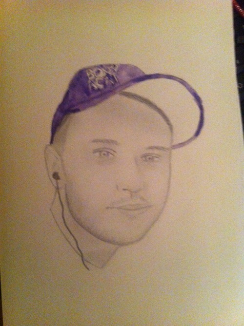
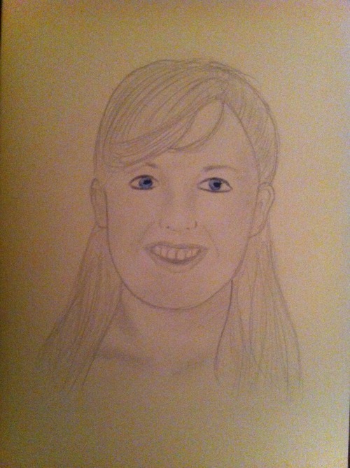
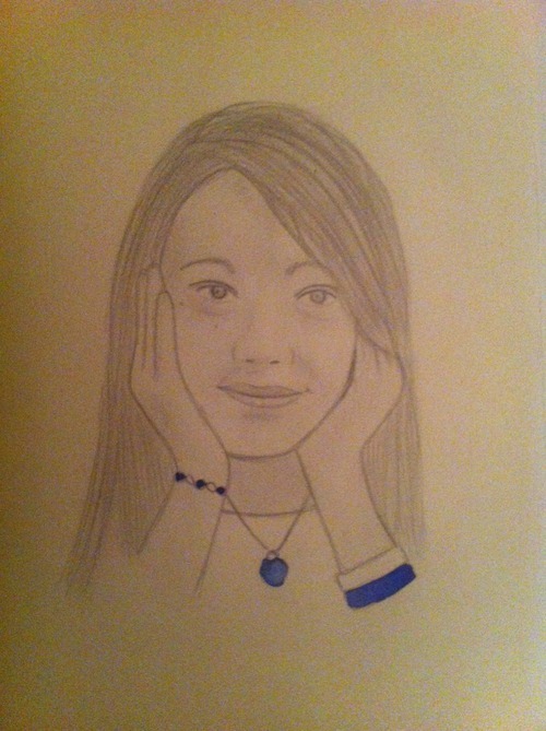
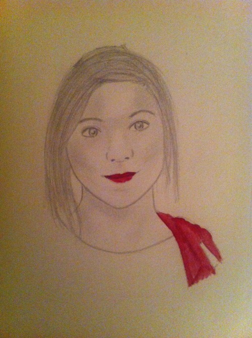
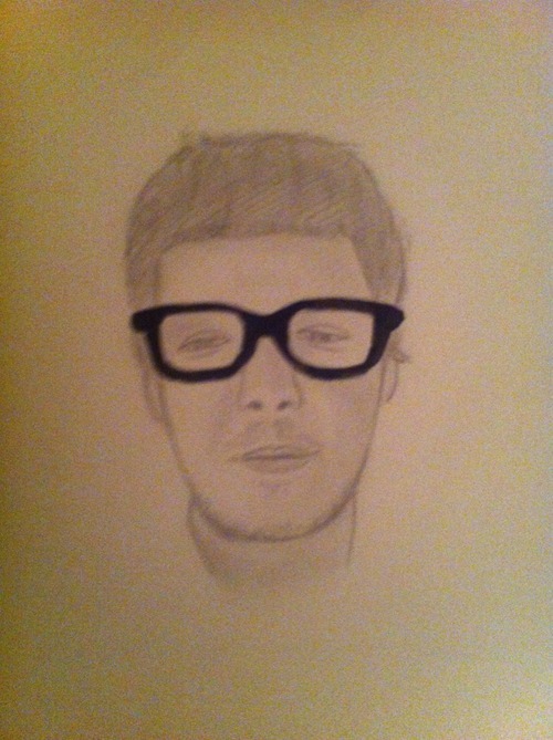
This is my final piece, 6 A3 pencil portraits. I didn't have any one particular in mind I wanted to draw, I just knew that I wanted to be able to focus on certain features and what define them. Things such as hair color, accessories, facial features, etc. I found it hard asking certain people if they minded me taking their picture but thankfully enough people said yes for me to have the right amount of portraits I wanted. I drew each picture and chose a certain part to paint with watercolor. I really like this because unlike my last two pieces over the years I've actually focused on the media I'm best at. I could've added black ink to make them stand out more but I thought I'd keep them more simple.
0 notes
Text
Final Evaluation
I enjoyed this project and the theme I had chosen but I think I could've focused on making more samples and coming up with my own ideas and developing them further. I'm happy with the materials I used because I know that my best skills lie in those medias, especially pencil. I chose to do portraiture because I think its quite a good theme to look at, seeing as there's many things you could explore, traditional portraits and alternative portraits. There wasn't really anything I particularly liked about this project considering you choose what you want to do but I definitely think It would have been better if I had more material to work with, which is my own fault really. I'm not really fond of change and prefer to stick to the things I know and I don't think my ideas are very well developed. The thing I like the most about my work is my final piece, I knew that initially I would use pencil in my work, which I know is quite basic and simple but I really like it and how simple the portaits are, I also like that the watercolor adds a small amount of color to each picture to make them stand out a bit. Overall I did enjoy this project but I think I could've done a lot more sample work and experimented with taking inspiration from the artists I looked at.
0 notes
Text
Ngah Dinh
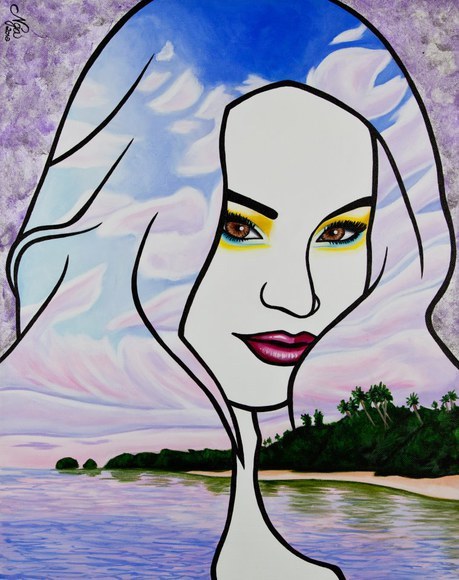
I thought I would include this because I planned on creating a similar piece but left it too late. I really like the bold lines and painted scenery used. Rather than just using basic block colors. I could've looked at patterns, texture and photographs I could have used that might reflect that person.
0 notes
Photo
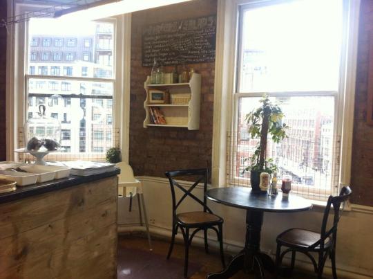
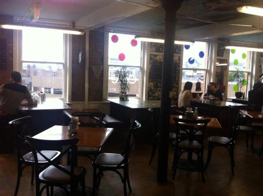
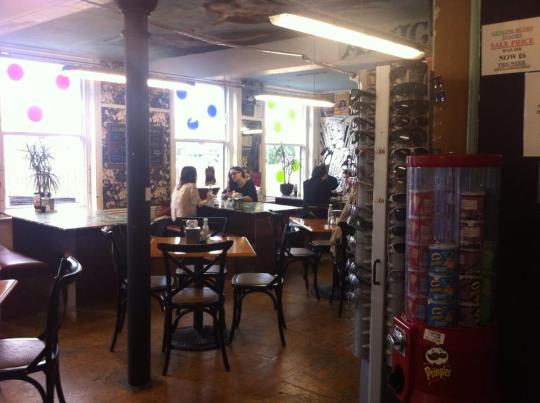
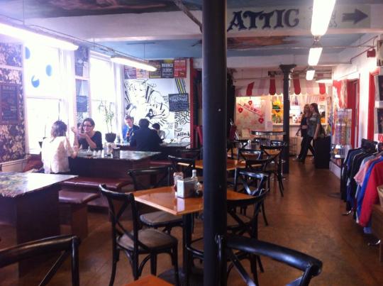
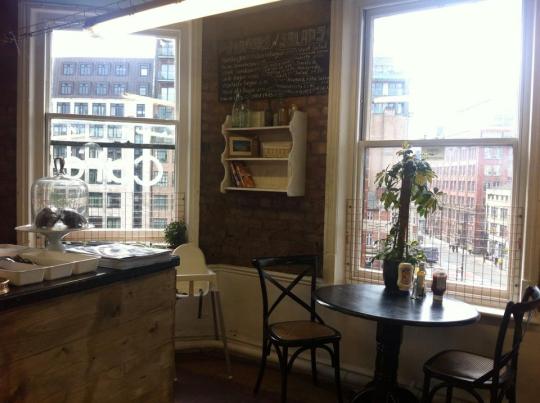
I took these pictures at Affleck's in Manchester. Unfortunately it wasn't really the place I had in mind and due to the fact I could only use my iphone camera I don't think photos are good enough to use for the background, especially because the quality isn't as good. An alternative I could use would be patterns such as polka dots or gingham, etc.
0 notes
Photo
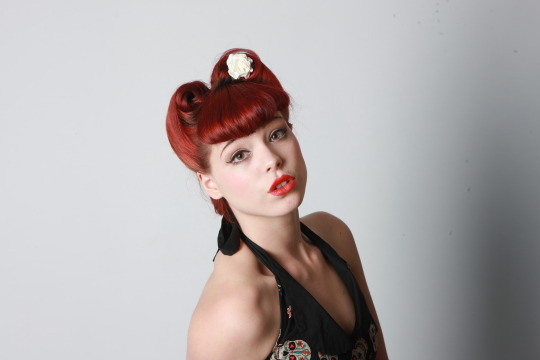
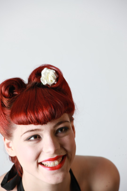
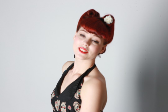
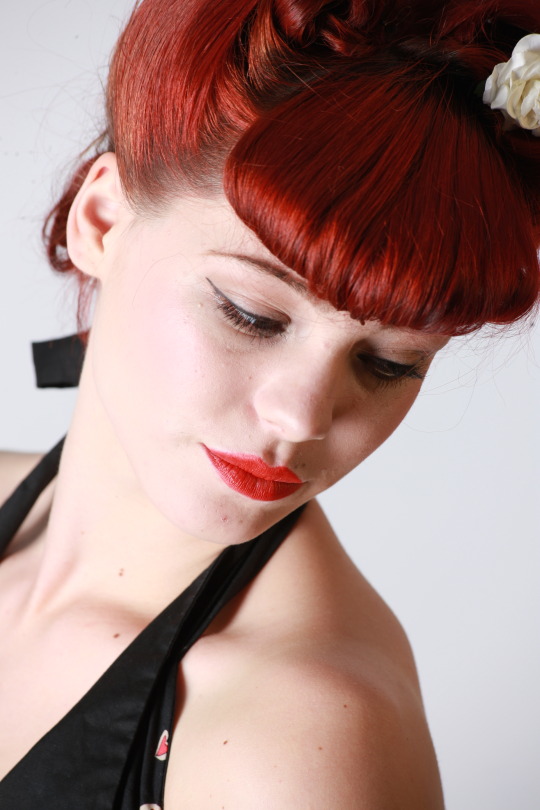
Some examples of the photographs that were taken in the studio, I included the first two because I really like them but didn't end up choosing them as my final piece. I also included a blurry one, were the models eyes weren't fully open for one of the pictures which I would not choose for one of my finals.
0 notes
Photo
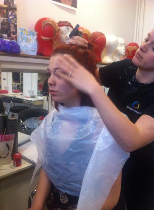
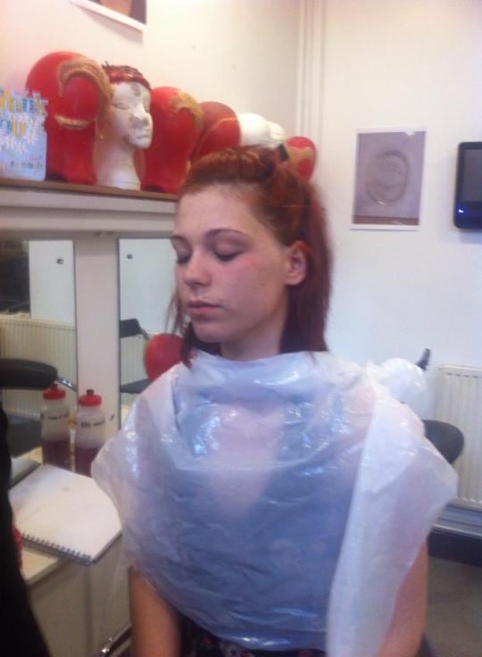
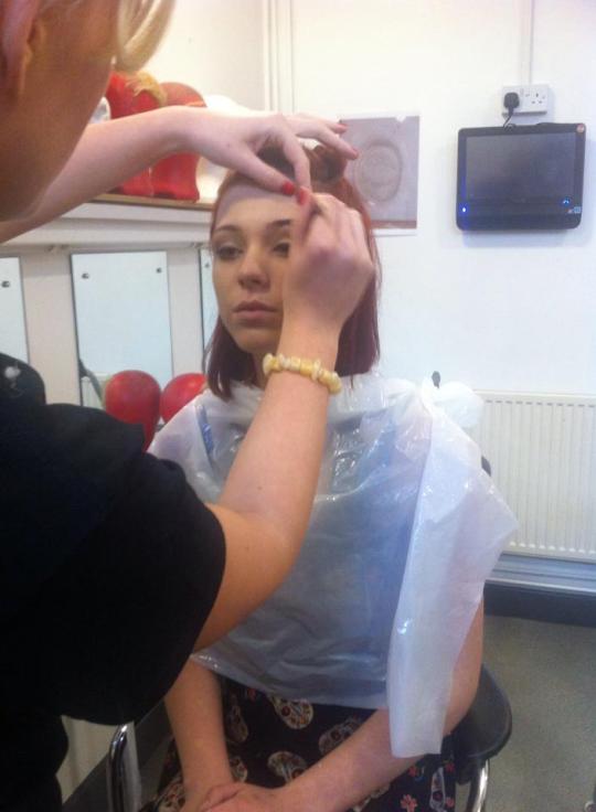
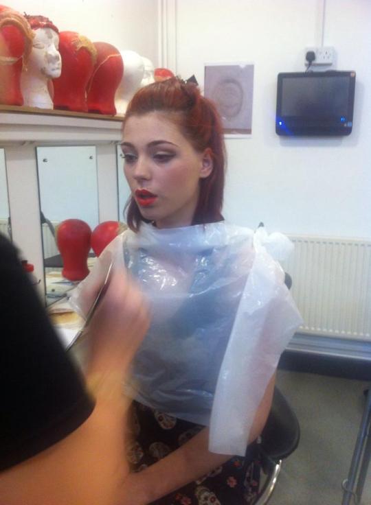
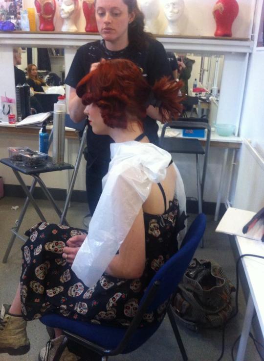
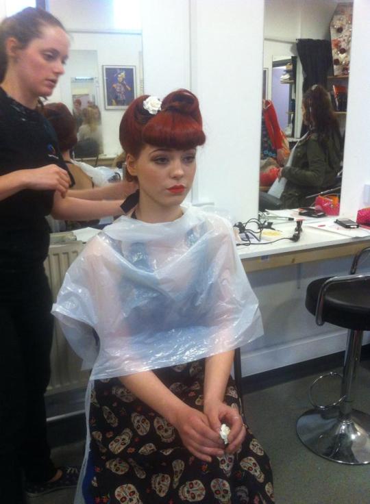
The makeup and hair was done by production arts makeup and was exactly what I wanted. If I could have I would have tried to incorporate tattoos, whether by using fake sleeve transfers or using photoshop but I wasn't sure whether it would look right or not but I'm still happy with the look overall.
0 notes
Photo
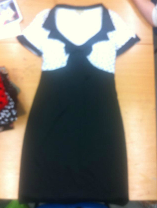
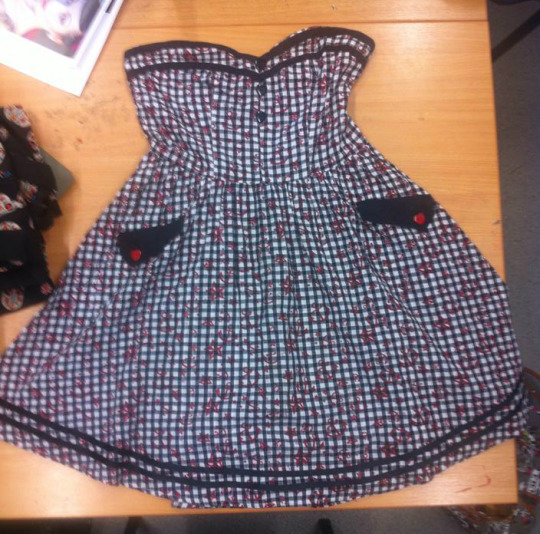
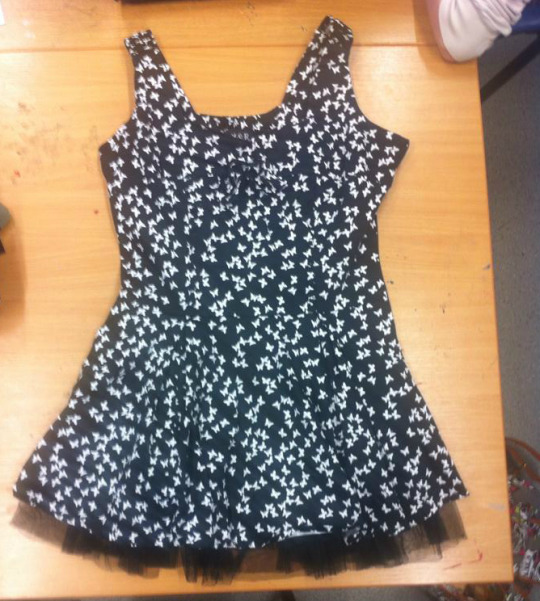
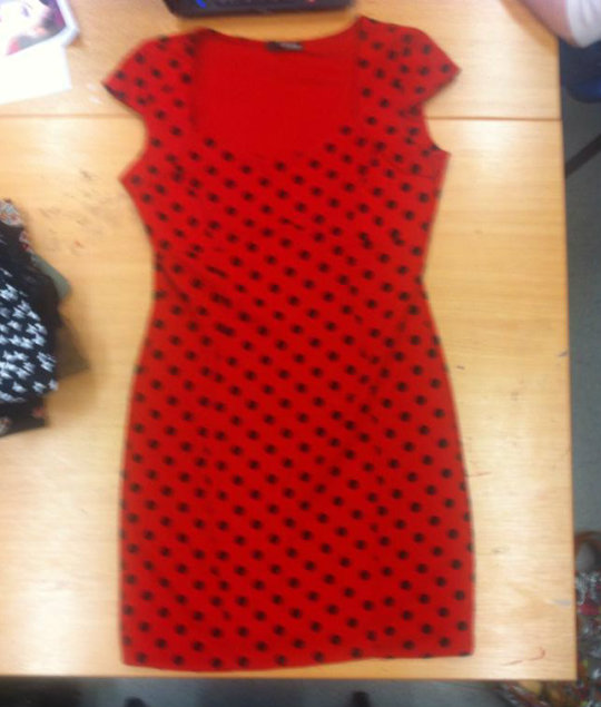
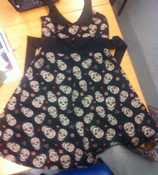
These where the dresses we had to choose from for the shoot, each dress had a rockabilly feel to it but I decided the skull one was best especially because I wanted to look at a more modern rockabilly look. I think it would've been good to try other dresses in the shoot but unfortunately we didn't have a lot of time left.
0 notes
Text
My Chosen final 4!
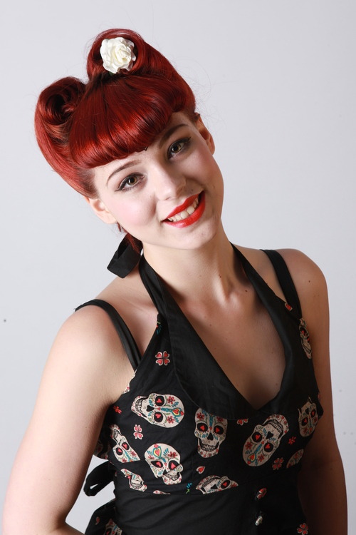
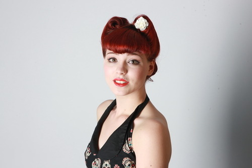
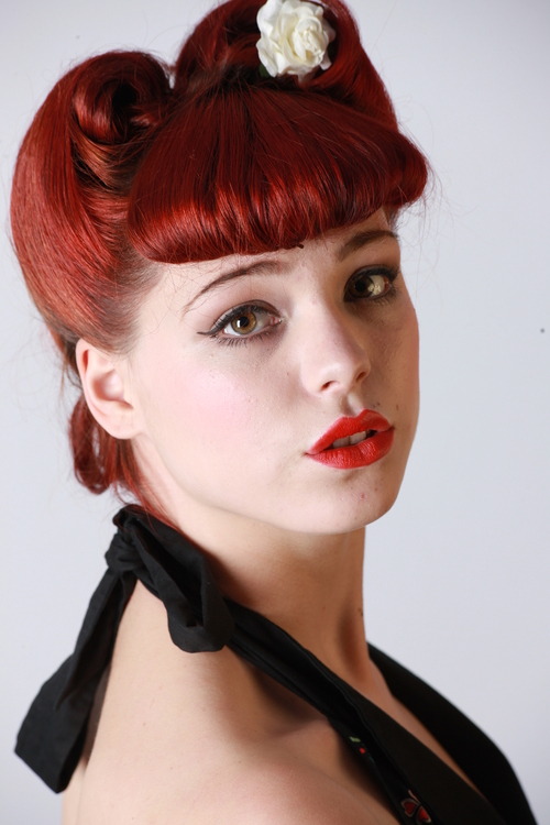
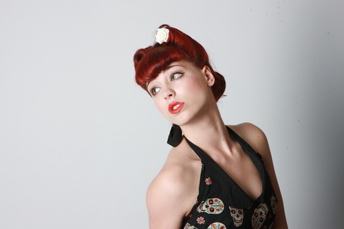
It was really hard to choose only 4 images because I liked so many. I knew that I wanted at least 2 close ups. I'm not quite sure why I chose these photos over every other one but I think its because the poses work really well in my opinion and I think the images are very striking.
0 notes
Photo
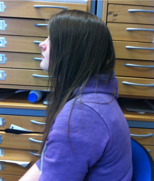
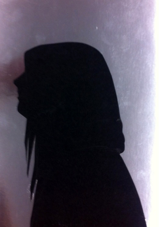
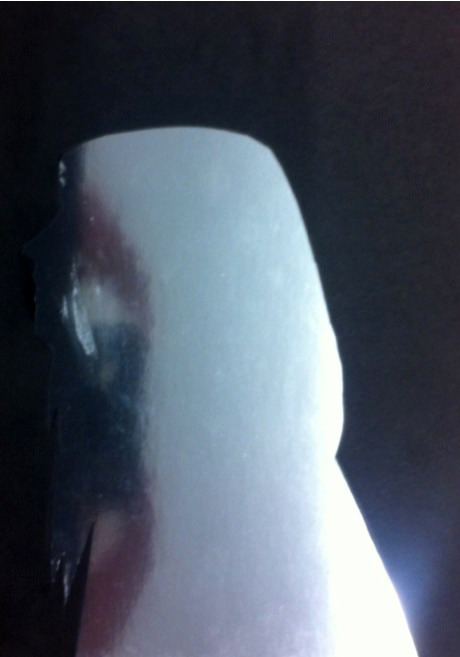
I found some metallic silver card that I didn't know what to use for so I decided to and make a silhouette because it was one of the ideas I was going to look at for a final piece but I decided against it because I don't think it would've showed my strong point. I used this picture as a guide to draw on black paper that was cut out and stuck on, I then did it the opposite way around. Although I quite like the way it looks I'm not fond of it because it didn't really take much effort or thought to do so I could have done something different with it.
0 notes
Photo
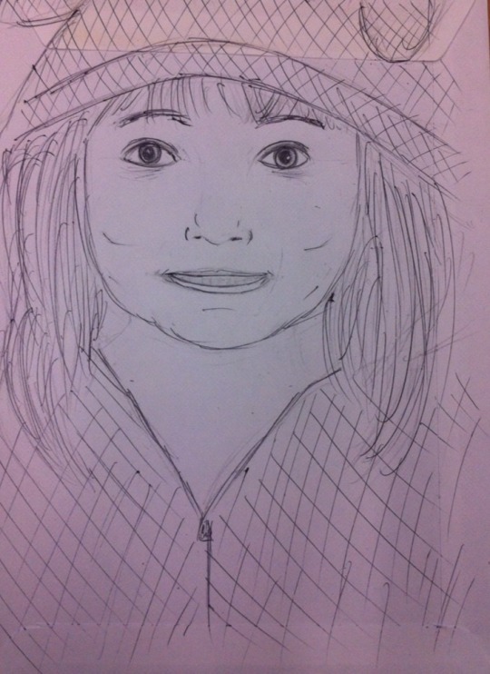
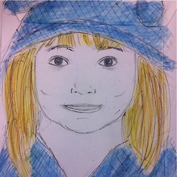
This was just experimenting using different material I could draw or paint on instead of regular paper. I used this envelope to draw a quick picture of my sister in biro before going over in colored pencil. I like this idea of using an envelope instead but next time I would use a different medium or add more detail.
0 notes
Photo
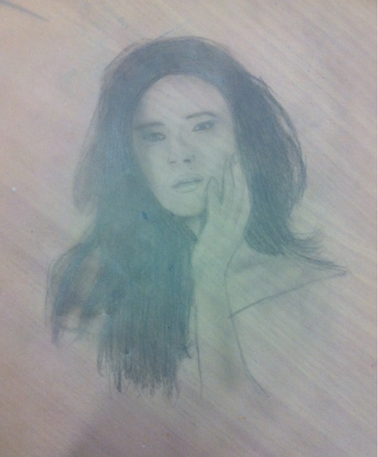
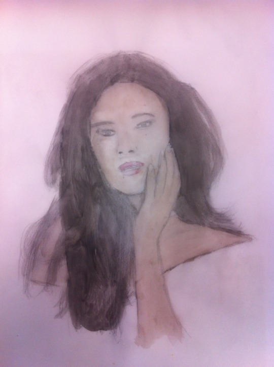
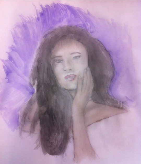
I looked online for different medias I could use to draw on other than regular paper and I really liked the idea I read about drawing on tracing paper especially because it leaves kind of a translucent look. This is a picture of actress Shay Mitchell I drew from the internet. I like the way it looked when it was just pencil but I think the watercolor makes it stand out much more. I'm not really sure how I could take this further, I suppose I could've just experimented over the image, adding ink, glitter, etc.
0 notes
Text
Pencil Portraits
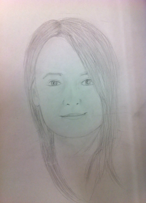
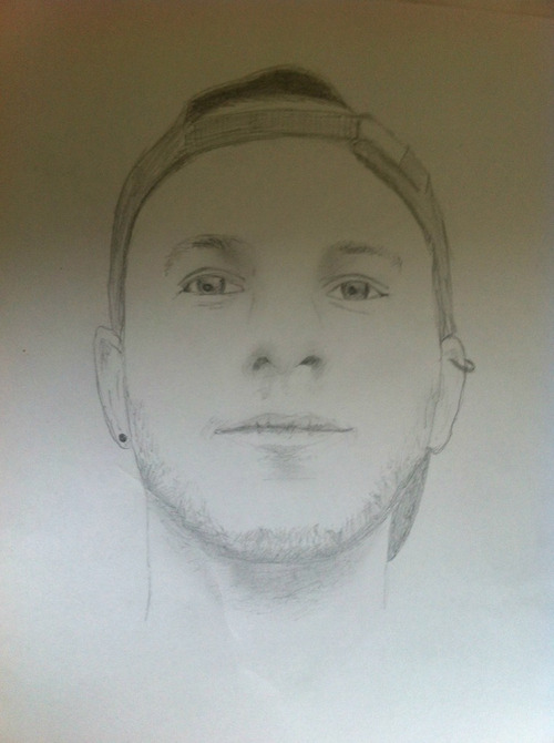
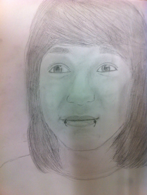
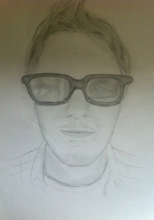
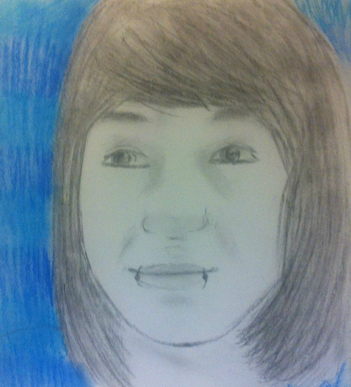
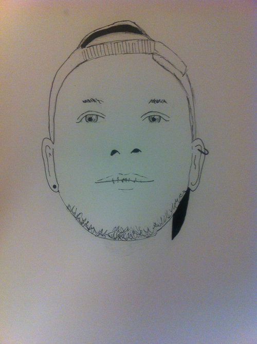
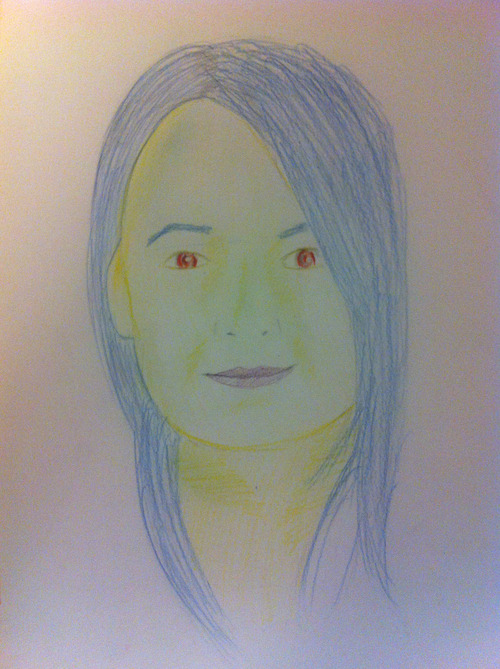
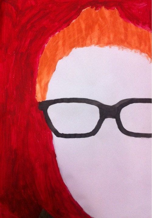
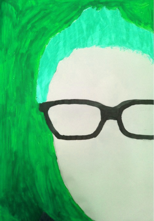
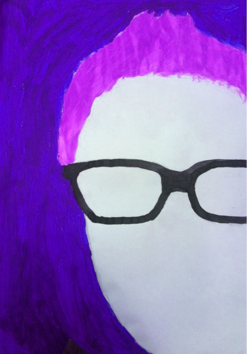
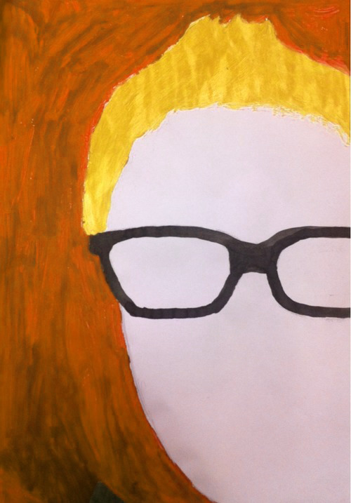
These pencil portraits were the first thing I did because it's the main theme I intend on focusing on, especially because I think its the strongest skill I have. I don't feel like I can really compare them to each other because they've all been done with the same material and style but I like how traditional they look and I think the detail is quite precise though I think I could've worked on them a lot longer, adding more shading to make them stand out more. Each image was photocopied and enlarged, I chose to do something to each image, the first one I simply drew over using black charcoal and pastel and drew over the image with a fine liner on the second one. The third I colored over but chose to use abnormal colors instead and chose colors that I knew Taz likes. The final one I really like because I really like how the face isn't completely in the picture, I also like how there's no face but you can still see important features like hair and glasses because I didn't want to paint over the original piece and I didn't have time to make more copies I made some colorways online.
0 notes
Photo
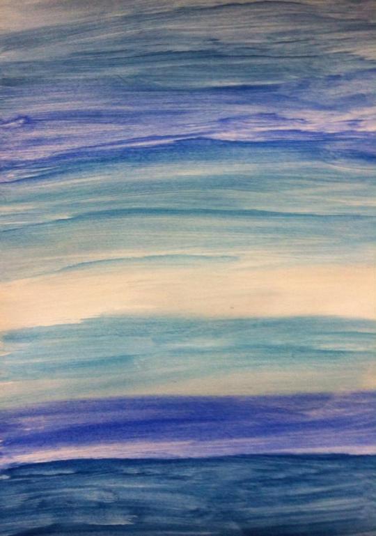
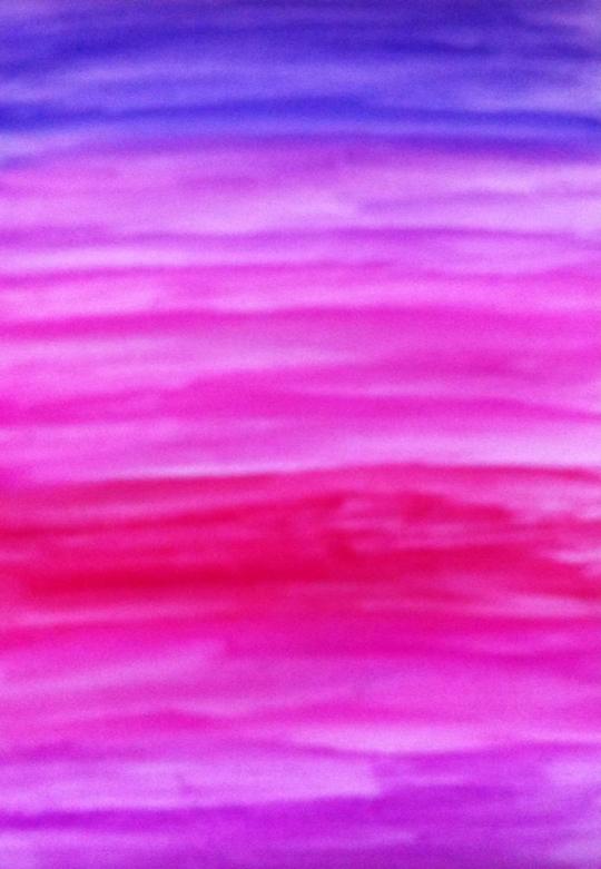
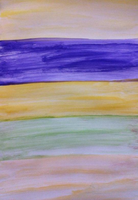
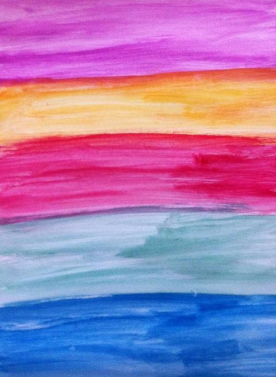
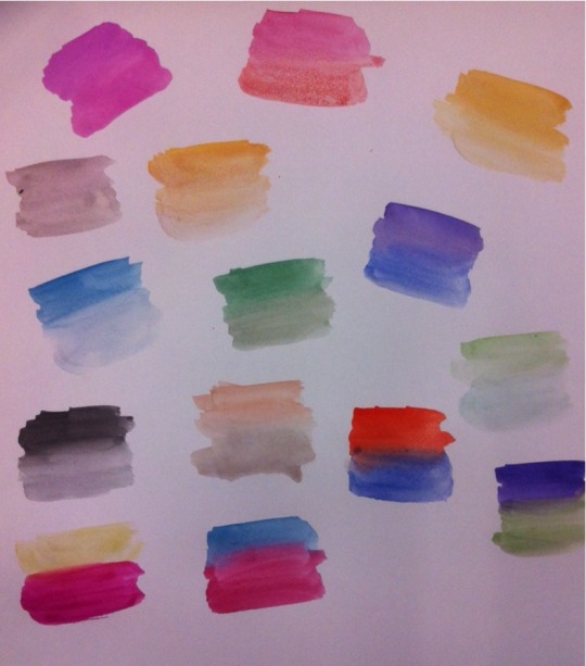

These are just some colorways I did experimenting with the watercolor pallet. I looked online for different color combinations aswell as listing all the colors that I had available to use. I think I could've tried experimenting with more blending techniques especially if I wanna incorporate it into my final piece.
0 notes
Photo
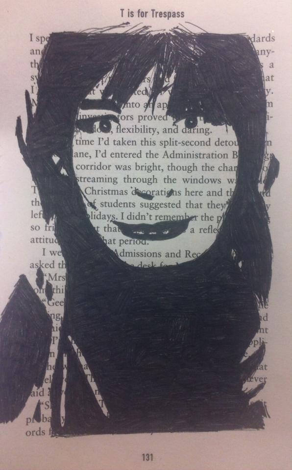
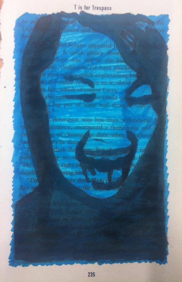
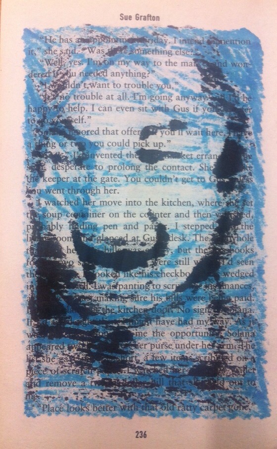


Inspired by the artist John Clark, I first just did a simple portrait similar to his work just using a marker on a page from old book. I used photoshop to adjust the threshold on a picture so it would be easier to draw. Afterwards I drew two classmates but also chose to color in the background using both of their favorite colors. I decided to include the back of one of them because I thought it looked really interesting. I then took several book pages and pasted them onto an A2 piece of paper using PVA glue. I still only did something similar to the first portrait I did but at least was actually at a larger scale which I don't normally do because I prefer sticking to small scale. Ways I could've taken this further would maybe add other media to it, such as paint or glitter, etc. I also could've used a book I liked or that was relevant to me, rather than just using any random one.
0 notes
Text
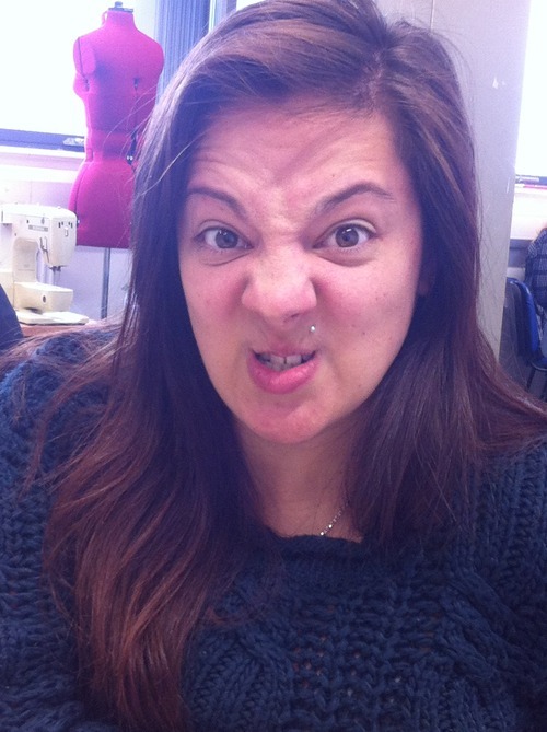
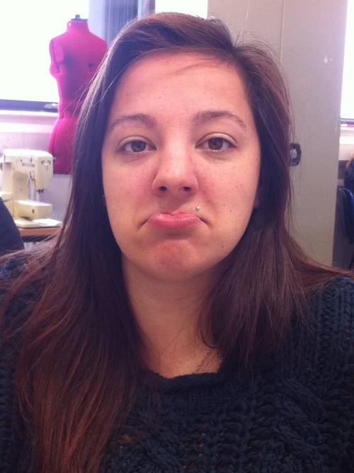
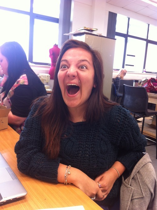
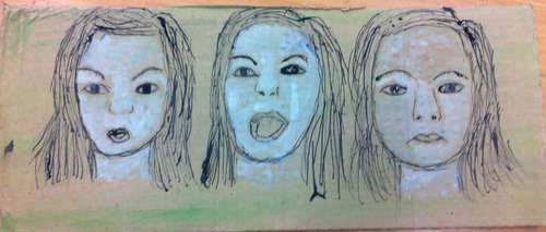
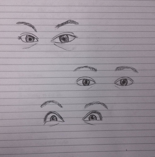
For this idea I was looking at using emotions in portraiture. I didn't really specify any specific emotions just basic ones, ie, happy, sad, angry, etc. Unfortunately I couldn't get the other images to upload but I drew each image in pencil on a piece of cardboard before going over it in green watercolor which I chose because its the persons favorite color. I then used stick and ink and white paint to make it stand out a bit more. I also did a quick drawing of the eyes on each image just to show how emotions can be read most obvious through the way eyes look sometimes. I like the second drawing more even though it's very basic but I could've looked more into it by adding more detail or looking at other emotions such as scared, tired, etc.
0 notes