Text
S U M M A R Y
So the first semester ended.
At the beginning, I was very confused about this course and didn't know what communication design was. I remember in the first lecture, Andy asked a question, "My individual objective is..." Someone answered" be happy ". Actually, I was really happy in this workshop of 12 weeks. In the workshop, we always did some different interesting activities. This filled our class with joy. At the same time, we had a lot of interaction. Actually, my English is not very good. I may not be able to communicate with others fluently. There were many times when I can't understand what's going on in class. But I met a lot of friendly friends, and more importantly, I met Andy and Karen. They are always careful to explain things to me. I really appreciate them.
Because studying abroad is really not easy for me, I can't understand some content very well. But I'm glad I did it, because I finished all the tasks of the first semester and my cooperation with my classmates in the workshop was very successful. I really think I have made some progress in the practice of workshop. I think learning environment is very important, because people around me will influence me. My classmates around me are always working so hard and very creative, so I really enjoy working with them. I have learned a lot from them. In my opinion, the most important thing in this course is we’re not just learning InDesign skills, but also communicating with partners through collaboration.
I remember that Andy said he didn't like having too many assignments, which is what other students don’t like about. No one wants to do assignments everyday. On the contrary, our lectures and workshops are full of fun, relaxation and pleasant atmosphere, which I have never experienced before. I think Andy and Karen are really good teachers. It was also a very interesting topic for our assignment. I really enjoy doing zine. I really think I have learned a lot from this project. When I interviewed the creator, she told me a lot about design and creation. This is something I've never experienced before. Because this was my first interview.
Anyway, this was really a happy class I’ve ever experience.
19 notes
·
View notes
Photo


Brand Identity for Flygrl by Felipe Rocha
“Visual identity for Flygrl, Melissa’s latest collection. Melissa is an iconic global footwear brand with origins tracing back to Sao Paolo, Brazil. Melissa has an international presence in more than 80 countries and more than 200 stores just in Brazil. We created a design system that is being translated into all kinds of applications, from Interior Design and website to bags and lollipops. Flygrl instantly became a hit in Brazil and it was the first time that I got my work drawn by someone at the beach.”
Felipe Rocha is a Brazilian graphic designer and art director based in New York City. His practice crosses different disciplines, from design systems at a global scale to website design and magazine covers. He believes good design can be done in every field, whether it’s culture, arts, technology, commerce or politics. He’s particularly interested in opportunities where he can use design as a tool to talk about things he cares about, such as diversity, immigration, gender and lgbt rights.
T D B: instagram • twitter • facebook • newsletter • pinterest
536 notes
·
View notes
Photo


Lettering by @davihero
Follow us on Instagram: @betype
2K notes
·
View notes
Photo


HUNGARY: TYPOGRAPHY: FANNY PAPAY
The Addiction Font is based on strange addictions, inspired by the TLC show My Crazy Obsession.
132 notes
·
View notes
Text
I really like this zine because I think it is very interesting and creative!GOOD JOB!
♫ THE FINAL COUNTDOWN ♫
// Reflection //
It’s reflection time!
Grap2199 has been one heck of a ride! An awesome, emotional, intense learning experience that I’m so happy to have had. Throughout this semester, Andy and Karen pushed me to re-evaluate my thinking and approach to design. From typography to bauhaus, from xylography to zine making, this whole experience has made me become so much more open-minded about design. I’ve met so so so so many new artists, friends and teachers that I will never forget. And instead of inhibiting each other, we’ve come together as a community to expand each other’s ideas.
Communication Design studies has made me realise that the measure of success in a design is not just about how the final product looks. It is the ideas, the history, origin of each aspect that make it successful. This course has made me realise that i will never be 100% happy with my work, but it doesn’t mean its flawed, it just means it can always improve. Just like design has evolved, we will all evolve as designers.
Thanks guys for this awesome semester, i��ll see you soon! Peace x
FINAL ZINE
Before i forget, heres the final of my zine! Thanks to everyone who helped and gave me feedback along the way. This project was super fun, and its made me discover how endless the world of zines are.


rip my zine fell out of the box
18 notes
·
View notes
Text
YES!This is a great summary!Really useful!Thanks!
Indesign tips:
18.05.18
- Page ‘A’ = Master page (use to enter titles, page numbers, guides, etc).
- Ctrl+Shift+Click = click on page (chance background colours, etc).
- Ctrl+D= apply images into containers
- Recommended dpi for images: 240 or 300
- ‘W’ = preview for printing
- ‘T’ = type tool
- Pages - layer - type - style & paragraphs - change type for one paragraph
- Always save during wip!!
29 notes
·
View notes
Photo


Costumes for Oskar Schlemmer’s “Bauhaus ballet”, Triadic Ballet (1922).
1K notes
·
View notes
Photo


ASKMEANYTHING!
At the beginning, I had a lot of ideas about this assignment. I want to show my interview in the form of posters. But after I tried, I found it a little hard to present the interview. Because there are so many words in the interview, it is not good to show them all on a poster. It will be very crowded.
But I deleted my test work... :(
FINAL ASSIGNMENT! DONE!
SOLAR TERM 节气
Through week11 workshop, I changed my mind and decided to make zine, because it could present my interviews and pictures more clearly. I think my interviewee's works are very beautiful and have Chinese style. I want to show them clearly.
This interviewer was my high school teacher and she was the person who taught me how to draw. She is not teaching now. She is now an illustrator. I also learned a lot from her interview. Just like she used to teach me to paint, now she told me how to get inspiration. After she entered the field of design, she kept learning, because she had never learned it before.
In this magazine, I used the solar term works of my interviewers as a visual communication. This kind of drawing of her works is my favorite. A solar term is any of 24 points in tradition East Asian lunisolar calendars that signifies some natural phenomenon. However, since she has not completed 24 solar terms completely, the pictures I can use are very limited.
Anyway, I'm done!!!!!!
9 notes
·
View notes
Photo
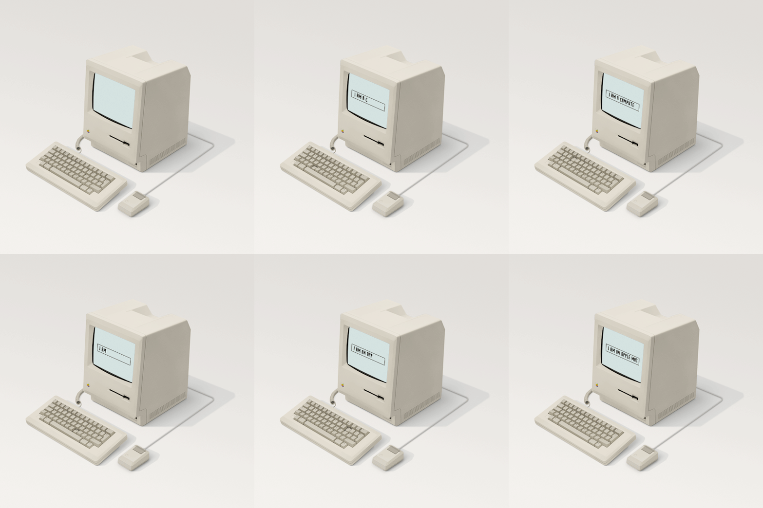
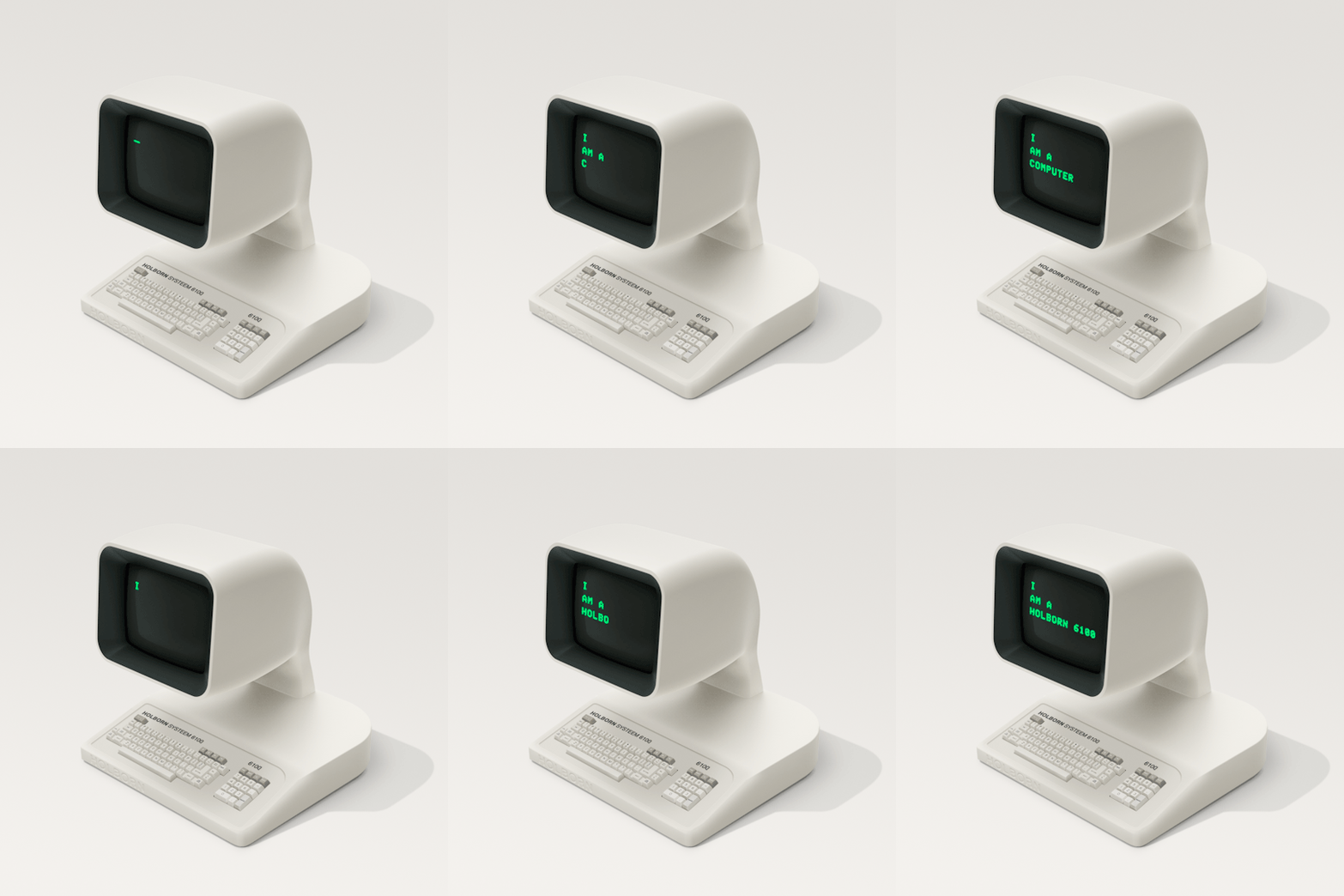
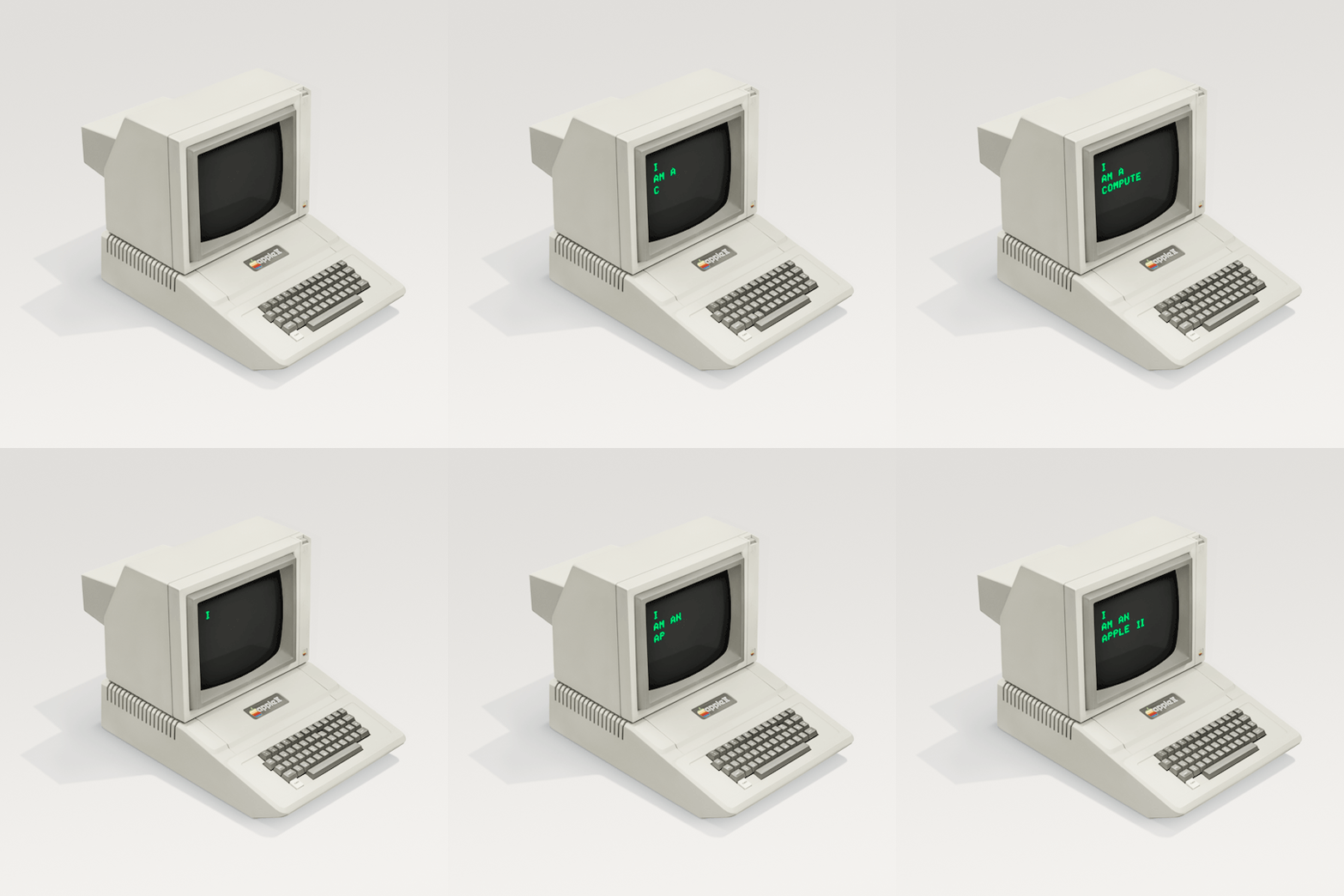


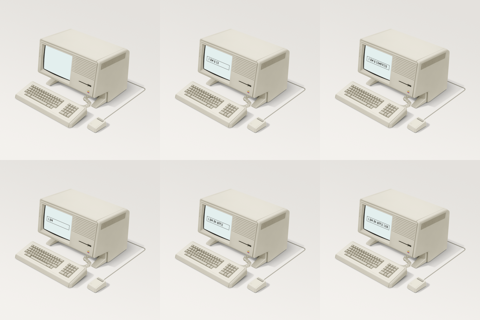

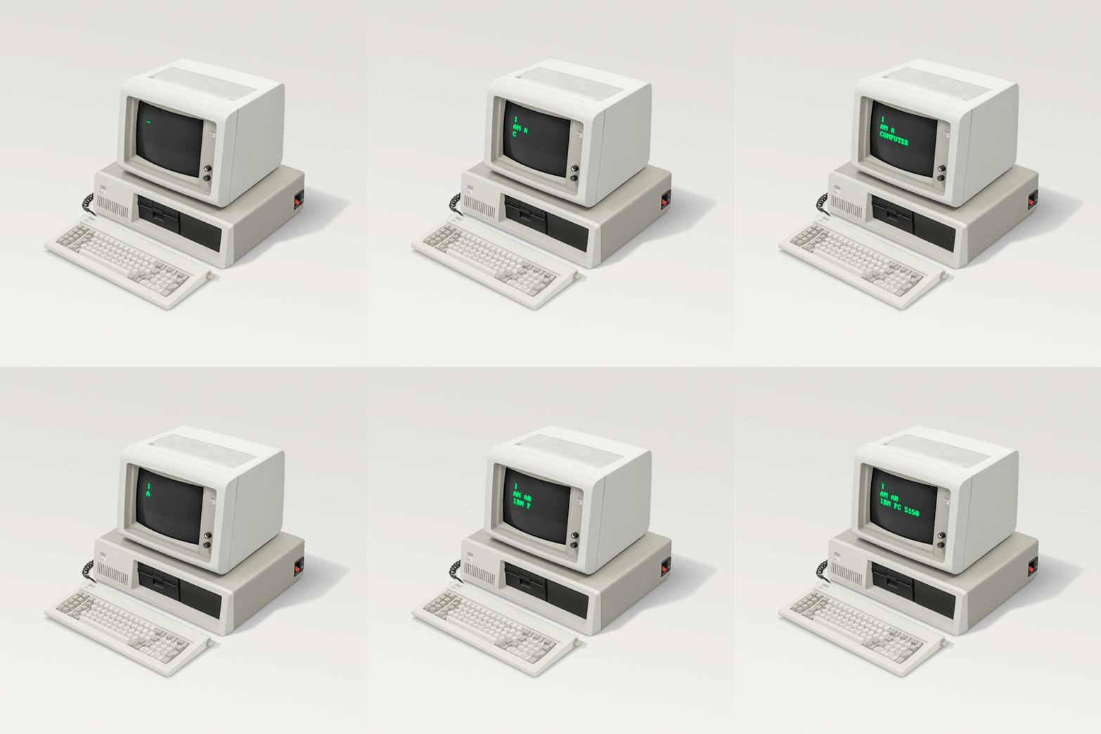
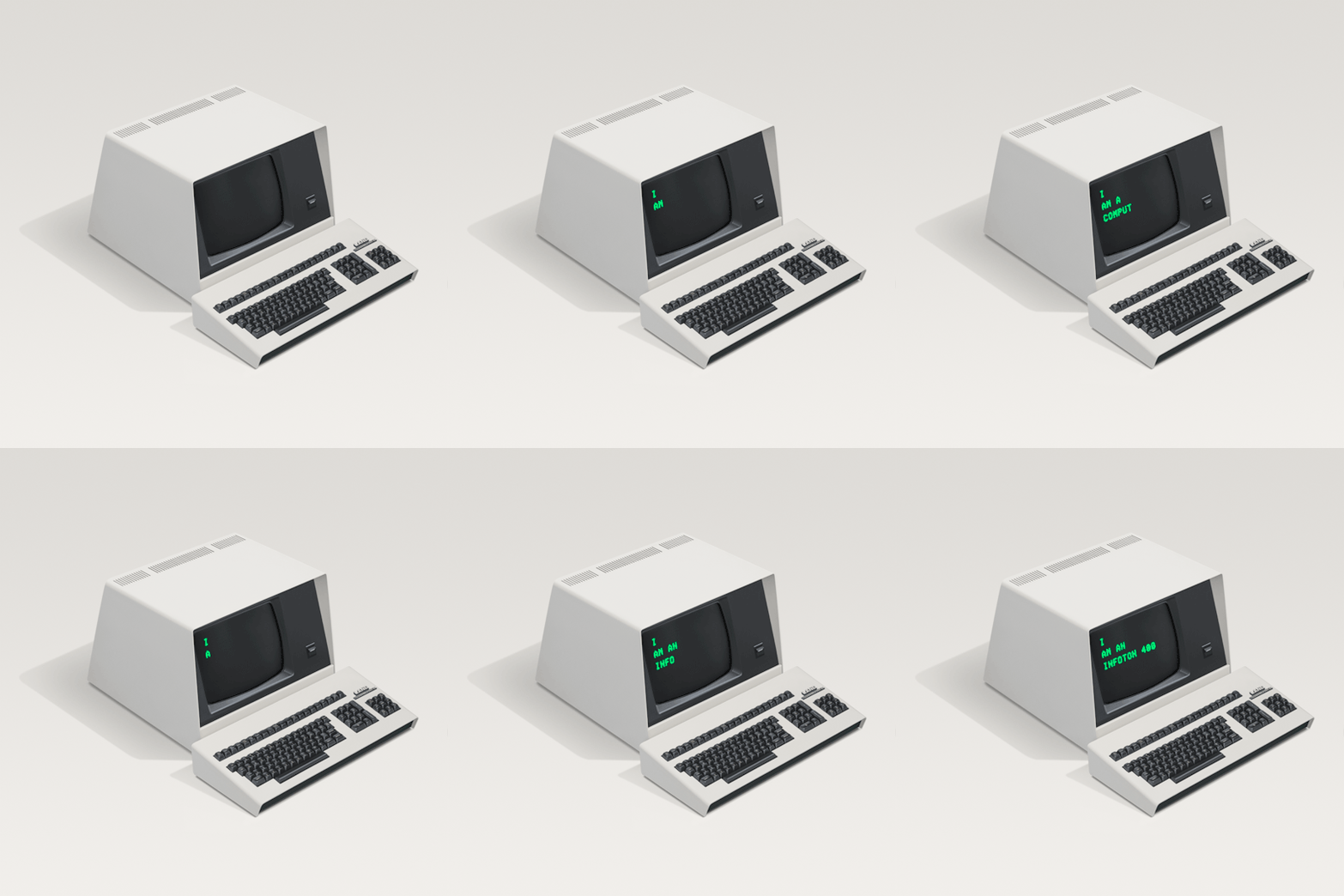

I Am Computer by Docubyte
‘I am computer’ celebrates the visual character of desktop computing machines from a colourless period in industrial design.
From word processors and video terminals, to the very first desktop personal computers, these compact machines heralded a beige age, a period of microcomputing from the the 1970s and early 80s when design standards had conformed to realise a palette of neutral coloured machines throughout offices and later the home.
4K notes
·
View notes
Photo

•Communication design studies/Week 11
In today's workshop, Andy demonstrated how to use InDesign for our most recent zine. I learned some useful tool chains and shortcuts and tried some basic typesetting tools for my zine as well as some InDesign. I think it's really useful for my assignment.
6 notes
·
View notes
Photo


•Communication design studies/Week 11
WHAT”S NEXT FOR DESIGN?
No machines can never replace human beings.
Human beings may not be perfect in everything but humans are the ones who make machines. Naturally, that makes them more efficient than machines as the vice versa is not possible.
Human beings take decisions based on memories of events which have occurred in the past, in other words they make decision on the basis of the experiences they have had. Machines are incapable of this quality which makes human beings unique and at the same time superior to them.
Other things is adaptability n response to sudden unknown outcome which humans with the use ot their intelligence n wisdom can do but machine will do for what it is prepared for and that is too by us..and number of sudden unknown outcomes nobody can predict.. For that human mind is required.
(https://www.quora.com/Will-machines-replace-humans-If-yes-when)
In fact, when I saw this eyewriter, I was shocked. I didn't know there were such people and machines in the world. I think this is a really useful machine for people who are physically disabled.
5 notes
·
View notes
Text
The Marías
ASK ME ANYTHING // CONCLUDE
Oh how this assignment has been so much fun yet stressful at the same time. BEFORE i get into the GUTS of how i used my hands to make things, i’d just like to congratulate everyone for making it through these 12 weeks and how amazing everyone’s ask me anythings look. Im really blown away by how our cohort can produce so much creative work. M I N D B L O W N
ALRIGHT!
So the The Marías are a band who formed in LA late 2016. The members include Maria, Josh, Carter, Jesse and Edward. Their unique style of music fits under the genre psychedelic-soul. I was introduced to them last year by a friend and fell inlove with their dreamy like composition. The reason why i decided to do a band instead of a Graphic Designer or Illustrator was because i realized that music plays a major part in my everyday life. The amount of music i consume some would say is unhealthy but i just find so much inspiration through what i listen. So when we were given the assignment of Ask me anything, The Marías was immediately on my list.
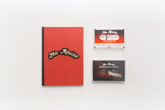
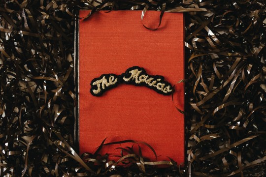
The creation of this small publication was probably the most fun ive had designing something. Since this task was driven on more interest in your artist rather then criteria, i knew this would be a great way to explore and really experiment with various medias. I started of searching my local thrift stores for items that could be of use. I happen to come across a few old books which had wonderful hard covers. I was lucky enough to find one that was red! This started the ideas flowing on how i could construct everything.
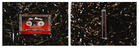
I had also found myself very interested in cassettes and cassette players. Growing up i never got to really experience the period where cassettes were booming. I found the concept of having physical music to be fascinating and oddly satisfying. Also i had no idea how tape worked so im pretty sure it was magic. Since The Marías had only one album out, (Superclean vol.1), I was determined to record it onto a cassette and find out how to do it. (with their permission ofcourse). After some research on how to record onto cassettes, i borrowed a old stereo player from a friend which enabled me to experiment with recording ontop of old cassettes from spotify. I experimented with different recording settings and Type 1 & 2 cassettes. After some frustration, i recorded the album onto a cassette and sliced the tape so it would only be the duration of their album. With 6 songs in their album, i split 3 and 3 and recorded them onto both side A & B. mmm quick math
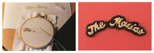
The second medium i tried for the first time was Embroidery!!! After having difficulty finding a method to create a foil on my hardcover, i decided to give embroidery a try. With the help of a few youtube tutorials and Matilda’s wisdom, i recreated The Marías logo (which was already an embroidery but on a larger scale). and stuck it onto the front of my cover. Embroidery was alot of fun but it was definitely a risky pathway as it was my first and anything could have gone wrong. It also took a long time so a few ghibli films passed the time :’)
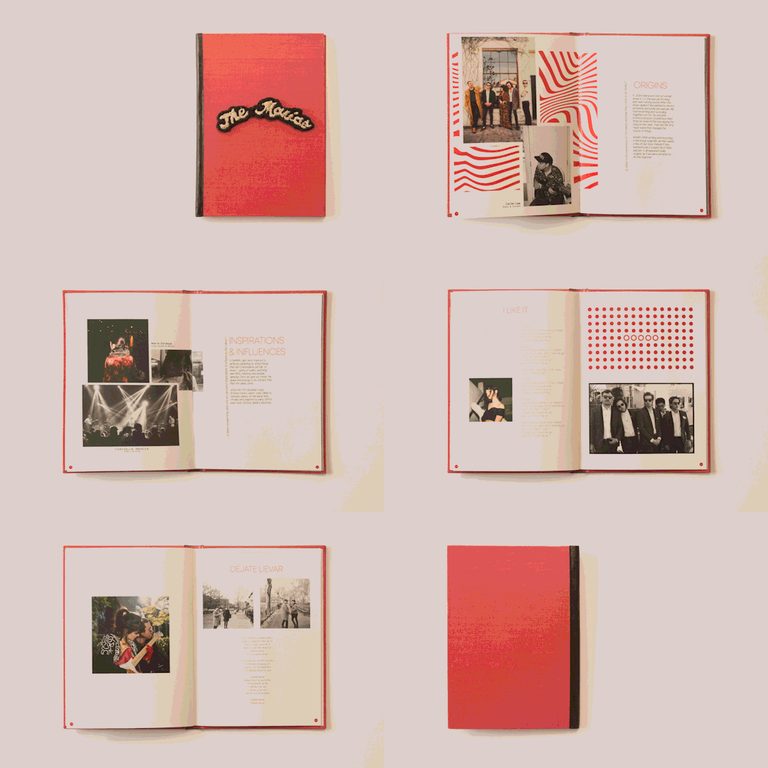
Designing the content within the booklet ran pretty smoothly. I knew i wanted to implement this psychedelic theme into the design aswell as their signature red. What was slightly stressful was the replies coming in 2 days before the deadline. It was another very risky gamble however it was all worth it. Since i had designed everything else, all i had to do was plonk the answers into the slots and rush to dinkums. Note to self, if ever creating another booklet, set up your documents as individual half pages instead of two pages on one piece of paper. Deciphering the correct order on what goes where is a nightmare.
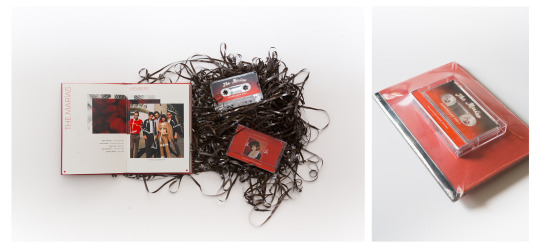
The whole concept of my project was that while you listened to the music, you would read through the booklet and create a connection between the two. I found that the experience of sitting infront of a stereo and having to listen through each song and then flip the cassette, a very warming and meaningful experience. I guess you cant really skip a song forcing you to listen to what the artist has to express. I shrink rapped everything together at the end to give the user (Andy and Karen lol) a real experience of something you would purchase from an artist.
Overall it was SO MUCH FUN creating this and learnt so many new things from it. Id like to thank everyone who helped me with feedback and advice on making this and ofcourse, The Marías for giving me this opportunity and answering my questions.
If you were curious on what they sound like: https://soundcloud.com/themarias/sets/superclean-vol-i
Much much love
-Jam
78 notes
·
View notes
Text
Interesting!
Ask Me Anything!
I thought it would be a good idea to share the finished product of my Ask me Anything! assignment, I created a jam-packed and vibrant interactive A5 book to represent the colourful and paper filled world of Tommy Perez.
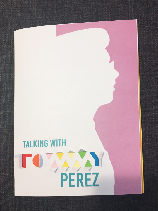
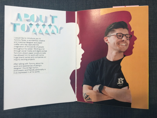
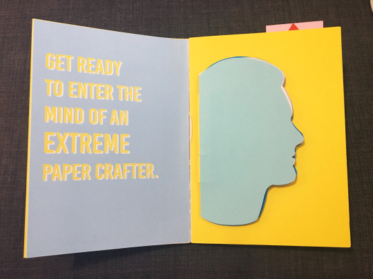
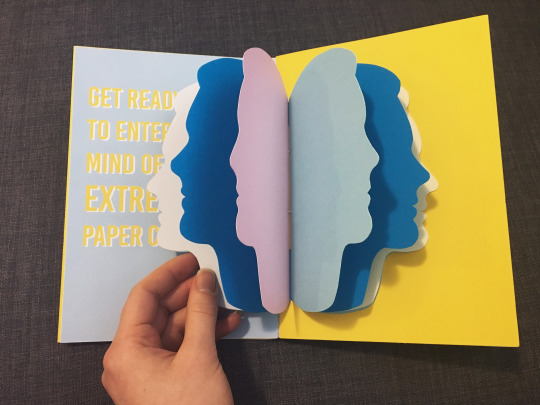
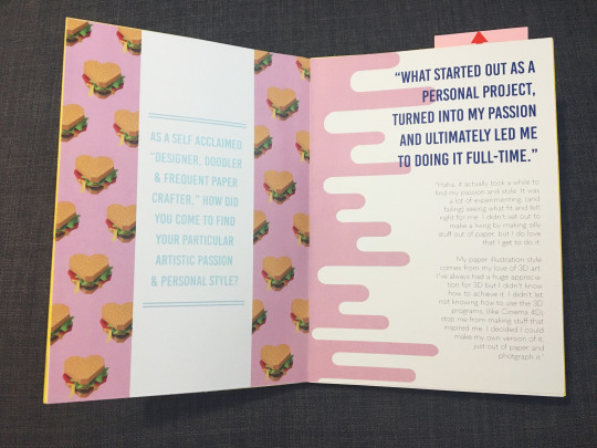
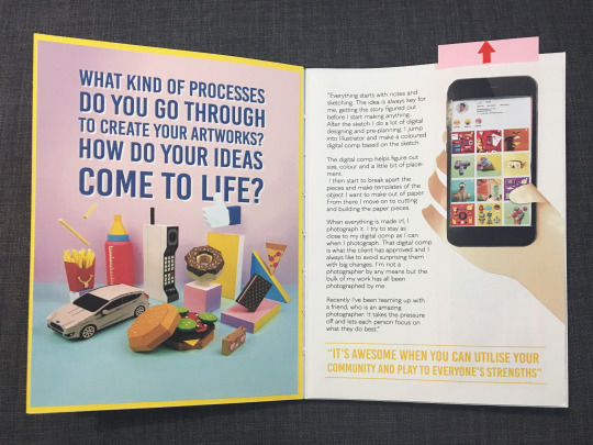
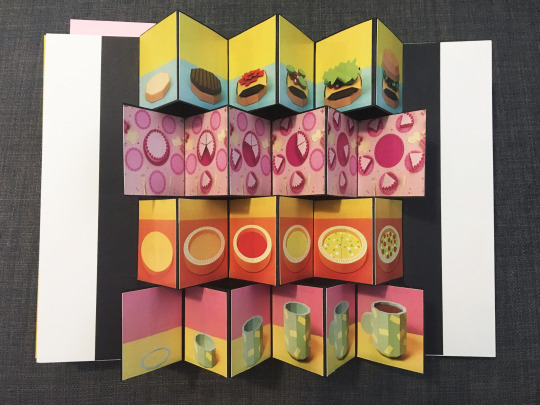
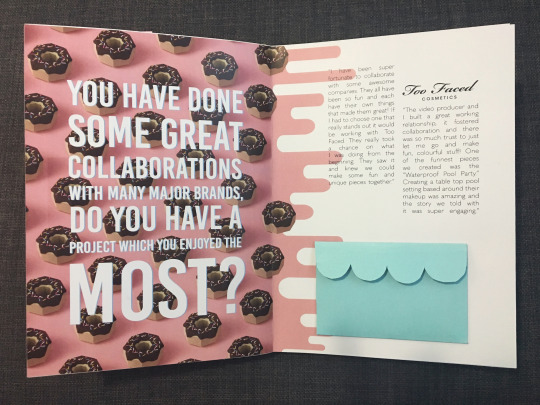
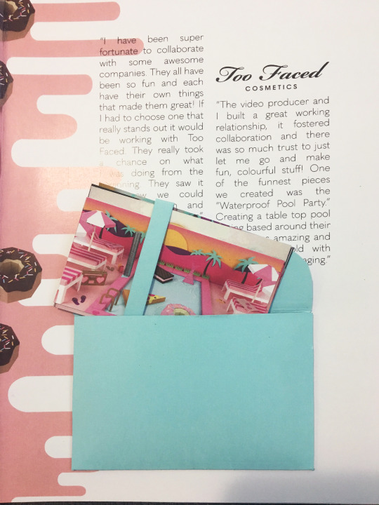
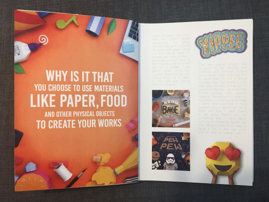
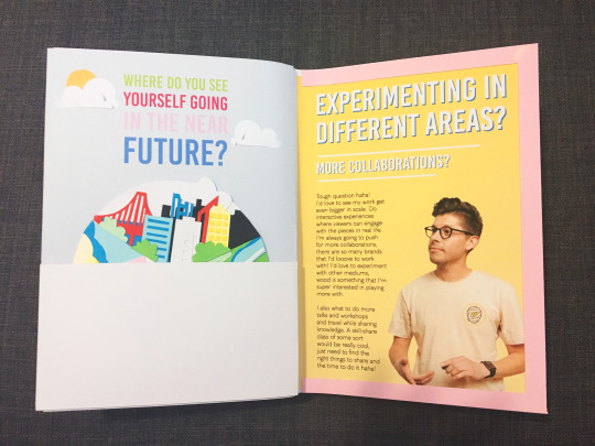
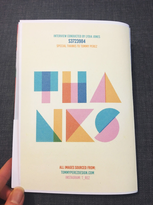
All images were taken from the Instagram page and Website of Tommy Perez, I am quite pleased with how the book turned out, the binding was by stitching in the centre of the pages and hard folding of 200 gsm paper.
53 notes
·
View notes
Photo

What was the most important thing I learned from Grap2199?
“Everything will be OK“
87 notes
·
View notes


