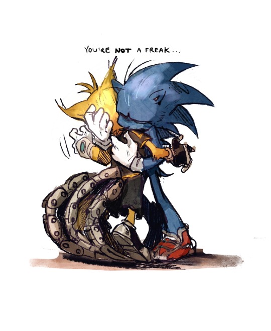
He/They. 20. ����🇭🏳️🌈. Sonic Artist but I do other stuff.
Don't wanna be here? Send us removal request.
Text
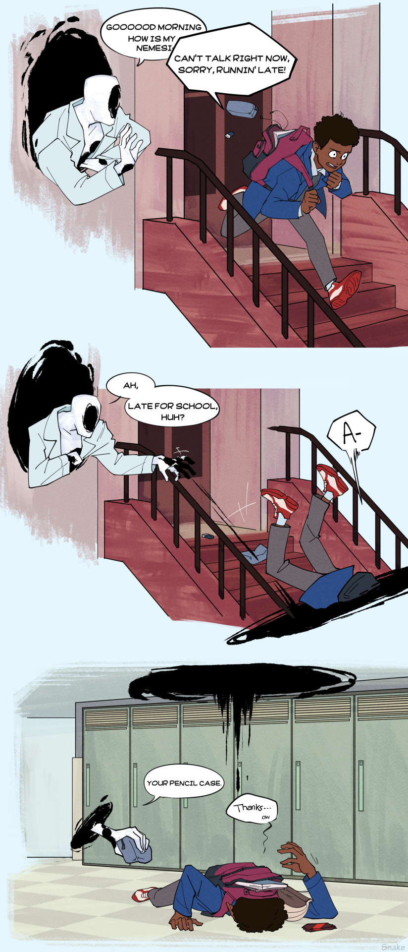
Commission for @siirknight!
In which the Spot becomes friends with Miles and helps him get to school in time (albeit a bit clumsily).
42K notes
·
View notes
Text
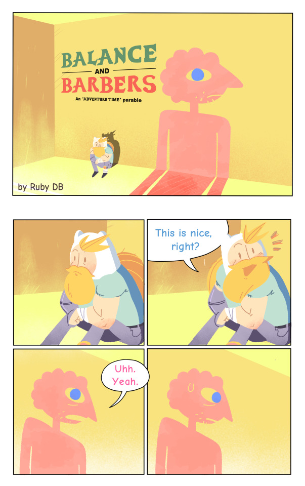
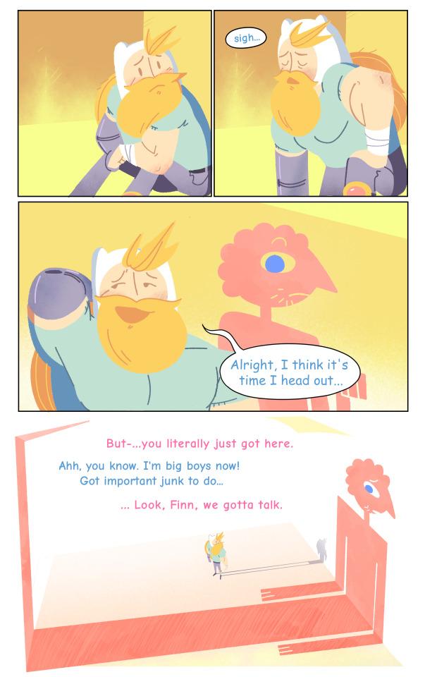
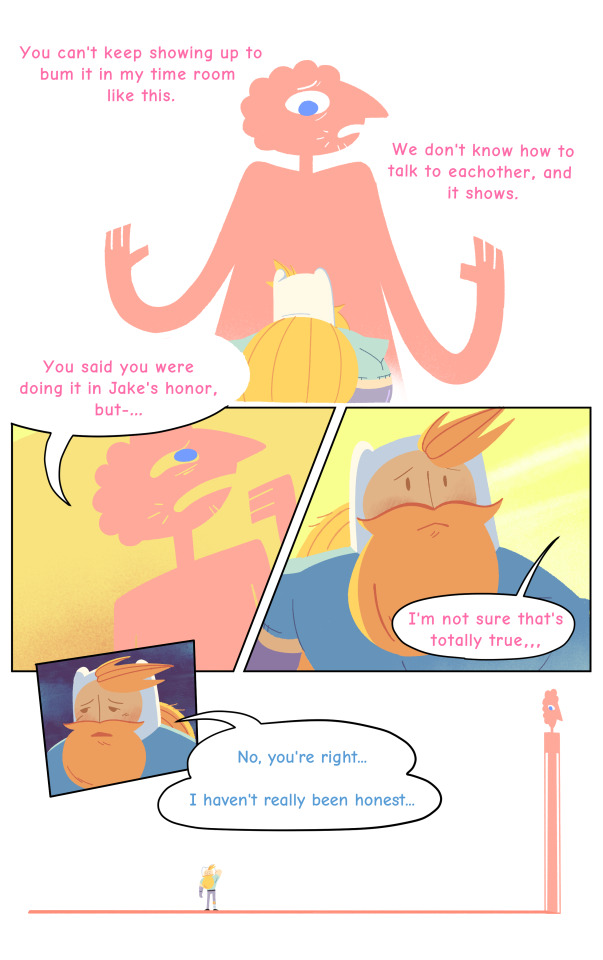
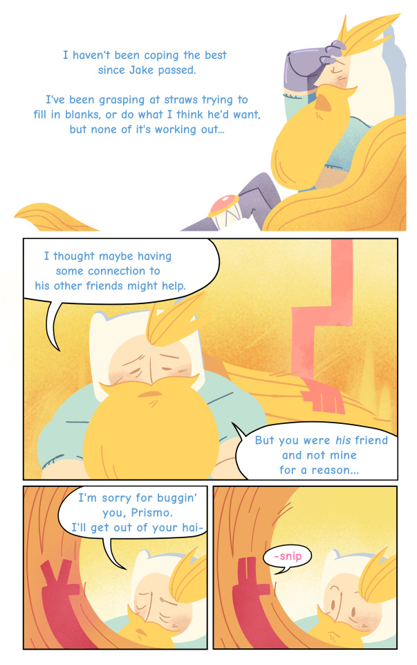
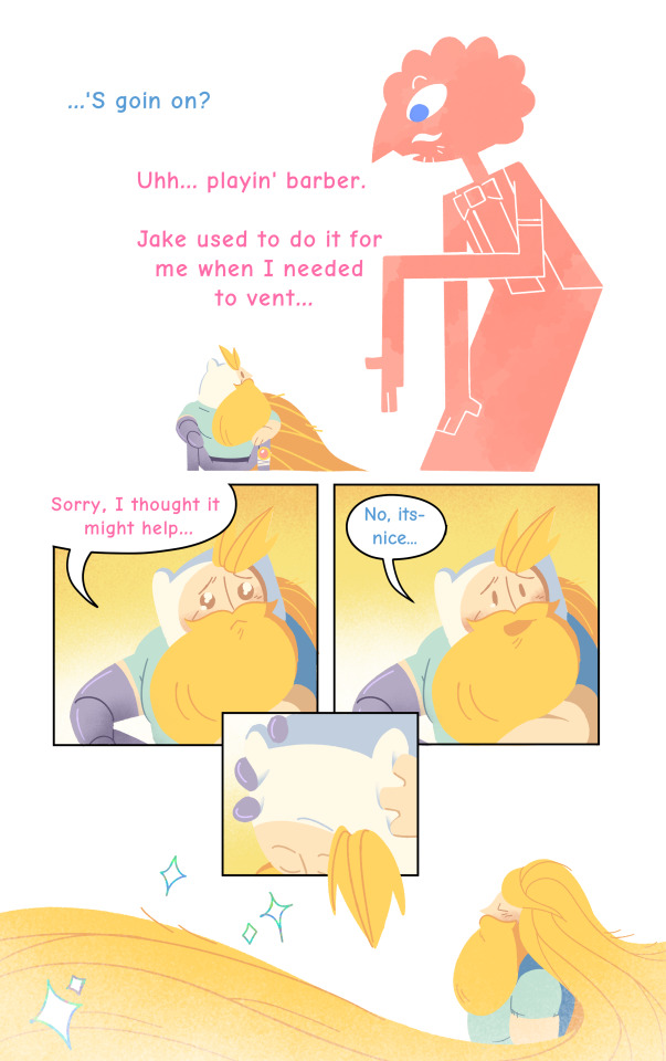
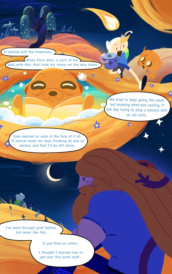
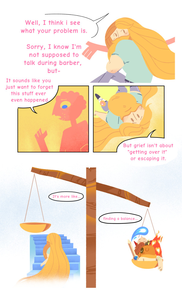
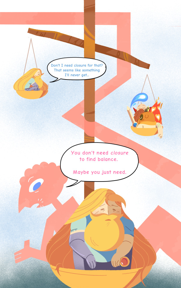
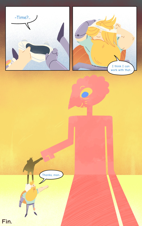
Balance and Barbers
After the death of Jake, Finn makes routine trips to Prismo's Time Room, to try and spark up a bromance that never was.
[Commissions] [Carrd] [Soup of the Day]
15K notes
·
View notes
Text
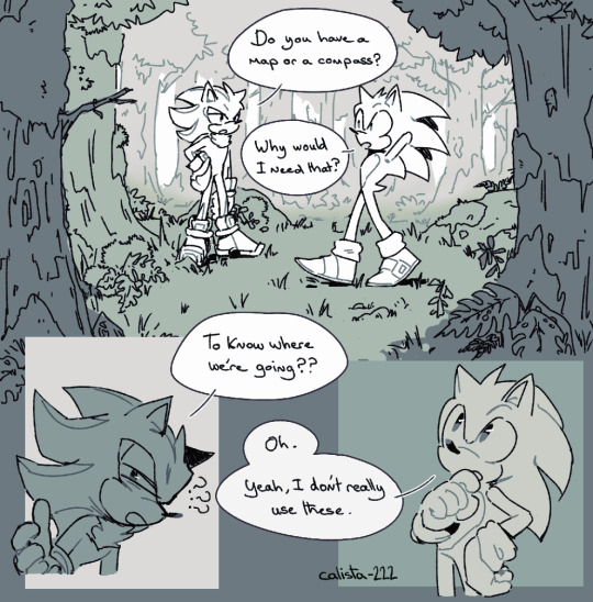
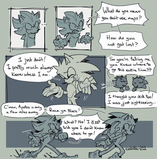
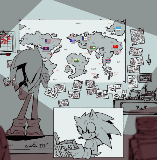
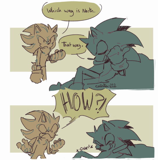
'Perfect sense of direction + geography nerd' Sonic, anyone?
42K notes
·
View notes
Text
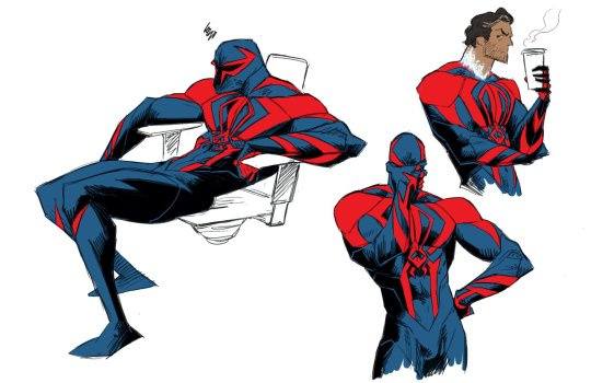
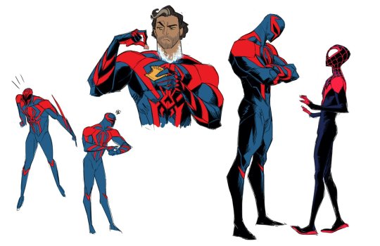
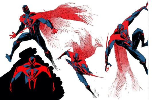
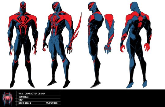
“Got to a body everyone liked, did some acting and action explorations, but now the design was sent off to the great Omar Smith to be modeled, where some of the proportions were adjusted. Omar did such an incredible job translating the design” — Kris Anka
35K notes
·
View notes
Text

truly a pitiful fate of being recruited for potato harvest by your friend. the reward is great soup
3K notes
·
View notes
Note
I noticed you asked people to send in requests!
Could you possibly draw Scourge the Hedgehog?

there u go !! i tried a different coloring style w this one, and had lots of fun too. tysm for your request, hope u like it :)
1K notes
·
View notes
Text
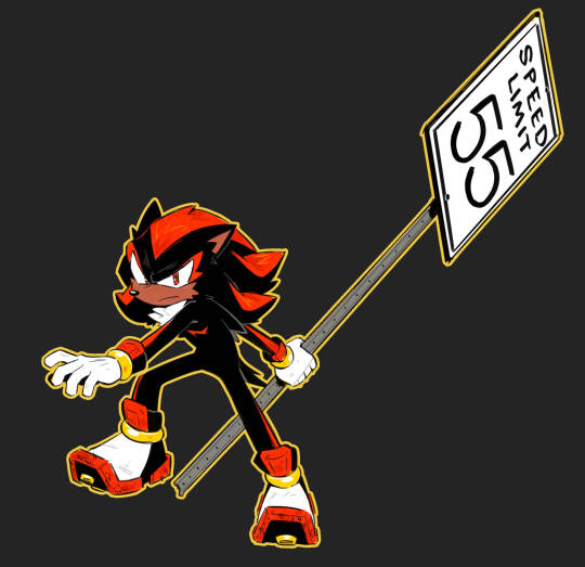

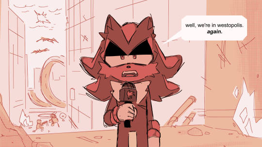
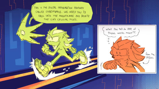
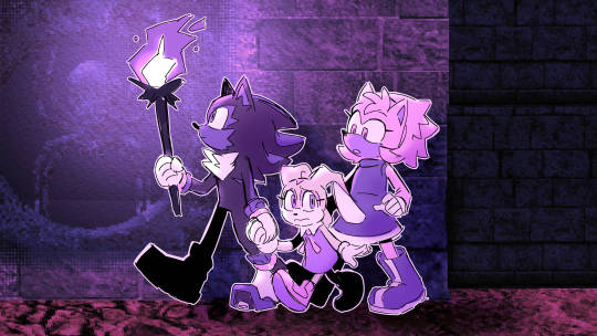
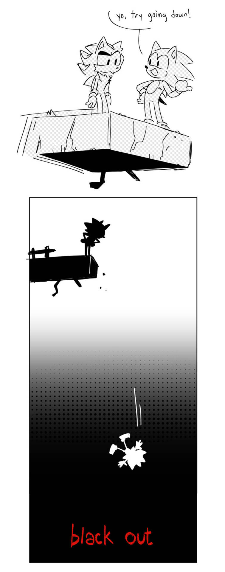
a bunch of (mostly) unfinished stuff from when i was playing shadow the hedgehog
11K notes
·
View notes
Note
Could you explain how to do lighting in landscapes?? I'm thinking specifically of how the heck they do it in Steven Universe. They have beautiful artwork and I'd love to be able to achieve that sort of lighting. Thanks!
Ah well lighting in animation backgrounds are done with the express purpose of guiding the eye to where the animation is going to take place - think of it like setting up spot lighting on a stage!
In fact, in a lot of cases the su team do literally set things up with what are essentially spotlights
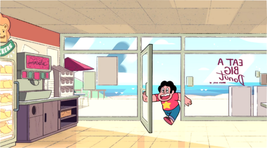
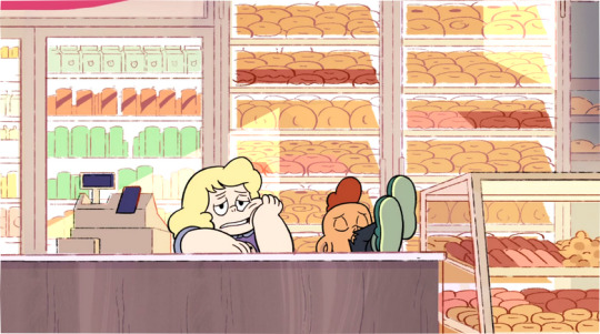
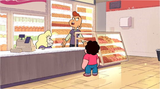
Note that all of the characters are in areas where the light is shining. This is done because your eyes are drawn to the areas with the highest contrast, so your eyes jump to the spotlights - and by extension, the characters!
Now if i show you some backgrounds without the characters, can you guess where abouts the characters are on the stage?
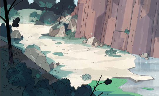
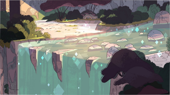
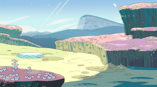
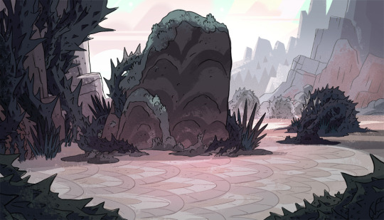
Now the thing to understand about the lighting in these backgrounds is that there are some rules and guidelines that inform the colour choices and value ranges.
Scenery is divided into planes, the Foreground, Background, and the Middleground which is generally where the characters are staged.
In outdoor scenery there is also often Deep Space, which is things waaay off in the distance like mountains.
Take a look at this background for example:
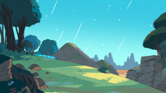
This background has all of the different planes, you can flatten them each down into a solid colour
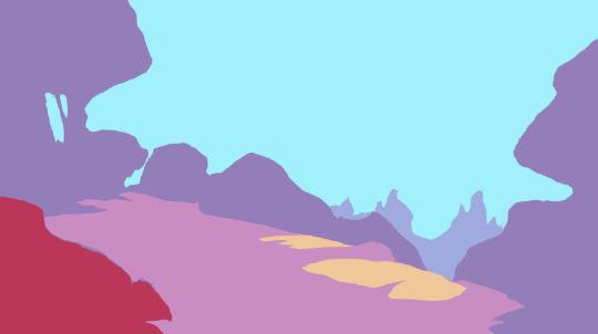
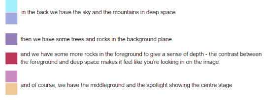
as i mention in the key there, the foreground is generally in contrast to the background and deep space.
If the background is full of cold blues and purples, the foreground is going to be warmer colours like browns and greens.
It’s also going to be on the opposite end of the value range - deep space is usually pale in colour and uses the higher end of the value range, whilst the foreground is usually darker and uses the lower end of the value range.
the colour of the sky is very important to the rest of the colour scheme!this is because of aerial perspective. It’s a simple enough concept, but it does need a little explaining
This is easiest to understand if you think of a really foggy day - you know how things get really hazy the further out in the fog they get?
This happens on regular days too! It’s just that it needs to be super far away for it to be noticeable.
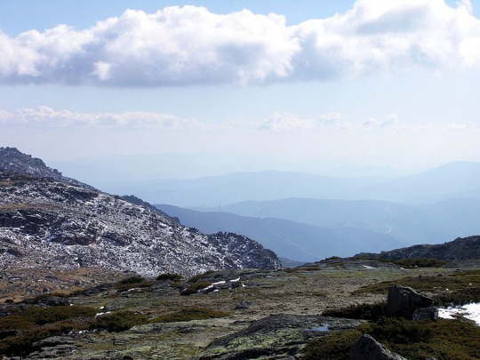
So, basically, the further away something gets, the less contrast there will be and the colour will become closer to that of the sky.
The reason for this is because of the water in the atmosphere - the sun shines on it and it reflects the colour of the sky, which is particularly noticeable on foggy days due to there being so much water.
most of the time, this means that things in the distance will turn bluer, due to the sky normally being blue.
However! SU regularly takes place at different times of day, so you can see how the colour of the sky and how bright it is changes the aerial perspective
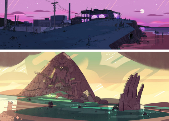
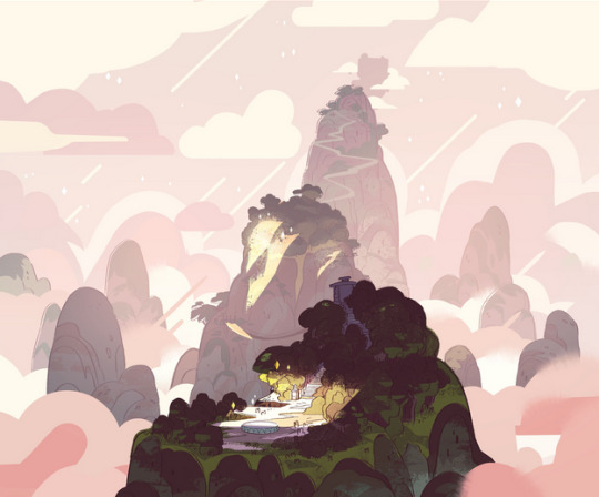
as for actually setting up the lighting, there are some simple rules to follow.
the area of highest contrast is where the viewer is going to look. To understand this better, look at the backgrounds in black and white only:

Your eyes are drawn to Beach Citywalk Fries because there is a stark contrast between the shadows and the spotlight!
It has the highest range of values going all the way through from black to white in the middleground.
The areas your eyes are not drawn to, however, only have a small range of values. The foreground goes from dark grey to black, and the background goes from light grey to white.
Generally, the foreground will be darker than the middleground, and the background will be lighter, whilst the middleground will have a full range of values.
I say generally as this is not always the case, there are lighting situations where the background will be the darkest part of the image
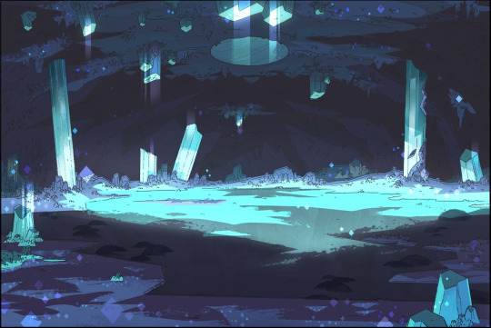
but they’re pretty unusual!
so in summary:
- figure out where you want the viewer to look, that should be the area of highest contrast. That means that there should be strong shadows and strong highlights.
- make use of aerial perspective to add depth to your scenery, the further away something is the less contrast it should have.
- Set your scenes up with the planes in mind, use the most values in the middleground and use opposite values for the foreground and background.
And also, you might want to check out kevindart, ducksofrubber, and ellemichalka, because they’re the art directors for steven universe! i also believe amandawinterstein and rickycometa are background painters c:
31K notes
·
View notes
Text
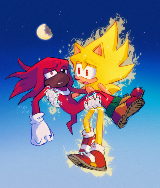


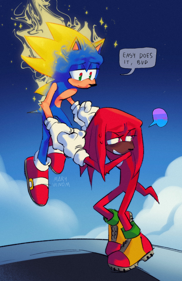
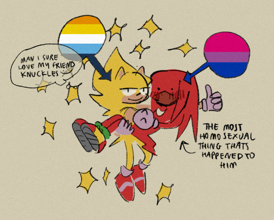
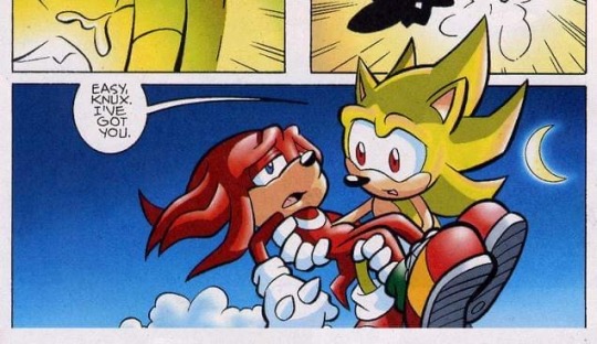

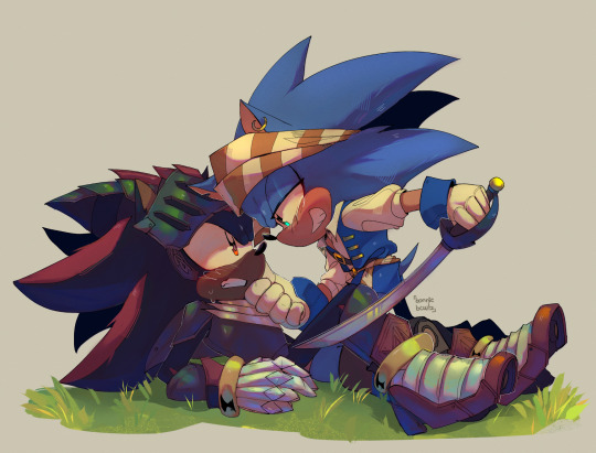
can two bros hold hands and also one of them has a crush on the other
4K notes
·
View notes
Text
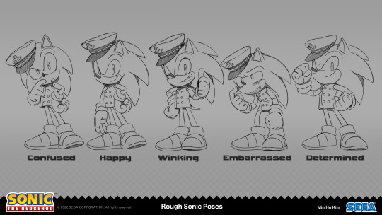
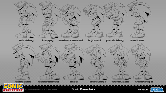
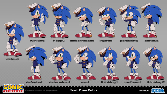
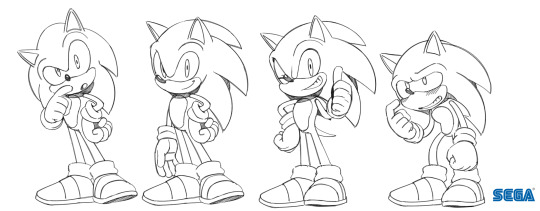
Here's the Sonic character art progression from sketches to the final from The Murder of Sonic the Hedgehog!
4K notes
·
View notes

