
Don't wanna be here? Send us removal request.
Statistics
We looked inside some of the posts by mi6011abifiges and here's what we found interesting.
Average Info
Notes Per Post
1
Likes Per Post
1
Reblog Per Post
0
Reply Per Post
0
Time Between Posts
7 days ago
Number of Posts By Type
Text
17
Last Seen Tumblr Blogs


Fun Fact
28.6 is the average number of monthly visits per US mobile user.
Text
Evaluating finished work
Video:
Positives:
The movement is mostly animated in a great way, It is smooth and clear.
The use of the grey and white only, makes the animation flow nicely.
The timelines movements and the graphic its self look great.
Negatives:
Some of the movement is slow and some is fast, so there are parts that don't flow as well as I wanted it to. This is due to errors made in the planning process. I will learn from this and do more animation tests and revise plans more frequently.
The introduction is not as good as the rest of the animation. This is due to me doing in intro first and then taking a break before starting the rest of the work. I was silly and lost the save the file, I only had an exported video. I tried to match the rest of the animation to this, but I didn't do the best job. Therefore the text and the effects don't match the rest of the animation. In the future I will save files to multiple places.
Booklet:


Positives:
The type choice and colour works well with both the design and the theme.
The first page looks professional and the lack of colour works well.
Negatives:
The last page is very cramped, this was due to me adding more writing then I was originally planning to.
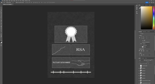
Poster:

Positives:
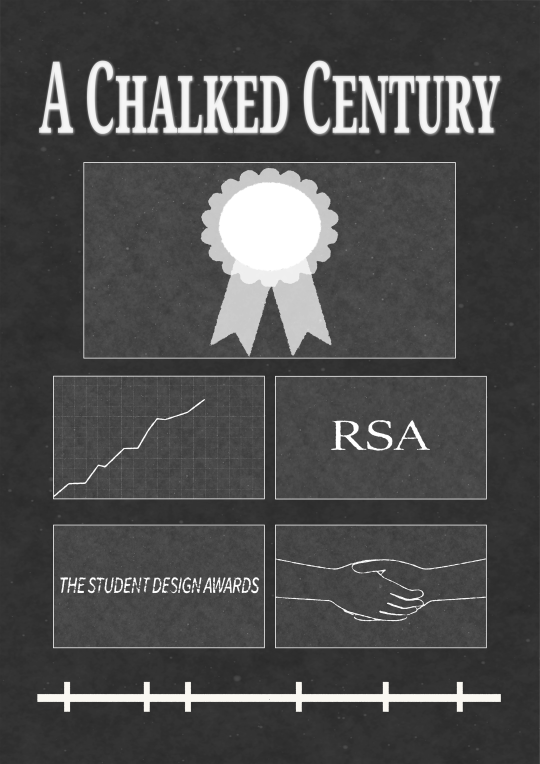
I like the fact I used the timeline and the award pin in the poster. They are both very important to the story of the animation. As it is about the last century and it is celebrating the fact it has been 100 years.
Negatives:
The colour of the background is much lighter then the colour in the video and booklet. This makes the poster look less cohesive when put with the other work.
The sentence looks squished, this was done as is looked better having the text span less of the page than the title. However I didn't have much of a choice, as my chosen sentence was a bit long.
0 notes
Text
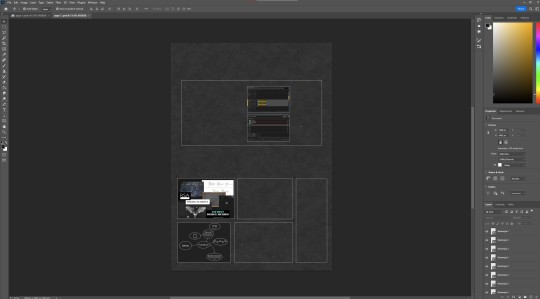
Booklet of supporting material
My first plan:
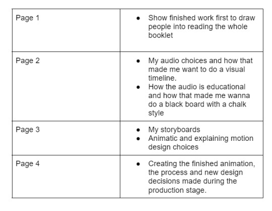
Use the blackboard background throughout
Use the same typeface as in the animation and poster throughout.
I want my booklet of supporting material to have less writing and more pictures as I personally find this more accessible to a larger audience. It won't exclude those who struggle with reading including people who can't read/read English.
Plan:
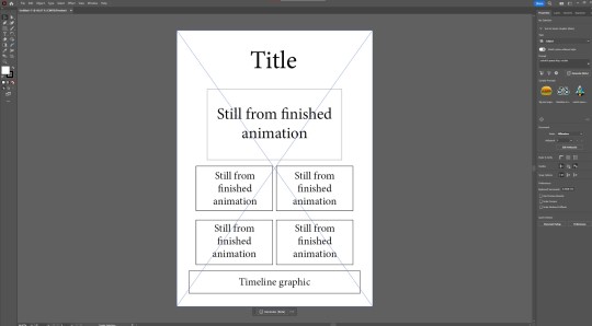
I made this plan in Adobe InDesign
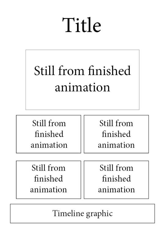
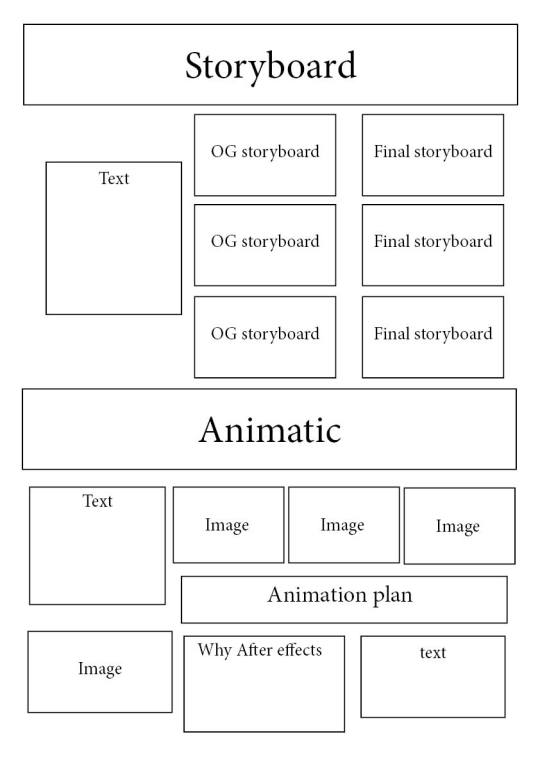
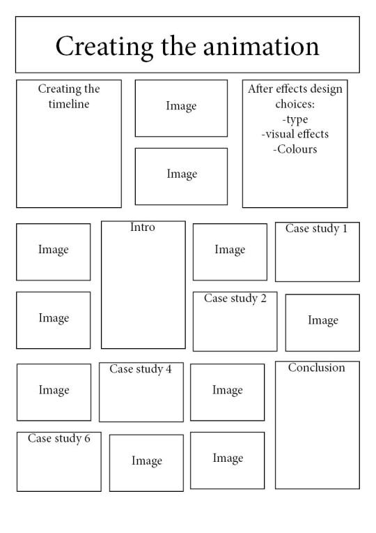
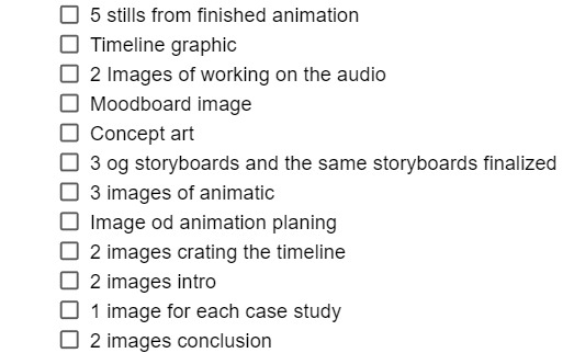
NEED: 5 stills from finished animation Timeline graphic 2 Images of working on the audio Mood board image Concept art 3 orignal storyboards and the same storyboards finalized 3 images of animatic Image of animation planning 2 images crating the timeline 2 images intro 1 image for each case study 2 images conclusion
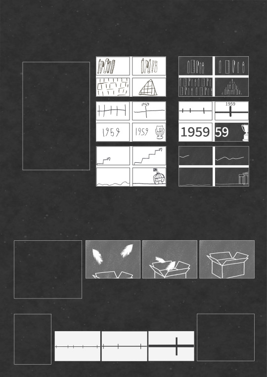
I started on Adobe illustrator but i ended up swopping to photoshop as it is better at cutting out parts of images.

I placed the frames i took from my finished animation and i added them.
Draft, adding photos/graphics first:
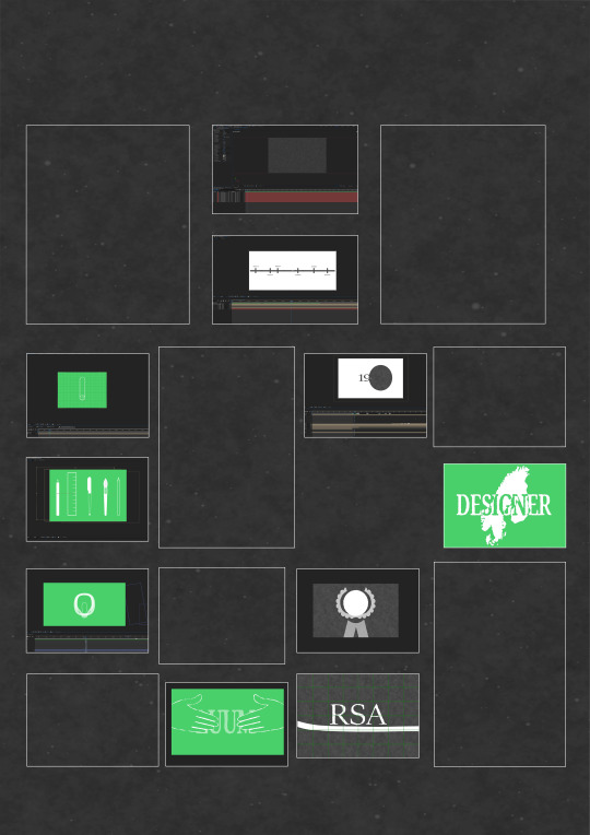
Text:
While writing up my text plan for page 3 I realised I was missing a big part of my planning process. I went back into photoshop and changed the layout of the page to make room.
Left - old plan, Right - new plan

Once I finished the writing I then rewrote them to condensed them and use better vocabulary.
Finished pages:

0 notes
Text
Hero image
What is a hero image?
According to nofilmschool.com
A hero image is often the first thing that people see when they encounter a film. A hero image should be a powerful and memorable image, that can leave a lasting impression on your audience and draw them in to watch your film.
'No film school' suggests that I should do the following, when creating a hero image:
Determine the tone and genre of your film
Look for images that evoke emotion
Consider the composition and framing
Think outside the box
Test different options
My favourite hero images/Movie posters:


I really think the text used in these hero images work amazingly with the graphics used and the story/style of the films they were created for. The images and the text really help present the genre of the each of the films.
Creating my hero Image:
Naming my animation:
Firstly I need to come up with a name for my animation, so far I have just been referring to it as '100 years of Rsa', but that doesn't have anything to do with my actual animation, so I need to come up with a name that relates to my video.
Firstly the the use of the timeline, throughout needs to be incorporated into the name, somehow. Also the fact that the graphics look like chalk and the background is a blackboard, should be incorporated into the name.

The name I have come up with:
RSA - A Chalked Century
While I was trying to think of a name I kept thinking of sentences for the hero image
Sentence:
ideas:
Wipe away a century from the timeline
Every mark of chalk reveals the stories of the last one hundred years.
Step into history, Step into the last 100 years.
A Journey Through the Timelines of a Hundred Years.
Every mark of chalk matters.
Drawing Stories Across the Timeline.
Drawing Stories Across the Century
Where every mark of chalk reveals stories across the century.
Every stroke of chalk unveils stories of a century
Where every stroke of chalk reveals stories from across the century.
What will my hero image look like:
I am using the advice from no film school, to help me come up with an idea.
Determine the tone and genre of your film:
My animation is for educational purpose. It focuses on the history of the last 100 years. It is light, upbeat and a quick easy watch.
Look for images that evoke emotion
I feel my animation doesn't convey an emotion, as it is for educational purposes. I would say an emotion that could be connected could be due to the celebratory nature of it being 100 years. So a happy exciting graphic would work.
Consider the composition and framing
I think this is important as i need to think of where I will place my text. I am not sure of where i will place it, but i will test out different options.
Think outside the box
Thinking outside the box is something I struggle to do. I want to create something that is outside of the box, that doesn't step too far away from the style of the actual animation.
Test different options
I will make a few options and then pick the best one.
Draft ideas:

I need to add the text, I also should brighten the rosette badge.

I think I prefer the title at the top of the poster.


My best composition yet. I am going to adapt this design.
Final design:

I added text at the bottom to mimic the text that is often at the bottom of movie posters.
My hero Image:

0 notes
Text
Creating the video
Timeline:
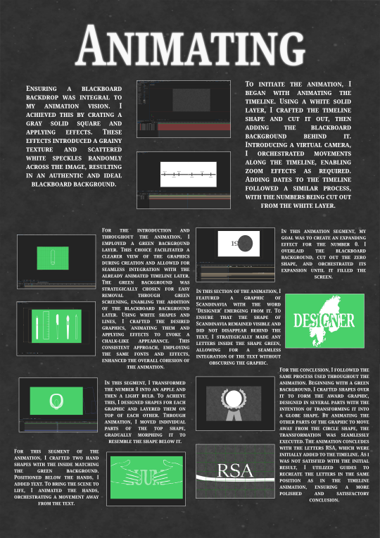
I used After effects to create the animation.

I created the blackboard, using a grey solid square, which I then added effects to. The effects made it look grainy and left white speckles, randomly across the image.

I used a white sold layer and put the chalkboard background behind it. I then created a timeline shape and masked it out of the white layer. This made my timeline a textured as a chalkboard. I then created a virtual camera and moved it to make it move along the timeline and zoom in and out when needed. I added the dates to the timeline using the same process as before, cutting out the numbers from the white layer.
Introduction:
I used shape layer to create each of my graphics.


I used an atlas to help me make the globe and to make sure I was putting the markers, where the countries were.
Case Study 1:

Case Study 2:


I used an image of Scandinavia to help me draw it.

I tested different fonts and chose this one to use for all of the text throughout my animation.
Case Study 4:


In this section I had to have the number 0 turn into an apple and then a light bulb. I created shapes of each of the graphics and placed them on top of eachother. I then animated the top one, moving parts of it individually until it resemble the shape below it.
Case Study 6:


I used the handshake to help me animate the handshake.

In the middle of animating the plummo box i knew i wanted to have tape on the box that said environmentally friendly. When i tried to animated this it was too difficult as the writing was too small to read. I decided to research plummo and find out of it was recyclable, so that i could use recyclable symbol on the tape instead.

I found graphics that I could use and downloaded them. I added them to the 'tape' masked them out.

Conclusion:


I used an image of a hand to help me create a graphic of a hand.


I used a graphic of a rope and masked its shape to help me create a rope graphic.
0 notes
Text
Animation test.
As a big part of my animation is focused around a visual timeline, I decided to make an animation of the timeline's movements.
I did this in After Effects, using the shape tool to create the timeline's shape. I used the 3D motion options to place the timeline and the background. I then added a camera and animated, while flipping back and forth between different views get the camera in the positions wanted it to be in.
I added to text just to show what case study the timeline is transitioning into.
0 notes
Text
Animatic
Here is my Animatic, excluding the conclusion
Final Animatic:
youtube
My plan is to import the animatic into After effects and animate over it. I will mostly be using Shape layers to create the graphics I will use in the animation. However I will be creating assets on Illustrator for the drawing of Scandinavia and the museum. I want to make everything apart from the timeline, look like it was drawn with chalk. I am not sure how I will do this with graphics I create using shape layers, so this is something I need to discover. I also need to pick a font before I start animating.
Feedback:
I presented my animatic and received the following feedback:
Tools rearrange:
When the audio says 'Bridge the gap' I could have the art tools make somewhat of a bridge shape. I agree that this is a great idea and i will incorporate this into the animation.
Add pauses to audio to make timeline more obvious:
I understand that the animatic doesn't highlight the timeline as much as I plan for it to do in the finished video. I don't think I will need to add pauses in the audio, as long as I make the timeline a key feature of the video.
Change the road lines to make it more obvious:
When the audio says 'as we depart' I should have my road lines move across the screen to make it more clear that I am trying to portray a road. I will do this in my animation.
Actually harness the rsa letters:
I now plan to do this in the final animation. I originally wanted to have the rope, just next to the letters, but I agree that having the rope, be intertwined with the letters is a great ides.
Add colors to conclusion:
This was suggested to help show that the conclusion is about the future of the RSA, where as the rest of the audio is about the past. I appreciate the advice, but I don't think I will be doing this. I prefer the whole animation to have a flowing style and aesthetic. I want to show that the RSA is Proud of it's history and I feel that changing it up will take away from this.
0 notes


Text
Introduction

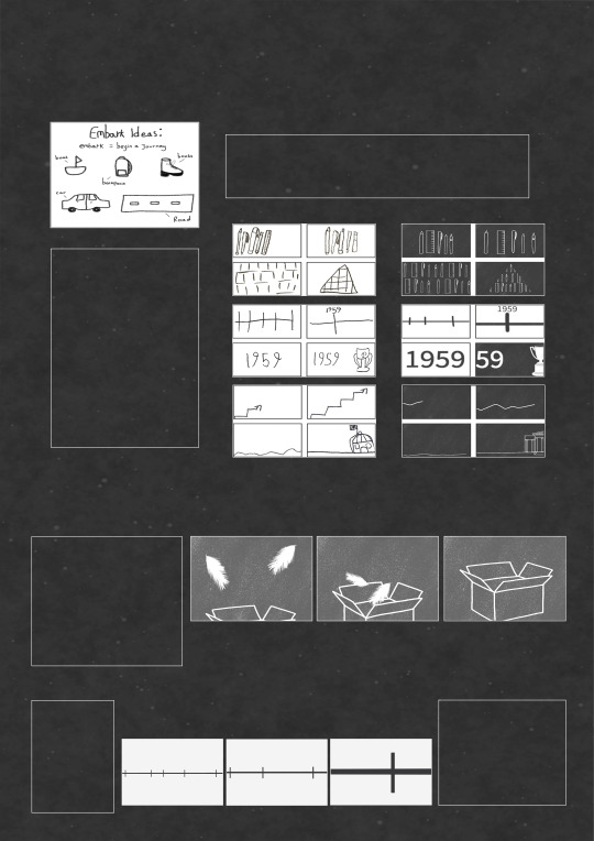
Ideas:
'instigation of the visionary silk manufacturer, Frank Warner':
A roll of silk.
'foster the emerging field of industrial design and bridge the gap between art and commerce':


Stationary that becomes part of a pyramid.

youtube
Storyboard:


Animatic
youtube
1 note
·
View note
Text
My ideas
Based on the finished audio I mind-mapped ideas:

Mood-board:

I like the idea of going with a blackboard as a background for the animation. As the voice over script is educational and the student design awards started in 1924 and blackboards were used then.
0 notes
Text
Project Plan
Do by October 23rd.
Work on the audio, and create a 2 min soundtrack that I am happy with.
Listen to the audio and mind map ideas.
Research The RSA.
Mind map Ideas related to the RSA research i did.
Pick 3 different ideas and come up with styles and plans for each.
Pick 1 idea.
Plan how to do this idea.
Animation plan:

0 notes
Text
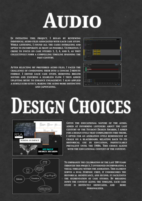
Creating the Audio
I started this process by first listening to the full audio. After doing this, I decided that i would pick a combination of voice overs that have a large gap in the year they are talking about. Having a large gap in the dates allows my finished soundtrack to have a nice flow, from the intro (beginning of the RSA) to the conclusion (now, 100 years later).
Editing in Audition
I started this process by taking the intro audio into Adobe Audition. I listened very closely to it and noticed that it included a lot of pauses and i could hear the voice breathe. I used the split tool to cut out the pauses and and the sounds of breathing.


After doing this something about the audio felt very flat. I experimented with multiple of the pre-made effects that audition has. I discovered that I liked the sound of the 'Echo voice' effect as it sounds like the voice is coming from a megaphone. I changed how dry/wet I wanted it until I found the best option.

Once I finished and was happy with the intro I knew i wanted to add music to it. I went to YouTube's Audio library to find something that is copyright free. I searched for 'inspirational' music around 2 minutes long. I found a few that I liked but i settled on ' Icelandic Arpeggios'

I brought the music into Audition and changed the volume so that it wasn't too loud and the voice was still easy to understand.
I then brought in the conclusion audio, I did the same process as i did with the intro, removing pauses and breaths. I then moved this audio into the same track as the intro so that the same sound effect was on both the intro and conclusion.
I brought in the audios from the 1950s, 80's and 2016. I then did the same process with them as i did for the intro and conclusion. I did edited these audios quite a bit to make them fit. I edited out extra information voiced after the main points were made.
The finished Audio
I am happy with my Audio. I like that is has pauses and I like the music I chose.
0 notes
Text
Research - The RSA
What are the RSA's Student Design Awards?
Since 2024 The Royal Society of Arts has Invited young and student artists to create art to design briefs. The briefs focus on pressing social and environmental challenges. Since 1924, the Student Design Awards have had over 110,000 project entries from over 20 countries.
0 notes