Don't wanna be here? Send us removal request.
Text
Final Animation
SOUND ON
Here's the final animation for the module, there's a lot I'm happy about and a lot which I wish I had time to change. As usual, because I over-complicated the project, everything feels somewhat rushed because I had to squeeze complex movements into a short period of time so there are parts which really feel rushed so the timing is a little off. Despite that, this project pushed me to learn how to animate a lot of complex movements including, running, jumping, swinging, hanging, falling, dodging, climbing and splatting. Attempting all of these movements gives me a much better idea about all of them and because I used the sack rig I had to exaggerate every movement so that you could tell what was going on. I animated it all somewhat chronologically and the first complex motion in the mini montage was running from the dodgeballs and as it was the first one I attempted, it was understandably the worst. I was really trying to exaggerate the leaping and bounding motion but because it is only on screen for just over a second it is way too quick to properly understand what is happening and I didn't properly sell the impact of the dodgeball. With every impact whether it was a faceplant or falling into a hole, I wanted to give each motion enough weight to make it look real, but I also wanted a cartoony feel to each motion including some over-the-top squash and stretch to make things more visually interesting (e.g: the upper torso hangs in the air briefly before slamming into the platform after he jumps from pole to pole, his limbs are stretched way beyond the default after launching out of the cannon, the upper body and arms hang in the air slightly longer after falling from the monkey bars, the bunched up squishing of the body before jumping from the sucker punch wall) I am still getting a feel for the right timing whilst animating and because I attempted a range of different actions all of which I haven't tried before there was a lot of mistakes along the way. I am happy with the sequence from the monkey bars to the swinging of the body before landing on the trampoline because that was the last bit of animation I did so its a lot better in my opinion.
For the next semester, I am going to keep things simple so that I can focus on subtle detail rather than trying 100 things at once. This semester has been exhausting because I really bit off more than I could chew but it has taught me a lot about animation and how to approach my projects in future. This project does meet the brief however it isn't as clear as it could be because I tried to fit too much into too short of a time window. I was aiming to show an increasing level of competency throughout the obstacle course starting with a faceplant and ending with a confident landing and a triumphant celebration. If you watch it with that in mind it shows an improvement of a skill but if I had made things simpler this would be much clearer. My animation skills have improved a lot thanks to this module because it gave me the chance to try out a lot and then some, before this module I had only ever animated a camera moving through a landscape and after, I have animated a character attempting an assault course. I've learnt a lot and I will take what I've learnt into the next semester confidently.
Also, if I had more time I would render it at a higher quality but my computer wouldn't be able to render everything at 1080p so I've rendered it all at 720p to save some time instead.
0 notes
Text
Work In Progress
Throughout this project I had to figure out a lot of different techniques with Maya. One thing which I may have done wrong for the entire animation is that I didn't move the base plate thing of the model once I started the motion for the most part. I found that if I moved them bot hat the same time that I would have to pose every single frame of animation whereas if I left it where it was, I could tweak poses to a lesser degree and without the positioning of the limbs being out of place for each movement. There was also an issue of the model rubber banding back and forth when I tried to keep the pose in the same place for more than 2 frames, I had to copy and paste the keyframes every other frame to keep things in place which was a little bit jarring but it solved the issue to an extent. I'm sure there were better ways of going about this animation but I have learnt some solutions that work for now and hopefully I'll figure out some shortcuts for any future animations.
I tried to exaggerate a lot of the movement to make things a little more interesting to look at but because of the time limit, a lot of it came out rushed in the final animation so I showed some of the footage slowed down so you have a better sense of what I was going for with each movement especially in regards to the initial sprint away from the ball which I maybe could have looked better in the final animation if I changed the positioning of the camera a little.
youtube
Monkey bars reference.
0 notes
Text
Animatic 2
TURN SOUND ON
This is essentially a working prototype of what my finished animation will look like, I may add some music during the mini montage of the assault course and I need to change the lighting and colour around a tad to make it look a little cheerier but for the most part, this project is nearly finished as animation is already under way.
youtube
youtube
I have used the looney tunes sound effects in the past for some of my projects which although at times don't quite fit right, it gives me a small set of sounds to work with to get a feeling for the sort of audio I want for the final animation. I decided instead to use the SpongeBob sound effects to change things up a little and because it provided a much wider set of sounds which took a little while to trawl through but it did set my project up nicely:


Here's some of the planning for the obstacle course from planning the obstacles to figuring out which sound effects to use.
youtube
youtube
youtube
These are some of the extra sound effects I used.
0 notes
Text
Animatic and Planning
When I started to work on this final project I knew that I wanted to try and push the brief. I wanted to make something which would challenge my technical animation skills with an end result that was a little more engaging for me than some of my other plans like a baby failing to walk. The link above perfectly encapsulates why I decided to use a flour sack rig for this project, but it also provided the flexibility to attempt more complex movement due to the simplicity of the rig. I have a tendency to overcomplicate the brief which won't happen again once I have finished this assignment because I understand now that keeping things simple and doing things quickly rather than in excess will provide better results because there is more time to tweak and grow if I'm not setting myself a herculean task which can't be properly achieved which I can see in the final assignment of each module.
Storyboard 1 - I made this one to get a sense of some of the timings of the project but I knew that I would have to build my assault course before I could start animating.


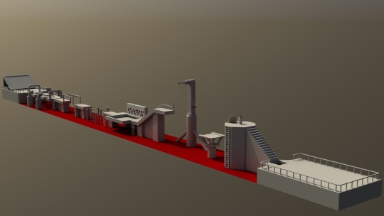
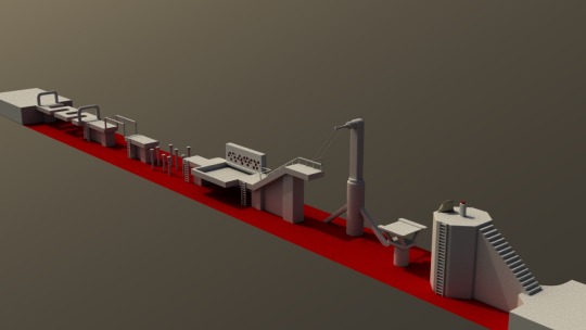
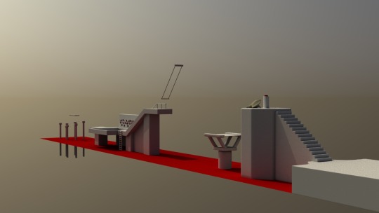
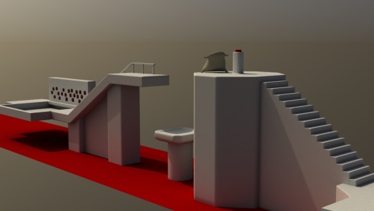
This is the final assault course and what it looked like at different stages, I will add some colour to the course so the whole project looks a little less bleak but I'm really happy with the model. I can now go ahead and figure out the timings of everything by rendering a few frames of the sack in the assault course to make an improved storyboard.
youtube

I used the stuff above to figure out the layout and obstacles of each course.
0 notes
Text
Sack Landing Test
This is the sort of thing that I could make using the sack for the final animation, it took me between 1 to 2 hours to make and its just a rough example of what I could do following the storyboard using the sack as my rig. I could probably finish the whole animation like this using the sack rig in a week give or take because this is one of the most complicated movements in the animation and it didn't take too long to finish a first draft. I need to decide tomorrow which direction I am taking with this animation because I will shoot myself in the foot if I take any longer. I had to give up on the robot rig because half an hour of messing around with the right arm wasn't enough time to make the hand rest on the hips of the model because the rig is made to move on hinges thus limiting the range of motion. I've looked through so many rigs now most of which have some issue with them that prevents me from getting started with the actual animation. I've once again overcomplicated things but I do have simpler ideas I could storyboard quickly if I have to abandon the sack animation.
0 notes
Text
Sack Test
Here's a quick test I made to see what I could do with the sack rig once the textures were reconnected and I didn't have any issues rendering. It only took around 20 minutes to animate around 5 or 6 key poses and I'm wondering whether or not I should run with the sack rig because it might not showcase what I have learnt this year animating in Maya.


The two rigs I am considering using are the robot and the sack, the robot obviously looks a lot more impressive but I need to decide what I could animate using this robot. Unfortunately I don't think I would have the time to animate the whole total wipeout animation using the robot so I might have to simplify or come up with a fresh idea.
0 notes
Text
Idea Changes?
I spent some time planning and thinking of different ways to approach this project because of the issues that IO had yesterday and this gave me a chance to have another look at my options and the rigs available on Agora. I had a look through them and thought about the different ways to go about my idea and I wanted to retain some sort of performative aspect to the animation with an emphasis on physicality and these were the ideas I had.
youtube
youtube
youtube
I looked at these three videos as possible inspiration for an animation and I like the idea of what I could do with them with the props and characters available I could attempt a struggling magic show, Boston dynamics testing of a robot improving or a road runner and Wile E Coyote esque duo.
0 notes
Text
Change of Plans

I have just spent some time finishing off my character design module and I now have a better understanding of texturing and lighting, I now understand how much they can elevate the quality of an animation. I thought that this flour sack rig had a lot of potential for my project with the storyboard that I planned out and I decided to go into Maya and play around with the model to get an idea of how difficult it would be to pose it so that I had a general idea of how long the animation might take. I posed the rig into a sneaking walk pose and it only took a minute or two to get there because the rig is so simple. But I'm glad I tried to play around with the lighting and texturing before I went any further.

I made a simple lighting setup and noticed in Render-view that the model had no texture to it and that I also could not edit the texture or colour of the model. It was made back in 2013 and I think that there may be some compatibility issues with the model because when I tried to render a single frame and save the image, the software crashed and gave me this error message. Not only could I not render a single frame, I also couldn't get a nice lighting set up for the character because the textures could not be changed so I was stuck with a grey blob which didn't pick up the creases of the form. I can't find another flour sack rig to use so I'm back to the drawing board with this project and I'm running low on time to make it so I may have to simplify things.
0 notes
Text
Final Animation Storyboard

Here's the initial storyboard breakdown with the start and finish but I was starting to get a little side-tracked. I decided to remake it ironing out the kinks and simplifying where I could.

This is the refined storyboard breakdown. I went ahead with the Total Wipeout theme with a clumsy start and a confident finish, to save time I decided that I could include still frames as a mini montage showing his progress dodging the obstacles.


Here's the full storyboard. It suits the brief in that it is someone refining multiple skills at once instead of one: dexterity, athleticism, strength, etc... All of the above are physical techniques which are refined through the process with the body language and confidence highlighting this progress finished with a Spiderman landing and a leap of victory. Then he explodes maybe. I don't know yet.
0 notes
Text
Final Animation Planning
With all my projects on this course I've tried to push the limits of the brief and in doing so, push myself. I spent some time planning out lots of different ideas which would be fun to animate but unsurprisingly, I got side-tracked.


I scribbled down as many ideas as I had to push the brief and turn it into something more interesting and complicated. I'm sure these would be fun to and challenging to make but past projects have taught me that I tend to bite off more than I can chew. I need to simplify the idea so that I can focus on the performance itself and create a smooth and refined final animation.

youtube
youtube
youtube
youtube
youtube
After throwing around a couple more ideas and looking through countless animated rigs, I settled on the Flour Sack rig - it's simple but I can learn a lot by experimenting with such a simple rig.
youtube
Before settling on the Flour Sack, I wanted to make something like this training scene from Kung Fu Panda but time there is only a 20 - 30 second time window for this project. In the past, time windows have obstructed my ideas because I always thought too big but I'm starting from something small this time. I want to build from the physicality of this scene and apply it to my flour sack animation and the best idea I had for this was Total Wipeout. I loved the show when I was young and it has a lot of slapstick physicality which I can play around with but it also has the scope to show the flour sack progressing during the course.
youtube
youtube
youtube
youtube
As reference, I think the was in which these animals behave doing each of these tasks could be exaggerated and applied to my flour sack animation to give it more life and character as their inexperience is evident from their interactions with each activity.
0 notes
Text
Blocking Exercise 3
I found the full page from The Animator's survival guide and I went ahead and added the next few poses to the blocking sequence

I need to add another keyframe or two to the fall animation with full contact with the floor at the end with a crumpled torso and both feet in the air to add some weight to the movement. It looks decent so far and I just removed the second pose because it didn't work with a 3D character.
0 notes
Text
Blocking Exercise 2

I started the blocking lift again following the steps from the animators guide to survival. The reference was 2D, Maya is 3D - that second pose needs a lot of work to look in any way decent.
0 notes
Text
Blocking Exercise 1
Here's my initial attempt at blocking, we were told to attempt a blocking exercise where a character lifts up a ball however I went a different direction initially and wanted them to walk to the ball, fail to pick it up, fall back, get annoyed, kick the ball and hurt their toe, then hop backwards holding their foot.
I realised quickly that I was overcomplicating things, what was meant to be a short exercise with 5 key poses ended up with 16 and still needed to be inbetweened to make things smoother. I left this as it is and went back to the drawing board for the next lesson.
0 notes
Text
Animating The Inanimate 4
AUDIO ON (VOLUME WARNING)
I finally got everything finished, I'll put all the audio files and things I used below:
youtube
youtube
youtube
It's not a bad attempt at bringing the log to life, if I had more time I would add some arms to make things a little more expressive and maybe a spurt of blood or sap out of the axe wound. Sorry if it blew your ears out, I know its a bit loud.
0 notes
Text
Animating The Inanimate 3
It took a long time to get this sorted with this animation, there were a lot of new things that I had to learn all at once which made the process a little daunting. Below is a video showing each stage of the animation as it progressed:
I tried to keep the 12 animation principles in mind when animating particularly the timing and arcs of motion. I was somewhat limited with timing because I exported the image sequence in the background at 12fps so that I could animate on twos. It saved a lot of time in the laborious process of positioning the features on the same part of the log (if I do this again I will animate and put it on top of the video in after effects) however it did make the timings a little less flexible than I might've liked. I think the ease in and out motions look smooth enough for a 12fps animation and it all came together fairly well.
0 notes
Text
Class Exercise - Maya Walk Cycle 2
I went back to the walk cycles to sort out the stepping forward timing and to animate the rest of the body in the walk. It took a little while to sort out some of the timings of the sway of the arms and had to feel less robotic, I managed this by off-setting the timings slightly so that they held on the furthest swing for an extra frame or two.

It's definitely an improvement on the walk cycle I had before because everything moves smoothly together. I have a much better understanding of walk cycles now and I think the main area that I should look into the next time I am working on a walk cycle is the type of walk the character is doing. It needs an intention and/or emotion behind the movement to make it expressive and more visually interesting. Another limiting factor of this walk cycle was following the timings on the reference sheet above; all these motions are evenly spaced at three second intervals smoothing the final look but restricting its expressiveness.
youtube
youtube
I looked back at these tutorials for the finishing touches of the leg motion and figured out the upper body motion myself.
0 notes
Text
Class Exercise - Maya Walk Cycle
I'll be honest, this exercise had a bit of a rough start to it and I really couldn't make progress for some reason or another and I had to restart my walk cycle multiple times. Initially I chose a character rig whose feet defaulted to splaying outwards thus when I tried to animate the walk, it was unnecessarily complex so I abandoned this walk cycle.

Secondly I began with the Iron Giant rig that Gary was using in the demo and after keyframe the first four poses on the image above, I checked the playback and for whatever reason (perhaps that I selected the whole rig instead of the moving limbs) I had only the most recent pose saved to my timeline.


By this point I was still content with moving forwards and instead switched to the Max rig which I have used previously for my Gollum animation. I again started the walk cycle however, this time I attempted to add contour to the feet as seen in the walk cycle reference so that the feet seemed less rigid and blocky. After continuing this somewhat successfully for the first fifth frames however once I reached the sixth frame I struggled massively with an imperfection in the animation. The transition of the back leg between these two poses had an unnatural snapping of the knee which really stood out in the playback. I struggled with this for 30 - 40 minutes and it was very frustrating because I just couldn't seem to get the model to walk smoothly.
The issue I faced during that exercise was not an issue with that knee joint, it was that I was tunnel visioning on minor details far too early in the process. I have since started the exercise again at home and the results with this Iron Giant model have been much more successful.
0 notes